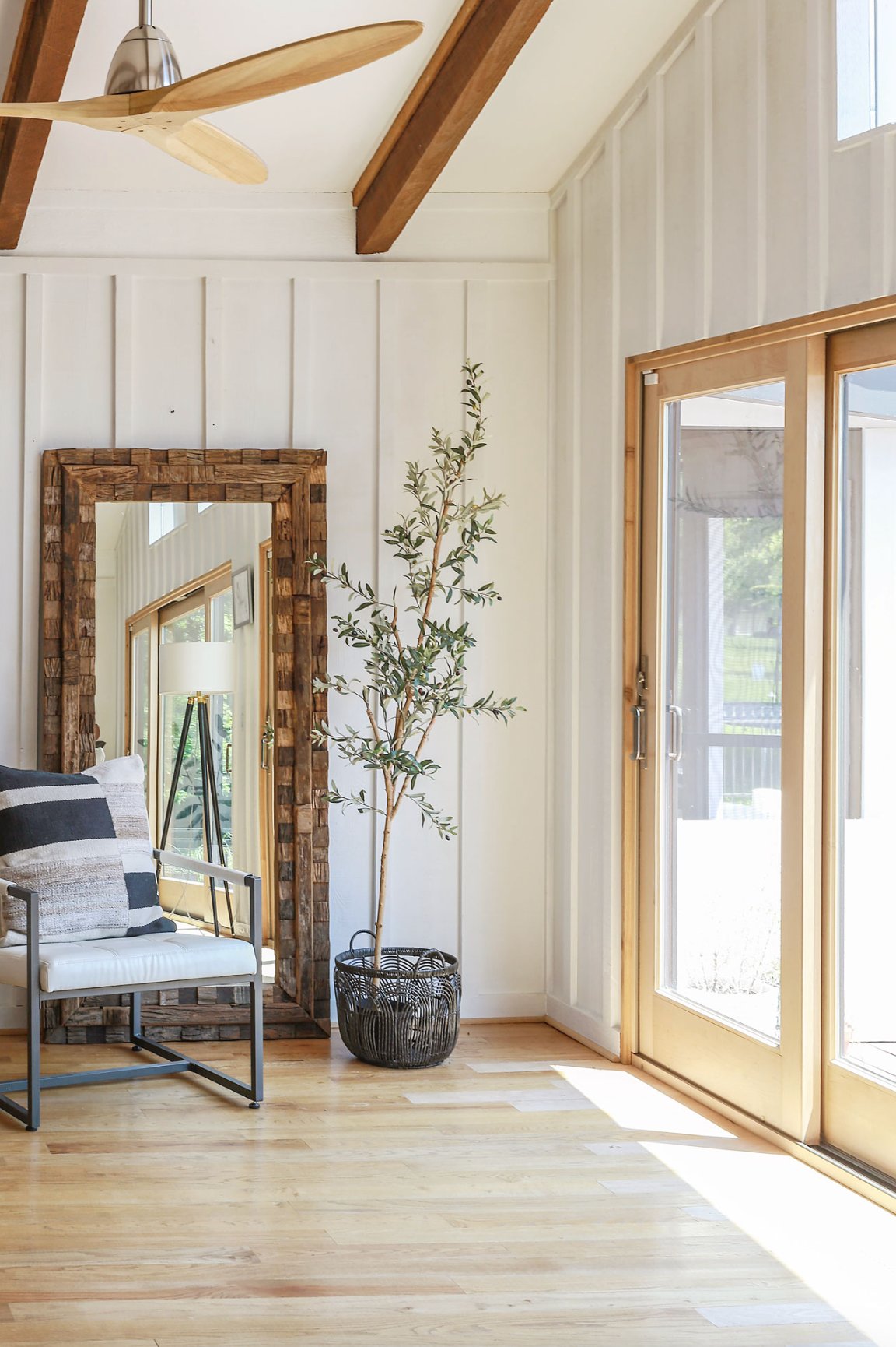
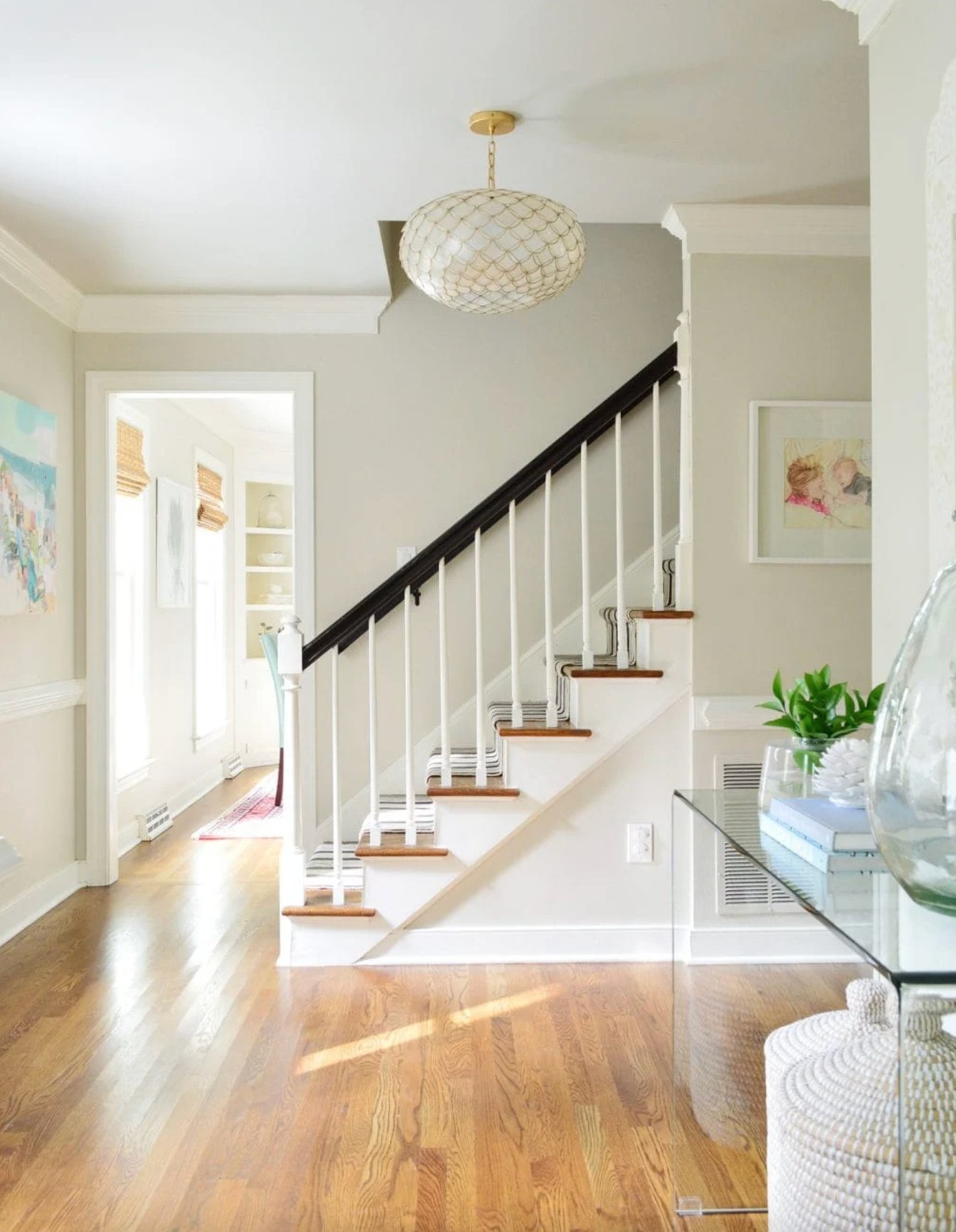
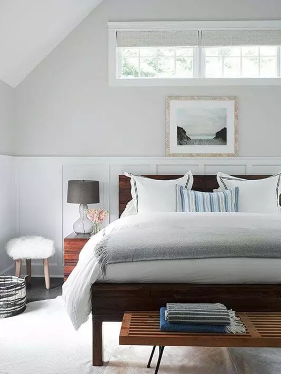
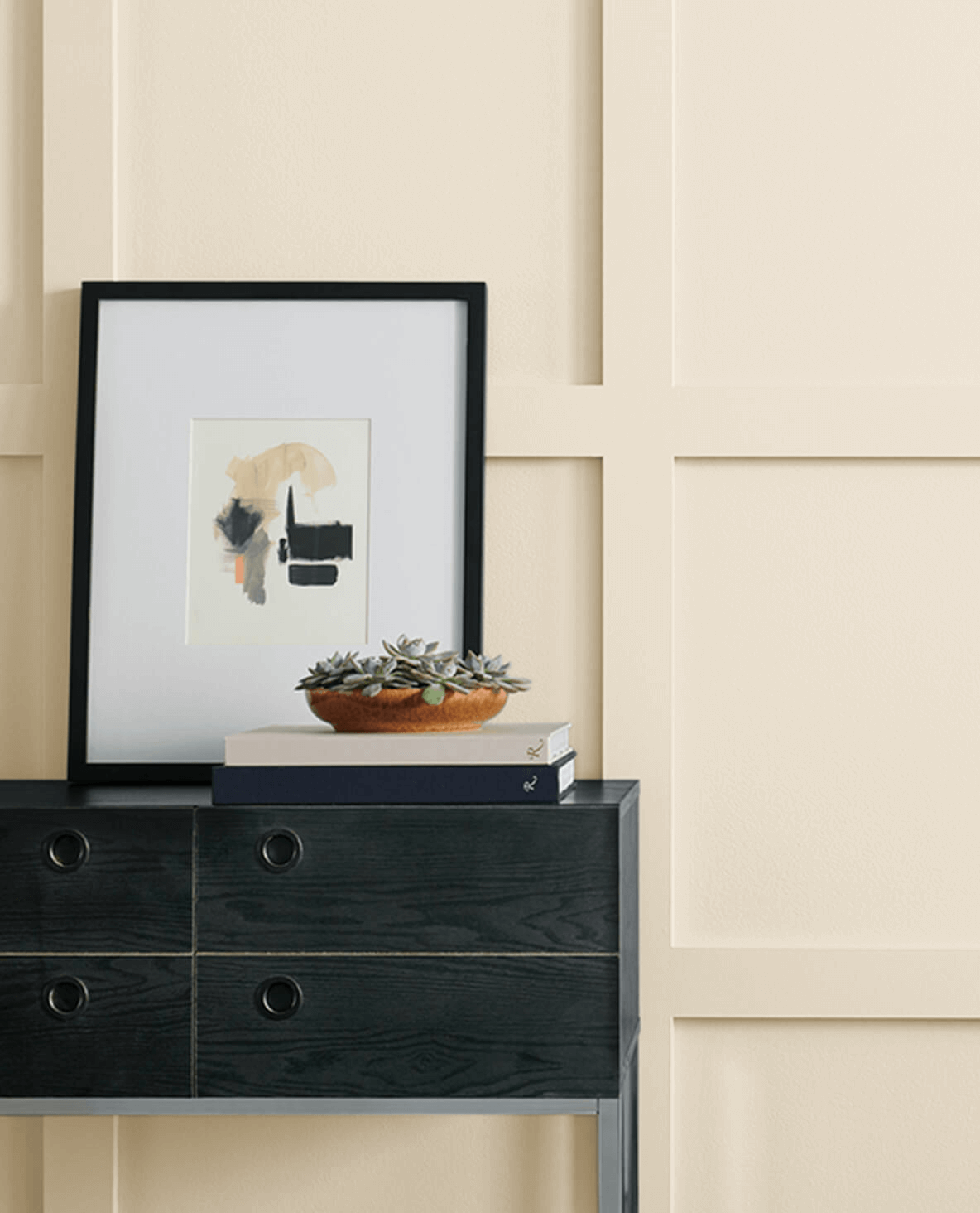
You know that feeling when you step into a room and instantly feel at home? Often, it’s all thanks to expertly chosen beige walls. This shade is having a real comeback, thanks to a significant shift away from the dominance of gray tones over the past decade.
Beige colors create a warm, inviting atmosphere while serving as the perfect backdrop for all sorts of styles – from modern minimalism to cozy country. Unlike white, it never feels clinical, and compared to gray, it’s much more welcoming.
But finding that perfect beige isn’t exactly a walk in the park. Some tones can end up looking too yellow, while others might turn muddy in less-than-ideal lighting.
In this article, I’ve reviewed the best beige paints with REAL examples, and I’ll show you how they look in different lighting conditions and what key factors to keep in mind when making your choice.
Best Beige Paint Colors for 2025
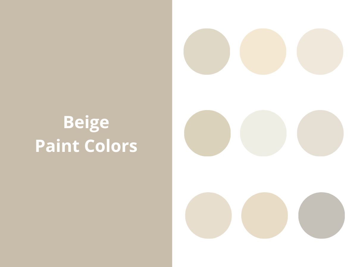
Let me share my top beige paint picks that’ll work for anyone – we’re talking everything from delicate sandy shades to rich caramel tones and those gorgeous earthy hues.
I mainly work with Sherwin-Williams and Benjamin Moore, so that’s what I’ll focus on here – but trust me, you’ll discover your perfect shade!
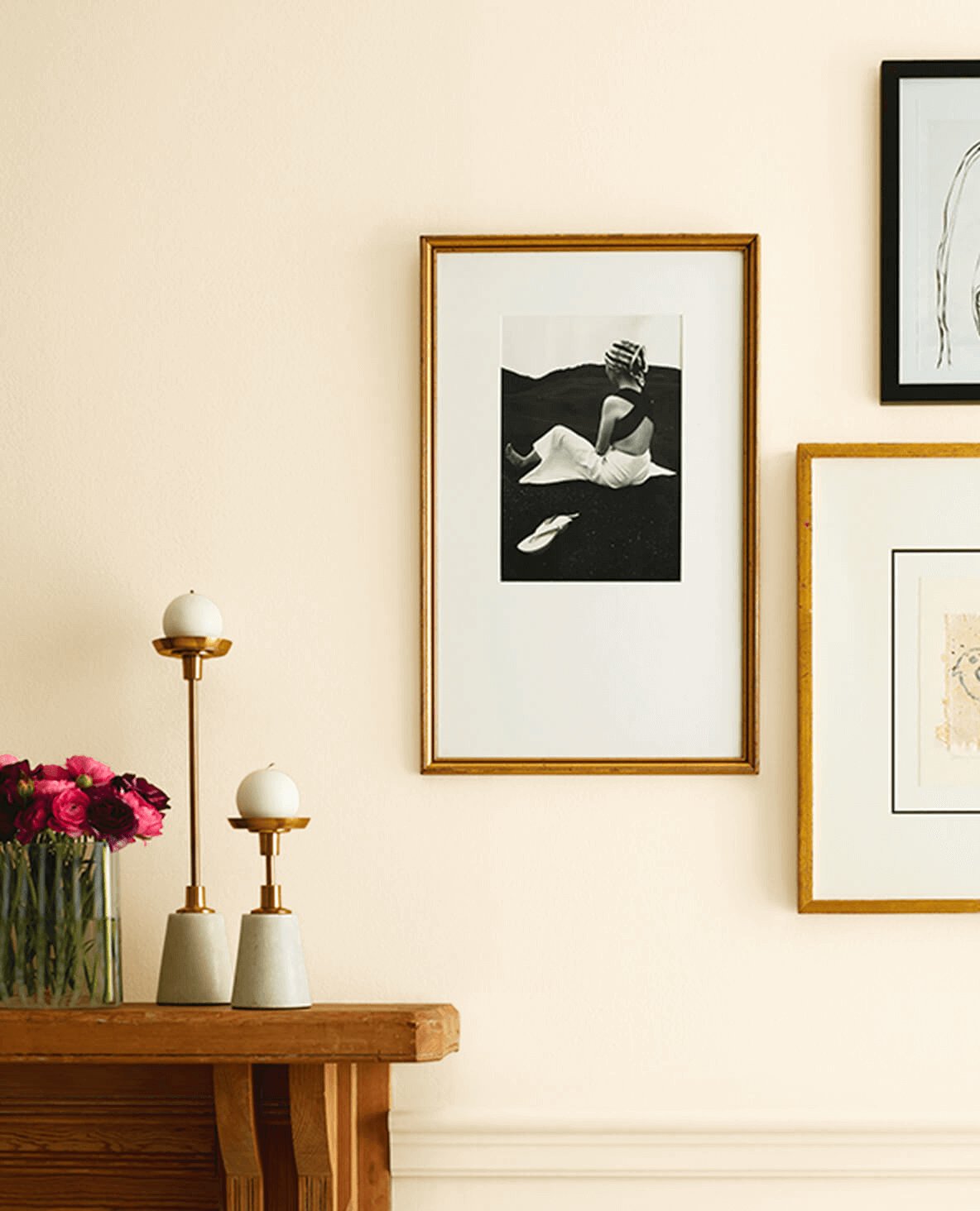
1. Shiitake by Sherwin-Williams

Let’s start with Shiitake – this dreamy warm beige-gray with subtle pink undertones. It hits the sweet spot between gray and beige, which makes it pretty much timeless.
Shiitake is soft and warm in well-lit rooms, while in spaces with less natural light, it creates a more intimate feel. It’s especially lovely for bedrooms and living rooms where you want that relaxing vibe.
When using Shiitake on walls, I like to pair it with white or neutral trim – this will enhance the depth.
2. White Sand by Benjamin Moore

Benjamin Moore’s White Sand is one of those colors that just wraps you in warmth. Picture the sweet spot between classic beige and gray, but leaning into those cozy beige notes.
Natural light really brings out its soft, rich personality, making it pop beautifully against lighter whites. In modern spaces, it plays the perfect supporting role, while in traditional rooms it highlights classic architectural details.
And don’t get me started on how beautifully it pairs with wood and natural materials – absolute perfection.
3. Crème by Sherwin-Williams

Sherwin-Williams’ Crème is gorgeous – it’s like a color that lives two lives depending on your lighting. Bright spaces bring out its lighter, almost white-like personality, while rooms with less natural light reveal its warmer, yellowy soul.
It’s my go-to for bedrooms and living rooms when I want something cozier than plain white or gray.
4. Sea Salt by Benjamin Moore

Looking for that can’t-go-wrong beige? Meet Sea Salt – it’s this warm beige with gentle brown undertones that honestly feels like bottled beach sand.
Here’s what makes Sea Salt so special – it’s totally at home in any space, whether you’re working with a tiny north-facing nook or a sun-soaked room facing south.
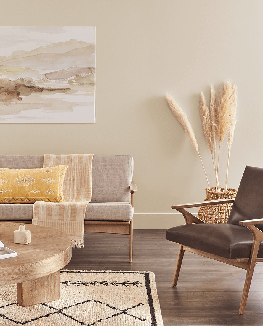
5. Natural Linen by Sherwin-Williams

Natural Linen from Sherwin-Williams really stands out from other beiges with its modern feeling.
Unlike those rich golden tones we saw in the 90s and 2000s, it has subtle gray undertones that make it much more versatile. Natural Linen keeps things soft and understated, which is why it works so well as a neutral backdrop. Speaking of which – have you seen my guide to neutral paint colors? It’s super helpful if you’re on the fence!
In north-facing rooms, you’ll see a gentle warmth, while rooms with southern and western light bring out more of its richness – but never too much.
6. Creamy by Sherwin-Williams

When people hunt for that perfect beige for their walls, Sherwin-Williams’ Creamy often catches their eye.
Its high LRV of 81 sits nicely between white and cream. The color shows warm yellowish undertones depending on the lighting, but they’re not as strong as what you’d see in traditional cream colors.
That’s what makes Creamy such a great pick for larger spaces where you want things bright but cozy. Just keep in mind – it might be a bit too rich for trim and furniture.
7. Manchester Tan by Benjamin Moore

Manchester Tan sets itself apart from typical beiges by striking a sweet spot between warmth and neutrality with its sandy undertones.
This shade from Benjamin Moore’s Historical Collection looks fantastic with wood, stone, earthy tiles, and other natural materials.
8. Pashmina by Benjamin Moore

Pashmina by Benjamin Moore blends beige and gray, with gray tones softly taming the beige warmth.
9. White Dove by Benjamin Moore

White Dove plays a fun trick on us – you’d expect classic white from the name, but you actually get lovely beige undertones. Put it in a room with southern or western light, and those warm tones really come alive.
It’s great for pretty much everything – walls, cabinets, and moldings – staying soft without ever looking yellowy. Pair it with natural materials, and White Dove will create an elegant, balanced look.
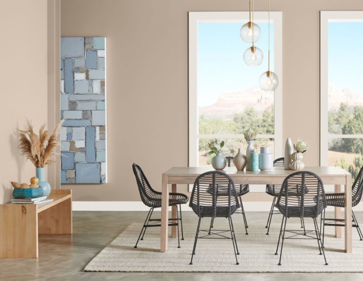
10. Accessible Beige by Sherwin-Williams

I have to say, Accessible Beige holds a special spot in my heart. It’s a beautiful beige color with gray notes that perfectly connects warm and cool.
On walls, it is softer than most beiges but warmer than typical grays. It’s nothing like those beiges we used to see in the early 2000s — this one creates a modern vibe and plays well with metallic accents in your space.
11. Shoji White by Sherwin-Williams

Shoji White SW 7042 is a stunning blend of warm white and beige. Its subtle green and greige undertones shine through in natural light.
This versatile color works in both modern and traditional spaces, and it looks especially good in rooms with clean lines.
12. Edgecomb Gray by Benjamin Moore

Another Benjamin Moore color that perfectly blends gray and beige undertones.
When the sun hits it, you might catch some slight greenish notes, which adds a natural feel to the space. I recommend pairing it with white trim, warm wood elements, and quartz countertops.
13. Balboa Mist by Benjamin Moore

Balboa Mist is a warm gray with beige undertones that changes DRAMATICALLY depending on your lighting. This color works beautifully with wood surfaces and bright white trim.
14. Aged White by Sherwin-Williams

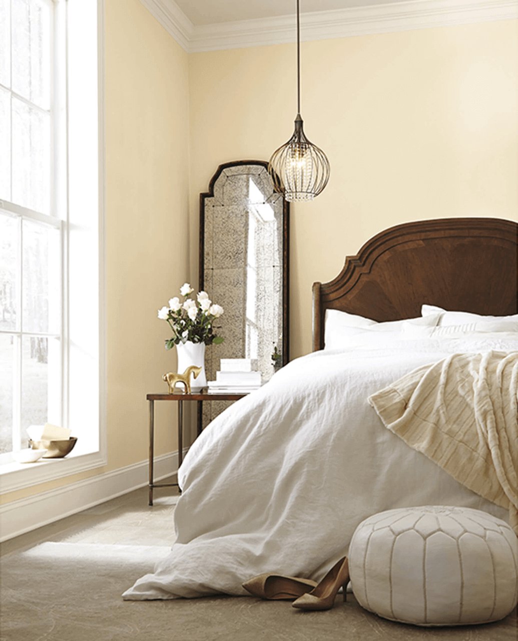
Aged White can bring depth to your space while staying light enough to read as a white variation. It’s particularly stunning in classic kitchens and living rooms, where the yellow undertone adds a touch of elegance without being overbearing.
15. Analytical Gray by Sherwin-Williams

Analytical Gray by Sherwin-Williams is a complex shade that walks the line between gray and beige, with warm stone notes that make it a great base for all kinds of color combinations.
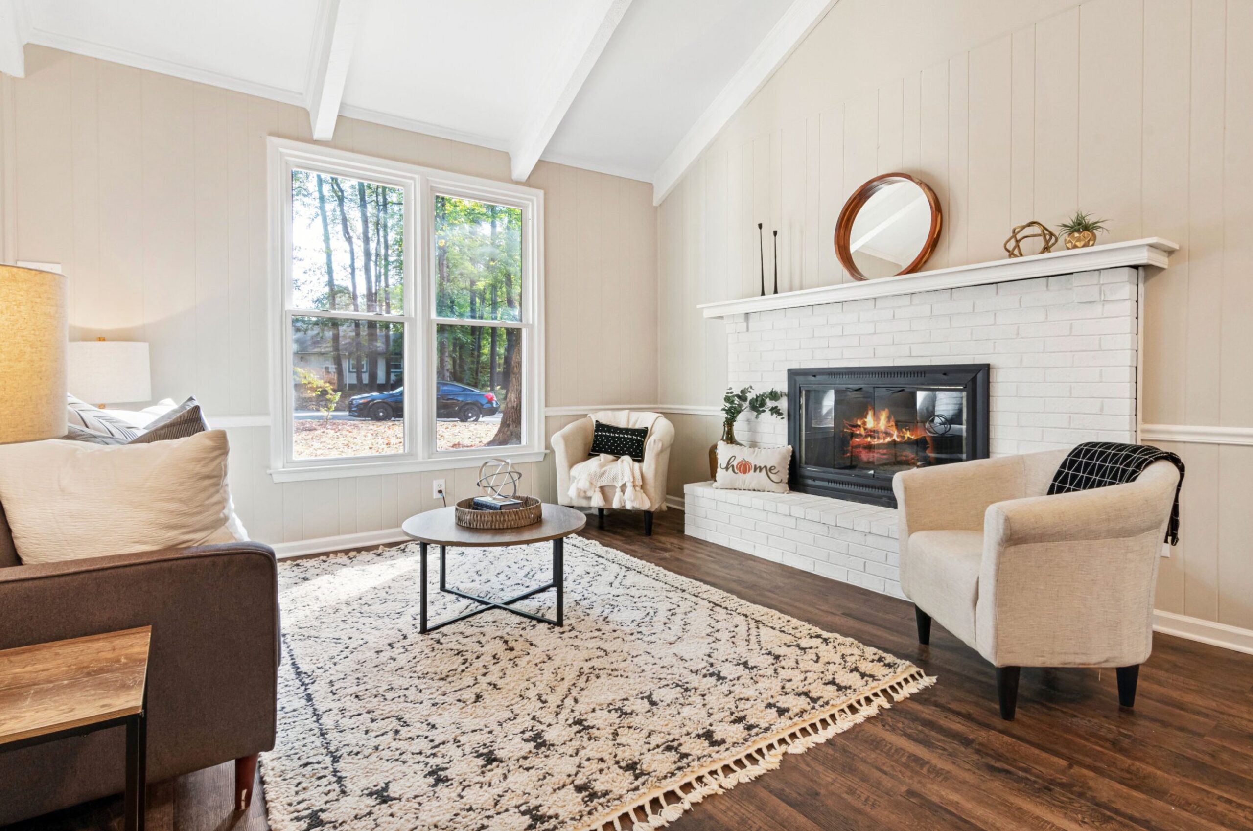
16. Antique White by Sherwin-Williams

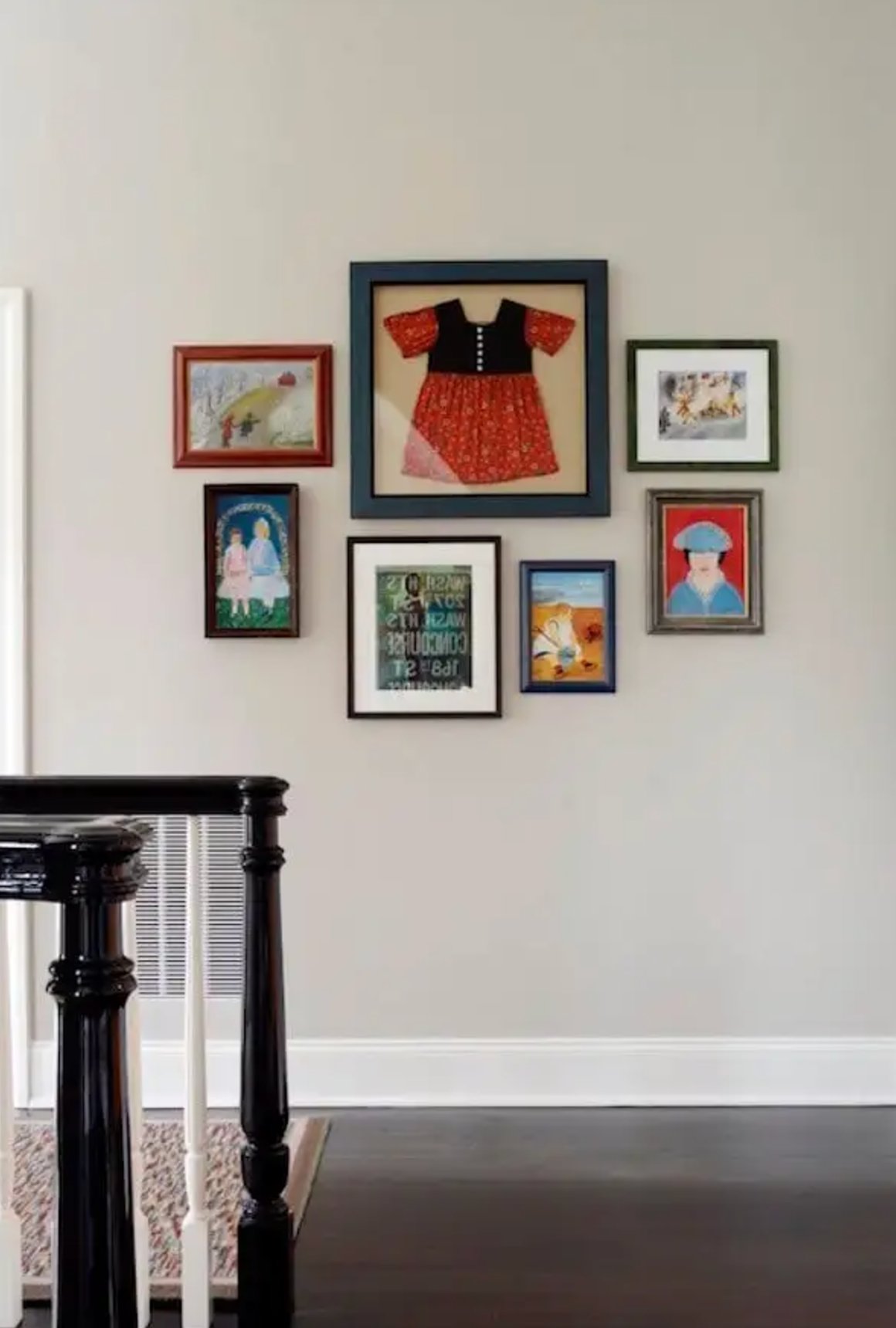
Want a more classic beige paint? Antique White is a warm beige with yellow undertones and an LRV of 72. It’s perfect for traditional spaces, creating a cozy vibe without being too bright.
It’s a bit too rich for moldings and cabinets, where people typically go for lighter shades with an LRV of 82-94. For walls, it looks best paired with colors 1-2 shades darker (just look at how great that dark wooden furniture looks in the photo above).
17. Cumulus Cloud by Benjamin Moore

Cumulus Cloud by Benjamin Moore is a beautiful greige with cool undertones. Think of overcast skies (but not the gloomy kind!) – that’s what this color looks like.
It’s especially great for open-concept spaces since it flows smoothly from room to room, creating a unified look throughout.