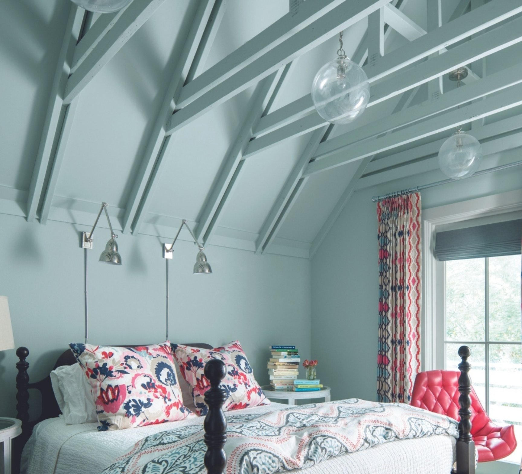
Are you tired of plain white ceilings? Modern designers have been getting more adventurous lately, experimenting with unexpected shades – everything from soft pink to deep blue.
I’ve put together a collection of the most eye-catching ceiling colors that can completely transform your space. And yes, classic whites made the cut (because how could they not?), but you’ll be amazed at how bold some of these alternative choices can be.
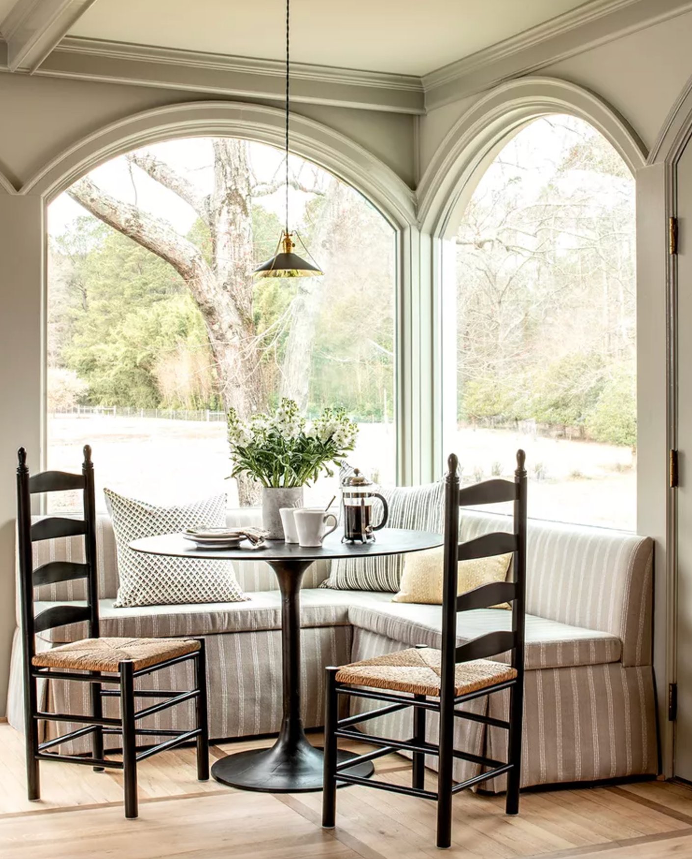
I’ll walk you through the best ceiling colors using REAL interiors so you can spot that perfect shade that’ll make your room truly special.
- Honorable Mention: White Paints
- 1. Stone Harbor by Benjamin Moore
- 2. Gateway Gray by Sherwin Williams
- 3. Studio Green by Farrow & Ball
- 4. Mount Etna by Sherwin Williams
- 5. Finnie Gray by Benjamin Moore
- 6. Onyx by Benjamin Moore
- 7. Blue Porcelain by Benjamin Moore
- 8. Newburyport Blue by Benjamin Moore
- 9. Yarmouth Blue by Benjamin Moore
- 10. Dead Salmon by Farrow & Ball
- 11. Indigo Batik by Sherwin Williams
- 12. Autumn Cover by Benjamin Moore
- 13. Shamrock by Sherwin Williams
Honorable Mention: White Paints
I left white paints off the main list of best ceiling colors – I mean, everyone knows about them already! But that’s exactly why I have to give them a quick mention before we dive into some more unexpected options.
The world of white paint isn’t as simple as it seems. Warm whites with creamy undertones can make a room feel super cozy and work like a charm with wooden furniture.
And if you’re going for a modern vibe, pure or cool whites are your best bet – they’re perfect with chrome fixtures and glass surfaces.
But enough about white – let’s get to the really interesting stuff!
1. Stone Harbor by Benjamin Moore

Stone Harbor by Benjamin Moore is a bit of a chameleon when it comes to lighting. During daylight hours, this gray shade shows off subtle purple undertones that create this really peaceful vibe. Switch on artificial lighting, especially overhead lights, and suddenly you’ll notice olive undertones peeking through. That’s actually what makes me love it so much!
It really shines on ceilings, like in this sunny room by Bria Hammel Interiors shown above. On a wooden shiplap ceiling, Stone Harbor creates just enough contrast to catch your eye without stealing the show.
Just keep in mind how your flooring might affect it. Warm brown woods like walnut or maple can bring out more of that greenish undertone when evening rolls around. If that happens, you can balance it out with some cool-toned decor or play around with directional lighting instead of overhead fixtures.
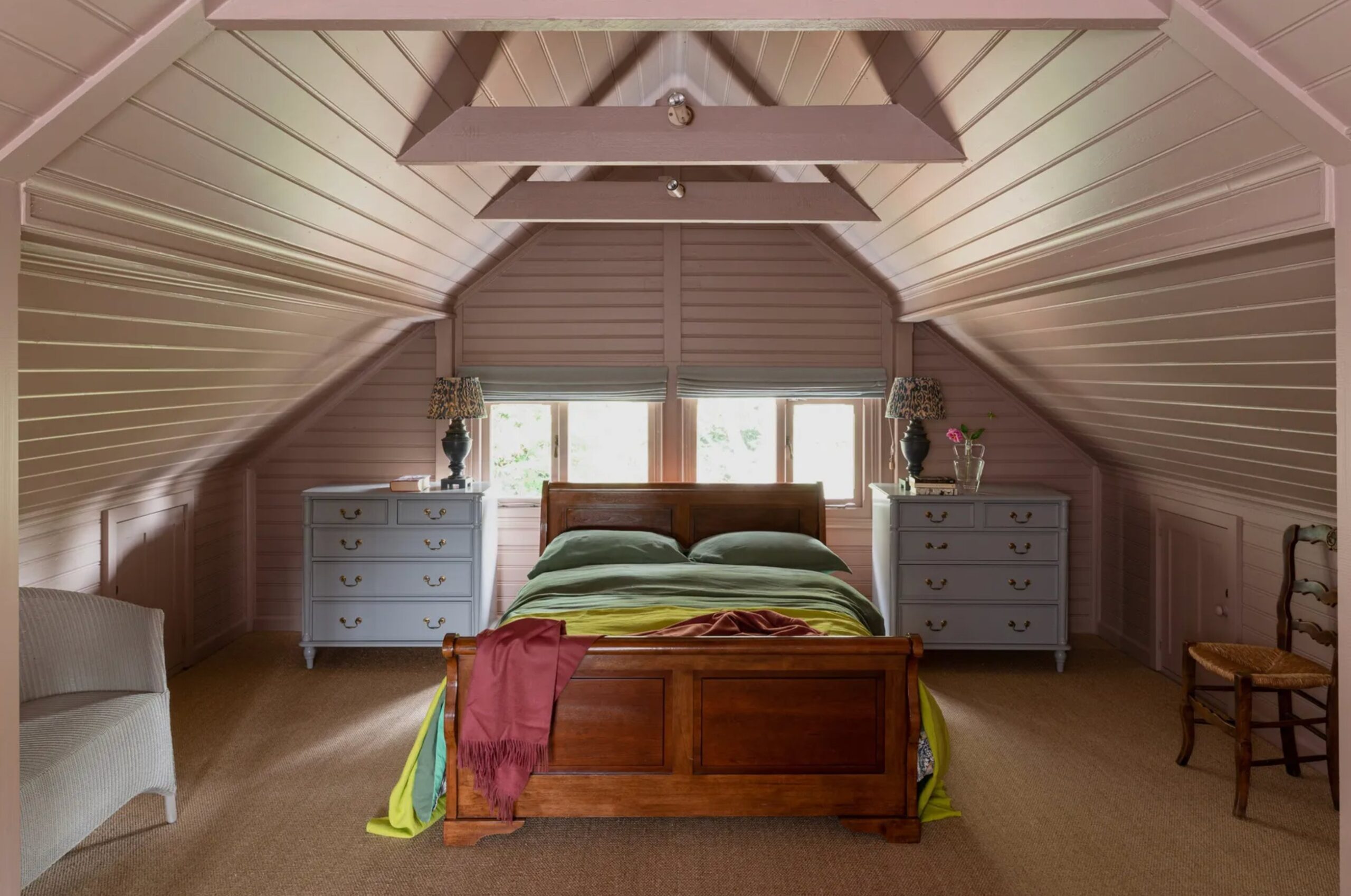
2. Gateway Gray by Sherwin Williams

Gateway Gray by Sherwin-Williams is a gorgeous gray with hints of green that’s become a go-to for highlighting ceiling beams and architectural details. Pair it with a classic white on the main ceiling surface, and you’ll get this beautiful layered look.
It’s especially stunning in rooms with nature views – it can bridge the gap between your indoor space and the landscape outside. It’s also a great pick for bedrooms, where it creates a peaceful feeling without being too stuffy.
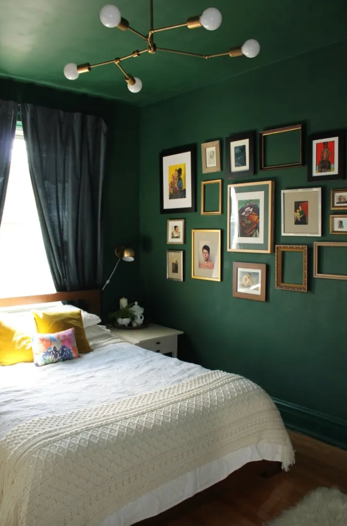
3. Studio Green by Farrow & Ball

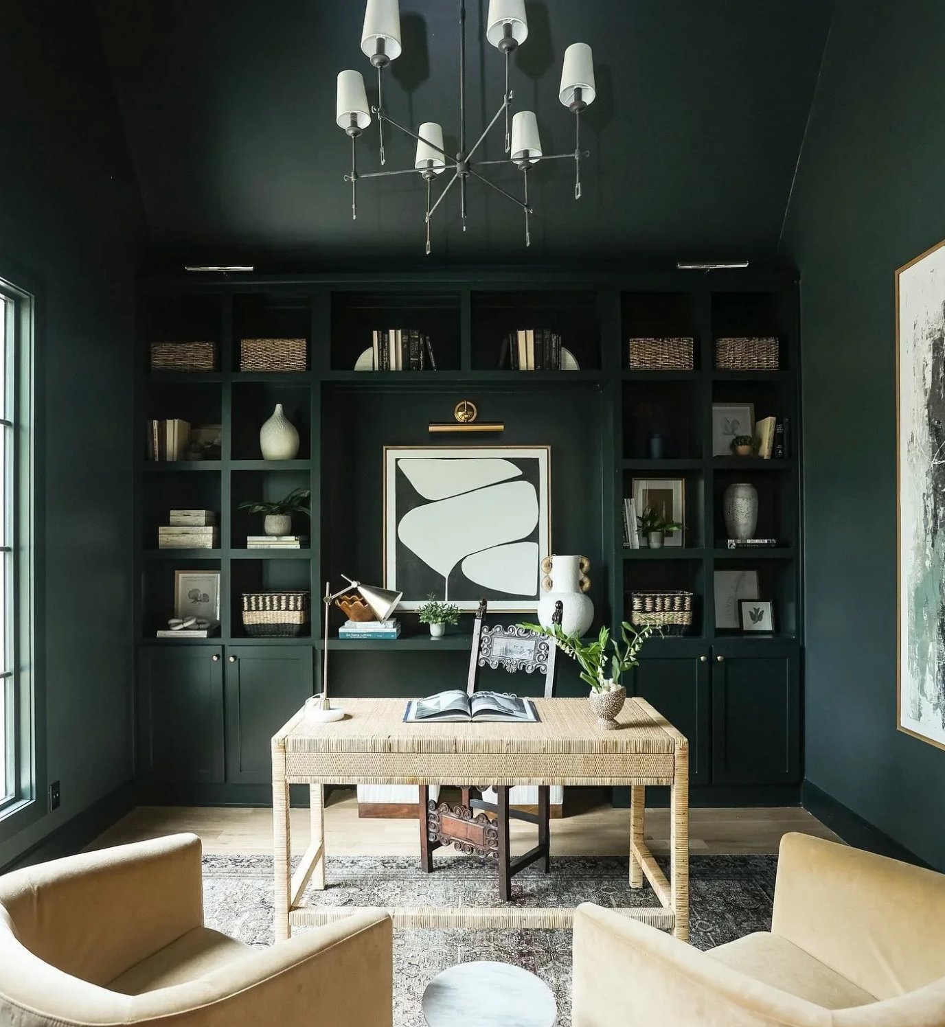
Studio Green by Farrow & Ball is one of those colors that keeps you guessing. In bright light, it’s a rich, deep forest green, but dim the lights, and suddenly you’re looking at what seems like a black ceiling.
Designer Mary Patton totally got this in one of her projects (shown above). She covered both walls and ceiling of this huge bedroom in Studio Green, adding cream trim, and you know what? It made this massive space feel so much more intimate. It’s like being wrapped in a cozy blanket.
Interesting fact: they named this color after Farrow & Ball’s original studio, where they first started developing their now-famous color palette.
4. Mount Etna by Sherwin Williams

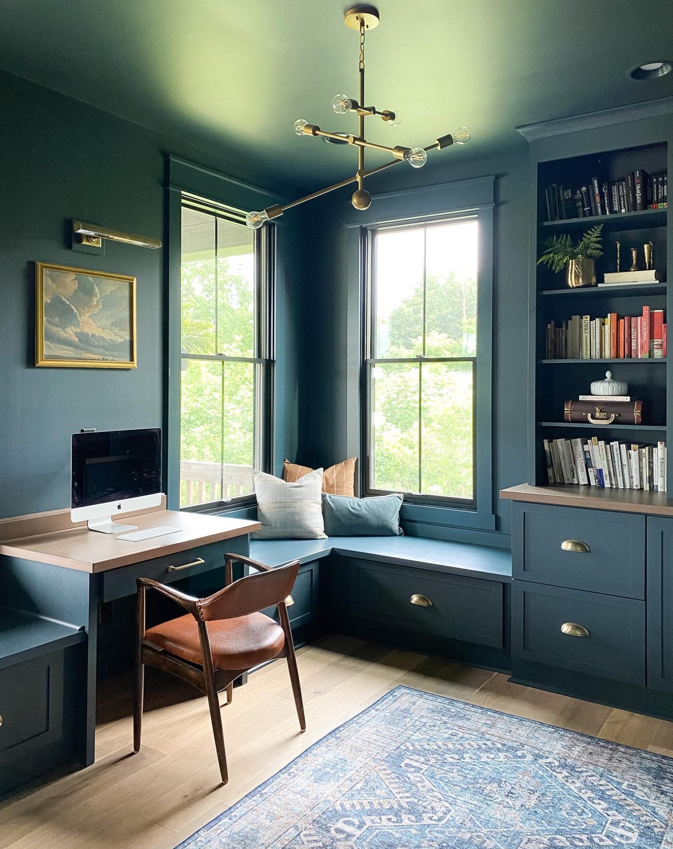
Mount Etna by Sherwin-Williams is a unique blend of blue and green with an ashy undertone. Its base combines gray and green notes to create a deep, jewel-like shade that catches the eye.
This color is perfect for ceilings in living rooms and home offices where you want to create a cozy vibe.
Mount Etna truly shines in monochromatic schemes. Remember that, like other rich colors, you’ll want to carefully choose your accessories to keep everything balanced and harmonious.
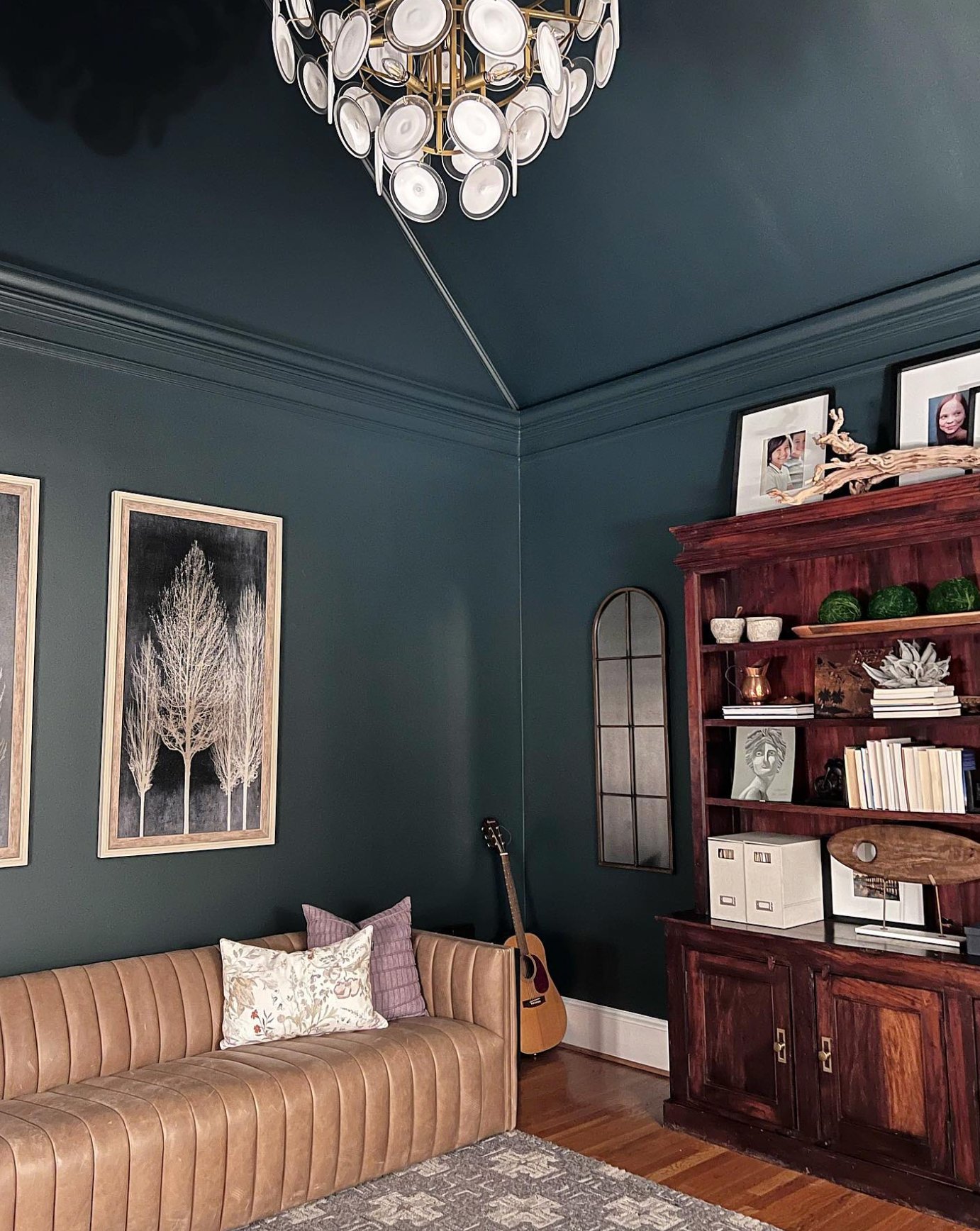
This is one versatile color – it looks great everywhere, from accent walls to furniture to fireplaces. It plays well with neutral palettes and works beautifully both inside and outside your home.
5. Finnie Gray by Benjamin Moore

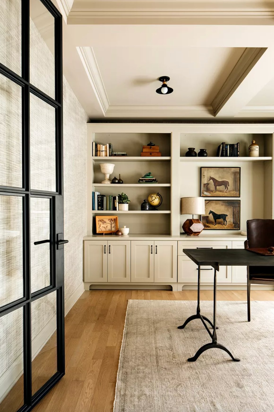
Finnie Gray by Benjamin Moore comes with quite a story – it dates back to the late 18th century when it was discovered on the historic Finnie House’s exterior. Pretty cool piece of history, right?
While it’s technically a gray, there’s more to it than that. It has warm notes and subtle green undertones that give it more of a mushroom-like quality. The neat thing is how it shifts between warm gray and olive tones depending on the lighting.
Designer Alessia Zanchi Loffredo put it to great use on an office ceiling as part of a monochromatic look. It’s super flexible – you can pair it with everything from green and black to brown and ivory. Plus, it looks fantastic with all sorts of materials like steel, wood, brass, and vintage pieces.
6. Onyx by Benjamin Moore

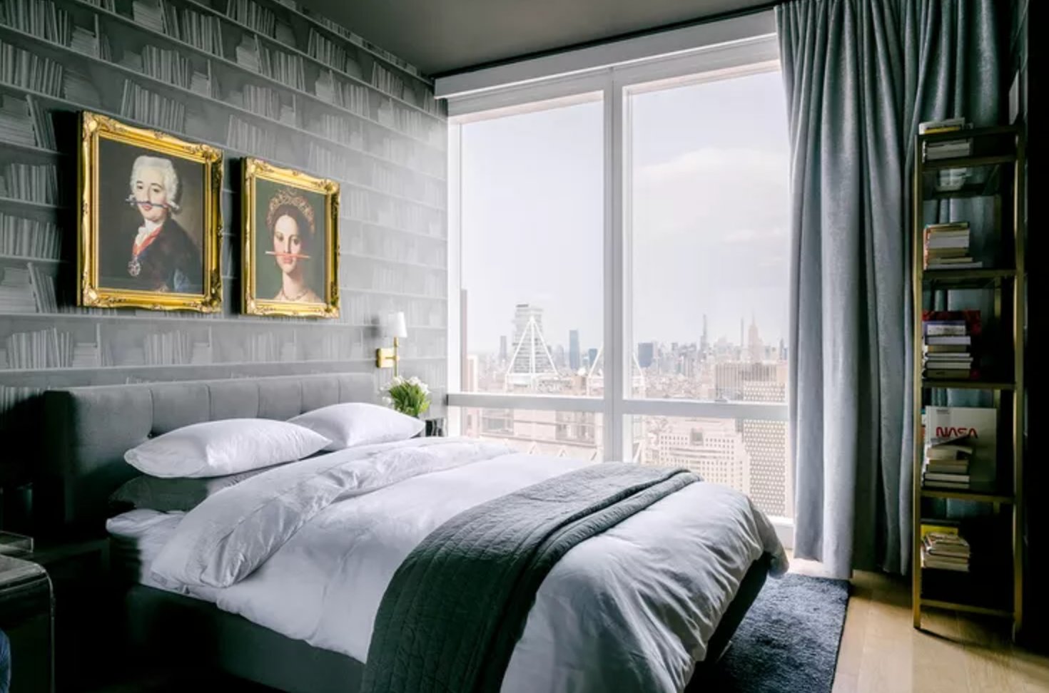
Benjamin Moore’s Onyx is a gorgeous deep black with an LRV of 5. Since it has no strong undertones, it works beautifully with both warm and cool colors.
Put this on your ceiling, and something magical happens – the room actually feels taller. This works exceptionally well in bedrooms and living rooms with plenty of light.
Designer Emma Kemper used this trick in darker spaces (like in the photo above) to avoid that jarring look you sometimes get with white ceilings.
What’s cool about Onyx is that it’s like white in reverse – it makes an excellent backdrop for artwork and colorful accents. In a room, it often feels warmer than you’d expect, especially next to natural wood.
7. Blue Porcelain by Benjamin Moore

This blue is just fantastic! Blue Porcelain has this lovely soft gray-blue tone that instantly makes a room feel more peaceful.
A hint of gray in there takes the edge off the blue, making it super versatile for ceilings. It adds interest without stealing the show.
When you use it on ceiling beams, it creates this nice architectural detail without going over the top. Even when you use Blue Porcelain on larger surfaces, it stays subtle rather than overwhelming the space.
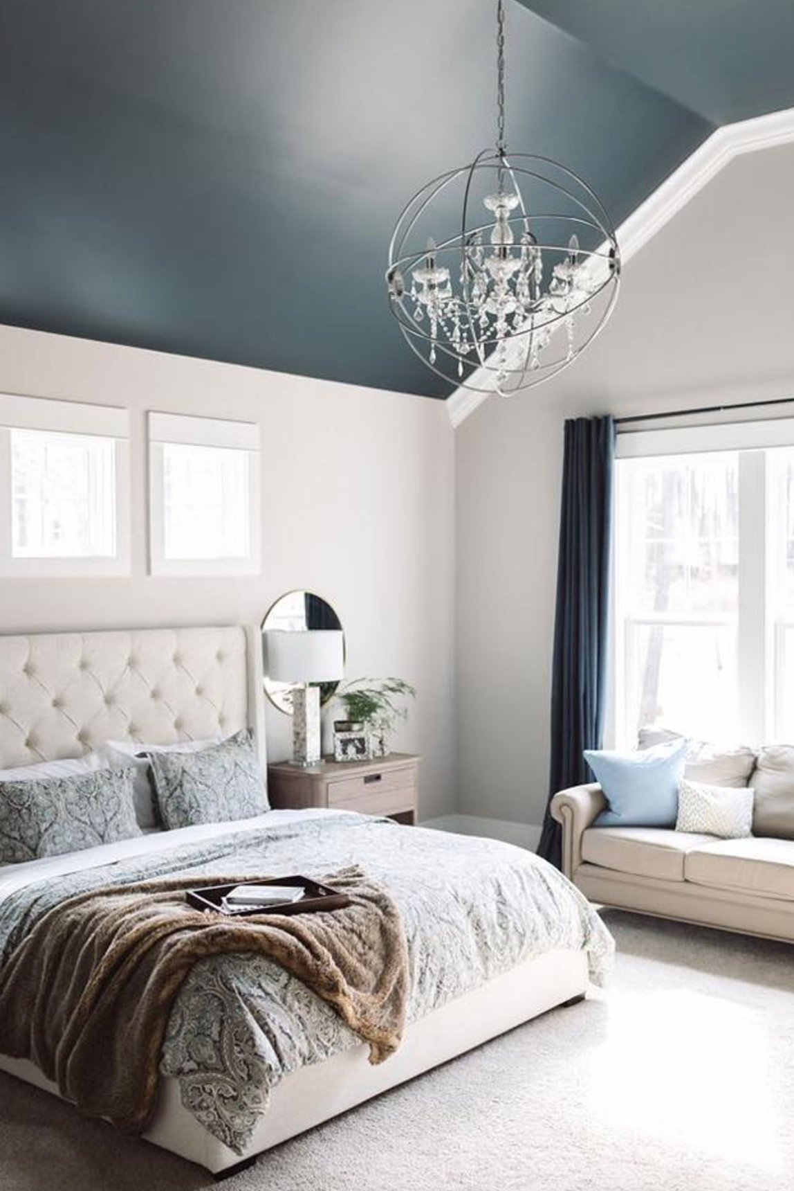
8. Newburyport Blue by Benjamin Moore

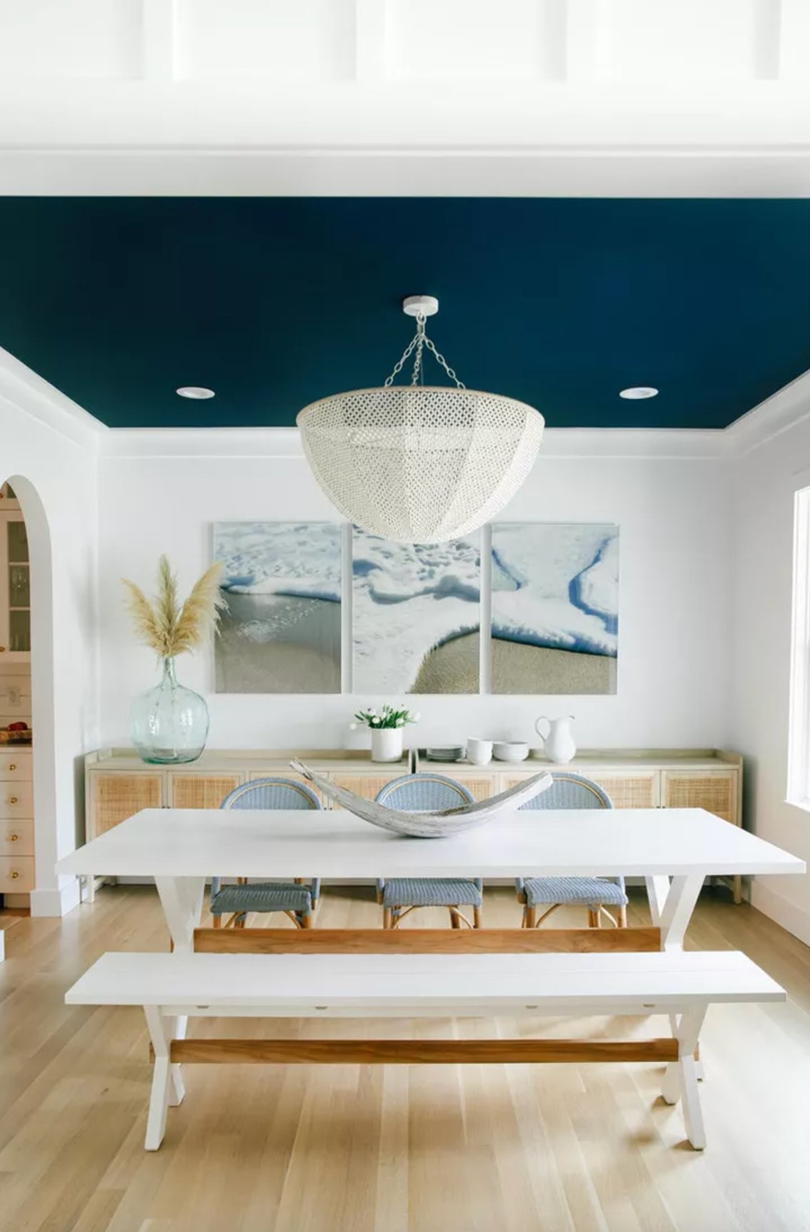
Newburyport Blue makes a superb choice for accent ceilings in bright spaces. This deep navy shade seems to push the ceiling upward, making the room feel like it extends forever.
Paired with white walls, it becomes a knockout element of coastal style without taking over the whole room.
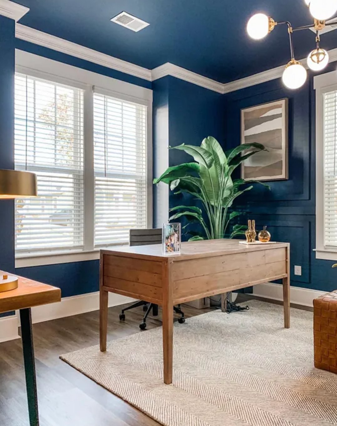
When using this shade, room size really matters. In big, window-filled spaces, Newburyport Blue feels warm and inviting.
But watch out in smaller rooms like the one in the top left photo – the color can look almost black and a bit too intense.
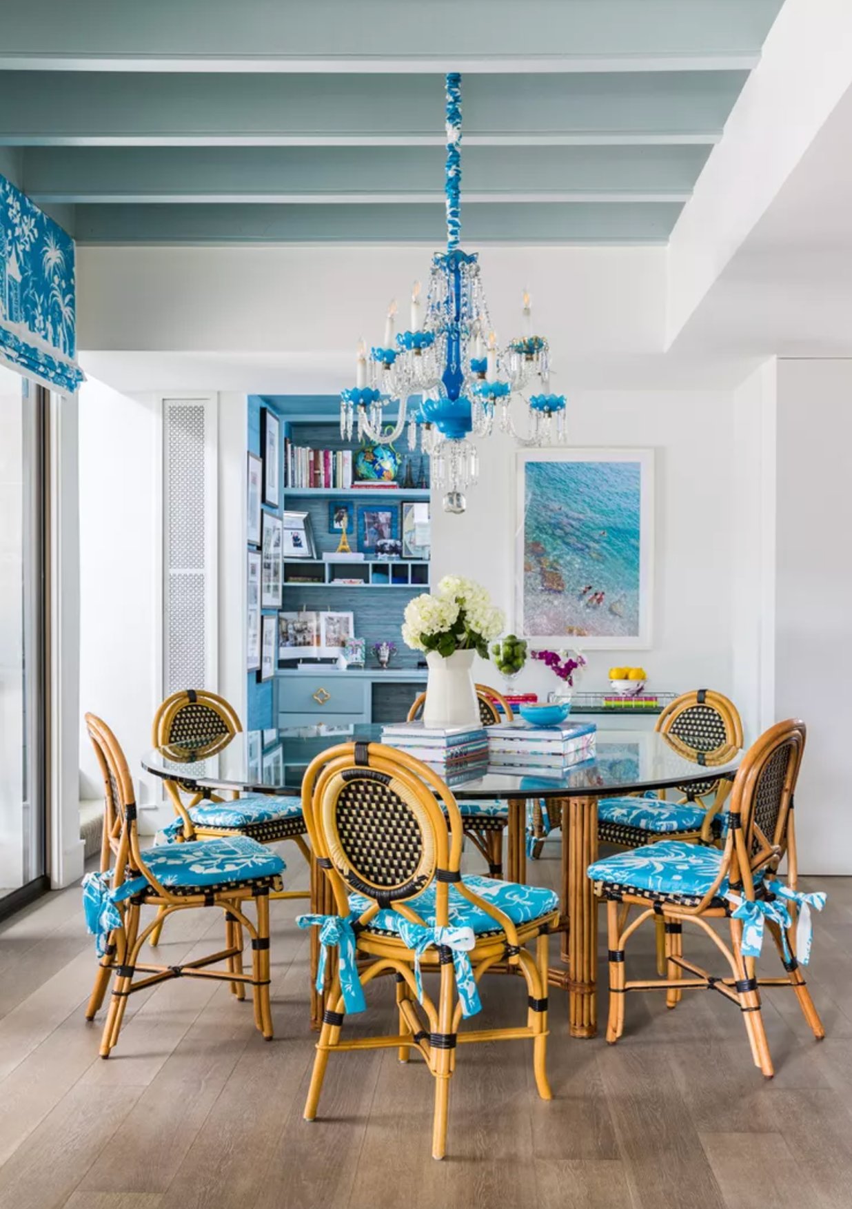
9. Yarmouth Blue by Benjamin Moore

Yarmouth Blue by Benjamin Moore puts a fresh spin on “haint blue” – the classic porch ceiling color from the American South. This breezy blue works wonders not just on porches but anywhere you want to create an open, airy feel.
Unlike in-your-face blues, Yarmouth Blue keeps things calm and doesn’t steal the show. Natural light highlights its subtle gray undertones, making it a smart pick for hallways and transitional spaces.
10. Dead Salmon by Farrow & Ball

Dead Salmon by Farrow & Ball is a real gem for ceiling colors. It’s quite the chameleon – shifting from soft pink to warm brown, depending on your lighting.
In bedrooms, Dead Salmon’s warm undertones create this incredibly cozy vibe. Just check out how designer Lauren Sullivan used it in that guest bedroom photo above. It’s pretty amazing, right?
When working with Dead Salmon, pair it with creamy white trim to keep the color crisp. Want to make it feel more current? Throw in some black accents and touches of chartreuse.
Here’s a fun fact: this color goes way back to 1805 at Kedleston Hall. And that name? It’s not about the fish (though that would be funny!) – “dead” refers to the matte finish, while “salmon” describes the pink tone found in an old painter’s receipt.
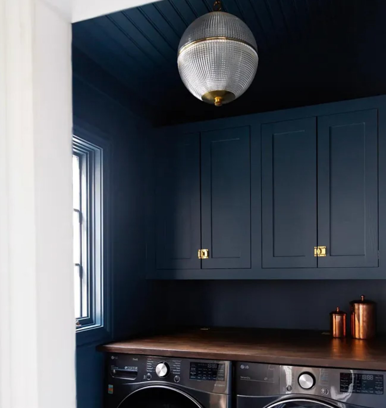
11. Indigo Batik by Sherwin Williams

Think of Indigo Batik by Sherwin Williams as your favorite pair of dark jeans – but for your ceiling. It really comes alive in sunny spots, while dimmer rooms bring out its moodier side.
It’s especially perfect for small spaces like home offices or libraries, where you can wrap the whole room around for a cozy cocoon effect. Indigo Batik makes for a stunning island color in kitchens when you keep the main cabinets neutral.
The key is to echo it throughout the room with fabrics and decor pieces to tie everything together.
12. Autumn Cover by Benjamin Moore

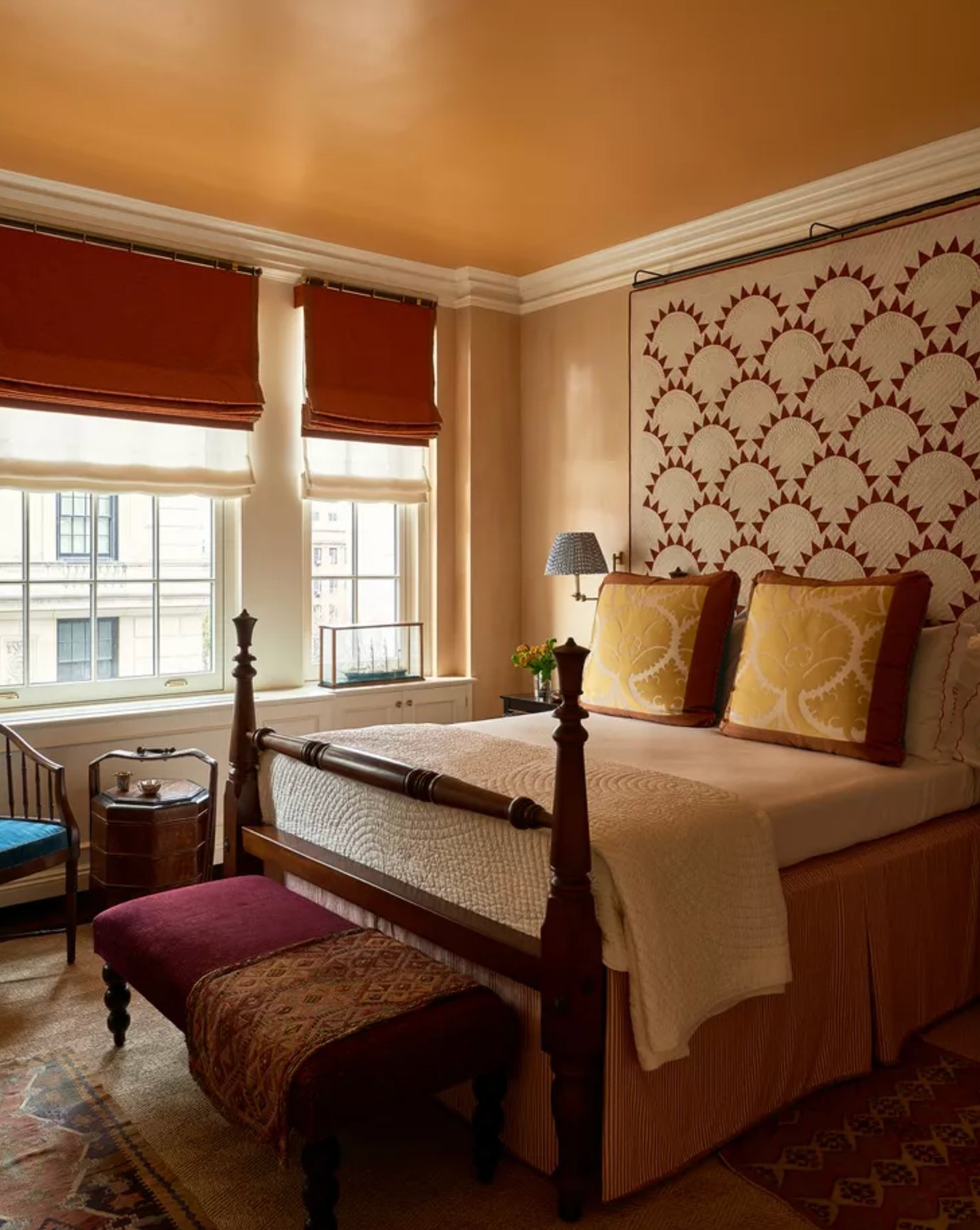
Want something unexpected? Autumn Cover by Benjamin Moore brings that warm fall feeling right to your ceiling. It looks incredibly gorgeous in bedrooms when mixed with red and mustard textiles.
This warm reddish-orange shines in rooms with cool natural light that needs some warming up. But plan your other colors carefully – it works best with neutral walls and coordinating fabrics in similar warm tones.
13. Shamrock by Sherwin Williams

Shamrock by Sherwin Williams is a bold green with a hint of blue that can totally transform your ceiling. In smaller spaces like home offices or bar areas, going glossy with this color on both ceiling and walls can create some serious drama.
Just ensure you’ve got good lighting – this deep shade needs it to show off its true richness. It’s best kept to smaller, separate rooms though – you don’t want it overwhelming your whole house.