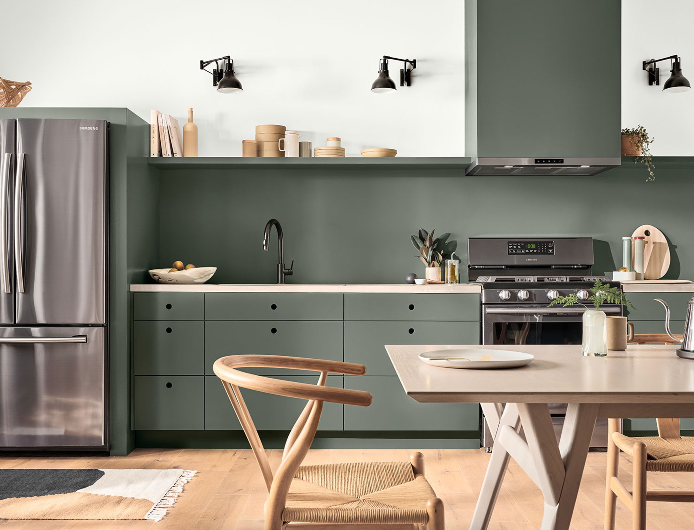
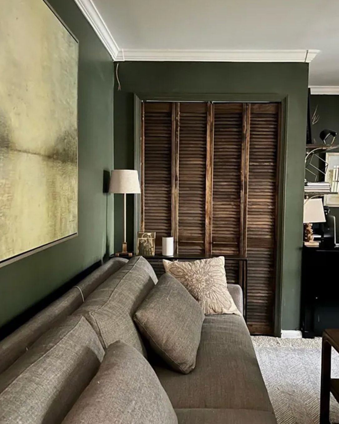
When I first painted my bedroom deep malachite green, it completely changed how I felt about dark colors in interiors.
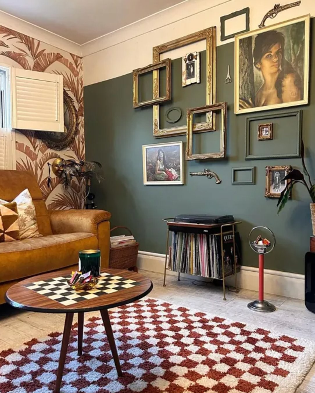
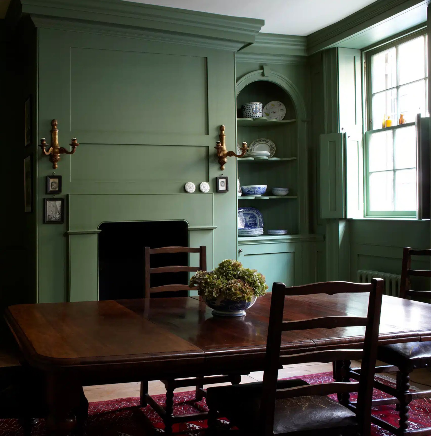
Dark green isn’t just another passing trend – it’s a genuinely versatile choice that creates warmth and depth, acts as a neutral backdrop, and works with practically any furniture and decor elements.
I’ve selected the best dark green paints that bring natural harmony to a space without making it feel too heavy – let’s take a look at these gorgeous green shades and see how they look in real homes!
- 1. Rookwood Shutter Green by Sherwin-Williams
- 2. Oakmoss by Sherwin-Williams
- 3. Backwoods by Benjamin Moore
- 4. Jasper by Sherwin-Williams
- 5. Alligator Alley by Benjamin Moore
- 6. Vogue Green by Sherwin-Williams
- 7. Hunter Green by Benjamin Moore
- 8. Chrome Green by Benjamin Moore
- 9. Black Forest Green by Benjamin Moore
- 10. Vintage Vogue by Benjamin Moore
- 11. Studio Green by Farrow & Ball
- 12. Calke Green by Farrow & Ball
- 13. Cedar Path by Benjamin Moore
- 14. Peale Green by Benjamin Moore
- 15. Pewter Green by Sherwin-Williams
- 16. Shade-Grown by Sherwin-Williams
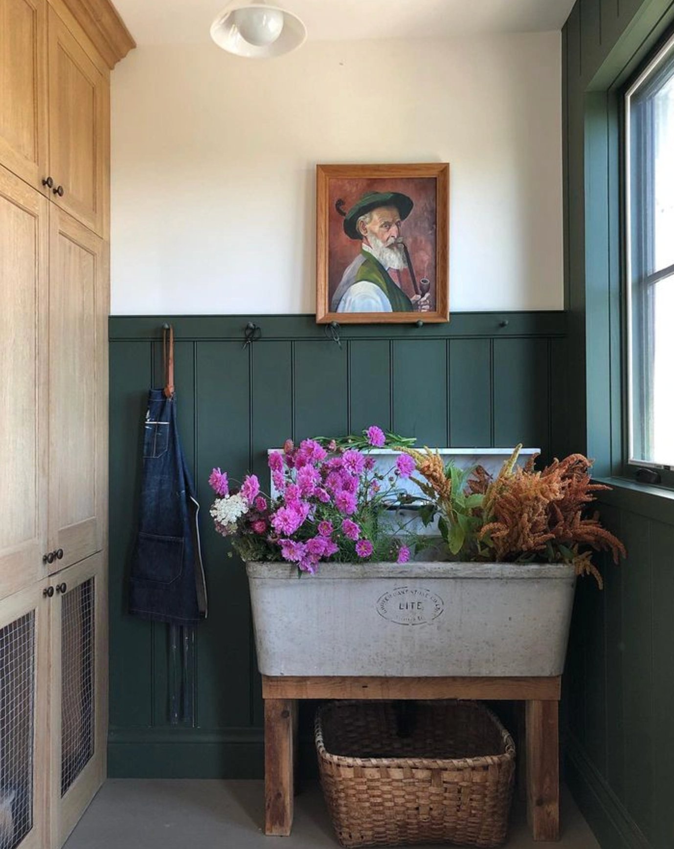
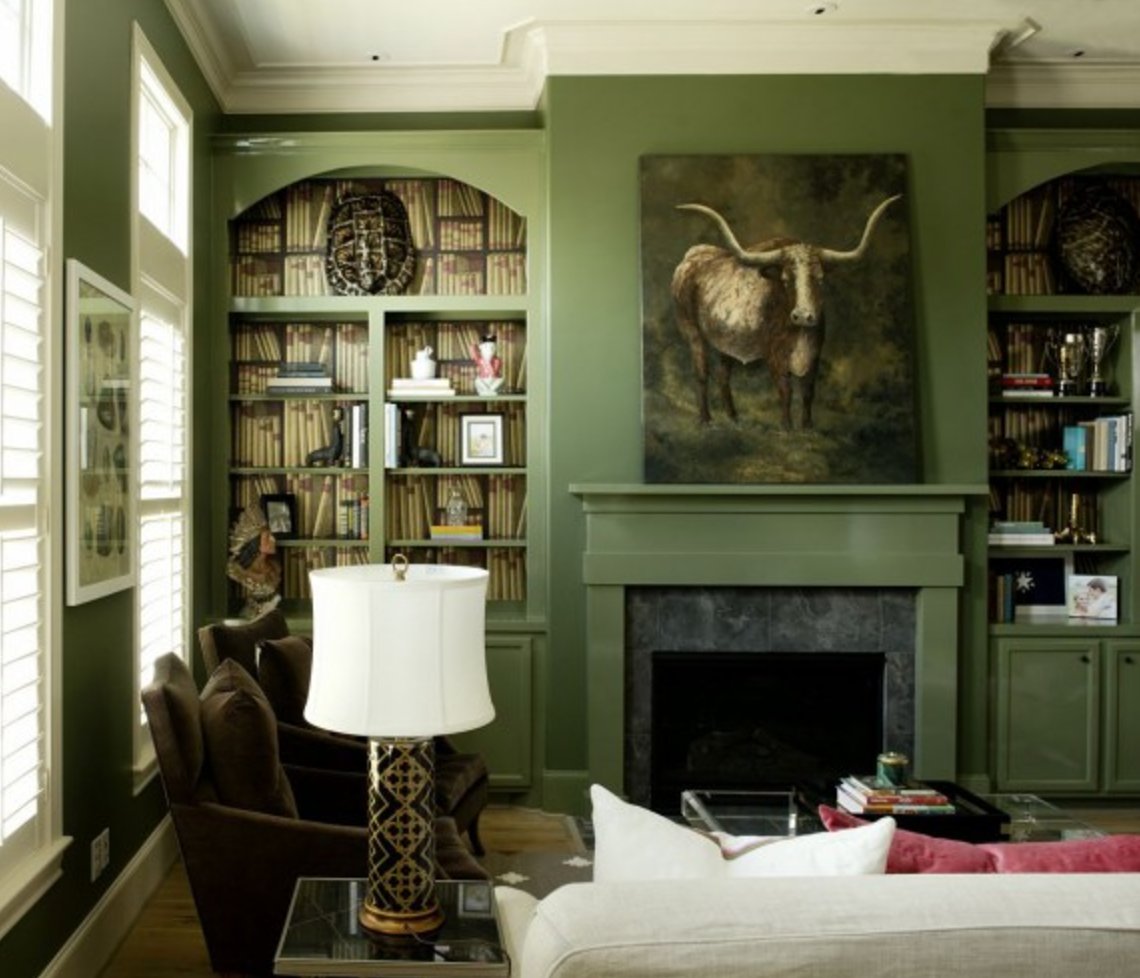
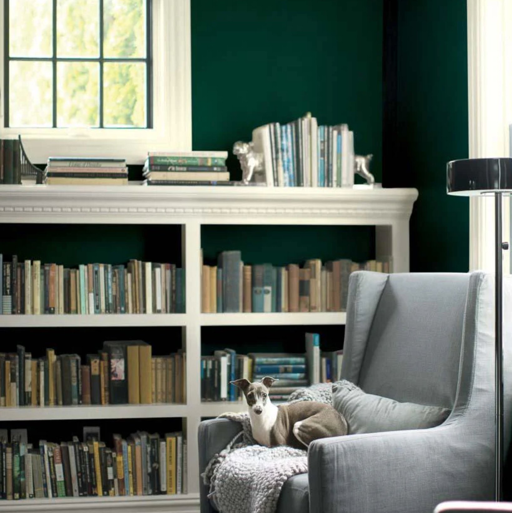
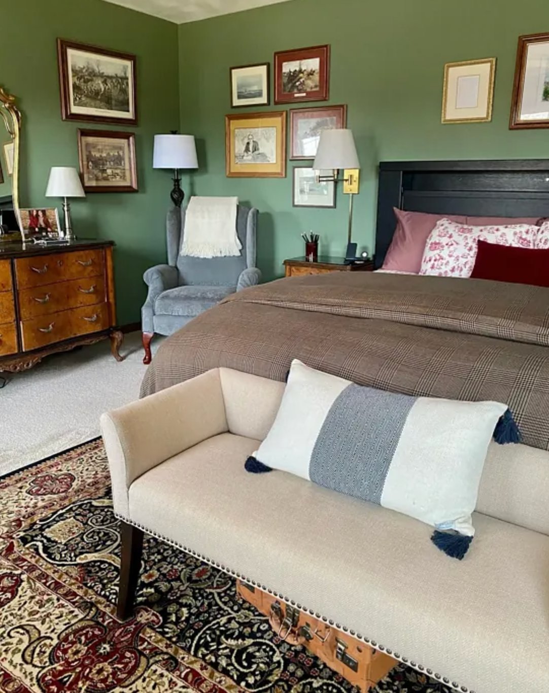
1. Rookwood Shutter Green by Sherwin-Williams

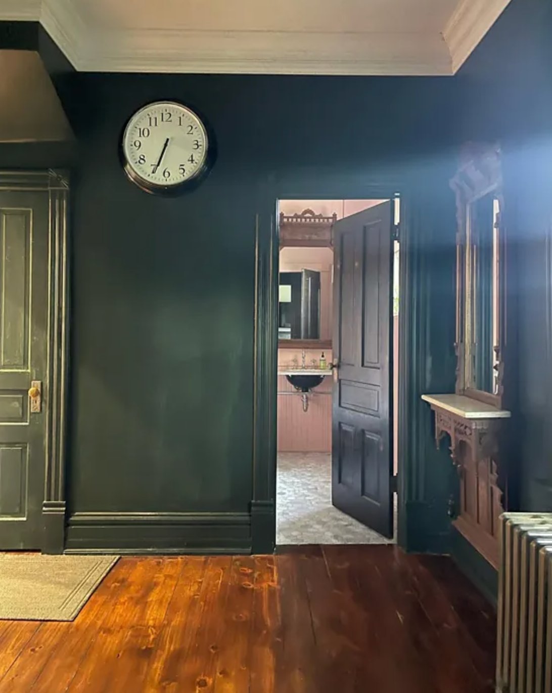
Rookwood Shutter Green is a deep green with cool undertones and just a hint of black. This shade comes from Sherwin-Williams’ historic collection and was traditionally used on window shutters.
In today’s homes, Rookwood Shutter Green doesn’t overwhelm spaces and works equally well in both traditional and minimalist settings.
What I really love about it is how beautifully it contrasts with white trim and wooden furniture.
One of the best things about this shade is how versatile it is. You can use Rookwood Shutter Green to paint entire rooms or just create accent walls (like in the photo above). Outside, it looks fantastic on doors, shutters, and other architectural features.
In terms of depth and temperature, it’s quite similar to Benjamin Moore’s Black Forest Green, which I’ll tell you about in a bit.
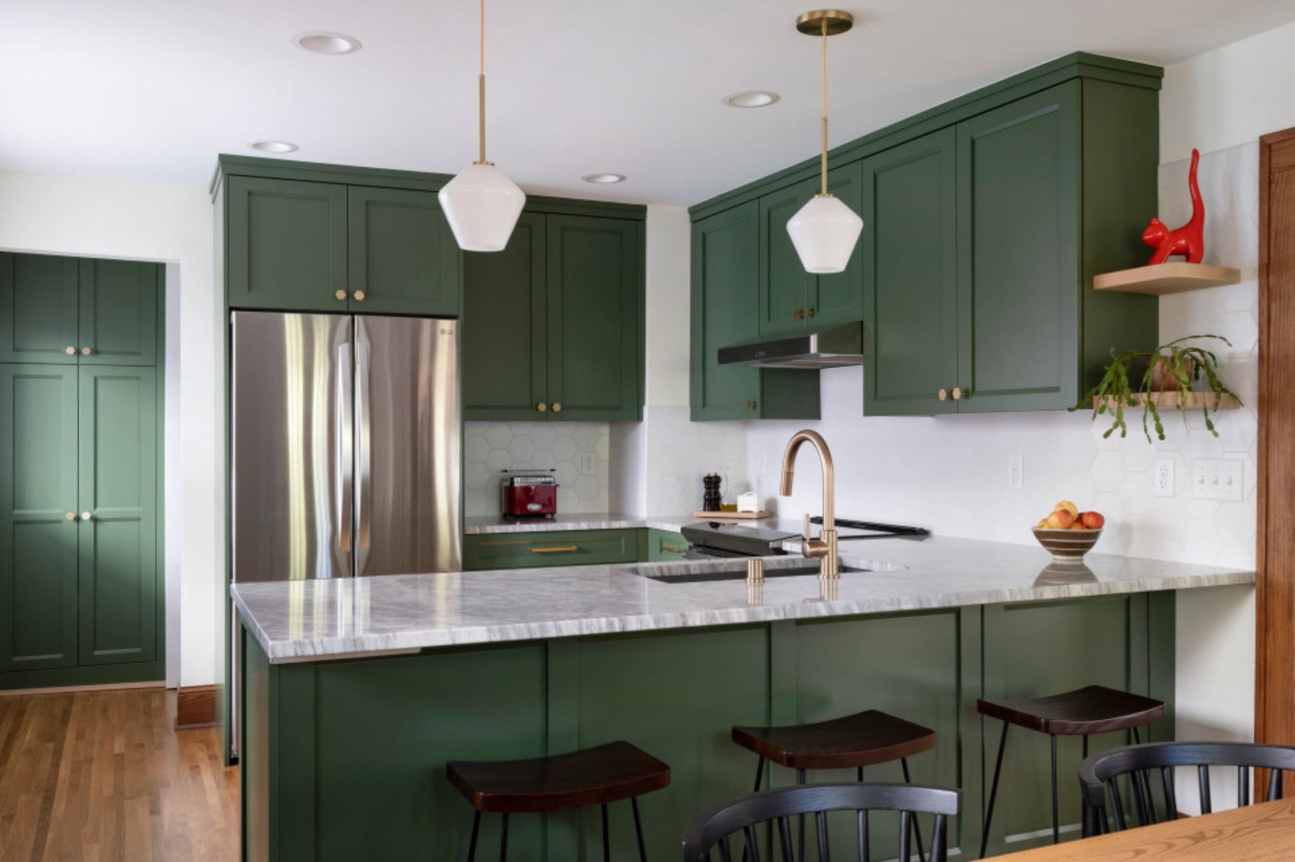
2. Oakmoss by Sherwin-Williams

Oakmoss is a rich green with warm yellow-gray undertones that brings the feeling of nature indoors – like being surrounded by lush tree foliage.
The yellow-gray undertone helps soften the depth of the color, making it work well in pretty much any room. As shown in the photo above, Oakmoss can also act as a neutral backdrop when paired with bolder accent colors.
Like with any paint, think about the room’s purpose when picking the finish. While glossy will bounce more light around and give a more formal vibe, it’ll also show every bump and dip in your walls. An eggshell finish is your best bet for traditional spaces – it hides minor wall flaws and cleans up easily.
3. Backwoods by Benjamin Moore

Backwoods takes me back to the forests near my first childhood home. It’s an inviting green with warm undertones and hints of black. While it stays rich-looking in any light, the black pigment keeps it from ever feeling too intense.
It plays well with white, gray, wood tones, and brass fixtures. Backwoods is flexible enough to work in both traditional and modern spaces.
4. Jasper by Sherwin-Williams

Jasper by Sherwin-Williams goes even deeper – it reminds me of the thick foliage you’d find deep in an old-growth forest.
With an LRV of 4, it’s definitely in the super-dark category, so you’ll want to think carefully about lighting. In dimmer rooms, it can look almost black, which can create a dramatic effect on accent walls or furniture.
It really shines in a glossy finish on doors and cabinets, especially when paired with aged brass hardware.
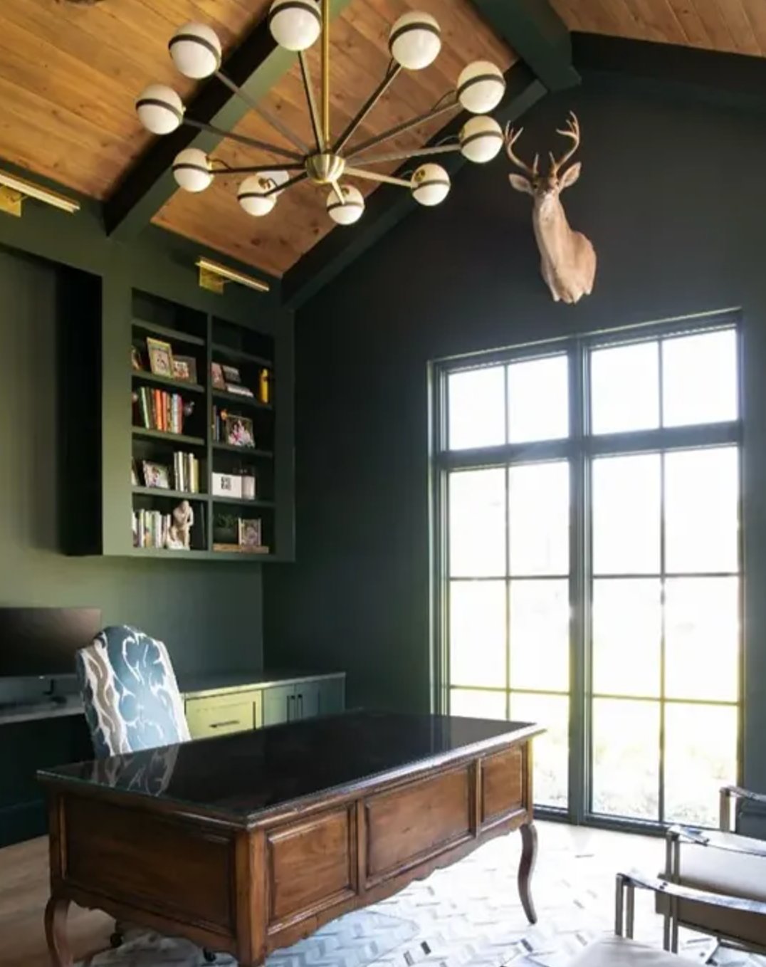
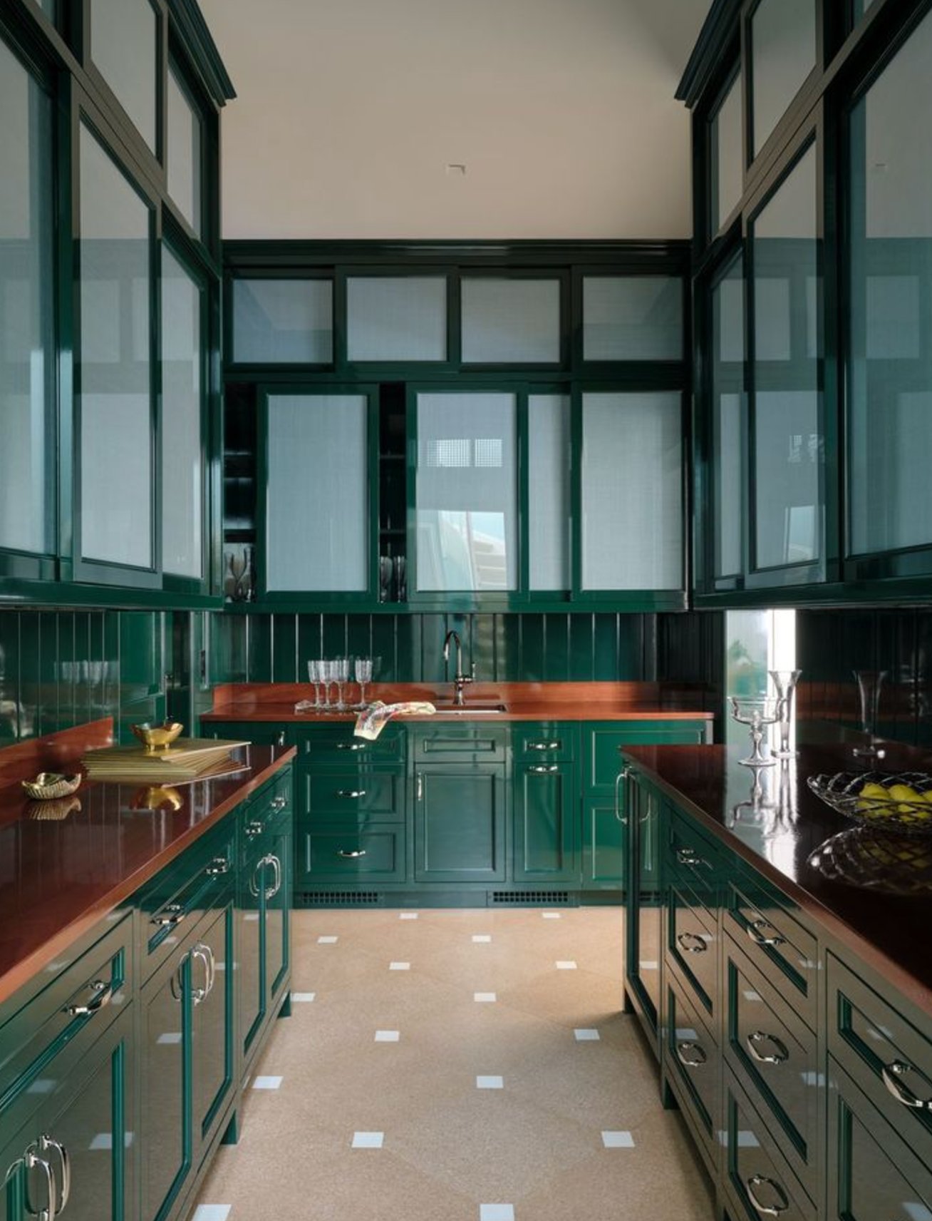
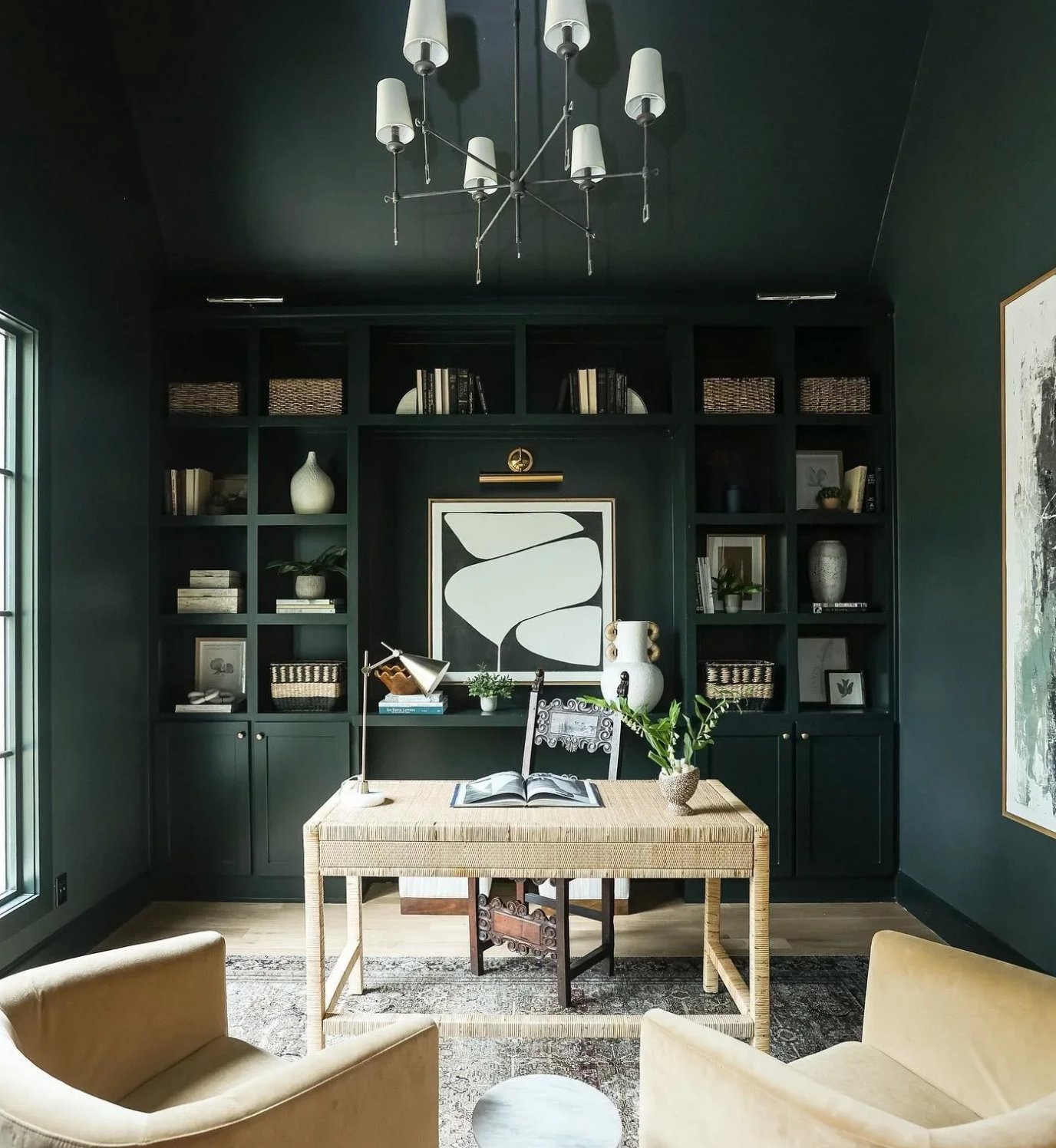
5. Alligator Alley by Benjamin Moore

Florida alligators’ natural coloring actually inspired Alligator Alley’s dark green! This deep forest green creates an unusual mood in any room and works beautifully in tone-on-tone color schemes. The cool thing about Alligator Alley is how it shifts from soft moss to rich emerald depending on the light.
Using it on everything in a room (like in the photo above) blends the walls and furniture together, creating this cool infinite space effect. It’s particularly great for home offices and workspaces where you want that sweet spot between focus and relaxation.
6. Vogue Green by Sherwin-Williams

Vogue Green by Sherwin-Williams is a historic dark green that you might have seen in period homes built before the First World War.
Thanks to its warm undertones, it stays true green no matter what lighting you have. While it might look less intense in darker rooms, it never shifts into blue or black territory.
If you’re picking paint for a room that doesn’t get much light, it’s worth noting that Vogue Green will keep its green character even in dim conditions.
7. Hunter Green by Benjamin Moore

Dark green shades can bring incredible depth to interior spaces, and Hunter Green really shows off this effect perfectly.
It has a blue base that gives it just a hint of coolness. With an LRV of 6.39, this color tends to soak up a lot of light, so you’ll want plenty of natural lighting – otherwise, it can look nearly black in shadowy areas.
This paint really shines in larger, well-lit spaces like living rooms, home offices, or dining rooms. It’s no wonder Hunter Green has become one of Benjamin Moore’s top sellers.
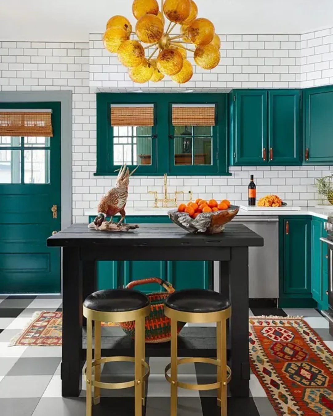
8. Chrome Green by Benjamin Moore

Chrome Green, part of Benjamin Moore’s historical collection, is a rich green shade that captures the essence of early American architecture. It makes for stunning accent pieces and looks great with either a traditional or modern furniture setup.
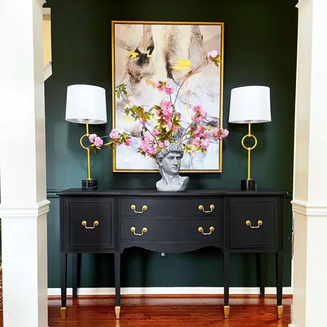
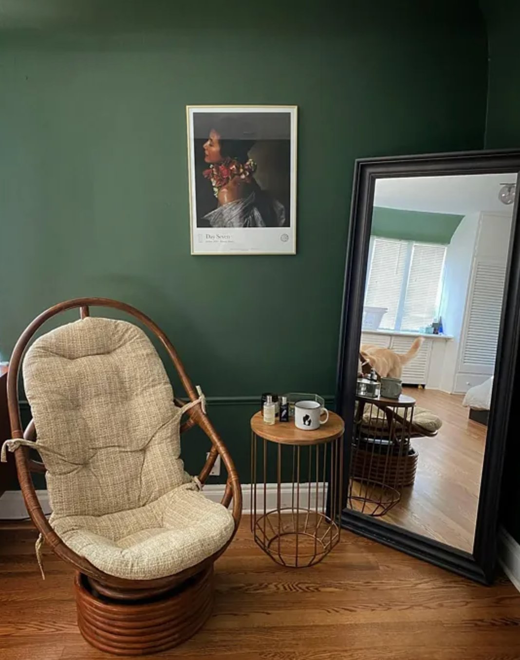
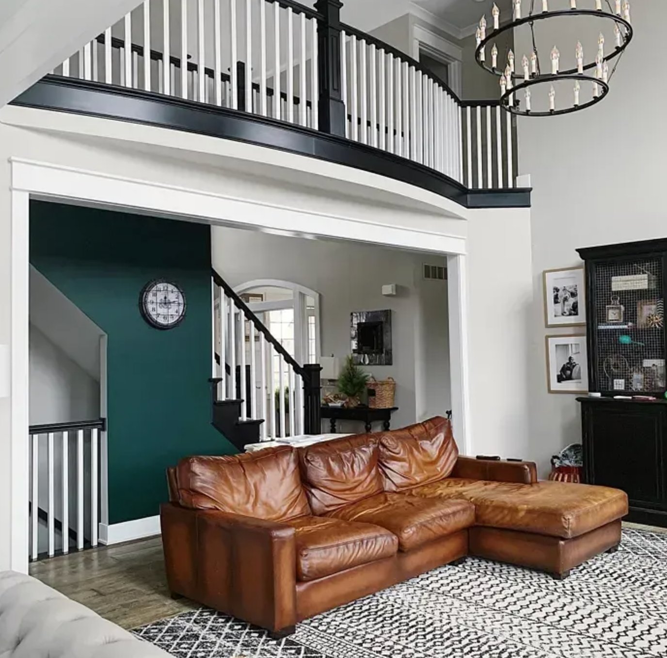
9. Black Forest Green by Benjamin Moore

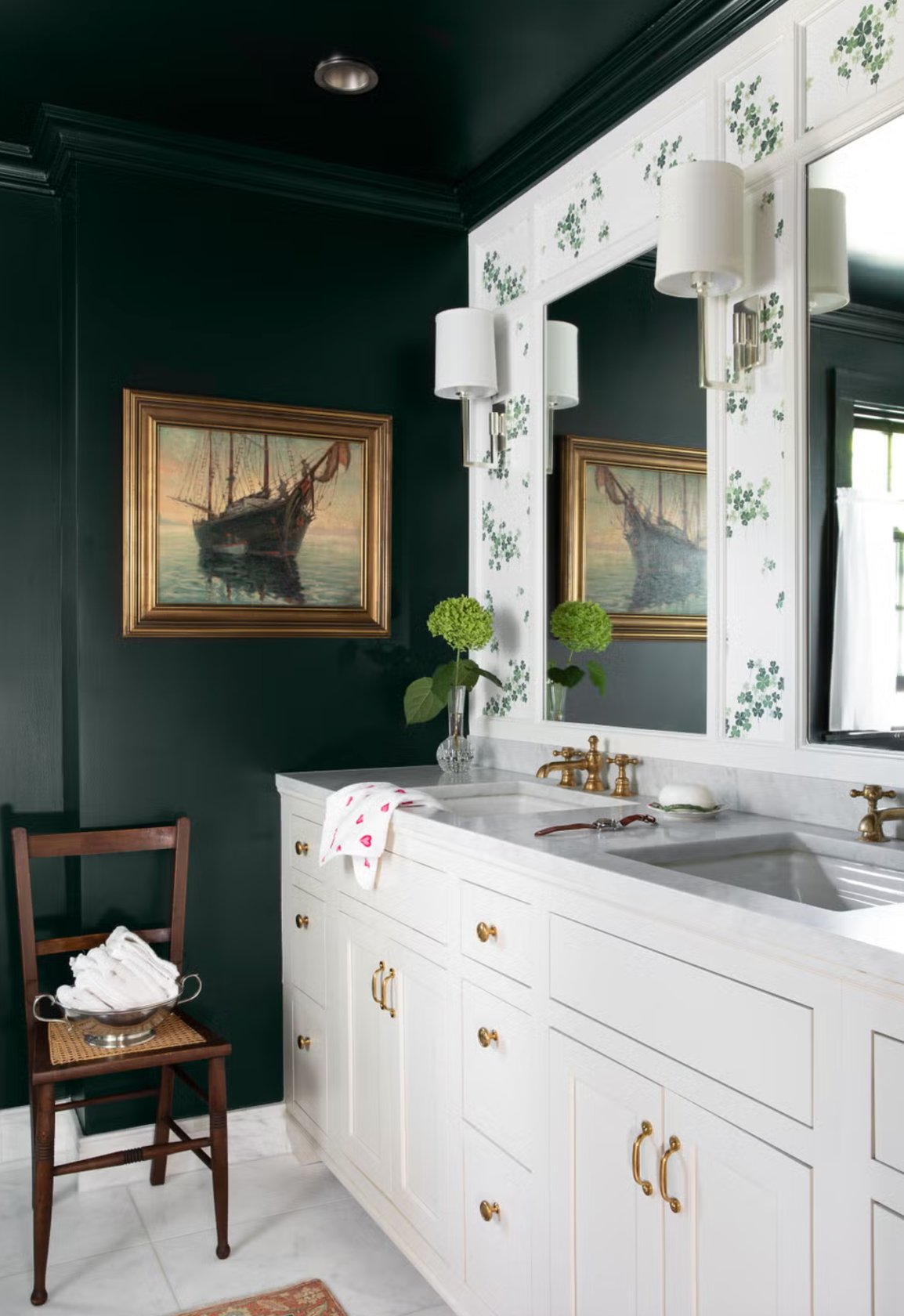
Benjamin Moore’s Black Forest Green is a wonderfully deep green with black undertones that makes you feel like you’re standing in a Nordic forest at nighttime.
Put it in a room with good natural light, and you’ll see its true colors come through – there’s this fascinating play between green and blue tones. Just remember that without enough light, it can look almost entirely black.
Designers love using it for accent walls in bathrooms and home offices, particularly in a glossy finish. It pairs beautifully with patterned wallpaper and mirrors, just like in that M. Lavender Interiors project shown above.
10. Vintage Vogue by Benjamin Moore

Vintage Vogue is a deep, smoky green that works as a fresh alternative to traditional black or brown in modern spaces. Unlike classic dark colors, it brings a welcoming feel without making rooms feel heavy.
The paint shows off its complex green undertones in daylight while shifting to a darker, almost graphite-like finish in the evening.
11. Studio Green by Farrow & Ball

Studio Green is one of those colors that’s full of surprises – it completely transforms depending on the lighting. If your room’s a bit dim, it’ll look almost black. But get it in natural light, especially on exterior walls, and it comes alive with rich green tones.
There’s a bit of history to this shade – it was actually first created in Farrow & Ball’s original studio, where they developed their very first paints.
12. Calke Green by Farrow & Ball

Calke Green by Farrow & Ball is another refined dark green, which was inspired by the Calke Abbey estate in England. With its rich green base and sage hints, it looks great both in single-color schemes and paired with neutrals, particularly Old White. Oh, and if you’re hunting for the perfect neutral paint color, I’ve got a helpful guide for that!
You’ll often spot this color in contemporary libraries and music rooms, where it adds a touch of classic sophistication. Want to brighten things up? Slipper Satin makes a perfect light accent that brings out Calke Green’s depth.
13. Cedar Path by Benjamin Moore

Benjamin Moore’s Cedar Path reminds me of a shaded walk through pine forests – it’s that kind of soft, woodsy green. In good natural light, it comes alive with the varied green tones you’d find in forest foliage.
Designers love to go all-in with this one, often painting entire rooms to create a wrapped-in-nature feeling.
14. Peale Green by Benjamin Moore

When people ask for a deep forest color, I often point them to Peale Green. It’s got that perfect mix of earthy and green tones. While it’s definitely rich, the muted, earthy undertones keep it from being too intense.
15. Pewter Green by Sherwin-Williams

Pewter Green blends deep green with cool gray undertones, making it a really versatile choice.
On cloudy days, it leans more toward gray, but catch it in natural light and you’ll see its true green depth shine through. It’s super adaptable – looks great on everything from built-in cabinets and wall panels inside to exterior walls.
Like most greens, it plays well with wood and metal finishes.
16. Shade-Grown by Sherwin-Williams

Shade-Grown is a rich olive with gray undertones that help tame its intensity. The gray keeps it from looking too bold—nothing like those bright olive tones from the 1970s.
The cool thing about this paint is how it changes with the light – sometimes it’s a rich green, other times it’s more of a subtle earthy tone. If you’re after something a bit cooler, Ripe Olive might be more your speed.