Anyone who’s ever painted their house exterior knows what a challenge it can be. And when it comes to green, the sheer number of shades can make your head spin. From soft sage to rich emerald – each shade has its own personality and unique characteristics.
Green colors aren’t trending for nothing: they fit seamlessly into urban settings while maintaining a connection to nature. The best part? The right shade of green can actually make your house look more upscale.
I’ve gathered all the best green options for exteriors in one place – everything from almost-neutral tones to bold, vibrant choices. Some of these combinations might just surprise you!
- 1. Black Forest Green by Benjamin Moore
- 2. Rookwood Dark Green by Sherwin Williams
- 3. Saybrook Sage by Benjamin Moore
- 4. Studio Green by Farrow & Ball
- 5. Aegean Olive by Benjamin Moore
- 6. Sage Mountain by Benjamin Moore
- 7. Salamander by Benjamin Moore
- 8. Louisburg Green by Benjamin Moore
- 9. Oakmoss by Sherwin Williams
- 10. Jasper by Sherwin Williams
- 11. Hunter Green by Benjamin Moore
- 12. Vintage Vogue by Benjamin Moore
- 13. Green Onyx by Sherwin Williams
1. Black Forest Green by Benjamin Moore

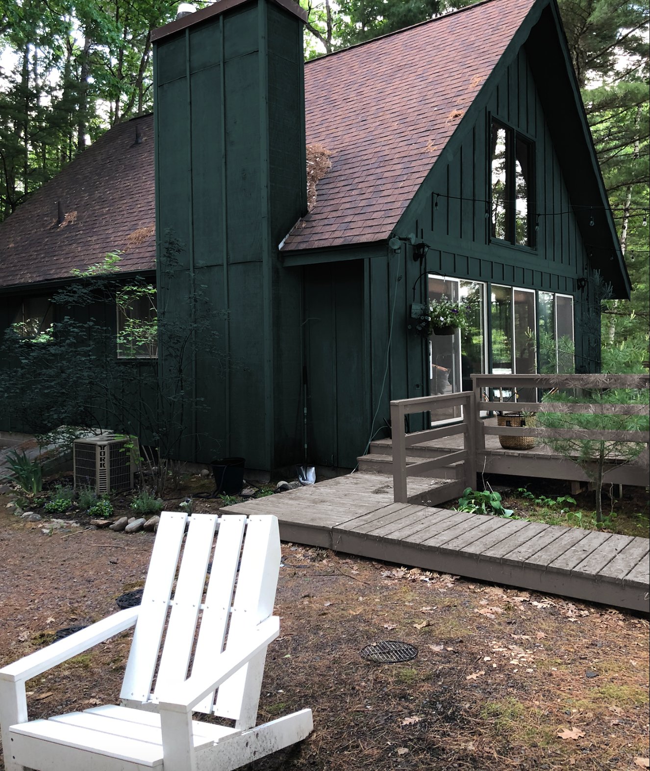
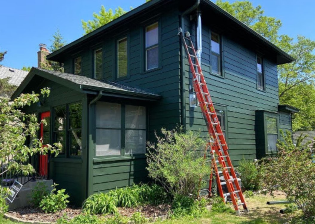
I absolutely fell in love with Black Forest Green by Benjamin Moore. This enchanting deep green shade with black undertones perfectly captures the feel of a northern forest at dusk.
When well-lit, you can really see the depth of this color – there’s this beautiful play between green and blue tones. Keep in mind though, it can look almost black in low light. That’s why I always suggest balancing it with lighter elements – like the white columns and porch steps.
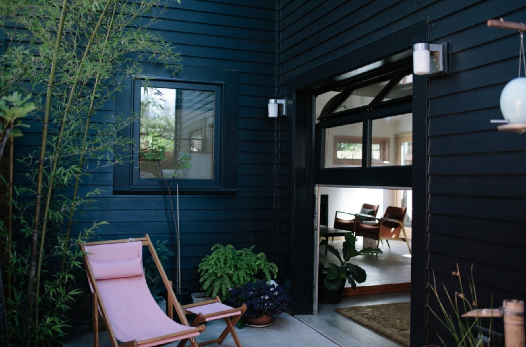
This color is perfect for homes surrounded by woods or greenery – it just blends into the natural setting. Plus, Black Forest Green is versatile enough to work with pretty much any architectural style.
It’s no wonder this color keeps making it onto “best of” lists in recent years – it gives homes a sophisticated look without feeling too dark or heavy.
2. Rookwood Dark Green by Sherwin Williams

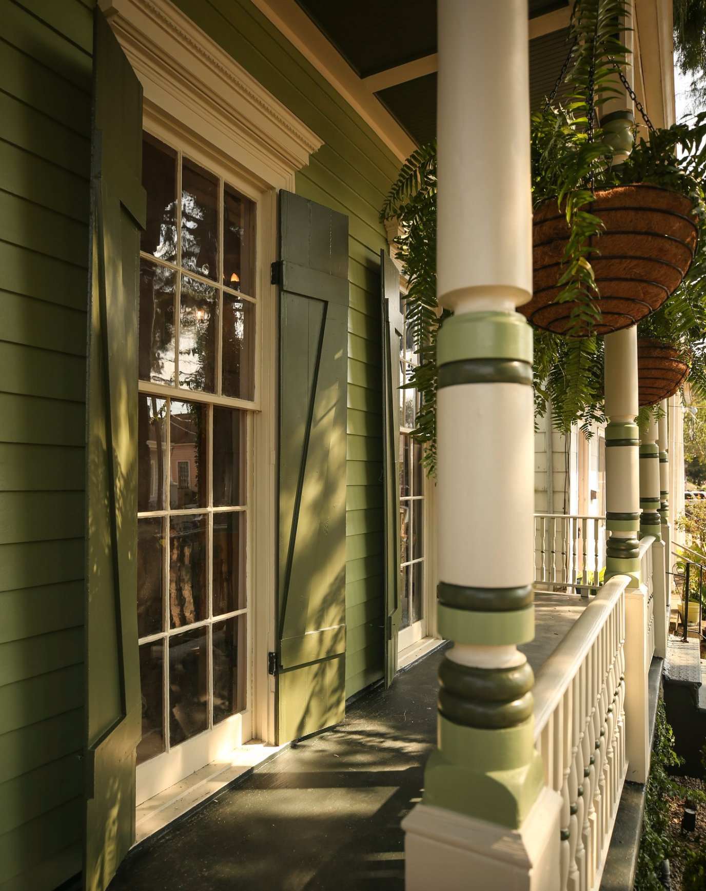
Don’t skip over Rookwood Dark Green when considering green exterior colors. While it might look intimidatingly dark at first, it’s a whole different story once it’s on a house facade (especially when the warm sunlight hits it, like in the photo above).
It pairs beautifully with white trim around windows and doors. It brings out their historic character on Victorian homes, while on modern builds, it adds this refined, sophisticated touch.
Just one heads-up – it can look a bit dark on north-facing walls. If that’s a concern, you might want to check out some lighter shades from the same palette.
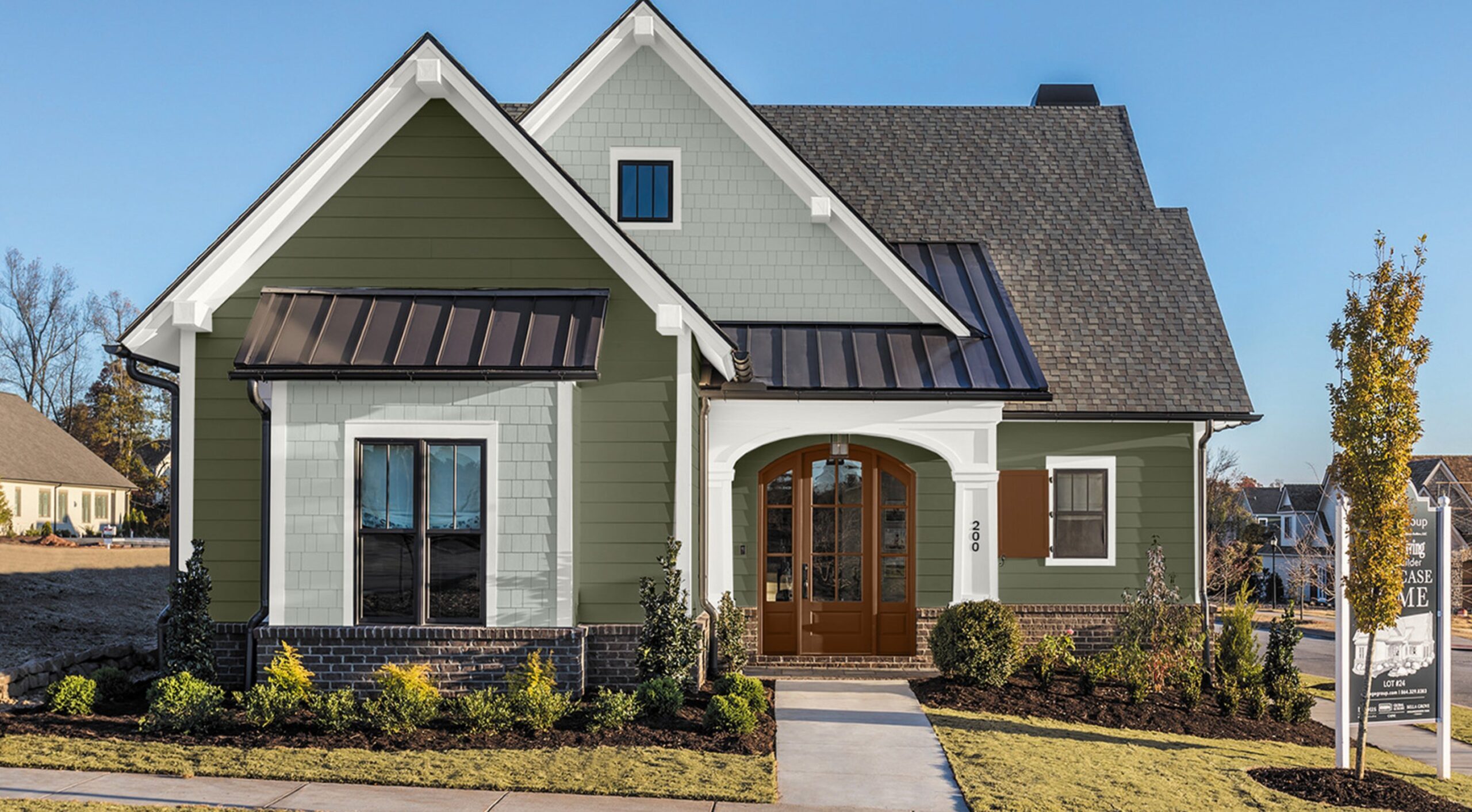
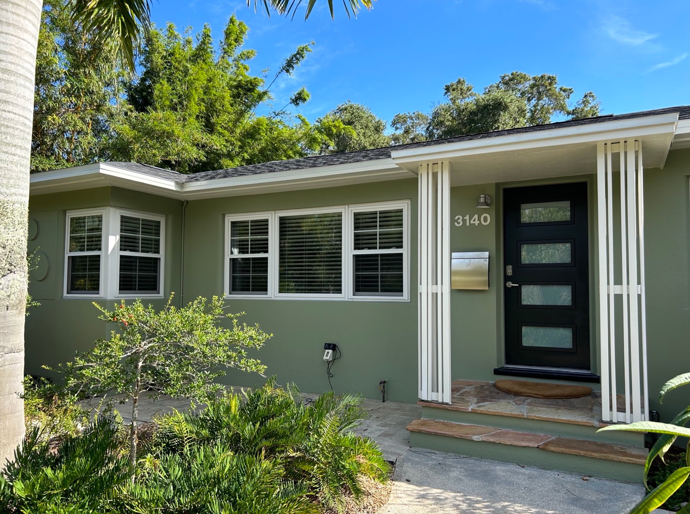
3. Saybrook Sage by Benjamin Moore

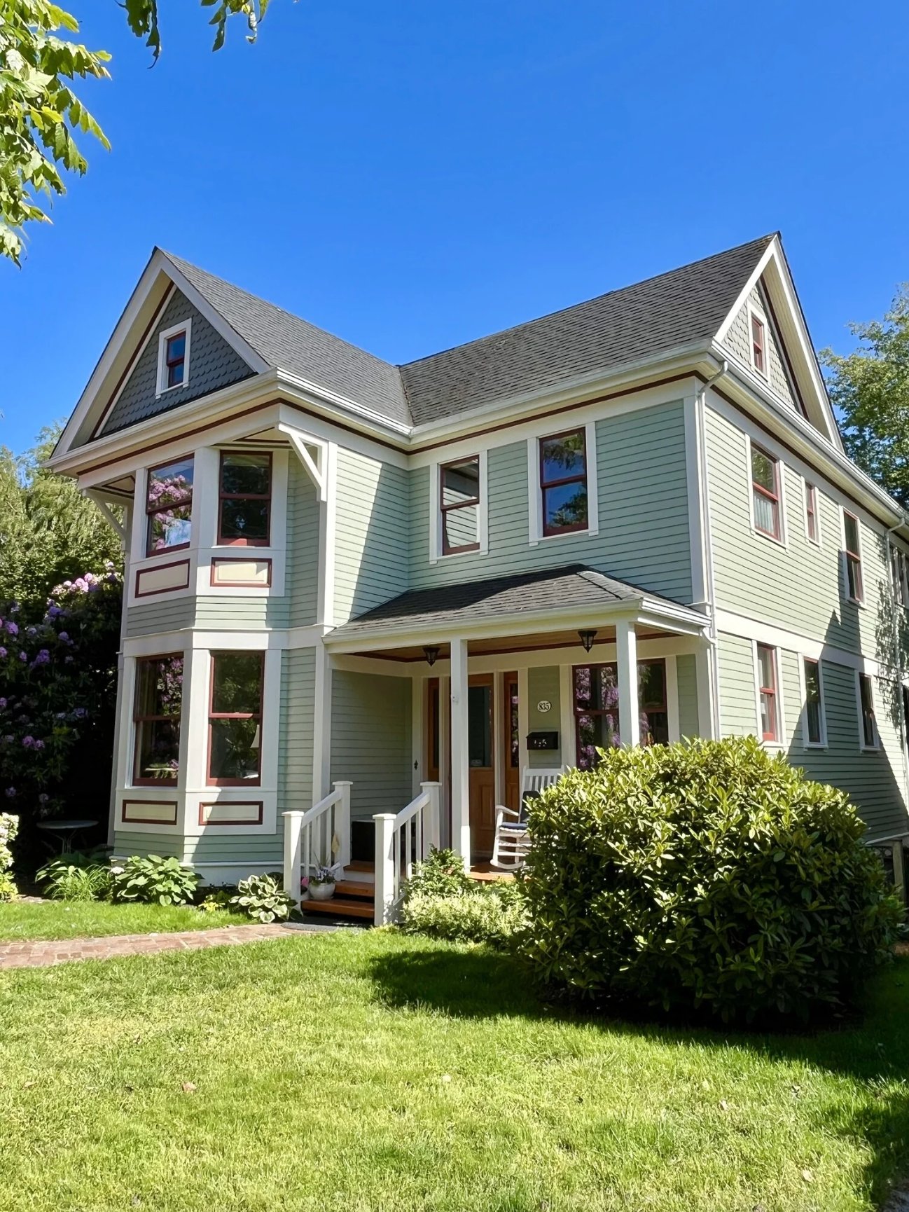
What draws me to Saybrook Sage is its striking balance between natural and modern. It’s particularly stunning on Colonial and contemporary-style homes.
The gray undertone keeps the color subtle, helping the house blend into its surroundings rather than stick out. But there’s still enough green in there to give the facade some personality.
Pair it with white trim, and Saybrook Sage really shines. It also looks fantastic alongside natural stone and wood elements.
4. Studio Green by Farrow & Ball

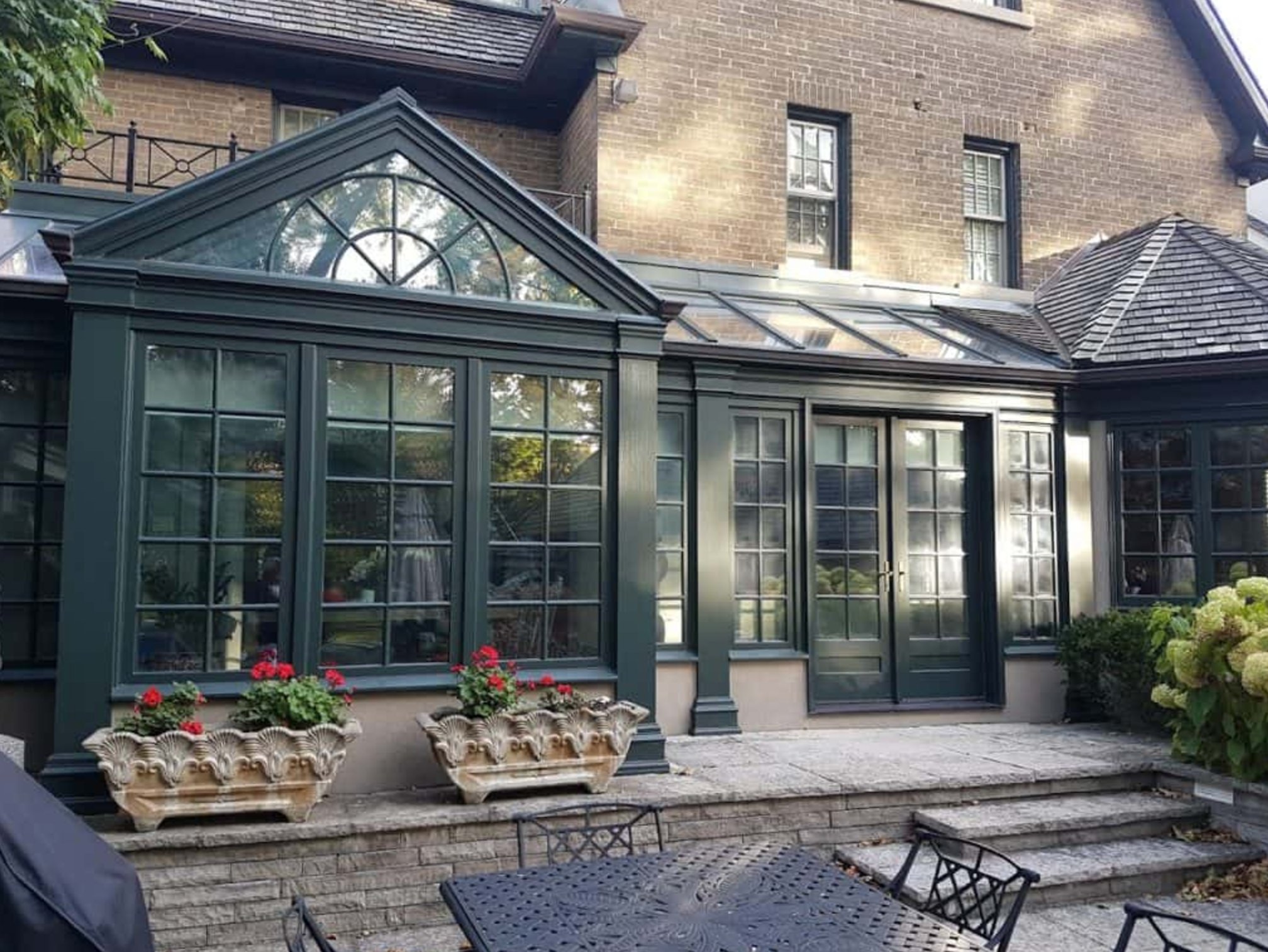
Studio Green is one of those complex colors that people often overlook for exteriors, which is really a shame. Just check out how stunning it looks in the example above!
On sunny days, a Studio Green facade shows off this gorgeous, rich green color. When it’s cloudy, it shifts to an almost-black shade – giving your house this dynamic, ever-changing look.
It works wonders on houses with white trim and stone accents. Adding wood or stone elements really brings out the natural quality of this color.
Here’s a cool bit of history – this shade was created in Farrow & Ball’s original studio, where they developed their first paints. When picking an exterior color, that’s a big plus – you know the formula’s proven itself over time.
5. Aegean Olive by Benjamin Moore

Aegean Olive by Benjamin Moore is fascinating because it’s not just a straightforward green – it’s a sophisticated blend where brown meets green.
It’s naturally deep and warm, which makes it a perfect choice for exteriors. Its earthy quality helps houses blend seamlessly with the surrounding landscape – it’s like your home becomes part of the natural environment.
On the facade, Aegean Olive works as a solid foundation color. It doesn’t scream for attention like brighter greens but creates a peaceful backdrop. Those brown undertones really give it depth and keep it from looking too stark or artificial.
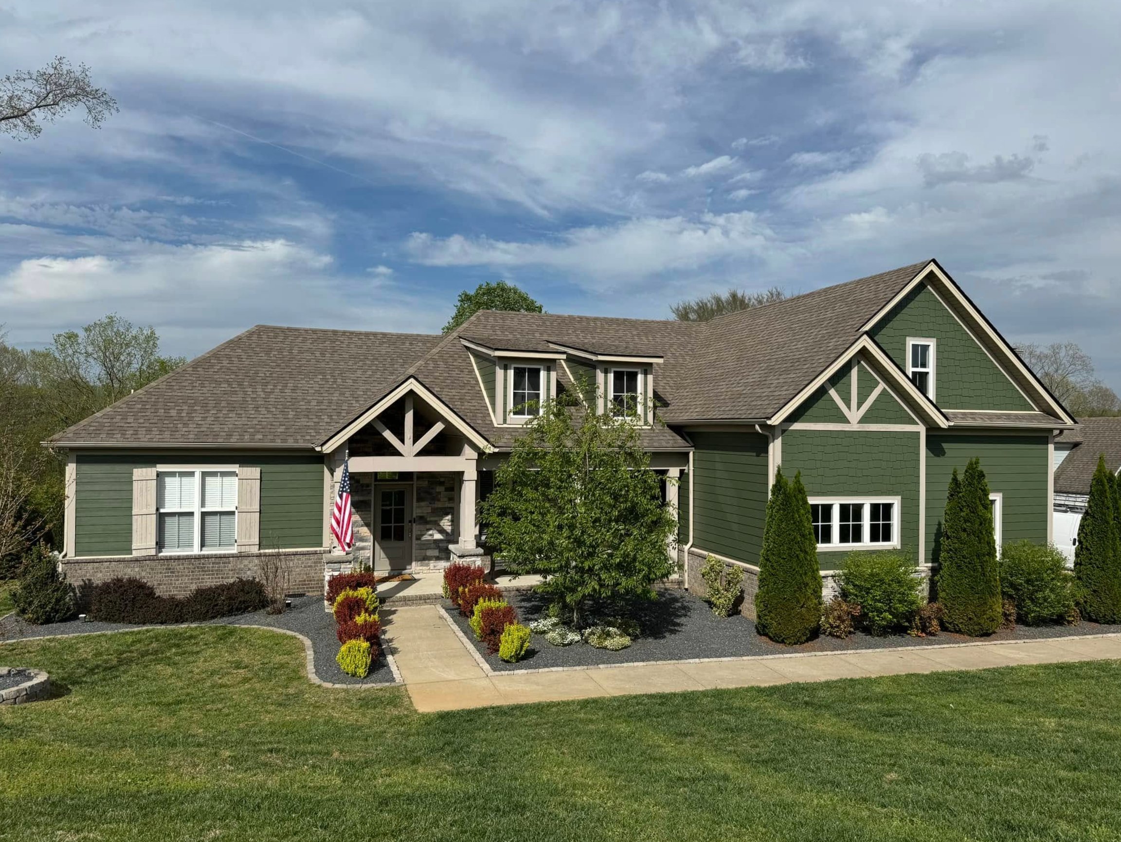
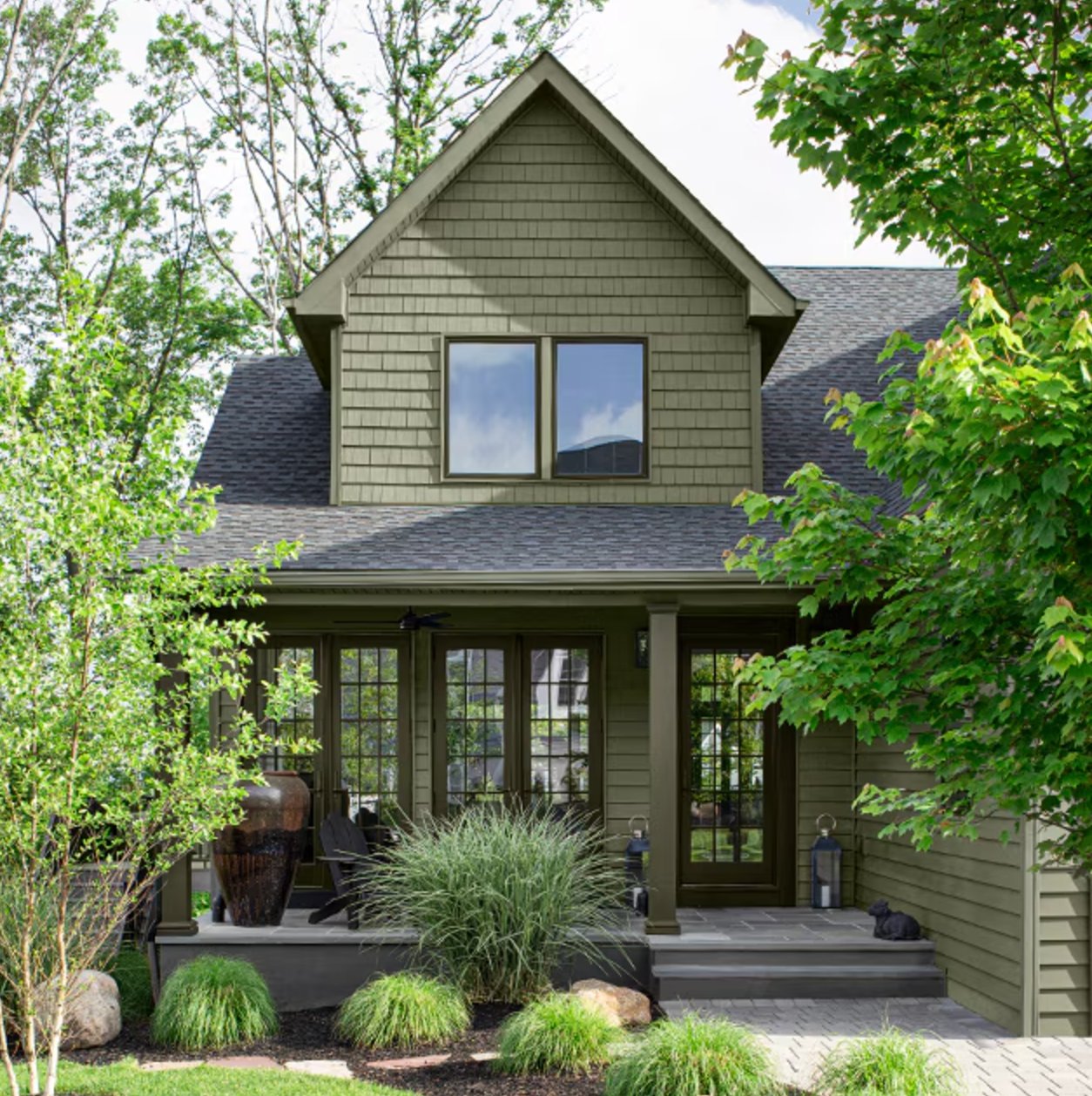
6. Sage Mountain by Benjamin Moore

Sage Mountain by Benjamin Moore is an earthy shade with just a hint of green in it. It looks fantastic with darker accents on shutters and doors, and any copper details make it shine.
While it’s got plenty of personality, it’s still mellow enough to work in neighborhoods where they’re pretty strict about house colors.
7. Salamander by Benjamin Moore

Salamander by Benjamin Moore is one of those rich shades that really grabs your attention. While it looks nearly black inside, put it on an exterior, and you’ll see a stunning, rich green emerge.
Those yellow-green undertones make Salamander feel warmer than you’d expect from a dark shade this deep. Your house won’t look cold or dreary, even on cloudy days.
It’s versatile, too – it works great as the main color for siding or as an accent on doors, shutters, and rooflines.
Here’s a tip from experience: think about how much natural light your house gets – the more sun it gets, the greener it’ll look. In shadier spots, it can read almost black.
8. Louisburg Green by Benjamin Moore

Louisburg Green is perfect if you want a green that’s easy to live with. The gray undertones keep it from being too in-your-face without making it boring.
What’s cool about this color is how it changes throughout the day – it goes from a soft pine needle green in the shade to something deeper in the sun. It shines next to wood and stone, though it might look a bit cooler than you’d like on the north side of your house.
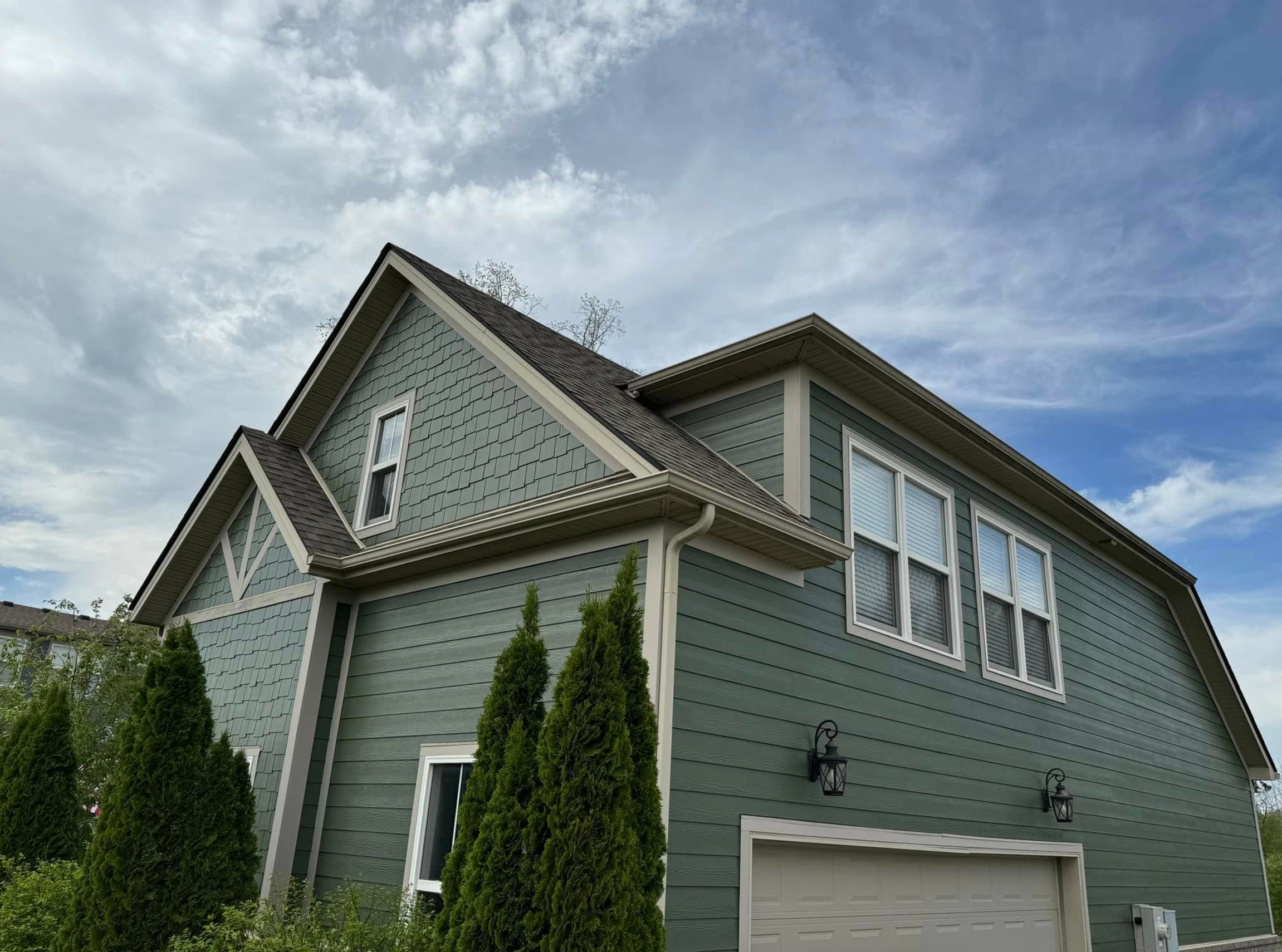
9. Oakmoss by Sherwin Williams

Oakmoss SW 6180 really stands out from other greens with its depth and warm yellow-gray undertones. Put it on a house near trees, and it just works – like it was meant to be there.
The neat thing about Oakmoss is how it shifts between gray and brown depending on the light, making it super adaptable to different architectural styles. It’s rich enough to make your house look great but won’t stick out like a sore thumb in the neighborhood.
I really like how it acts as a neutral base – it’s not trying to steal the show but creates this perfect backdrop for other exterior elements.
Pair it with white trim around your windows and doors, and you’ve got a classic look far from boring.
10. Jasper by Sherwin Williams

Jasper by Sherwin Williams is a gorgeous deep forest green that’s almost black (with an LRV of 4 to prove it). Don’t let the paint sample fool you – while it might look grayish-green there, it’s a true dark green on your walls.
It’s cool how it changes with the light – sometimes warming up, sometimes showing these bluish tones, like a real forest throughout the day.
On an accent wall, it makes quite a statement, but just keep in mind – when the light’s low, it’ll look pretty close to black. Even so, it never feels gloomy and fits right in with both modern and traditional spaces.
11. Hunter Green by Benjamin Moore

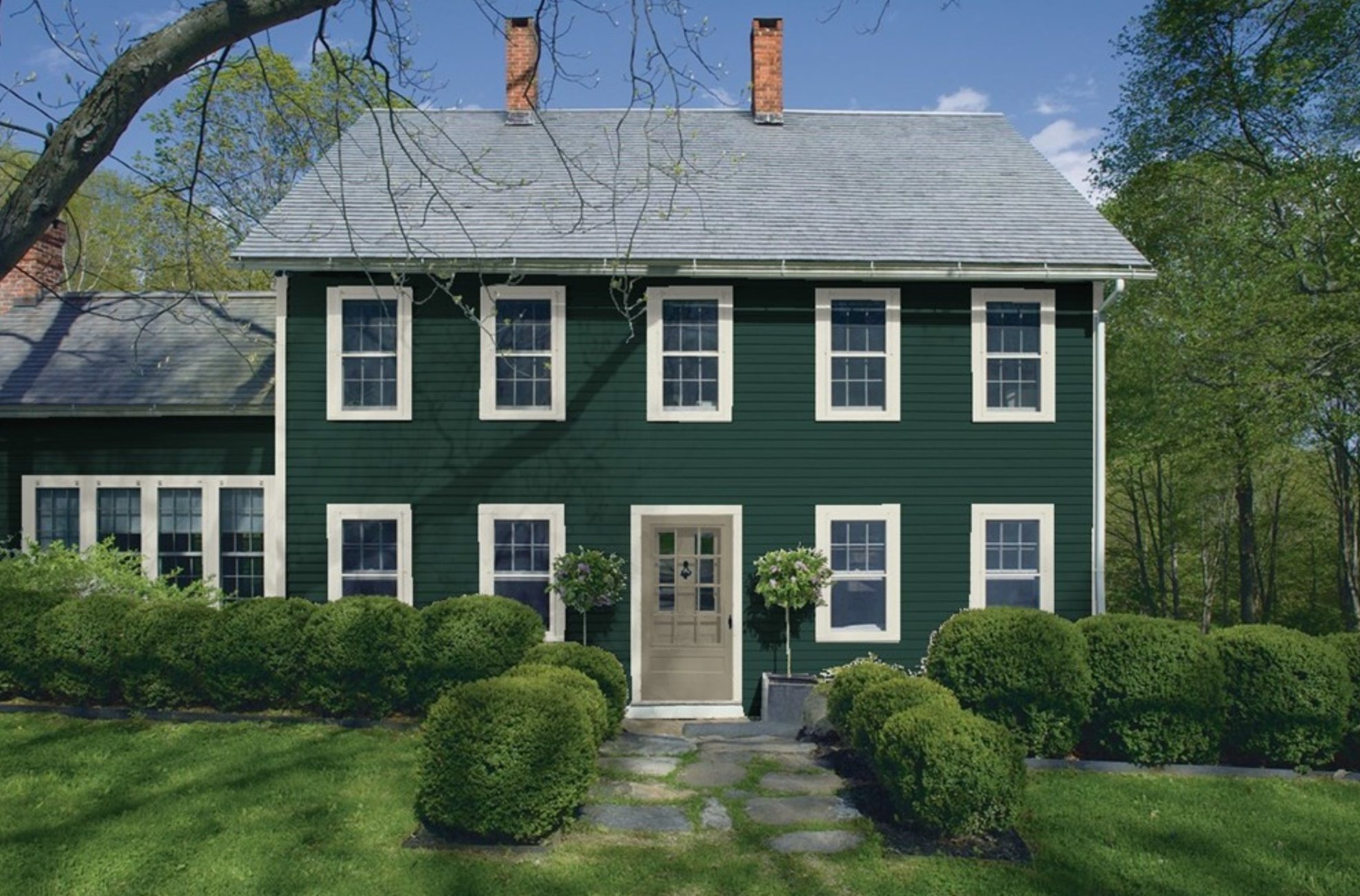
Hunter Green isn’t just another dark green color – it’s special. What makes it stand out is its subtle cool undertone that creates an interesting play of light depending on the time of day.
Paired with white trim, it nails that timeless American look that just works. The cool undertone shines on cloudy days, making the house look stunning. While its LRV of 6.39 might seem low, it’s perfect for exterior walls – the color stays vibrant even in direct sunlight.
12. Vintage Vogue by Benjamin Moore

Vintage Vogue is the kind of dark green that can completely transform your home’s look. It’s a fantastic alternative if you’re tired of the usual black or brown exteriors.
You’ll catch all those beautiful green undertones in the sunlight, while evening light brings out a sophisticated graphite quality that looks upscale. Here’s the clever part – the manufacturers mixed in yellow oxide along with the green and black pigments to keep it from being too intense.
13. Green Onyx by Sherwin Williams

Green Onyx by Sherwin-Williams takes exterior greens in a fresh direction. Unlike your typical sage green, this medium-toned, muted shade (with an LRV of 31) brings a warm feel without being overwhelming.
You’ll spot this color a lot in Florida, where the intense sun makes it look quite a bit lighter – definitely something to keep in mind when choosing. But don’t worry if you live somewhere cloudier – it holds up beautifully in overcast conditions too, keeping its warm character.
The best part? When surrounded by greenery, it doesn’t fight for attention – instead, it blends nicely with the landscape.