A couple of years ago, I was just like everyone else – totally convinced that white kitchens were the way to go. But as time went on, I started noticing how trends were shifting and just how many fascinating color choices were popping up in home design.
In the past few years, I’ve built up quite a collection of ideas – everything from soft, dreamy pastels to surprisingly bold shades that can completely transform your kitchen space.
I’ll walk you through my favorite kitchen cabinet color ideas and show you how color alone can help you create your dream kitchen – no major remodeling required.
Popular Kitchen Cabinet Colors in 2025
In 2025, kitchen cabinet colors are taking a bolder, more diverse turn. More and more homeowners are ready to experiment with color, particularly leaning toward natural shades and rich, deep tones. While classic white is slowly stepping aside for more expressive choices, it’s still holding strong as a favorite.
Here are the most popular colors this year that we expect to stick around:
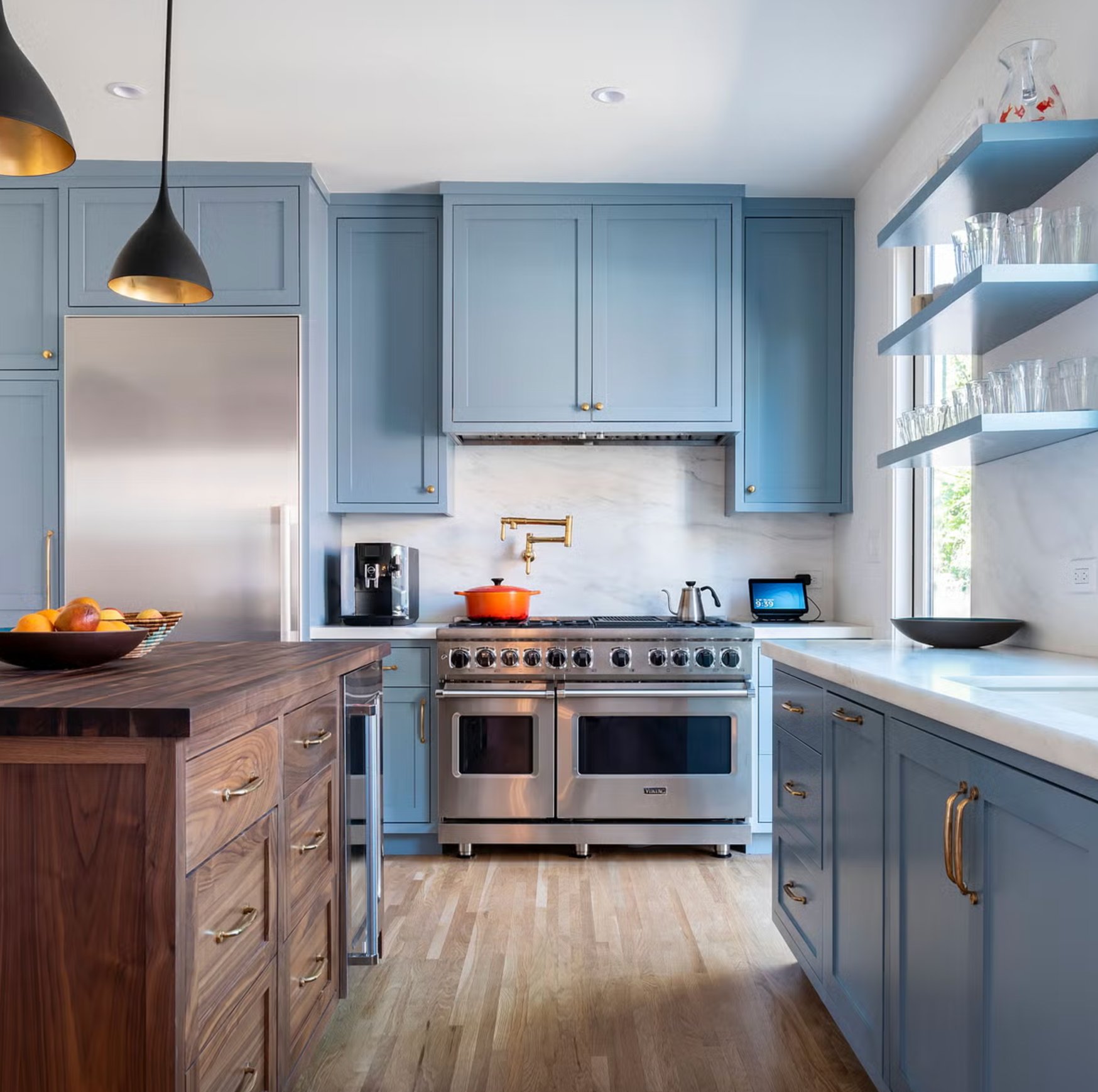
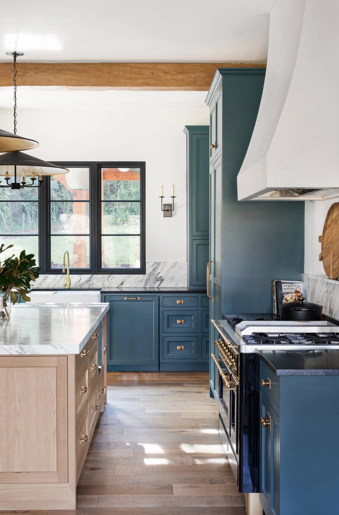
1. Navy Blue
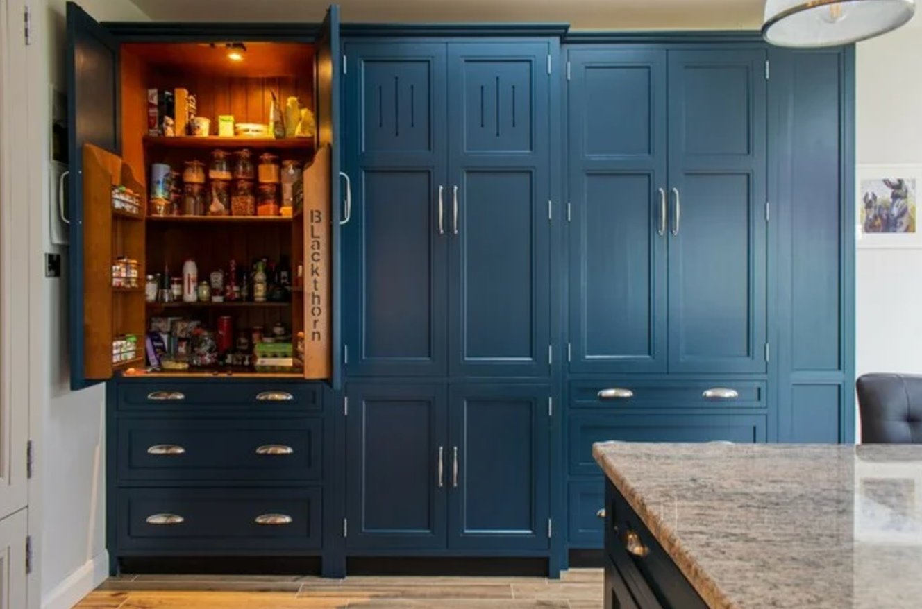
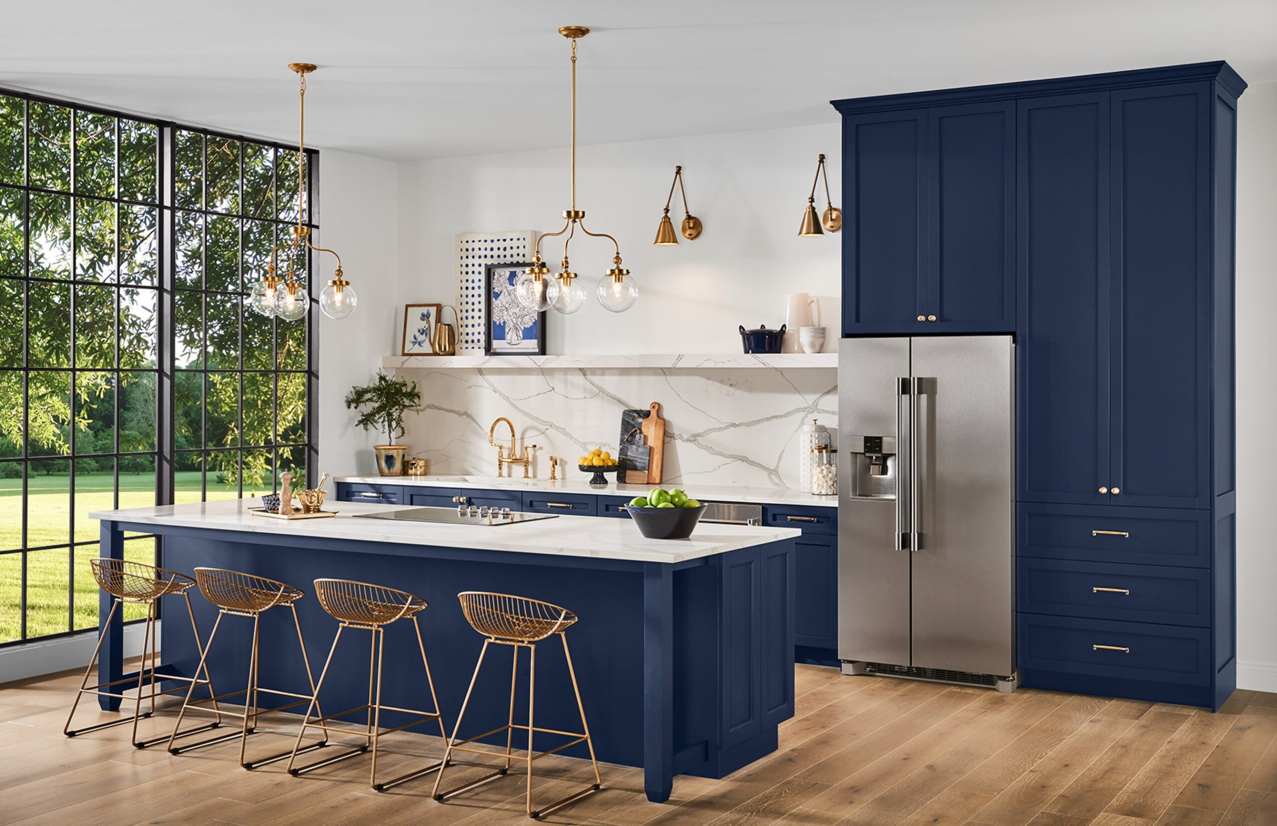
I’ll be honest – I was skeptical about navy blue cabinets at first. It seemed like quite a statement. But now? I’m completely sold on this color! It has this sophisticated vibe without feeling stuffy.
Pair it with gold hardware, and wow – it’s a game-changer. Just switching to brass handles can make your kitchen look so much more luxurious. The best part? Navy blue is incredibly versatile – it fits right in with both traditional and modern designs.
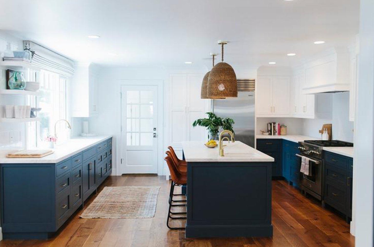
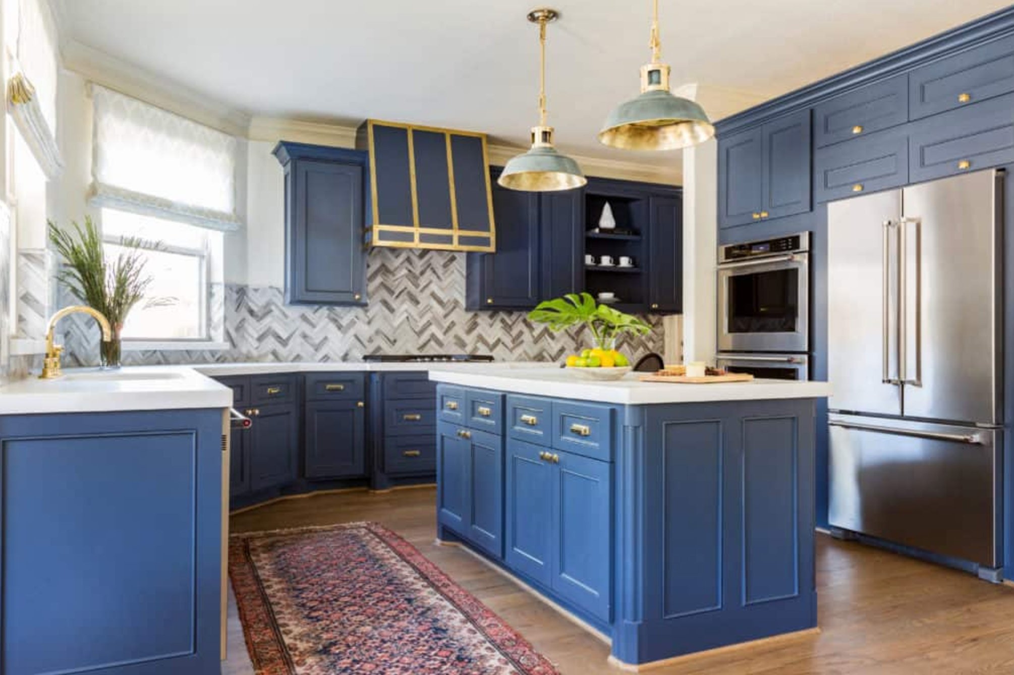
What I also appreciate about navy is how practical it is – fingerprints and splashes barely show up. Contrary to what you might think, it’s not dark or gloomy at all, especially when combined with light countertops and good lighting.
Another big plus is how well navy blue plays with other materials. Whether it’s white marble, hardwood floors, or metallic accents – everything just clicks together beautifully.
Even if you decide to switch up your decor down the line, this color will stay relevant. It really hits that sweet spot between trendy and timeless.
Paint suggestion:
- Benjamin Moore Hale Navy
- Sherwin Williams Naval
- Farrow & Ball Hague Blue
2. Soft Pink
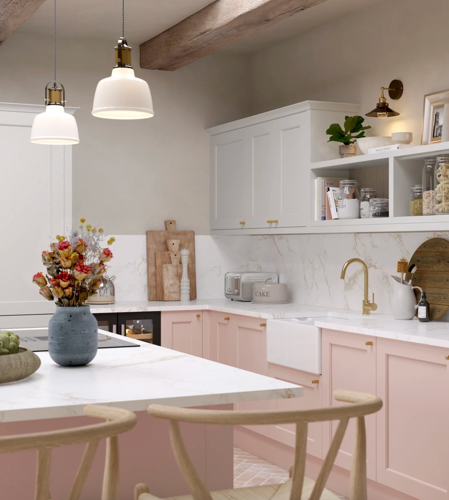
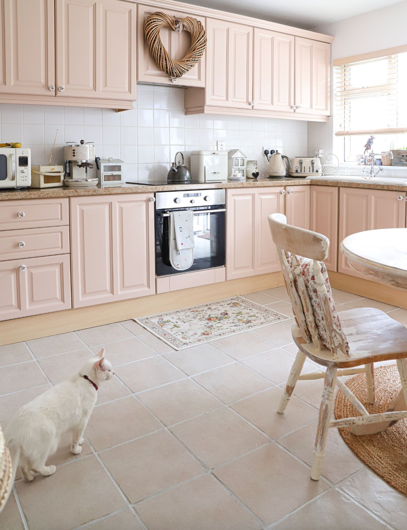
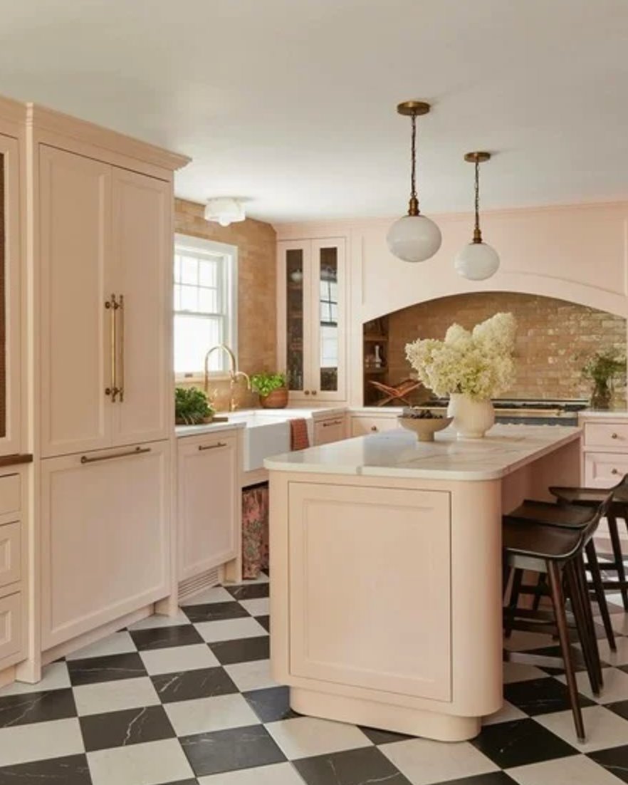
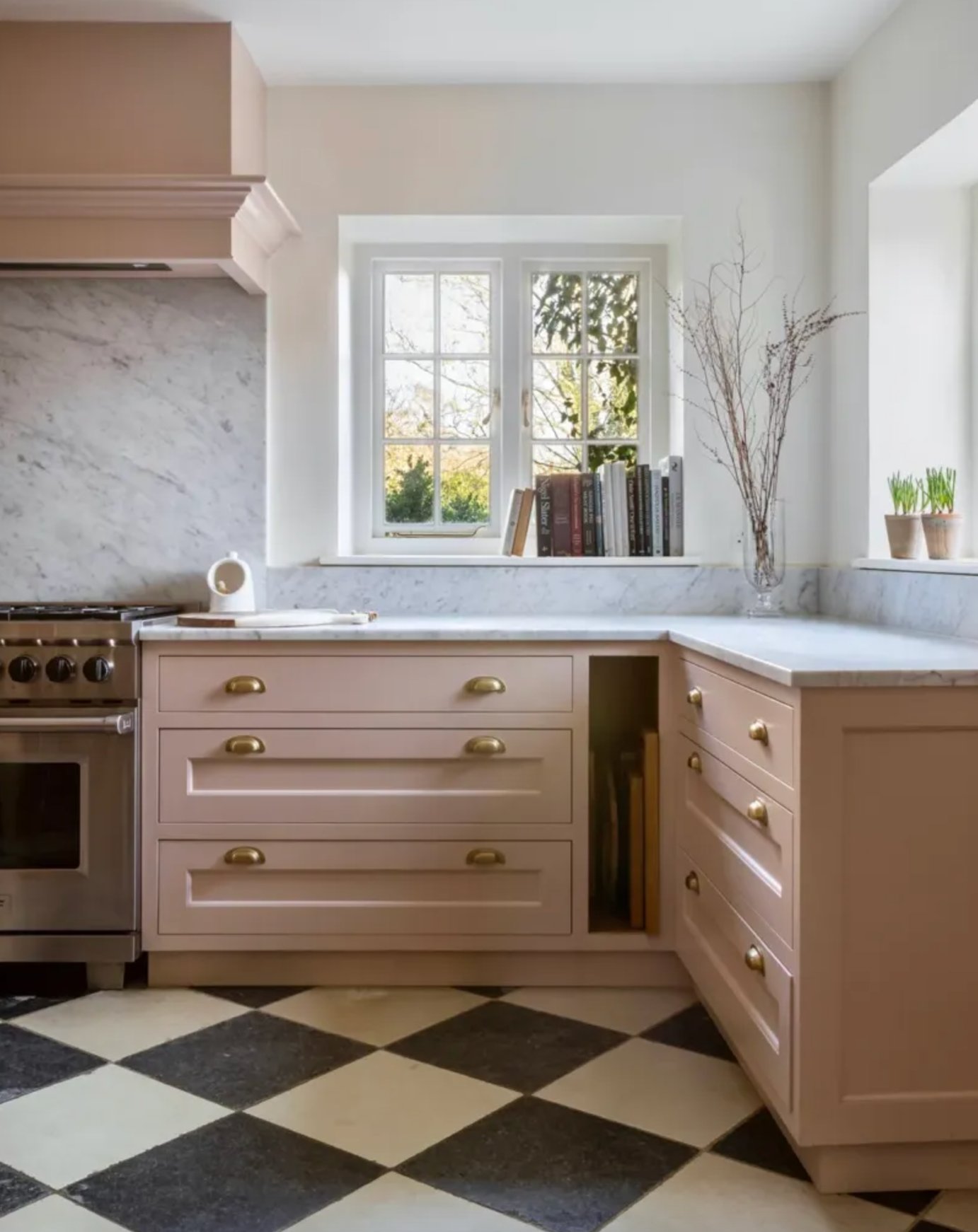
Soft pink kitchen cabinets are having a major moment, and I can totally see why. That soft, dusty pink (you might know it as “millennial pink”) works surprisingly well as a neutral, adding a touch of elegance without being overly feminine or sweet.
When you combine it with white marble, the result is both sophisticated and welcoming. One thing I love about this shade is how it transforms throughout the day – crisp and fresh in the morning light, warm and cozy as evening sets in.
It’s incredible how well this color works in both contemporary and traditional kitchen designs!
P.S. Did you catch that adorable white cat in the kitchen photo above?
If you’re considering trying this trend, start with just the lower cabinets while keeping the uppers white – it creates a lovely, light feel.
The way it works with different materials is pretty impressive too. Wooden beams, marble countertops, or black and white floor tiles – they all add character to this subtle shade.
Here’s a nice bonus – light pink makes a fantastic backdrop for seasonal decor. Whether you’re styling with copper accessories for fall or fresh greenery in spring, it just works.
Paint suggestion:
- Farrow & Ball Pink Ground
- Benjamin Moore First Light
- Sherwin Williams Intimate White
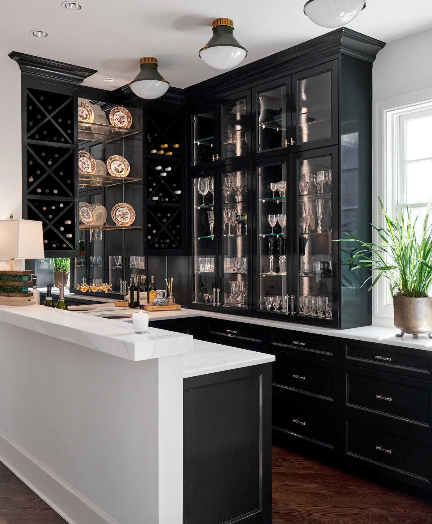
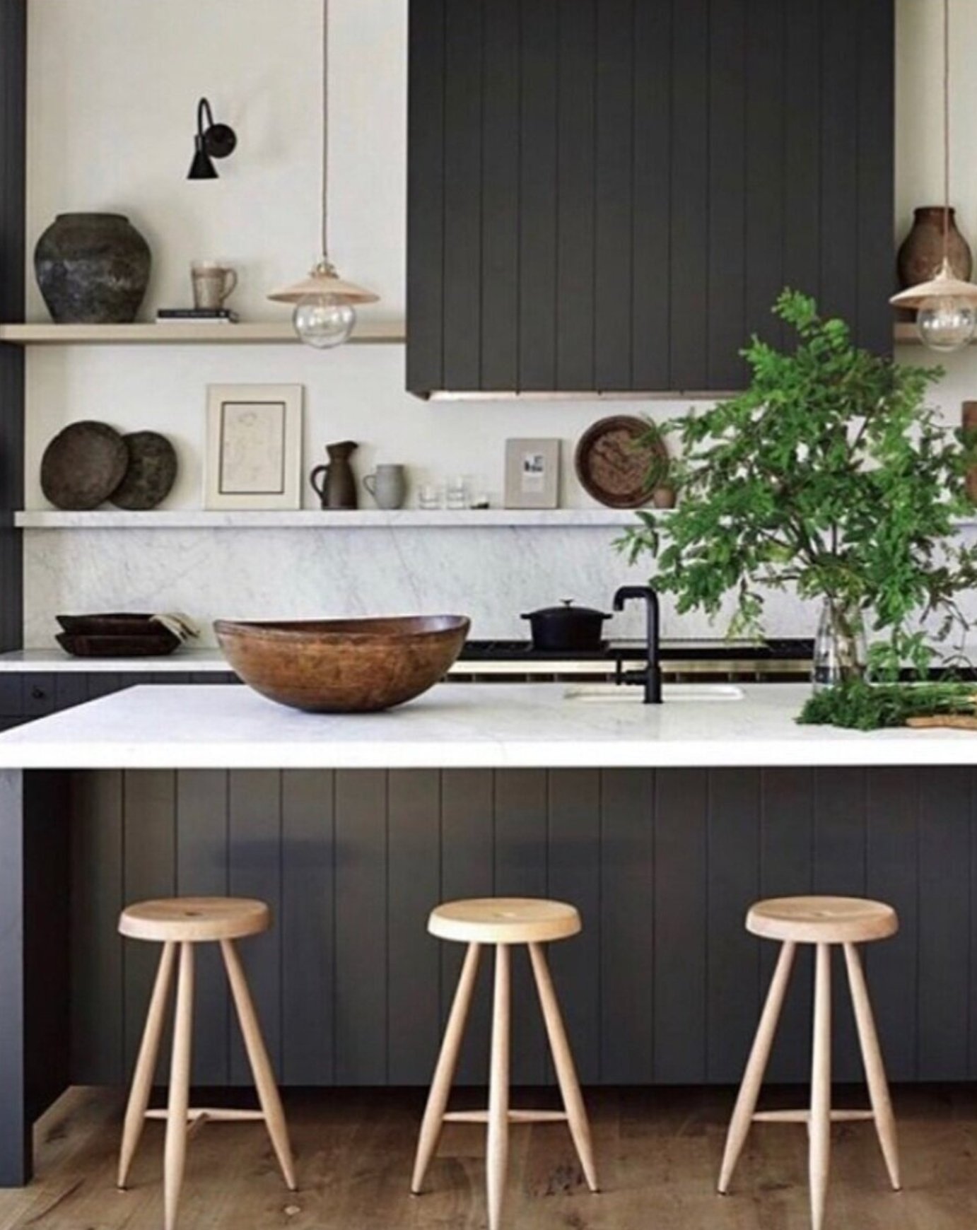
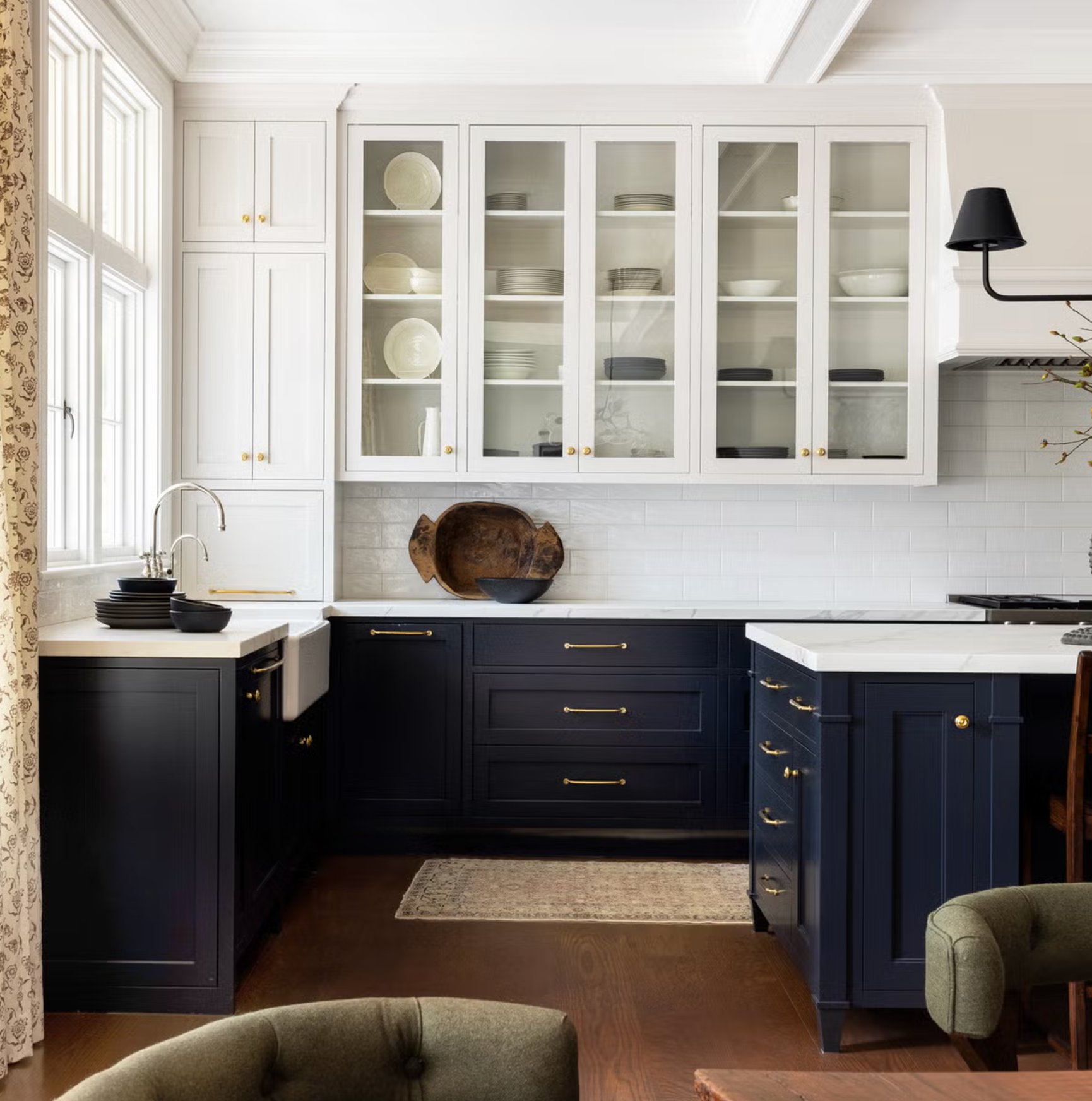
3. Black
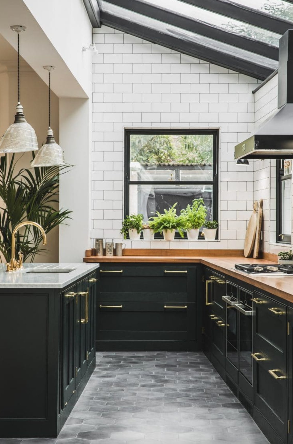
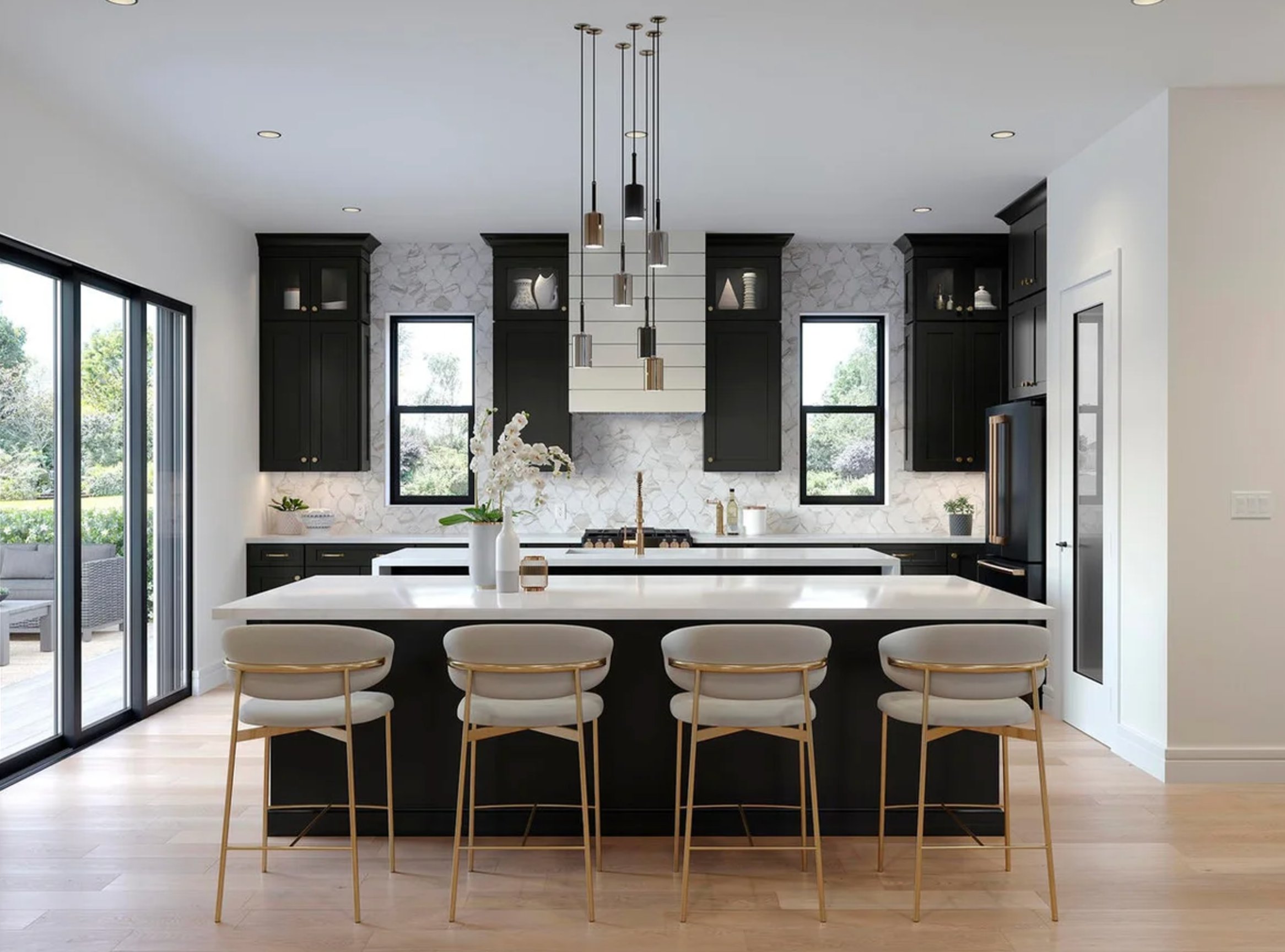
Deep black kitchen cabinets are a bold yet luxurious choice. Black kitchens have become a significant trend in recent years, thanks to their striking contrast with light countertops.
Black looks especially stunning with brass hardware – warm metallic handles and light fixtures really make the monochrome palette come alive.
When it comes to choosing black, matte graphite or charcoal shades, look more sophisticated than glossy blue-black tones.
Worried that black might make your space feel smaller? There are plenty of clever design tricks to help. Try white tiles running up to the ceiling, marble accents, and large windows to bring in lots of light. Wooden countertops can add that extra touch of warmth and comfort.
Potted greenery and natural materials like woven baskets or wooden cutting boards help soften the bold black. Plus, black creates a gorgeous backdrop that makes these decorative elements pop.
If you’re going for black cabinets, pick a quality finish that’s moisture-resistant and easy to clean. Matte surfaces tend to be more practical than glossy ones since they don’t show fingerprints and splashes as much.
Paint suggestion:
- Sherwin Williams Tricorn Black
- Farrow & Ball Off-Black
- Benjamin Moore Black
4. Yellow

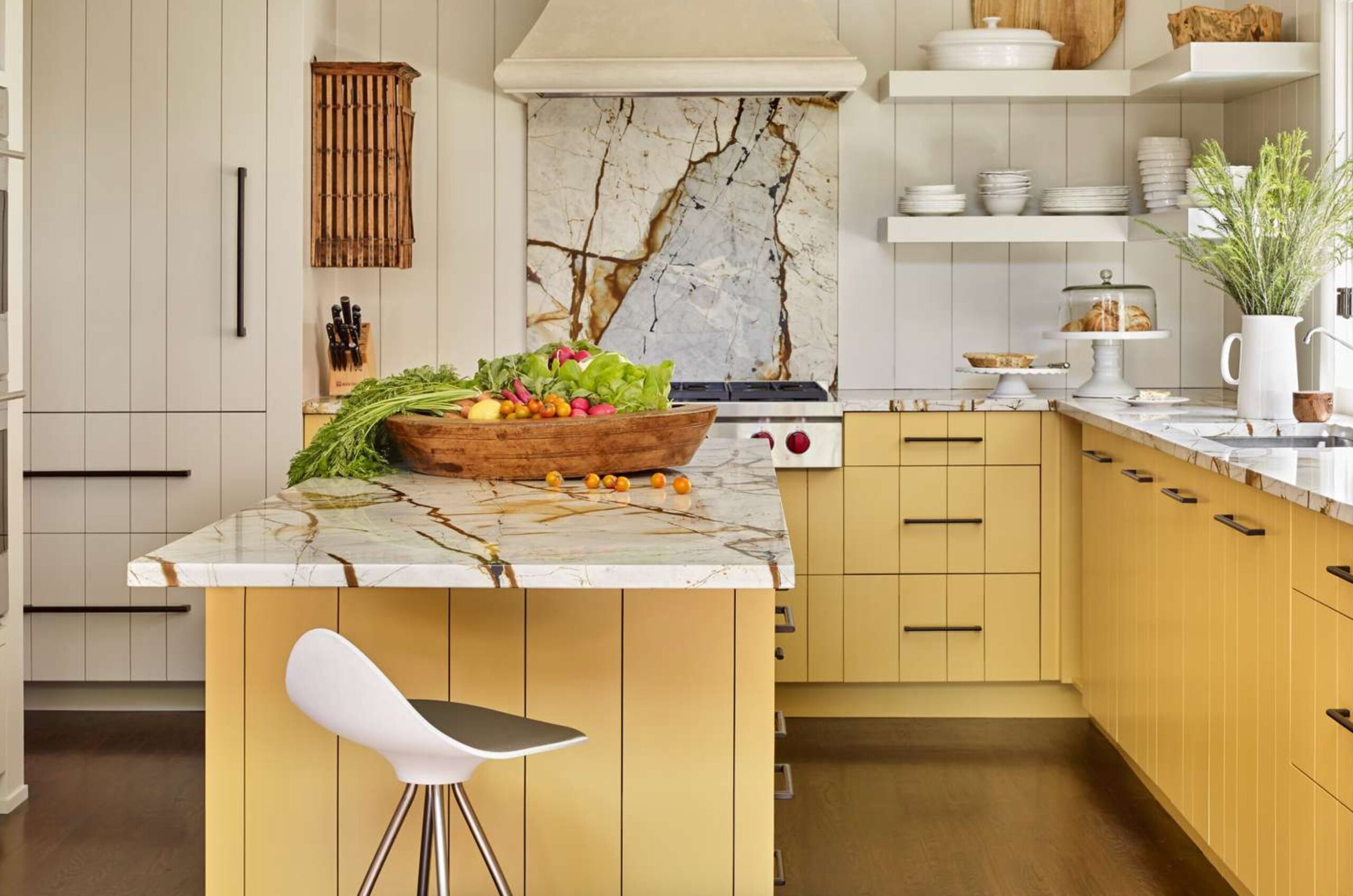
Yellow cabinets might sound a bit out there at first, but hear me out – they’re absolutely gorgeous! Soft shades like butter yellow or pale lemon create such a cheerful, welcoming vibe in the morning.
They look amazing paired with marble and wood – perfect if you’re going for that modern-meets-farmhouse look!
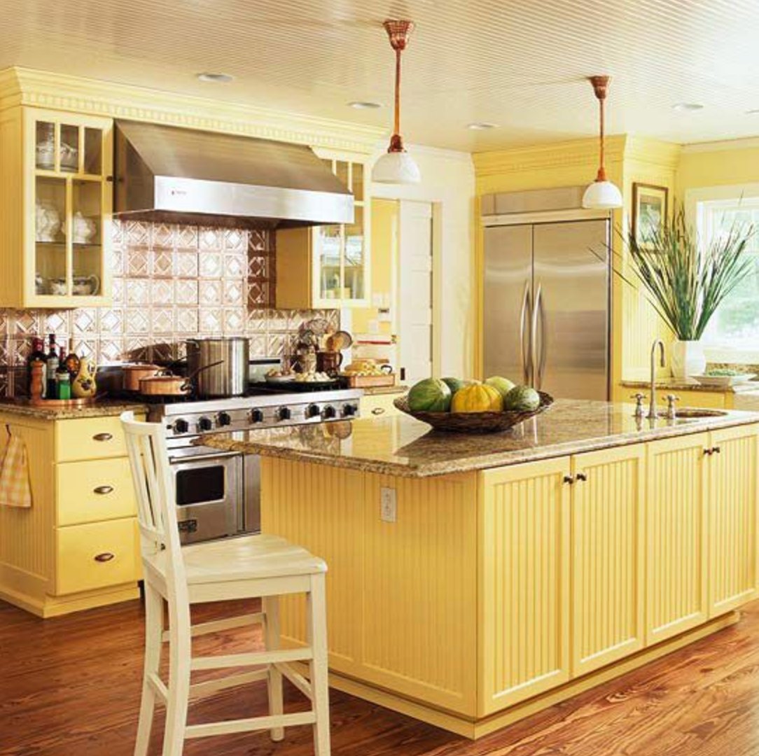
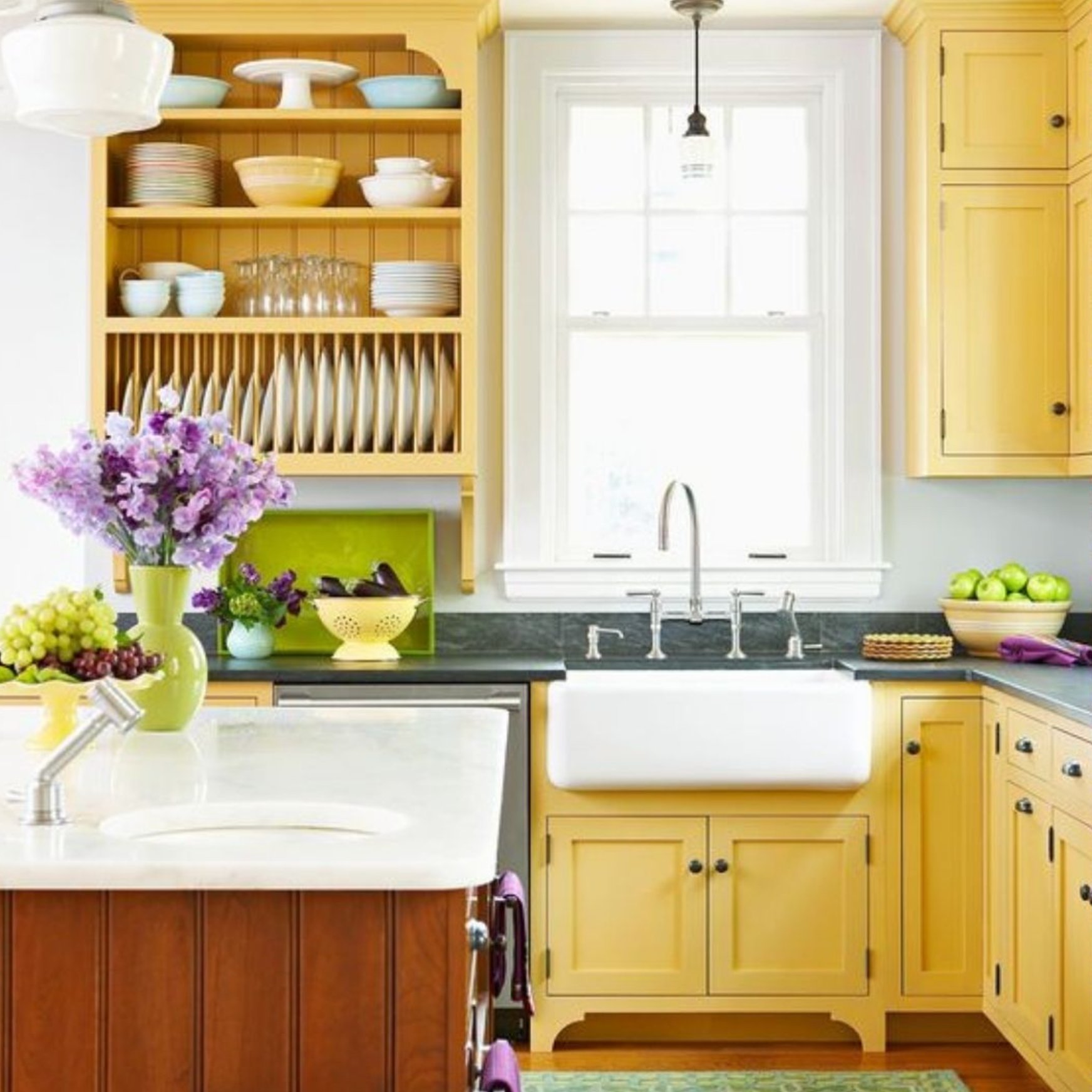
Here’s a neat trick I’ve noticed – white hardware and light walls make the space feel bigger, while dark handles add a touch of elegance.
Just stick to softer, warmer yellows – they’re easier to live with long-term. Adding texture like paneling or grooves to the cabinet fronts brings extra depth to the sunny shade.
The best part? You can tone down bold yellow with neutral accessories or amp it up with colorful dishes and decor.
Paint suggestion:
- Benjamin Moore Yellow Highlighter
- Sherwin Williams Cheerful
- Farrow & Ball Babouche
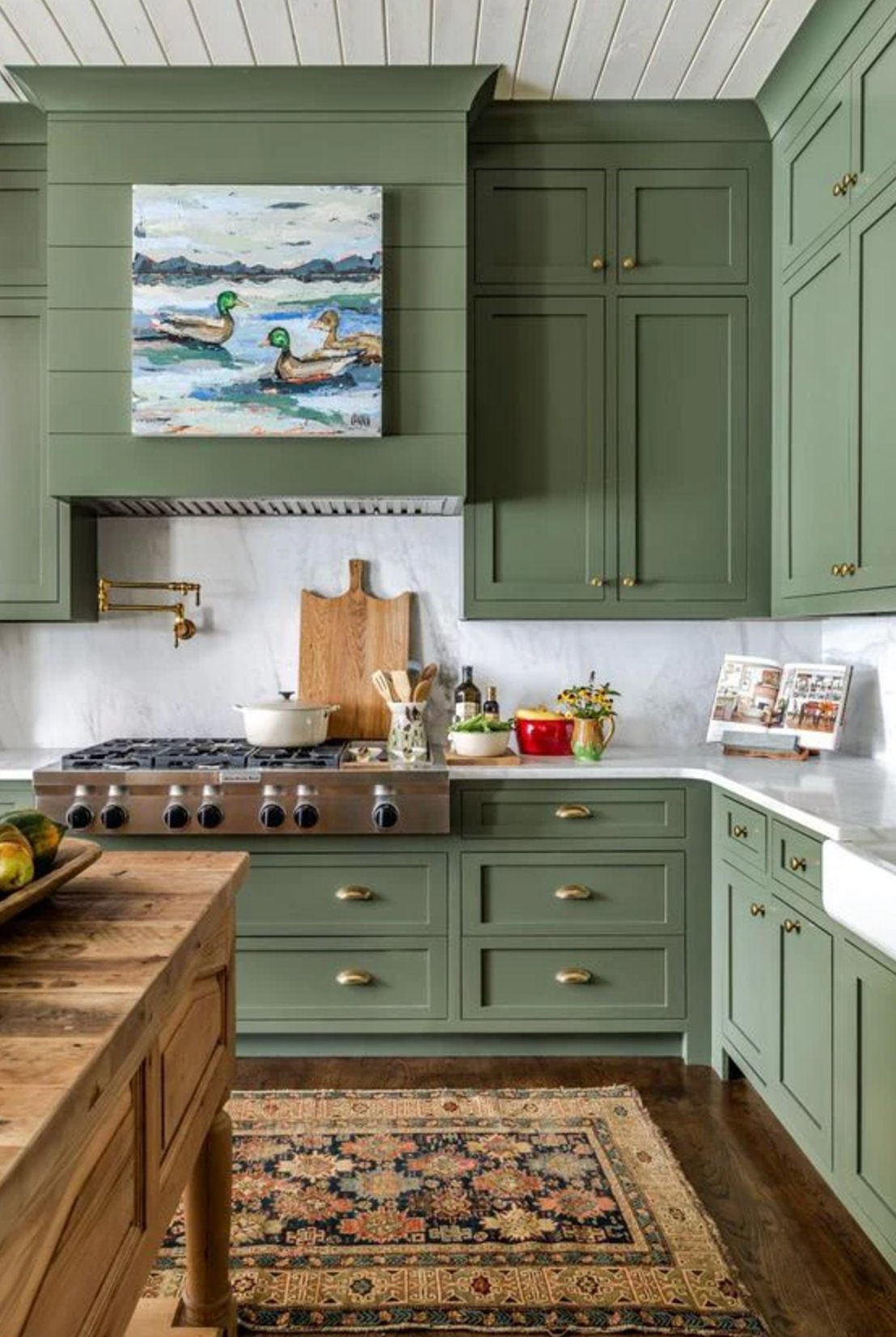
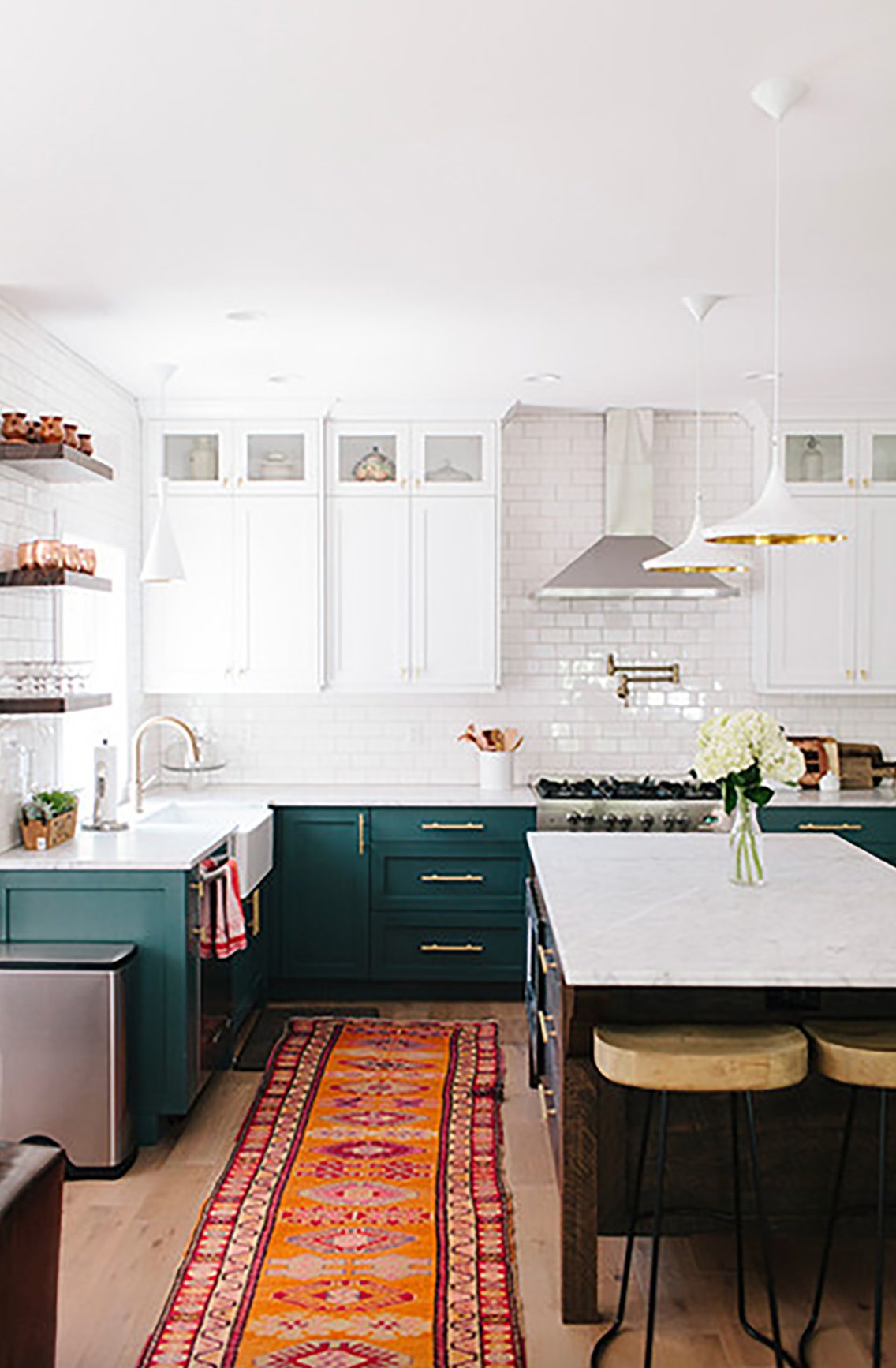
5. Deep Green
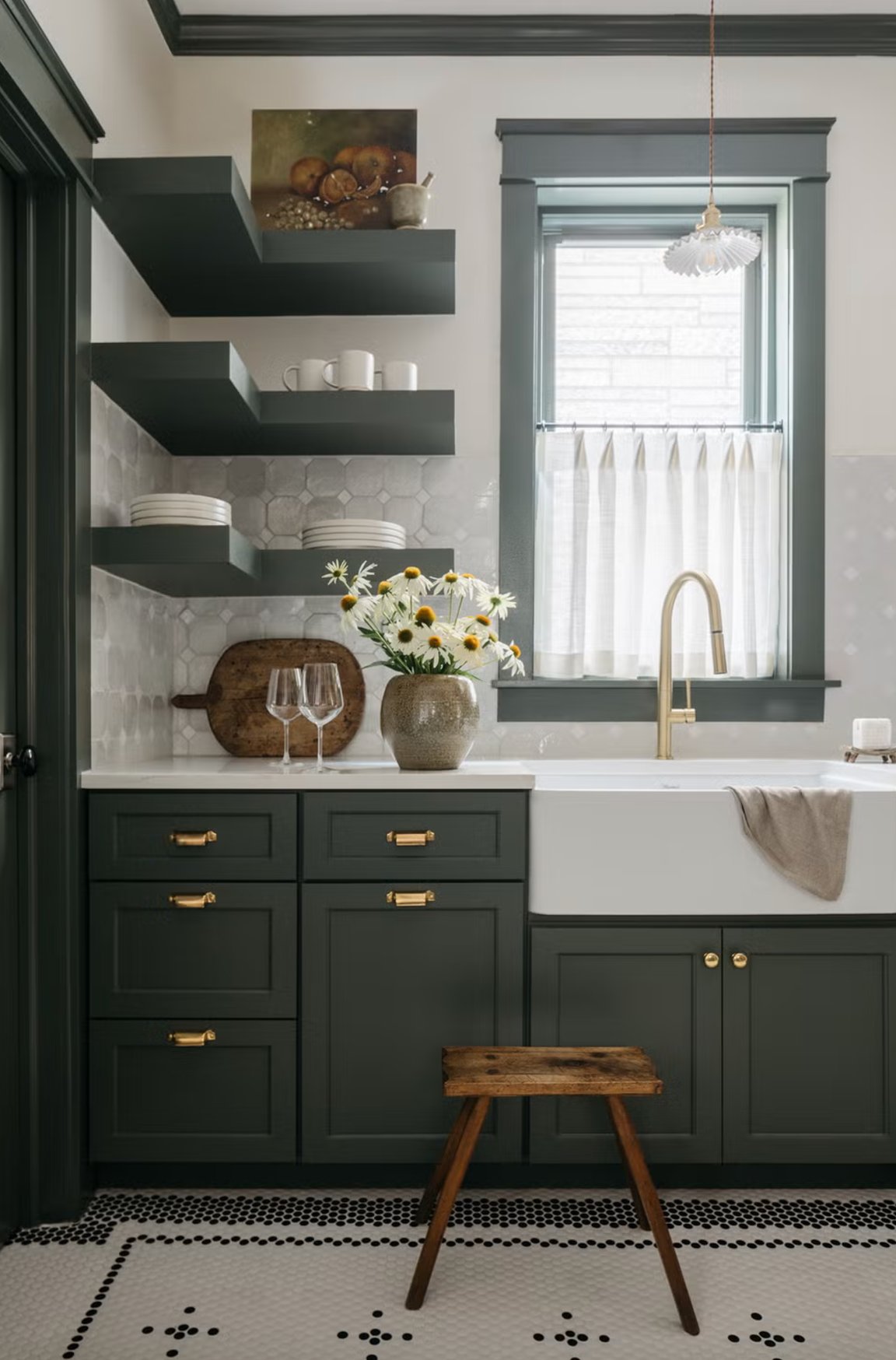
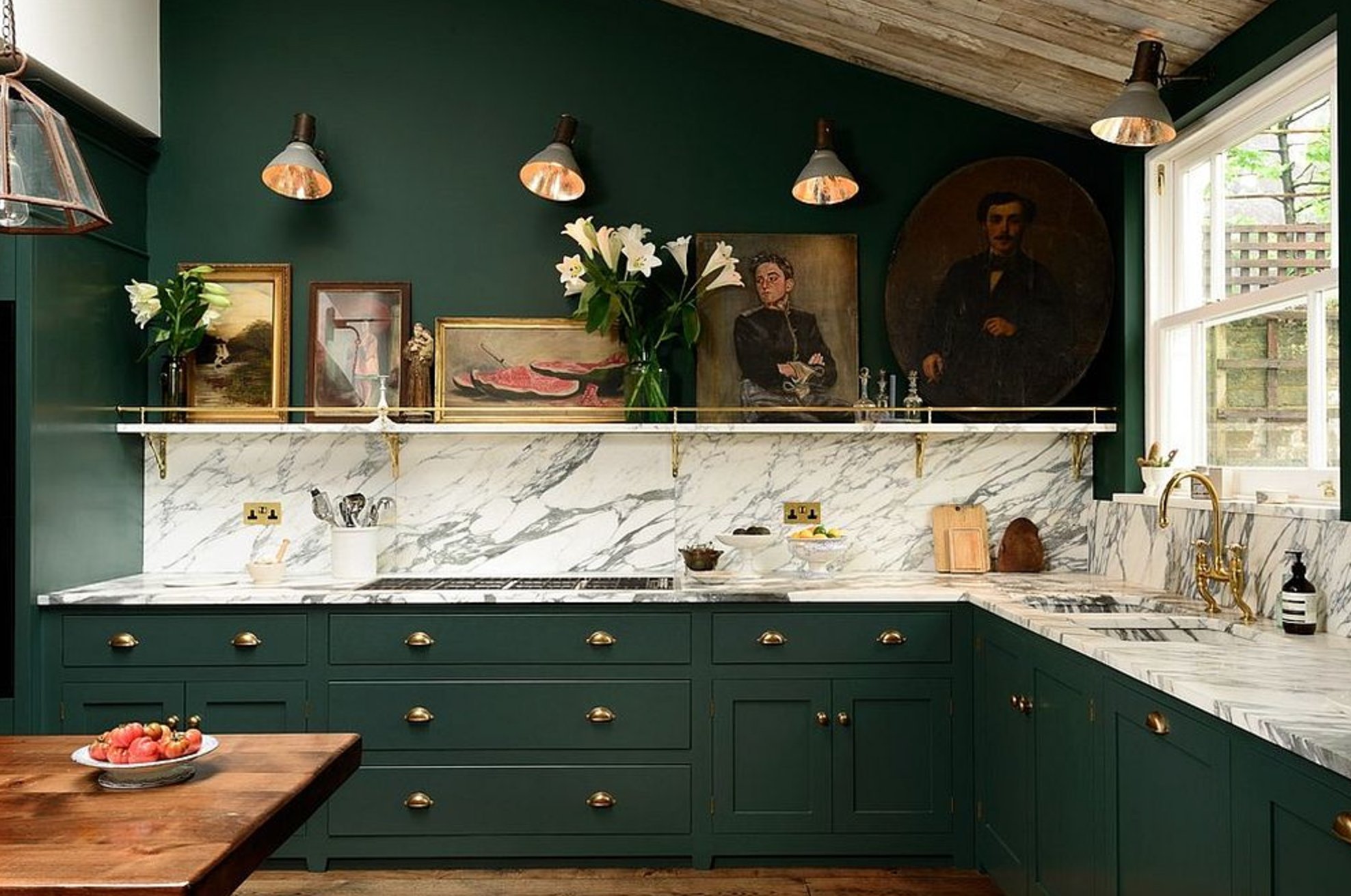
Deep green in modern kitchens adds character while staying timeless. Rich forest or emerald tones look incredible against white countertops.
One of the best things about these green shades is how they transform throughout the day – bright and energizing in the morning, then rich and moody by evening. Deep green creates this beautiful, nature-inspired space when you mix in wooden elements and marble textures.
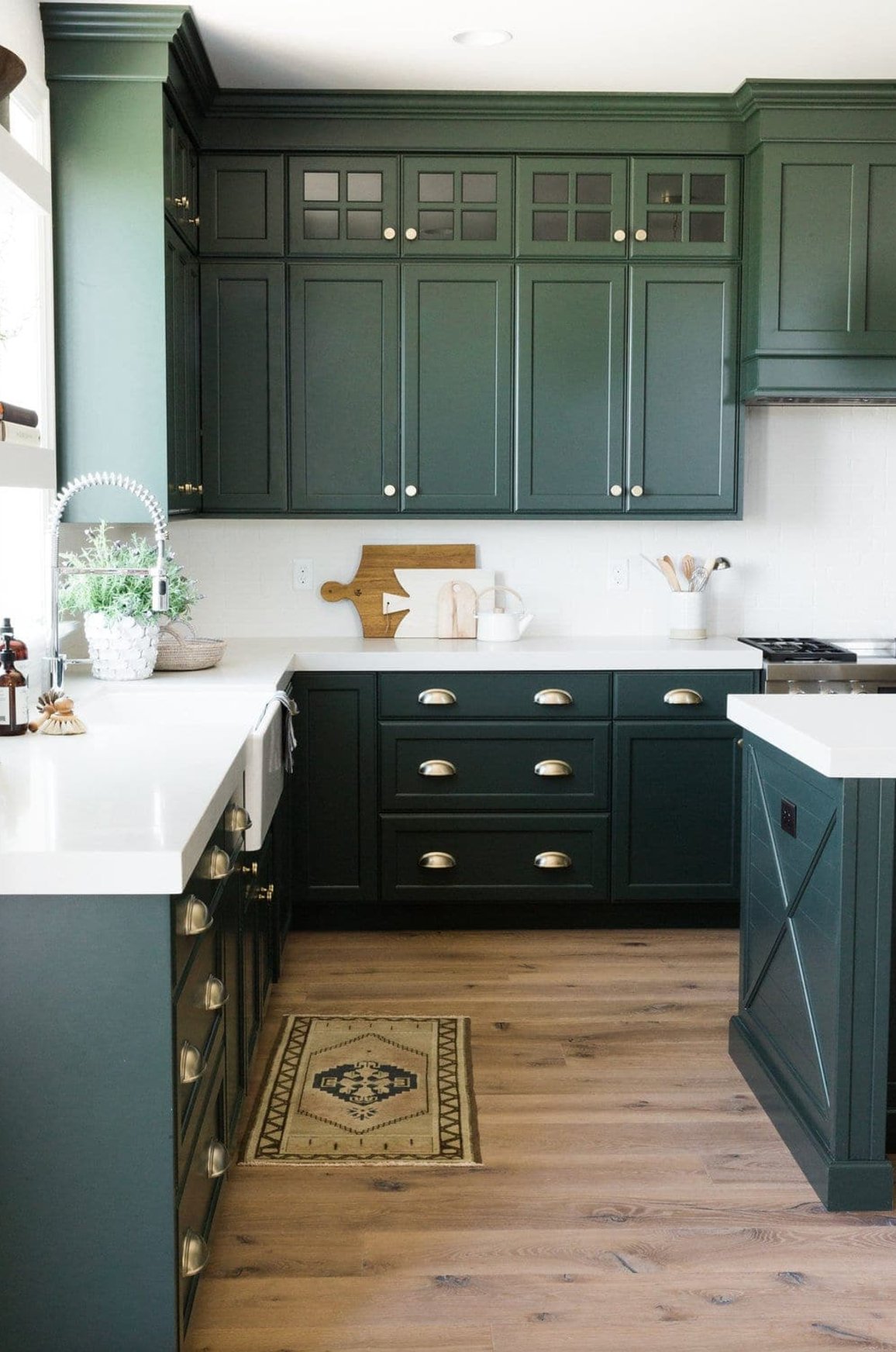
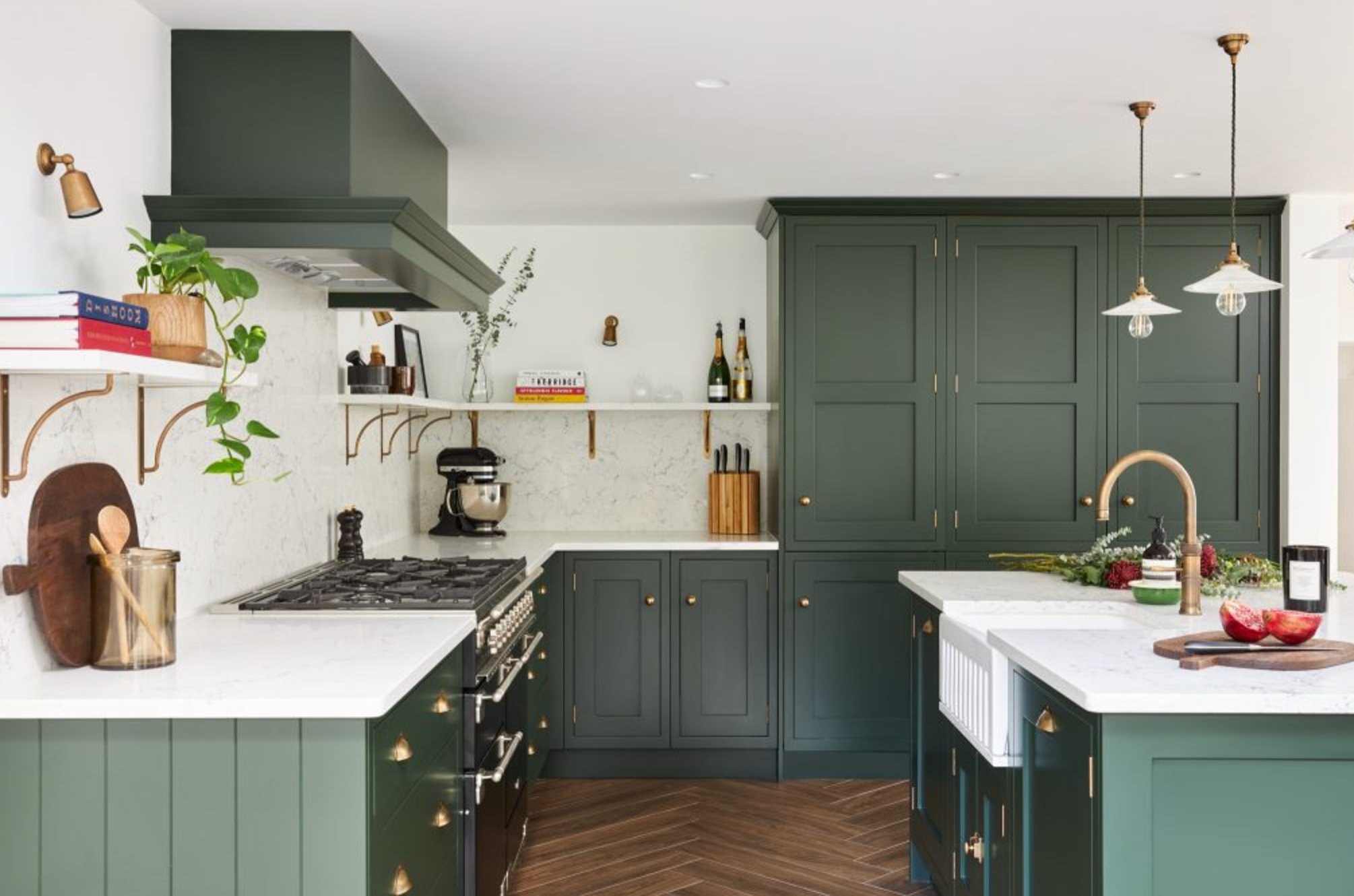
The great thing is this rich color works beautifully in both spacious and smaller kitchens – just make sure you’ve got good lighting. Pairing it with white walls helps balance out the intensity and keeps things feeling fresh.
Paint suggestion:
- Sherwin Williams Rock Garden
- Benjamin Moore Hunter Green
- Farrow & Ball Studio Green
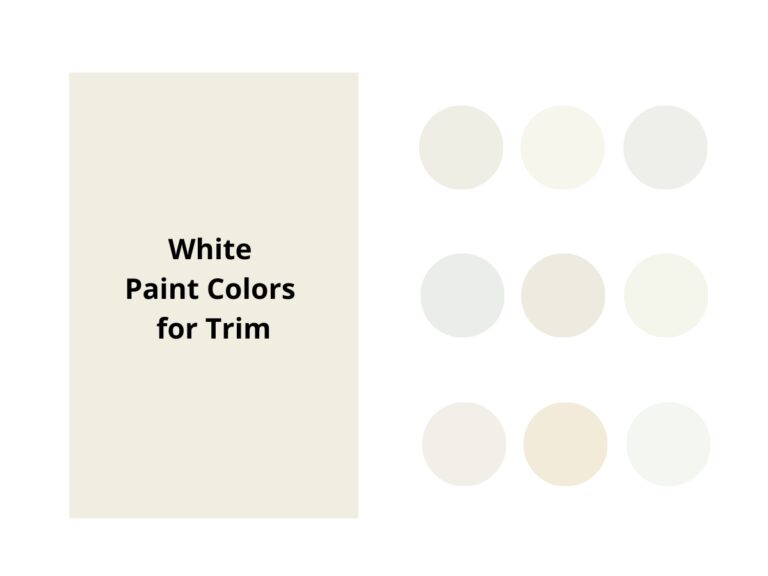
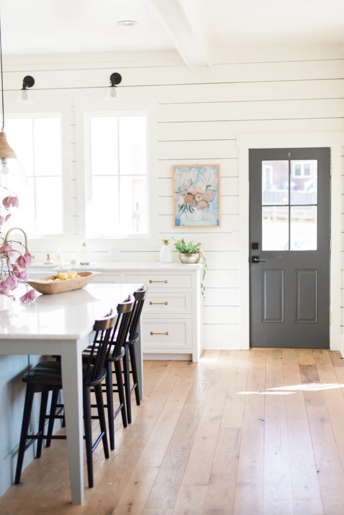
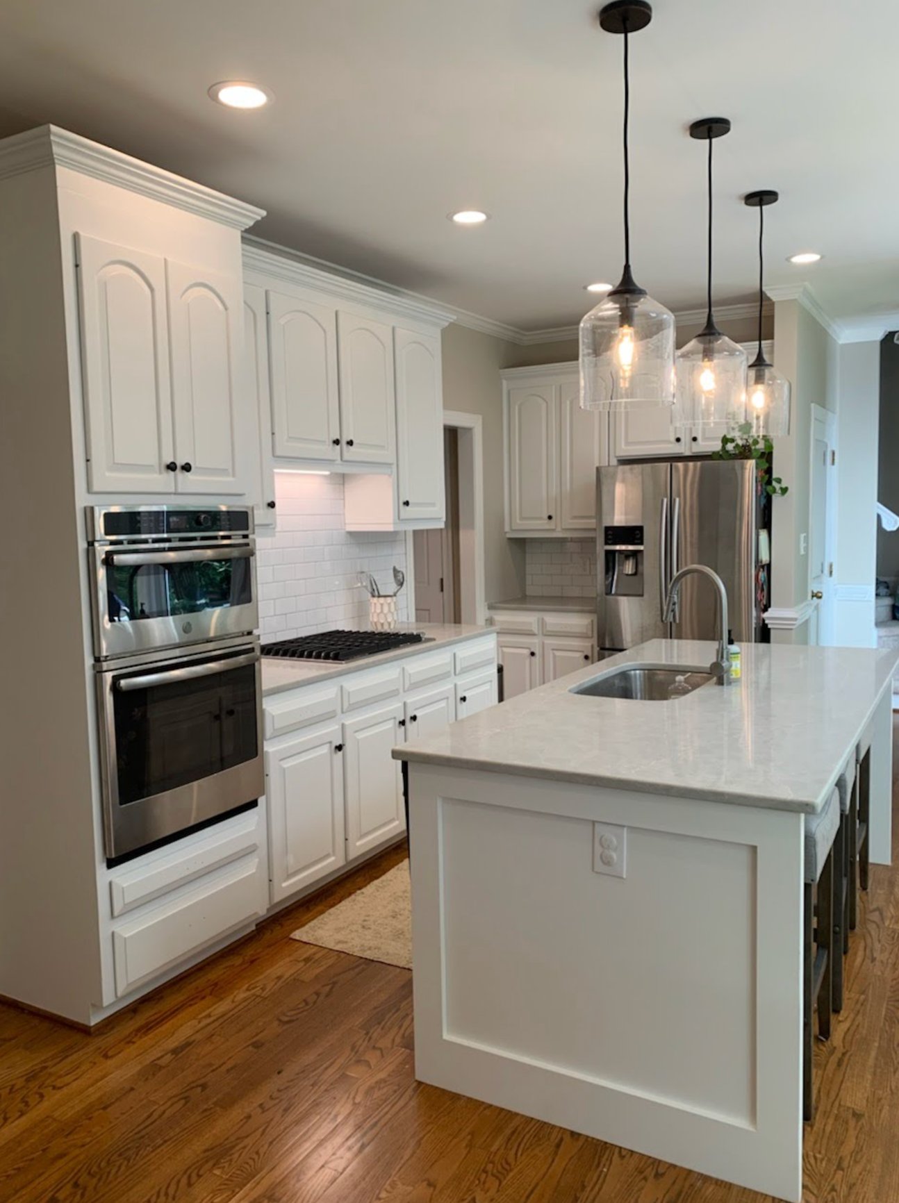
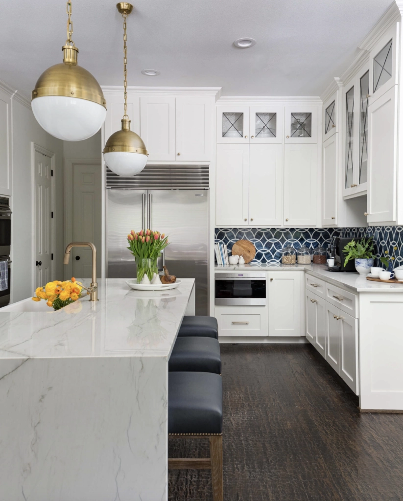
6. White
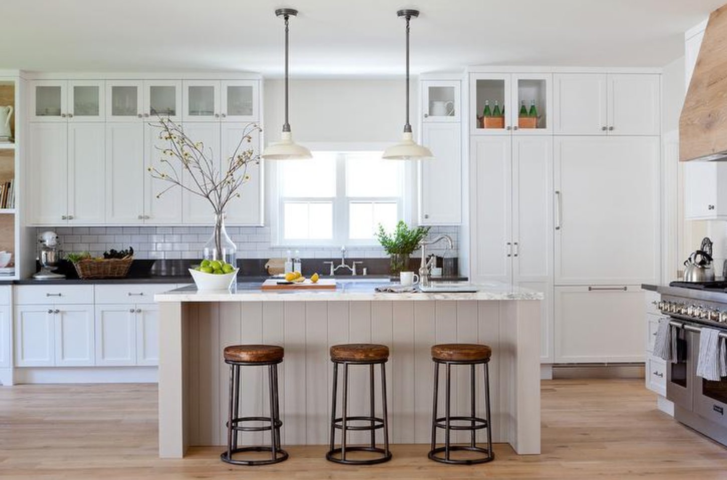
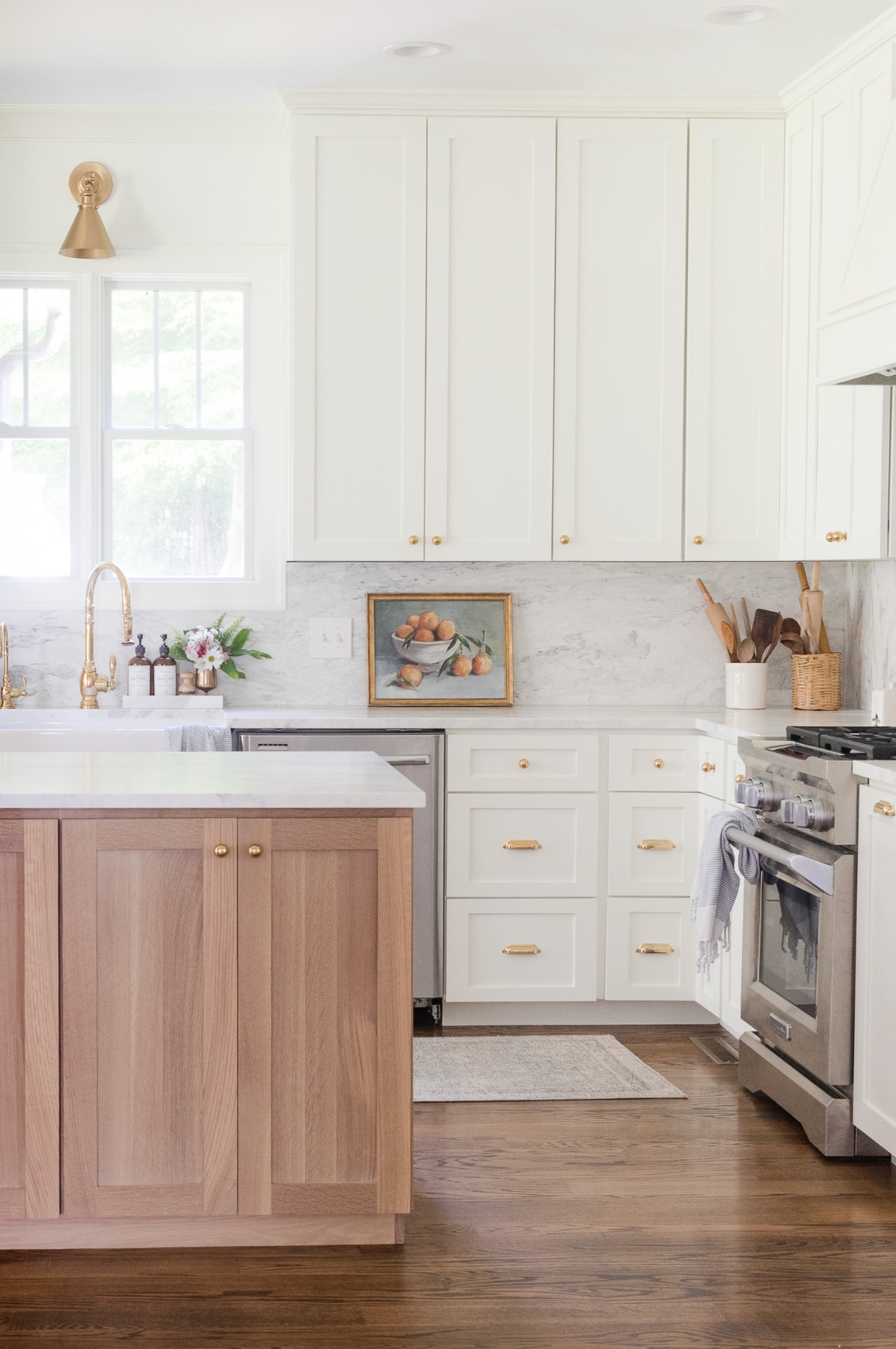
White cabinets are still a top choice – and for good reason! Matte white paint with marble countertops is honestly one of my favorite combinations.
These days, everyone’s into mixing textures, and white is the ideal canvas for this trend – you can have fun with copper sinks or statement tiles.
Want to shake things up a bit? Try white upper cabinets with wooden lowers – it looks super fresh! And don’t forget about different shades of white: bright white is perfect for modern spaces, while creamy whites create a cozier feel.
Paint suggestion:
- Farrow & Ball All White
- Sherwin Williams Pure White
- Benjamin Moore Simply White
7. Bronze
I’ve completely fallen for bronze cabinet colors! This rich brown with its metallic finish creates such a unique vibe – managing to feel both modern and homey at the same time.
Bronze looks stunning against white marble and light walls. Pair it with brass hardware, and your cabinets become the showstopper of the space. Black matte faucets and lighting fixtures fit right in too – creating a look that’s stylish without going over the top.
Want to know a great tip? Adding natural wood elements instantly makes everything feel cozier. Just keep one thing in mind – watch out for the undertones. Some bronze finishes can lean reddish, which creates an entirely different feel.
Paint suggestion:
- Benjamin Moore Metallic Bronze
- Farrow & Ball London Clay
- Sherwin Williams Bronze Tone
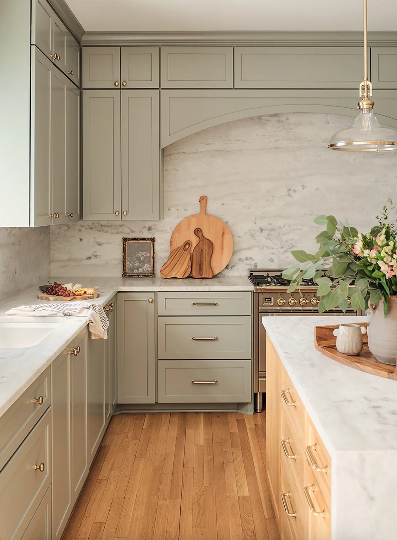
8. Sage Green
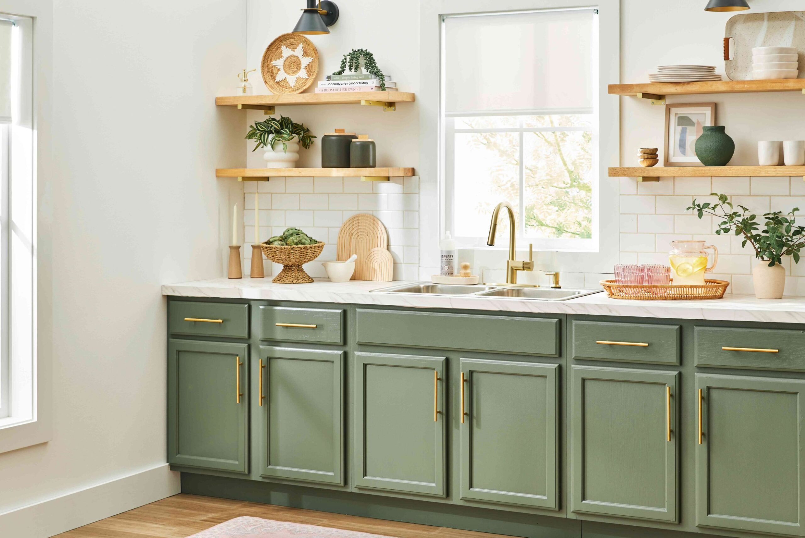
Sage green is one of those special colors that manages to be both calming and full of personality. It’s been trending in kitchen design lately, and I can see why!
This earthy green pairs beautifully with white quartz or marble countertops and light oak open shelving. What I really love about sage is how it stays fresh-looking in any light, never turning murky or too gray.
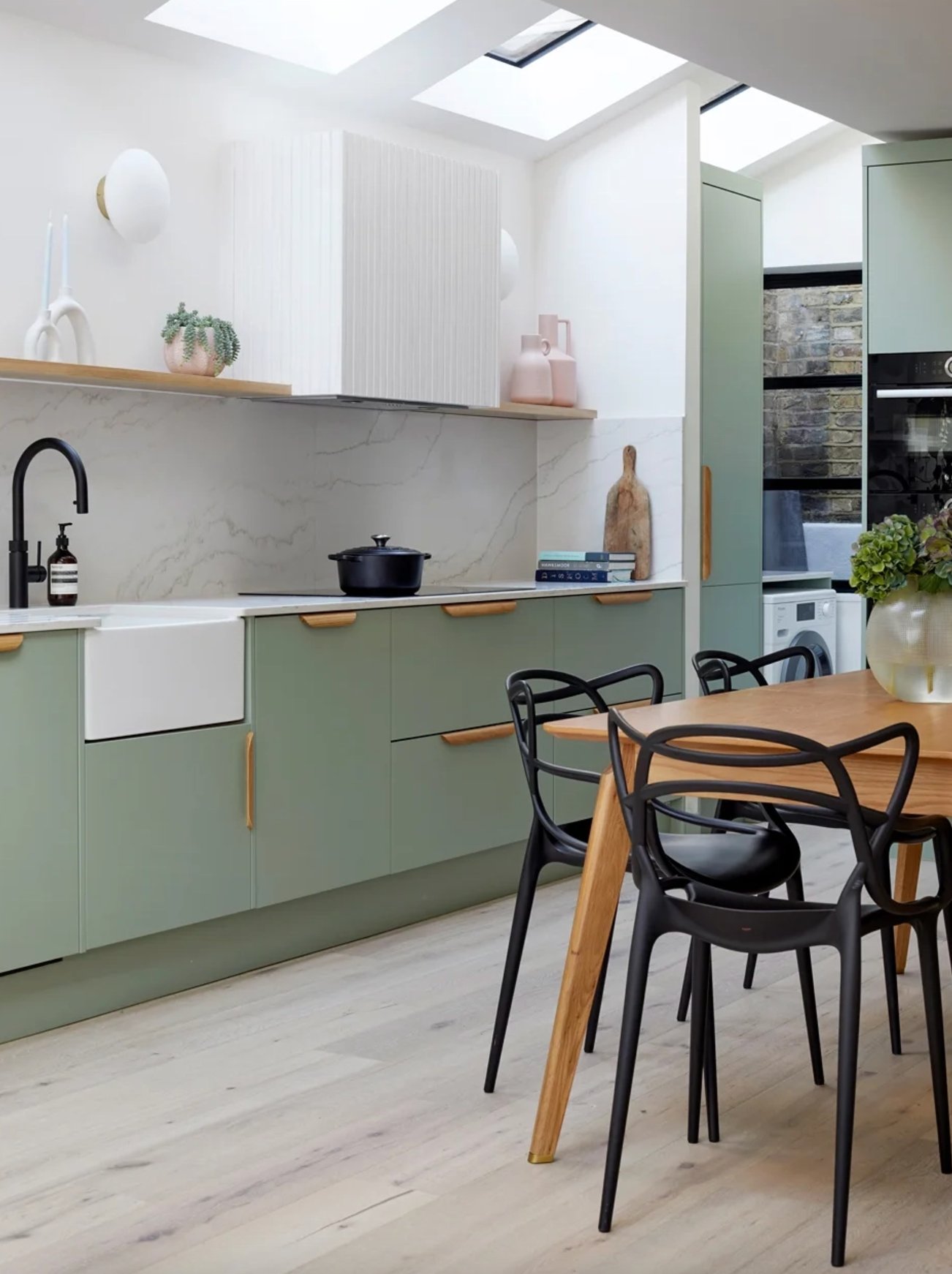
When picking your paint, look for shades with gray undertones – they give you that refined, understated look. Mix in some texture with woven baskets, vintage rugs, or pottery, and you’ll get this amazing blend of cozy country charm and modern sophistication.
Paint suggestion:
- Sherwin Williams Dried Thyme
- Farrow & Ball Mizzle
- Benjamin Moore October Mist
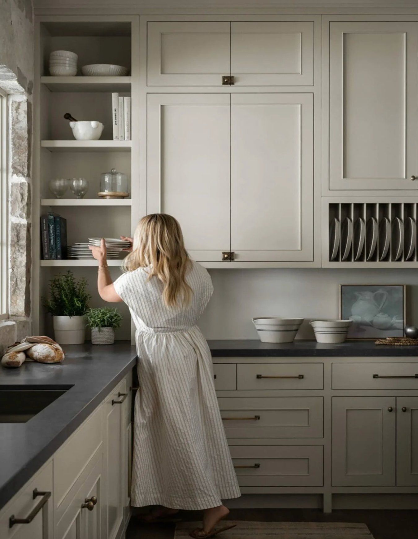
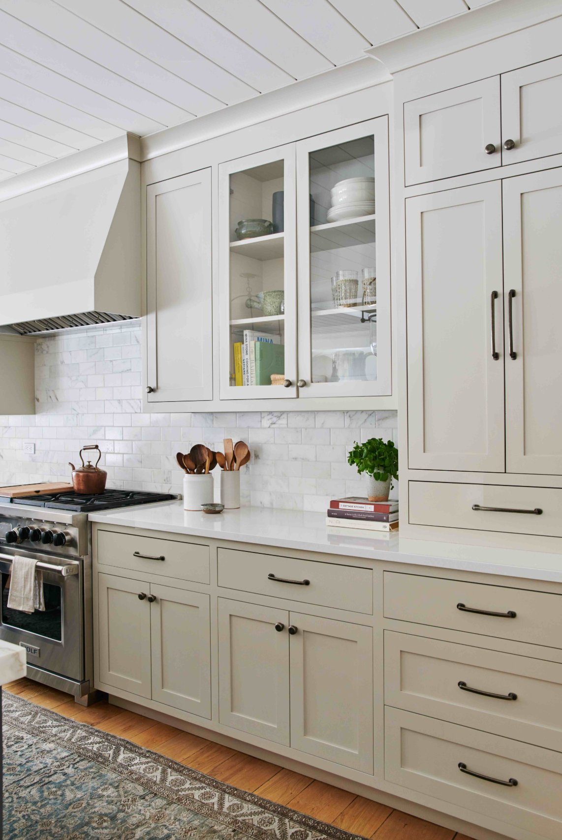
9. Cream
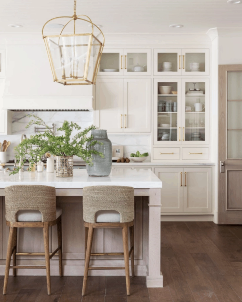
Cream cabinets are a staple in upscale California homes, and for good reason. Unlike stark white, cream brings so much more warmth and dimension to the space.
It looks incredible with bronze hardware and marble countertops – I’m absolutely in love with this combination!
When choosing cream, think about the undertones: yellowy cream works wonderfully in spaces with warm lighting, while grayer creams are pretty much foolproof in any setting.
Looking to add some drama? Try cream upper cabinets with graphite or navy lowers – this look is super popular right now.
In larger kitchens, I often go for Swiss Coffee or Alabaster. They help define the space without making it feel clinical. Just remember to balance out those cream tones in your walls and backsplash – you don’t want things looking too one-note.
Paint suggestion:
- Farrow & Ball Pointing
- Benjamin Moore Swiss Coffee
- Sherwin Williams Alabaster
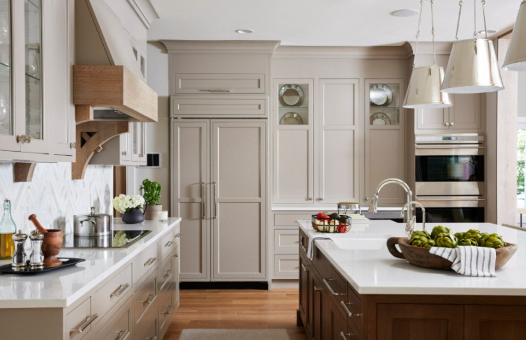
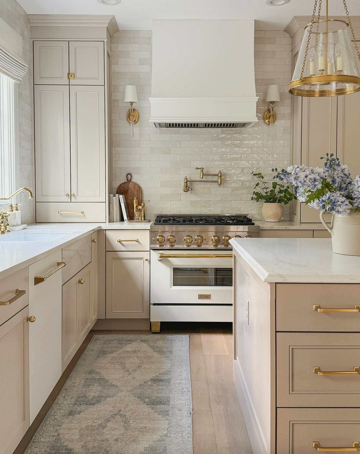
10. Warm Beige
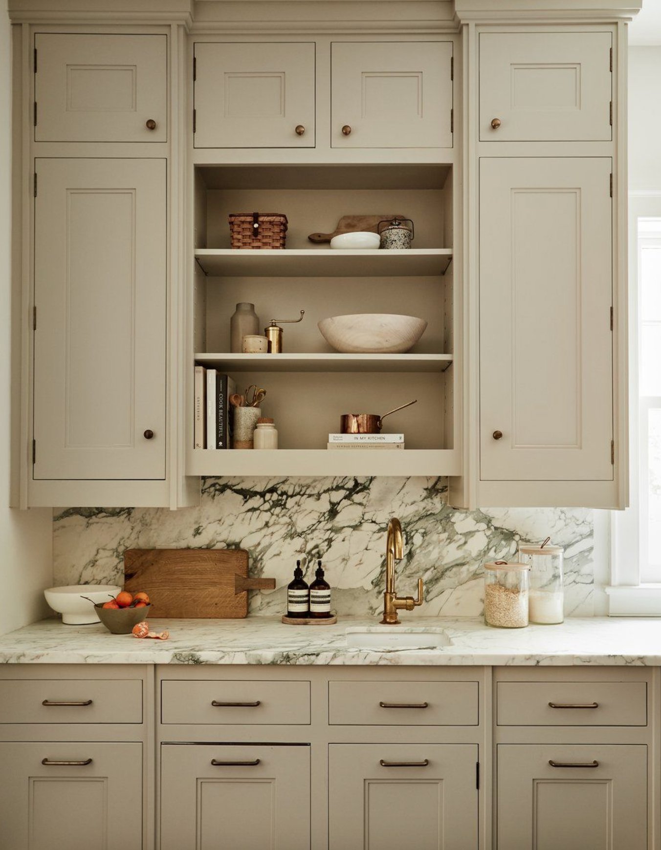
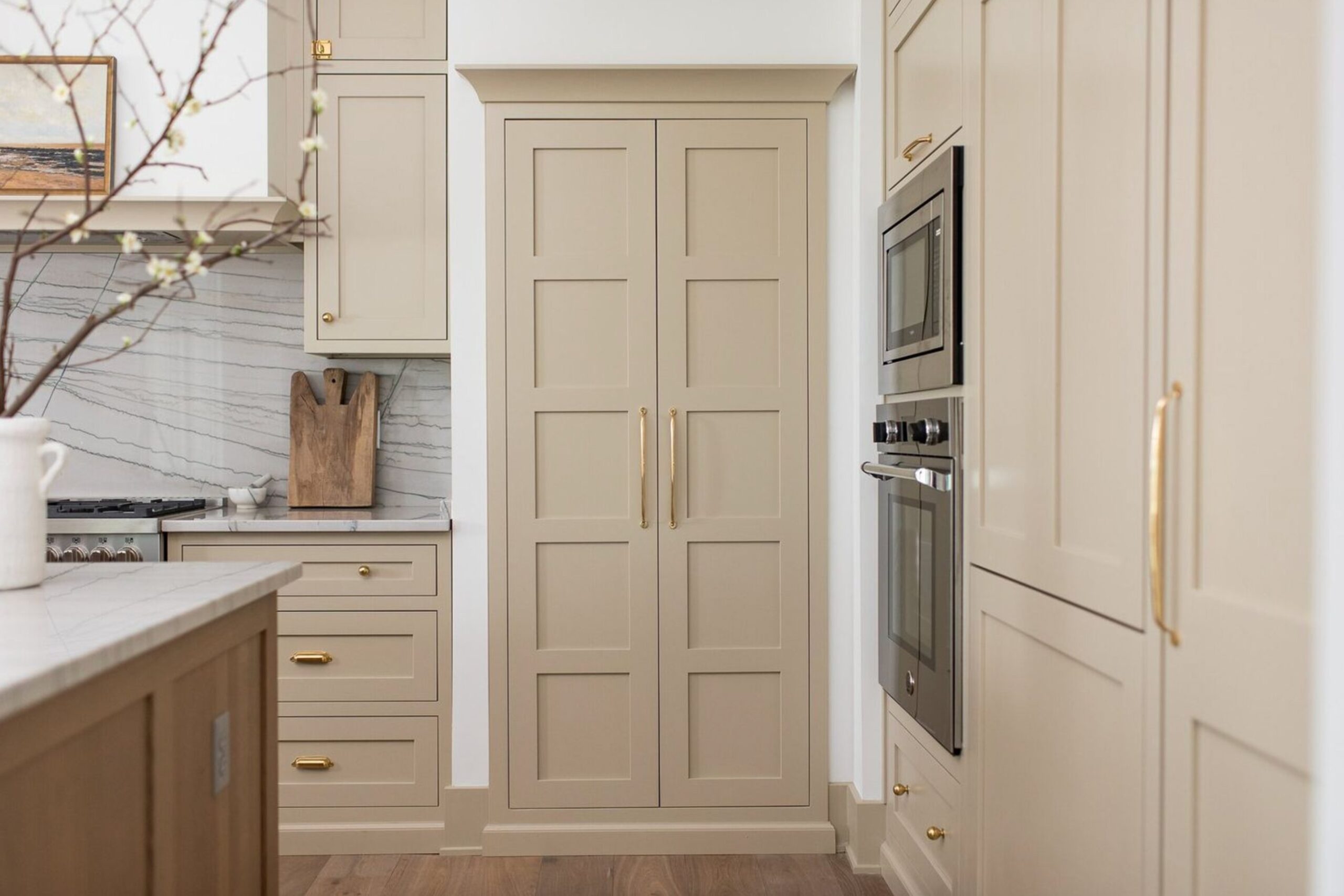
Warm beige is one of those timeless neutrals that just works. Unlike the cool grays we’ve seen everywhere, this shade brings such nice warmth to a kitchen.
Warm beige (or warm sand) is incredibly versatile – it works just as well in modern spaces as it does in traditional ones. I particularly love how it plays with natural wood elements, whether they’re cutting boards or light oak bar stools.
It’s amazing how this color can make any kitchen look more expensive while keeping things cozy and inviting.
I’ve noticed more designers choosing this over pure white lately – it’s easier to maintain and creates this lovely, grounded feeling. It’s especially perfect for open-concept spaces where your kitchen needs to flow naturally with the rest of your home.
Paint suggestion:
- Sherwin Williams Accessible Beige
- Benjamin Moore Brandon Beige
- Farrow & Ball Stony Ground
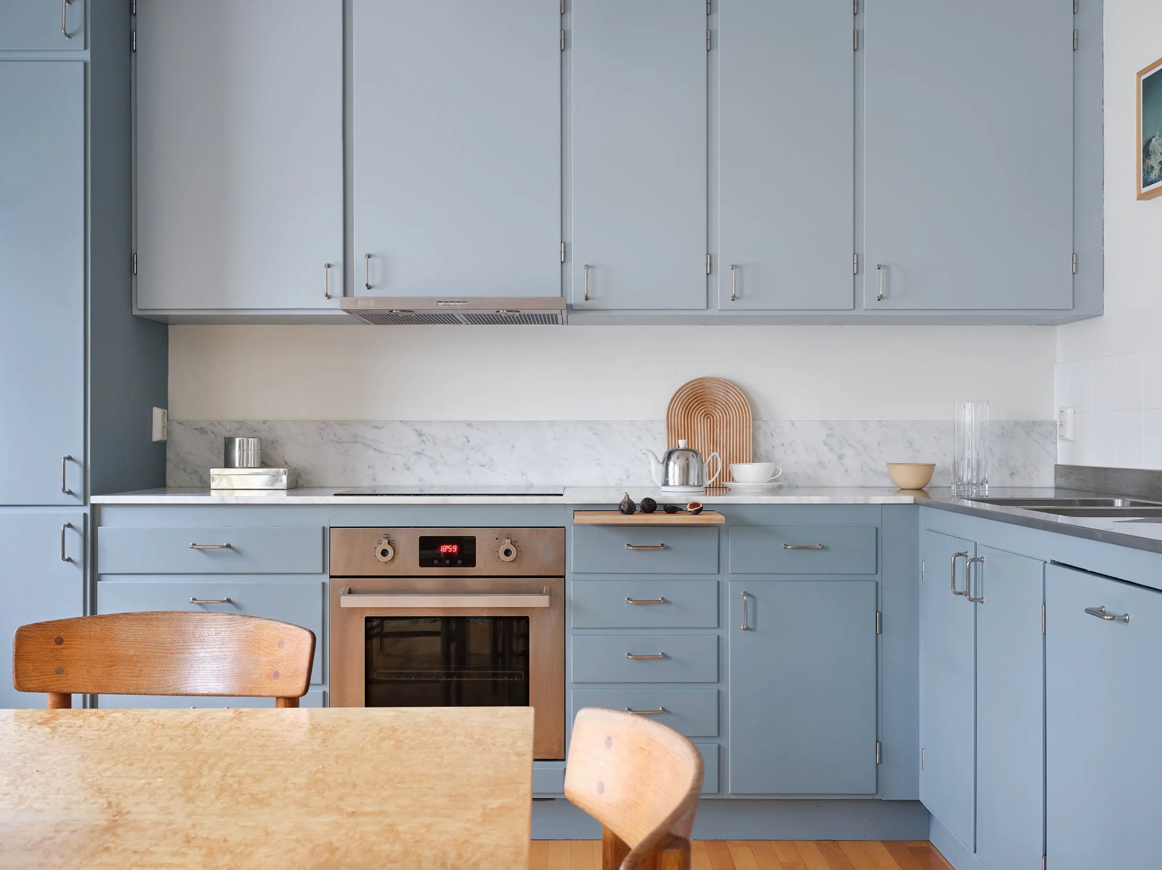
11. Light Blue
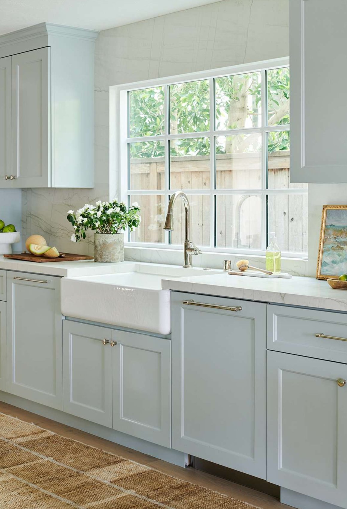
Light blue kitchen cabinets are a breath of fresh air if you’re tired of white! They bring a sense of serenity, almost like being by the ocean. Paired with white countertops, this color creates a stylish yet unpretentious look that’s perfect for a modern kitchen.
The best part? This color is incredibly versatile – it plays well with any decor or dishware you throw at it. While some might worry about blue feeling too cold, just add some wooden elements and warm lighting, and your kitchen instantly becomes super cozy!
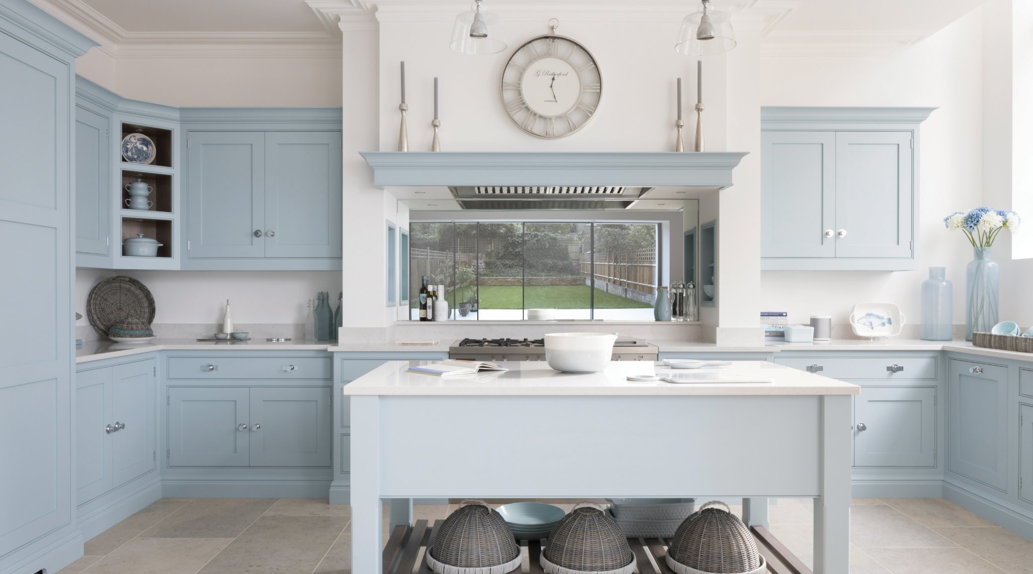
These days, paint companies offer countless light blue shades – from whisper-soft, misty tones to clearer sky blues. The key is thinking about your natural lighting situation.
For a sun-filled kitchen, you can confidently go with a bolder shade. Working with smaller windows? Stick to lighter, softer tones.
Paint suggestion:
- Farrow & Ball Light Blue
- Benjamin Moore Blue Veil
- Sherwin Williams North Star
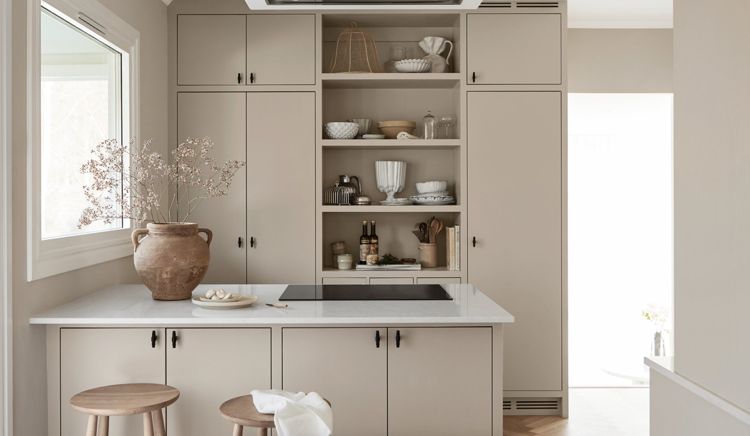
12. Greige
Greige, that perfect mix of gray and beige, has become one of my go-to choices for kitchen cabinets. Unlike stark white kitchens, it brings warmth and coziness while staying wonderfully neutral.
Here’s a pro tip: pay attention to the undertones when picking your shade – they can lean warm or cool. Warm greige feels right at home in traditional spaces, while cooler tones work beautifully in modern kitchens.
One of the best things about this color is how flexible it is with decor – you can easily switch up your kitchen’s look with different accessories. Plus, it’s way more forgiving than white when it comes to showing dirt and fingerprints!
Paint suggestion:
- Benjamin Moore Revere Pewter
- Farrow & Ball Purbeck Stone
- Sherwin Williams Agreeable Gray
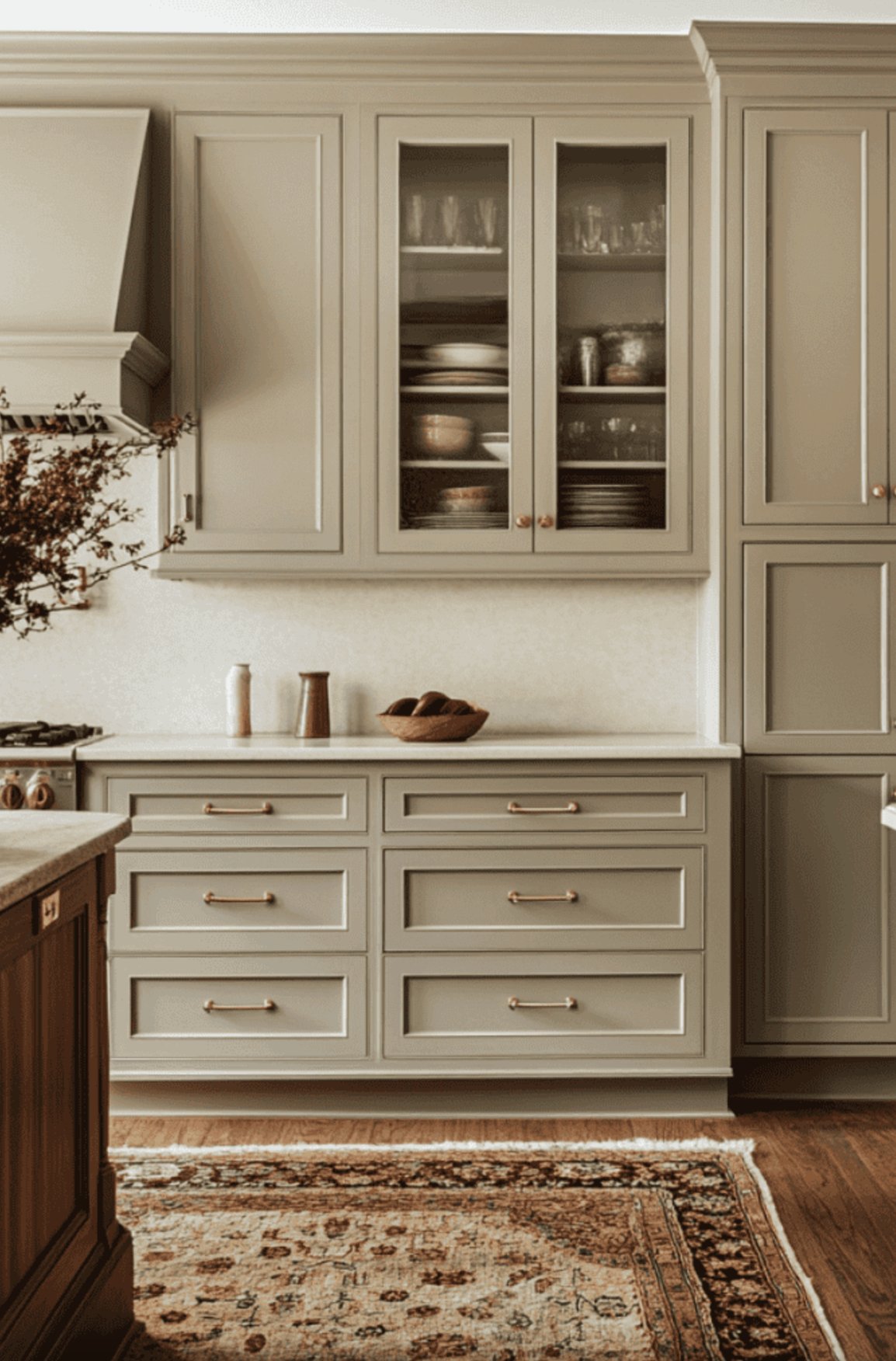
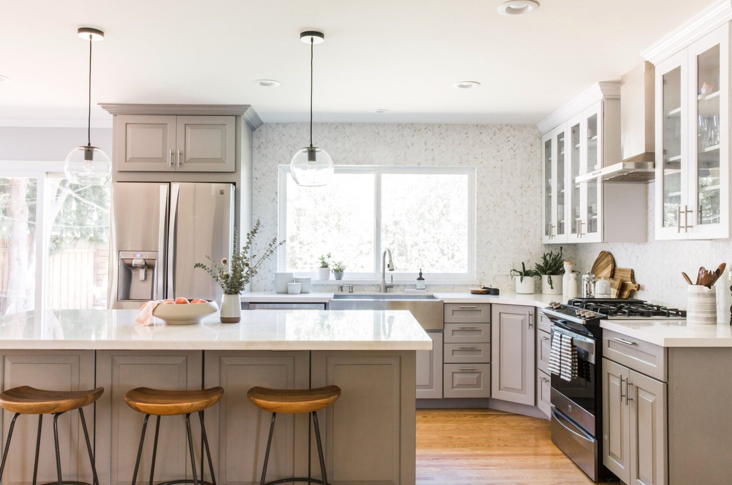
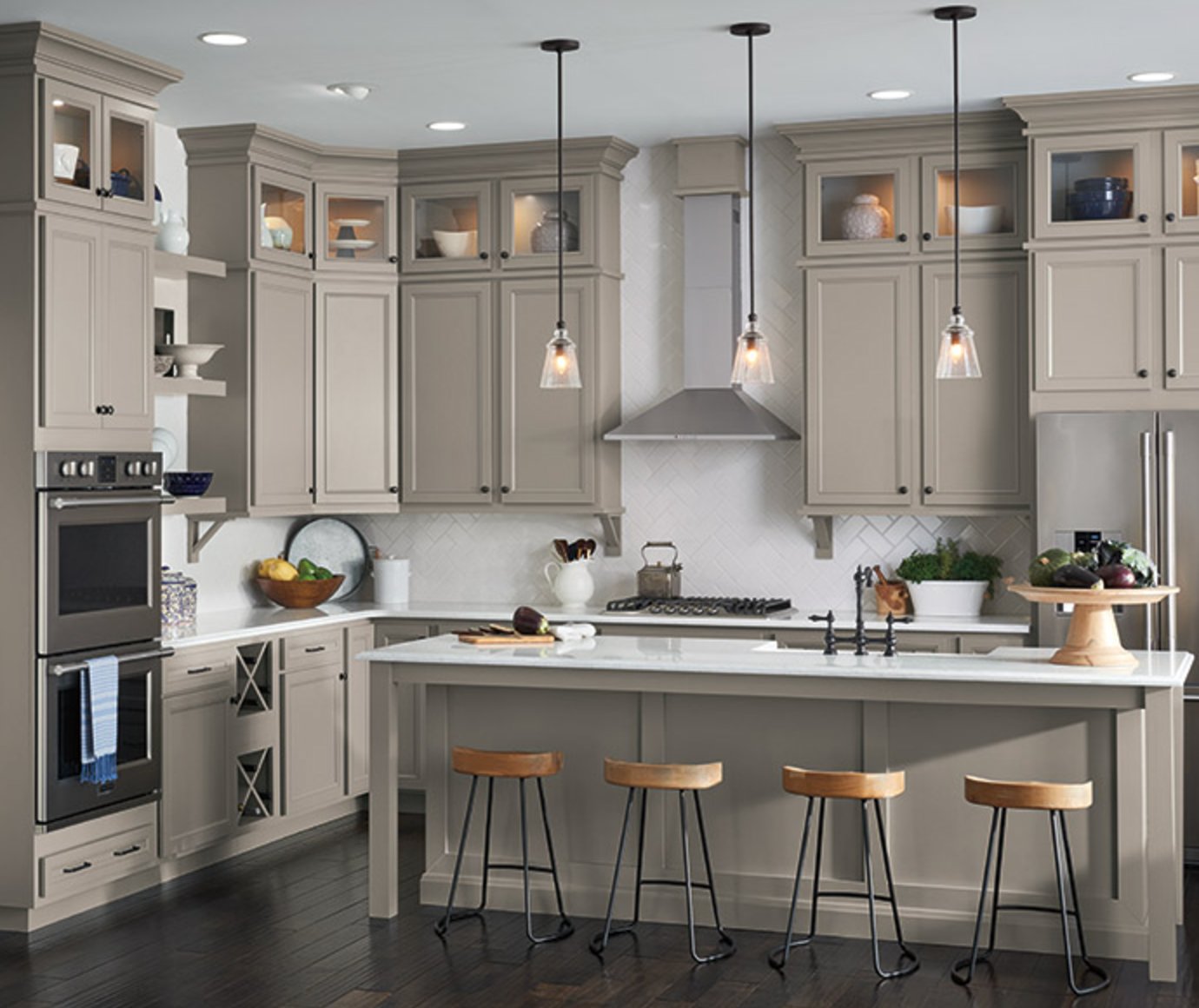
13. Taupe
Let me tell you about taupe – it’s that clever in-between color (not quite gray, not quite beige) that designers can’t get enough of right now. And honestly? I totally get it!
In my kitchen, it creates this amazing cozy-yet-clean vibe. When you pair it with wooden cutting boards and accessories, it just works – creating this wonderfully warm, lived-in feel.
The best thing about taupe? It’s got staying power – I did my kitchen years ago and still love it every single day. If you’re planning a renovation, definitely give this color a serious look!
Paint suggestion:
- Sherwin Williams Mega Greige
- Benjamin Moore Thunder
- Farrow & Ball Elephant’s Breath
14. Gray
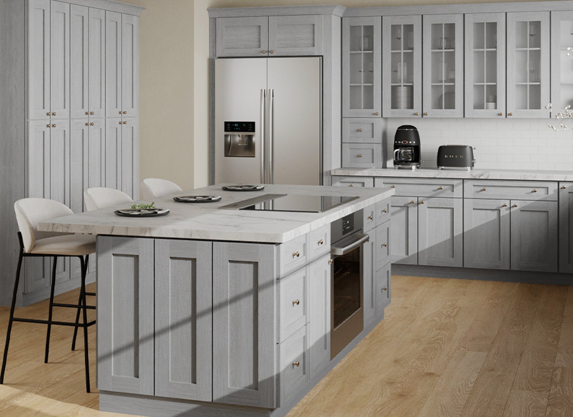
Let’s talk about elegant gray – it’s absolutely fantastic for kitchens! I get excited whenever I see those light gray cabinets that look like they’ve stepped out of a Scandinavian design magazine.
Put it next to a white countertop, and it’s pure magic – clean and fresh without feeling sterile. Add some wooden flooring, and you’ve got this perfect balance of modern style and cozy warmth.
The real beauty of gray? Unlike bolder colors, you won’t get tired of it after a couple of years. And if you’re feeling fancy, add some glass-front upper cabinets – they make the space feel bigger and give you a chance to show off your pretty dishes!
Paint suggestion:
- Farrow & Ball Ammonite
- Sherwin Williams Repose Gray
- Benjamin Moore Gray Owl
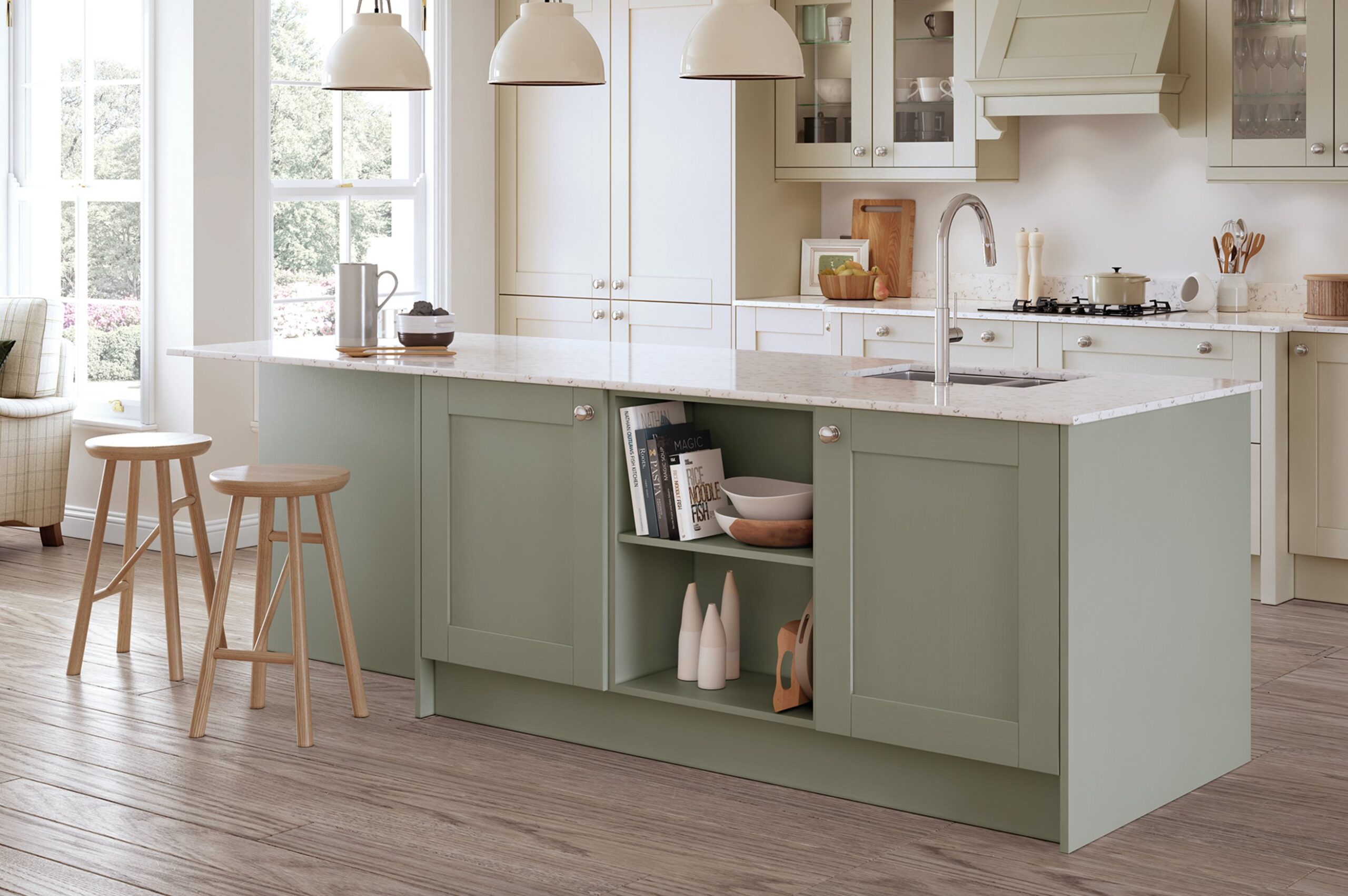
15. Two-Tone Combinations
Two-tone cabinet combinations are a game-changer when it comes to kitchen design!
This contrasting approach is super smart – darker lower cabinets ground the space, while lighter upper cabinets make your ceiling feel higher. It’s like visual magic!
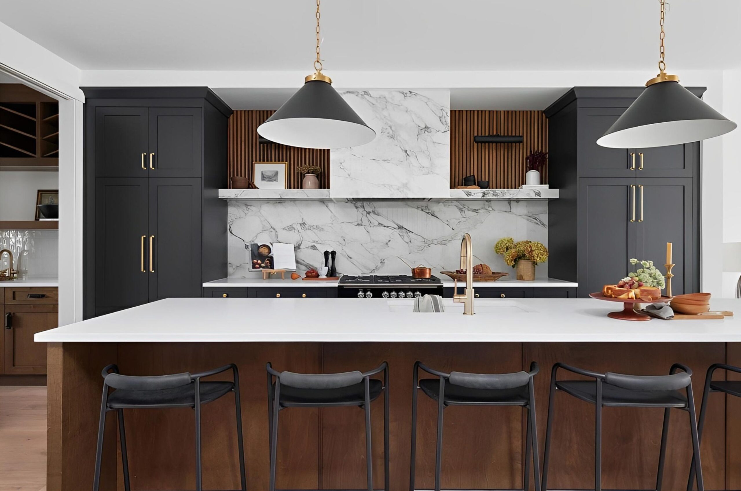
Two-tone kitchens look fantastic whether your space is tiny or huge – it’s all about getting the balance right. The sweet spot is usually a 60/40 split, with your main color taking up the bigger share.