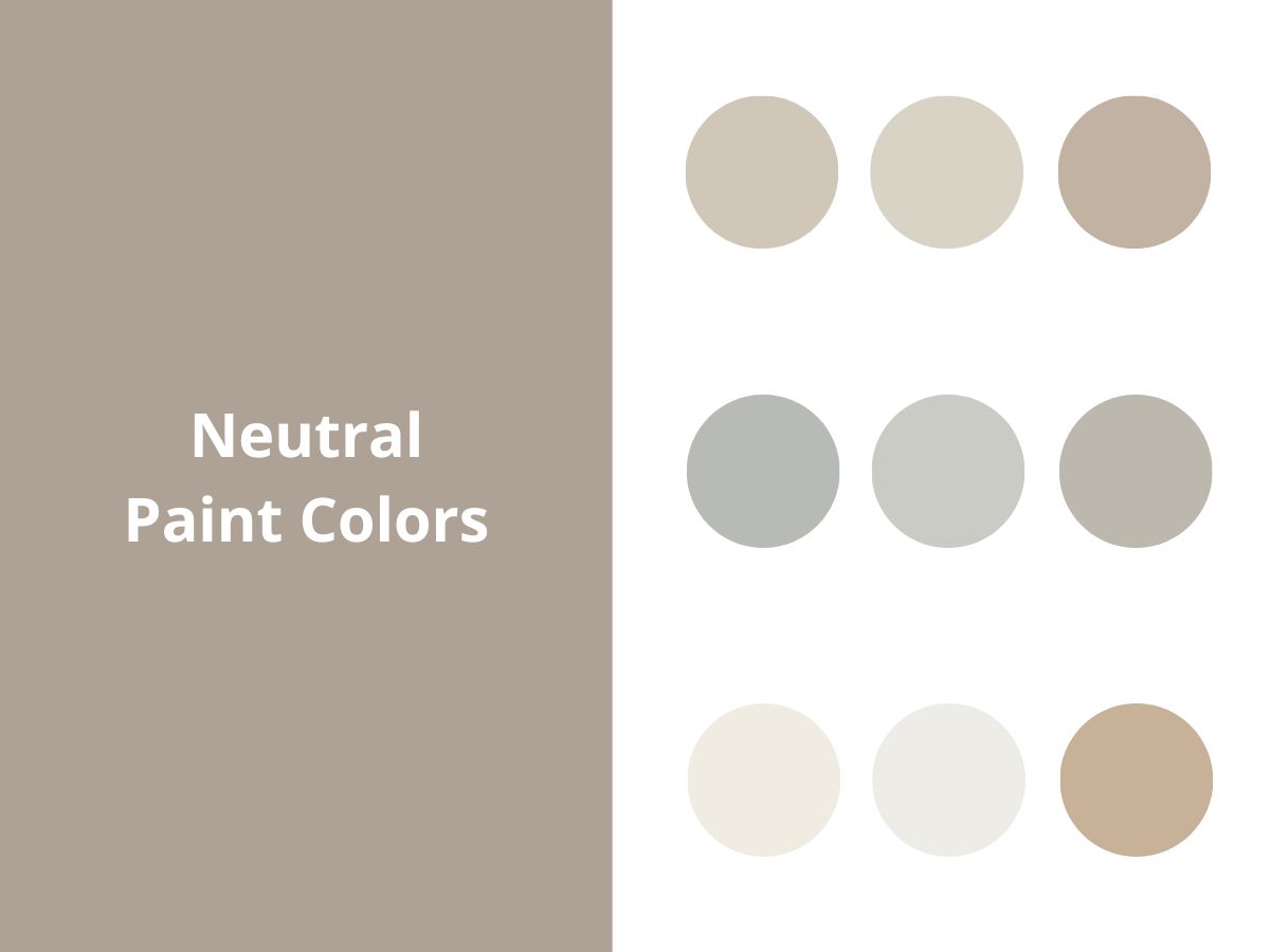
Neutral paint colors have become one of the biggest interior design trends in the past 5-10 years, becoming the go-to foundation for most modern homes.
These shades create a calm vibe and work perfectly as a backdrop for any accents – whether you’re adding colorful decor or natural textures. But here’s the thing: choosing neutrals requires special attention – pick the wrong undertone, and it will distort the whole room’s feel.
In this article, I’ll walk you through the best neutral colors with TONS of real-home examples and share some hands-on tips for working with neutral shades.
Why Neutral Colors Work
I’ve come to realize over the years that neutral colors are my preferred choice for creating lasting interiors. They work as a perfect canvas for any home style, whether you’re going for minimalist or boho chic.
Still on the fence about using neutral colors in your project? Here are three major pros of these paints:
1) Versatility and longevity. Neutral colors are a fantastic backdrop for countless styles and let you easily switch up the look with different accessories.
Unlike bold colors that can feel overwhelming, neutrals are easy on the eyes and never really go out of style. They’re basically the little black dress of interior design.
2) Space-enhancing skills. Light neutral shades make rooms feel bigger and really make the most of natural light.
I’ve seen it time and time again – even the smallest rooms feel more open and airy with the right neutral paint.
3) Better resale potential. A neutral color palette makes selling your home much easier. In fact, 81% of real estate professionals say warm neutrals are the way to go when prepping a home for sale.
House hunters can better picture their own stuff in a space with neutral walls, and that could make all the difference in closing a sale.
Best Neutral Paint Colors for 2025
I divide neutral colors into five main groups: true, warm, cool, white, and earth-toned neutrals. Let’s take a closer look at what makes each category special.
Quick heads up: keep in mind that the same shade can fit into several categories, depending on your lighting and the colors around it.
True Neutrals (Pure Grays)
Pure grays create an excellent foundation for any interior and can work with pretty much any style, whether it’s an industrial look or Scandinavian minimalism.
These shades are quite peculiar throughout the day – they look cooler in the morning light and warm up by evening. Pure grays look fantastic paired with black metal fixtures, white marble, and natural wood elements.
Think of these colors as your quiet backdrop – they won’t steal the show but will beautifully support everything else.
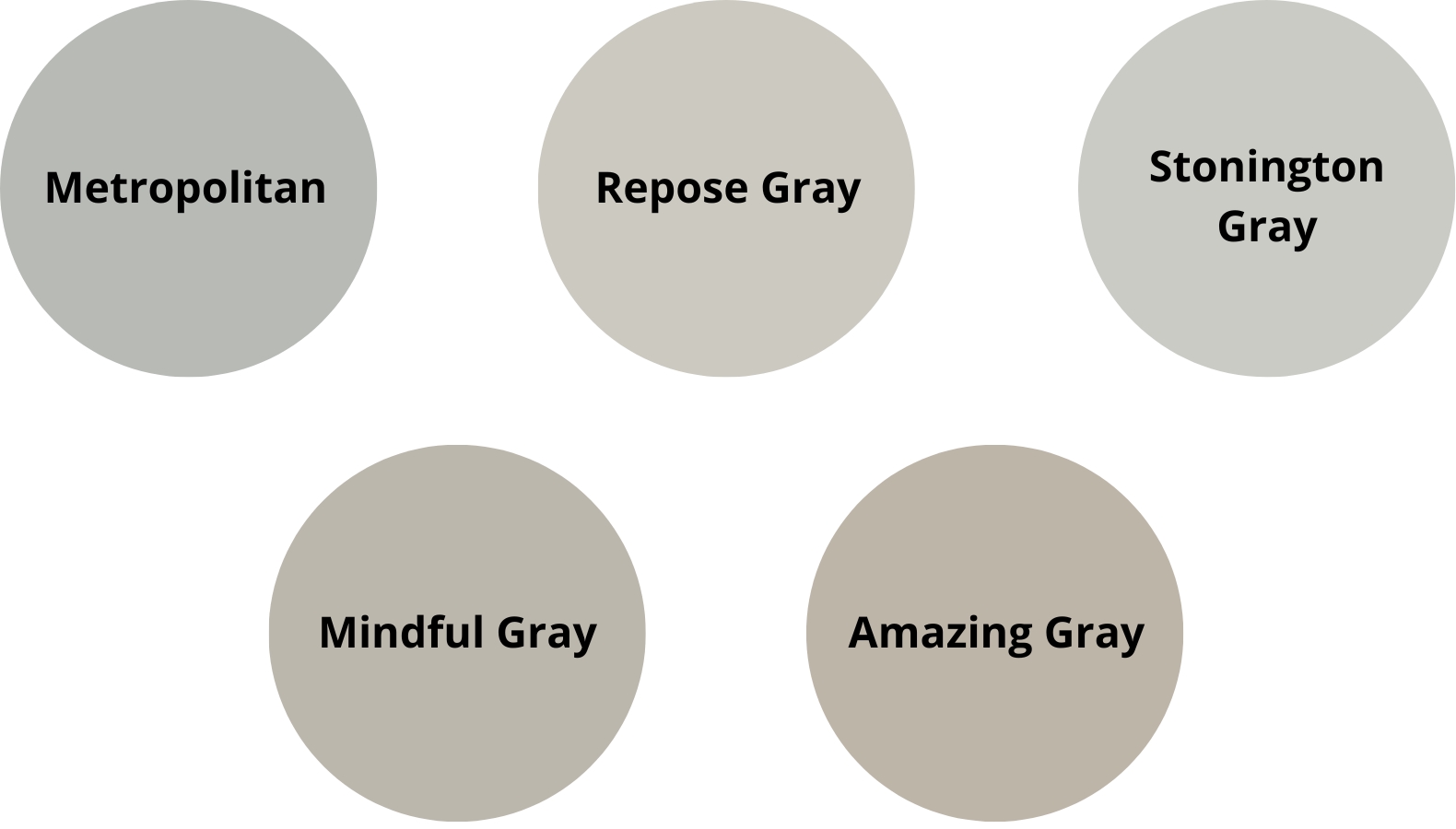
Recommended Colors:
- BM Metropolitan AF-690
- SW Repose Gray 7015
- BM Stonington Gray HC-170
- SW Mindful Gray 7016
- SW Amazing Gray 7044
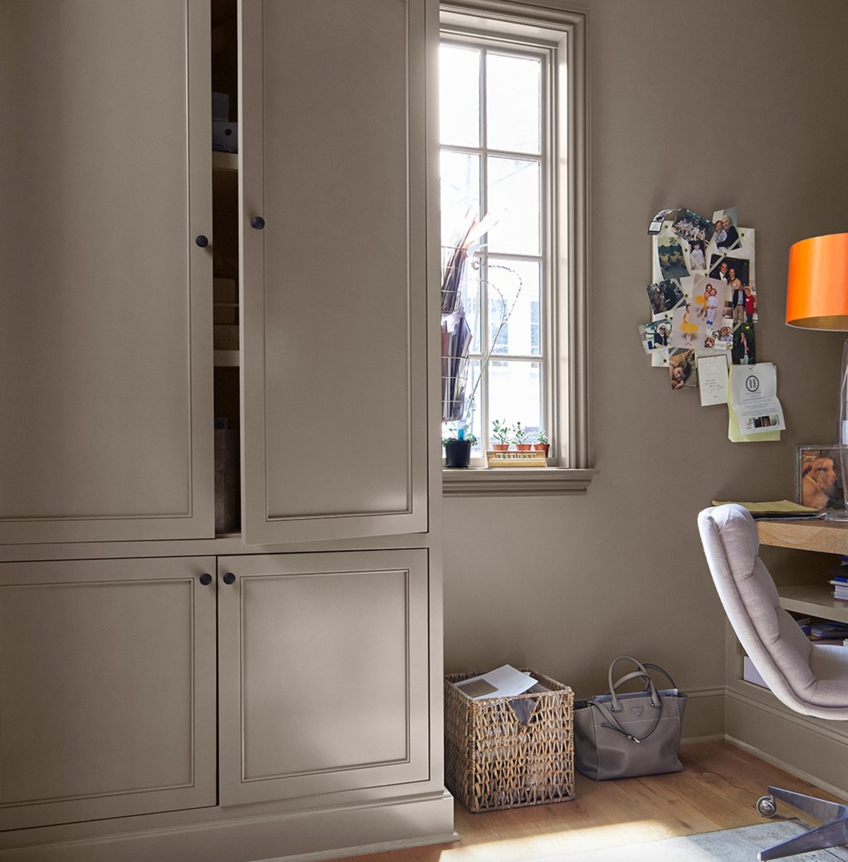
Warm Neutrals
Warm neutrals bring that cozy atmosphere to your home without going overboard on warmth. These colors blend gray and beige (what designers often call “greige”) to create a soft vibe. If you’re more into beiges only, I’ve put together a complete guide on those!
They’re especially great for north-facing rooms where you must compensate for limited natural light.
Warm neutrals play well with textured fabrics, woven furniture pieces, and matte brass finishes.
I especially love how these shades look when you add deep brown or terracotta accents to the mix.
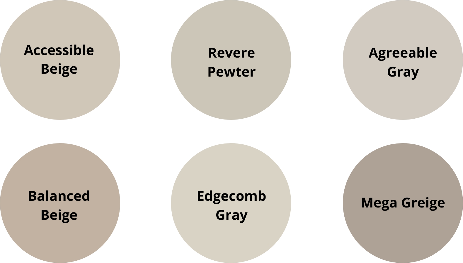
Recommended Colors:
- SW Accessible Beige 7036
- BM Revere Pewter HC-172
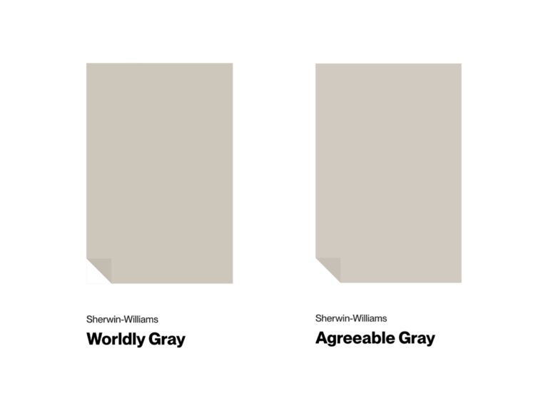
- SW Agreeable Gray 7029
- SW Balanced Beige 7037
- BM Edgecomb Gray HC-173
- SW Mega Greige 7031
Cool Neutrals
Cool neutrals have a lovely subtle blue undertone. Don’t they remind you a bit of natural stone?
They’re a good choice for south-facing rooms, where they help make spaces feel bigger and fresher.
Natural light brings out their bluish notes, while warm artificial lighting softens the shades.
Cool neutral colors look stunning with chrome details, glass, and light marble. To keep things balanced, add warm elements like linen curtains or wooden furniture pieces.
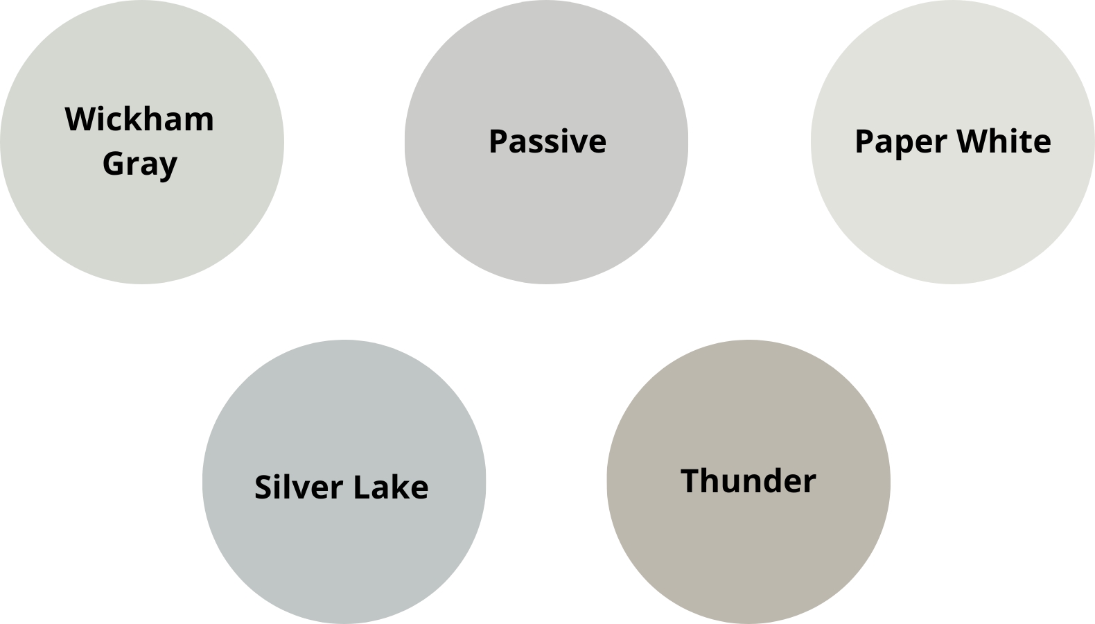
Recommended Colors:
- BM Wickham Gray HC-171
- SW Passive 7064
- BM Paper White OC-55
- BM Silver Lake 1598
- BM Thunder AF-685
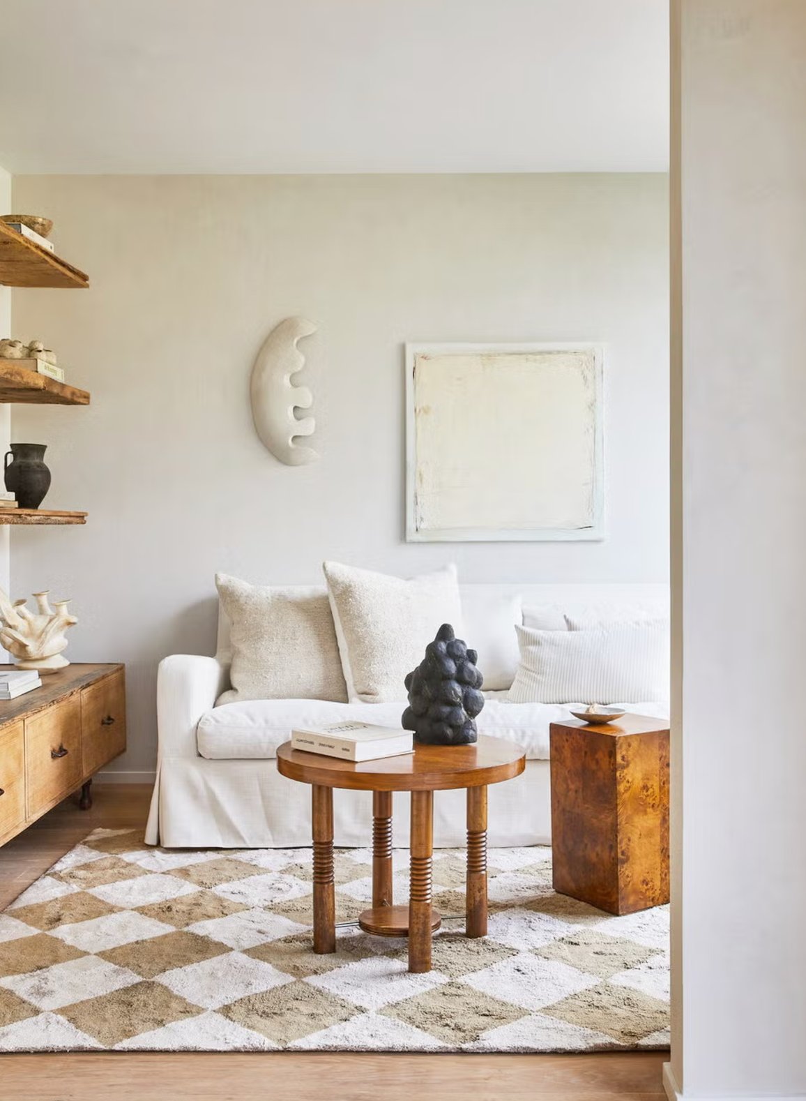
White Neutrals
White neutrals are another great foundation for pretty much any interior style. They help spaces feel open and shine in rooms with lots of natural light.
In the morning, they pick up this beautiful golden glow, while evening light gives them the softest hint of purple.
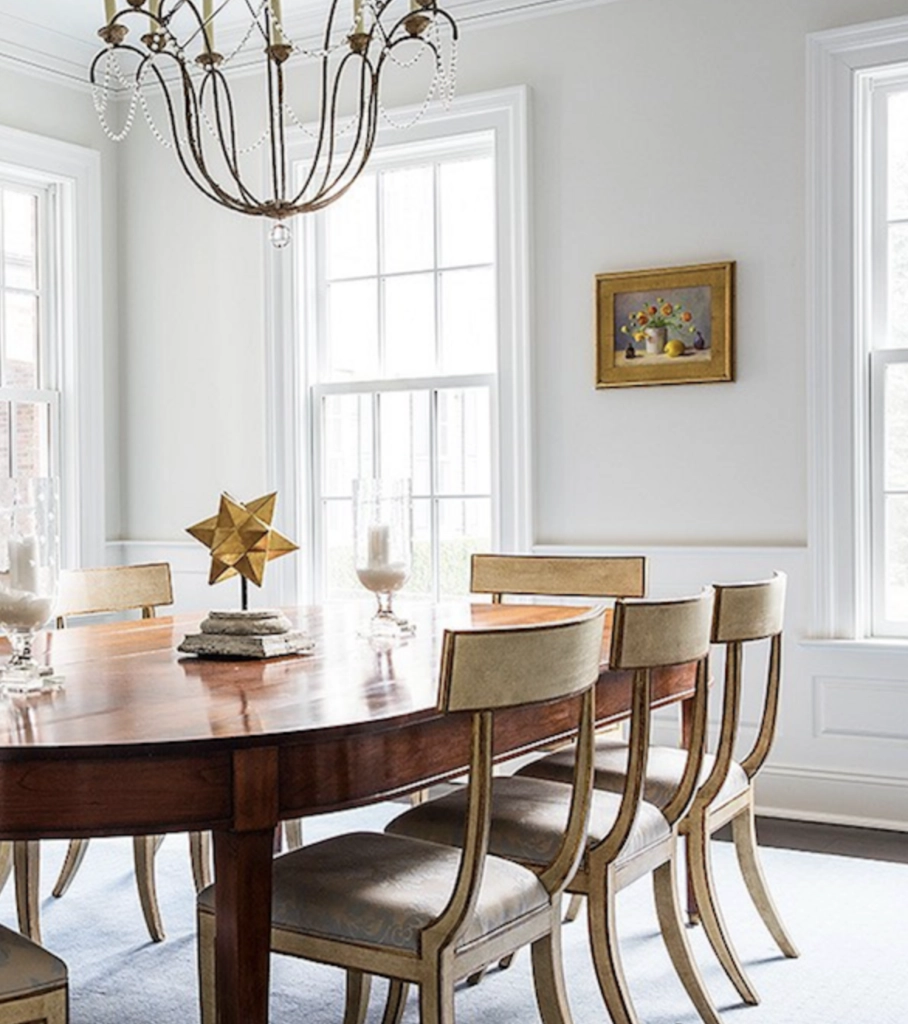
They make the perfect backdrop for artwork and large mirrors. Try mixing in some natural wood and textured fabrics to add warmth and interest.
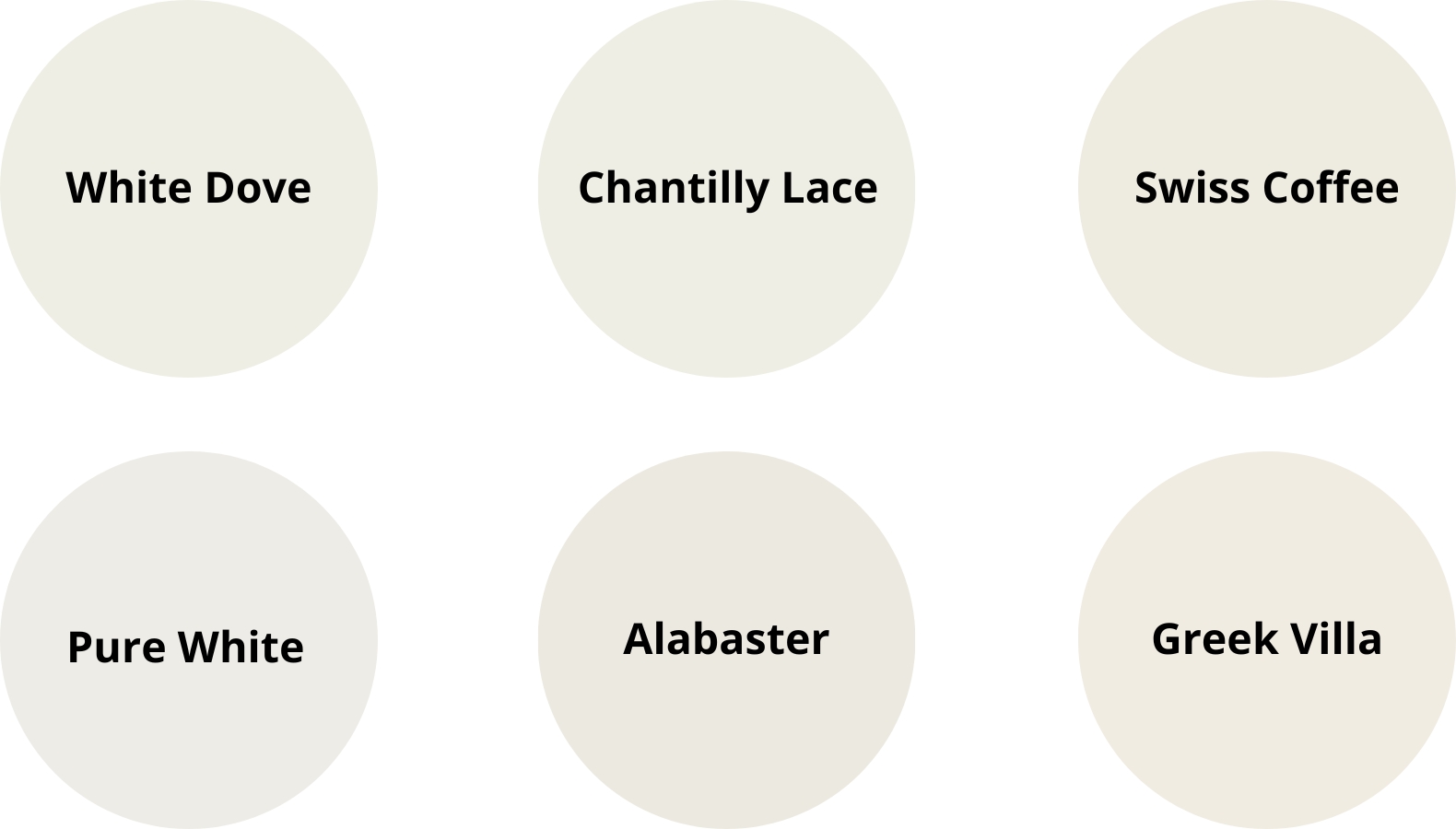
Recommended Colors:
- BM White Dove OC-17
- BM Chantilly Lace OC-65
- BM Swiss Coffee OC-45
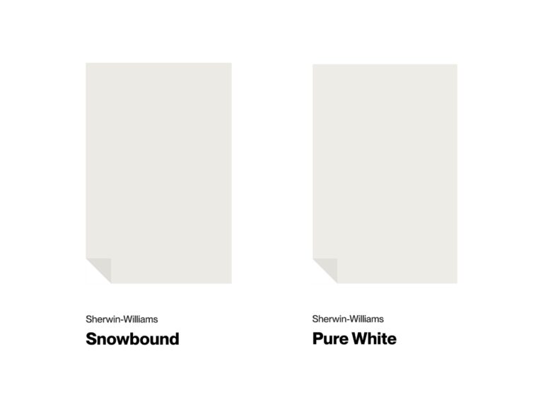
- SW Pure White 7005
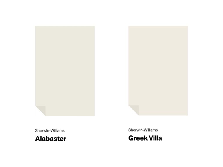
- SW Alabaster 7008
- SW Greek Villa 7551
Earth-Toned Neutrals
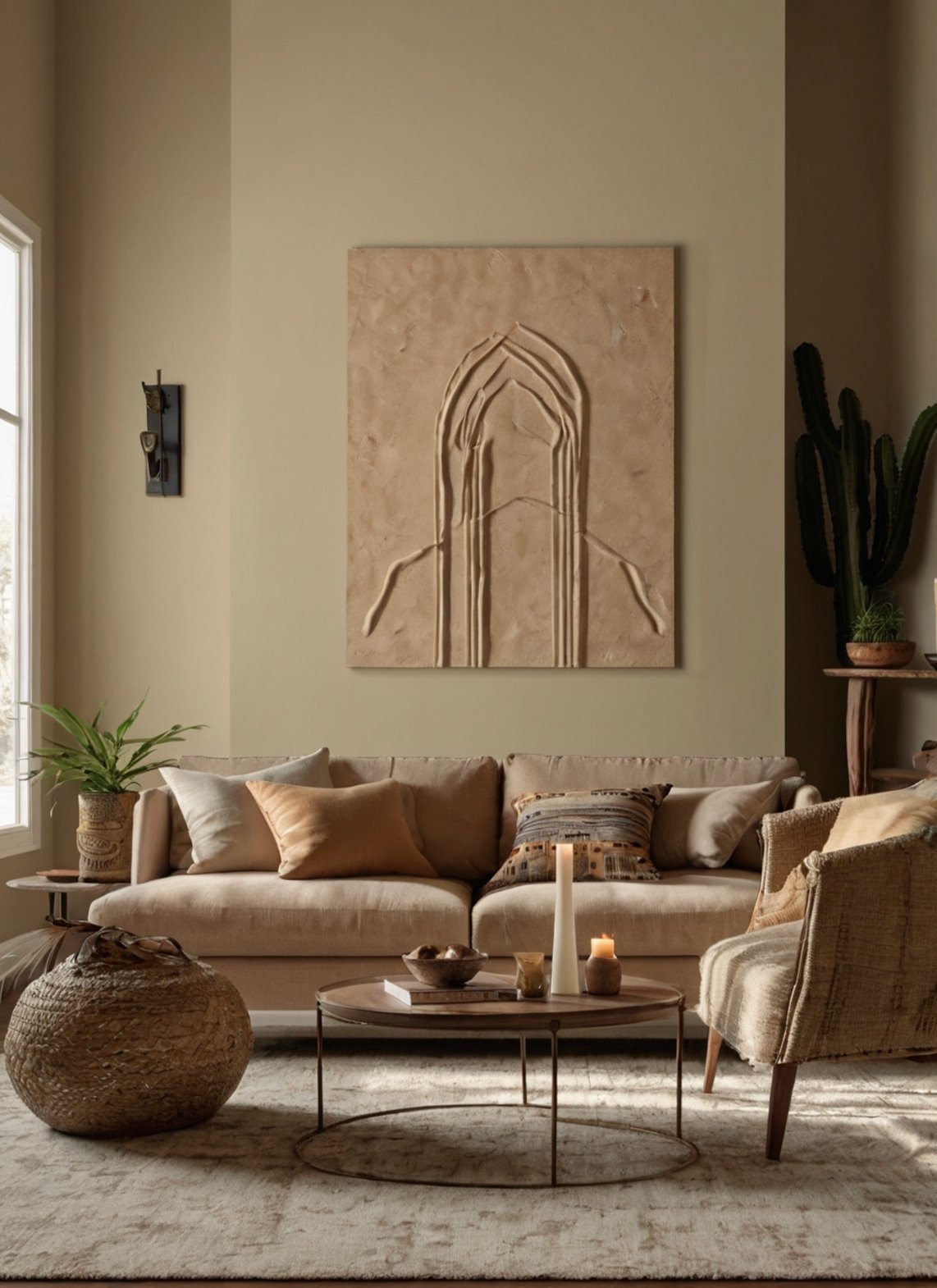
Earth tones can bring a natural warmth into your home.
In natural light, these colors show off rich undertones from golden to terracotta. They keep their depth and create a cozy space even on cloudy days.
If you have a south-facing room, choose lighter shades that will not feel too dark when the sun is bright.
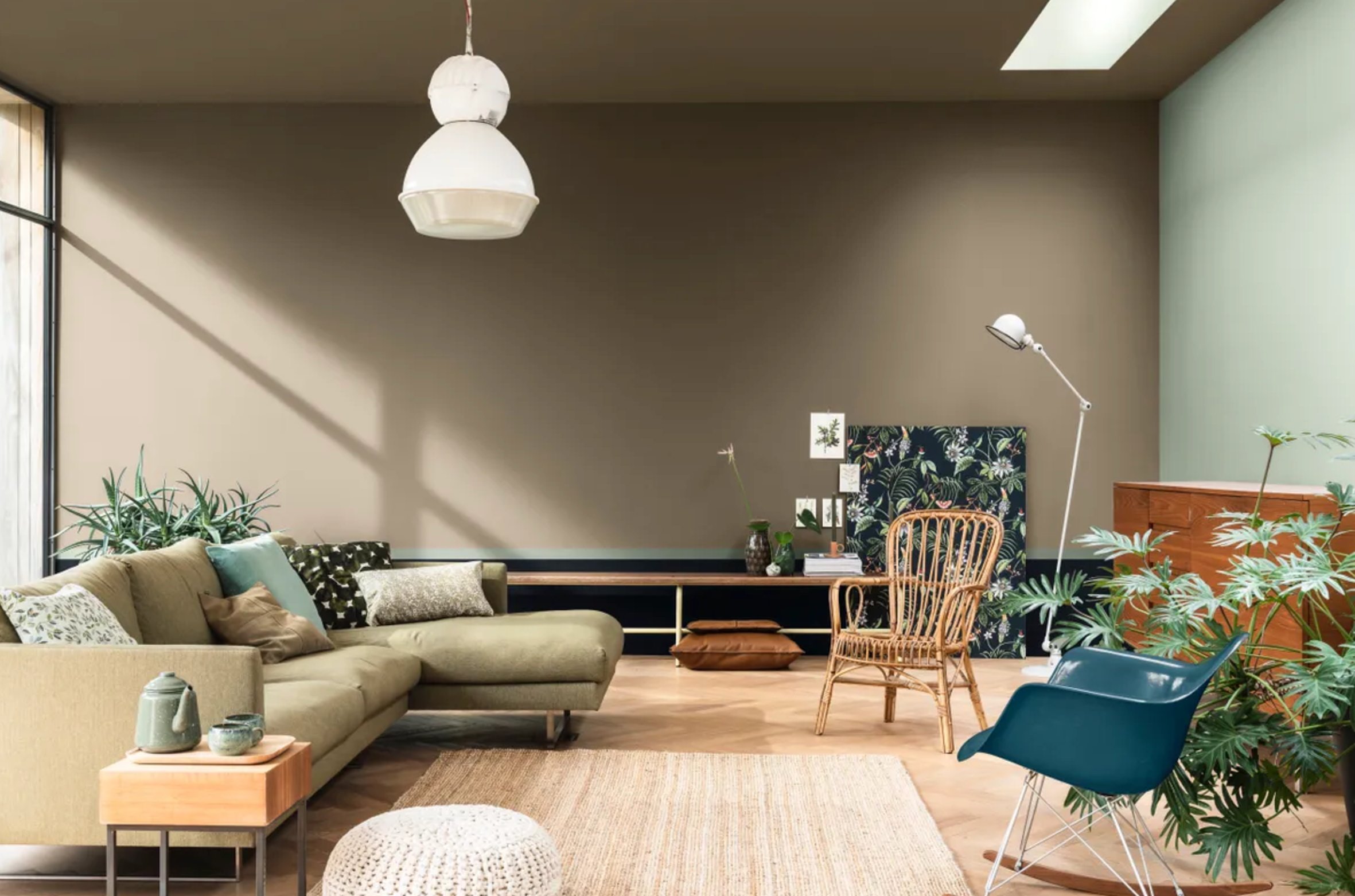
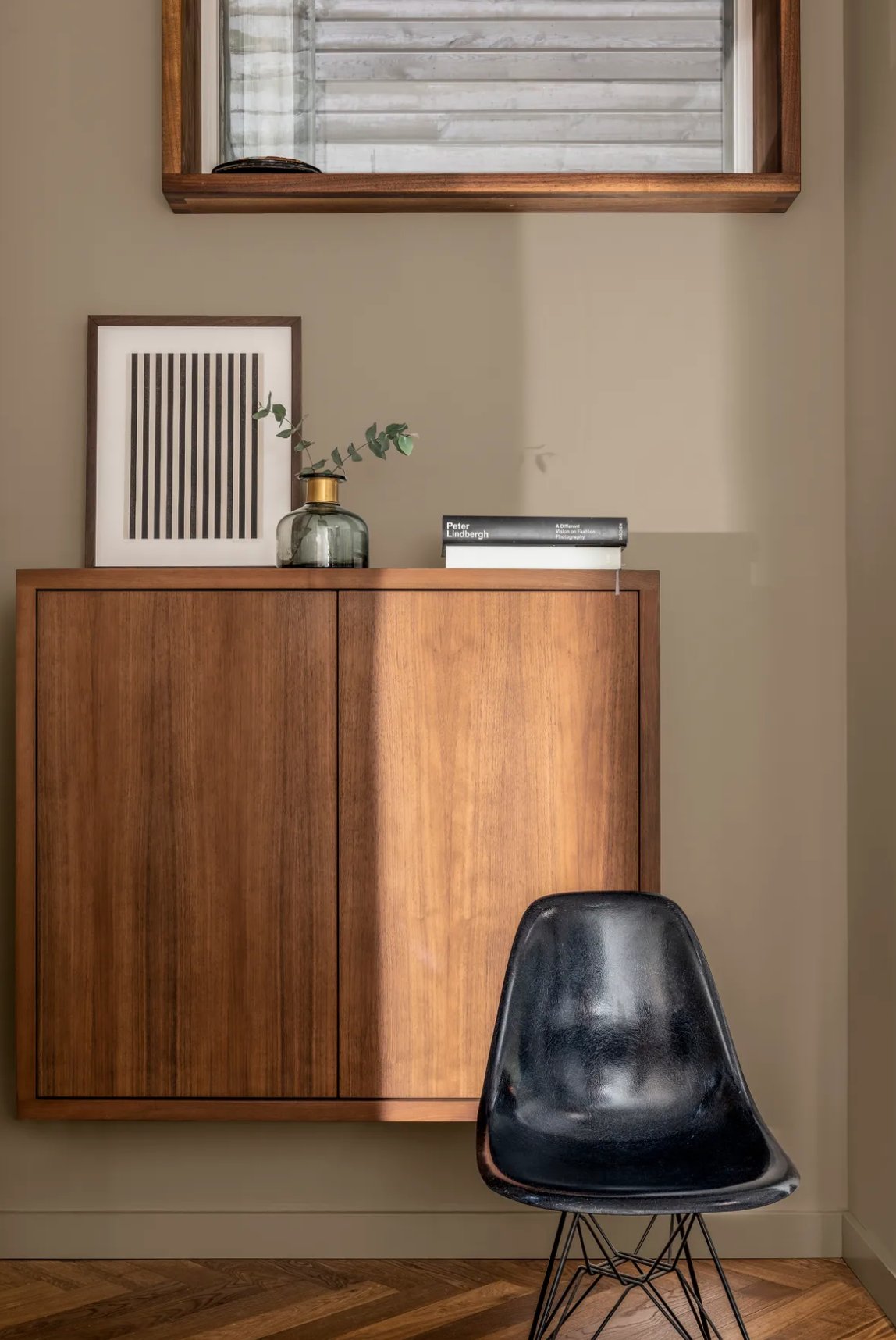
Earth tones look fantastic with natural materials – think woven rugs, linen drapes, and pottery pieces.
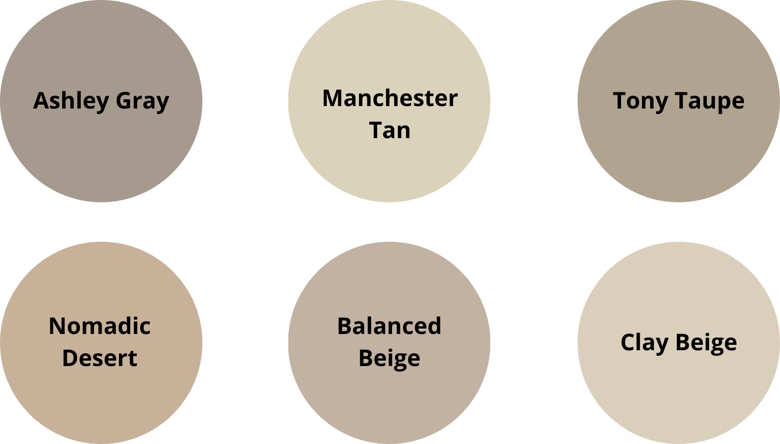
Recommended Colors:
- BM Ashley Gray HC-87
- BM Manchester Tan HC-81
- SW Tony Taupe 7038
- SW Nomadic Desert 6107
- SW Balanced Beige 7037
- BM Clay Beige OC-11
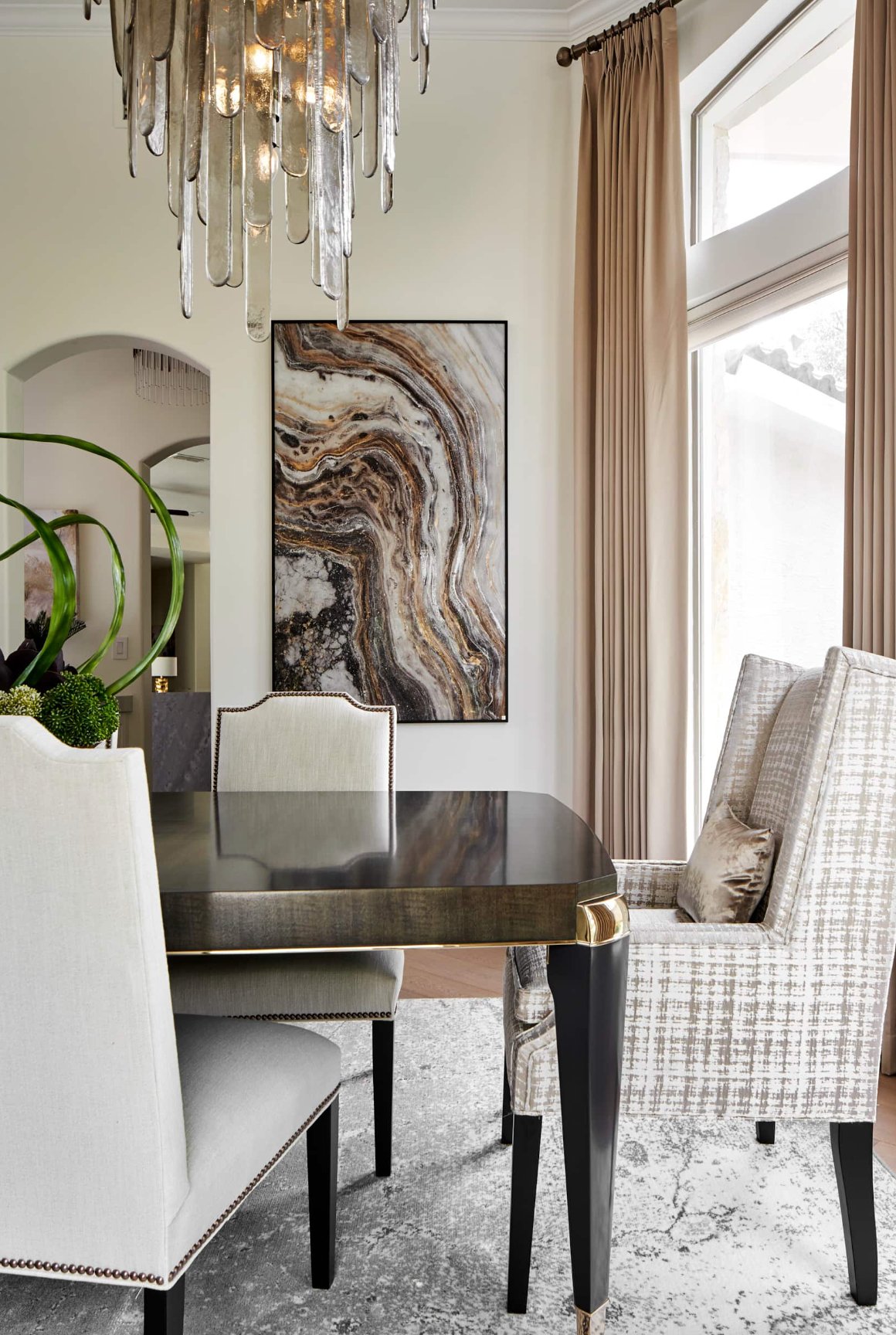
Best Neutrals by Room
We’ve looked at thirty different neutrals – from warm to cool – now let’s see how to use them in different rooms!
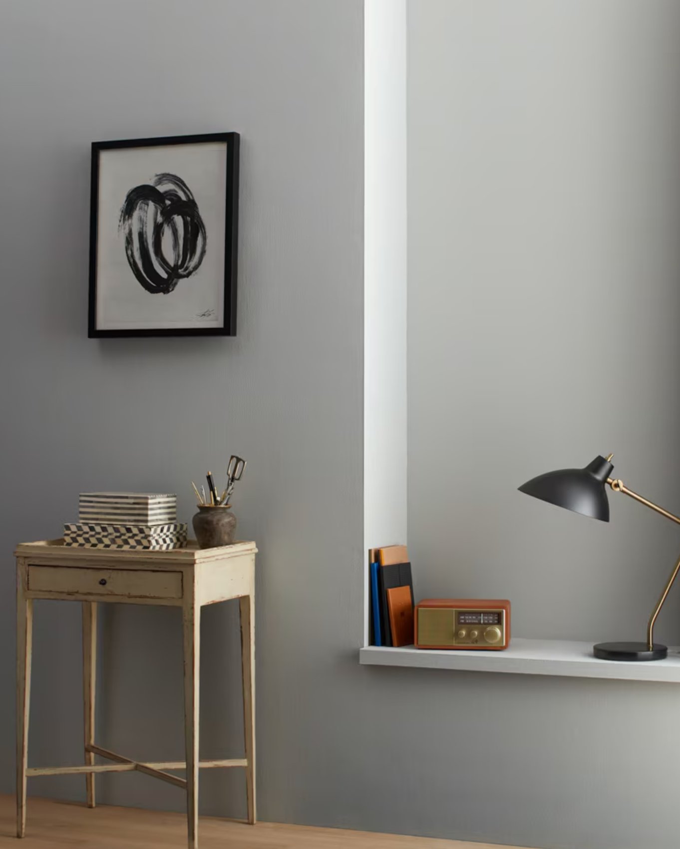
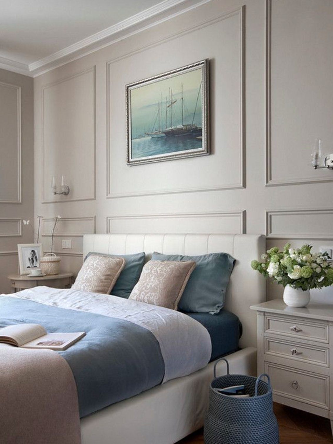
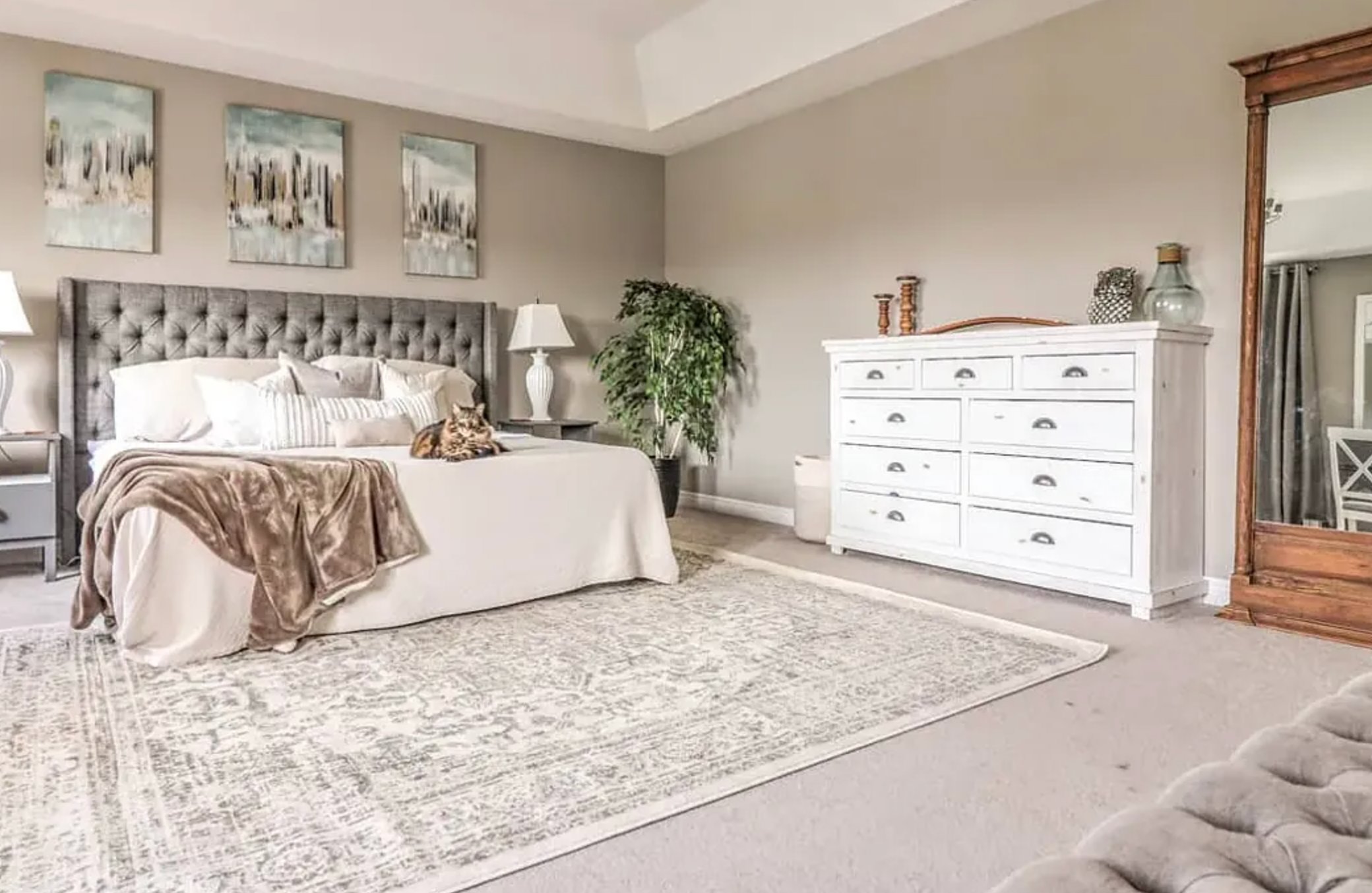
Bedrooms
For bedrooms, you want calming colors that help you unwind. Skip bright white on the walls – it can feel too clinical and energizing.

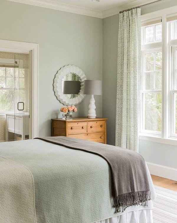
Benjamin Moore’s Quiet Moments, a soft blue-gray, can help you create a peaceful vibe, especially with white bedding.

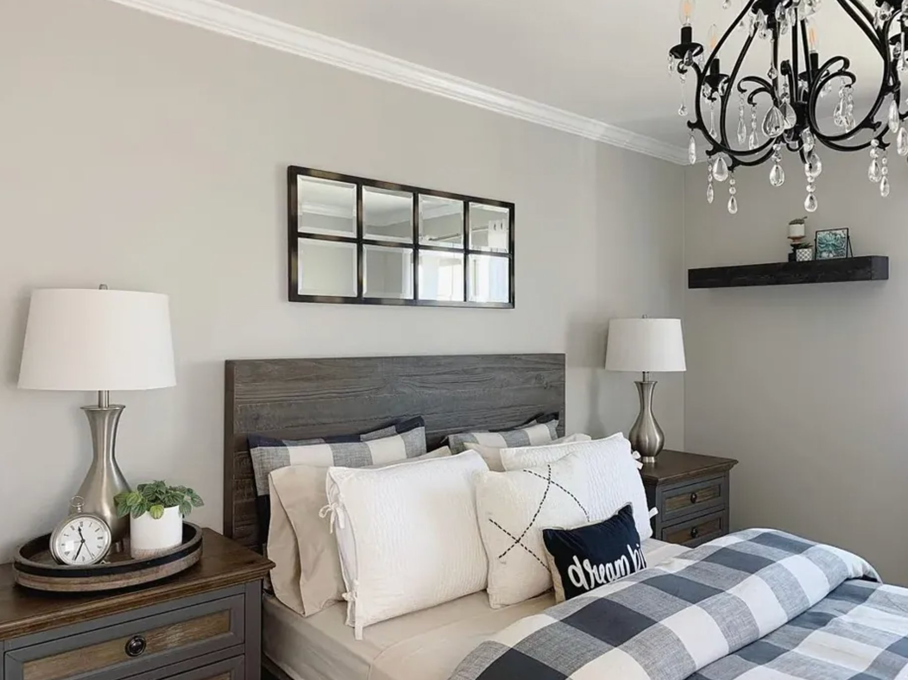
Sherwin-Williams Agreeable Gray makes a perfect backdrop that works with any accent colors without being overwhelming.
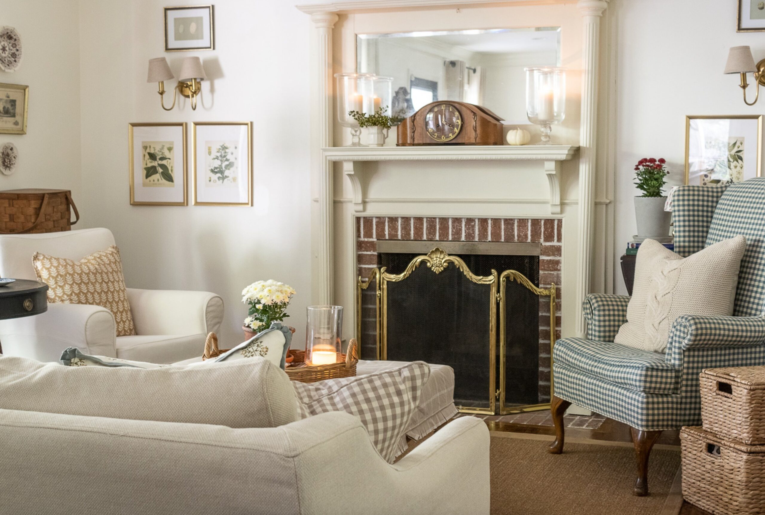
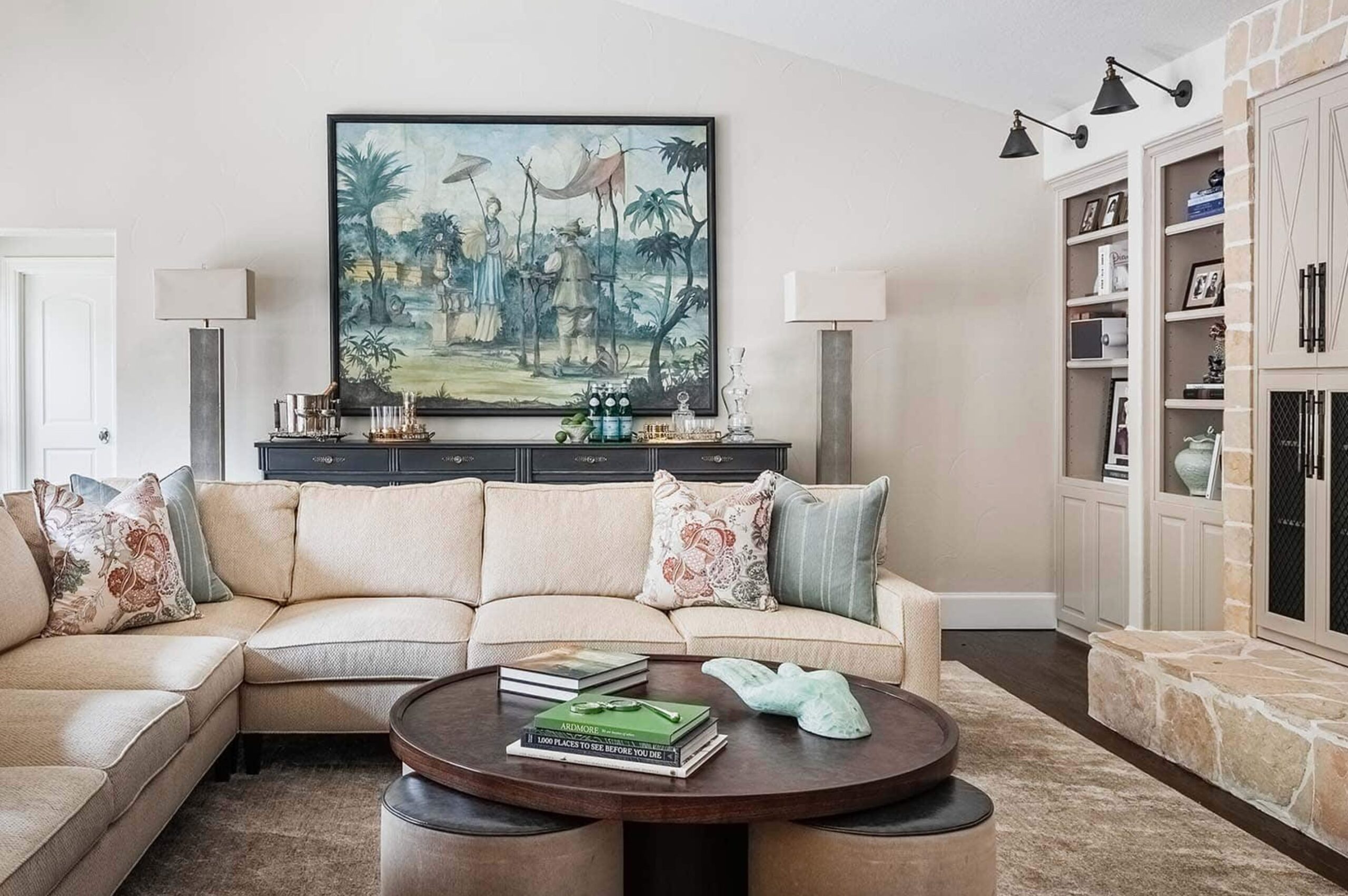
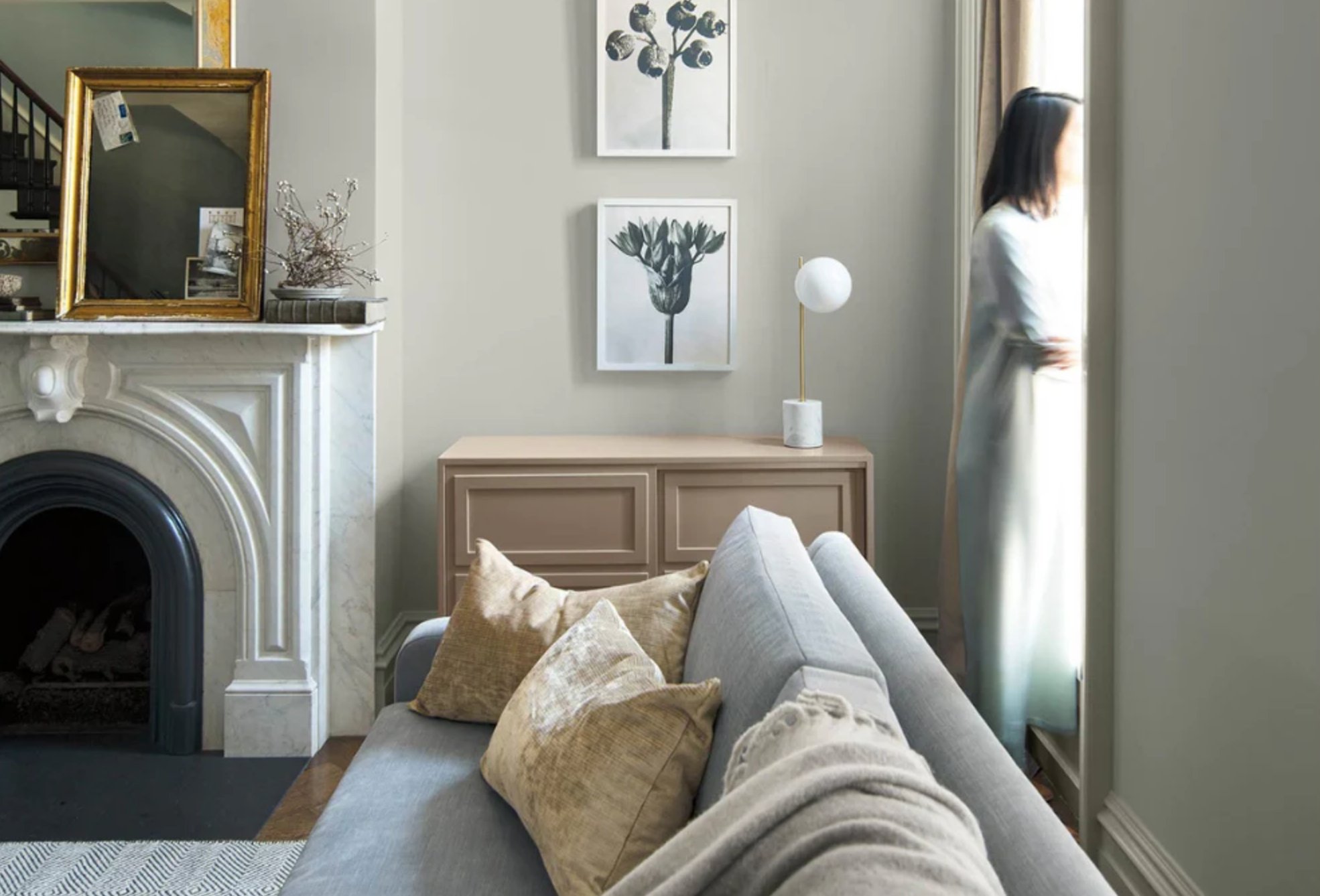
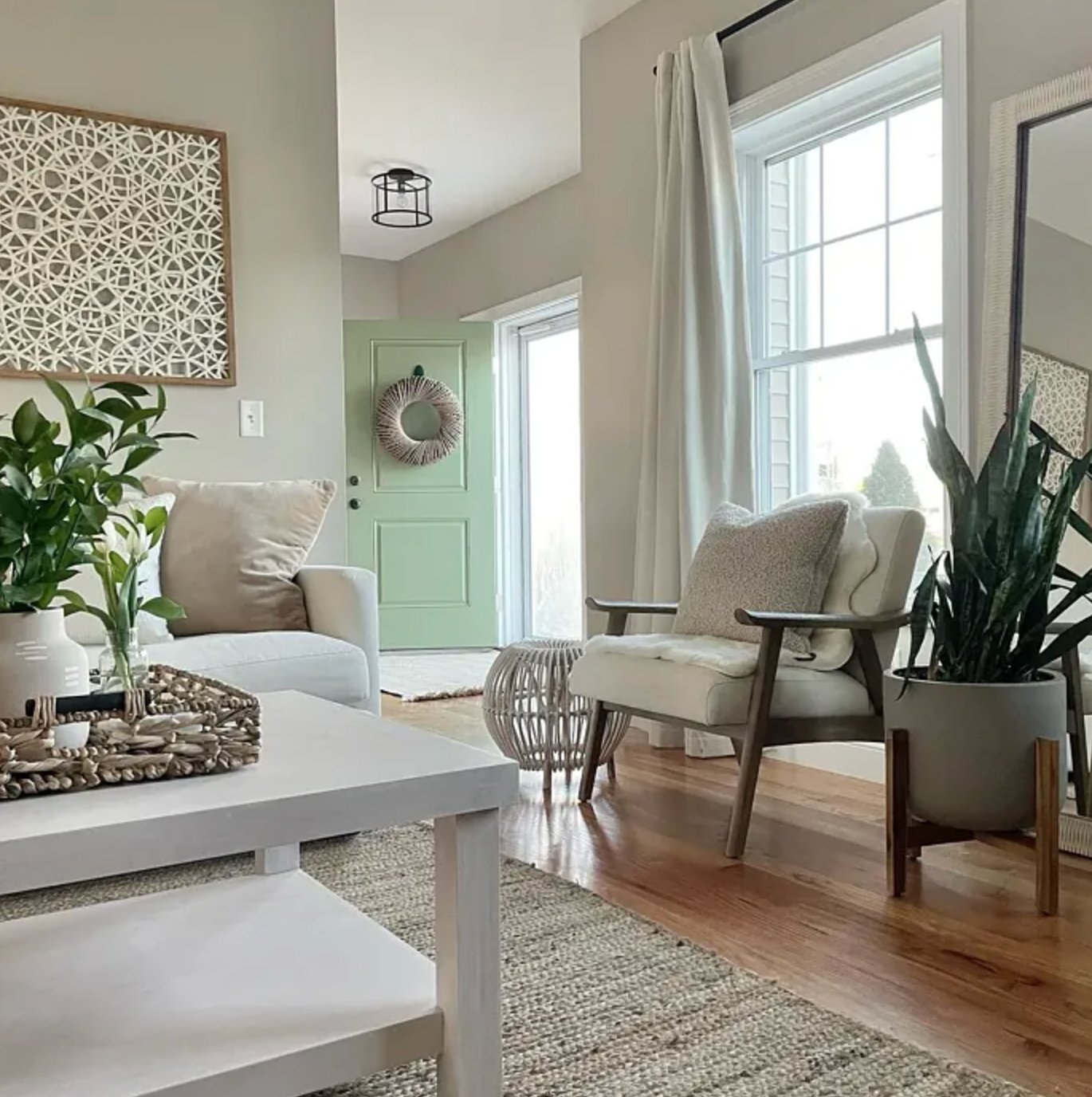
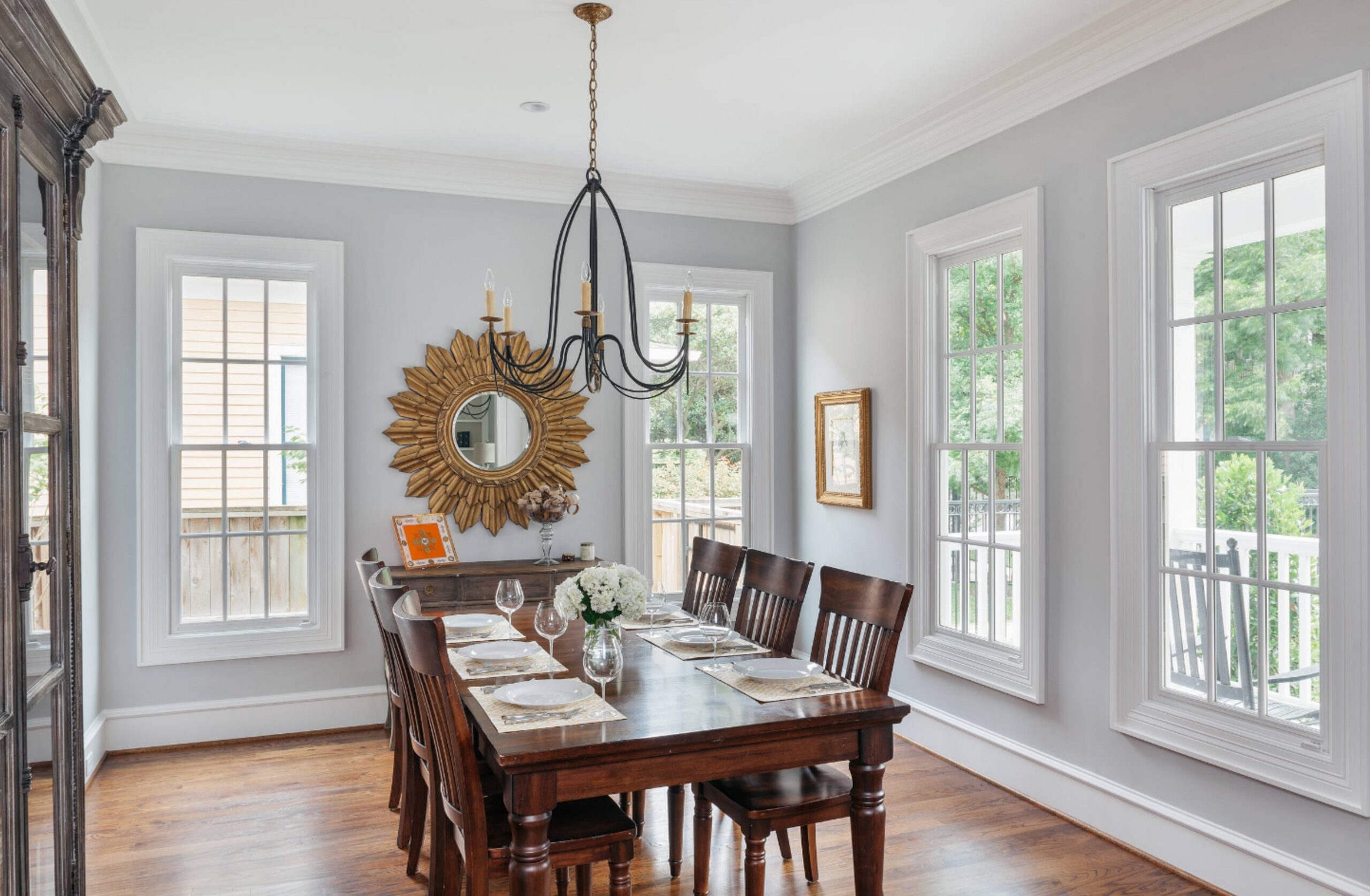
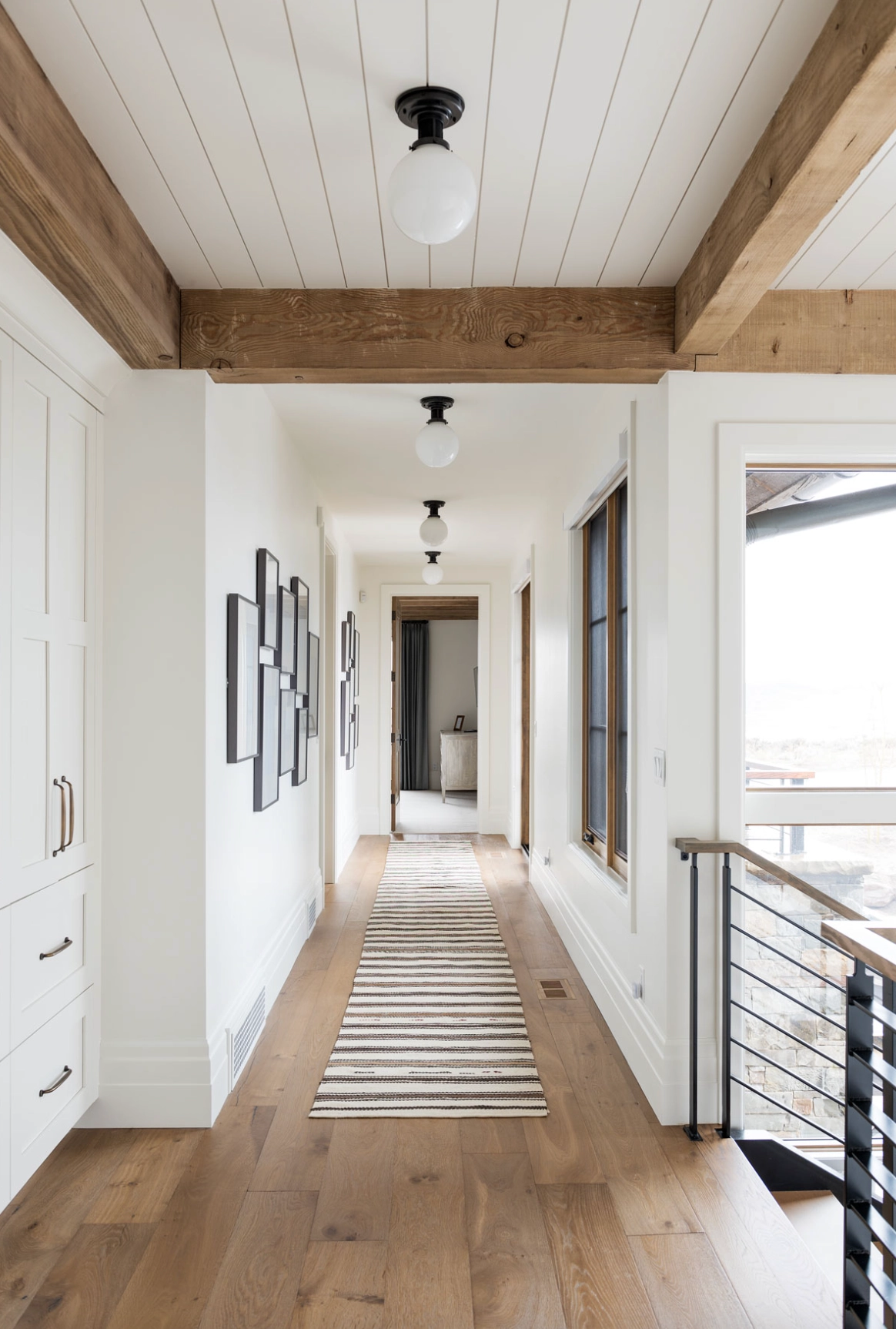
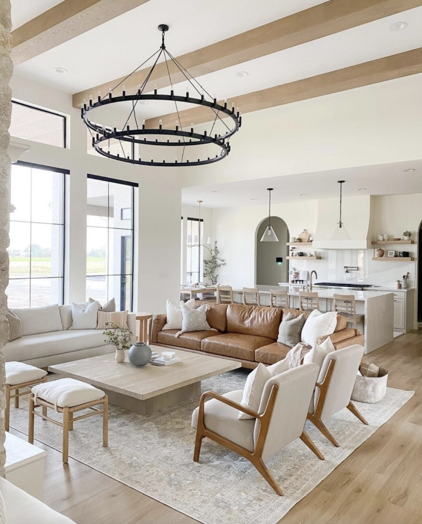
Living Rooms
Living rooms need flexible colors that look good in any light.

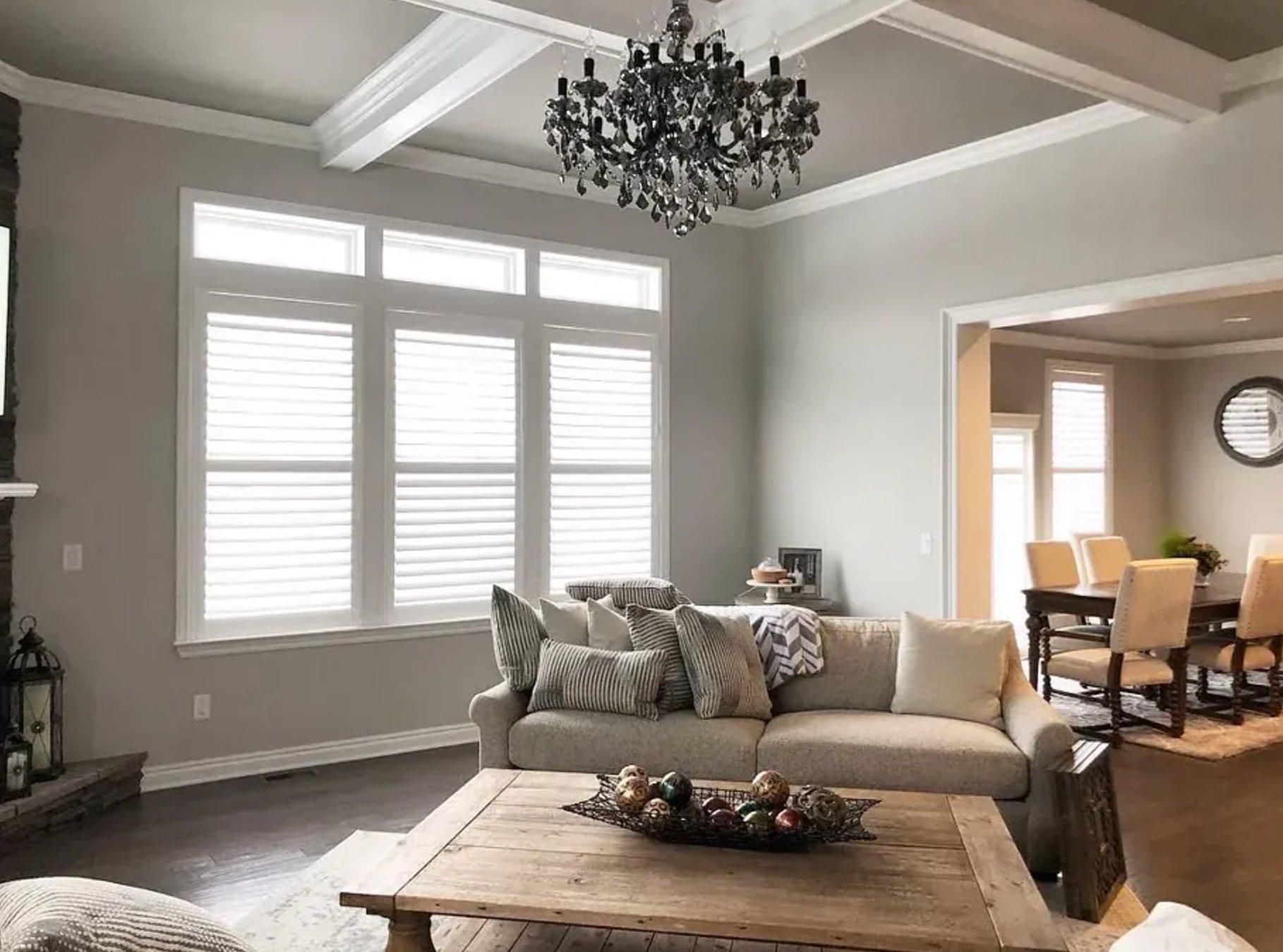
Sherwin-Williams Repose Gray is a warm gray that looks great in both natural and artificial light throughout the day.

Farrow & Ball’s Skimming Stone creates a welcoming feel with its warm undertones.
Both colors work beautifully with wooden furniture and make the artwork pop.
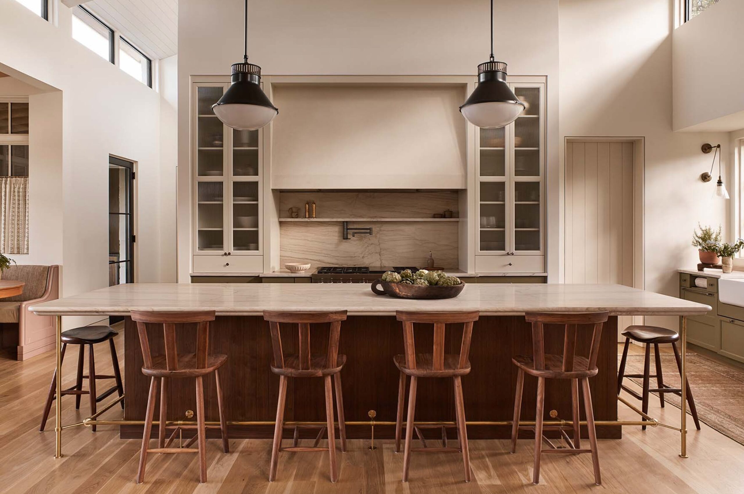
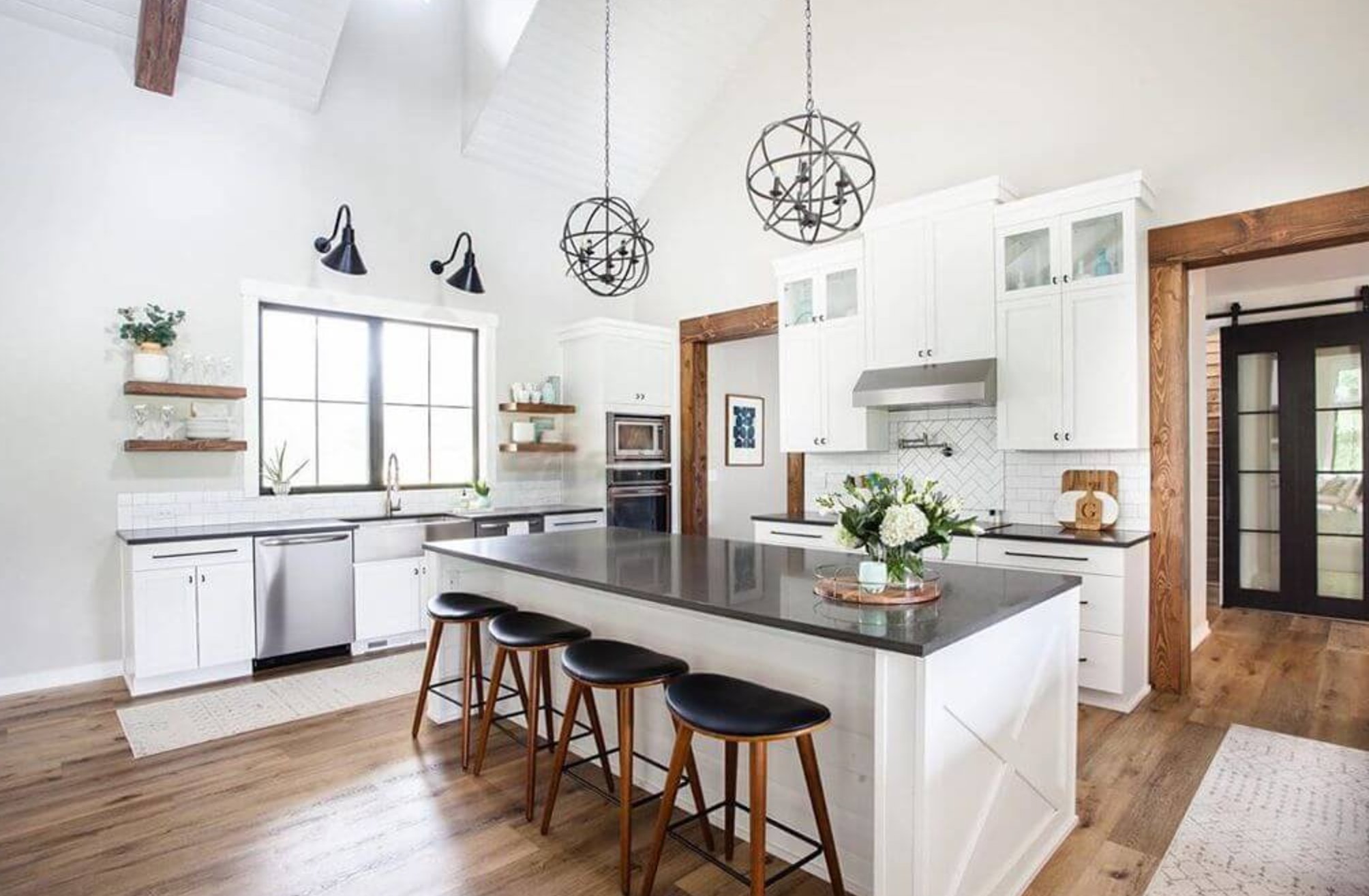
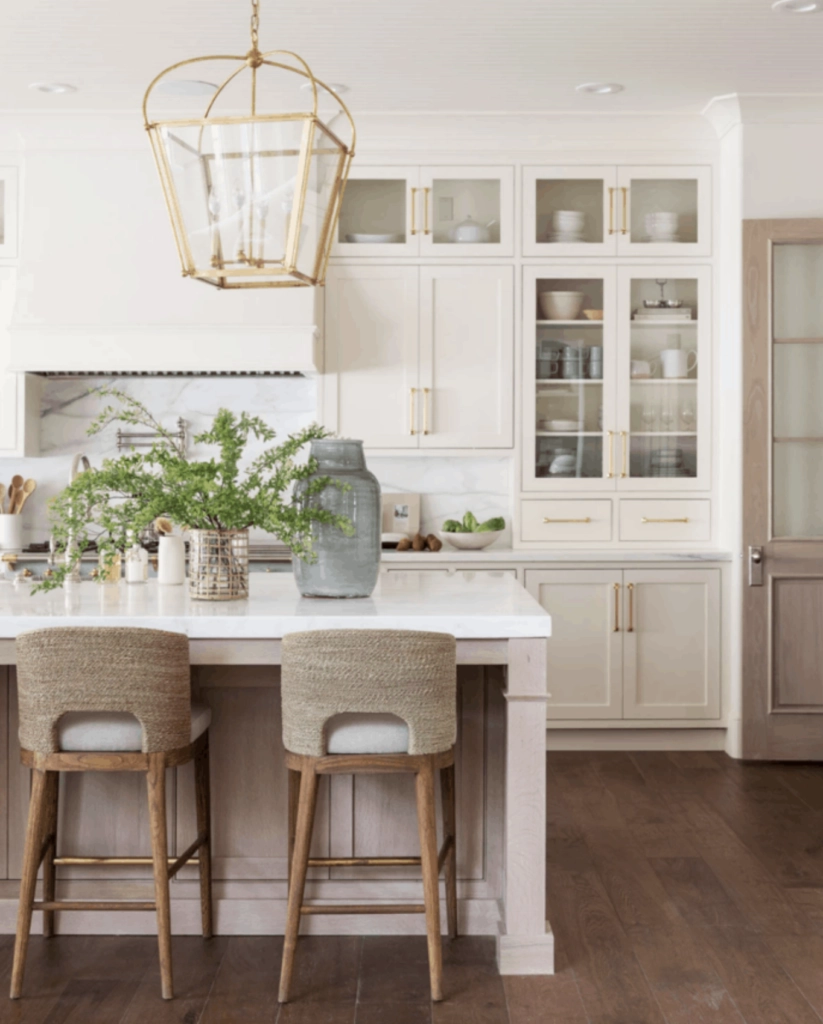
Kitchen

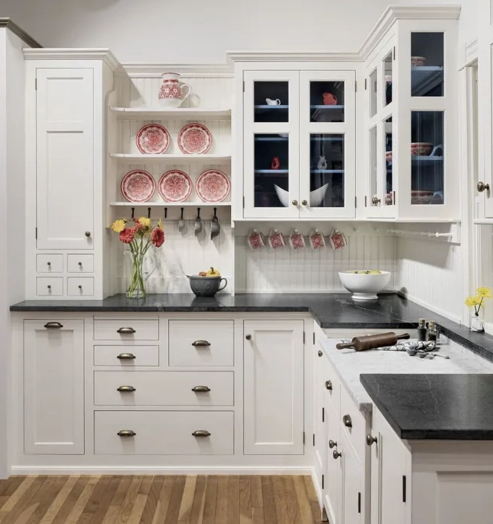
In kitchens, you want fresh, clean colors. Benjamin Moore White Dove can give you brightness without feeling sterile.

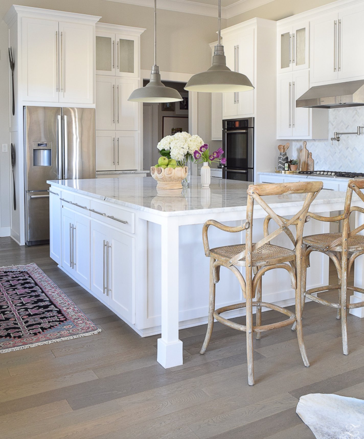
Sherwin-Williams On The Rocks is a light gray that complements wooden cabinets while hiding minor marks.
Bathrooms
Cool neutrals in bathrooms help bounce light around and make the space feel bigger, especially with large mirrors.

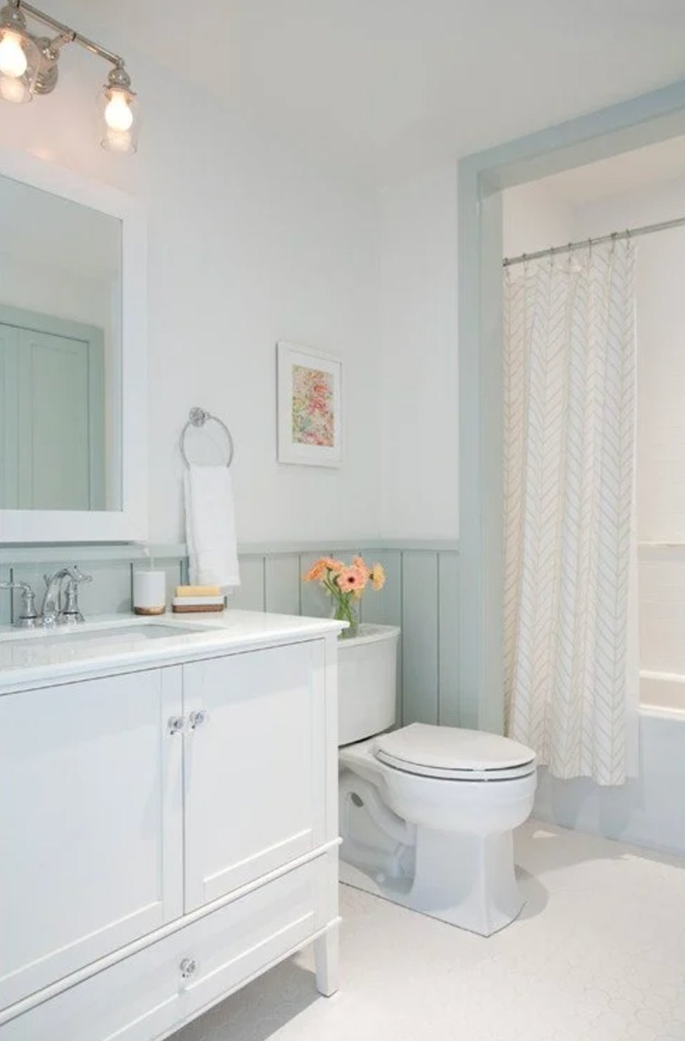
Sherwin-Williams Sea Salt is perfect for smaller bathrooms.

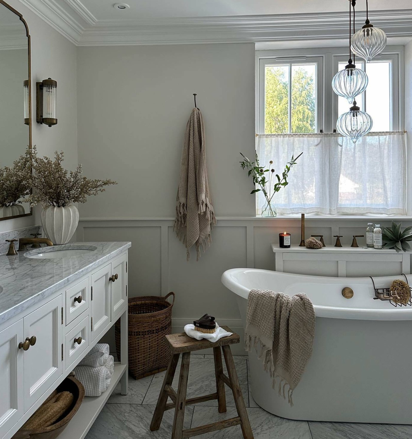
F&B’s Strong White has subtle gray undertones that keep the space feeling fresh while providing a great base for your decor.
Just remember to use bathroom-specific paint with mold resistance and moisture protection!
How to Choose Your Neutral
We’ve seen many beautiful neutral spaces today, but remember, these are just guidelines, not rules.
- Think About Light
- North-facing rooms → go warm
- South-facing rooms → go cool
- East/west-facing rooms → most neutrals work well
- Consider Size
- Smaller rooms → stick to lighter shades
- Bigger rooms → feel free to go darker
- Work With Your Architecture
- Look at your trim and moldings
- Consider built-ins
- Think about ceiling height
- Create Flow
- Pick a main neutral
- Use lighter/darker versions in different rooms
- Keep transitions smooth between spaces
- Always Test Your Paint!
- Get peel-and-stick samples
- Try them on different walls
- Check them in day and evening light
- See how they work with your furniture and fabrics