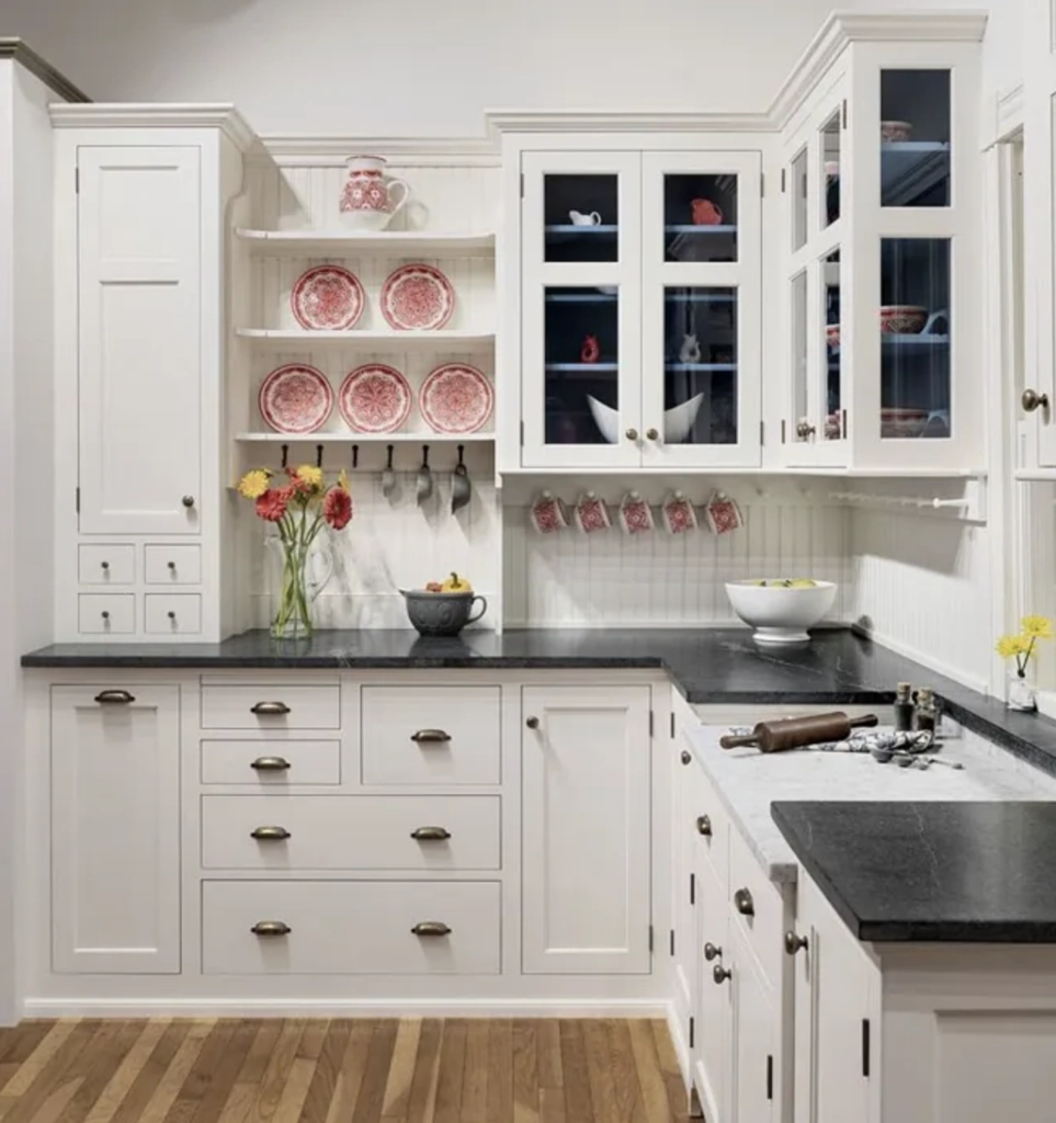
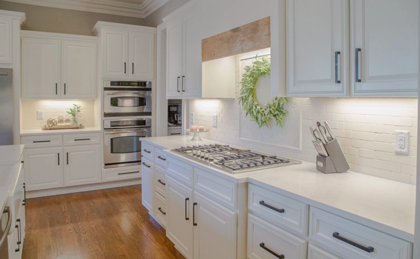
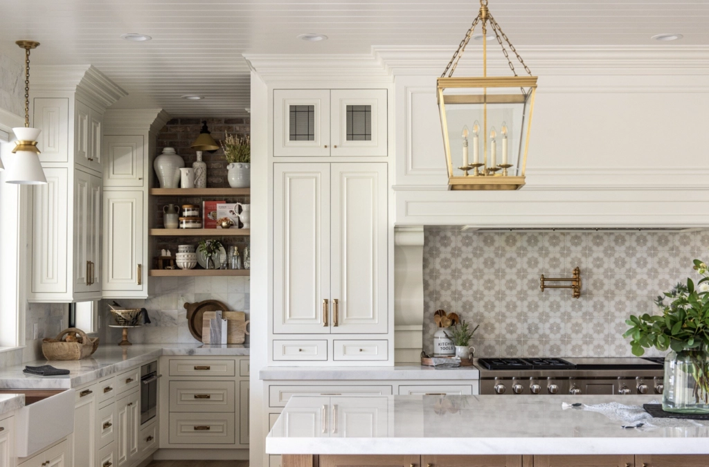
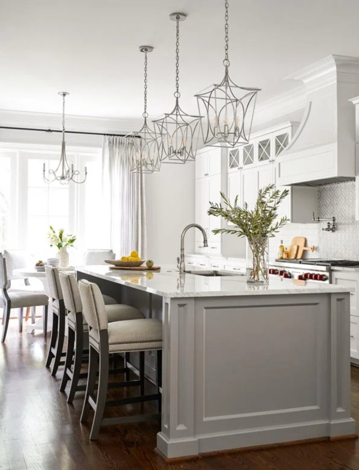
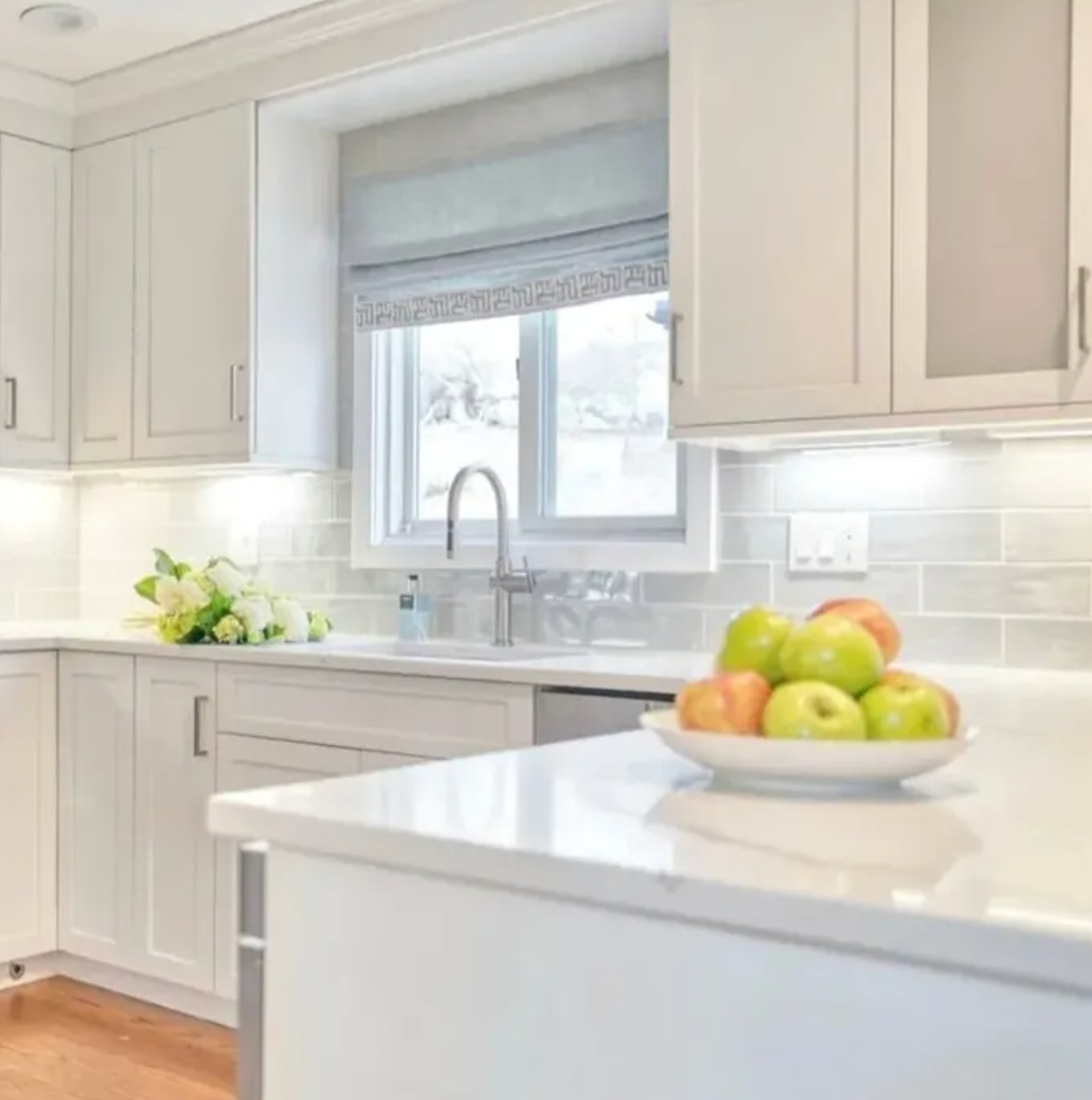
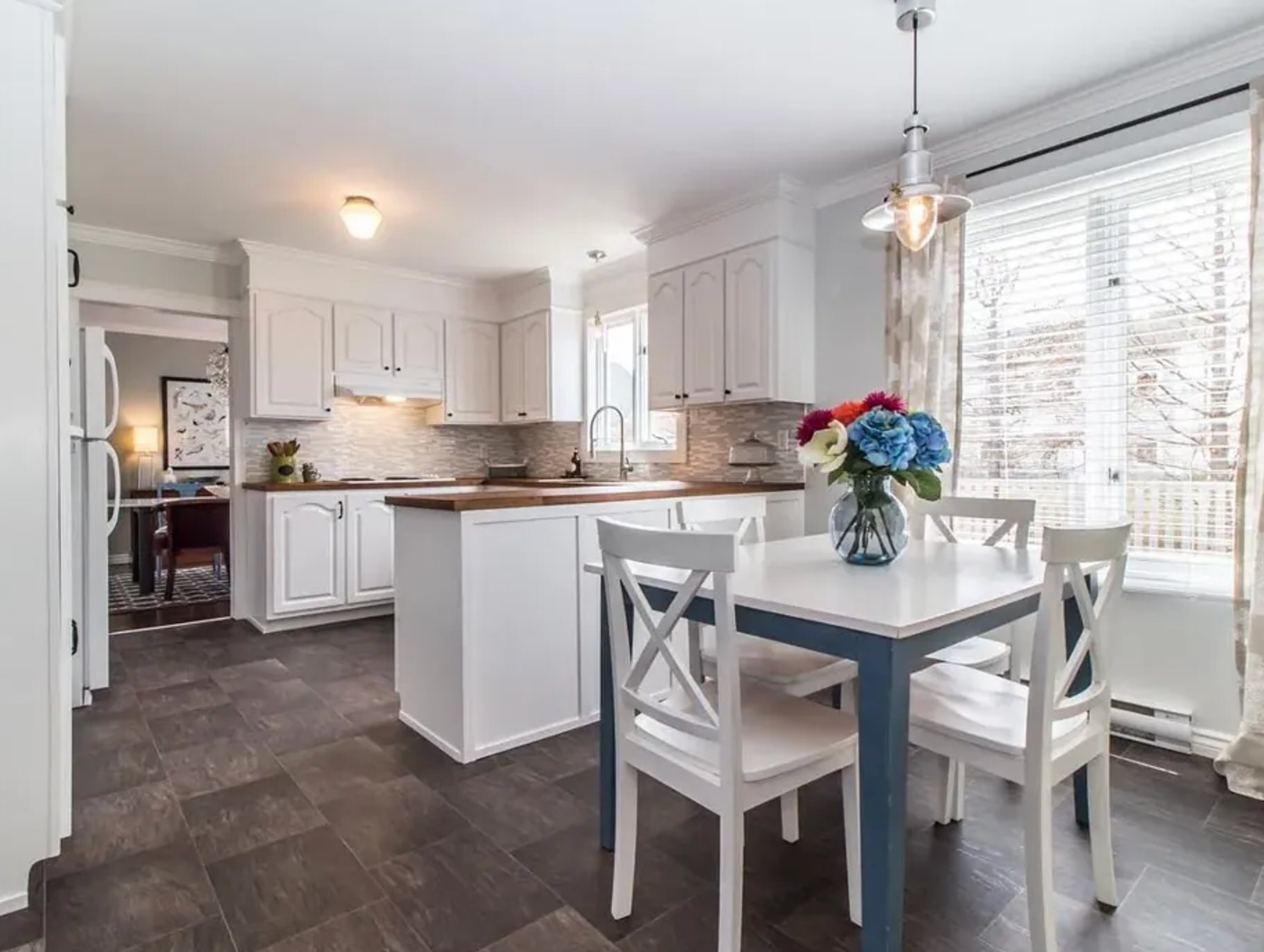
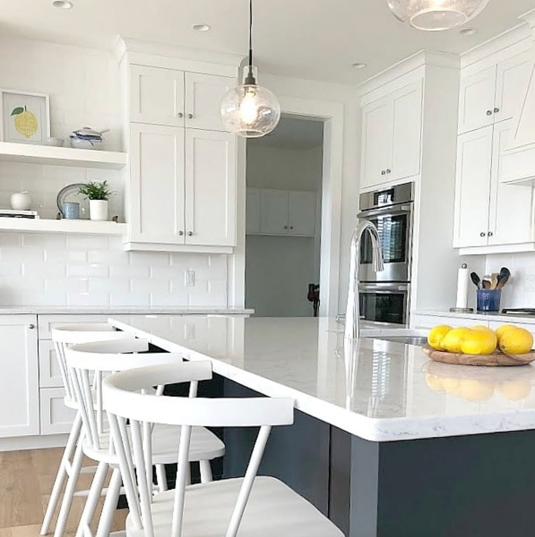
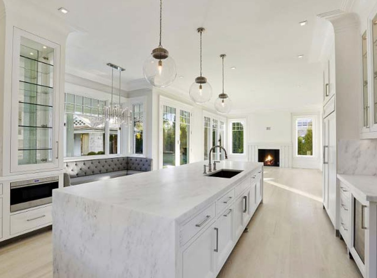
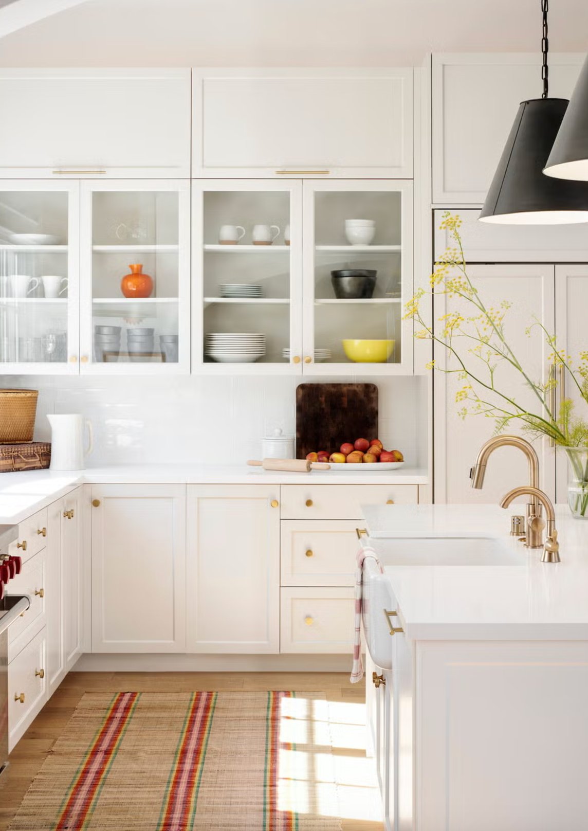
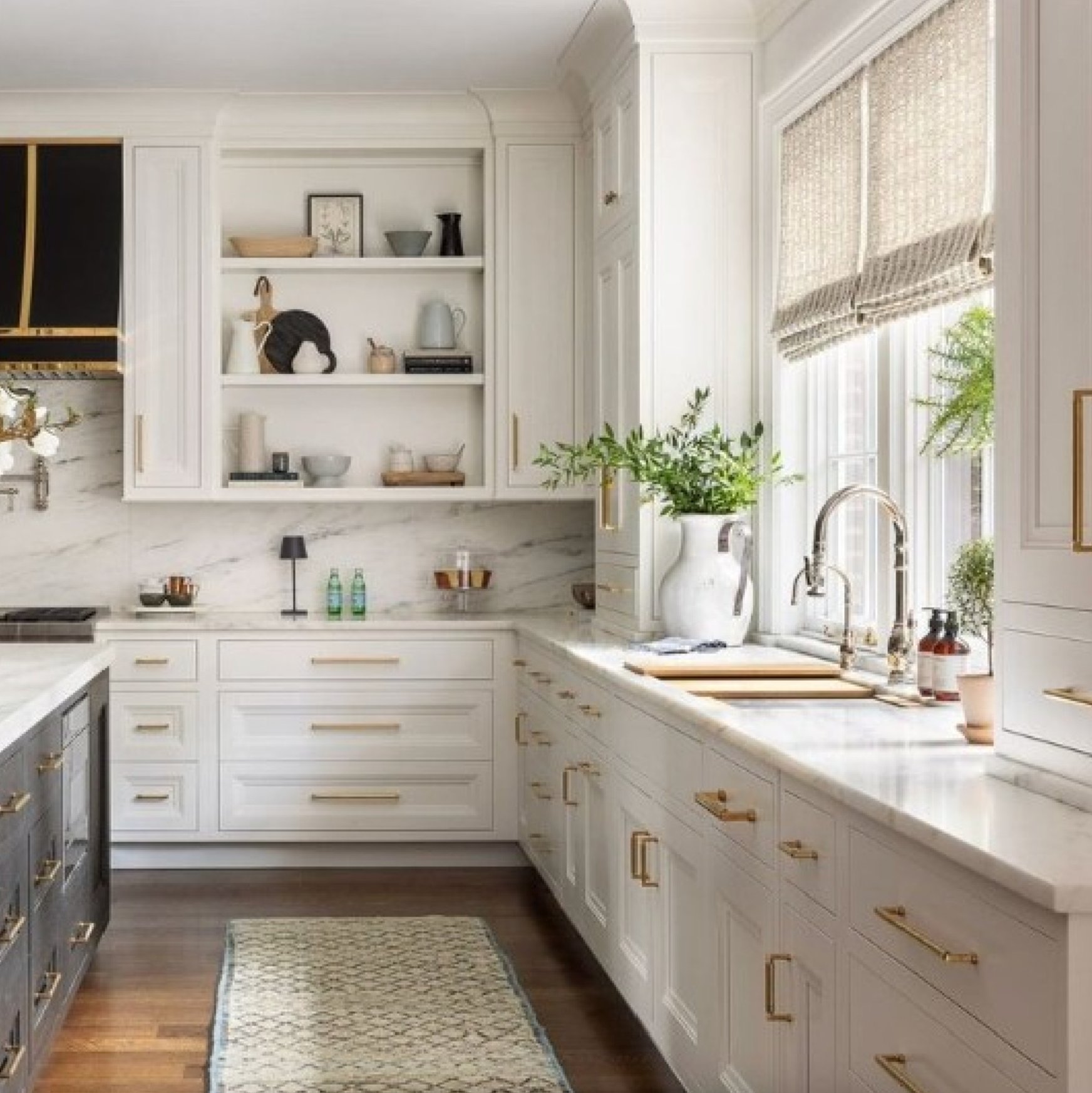
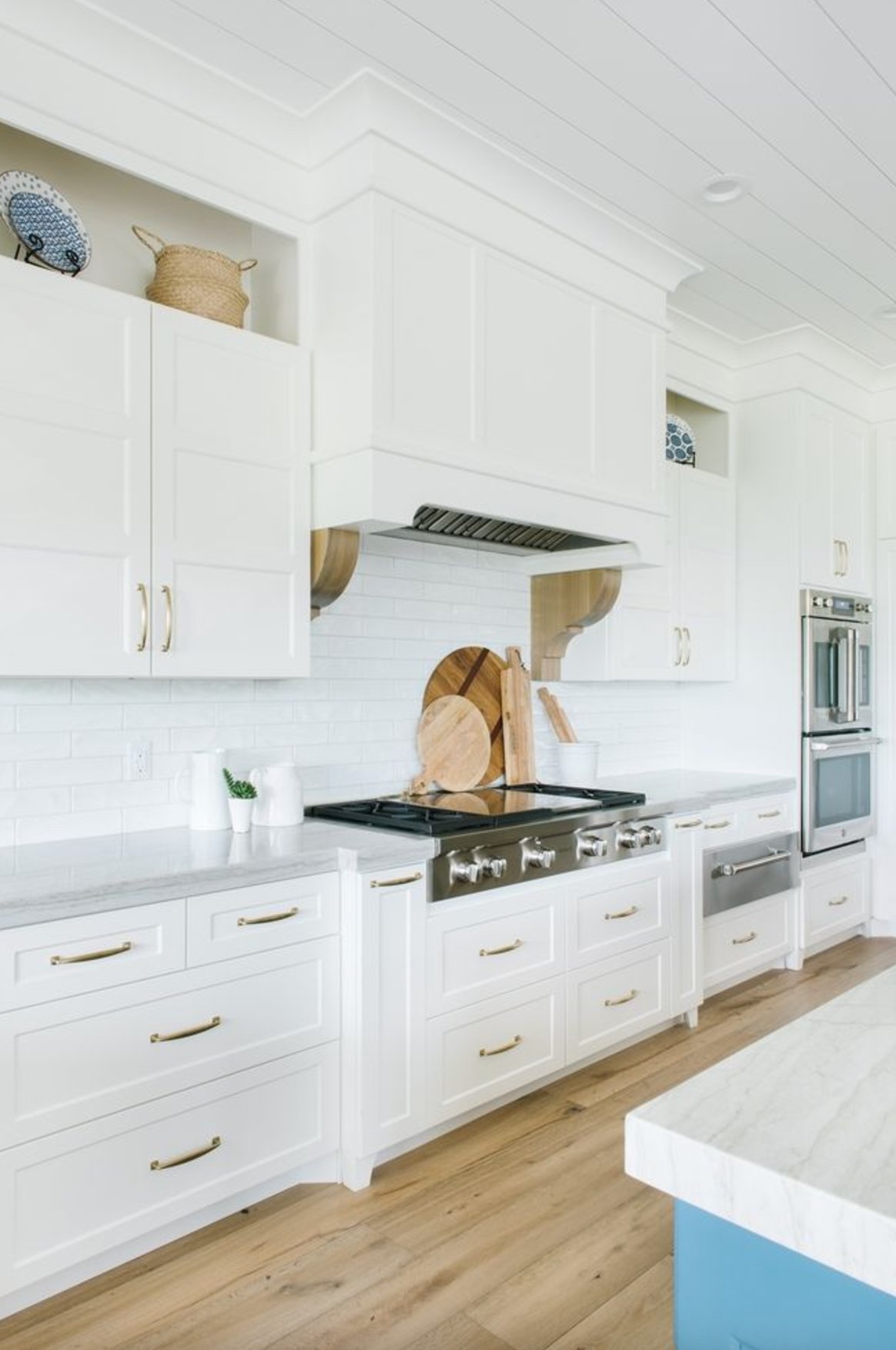
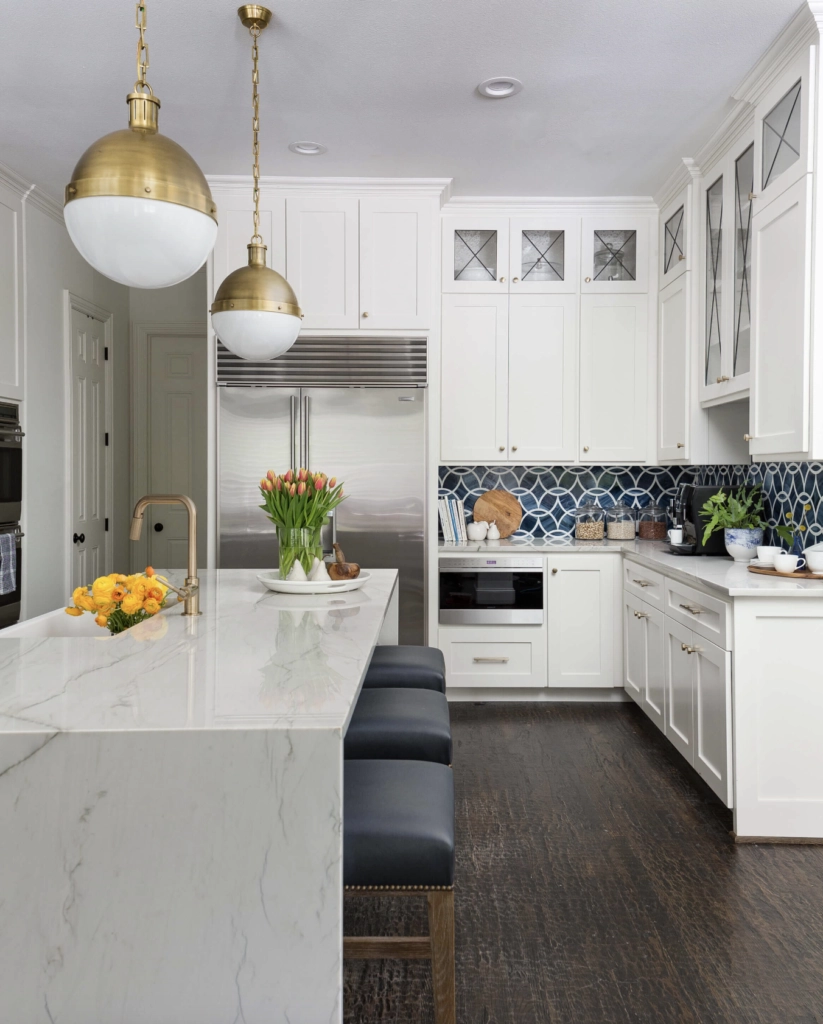
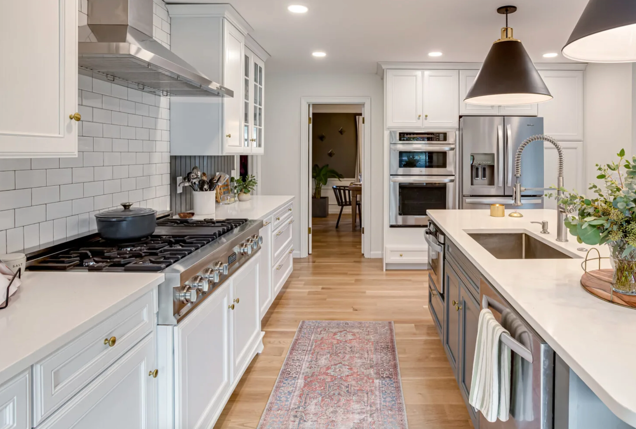
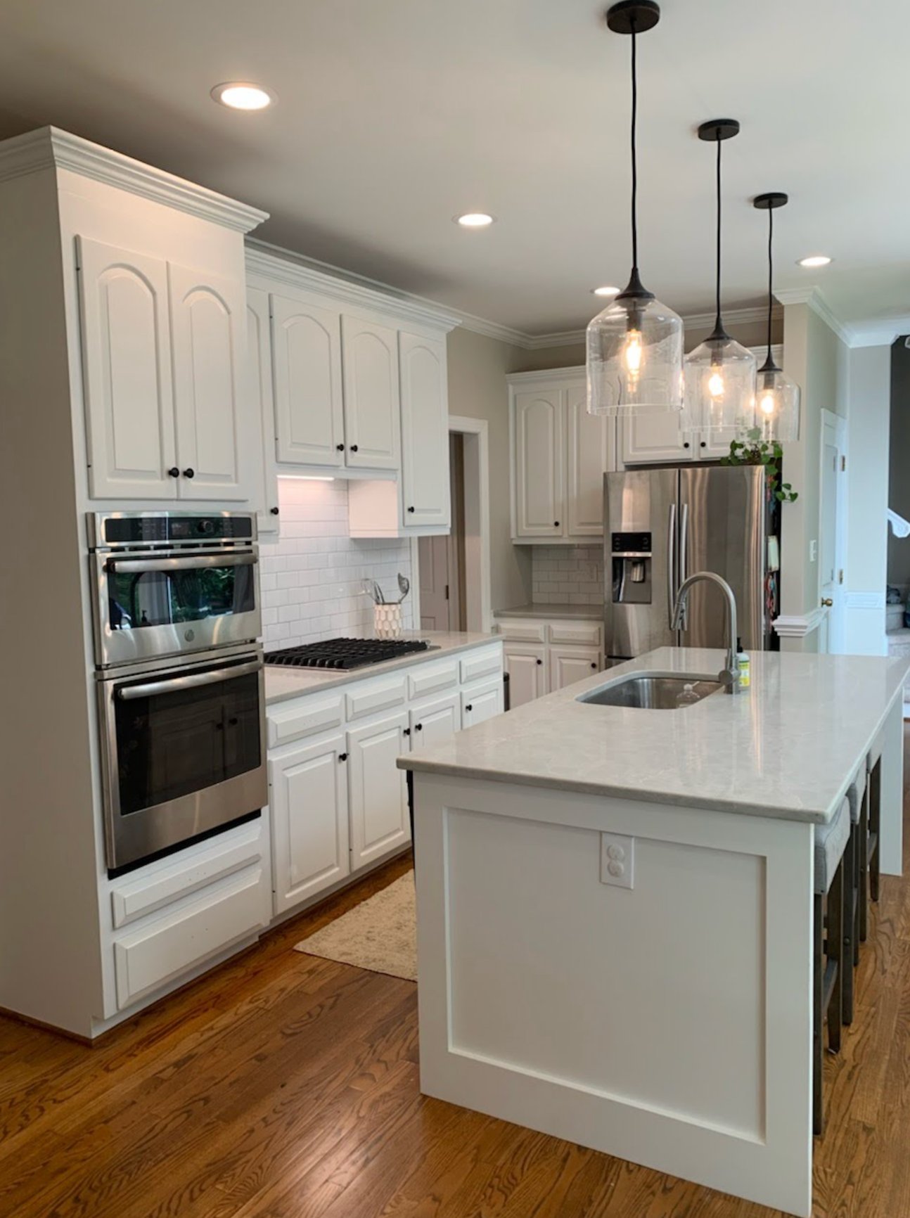
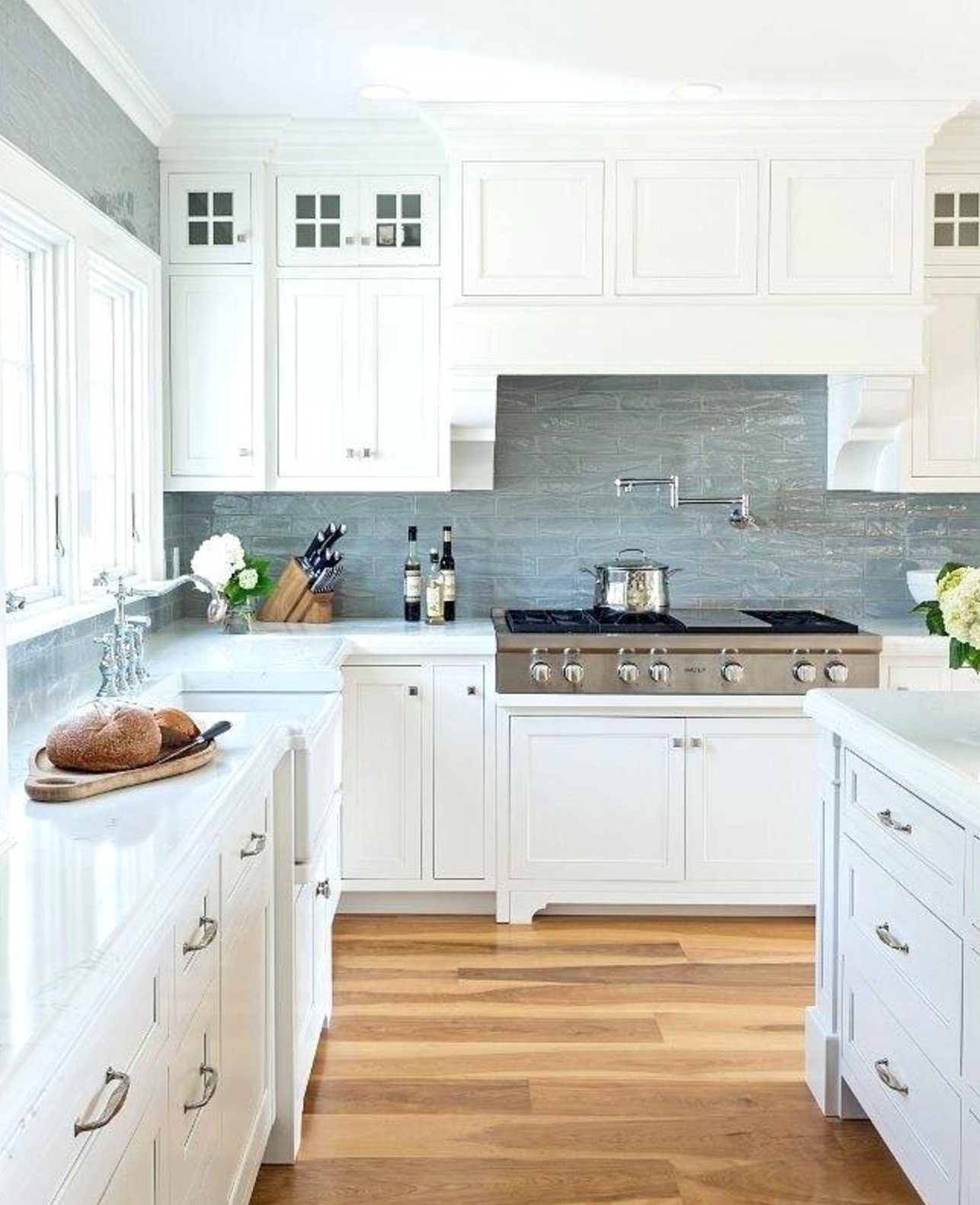
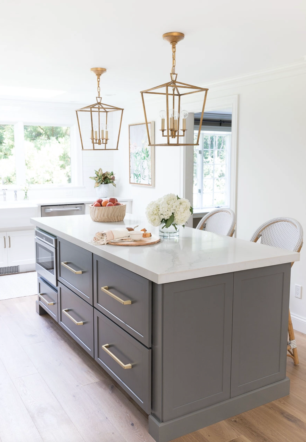
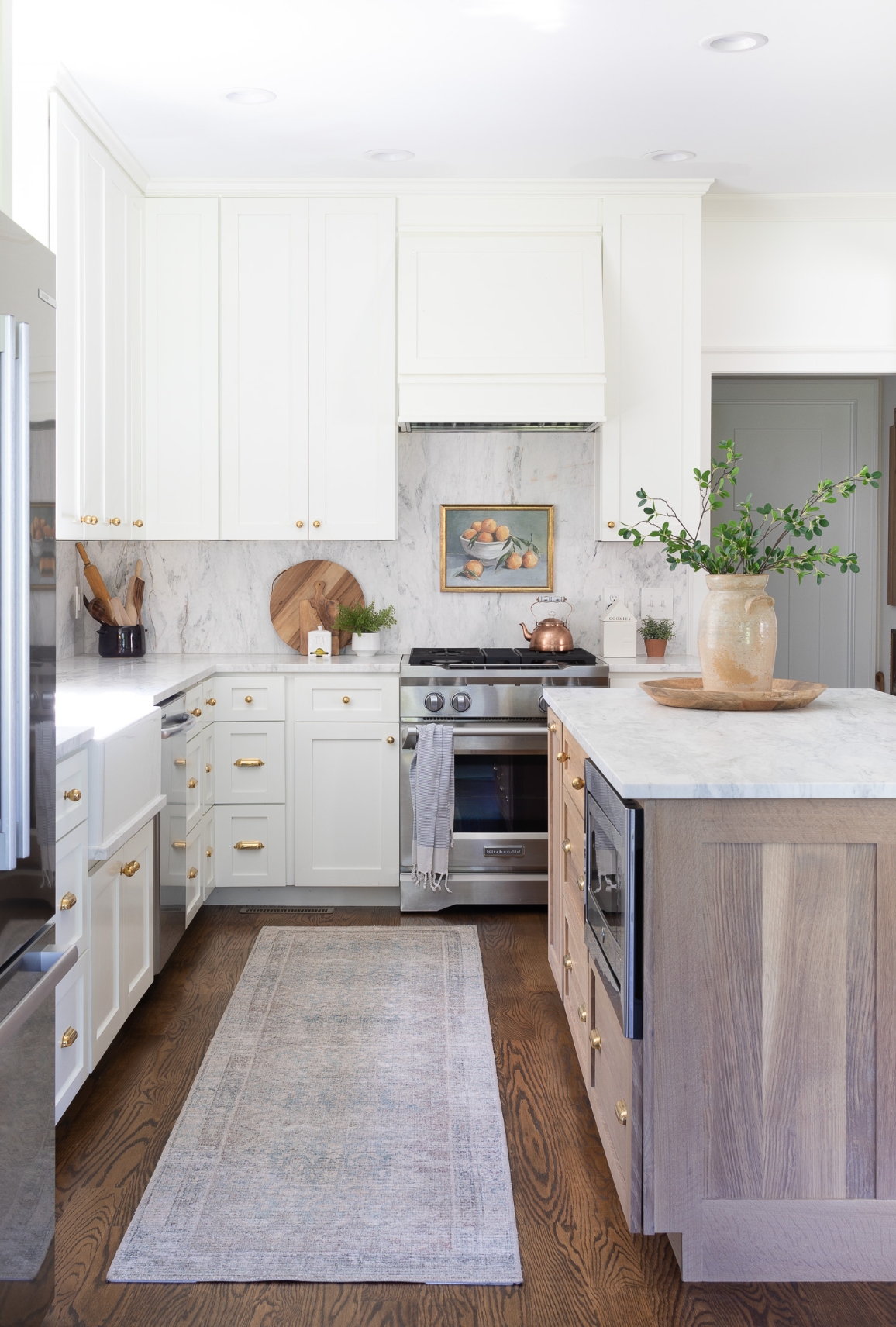
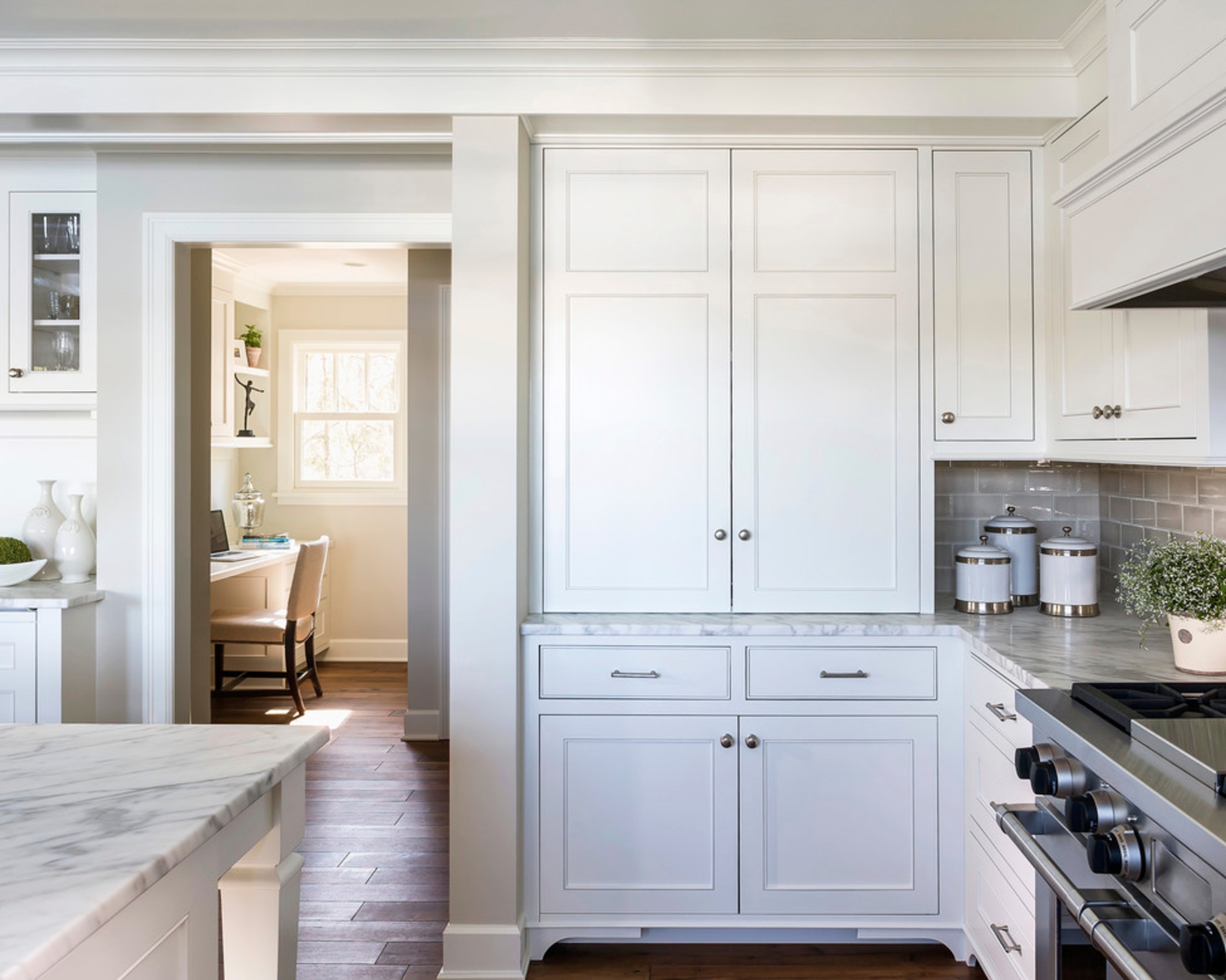
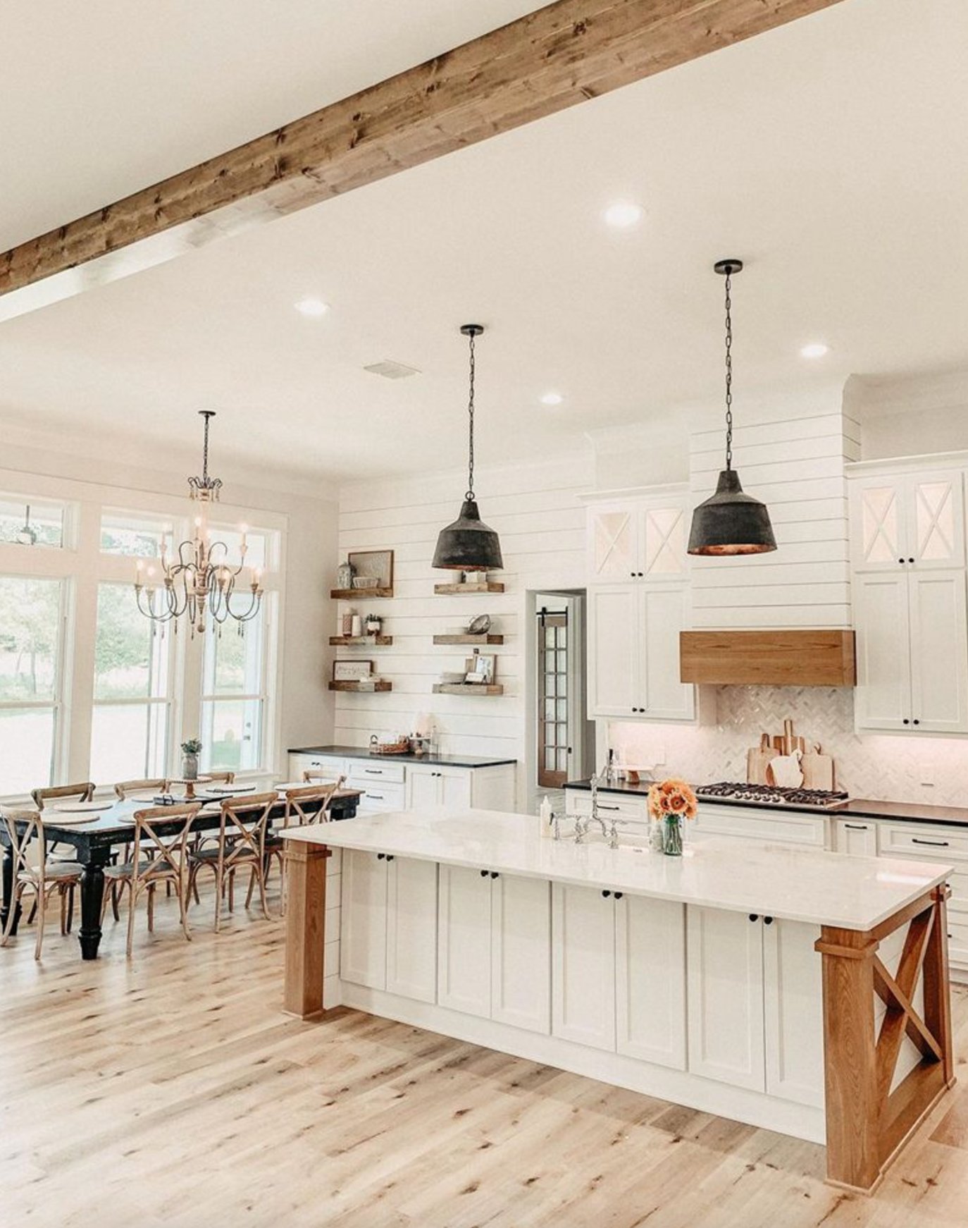
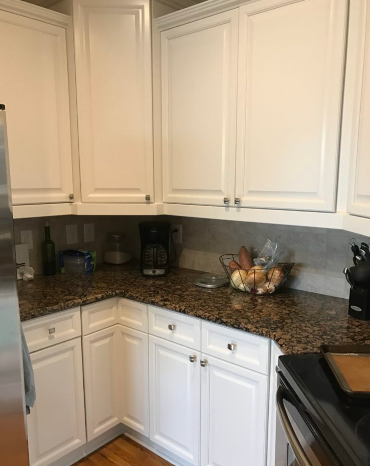
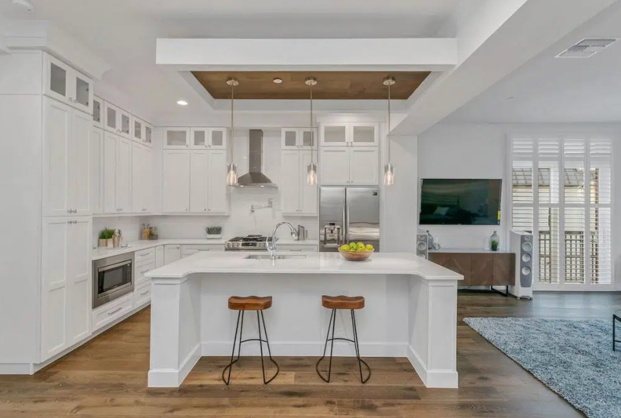
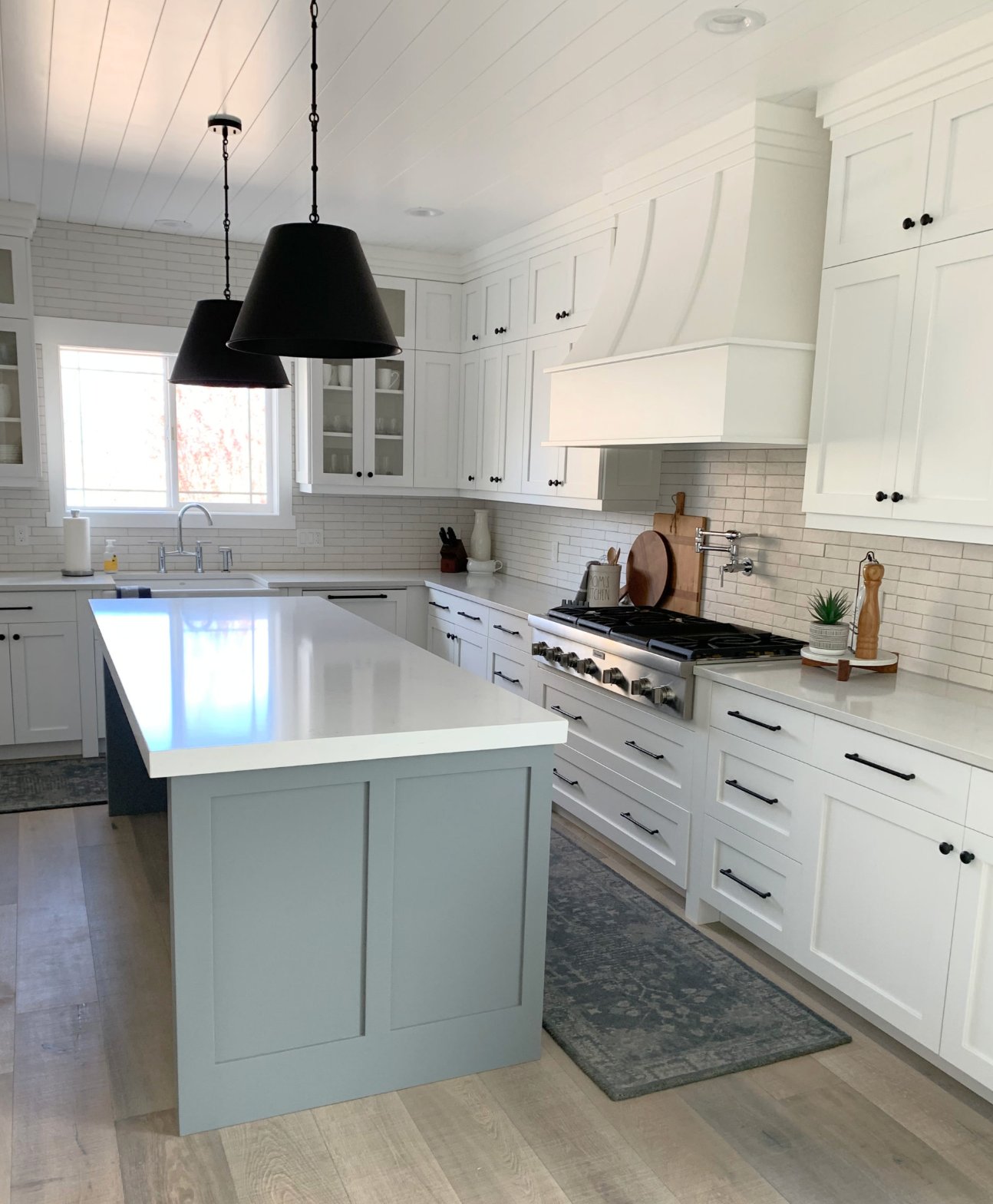
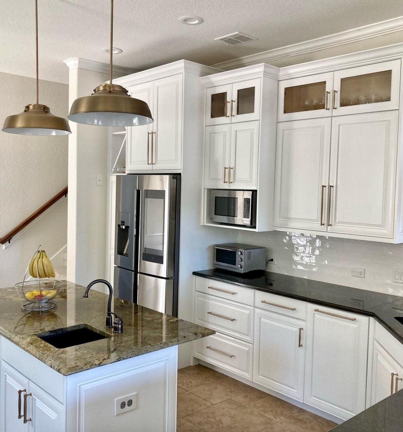
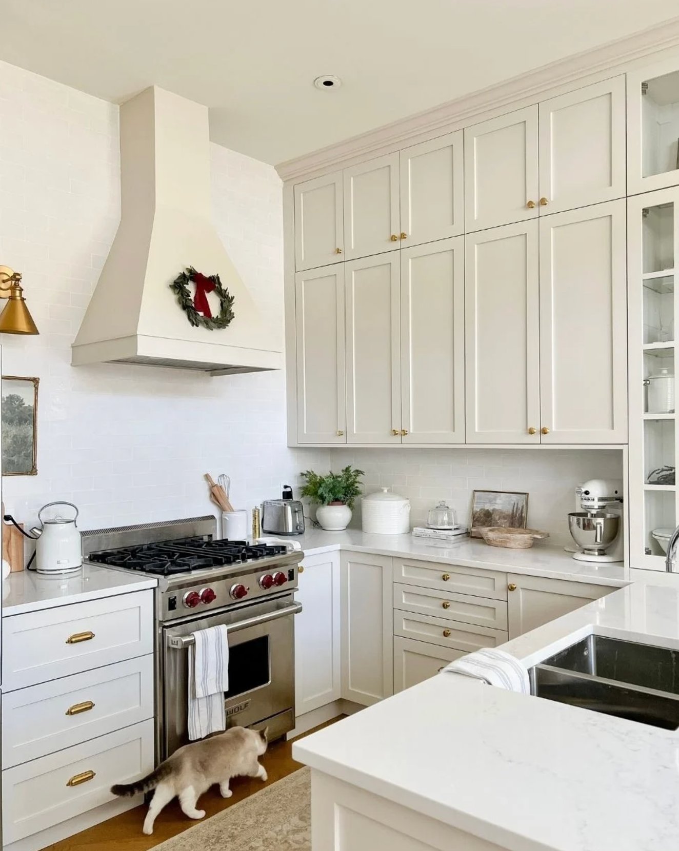
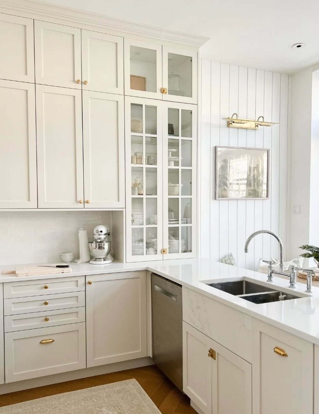
White kitchens are timeless. And while gray and black cabinets are trending now, white remains the undisputed champion when it comes to kitchen cabinet design.
I know how OVERWHELMING it can be to pick just the right shade of white – from warm creamy to cool arctic, from soft pearl to crisp snow white – this choice can drive even seasoned designers crazy.
That’s why I’ve rounded up the most foolproof and versatile white shades that will help you create the exact kitchen vibe you’ve been dreaming of.
- 1. White Dove by Benjamin Moore
- 2. Paper White by Benjamin Moore
- 3. Pure White by Sherwin Williams
- 4. Chantilly Lace by Benjamin Moore
- 5. Alabaster by Sherwin Williams
- 6. Cloud White by Benjamin Moore
- 7. Extra White by Sherwin Williams
- 8. Snow Bound by Sherwin Williams
- 9. Simply White by Benjamin Moore
- 10. Origami White by Sherwin Williams
- 11. Decorator’s White by Benjamin Moore
- 12. High Reflective White by Sherwin Williams
- 13. Natural Cream by Benjamin Moore
- How to Choose the Right White Paint for Cabinets?
1. White Dove by Benjamin Moore

White Dove is a timeless white that’s earned its spot as a kitchen favorite. In my years working with this color, I’ve come to appreciate how beautifully it walks the line between warm and cool tones.
While other whites tend to swing too far one way or the other, White Dove (with an LRV of 83.16) hits the sweet spot. It doesn’t feel sterile like Pure White or turn yellowish like Alabaster. The touch of gray in its makeup keeps those yellow undertones in check.
This shade really comes into its own in those Tuscan-style kitchens from the late 90s and early 2000s. But don’t let that pigeonhole it – it feels right at home in modern spaces, too. I’ve seen firsthand how well it adapts to different lighting conditions and finishes.
One of White Dove’s biggest perks is how flexible it is. You can use it on everything – walls, ceilings, doors, and cabinets – to create a seamless look without any jarring transitions.
This is especially handy in smaller kitchens, where you want to avoid chopping up the visual space.
2. Paper White by Benjamin Moore

Paper White is perfect for anyone looking to split the difference between white and gray for their kitchen cabinets. With an LRV of 74, it’s slightly darker than your typical bright whites, which usually clock in around 80-90.
Paper White might show hints of blue or gray throughout the day, but it never feels cold. Working with it has taught me just how much lighting can change its personality. It leans more white in rooms flooded with natural light, while dimmer spaces bring out its gray undertones.
Here’s a neat trick: try pairing Paper White cabinets with crisp white walls. This combo really highlights the shade and adds some nice depth to your space.
Just keep in mind the natural light situation in your kitchen when considering this color. North-facing rooms might need some extra lighting to make it work.
Paper White is one of those versatile colors that work as well in contemporary spaces as it does in traditional ones. It’s particularly at home in coastal properties and kitchens featuring marble elements.
3. Pure White by Sherwin Williams

Pure White by Sherwin-Williams is definitely worth considering for kitchen cabinets. This color is special because it creates a bright space without being overwhelming, thanks to its balanced LRV of 84.
It has just a hint of yellow undertone, which keeps it from looking too clinical. This really matters in the kitchen where we spend lots of time – it won’t tire your eyes and keeps the space feeling welcoming.
It’s fascinating to see how Pure White adapts to different lighting. It stays soft and inviting in south-facing rooms with warm light, and even in north-facing spaces, it doesn’t take on that cold, harsh look. This makes it a great pick, no matter where your kitchen is located.
One of the best things about Pure White is how well it plays with other colors. It looks great with cool tones (blue, green, gray) and warm ones (beige, sandy colors) alike. This means you can easily refresh your space by just switching up your wall color or accessories.
Designers love using Pure White in new homes, often playing with different gloss levels to add some subtle visual interest through texture.
4. Chantilly Lace by Benjamin Moore

Chantilly Lace stands out as one of the purest whites you’ll find for kitchen cabinets. With an LRV of 90, it brightens up your space without making it feel like a hospital room.
Unlike stark whites, it has a gentle softness that makes it feel more livable and easy on the eyes.
The great thing about Chantilly Lace is how versatile it is. It looks fantastic with both warm and cool colors in your space. It’s especially gorgeous in kitchens with big windows – even in bright sunlight, it stays pleasant without looking harsh.
Chantilly Lace creates nice, clean contrasts with other materials without being too dramatic. This really shows when you pair it with different countertops and backsplashes.
Plus, it’s one of those rare whites that actually looks good with white appliances – something that can be tricky to pull off with other shades.
Chantilly Lace helps keep things balanced in rooms with warm lighting – it won’t turn yellow or lose its crisp look.
Just keep in mind that Chantilly Lace needs a well-prepped surface – since it’s such a pure white, it’ll show every little bump and imperfection.
5. Alabaster by Sherwin Williams

Alabaster by Sherwin Williams is something special. It has its own unique personality – soft and warm, but still definitely white, with an LRV of 82.
Watch this color in different lights, and you’ll see why it’s so versatile – unlike many warm whites, it doesn’t go yellow on you.
Instead, it brings this lovely, soft, cozy feeling while still keeping your kitchen looking fresh.
On sunny days, it reads as a clean white, but when it’s cloudy, it shows its warmer side, making your space feel extra welcoming.
While it is white, it’s intentionally soft and warm. If you’re after that super crisp, modern, minimalist white, you might want to look at other options. Alabaster is made for those who want the perfect balance between fresh and cozy.
6. Cloud White by Benjamin Moore

Cloud White is one of the most beloved white shades in interior design history. For years, paint code 967 was so well-known that both design pros and homeowners could recite it from memory.
What makes Cloud White special is its warm undertone. It bathes rooms in soft, gentle light without harsh contrasts.
Here’s something interesting – while it has a creamy tint in the color palette, it doesn’t read as yellow or obviously creamy once it’s on your walls.
Cloud White shines with wood elements and brass hardware, creating this wonderfully cozy, balanced feel. It’s bright enough to make spaces feel bigger without turning them into something that looks like a hospital room.
7. Extra White by Sherwin Williams

Sherwin-Williams’ Extra White has earned its spot among the top white shades. With an LRV of 86, it looks crisp and fresh, though it’s actually softer than you might expect from the name. There’s a subtle bluish-gray undertone that you’ll barely notice.
This shade can look flat in rooms that don’t get much light because of its cool undertones. If your kitchen is on the darker side, consider looking at warmer whites instead.
In a space, Extra White looks stunning against dark blue accents – creating this gorgeous contrast that makes the white pop even more.
At the same time, it’s neutral enough to work with any wall color or decor you throw at it.
One thing to watch out for – like most whites, Extra White tends to reflect everything around it, from furniture to the view outside. Sometimes it might even pick up beige tints from your ceiling.
That’s why you’ll want to test it out in your actual space, checking how it looks as the light changes throughout the day.
8. Snow Bound by Sherwin Williams

Think of fresh snow when you picture this color – pure white with just a hint of gray that gives it some depth and personality.
At first look, Snow Bound reads as white. But put it next to a plain white paper, and you’ll catch that subtle creamy-gray undertone.
That’s exactly what makes it perfect for kitchen cabinets – you get that bright, airy feel without the harsh, clinical white vibe.
Snow Bound plays differently as the day goes on. In the morning light, it can look almost pure white, while evening brings out those warmer gray notes.
It plays especially nice with different shades of gray, creating these beautiful, seamless transitions. Yet it’s still neutral enough to let your bold decor pieces shine.
9. Simply White by Benjamin Moore

Benjamin Moore’s Simply White is a go-to white for kitchen cabinets. With an LRV of 89.52, it brightens up spaces beautifully. Unlike other high-LRV whites that feel a bit sterile, its warm yellowish undertone keeps things cozy.
When Benjamin Moore named Simply White their Color of the Year in 2016, we totally got why!
Simply White fits right in whether you’re going for a sleek, modern look or a traditional kitchen with classic details. It’s neutral enough to work as a perfect backdrop for whatever accent colors you choose.
In the kitchen, it pairs beautifully with greige walls – Edgecomb Gray is a particular favorite match.
10. Origami White by Sherwin Williams

At first glance, Origami White looks like a crisp white with subtle purple notes. But in reality, it tends to show yellowish undertones.
It shines in spaces flooded with natural light. But the paint can look a bit flat in rooms that don’t get much sun or have mostly cool-toned decor.
I recently saw this happen in a north-facing kitchen – Origami White just lost its vibrancy and ended up looking a bit dingy.
The trick with this shade is to test it on a large wall section. A tiny sample just won’t show you how the paint will actually look in your space.
Make sure to check how Origami White plays with your countertop color, backsplash, and appliances.
11. Decorator’s White by Benjamin Moore

Benjamin Moore’s Decorator’s White is a standout among cabinet whites. With an LRV of 84.6, it’s bright but not as stark as Chantilly Lace, which comes in at 92.
The gray undertone gives it a softness and depth that differentiates it from brighter whites.
I’ve found this shade to be incredibly versatile – it looks great in both east and west-facing rooms. In east-facing spaces, you’ll notice cool tones in the morning that mellow out by midday.
On the western side, it does the opposite – the soft white gradually picks up bluish undertones after noon.
Decorator’s White pairs beautifully with natural wood and bold accent colors. Remember that the gray undertone might be limiting if you plan to use it on both cabinets and walls.
12. High Reflective White by Sherwin Williams

High Reflective White is perfect for kitchen cabinets if you’re after the purest white possible. Unlike the softer Pure White or the warmer Alabaster, this one gives you a crisp, bright look with an LRV of 93 – one of the highest you’ll find.
One thing to remember is that it doesn’t cover as well as other whites, so you’ll want to spring for high-quality premium paint like the Emerald line (where they call it Ultra White).
Here’s the thing – spending more on better paint might actually save you money since you’ll only need 1-2 coats instead of 4-5.
If a store tries to swap in “enhanced” Extra White for High Reflective White – don’t fall for it. It’s a different color with an LRV of 86 and gives a softer look.
13. Natural Cream by Benjamin Moore

Natural Cream is unique in the world of cabinet whites. With an LRV of 64.78, it sits right between white and beige, creating this lovely warm, greige undertone.
Unlike Revere Pewter and Edgecomb Gray, it stays true without going purple. It’s light enough to keep your space feeling airy but has enough depth to hold up well, even in bright rooms, without fading.
What’s interesting is that it often reads as a lighter cream in a room, especially next to contrast colors. It comes into its own on kitchen cabinets when paired with pure white walls like Chantilly Lace.
How to Choose the Right White Paint for Cabinets?
1. Consider Natural Light Direction:
- South-facing kitchens → use greyish whites like Benjamin Moore Decorators White to balance warmth
- North-facing kitchens → choose warm whites like Benjamin Moore White Dove for coziness
- Mixed lighting spaces → opt for pure whites like Benjamin Moore Chantilly Lace
- LED lighting considerations → avoid warm whites (they yellow), select slightly grey undertones
2. Factor in Kitchen Size:
- Large kitchens → mix warm whites with dark countertops for contrast
- Small kitchens → use pure whites in monochromatic schemes to expand space
3. Match Your Style:
- Modern kitchens with metal hardware → cool white shades
- Classic or country style with wood elements → creamy whites
4. Test Your Samples:
- Consider reflections from surrounding surfaces
- Apply Peel-and-Stick samples on cabinet doors
- Check in morning, afternoon, and evening light
- Test on different walls/cabinet faces
- Observe for 2-3 days minimum