Have you ever felt like choosing a paint color is like trying to order from a menu in a foreign language you don’t know? I get it – I’ve been in that very same situation.
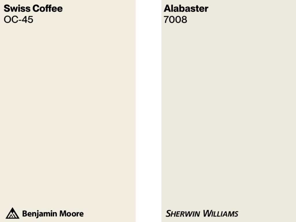
Now, while both BM Swiss Coffee and SW Alabaster are creamy off-whites that can transform a room, their unique undertones and light reflectance values (LRV) set them apart. While one might perfectly brighten your sun-drenched living room, the other could create an intimate atmosphere in a shadowy study.
In this article, I’ll explain what makes each of these colors unique, the kind of atmosphere they can create, and how they mesh with your decor, be it old-school vintage or the latest trend.
Hang tight, and let’s compare these paint colors with over 20 REAL photos!
BM Swiss Coffee vs SW Alabaster at a Glance
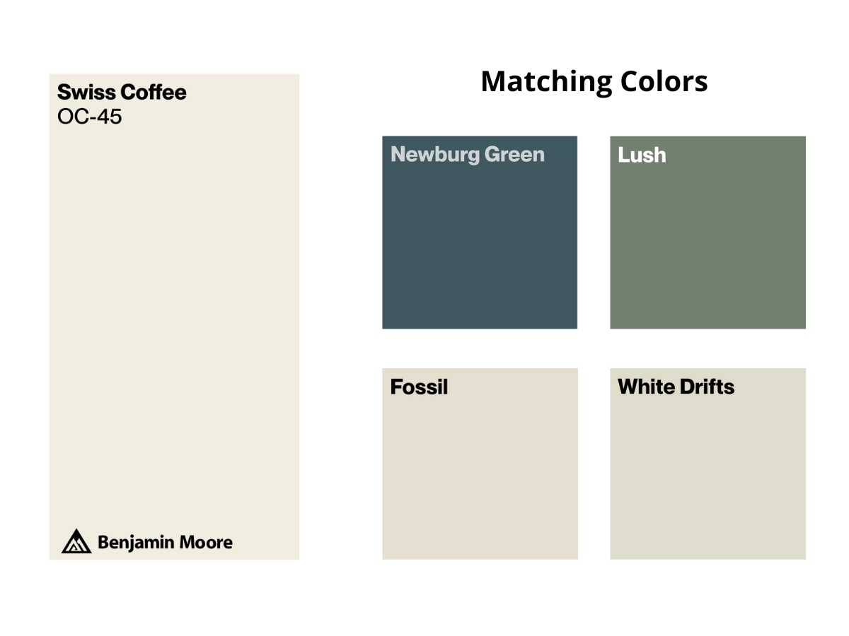
Swiss Coffee is a timeless off-white from Benjamin Moore. Its yellow undertones carry a subtle warmth, giving it a soft, welcoming vibe. Perfect for those who want a neutral shade without the starkness of pure white, Swiss Coffee offers a delicate balance between warmth and brightness.
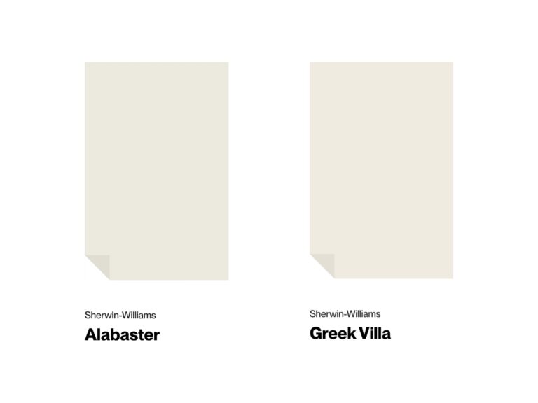
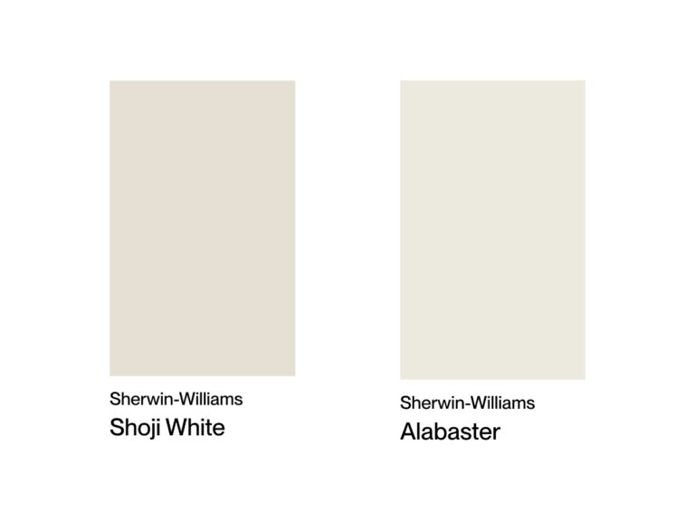
Alabaster, on the other hand, is a cherished off-white from Sherwin Williams. It leans more towards a neutral undertone, with hints of gray, making it versatile for various settings. It’s a favorite for homeowners aiming for a pure, uncomplicated look with a touch of sophistication.
| BM Swiss Coffee | SW Alabaster | |
|---|---|---|
| Color Code | OC-45 | SW 7008 |
| Light Reflectance (LRV) | 81.91 | 82 |
| Color Family | Creamy off-white | Creamy off-white |
| Undertones | Yellow | Neutral with hints of gray |
| Best For | Cozy spaces | Contemporary spaces |
| Versatility | High | Very high |
Best Settings for Each Color
Swiss Coffee
This Benjamin Moore beauty is like that perfectly brewed morning latte – warm, comforting, and oh-so-welcoming.
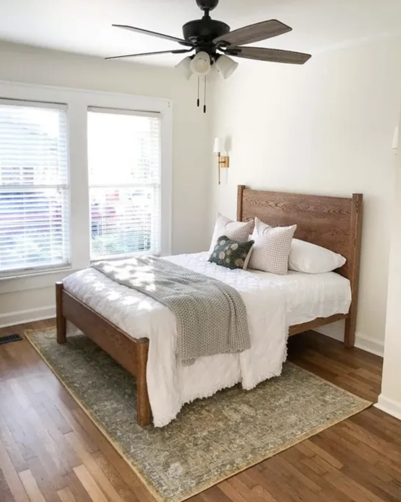
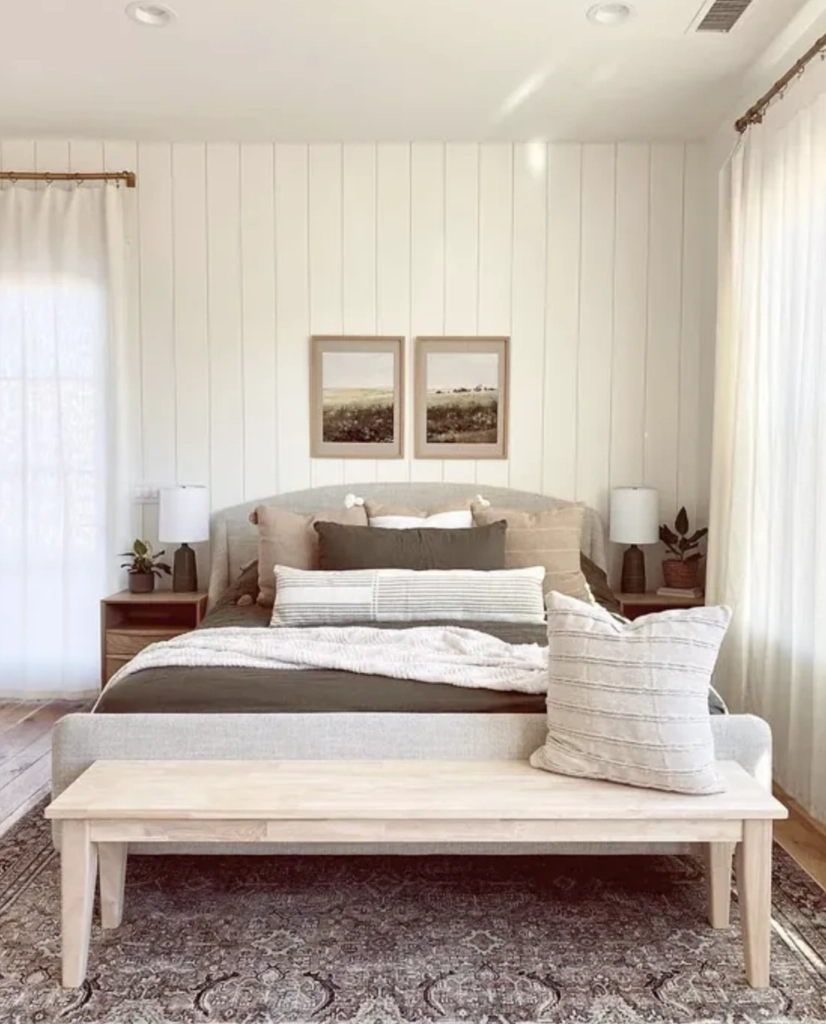
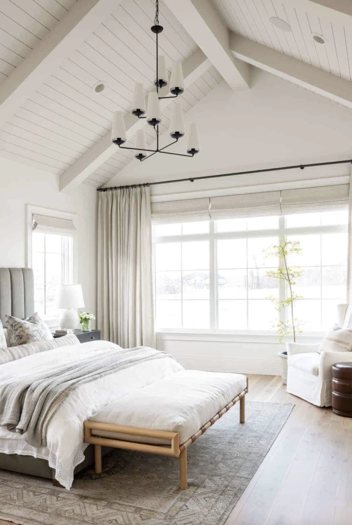
1. Bedrooms: Picture this – waking up in a room painted with Swiss Coffee. It’s like a gentle embrace from your favorite blanket. Paired with soft textiles, it’s the bedroom makeover you didn’t know you needed.
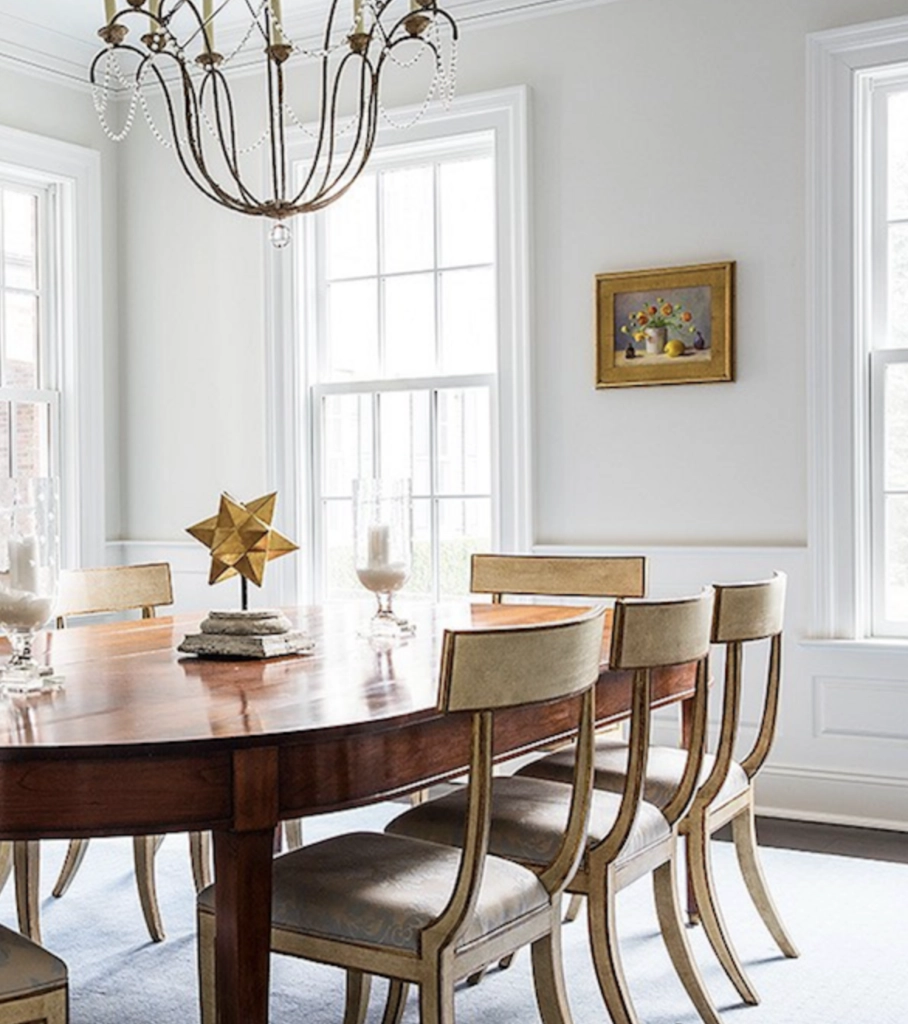
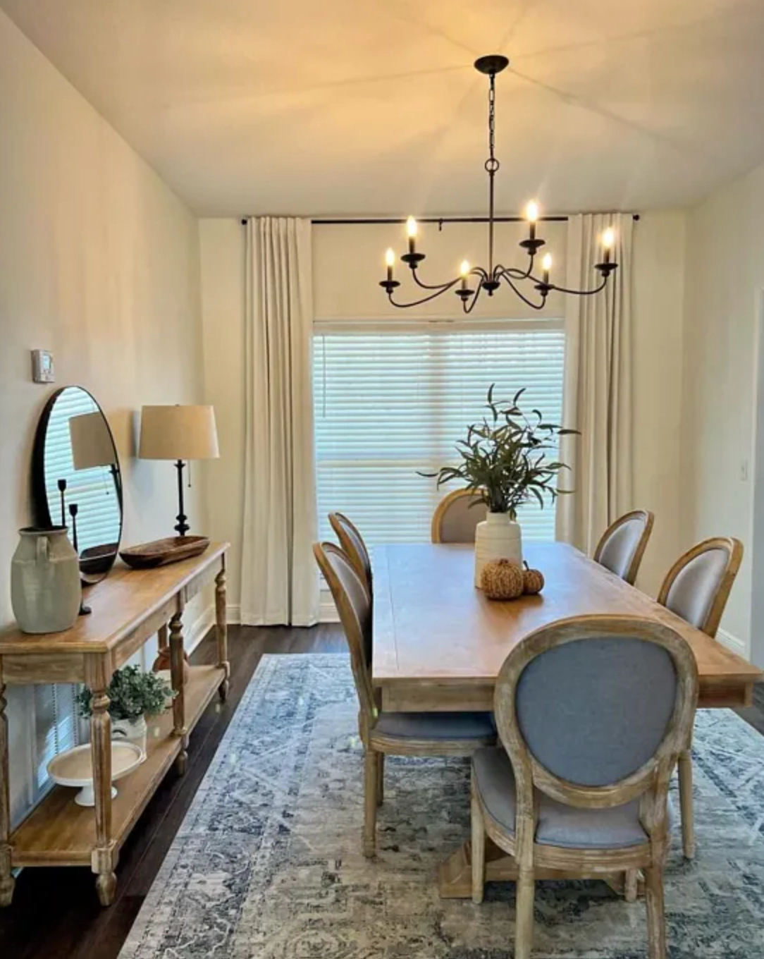
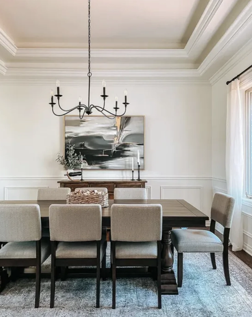
2. Dining Rooms: Now, who doesn’t love a dinner party? Swiss Coffee sets the scene for memorable nights with friends, where the laughter is as warm as the walls around you. Whether it’s brunch or a holiday dinner, this hue just feels right.
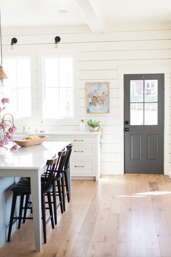
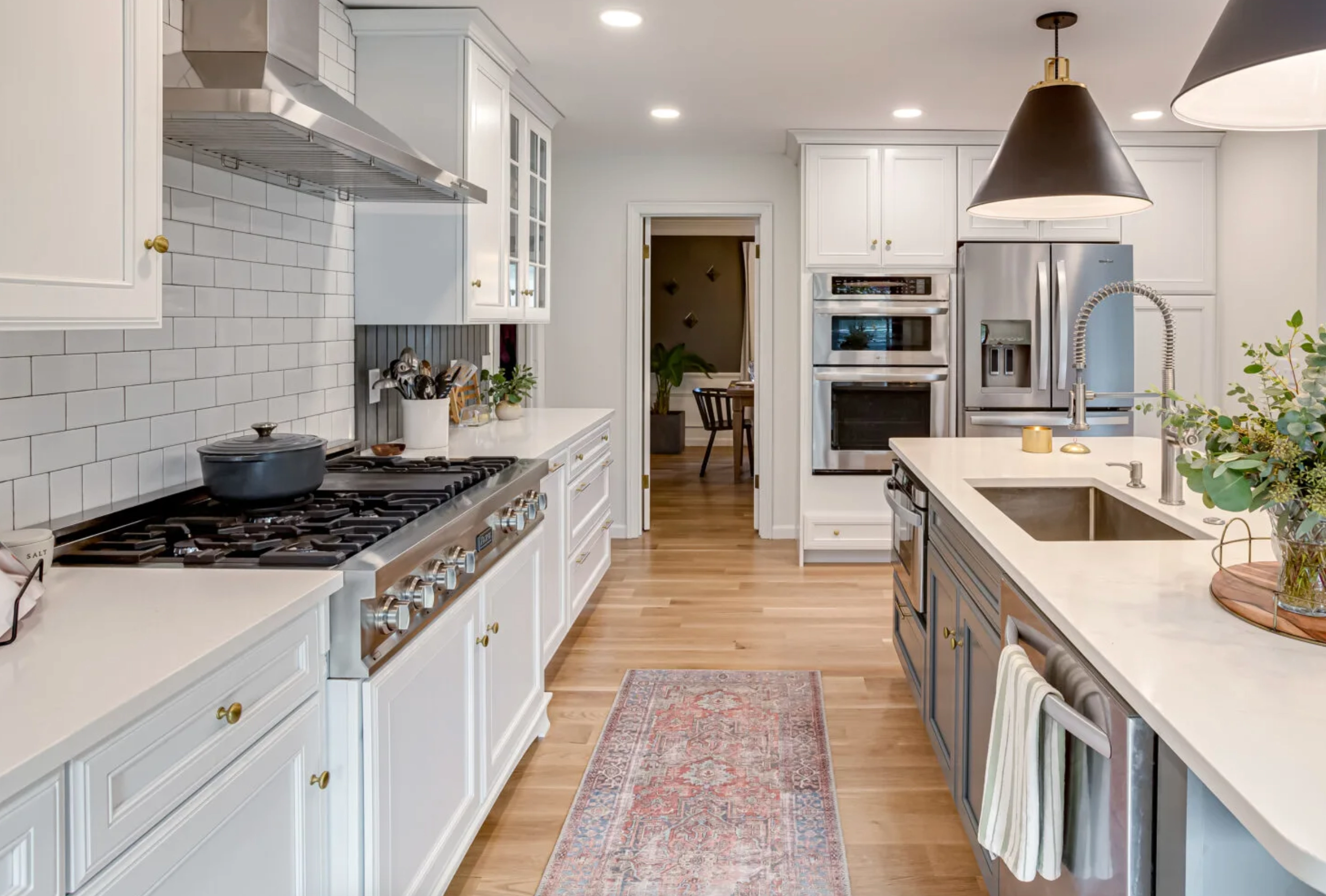
3. Kitchens: Cooking in a Swiss Coffee-painted kitchen is like baking in grandma’s kitchen. There’s a nostalgic warmth to it that’s hard to beat.
Alabaster
Sherwin Williams Alabaster is a gift to interior design lovers. It’s the white tee of paints – classic, versatile, and always in style.
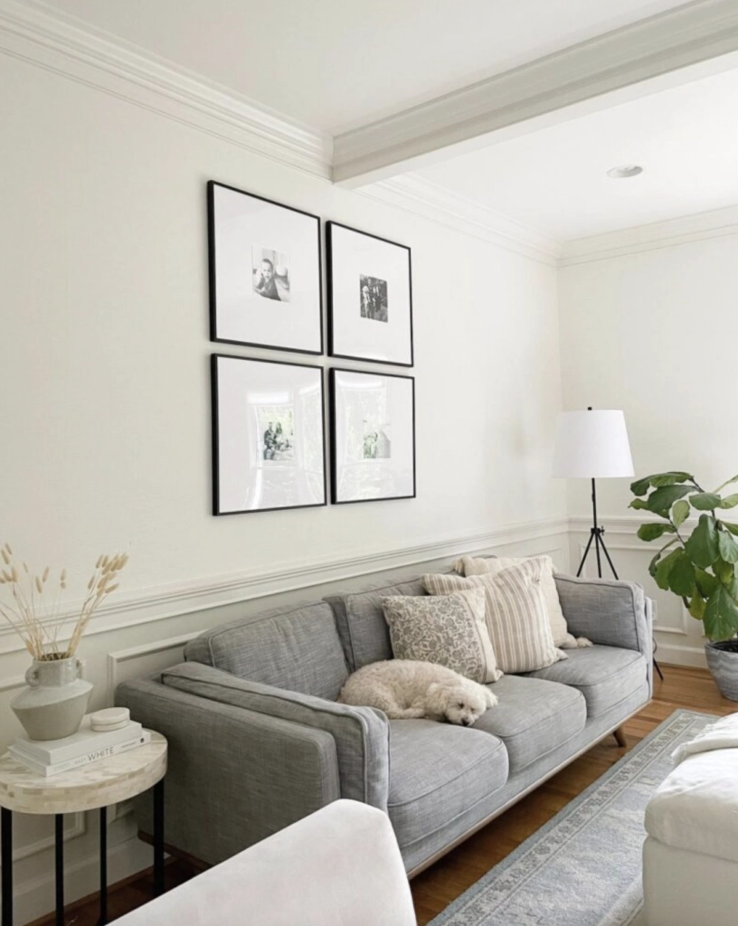
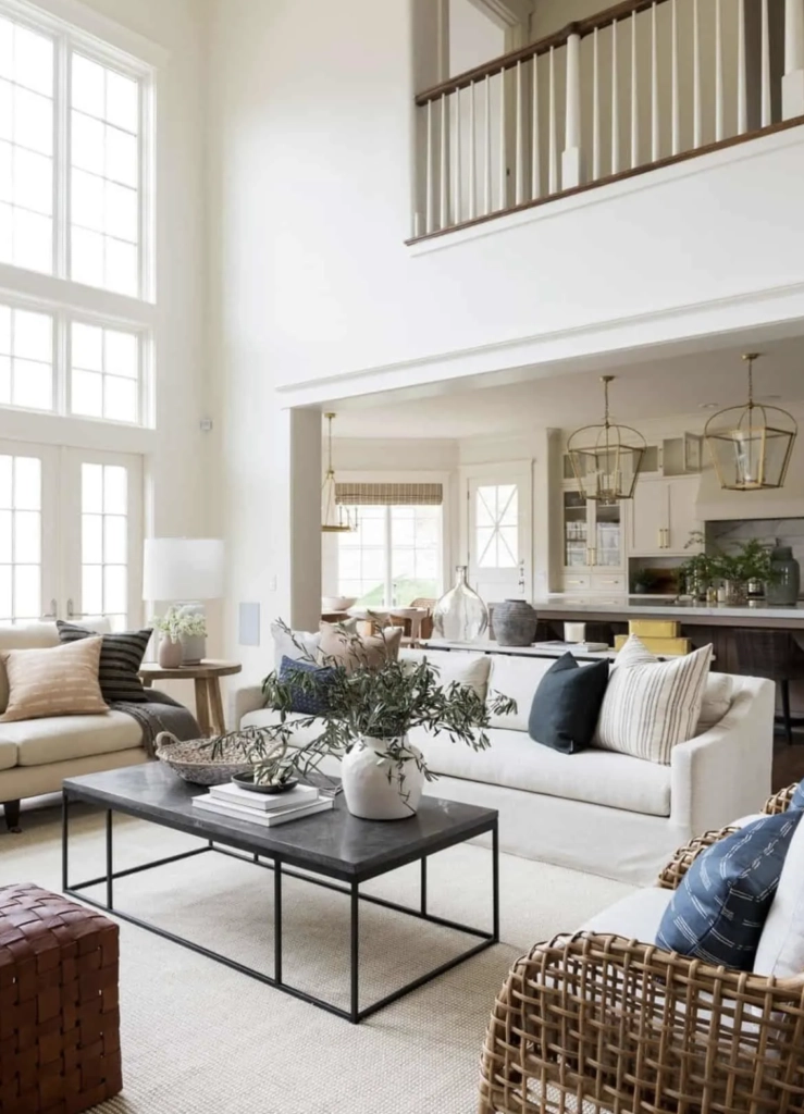
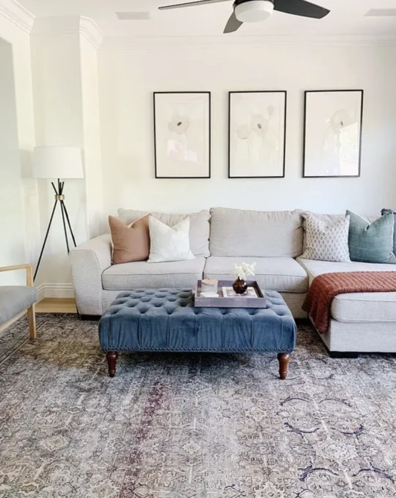
1. Living Rooms: Alabaster has this knack for making living rooms look straight out of a design magazine. Whether you’re a fan of bold art pieces or prefer a minimalist vibe, this color’s got your back.
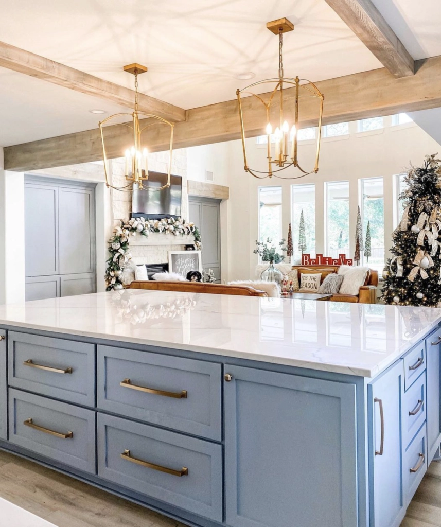
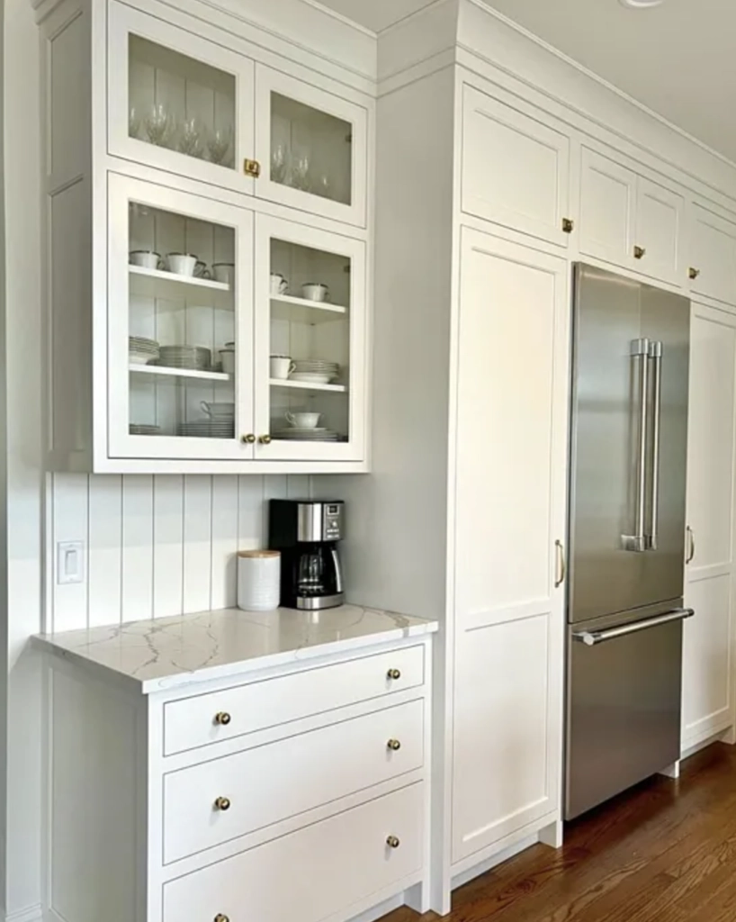
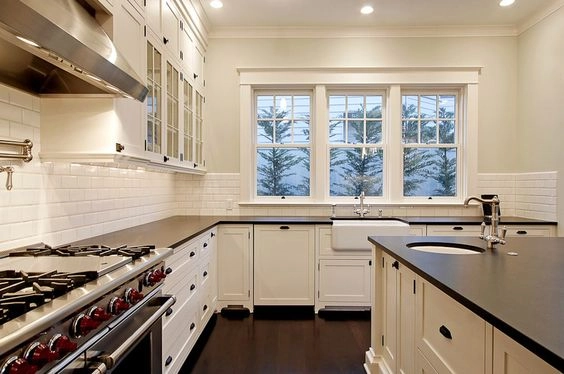
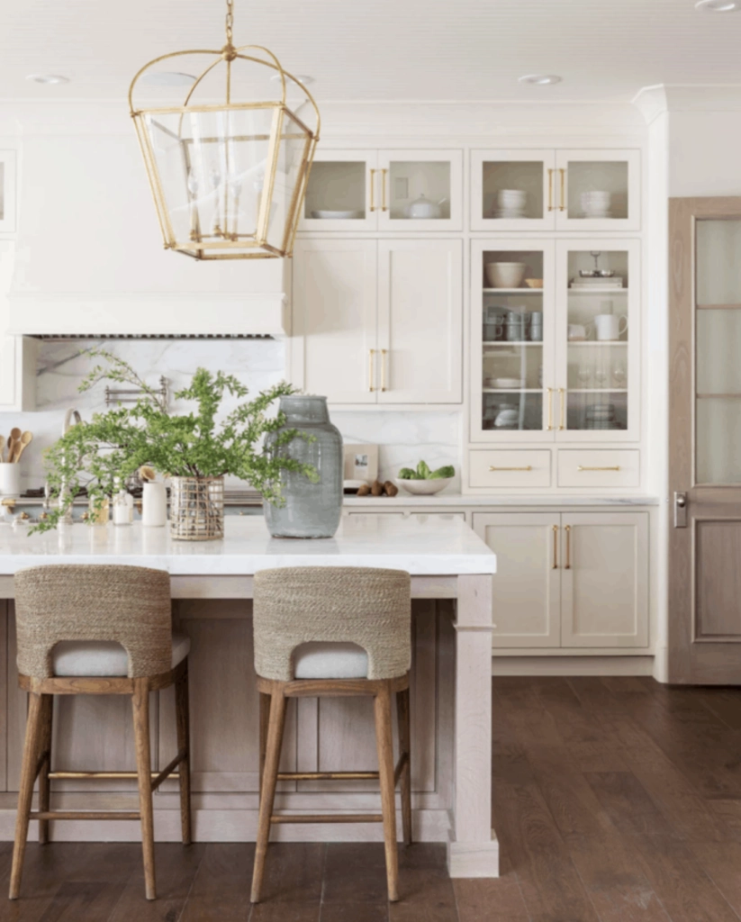
2. Kitchens: Think of a kitchen where everything’s in place, and the walls have this clean, fresh Alabaster glow. Makes you want to cook, right? Or at least order takeout in style.
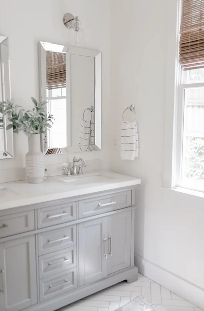
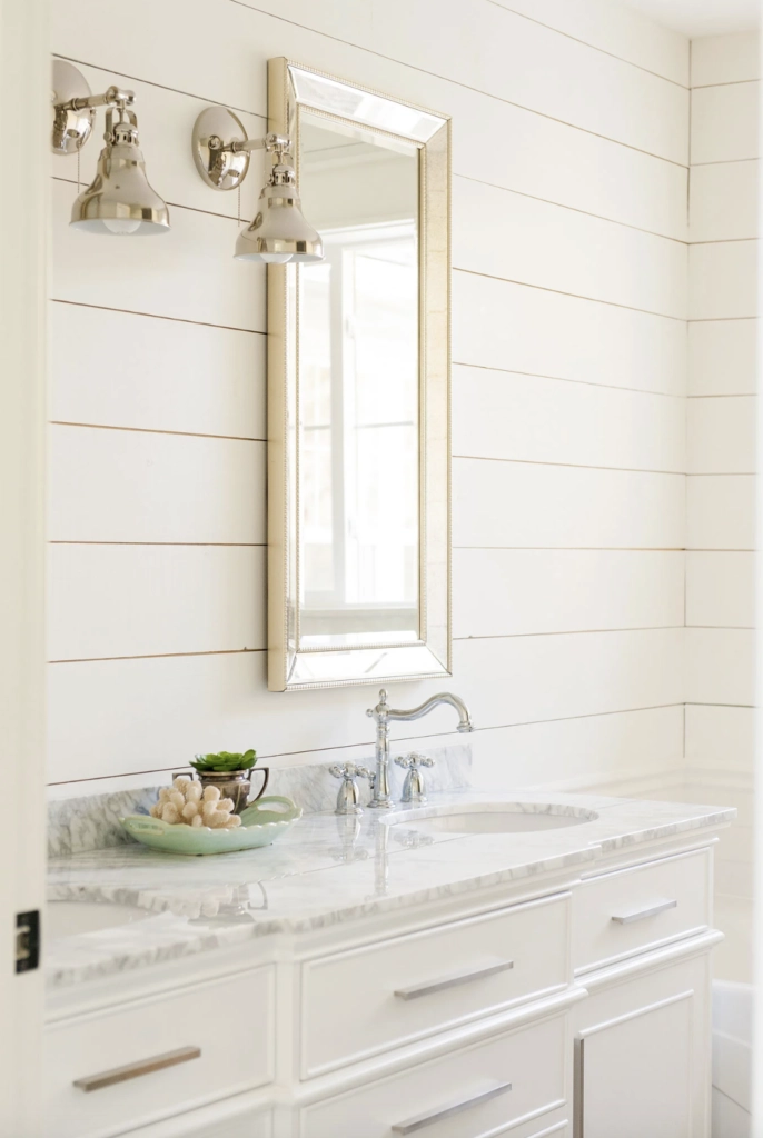
3. Bathrooms: Bathrooms with Alabaster are like mini spa retreats. Pair it with some fluffy white towels, maybe a plant or two, and voilà – instant relaxation.
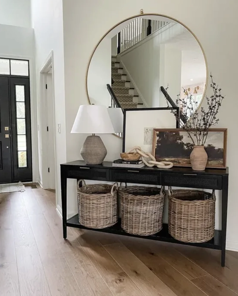
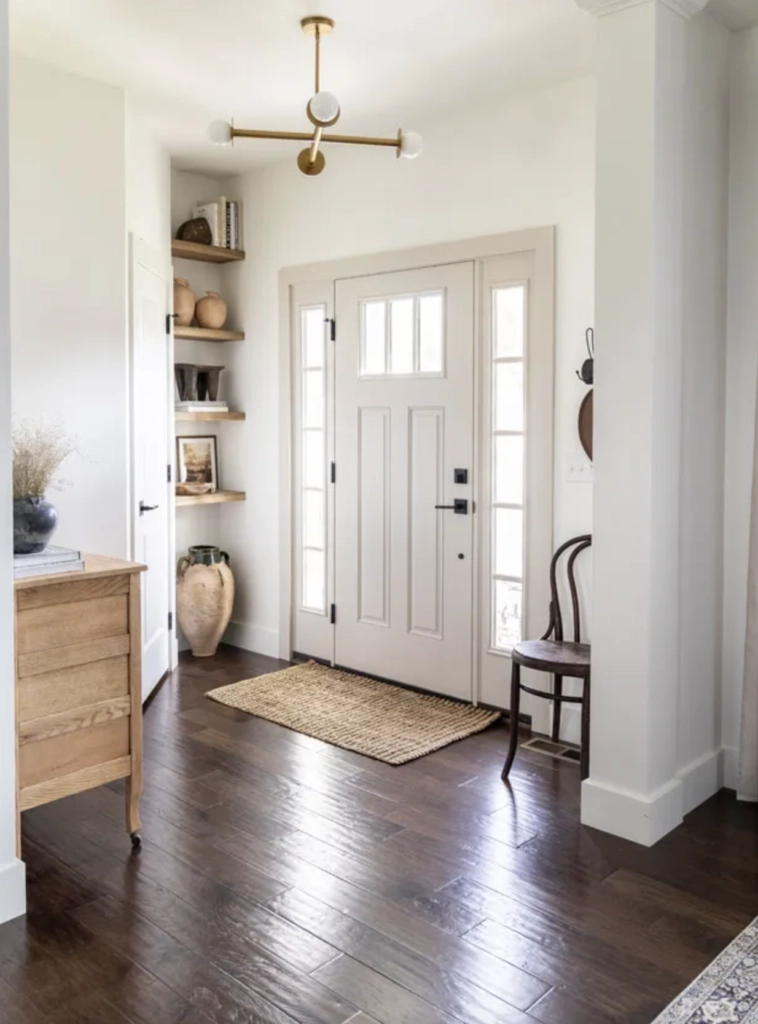
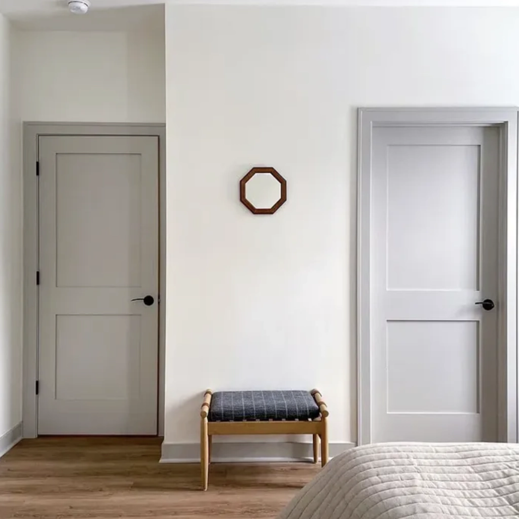
4. Hallways & Foyers: First impressions matter, and with Alabaster in your hallway or foyer, guests are in for a treat. It’s like a warm, stylish hug right when you enter.
Lighting
Swiss Coffee
You know how some days you just feel different, even if you’re wearing your favorite outfit? Well, Swiss Coffee’s kinda like that, but with lighting.
Natural Daylight: In the morning sun, Swiss Coffee is like your favorite cozy sweater – it just feels warm and right. Those gentle yellow undertones? They come out to play, making everything seem a touch sunnier.
Warm Indoor Lights: When the evening rolls in and you switch on those warm bulbs, Swiss Coffee takes on a richer, more intimate vibe. Perfect for those nights when all you want is a book and some quiet.
Cooler Lights: Under stark, cool lights, Swiss Coffee tones down the warmth. It’s more laid-back, ideal for spaces that want clarity and calm.
Alabaster
Alabaster’s a bit of a show-off when it comes to lighting. It loves to adapt and show different sides of itself.
Natural Daylight: In pure daylight, Alabaster feels clean and refreshing. Those tiny gray hints? They give it an edge, making spaces feel modern and open.
Warm Indoor Lights: In the evening, Alabaster mellows out under the glow of soft lights. It’s neutral but with a touch of warmth, just what you need for a relaxed vibe.
Cooler Lights: With cool lights, Alabaster stands tall and pure. It’s crisp and contemporary, making it the go-to for anyone chasing a modern aesthetic.
Matching Colors & Decor
Choosing a paint color is much like setting the stage for a play; every piece of decor, every shade of complementing color, and every piece of furniture has a role. The wall color sets the tone, and everything else follows suit.
Swiss Coffee
Swiss Coffee’s warmth and subtleness can be the unsung hero in many design stories.
Matching Colors: Think of soft beiges, muted sage greens, and even deep blues. When paired with Swiss Coffee, these shades create a symphony of colors that’s easy on the eyes.
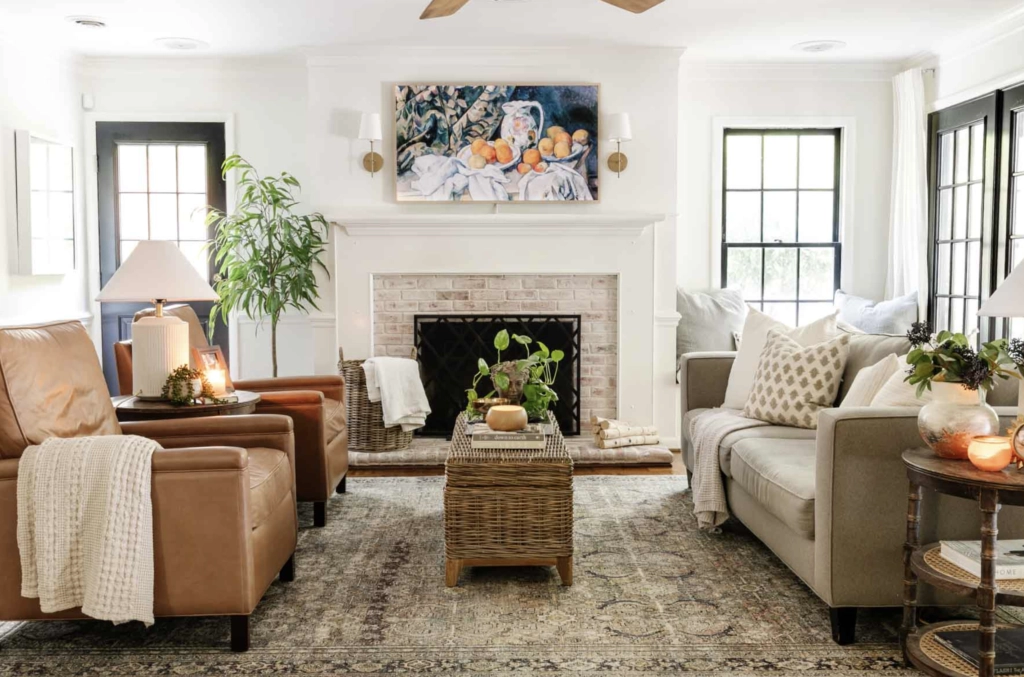
- Wooden Furniture: The beauty of wooden furniture, whether a sleek modern piece or something with a rustic charm, is elevated with Swiss Coffee. It’s like highlighting the intricate details of a beautiful song.
- Textured Decor: Fabrics like linen, jute rugs, and even macramé wall hangings resonate with the comforting vibes of Swiss Coffee. It’s akin to the feeling of wrapping up in a warm blanket on a cold day.
Alabaster
Alabaster’s versatility is its superpower. It’s the backdrop that allows other elements to shine.
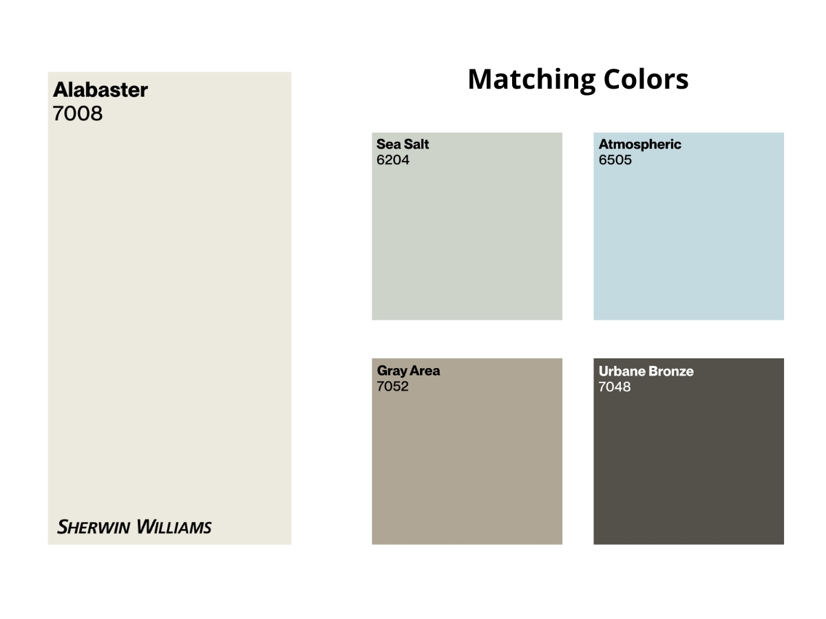
Matching Colors: Alabaster gets along with a myriad of shades. Soft grays, refreshing teal, and even bolder shades like emerald green create a delightful dance of colors when paired with it.
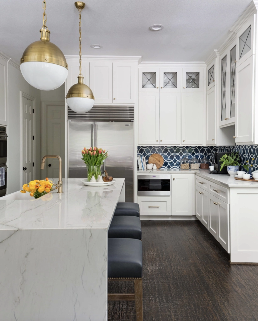
- Modern Accents: Incorporate geometric patterns, sleek metallic fixtures, and abstract art. Alabaster provides them with a canvas, much like a silent pause in a musical piece emphasizing the following notes.
- Glass and Metallic Decor: Crystal-clear glass pieces or shimmering metallic accents? Alabaster makes them pop. It’s the subtle contrast that makes a design memorable.
Which Should You Choose?
Swiss Coffee vs Alabaster is like picking between two hit songs – both are fantastic, but which one resonates with you more?
Benjamin Moore Swiss Coffee is for those who lean towards warmth and coziness. It’s reminiscent of a comforting hug on a chilly day or that first sip of a creamy latte. If your home is filled with wooden accents and textured fabrics, or you just love that sun-kissed glow on your walls, Swiss Coffee might just be your jam.
On the flip side, Sherwin Williams Alabaster is the epitome of versatility. It’s the crisp white shirt that goes with any outfit. Whether your home vibes are modern, chic, minimalist, or even a bit eclectic, Alabaster stands out without overpowering. It’s the subtle background score that sets the mood just right.
In the end, it’s all about what feels right for you and your space. Grab some samples, test them out, and trust your instincts. Because, just like in life, there’s no right or wrong, only what feels true to you.

Hi, we are remodeling a home with Spanish trowel walls and looking for a color to neutralize the walls. The house is full of medium dark hand scraped hardwoods and built in cabinets as well as an open kitchen with knotty alder cabinets. Any recommendations for a nice white, off white, or beige? We are leaning towards Swiss Coffee. Loved your article!
Hi Katie! Swiss Coffee is a lovely choice – perfect with those cabinets while keeping things bright. With Spanish textured walls, it’ll create beautiful subtle shadows.
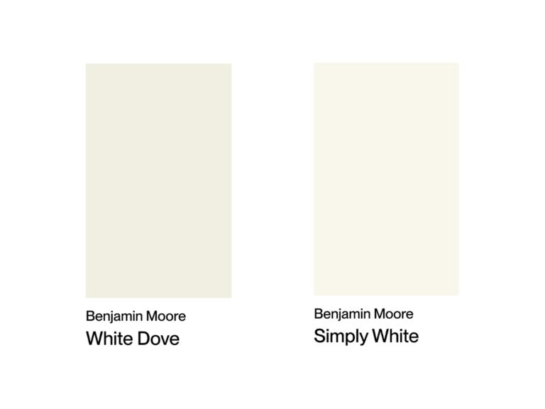
For alternatives, Benjamin Moore’s White Dove works wonderfully with hardwoods. Or try Farrow & Ball’s School House White – it has a sophisticated, warm undertone that would complement both your wood elements and wall texture.
Test samples at different times – textured walls can really change how colors read 💕
Thank you so much!
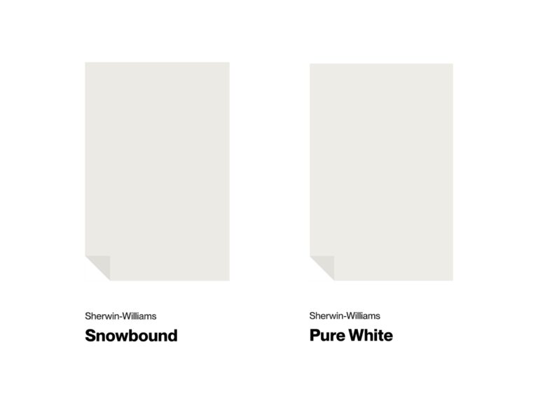
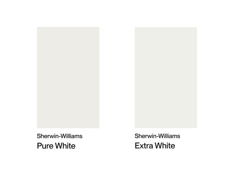
We are repainting all of our kitchen and Great room walls in our new build. We used SW Aesthetic White and have SW pure White trim and white cabinets that are close to SW Pure White. We have a black island in the kitchen and MSI Calcutta Izaro quartz countertops. The SW Aesthetic White is pulling a pink undertone several times a day! Our great room faces East and the front of the house faces West. We have lighter white oak engineered wood floors that pull a wink of pink which is reflecting a bit making it hard to pick a new wall color. We are between SW Alabaster, SW Swiss Coffee, SW Pearly White or just SW Pure White. Help!
Based on what you’ve described, I’d go with SW Pure White for your walls. Since you already have it on your trim and cabinets, it would create a beautiful, clean look throughout the space. Its neutral undertone should help minimize that pink reflection from your floors too.
If you want a tiny bit of contrast though, Pearly White would be my second choice since its subtle gray undertone might help balance things out.
Before you commit, definitely grab some samples – those undertones can really shift throughout the day!
I have Brazilian cherry engineered wood floors, a white kitchen with cabinets that are painted Extra White, and not very much natural light. Do you recommend Alabaster or Swiss Coffee? Are you familiar with soft chamois?Thank you.
Alabaster would be an excellent choice to brighten the room! It’ll complement your warm floors nicely without clashing with the cabinets.
Soft Chamois might be too dark for this space. If you’re looking for alternatives, consider White Dove or Simply White 🙂
I have been researching whites for two weeks, this is by far the BEST writeup I have seen to date! Thanks for sharing!
I have Wood Floors that tent to have a slight hint of orange… early 2000 vibe. cant change floors. Looking to paint either alabaster of swiss coffee. Swatch of swiss coffee leans yellow to me . I also like alabaster but im afraid if wont pop against white trim . My main peice of furniture is Charcoal sectional couch . Please help
Hi Peggy,
To complement your early 2000s orange-hued wood floors and charcoal sectional, I suggest opting for a crisp white like Alabaster on the walls. To make the trim pop, consider going a shade darker, like Benjamin Moore’s White Dove. This will create a clean, modern look that balances the warmth of your floors. Swiss Coffee’s yellow undertones could clash, so Alabaster is the way to go. Bring home samples to see how the colors work in your space’s lighting before committing.
Good luck with your painting project!