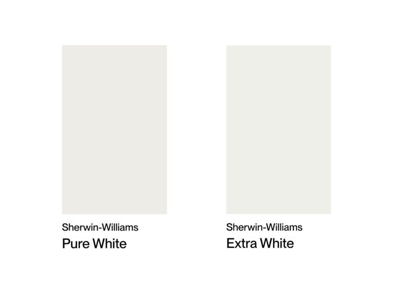
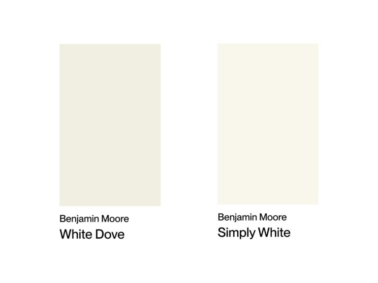
You know those moments when you’re standing at the paint store, staring at a wall of white paint samples and questioning your sanity? That’s exactly how I felt while trying to decide between Benjamin Moore White Dove and Sherwin Williams Alabaster for one of my projects.
You might think “white is white” – but that couldn’t be further from the truth! These two shades consistently make it to the top of most popular white paint lists, and for good reason: they’re truly something special, though quite different from each other.
After countless hours of testing samples on my walls (and maybe getting a bit obsessed with comparing the shades in different lighting), I finally cracked the code on all their subtle differences. I’m ready to share what I learned so you can get it right the first time.
Undertones & Character
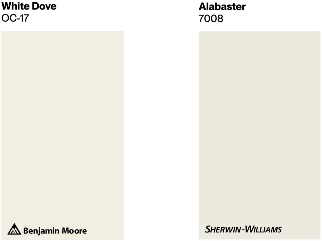
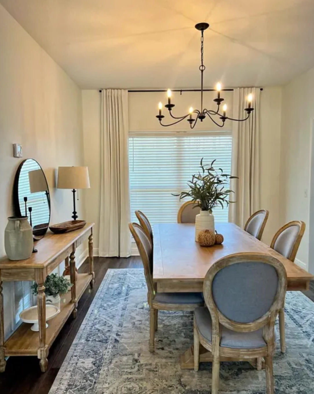
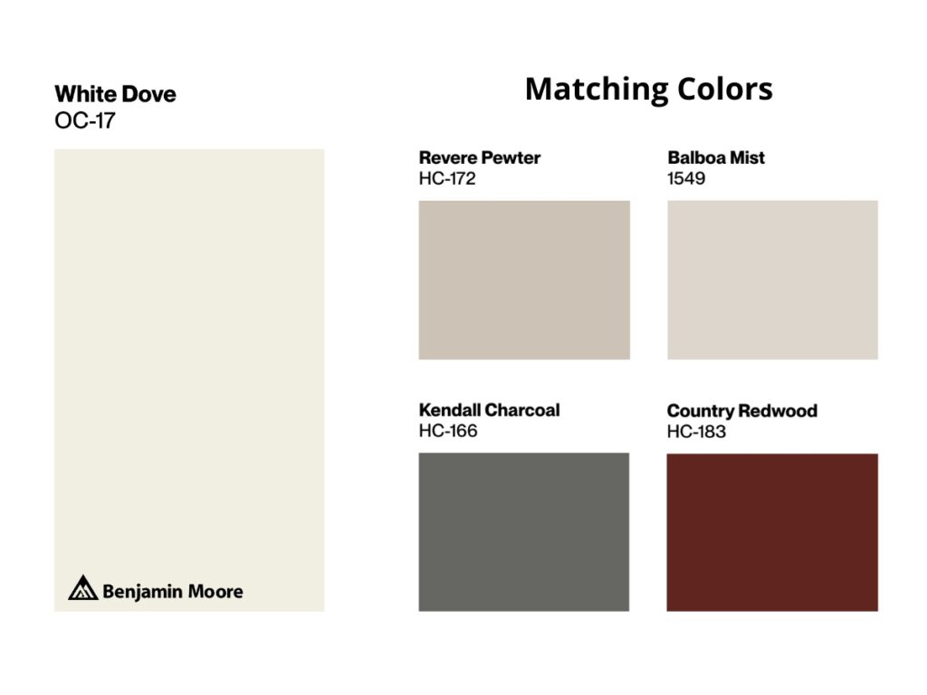
Benjamin Moore’s White Dove (OC-17) is a warm white with a soft greige undertone and 83.16 LRV. It’s perfect for anyone wanting to create a cozy space that doesn’t feel sterile, especially in traditional interiors and north-facing rooms.
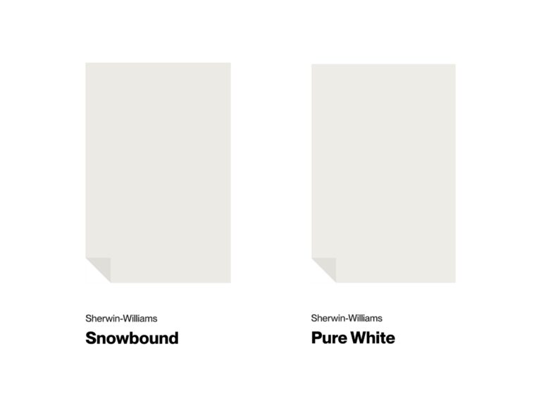
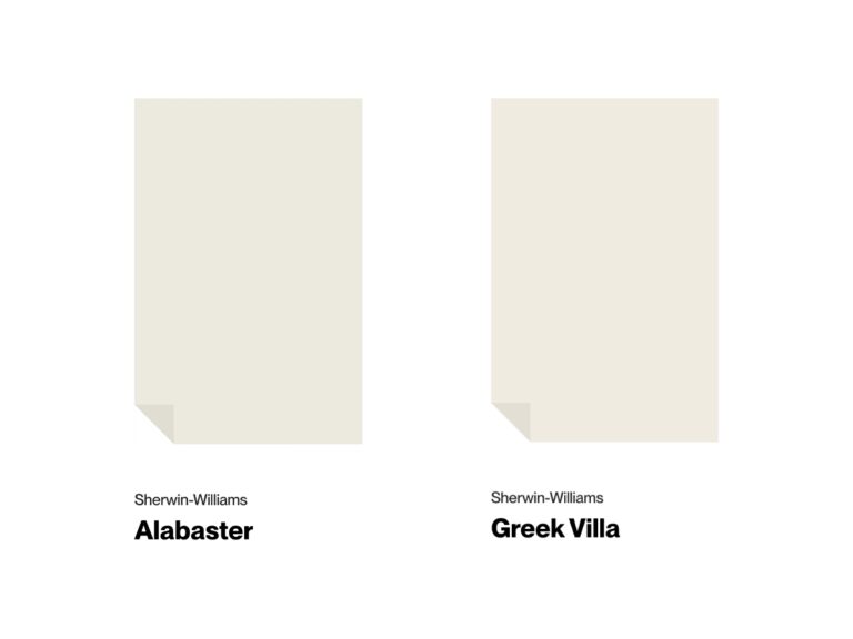
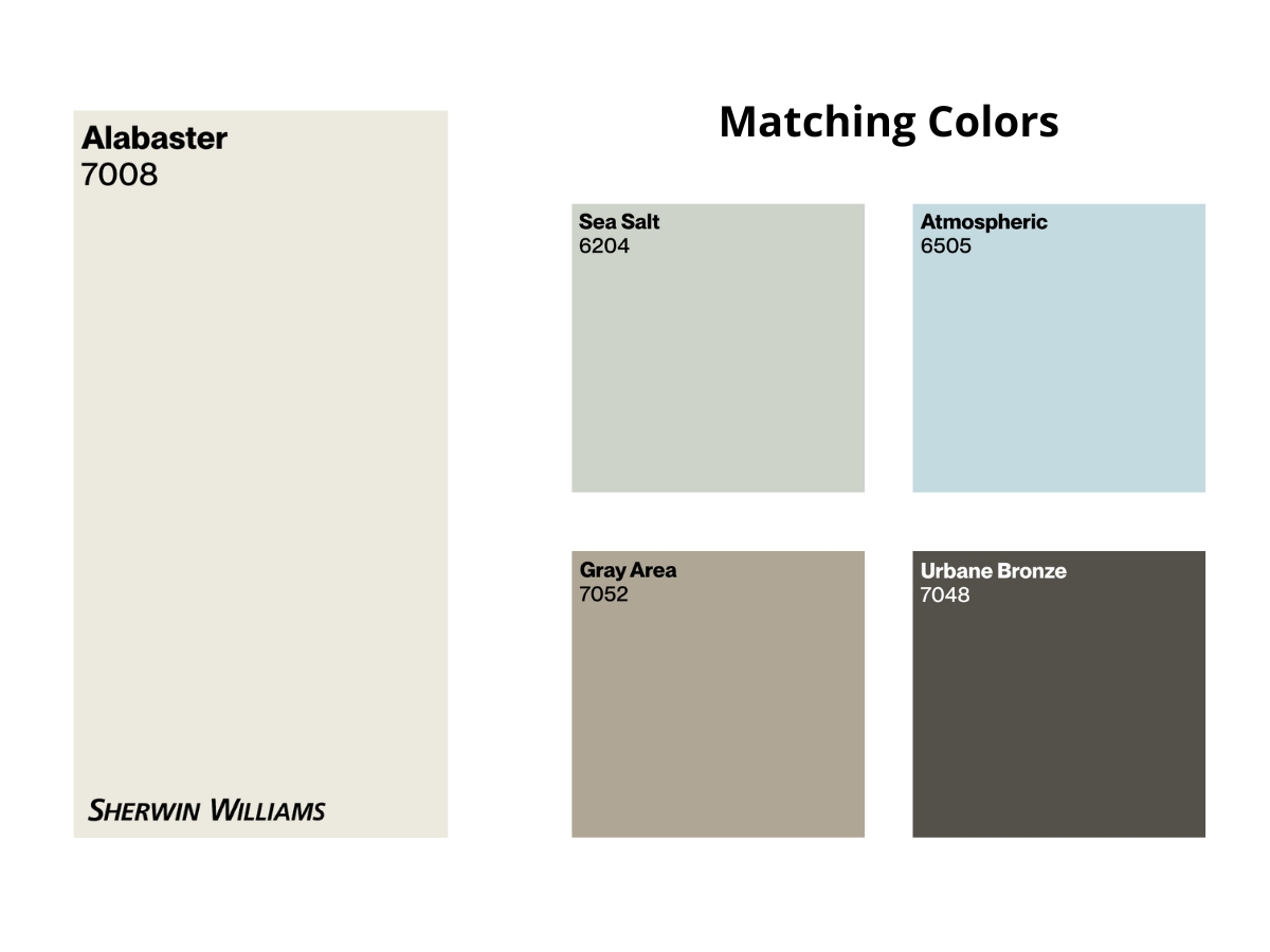
Sherwin-Williams Alabaster (SW 7008) is another warm white featuring a yellow-beige undertone with a hint of gray and an LRV of 82. It’s an excellent pick for darker spaces and areas where you need consistent color regardless of lighting.
Both are off-whites rather than pure whites. They’re quite similar, and sometimes you could use either one in the same space with equally good results.
Looking at the comparison photo above (click to enlarge), you can see that White Dove leans slightly more creamy, while Alabaster appears a bit brighter and more neutral.
source
source
When I look at these shades side by side, their personalities really stand out.
White Dove has this subtle, barely-there greige undertone that becomes more visible in certain lights. You might catch a slight yellow tinge during golden hour, but it never gets overwhelming.
source
source
Alabaster, on the other hand, has a more balanced undertone. While many whites can shift dramatically depending on the light, Alabaster stays more consistent.
Their high LRV numbers mean they’re both great at bouncing light around and making spaces feel more spacious.
But here’s a key difference: White Dove can show its warm side more in south-facing rooms, while Alabaster keeps its cool and stays more neutral in the same conditions.
Best Applications
Both White Dove and Alabaster are incredibly versatile. Designers love using either one pretty much anywhere, but they each have their sweet spots.
source
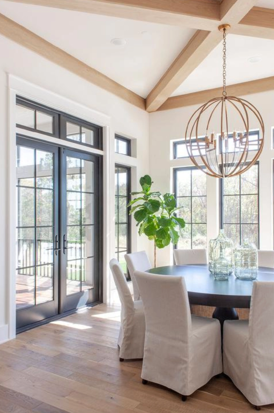
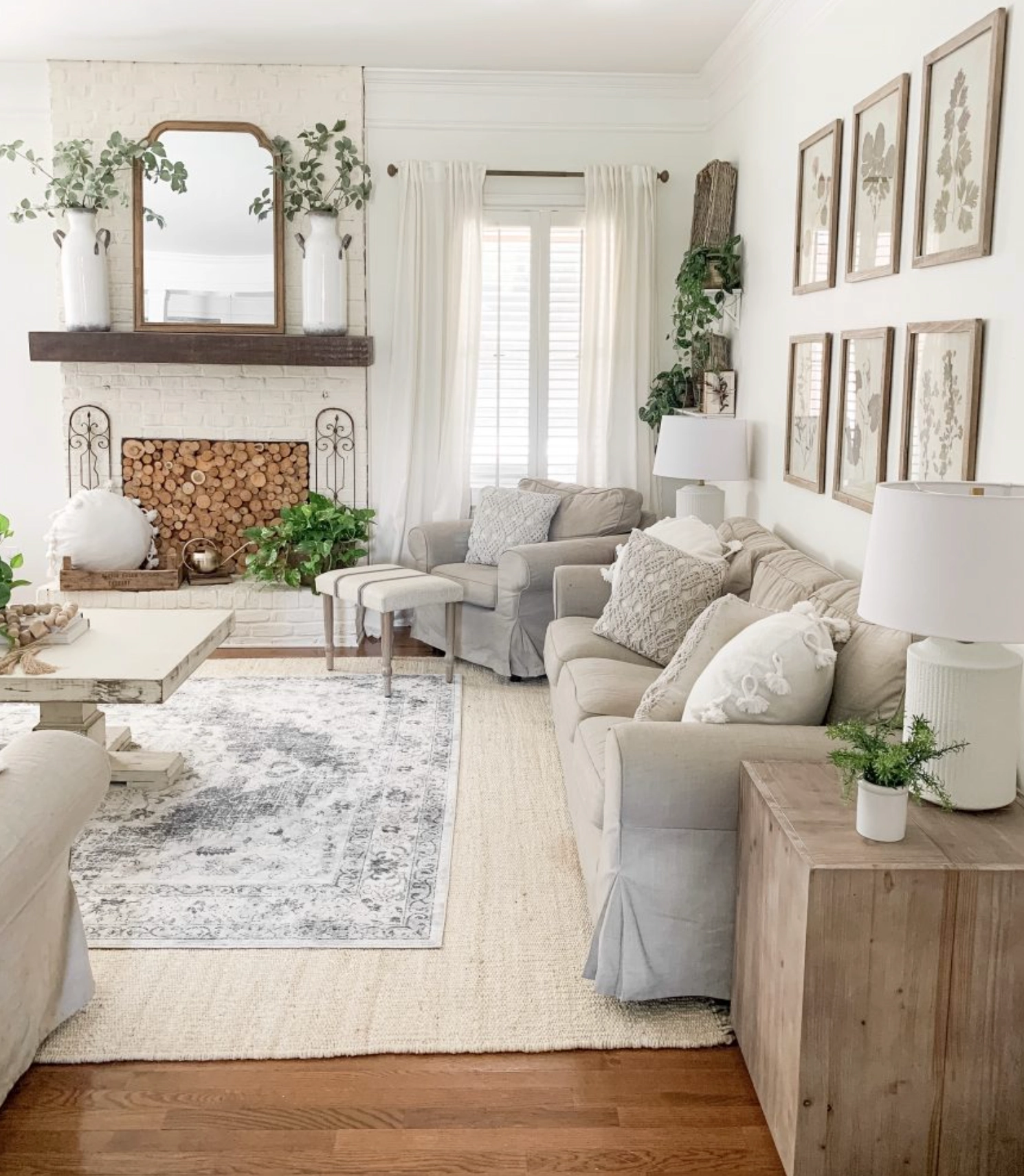
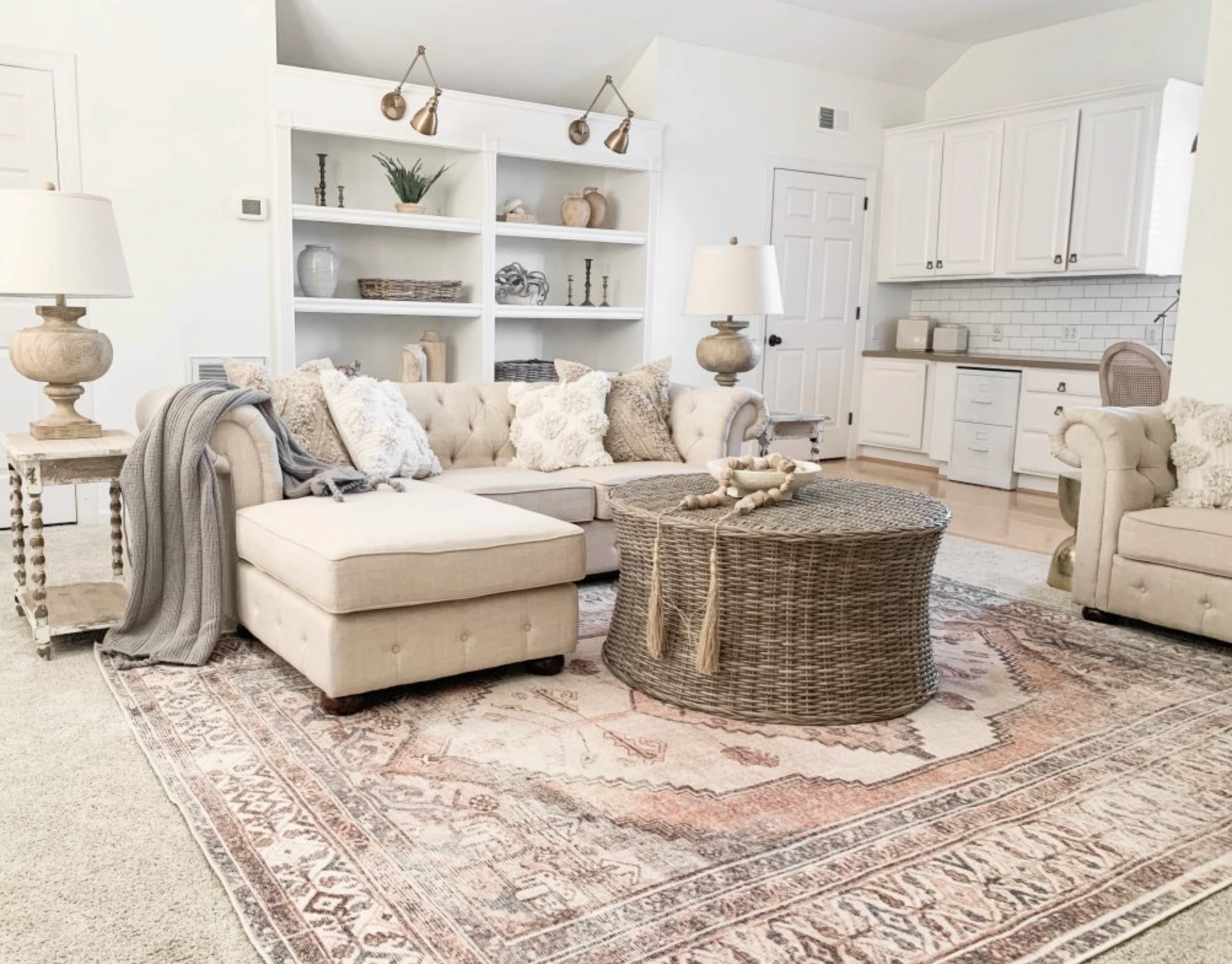
I personally love White Dove for larger spaces, especially when you want everything to flow together smoothly.
source
source
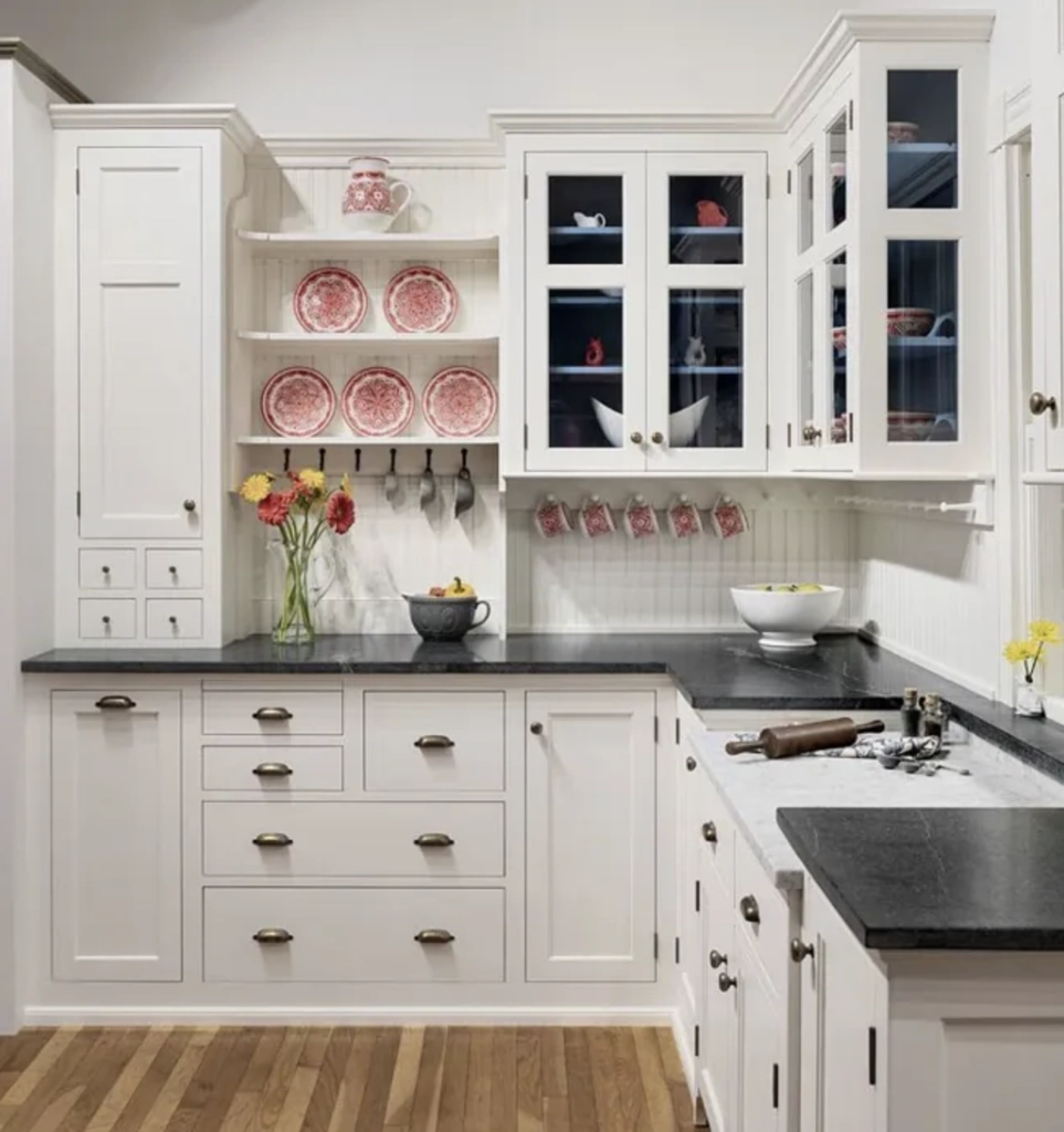
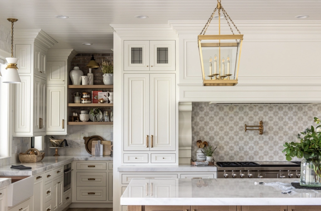
It’s particularly fantastic on kitchen cabinets – giving you that warm, welcoming feel without turning your kitchen into a cream-fest.
The subtle, greige undertone adds just the right amount of softness for these practical spaces. Plus, that high LRV of 83.16 means it reflects plenty of light.
source
source
As for Alabaster, it’s remarkably stable – you won’t see it suddenly turn yellow or gray, even in tricky lighting situations.
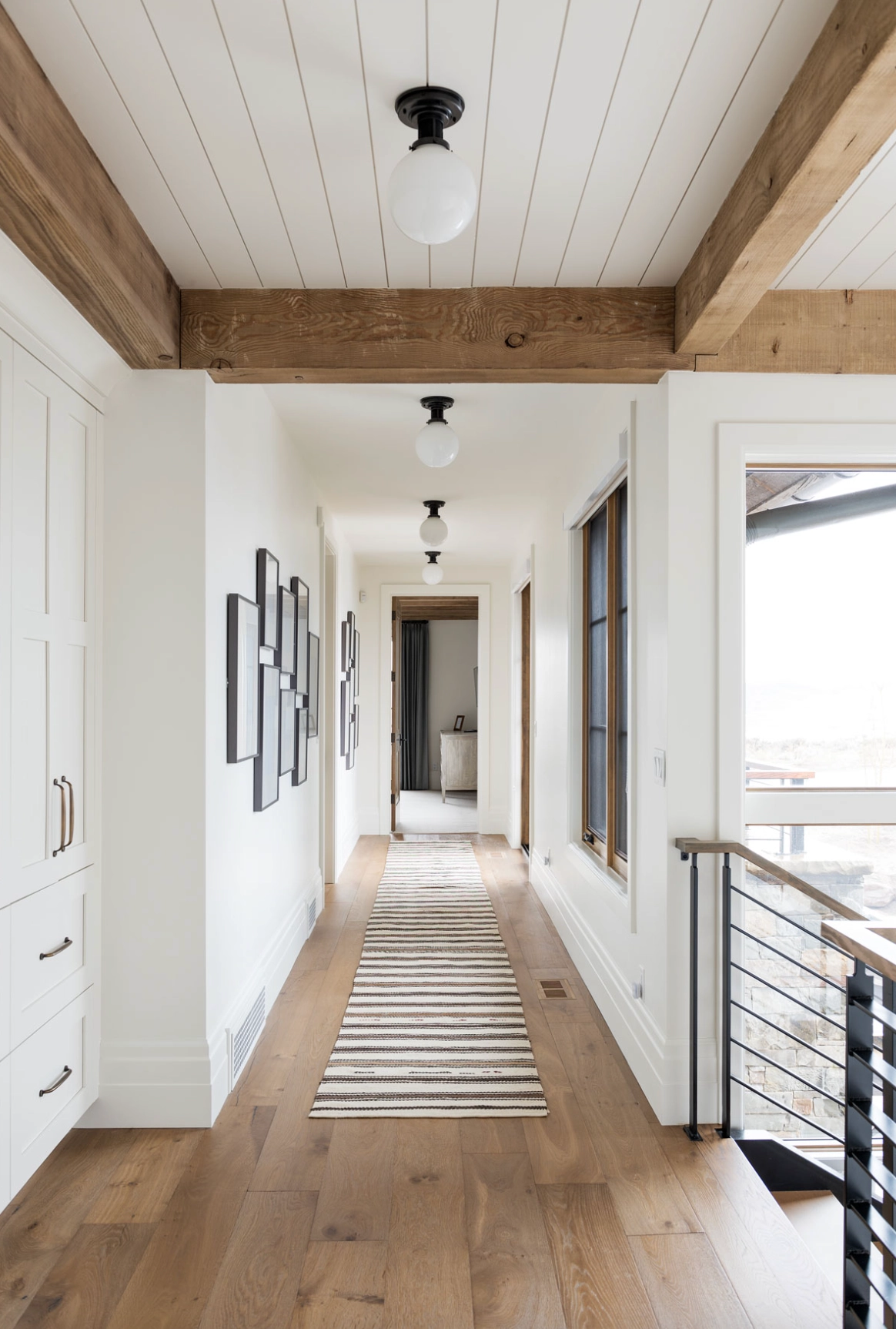
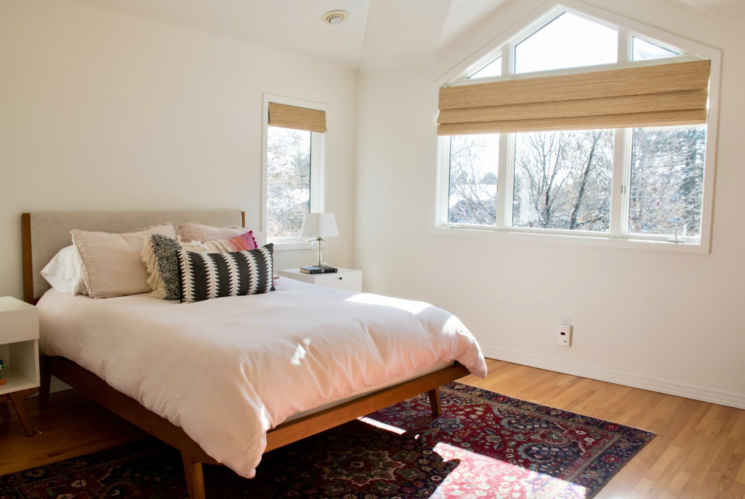
It really shines in darker spaces, particularly north-facing bedrooms, where it creates this lovely soft, diffused light effect. Its biggest strength is how it manages to stay fresh and white without feeling clinical.
Lighting Impact
source
White Dove shows different personalities under various lighting conditions – that’s exactly why some clients love it while others shy away from it.
In north-facing rooms or on cloudy days, its warm undertone shines – keeping spaces cozy despite the cool light. I once used it in a Portland home where sunlight was scarce, and it delivered exactly the warm comfort my client was after.
source
White Dove might throw you a curveball in south-facing rooms – during the golden hour, it picks up a subtle yellowish tint.
But don’t worry – this isn’t that harsh yellow everyone dreads in white paints. Instead, it adds a lovely warmth, almost like the room is bathed in gentle sunset light.
source
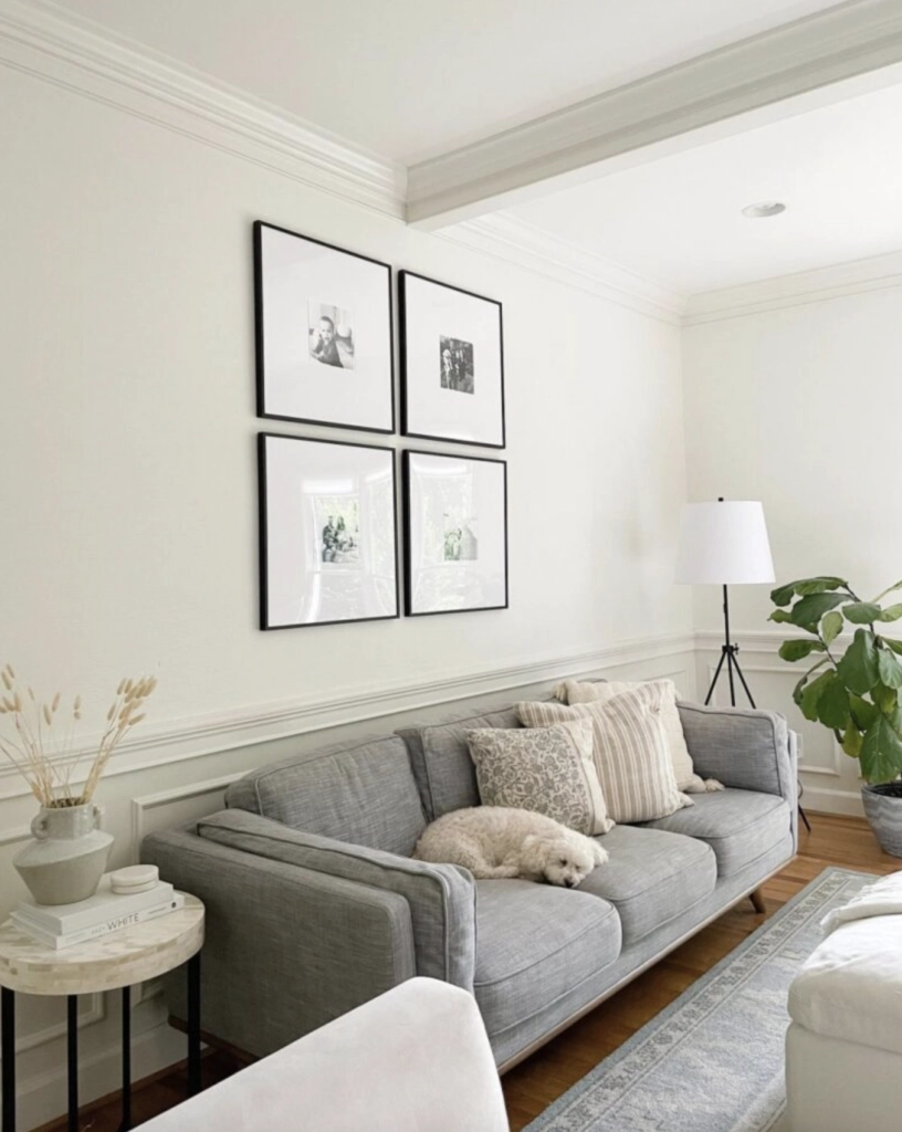
On the other hand, Alabaster is much more predictable with lighting changes. In north-facing rooms, it reads as a clean white. Even on gloomy days, it won’t turn muddy or gray.
It stays true to its white nature in natural light without feeling clinical like those stark hospital walls.
source
Come evening or under artificial lights, Alabaster warms up nicely but never ventures into noticeable yellow or cream territory.
Here’s a key point – Alabaster is a rockstar in spaces with limited natural light. Its high LRV (82) bounces light around and makes spaces feel bigger.
Even in shadowy areas, it keeps its brightness and clarity, making it perfect for those darker hallways or entryways.
Coordinating Colors
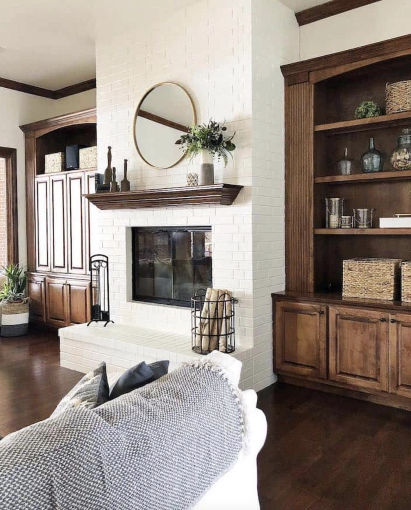
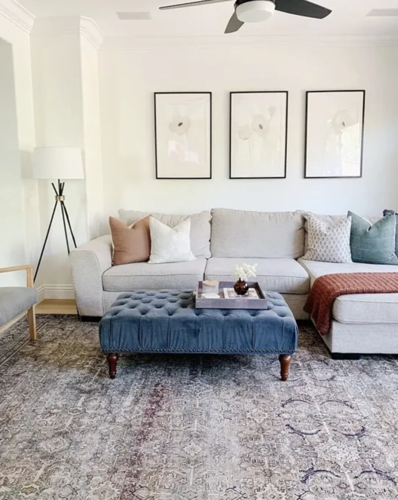
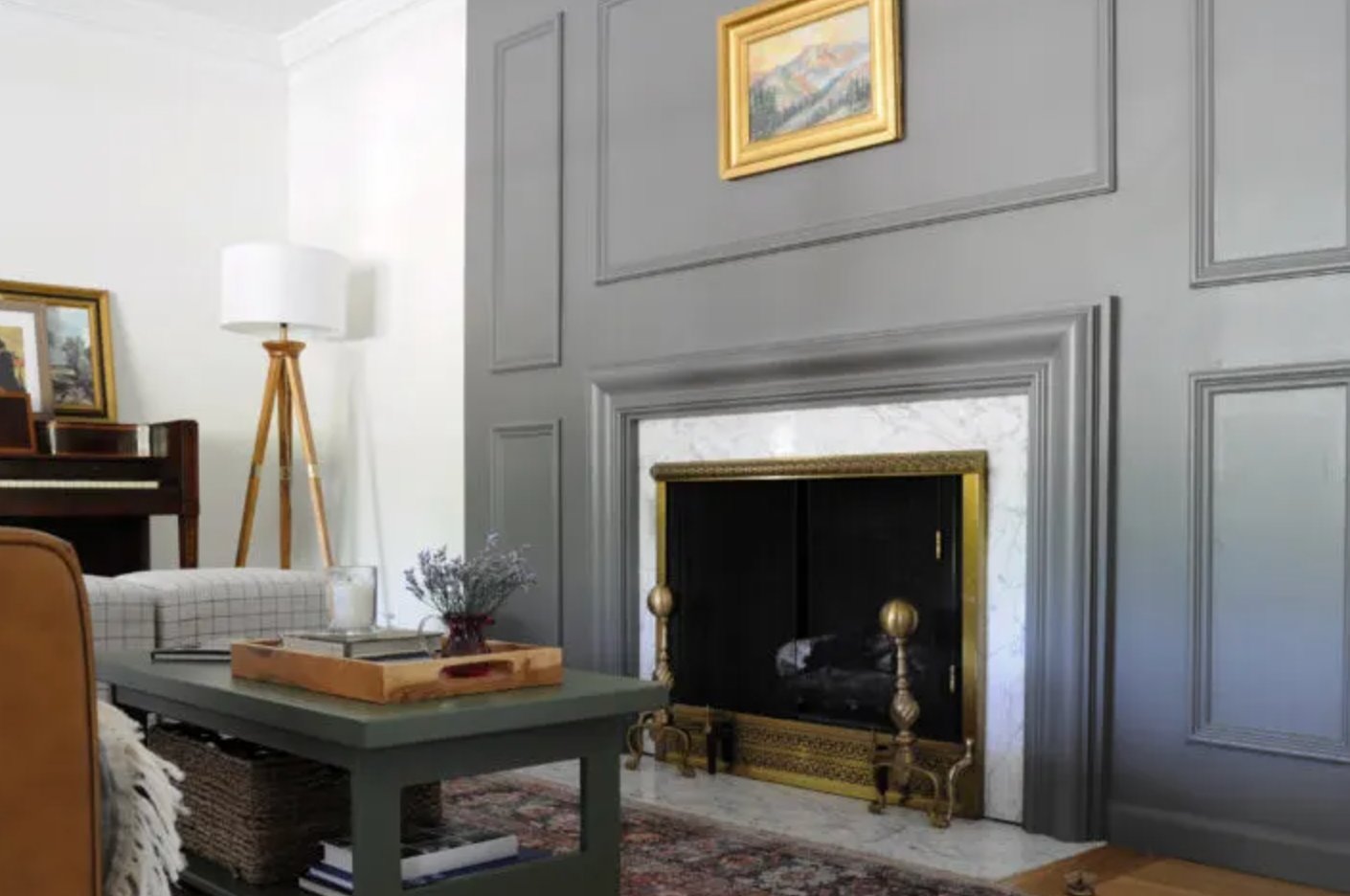
For color pairings, White Dove really hits its stride with deep grays. The combo creates a classic contrast that never feels jarring.
source
source
I love pairing it with medium greige tones on accent walls – they just click together perfectly.
While both colors work in modern and traditional spaces, White Dove has a slight edge in classical settings.
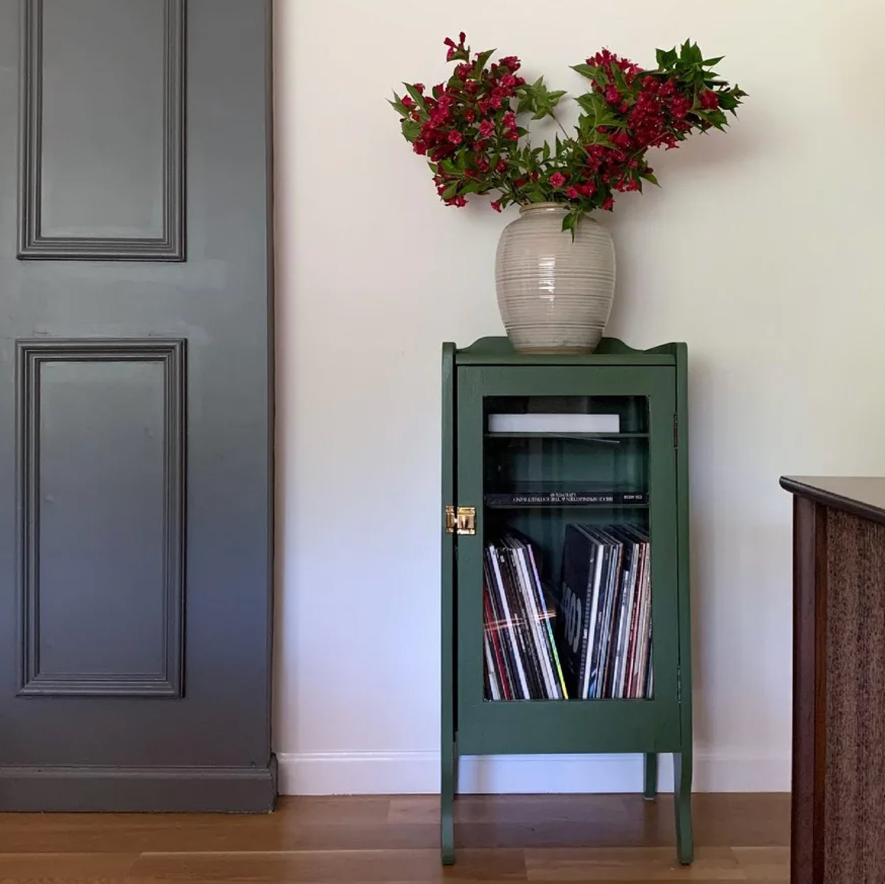
Alabaster plays nicely with several color families. Grays, from mid-tones to almost black, help create an elegant foundation. Like White Dove, it looks fantastic with dark gray accents – they add just the right amount of depth.
source
source
Earth tones naturally complement Alabaster’s warm undertone. Browns, greens, and sandy hues in various intensities create a cozy vibe while keeping things natural.
source
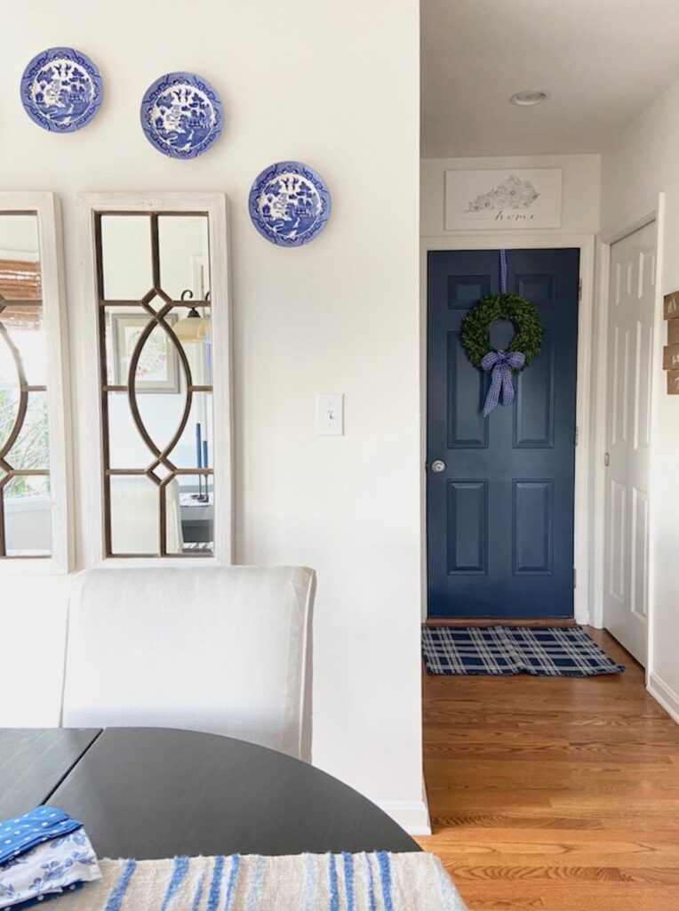
Designers often reach for blue pairings too – they bring in a fresh, cool element. Just stick to muted blues with gray undertones to keep everything balanced.
Making Your Decision
Your final pick really comes down to your space and what you’re going for with your interior. Make sure to test samples in your actual lighting or at least take a good look at photos of real rooms painted in these colors.
I know it’s that same old (kind of boring, sorry!) advice, but it’s true – slapping up 5 different peel-and-stick samples is way easier than repainting your walls later.
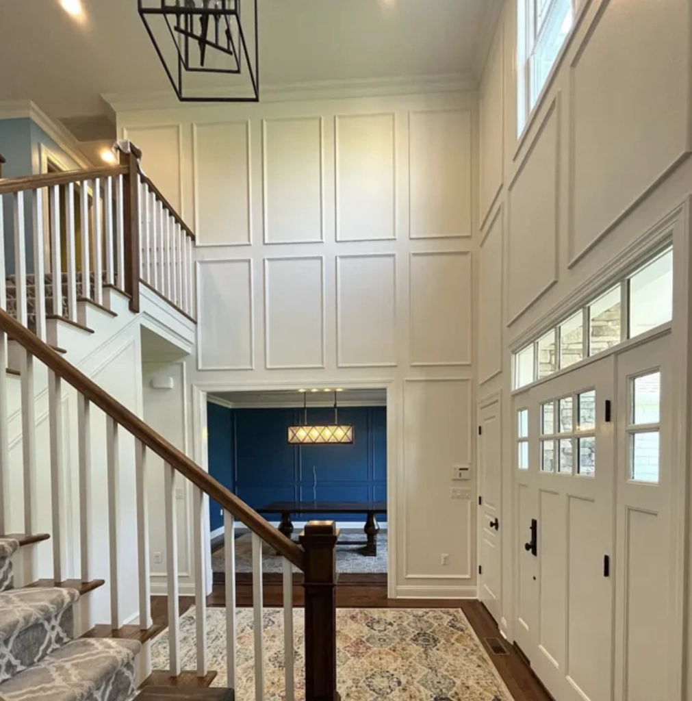
Benjamin Moore White Dove is your go-to for classic interiors with moldings and panels, especially when warming up that cool northern light.
Just keep in mind that this shade likes to change throughout the day, creating different moods as the light shifts.
Sherwin Williams Alabaster is your safe bet when you want consistency. It handles low-light spaces like a champ and works great if you paint everything the same color.
Though they have similar light reflection values, these colors have distinct personalities. White Dove is the more dynamic, warmer option, while Alabaster keeps things neutral and steady.