Do you ever feel like choosing the perfect white paint is an impossible mission? You’re staring at swatches, wondering if you’re seeing things, and suddenly, all those whites start to blur together. Trust me, we’ve all been there!
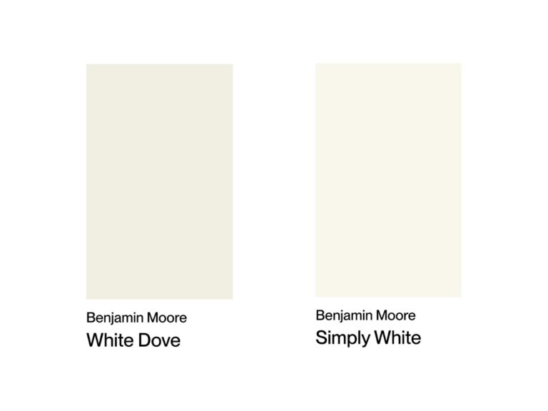
Today, I’m comparing two of Benjamin Moore’s most popular whites: Cloud White and White Dove. I will break down these fantastic shades for you – where they work best, what colors play nice with them, and how different lighting can change their look.
By the end, you’ll have a clear understanding of which one’s right for your space. Let’s get into it!
Cloud White vs White Dove at a Glance
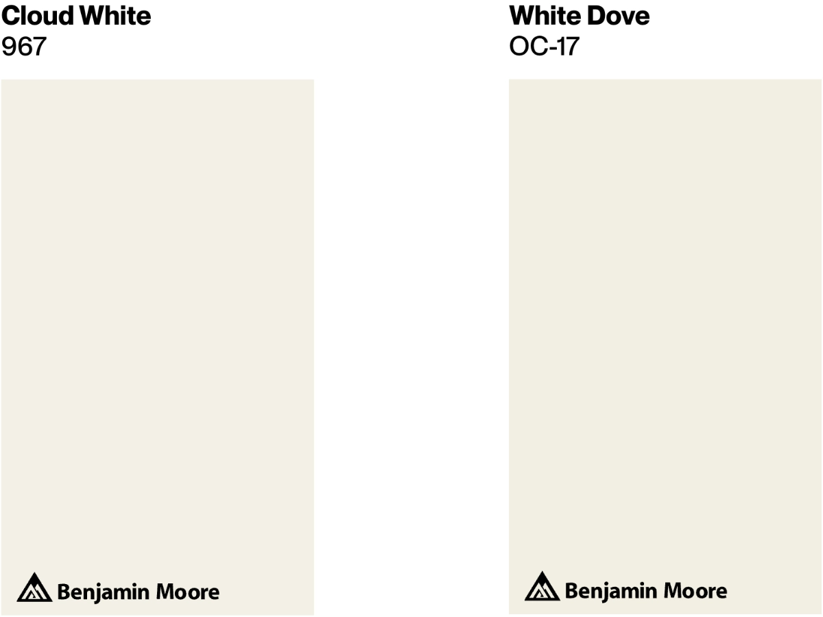
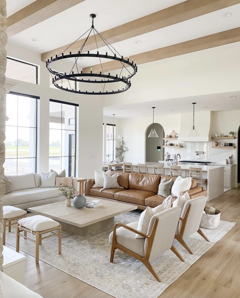
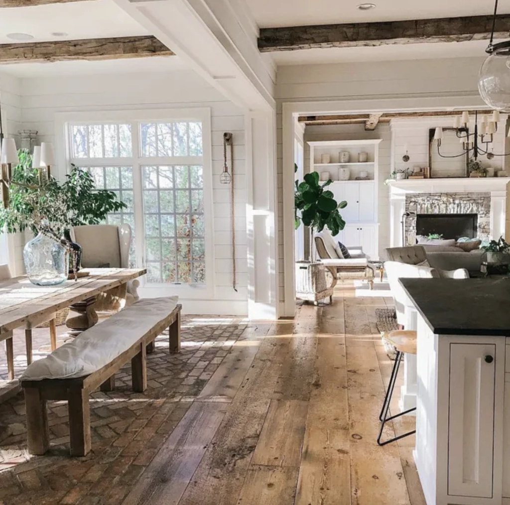
Cloud White OC-130 is a soft, balanced white that effortlessly brightens any space. Its subtle warmth makes it remarkably adaptable, whether you’re going for modern chic or cozy traditional.
This shade reveals its full potential in spaces filled with natural daylight, where its subtle warmth truly shines. Cloud White complements natural wood tones and soft textiles, while providing an elegant backdrop for plants and flowers.
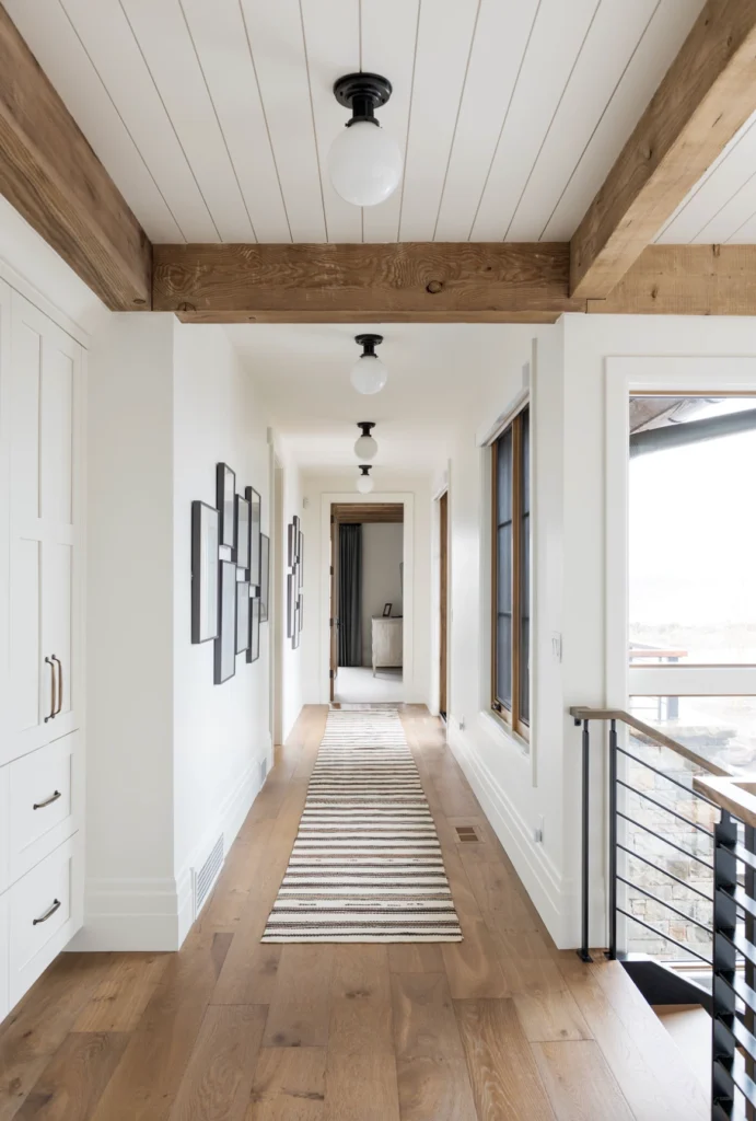
White Dove OC-17 is a classic creamy white that has stood the test of time. It’s the go-to for many designers for trim and cabinetry, but don’t let that limit you – this shade can hold its own on walls, too!
White Dove maintains a warm appearance in both natural and artificial light. This shade pairs well with metallic finishes and natural materials.
| Cloud White | White Dove | |
|---|---|---|
| Color Code | OC-130 | OC-17 |
| Light Reflectance (LRV) | 85.05 | 83.16 |
| Color Family | Off White | Off White |
| Undertones | Slightly warm with subtle gray undertones. | Slightly warm with hints of gray and yellow. |
| Best for | Living rooms, bedrooms, and kitchens; bright, natural light to highlight its warmth. | Living rooms, dining areas, and bathrooms. Excellent for cabinetry and trim work. |
| Versatility | Suitable for modern, traditional, and coastal designs. Pairs well with both warm and cool colors. | Works in a variety of settings; great for open-concept spaces. Pairs well with both bold and muted colors. |
Best Settings for Each Color
Cloud White
Cloud White is the Swiss Army knife of paint colors – it’s versatile enough to work just about anywhere. But there are a few spots where it really steals the show:
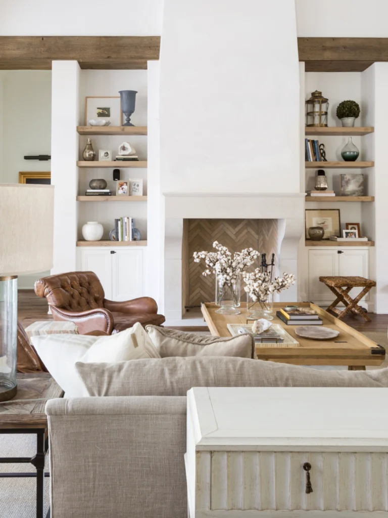
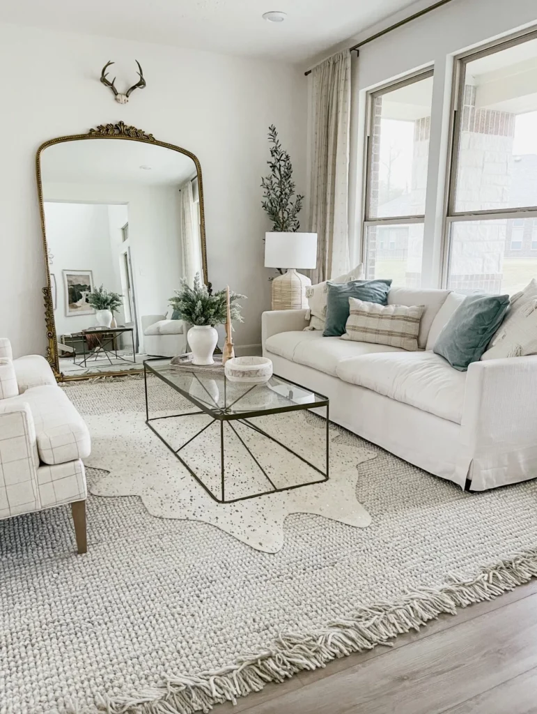
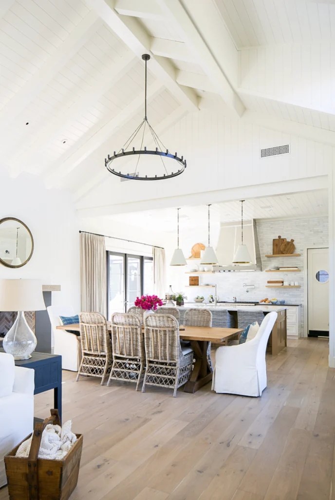
1. Living Rooms: Want to create a space that feels both fresh and cozy? Cloud White’s your answer. It’s bright enough to make the room feel spacious but warm enough to keep things comfortable.
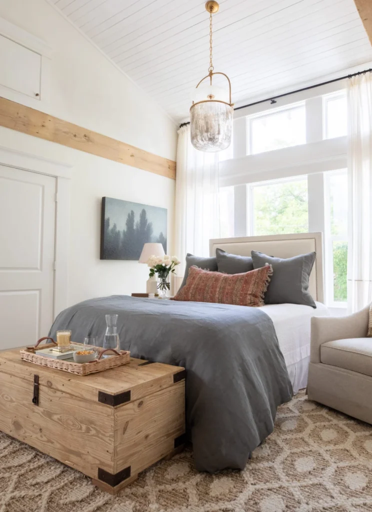
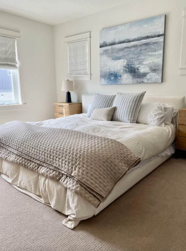
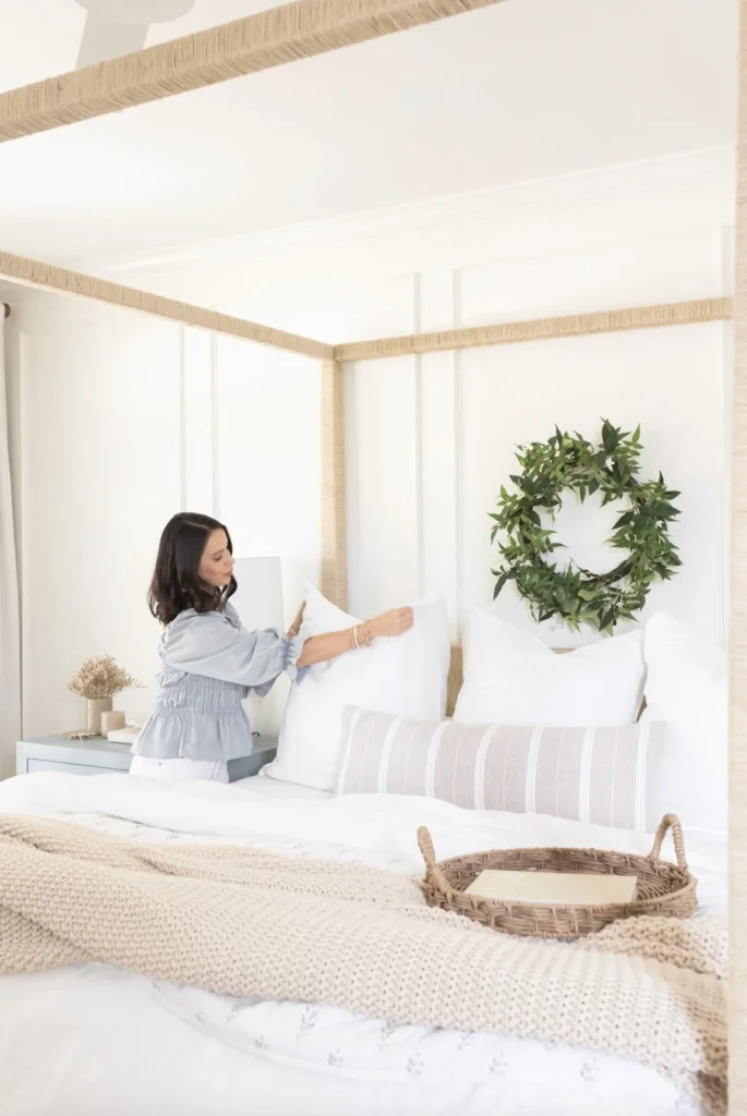
2. Bedrooms: Imagine waking up in a room that feels like you’re floating on a cloud. That’s what Cloud White can do for your bedroom. It’s serene without being boring – the perfect backdrop for a good night’s sleep.
3. Kitchens: Cloud White just brightens everything up in a kitchen. It’s especially great if you have colorful appliances or bold cabinet colors you want to show off.
White Dove
White Dove is like the mood ring of paint colors – it seems to know exactly what each room needs:
1. Dining Rooms: White Dove can turn your dining room into a sophisticated space perfect for everything from casual brunches to formal dinners. It’s warm enough to feel inviting but neutral enough to let your decor shine.
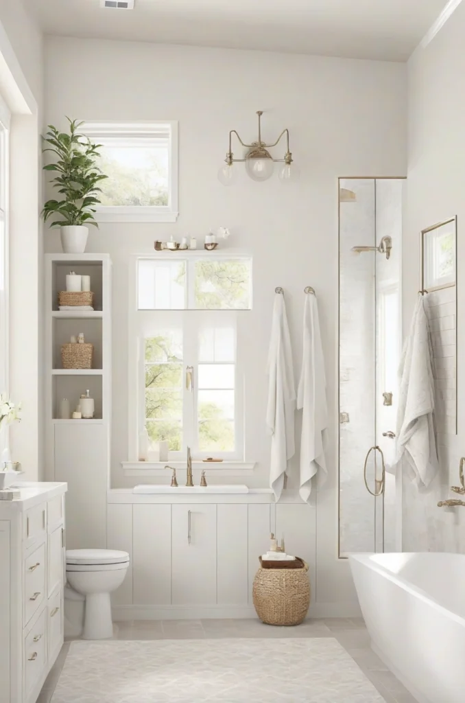
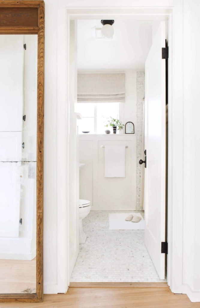
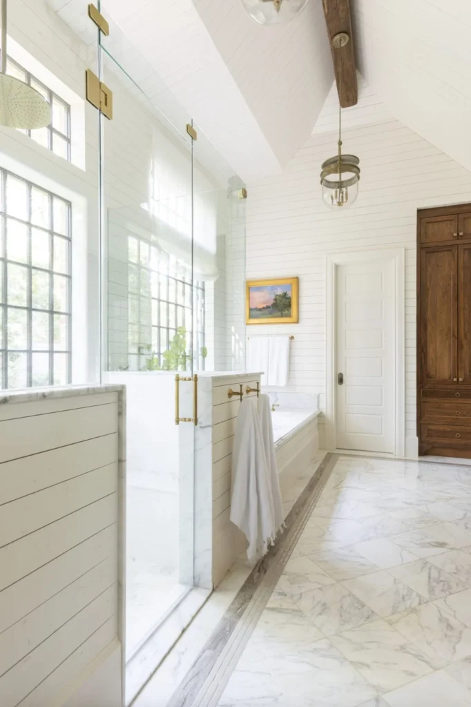
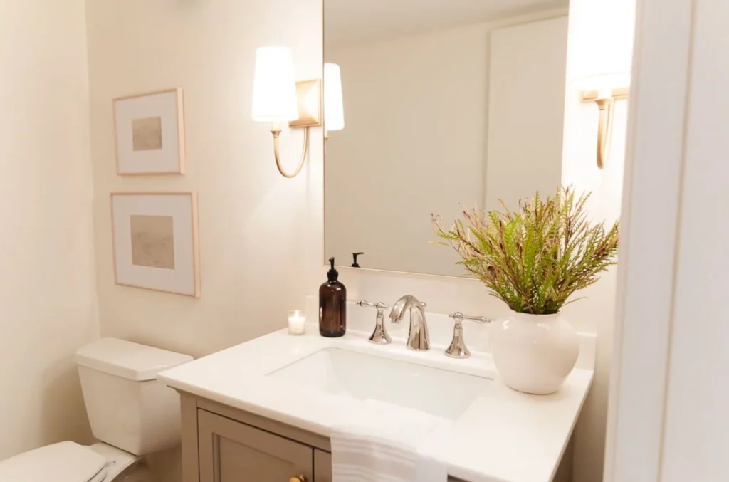
2. Bathrooms: Want to create a spa-like retreat? White Dove’s your ticket. It bounces light around like a pro, making even the tiniest powder room feel like a luxurious retreat. Hello, bubble bath!
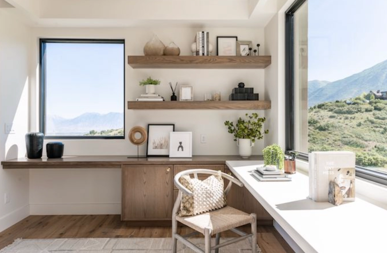
3. Home Offices: In a world of Zoom calls, White Dove can be your secret weapon. It provides a clean, professional backdrop without being harsh on the eyes during those long screen sessions.
Lighting
Cloud White
Cloud White changes with the light, but always in a good way:
In bright, natural light, Cloud White really lives up to its name. It’s soft and airy, like a perfect puffy cloud on a summer day.
Under warm bulbs, Cloud White cozies up, taking on a subtle glow that’s perfect for relaxing evenings. With cooler LEDs, it maintains its crispness without feeling cold.
Even in dimmer settings, Cloud White manages to keep spaces feeling open and bright. It’s like it has a light of its own!
White Dove
Just like a Cloud White, White Dove is also the master of adaptation when it comes to lighting:
In daylight, White Dove shows off its creamy undertones, adding a touch of warmth without going yellow. It’s like your walls are basking in a perpetual golden hour.
White Dove shines under artificial lights. It maintains its warm glow with incandescent bulbs and stays crisp and clean under LEDs.
As evening sets in, White Dove softens, creating a cozy atmosphere that’s perfect for winding down after a long day.
Matching Colors & Decor
Cloud White
Cloud White plays well with both cool and warm tones. Try pairing it with soft grays for a serene look, or go bold with navy or forest green accents.
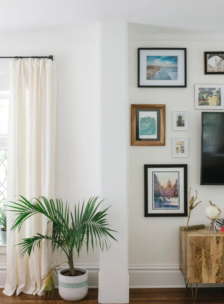
This color is a dream with natural materials. Think wood furniture, jute rugs, and plenty of plants. It also makes a great backdrop for gallery walls, letting your art take center stage.
White Dove
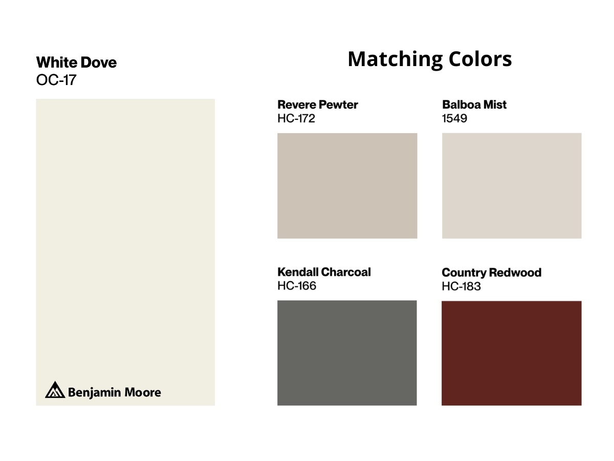
This shade is incredibly versatile. It looks stunning with earth tones, pastels, and even bold jewel tones. For a classic look, pair it with deep blues or greens.
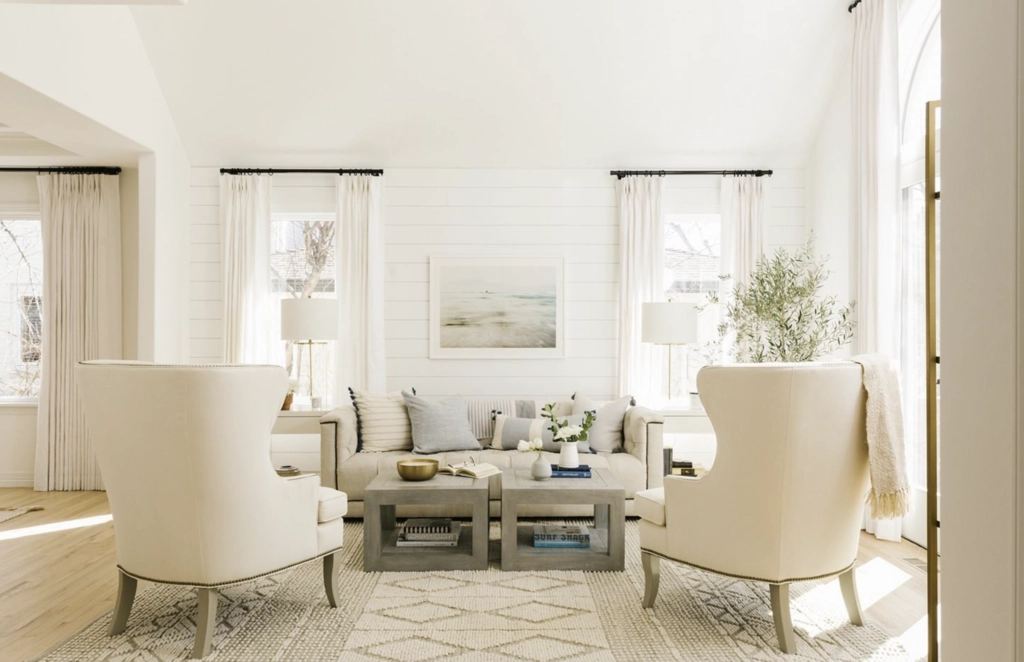
White Dove is a natural fit for farmhouse or traditional styles, but don’t let that limit you. It can also hold its own in modern spaces, especially when paired with sleek furniture and metallic accents.
Which Should You Choose?
Choosing between Cloud White and White Dove is like picking between two amazing desserts – there’s no wrong choice, but one might satisfy your craving better.
Go for Cloud White if:
- You want a bright, airy feel in your space
- You love a clean, fresh look
- Your room gets a lot of natural light
Choose White Dove if:
- You’re after a softer, creamier white
- You want a versatile shade for trim and walls
- You’re looking to create a warm, inviting atmosphere
Remember, the best way to decide is to test these colors in your own space. Lighting can vary dramatically from room to room, so what looks perfect in your living room might not work as well in your bedroom.
Whichever you choose, both Cloud White and White Dove are timeless colors that can transform your space into something truly special.