Ever found yourself staring at a wall of white paint swatches, feeling like you’re trying to spot the difference between snowflakes? You’re not alone.
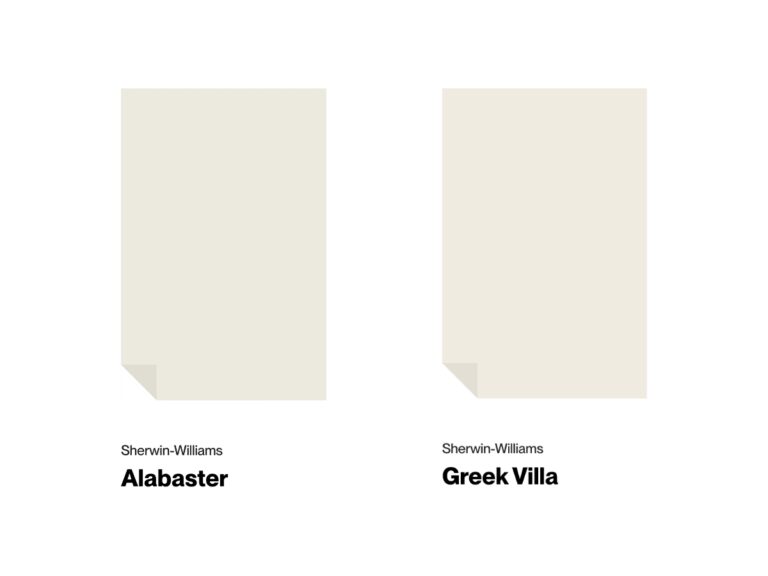
Choosing the right white paint can be a head-scratcher, but don’t worry – I’m here to help you decide between two popular options: Sherwin-Williams’ Dover White and Alabaster.
In the next few minutes, I’ll explain what makes these paints special, where they work best, and how they will complement your favorite throw pillows or that antique coffee table you inherited from Grandma.
Dover White vs Alabaster at a Glance
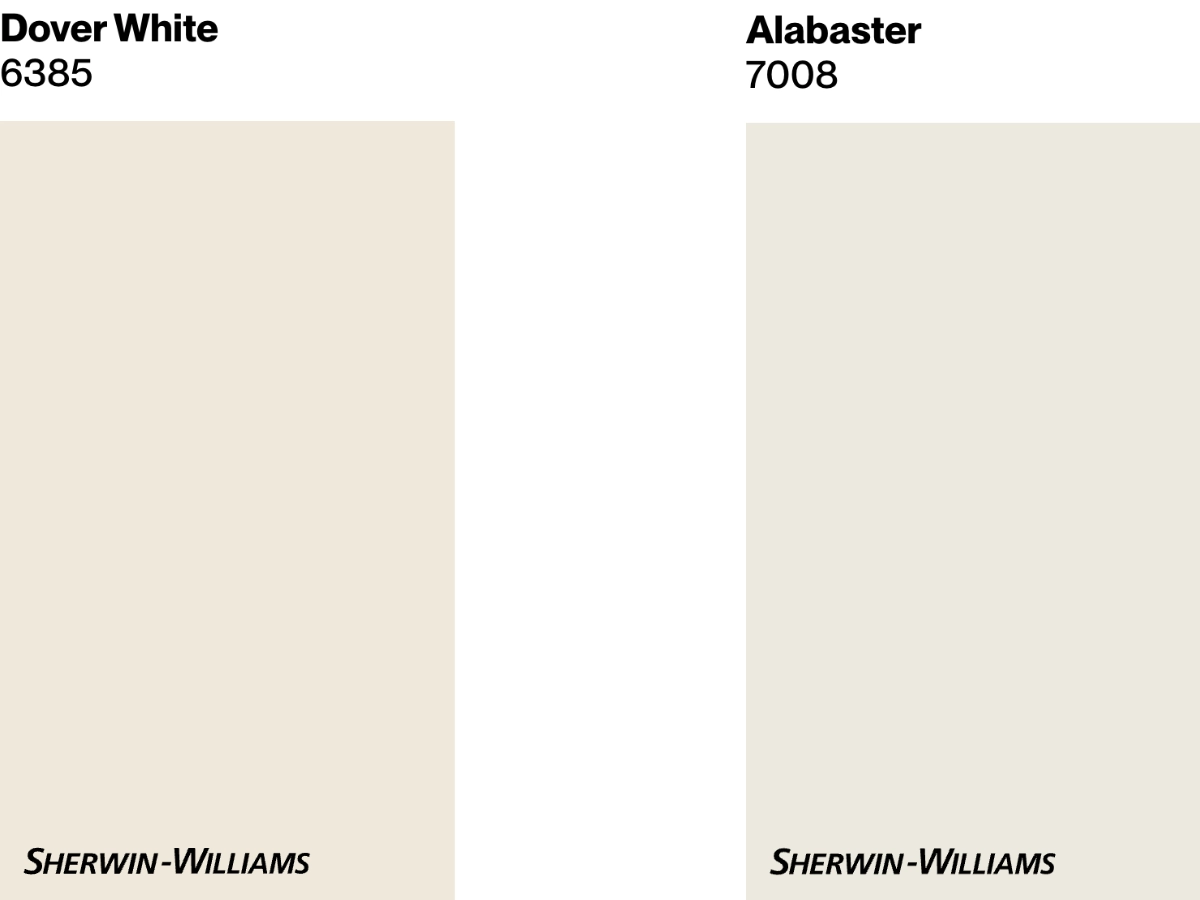
Dover White is like a warm, buttery croissant that you just can’t resist – a creamy off-white with sunny yellow undertones. With an LRV of 83, it’s excellent at bouncing light and can brighten up even the gloomiest corners.
It’s ideal for creating that “lounging in a sunbeam” vibe, perfect for spaces that need a little warmth and cheer.
Alabaster is more like a perfectly toasted marshmallow – soft, warm white with a hint of beige. Its LRV of 82 makes it slightly less reflective than Dover White but still bright enough to open up a space.
This paint color is the Swiss Army knife of whites – versatile enough to complement almost any style, from beachy vibes to modern farmhouse chic.
| Dover White | Alabaster | |
|---|---|---|
| Color Code | SW 6385 | SW 7008 |
| Light Reflectance (LRV) | 83 | 82 |
| Color Family | White | White |
| Undertones | Predominantly yellow | Creamy beige |
| Best for | Interiors that aim for a cozy and inviting atmosphere. | Homes seeking a light and airy feel without starkness. |
| Versatility | Suitable for various settings, especially nurseries, kids’ rooms, and north-facing spaces where it can brighten the room. | Excellent for a range of spaces, including living rooms and kitchens. Works well as a backdrop for various decor styles. |
Best Settings for Each Color
Dover White
Sherwin-Williams Dover White is a warm, creamy white that leans towards a sunny palette thanks to its yellow undertones. Here’s where it really shines:
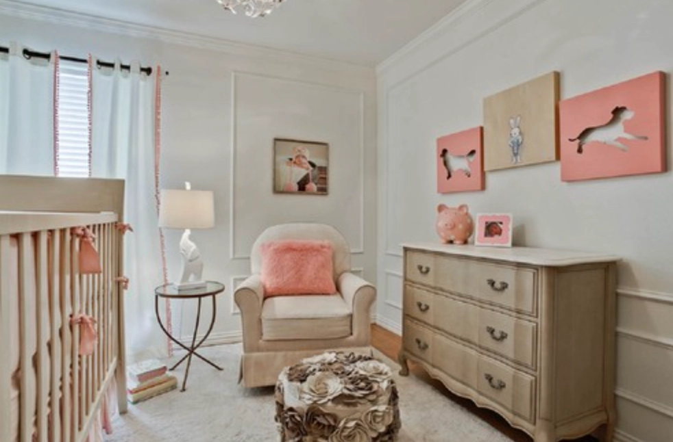
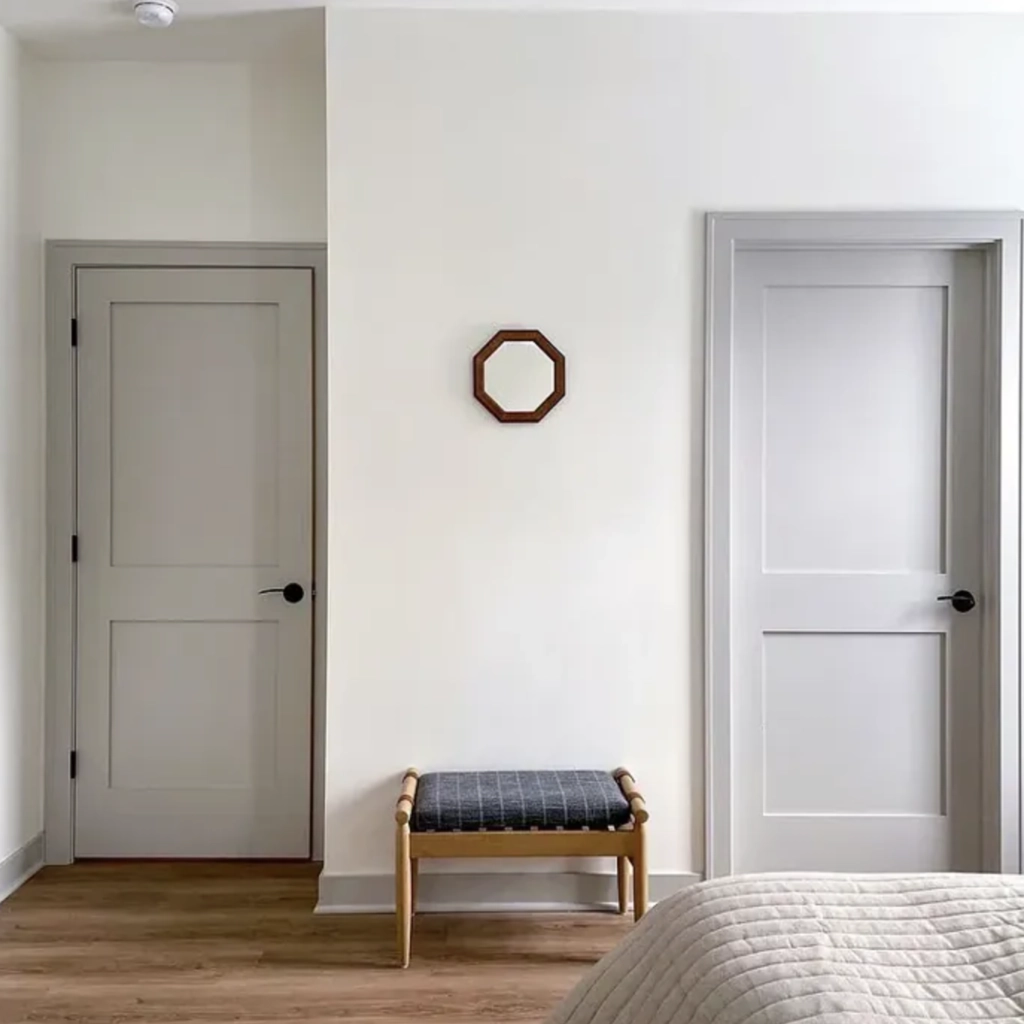
1. Nurseries and Kids’ Rooms: The warm, cheerful undertones create a nurturing atmosphere. It’s like wrapping the room in a soft, cozy blanket – perfect for little ones and their imaginations.
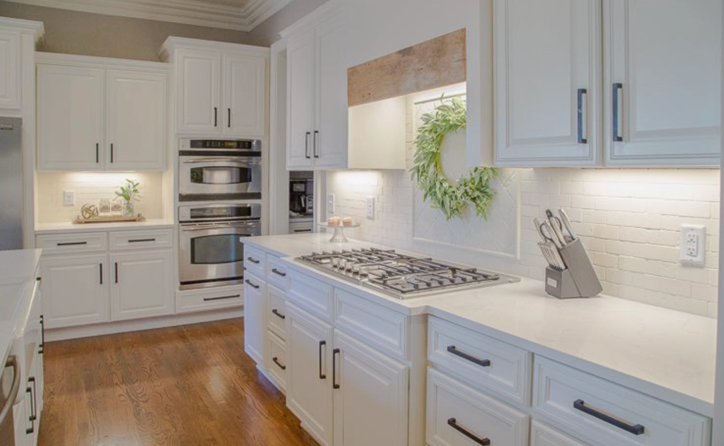
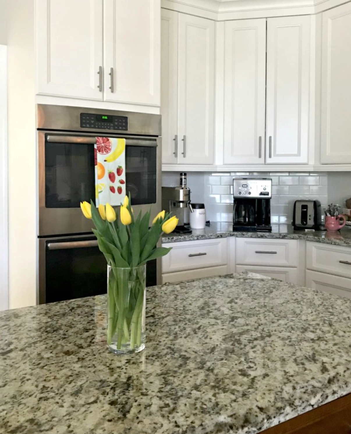
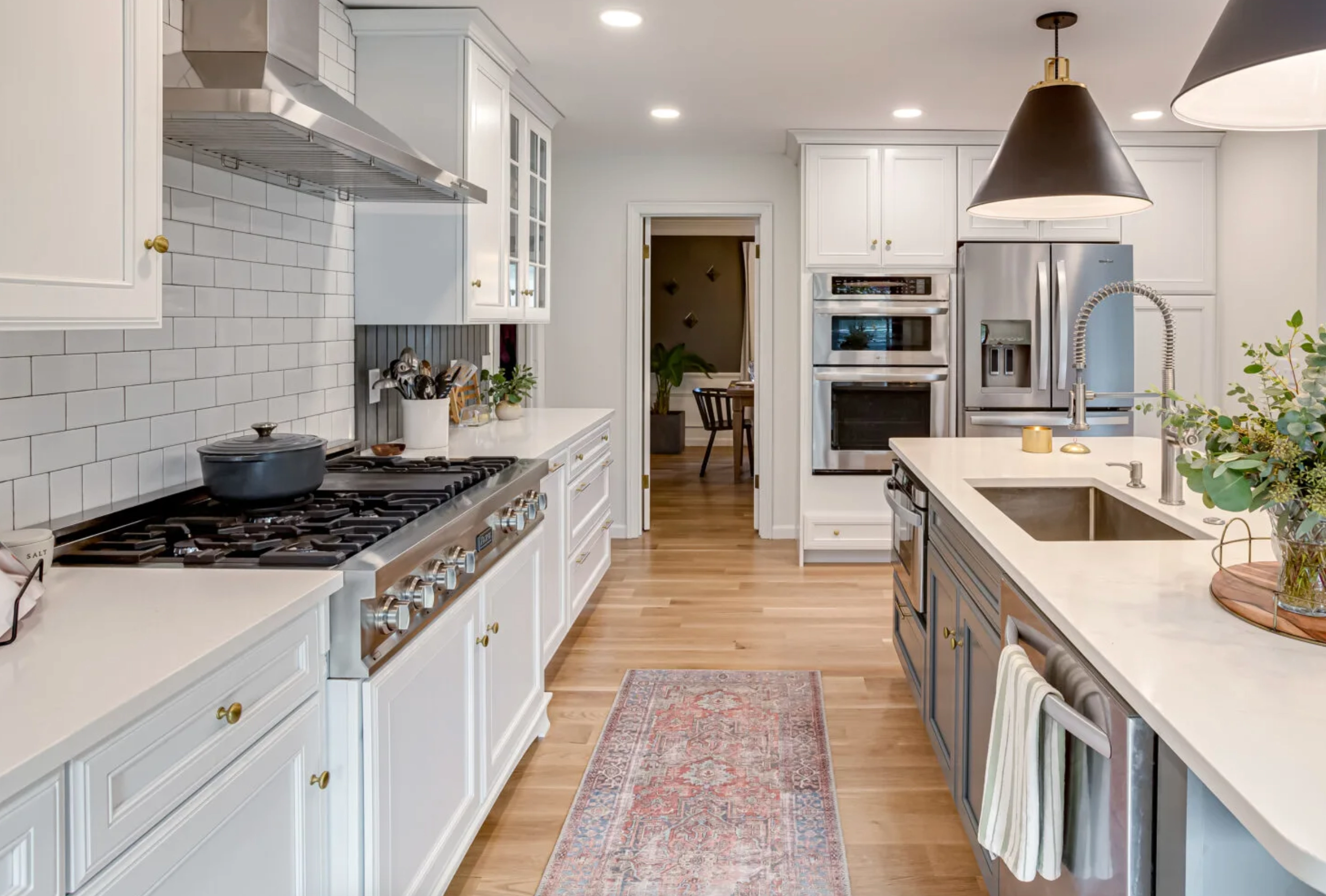
2. Cabinets: Dover White can be an excellent choice for kitchen cabinets. Its warm, creamy tone adds depth and character to cabinetry without appearing too stark. The yellow undertones can complement wood floors and warm-toned countertops.
PS. Notice how lighting conditions affect the color above.


3. Tropical or Warm Climate Exteriors: This color can make your home look like it’s always basking in the glow of a perfect sunset. It’s particularly suited for Mediterranean or Spanish-style homes.
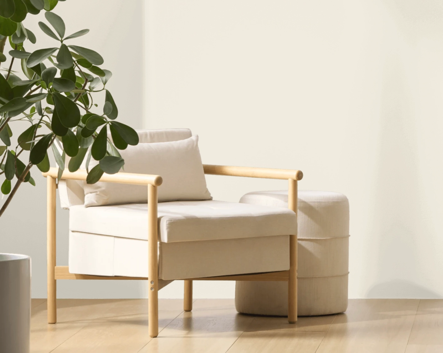
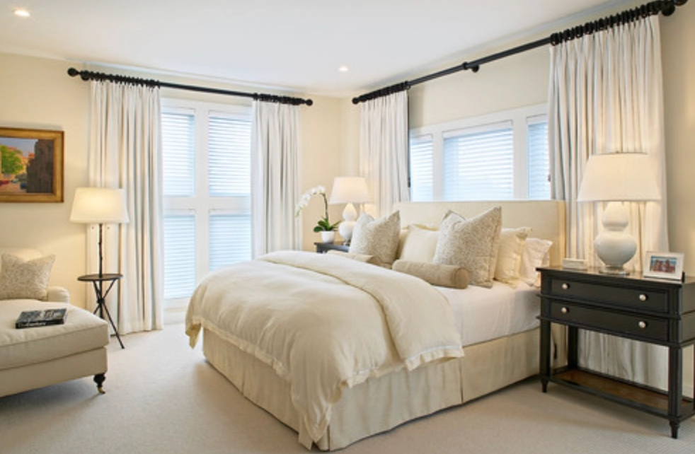
Alabaster
Alabaster’s versatility lies in its soft, neutral undertones. It’s the chameleon of white paints, adapting to almost any setting.
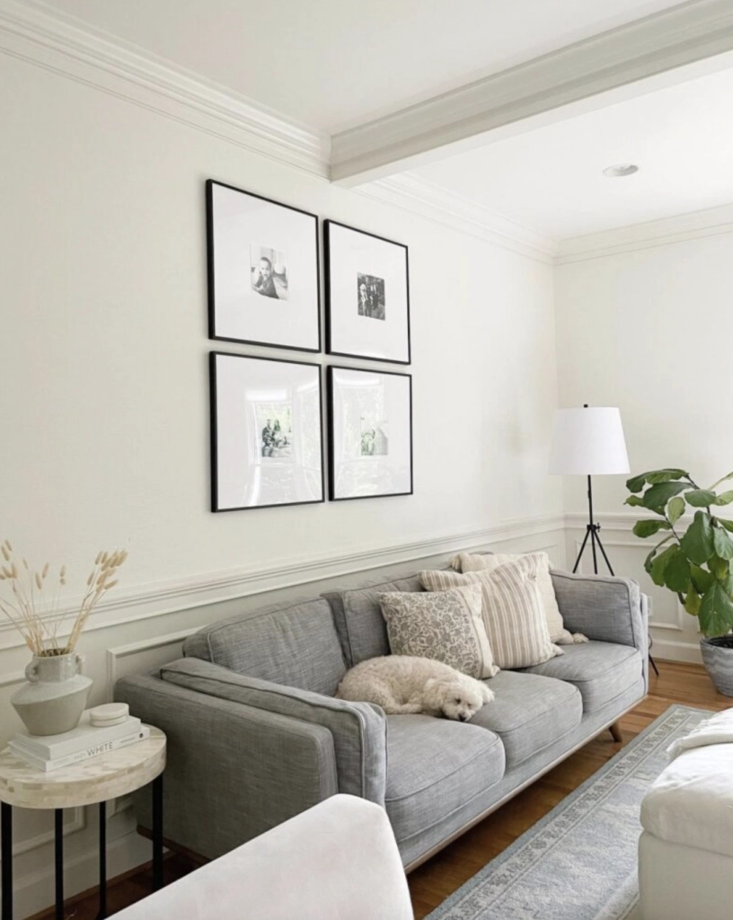
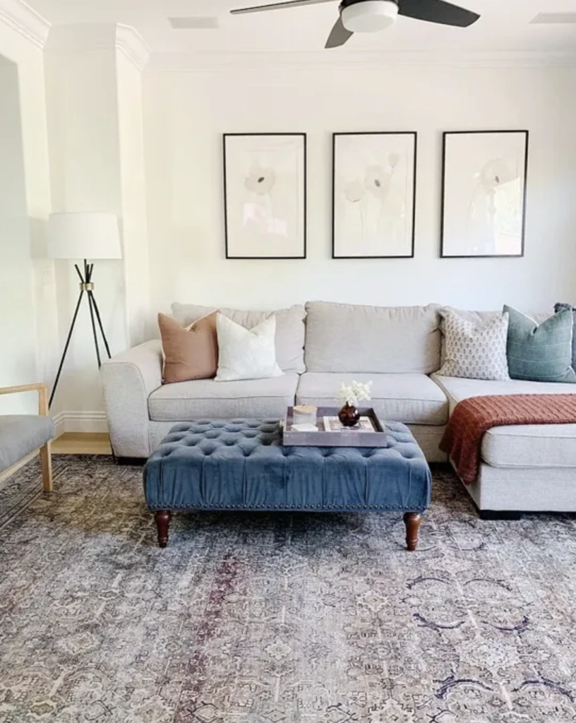
1. Living Rooms: The color’s subtle warmth creates an inviting atmosphere without overwhelming the space. It’s like the perfect host at a party – present but not stealing the show.
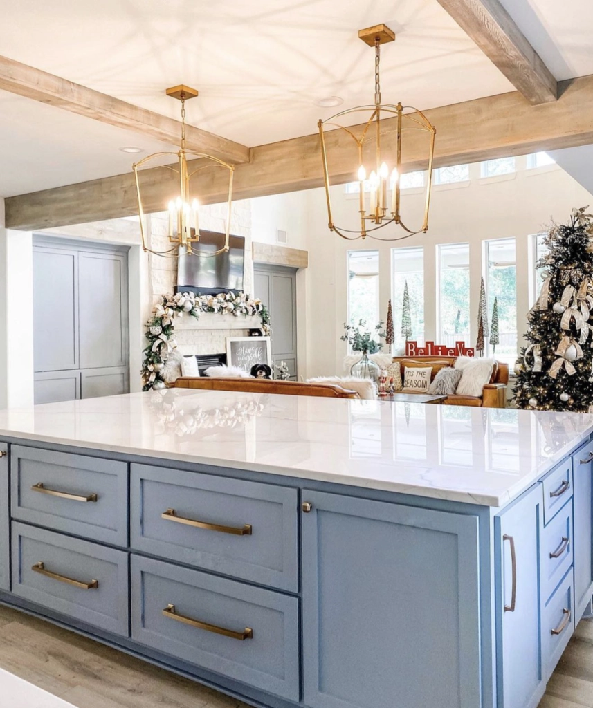
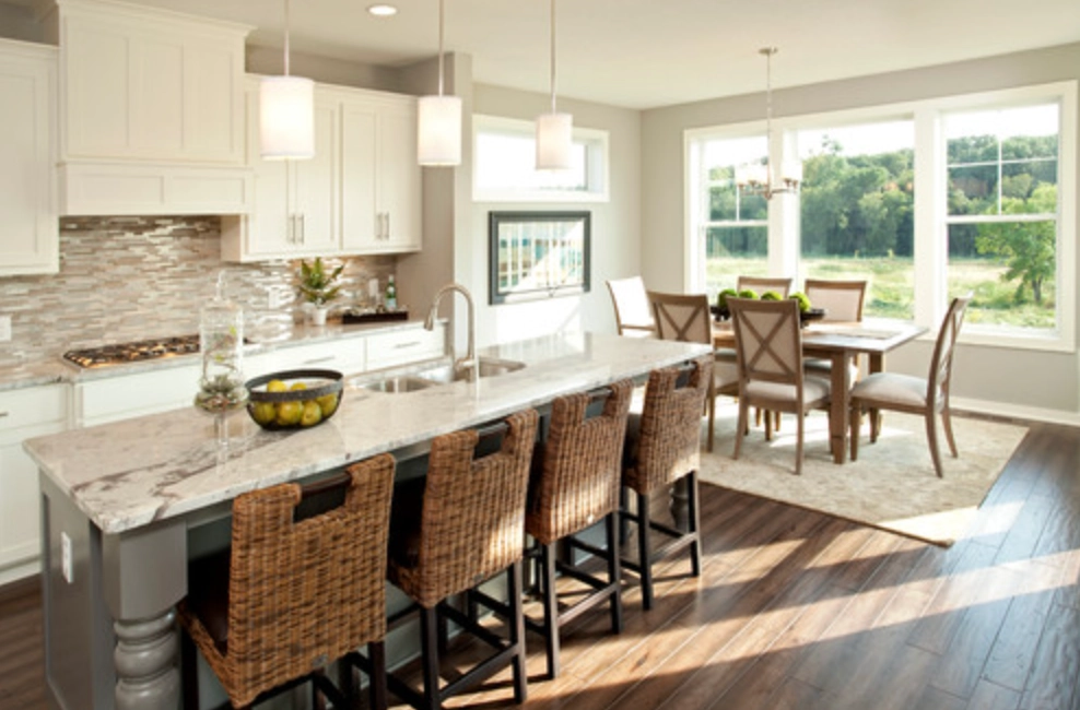
2. Kitchens: Alabaster provides a clean, fresh backdrop that complements both modern and traditional kitchen styles. It’s the ideal canvas for your culinary creations.


3. House Exterior: An all-Alabaster exterior creates a canvas that plays beautifully with natural light, shifting from warm to cool tones as the day progresses.
Lighting
Just as the sky changes colors throughout the day, so do Alabaster and Dover White under different lighting conditions.
Dover White
In bright daylight, especially in west-facing rooms, Dover White leans into its warm, creamy nature. It’s like watching a field of daffodils bloom.
Under warm artificial lights, the yellow undertones become more pronounced, creating a cozy atmosphere for those evenings when you want to curl up with a good book.
Alabaster
Alabaster is the steady Eddie of white paints, maintaining a consistent look in various lighting conditions:
In daylight, Alabaster stays warm without appearing too yellow or stark, like a perfectly toasted marshmallow.
Even under artificial lighting, Alabaster keeps its cool (or rather, its warmth). The beige undertones help to soften the brightness, making it suitable for any room at any time.
Matching Colors & Decor
Choosing the right white is like finding the perfect pair of jeans – it needs to go with everything in your wardrobe (or, in this case, your home).
Dover White
Dover White’s warm undertones make it a natural companion for certain colors and decor styles:
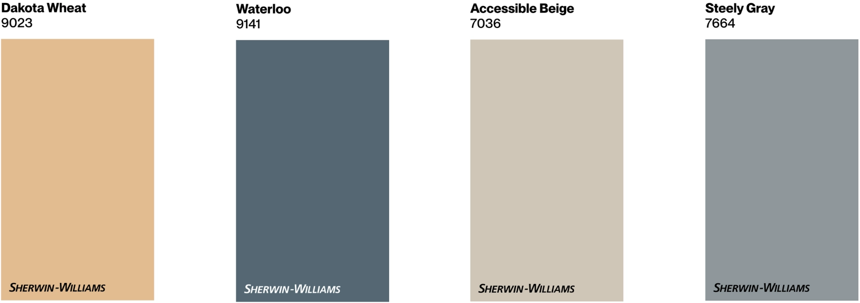
It plays well with earthy tones like SW 9023 Dakota Wheat and SW 9141 Waterloo. Think of it as the cream in your coffee – it just makes everything better.
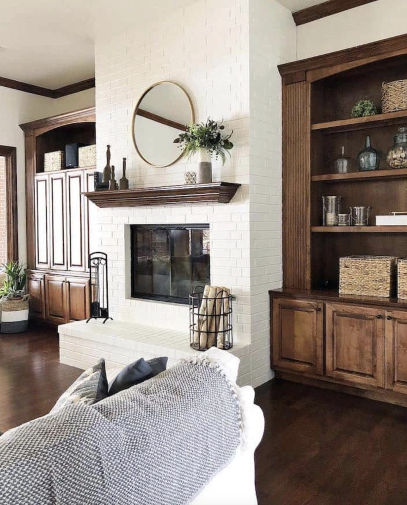
Dover White is best friends with natural textures like jute, rattan, and dark woods. It’s the perfect backdrop for a cozy, rustic retreat.
Pro Tip: While Dover White is great for walls, it might be a bit too yellow for trims. It’s like wearing yellow socks with a white shirt – sometimes, it’s best to stick with a crisper white for those details.
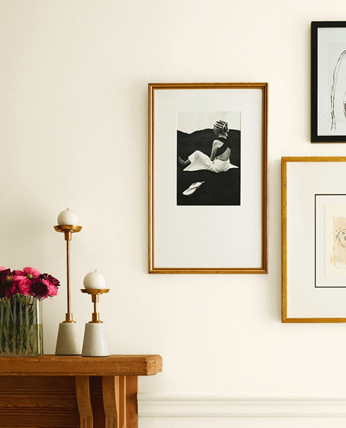
Alabaster
Alabaster is the social butterfly of white paints, getting along with a wide range of colors and decor styles:
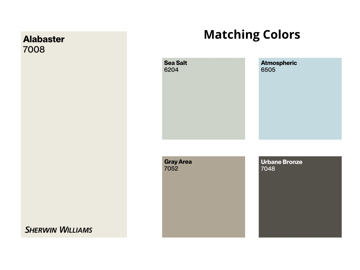
It pairs beautifully with both cool and warm tones, from SW Sea Salt to SW Repose Gray and SW Urbane Bronze. It’s like the perfect neutral scarf that goes with every outfit.
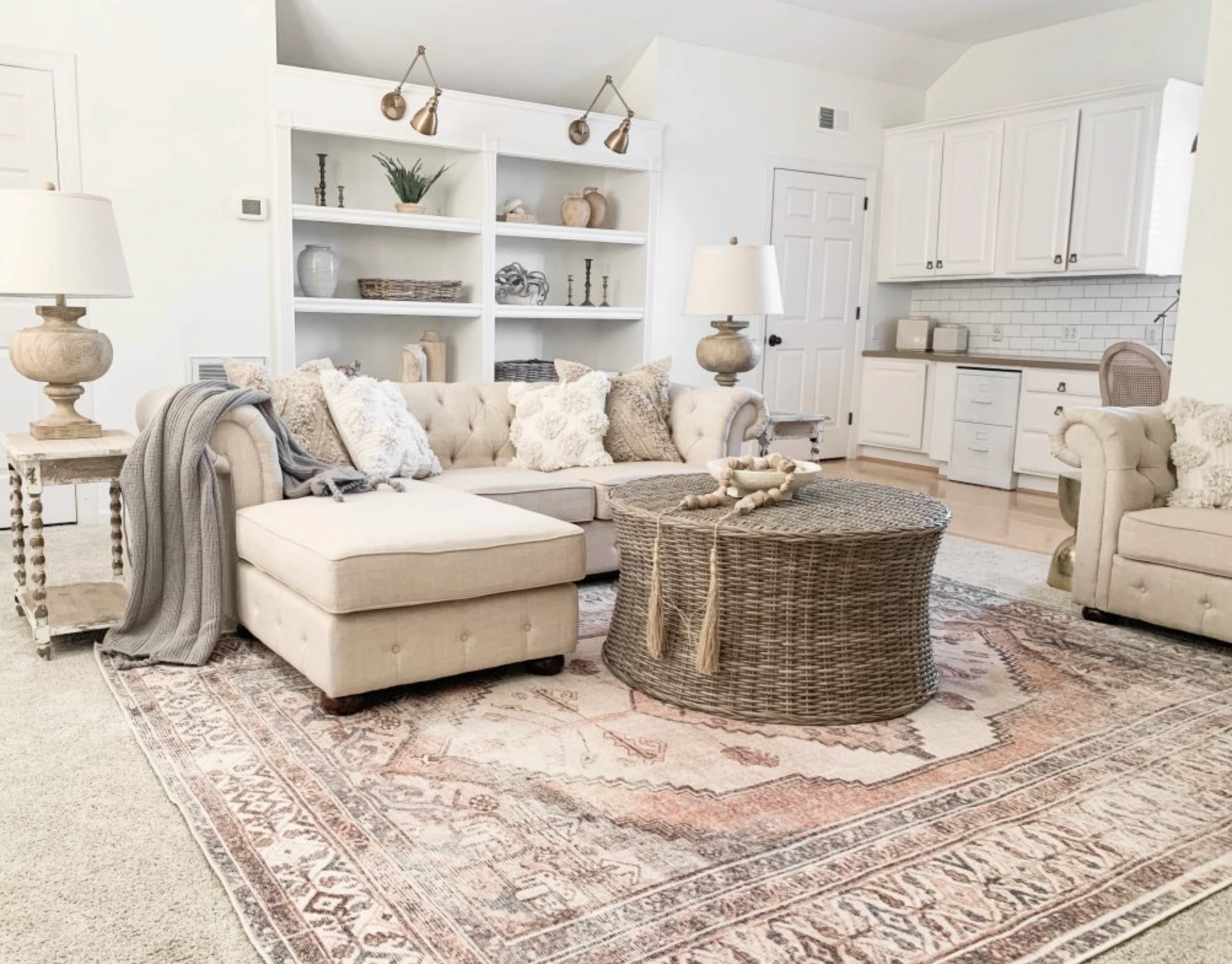
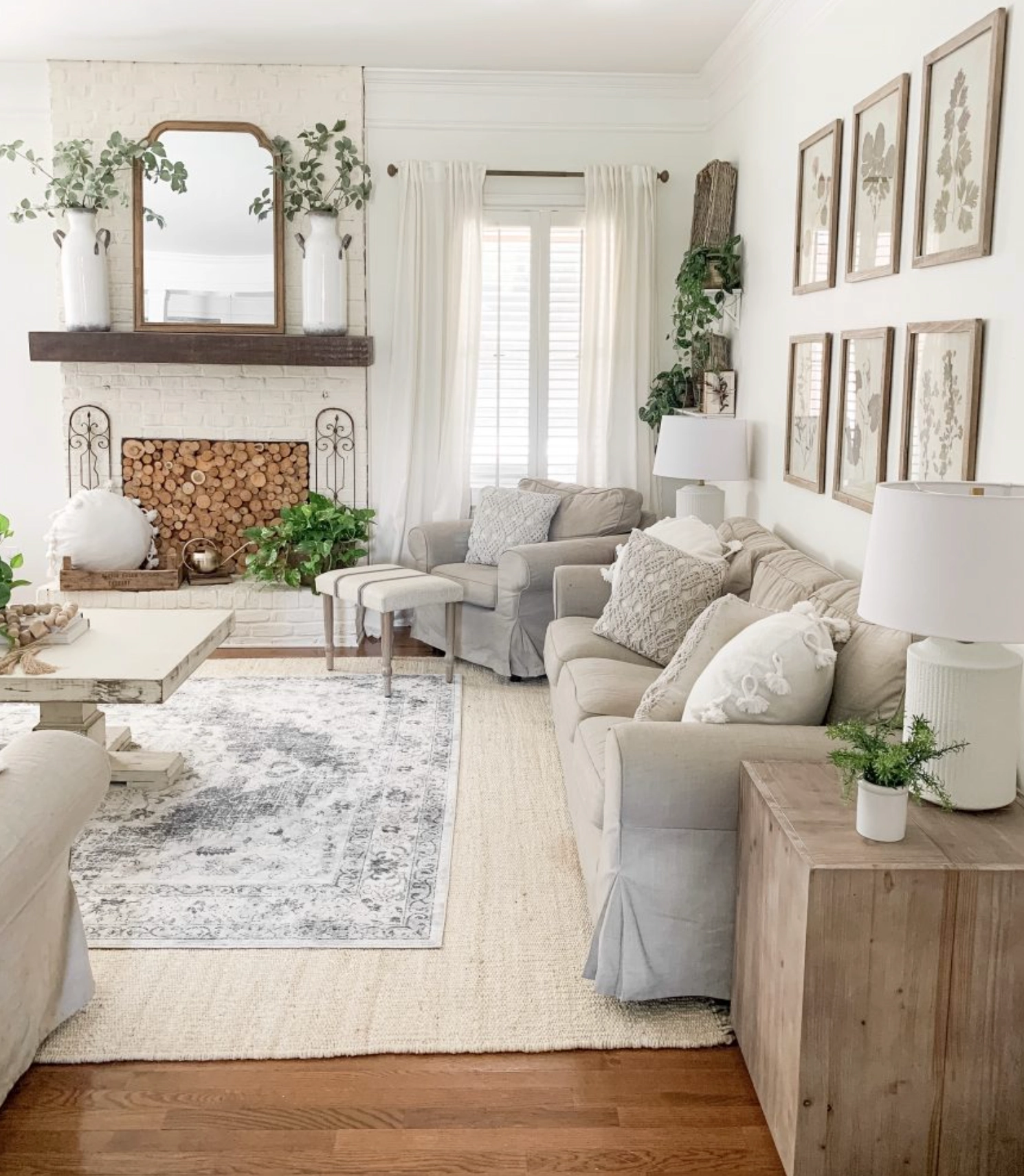
Alabaster complements creamy linen fabrics and natural wood tones equally well. It’s the ideal backdrop for creating a calm, cohesive palette with various textures and styles.
Which Should You Choose?
By now, you should have a good feel for what Dover White and Alabaster bring to the table (or wall, in this case).
If your space is filled with warm woods and earthy textures, or you want to brighten up a room that doesn’t get much natural light, Dover White might be your perfect match.
On the other side, if you love to switch up your decor with the seasons or you’re after a versatile backdrop that can handle anything from modern minimalism to cozy farmhouse chic, Alabaster could be your new best friend. It’s the “goes with everything” white that designers swear by.
Remember, at the end of the day, the best white is the one that makes you feel at home. So grab some samples, slap them on your walls, and see which one speaks to you. Happy painting!