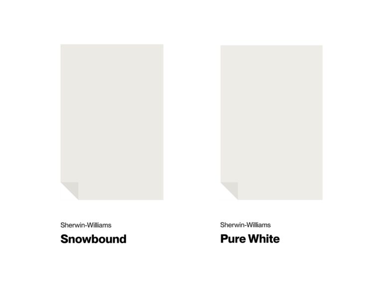
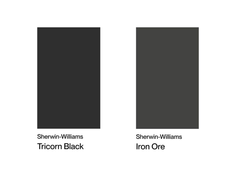
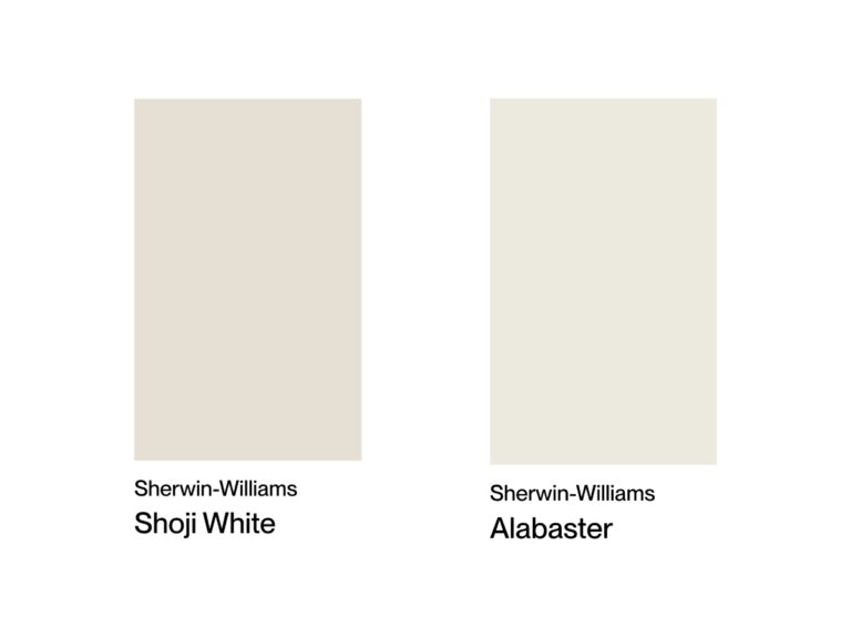
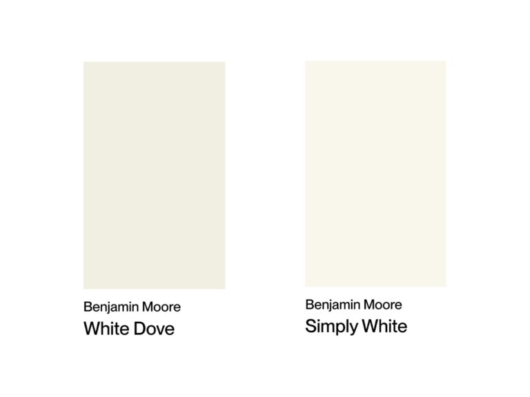
In the paint world, there’s a subtle line between white shades that can throw anyone for a loop. Pure White and Extra White? They’re basically twins that only their mother could tell apart – though in reality, these shades can completely transform how a space feels.
When clients say they want “just white,” designers can’t help but smile nervously – they know they’ll have to tell them there’s no such thing as “just white.” And yes, this is why designers are always a bit on edge. But hey, who isn’t these days? 😅
Let’s get to the bottom of what makes these popular shades different and how to pick the perfect one for your project. I’ve gathered tons of real photos (over 20!) to show you exactly how these whites behave under different lighting conditions.
Undertones & Character
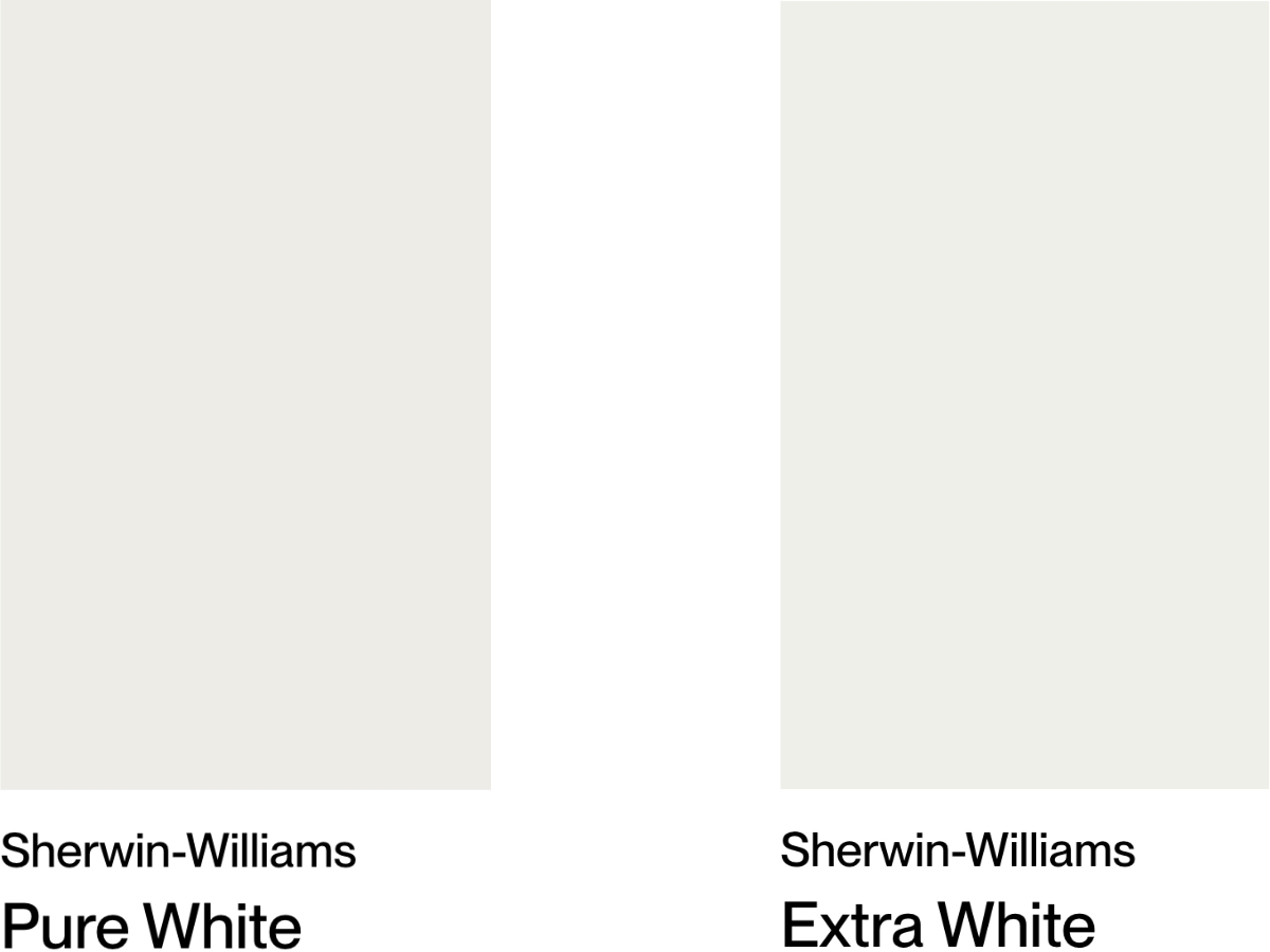
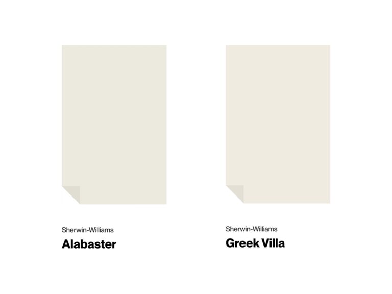
Pure White by Sherwin-Williams is a soft white with subtle warm undertones. With an LRV of 84, it’s bright but won’t give you that harsh hospital feel.
The first time I used it in my living room, I couldn’t believe how natural it looked, no matter the time of day. In north-facing rooms, its slight warmth helps balance out the cool light, and in west-facing spaces, it warms up nicely in the evening without going yellow.
It’s a perfect fit for modern spaces with natural materials and works great as a whole-house color.
Extra White, another Sherwin-Williams color, is a bright, crisp white with cool blue undertones and an LRV of 86. You won’t find any hints of yellow or cream in this one.
From my experience, it’s a knockout on ceilings and moldings, thanks to its high-light reflection. In sunny rooms, Extra White creates this really fresh, modern vibe. The downside? It can look a bit flat in darker spaces and throw some noticeable shadows in corners.
The main difference between these two? It’s all in their basic character: Pure White has that slightly warm undertone, making it softer and more versatile, while Extra White leans cooler and more technical with its bluish tint.
Think of Pure White as Extra White with just a drop of yellow to take the edge off. Put them side by side in a room, and you’ll spot the difference right away: Pure White feels cozier and more natural, while Extra White looks crisper and more contemporary.
When you’re choosing between them, lighting is key: Pure White is pretty forgiving and adapts well, but Extra White can be a bit picky without good natural light.
| SW Pure White | SW Extra White | |
| Color Code | SW 7005 | SW 7006 |
| Light Reflectance Value (LRV) | 84 | 86 |
| Color Family | White | White |
| Undertones | Minimal yellow and black, soft warm white | Cool blue with slight green notes, bright clean white |
Room-by-Room Comparison
These shades can look totally different depending on the room and lighting – they really transform from space to space. Your best bet? Grab some peel-and-stick samples and see how they look in your actual lighting.
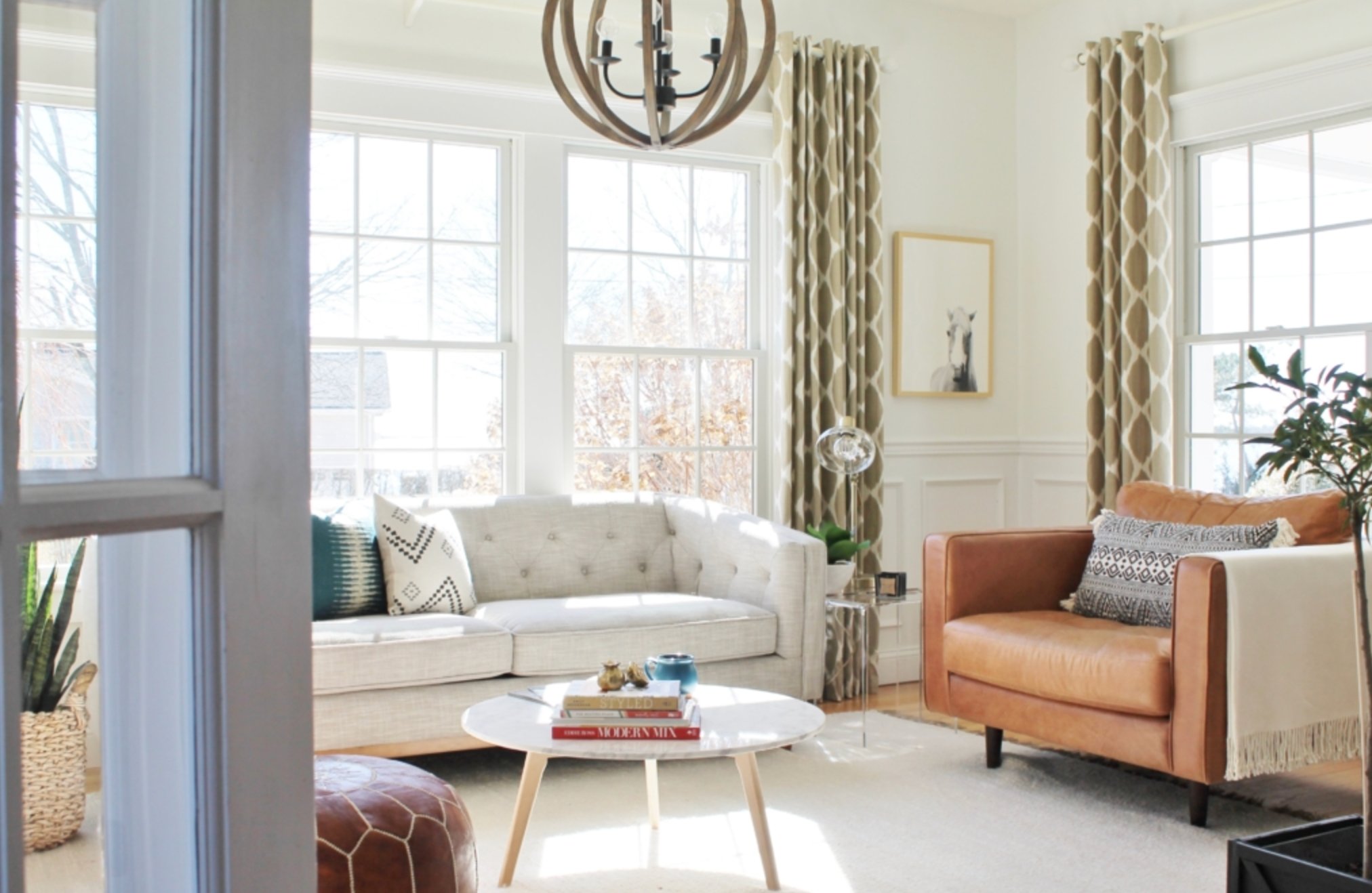
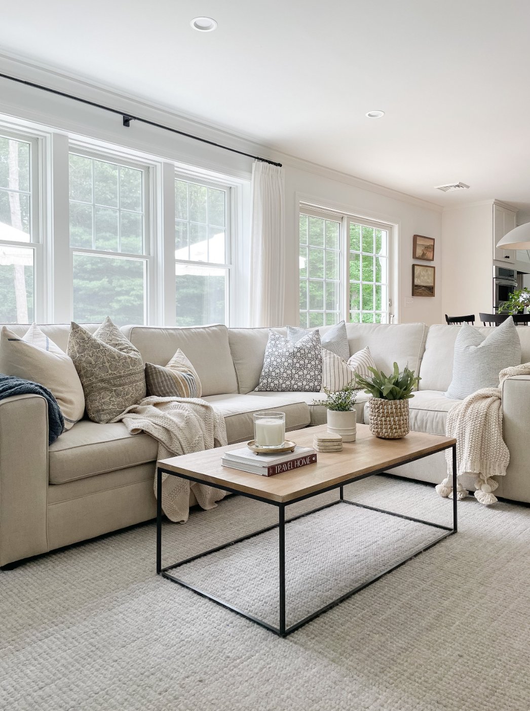
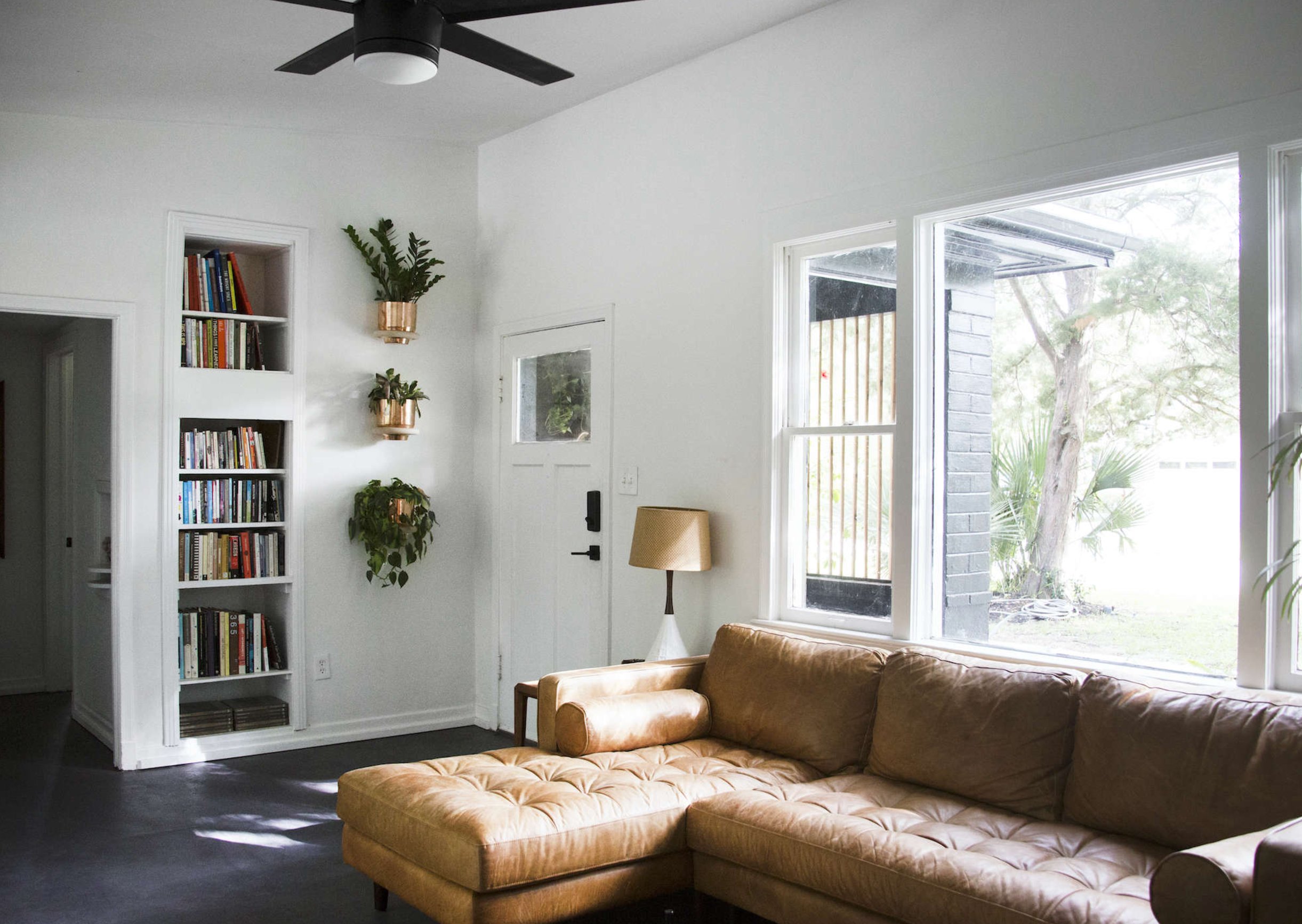
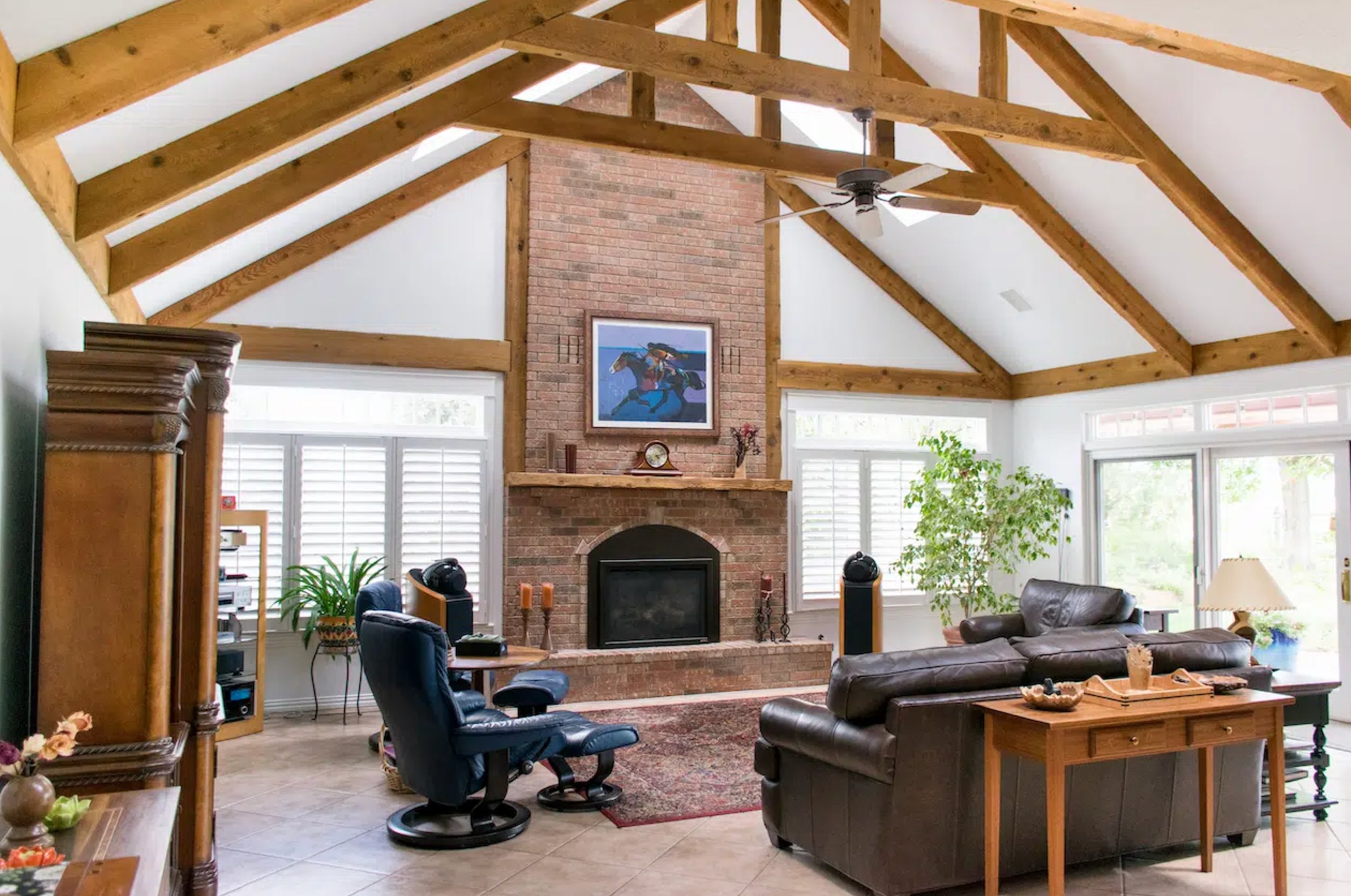
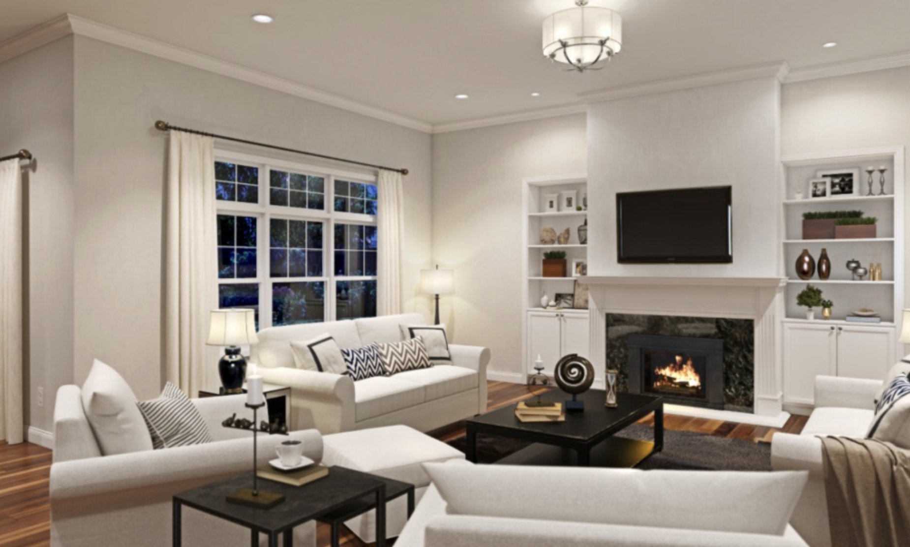
Living Rooms
source
source
Pure White makes living rooms feel cozy with its soft yellowish undertone. It shines in the evening – no turning gray under artificial lights here. Plus, it makes artwork and decor pop without stealing the show.
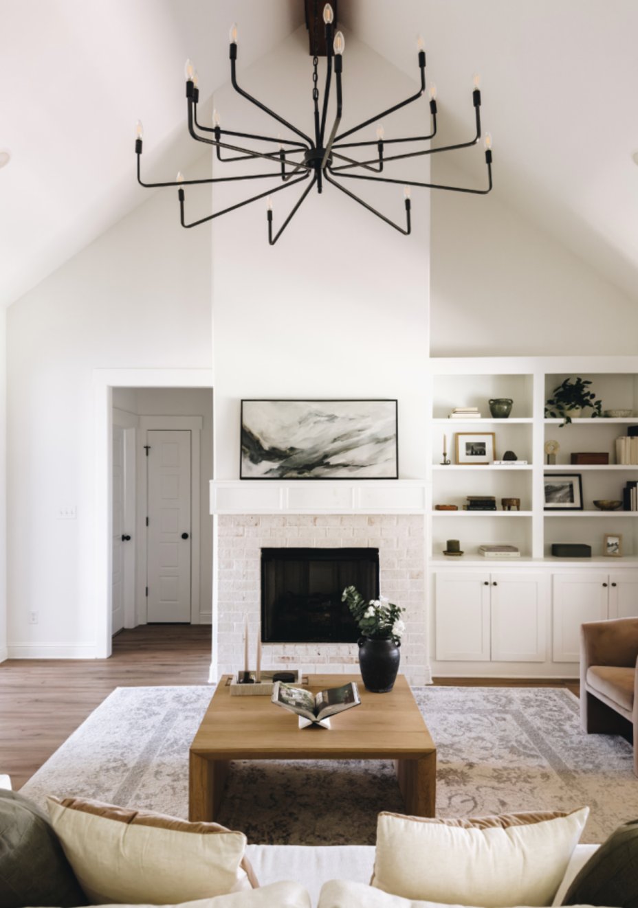
source
source
Extra White gives living rooms a more formal, modern look. Next to Pure White, it definitely makes spaces feel more structured and defined.
Just keep in mind – in north-facing rooms, it can feel a bit cool, so you might want to warm things up with your decor choices.
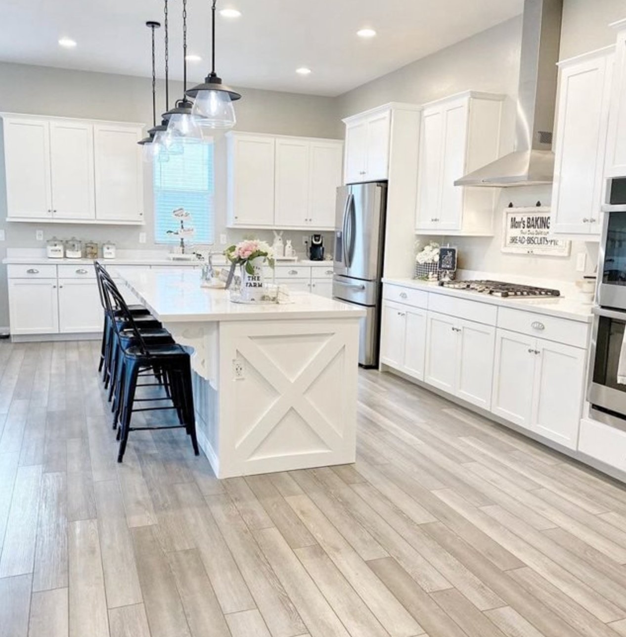
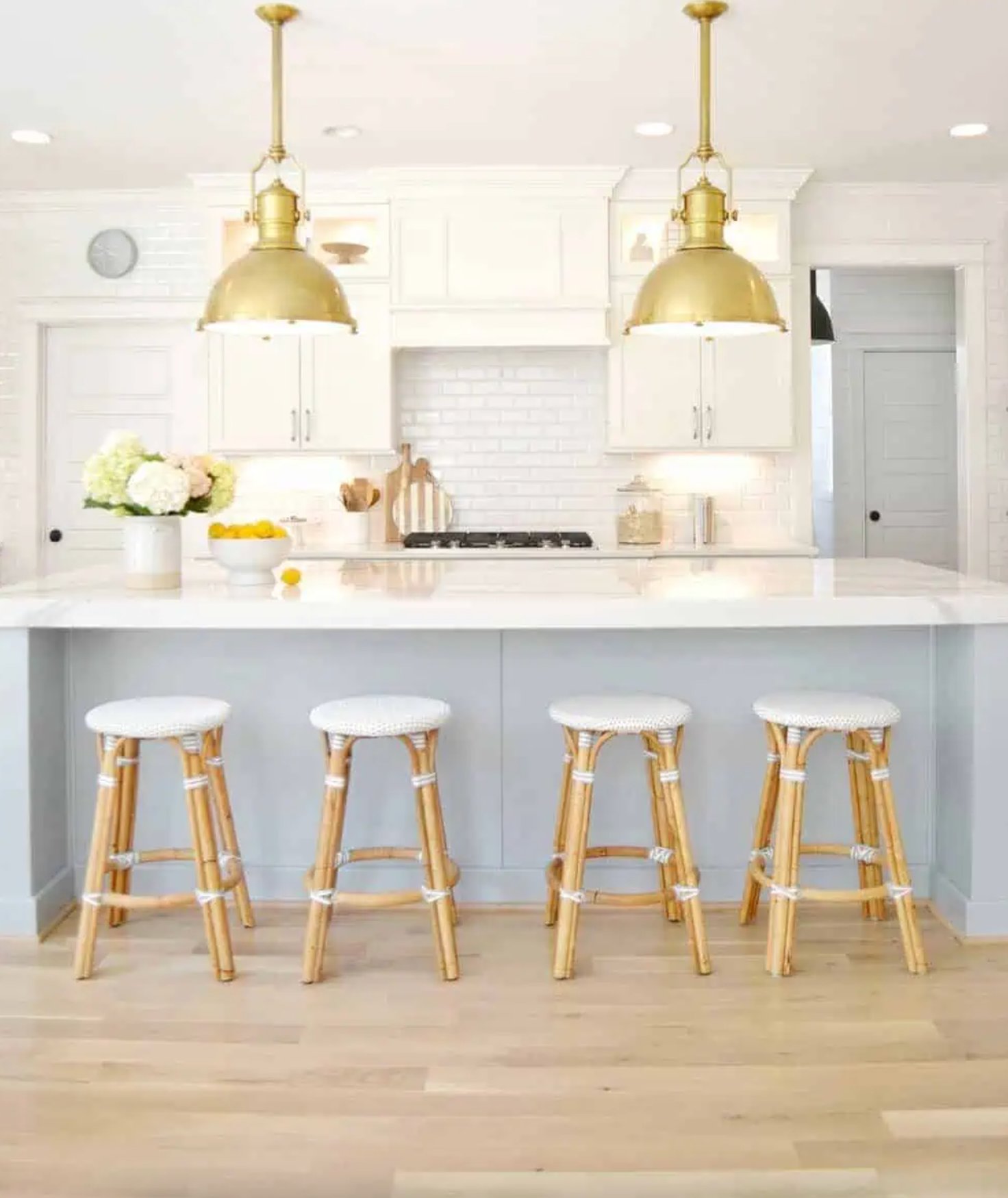
Kitchens
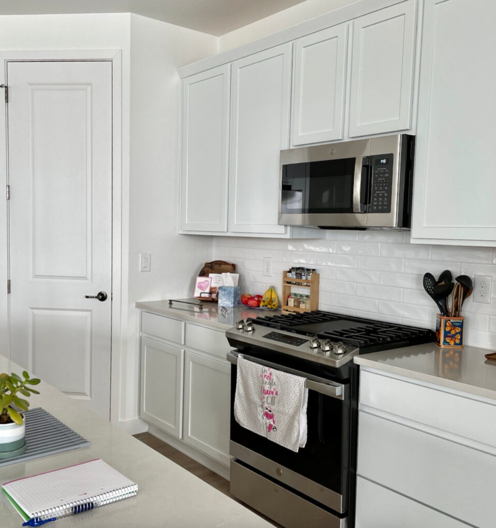
source
source
Pure White is a perfect match for kitchens with natural materials. Its warm undertone helps soften up metallic appliances and plays nicely with wood elements. Plus, it stays pretty consistent throughout the day as the light changes.
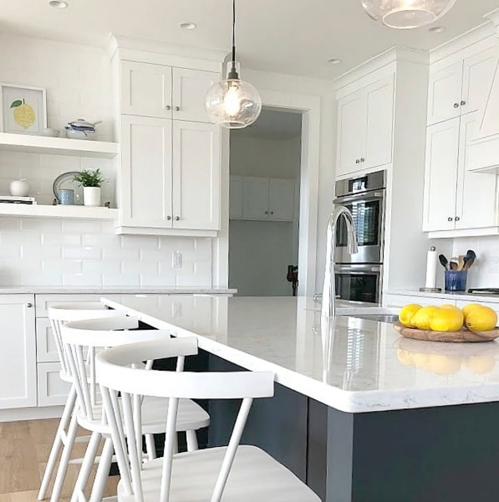
source
source
Extra White is a star in modern minimalist kitchens. Unlike Pure White, it brings more of that clean, crisp feel and looks especially amazing on glossy cabinet surfaces.
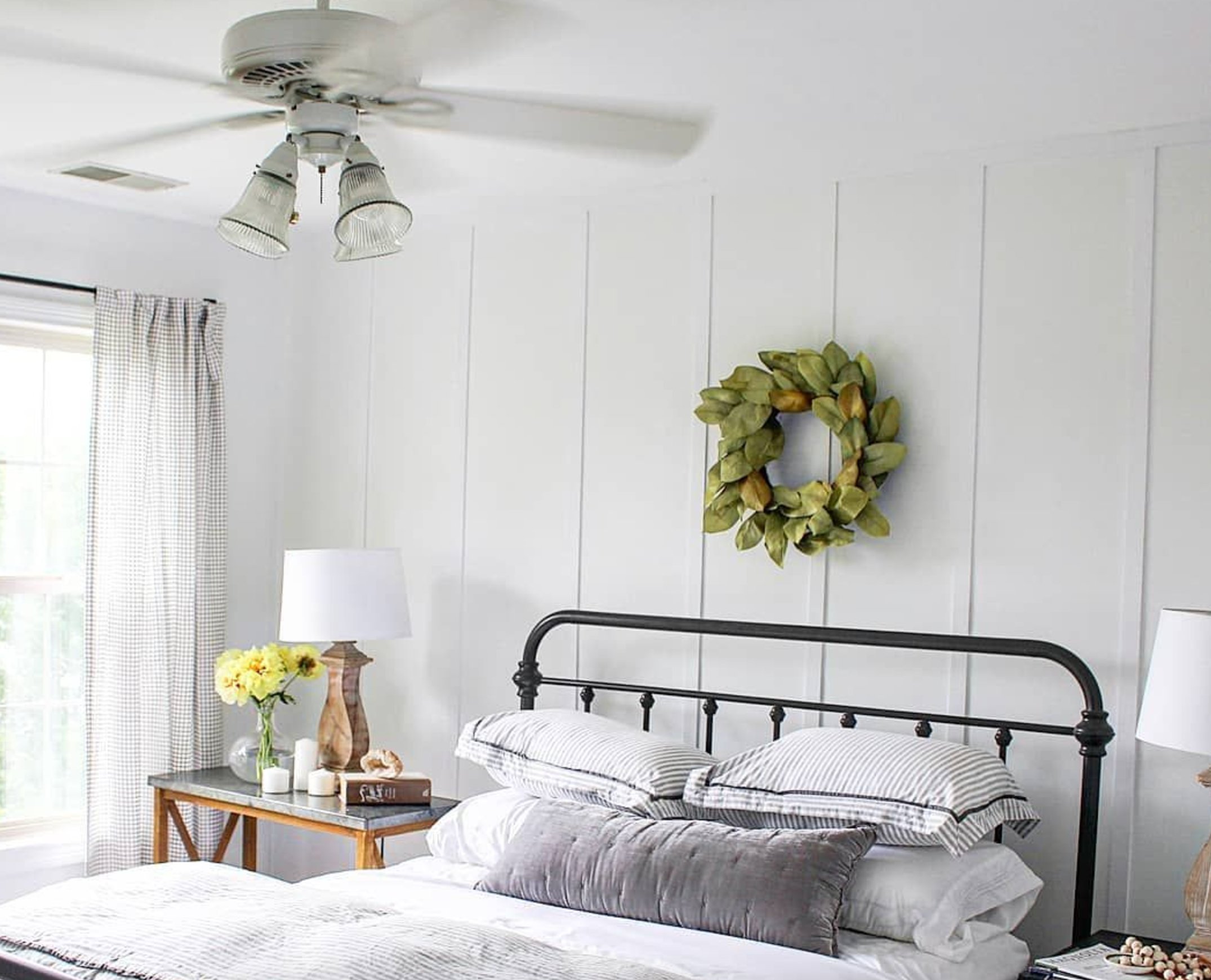
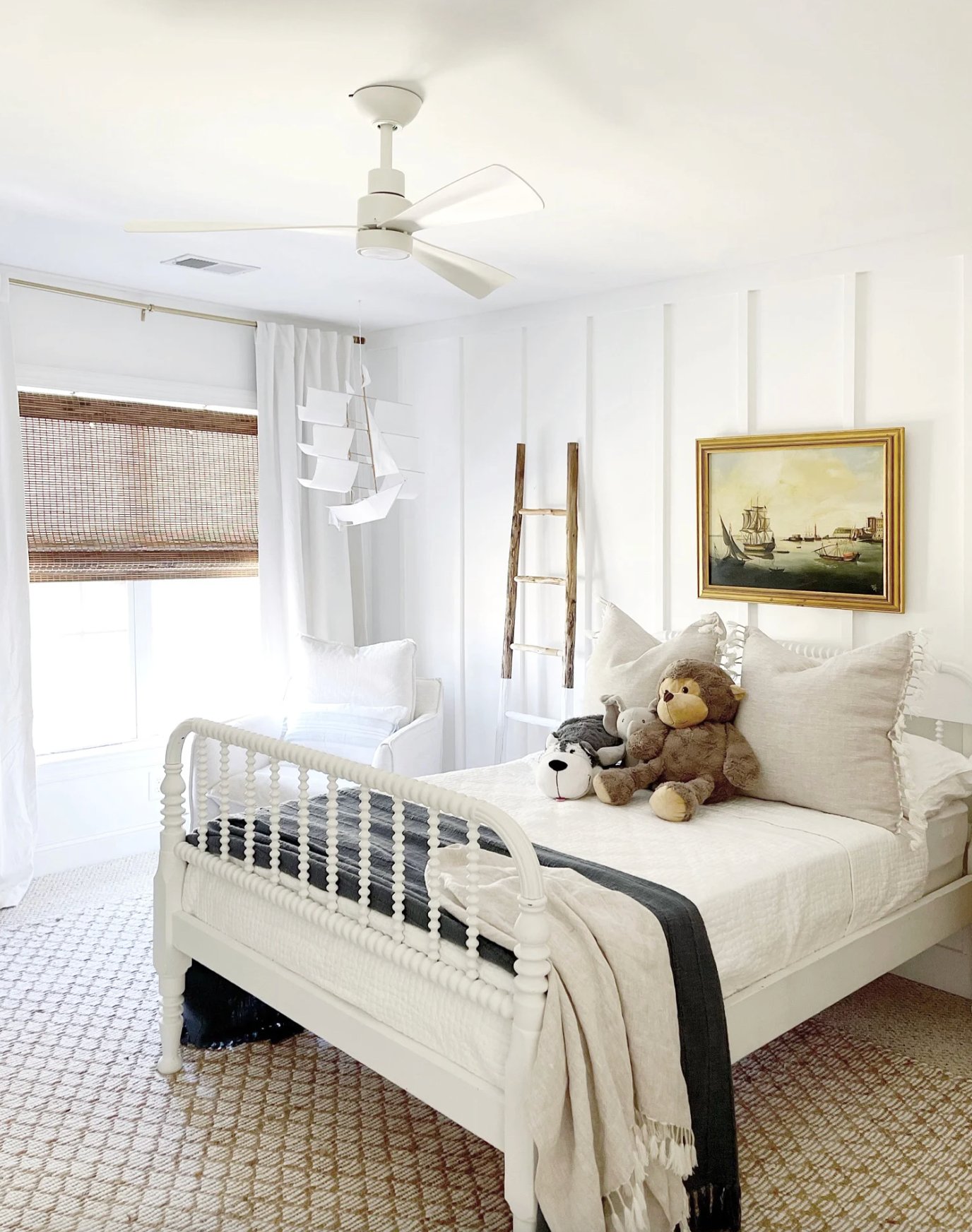
Bedrooms
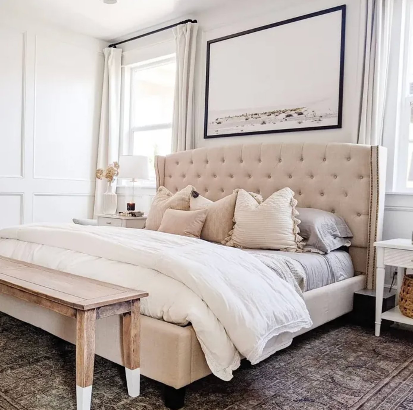
source
source
Pure White brings a peaceful, zen-like vibe to bedrooms. It’s versatile enough for any room size and doesn’t need fancy color pairings. It really shines when paired with textured fabrics.
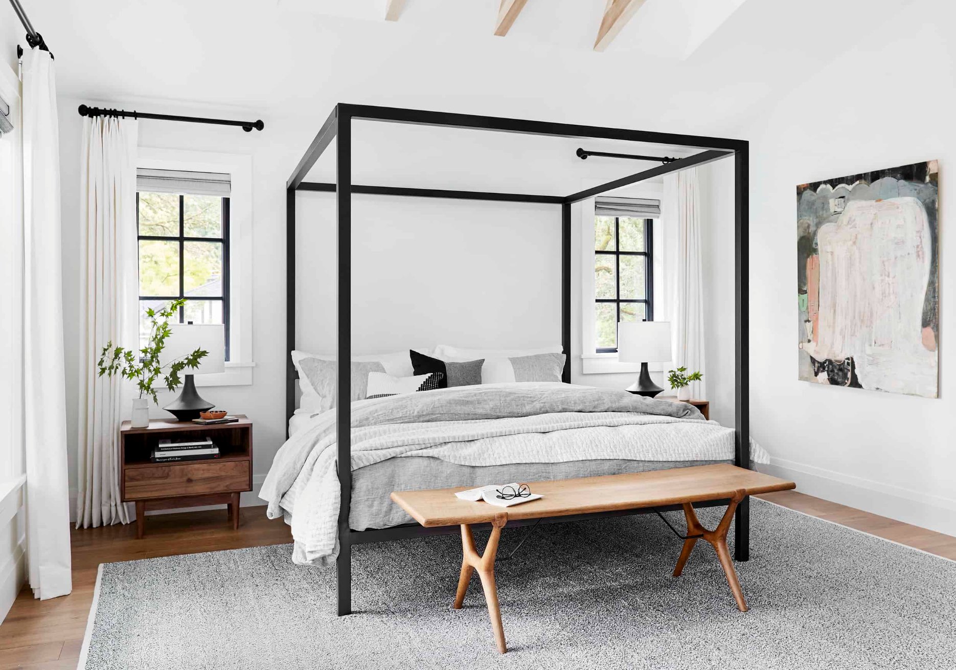
source
source
Extra White gives bedrooms a crisper, fresher feel than Pure White.
Keep in mind – in north-facing rooms, you’ll want to add some warm elements, or the space might end up feeling too stark.
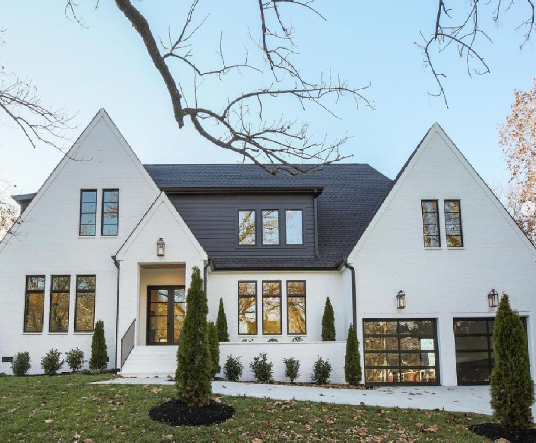
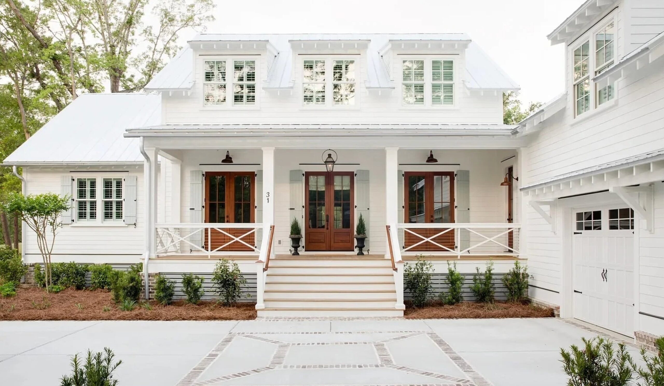
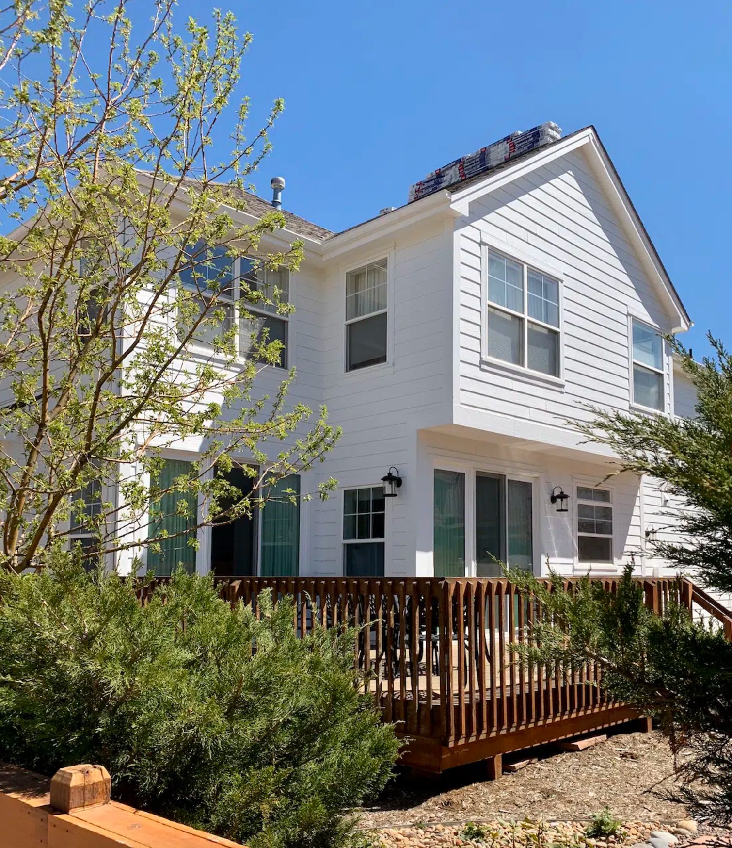
Exteriors
source
source
Pure White looks right at home on the exterior walls. One thing I love about it is that it stays true to its color over time (no yellowing!), and it plays well with any building material. It’s particularly gorgeous on traditional homes.

source
source
Extra White creates more of a bold, graphic look compared to Pure White. You’ll want to include some interesting accent elements, though – otherwise, it can come across as a bit basic. But put it on a modern house with lots of glass? Now that’s a showstopper.
Lighting Impact
source
source
Pure White is quite the chameleon throughout the day. In north-facing spaces, it stays soft and balanced, and its subtle, warm undertone helps to offset cooler light.
In west-facing rooms, it warms up at sunset but doesn’t go yellow like so many other whites tend to do. Even under artificial light, it keeps its character – no dramatic swings between warm and cool.
source
source
Extra White tells a different story. It’s crisp and clean during the day in bright rooms, but come evening, you’ll see its true colors – those slight blue undertones start to peek through.
It’s like a mood ring for your space, picking up everything around it – from the trees outside to your colorful decor pieces.
Coordinating Colors
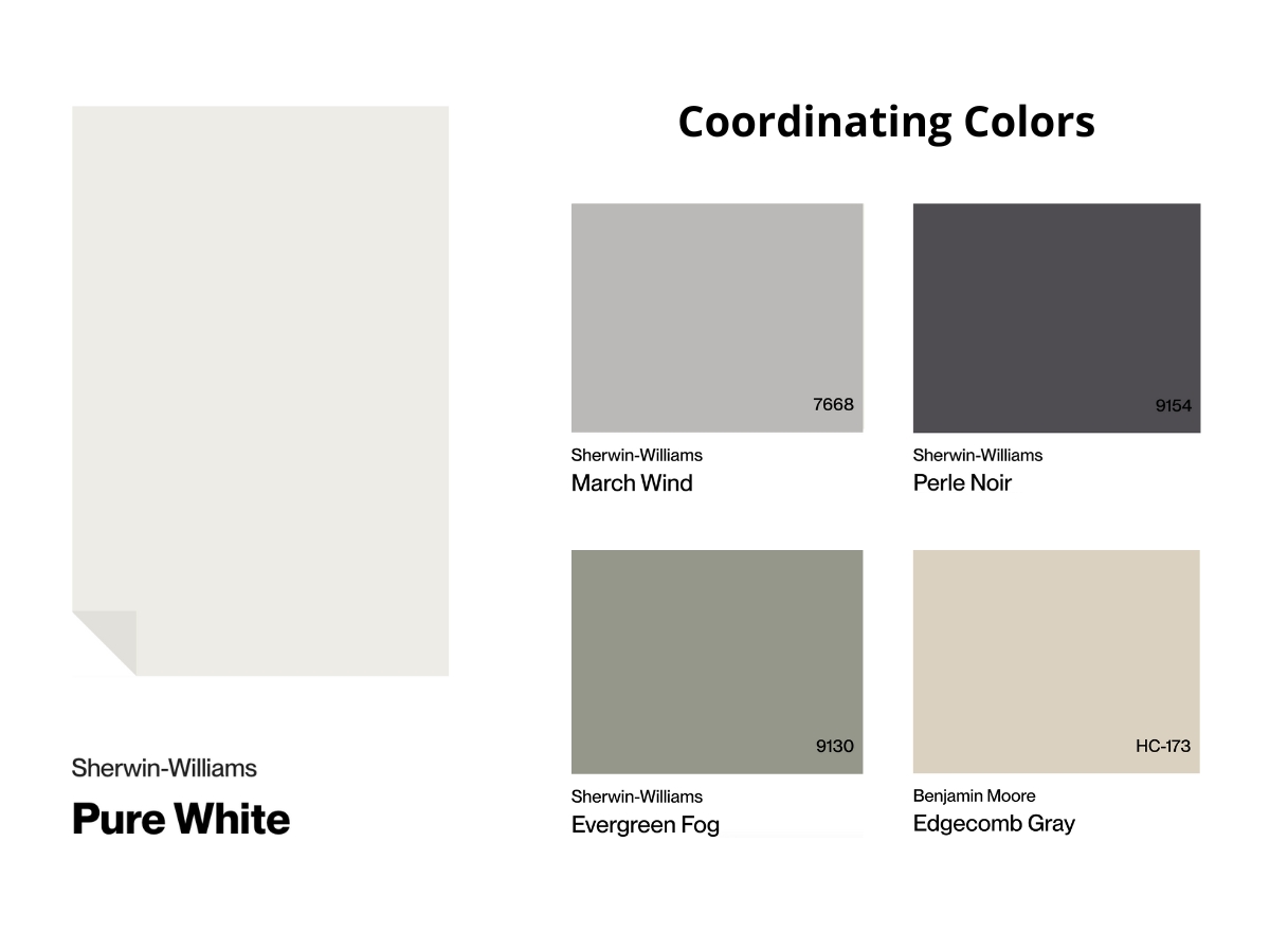
Pure White perfectly balances warm and cool without tipping into yellowy or grayish territory. It creates a soft, neutral backdrop that plays nice with everything. You’ll find it works beautifully with deep blues, rich greens, and pretty much any earthy tone you can think of.
It’s also super friendly with bold accents – whether you’re going for punchy coral or deep burgundy. What’s cool is that even black elements don’t look harsh against it – they just seem to fit right in.
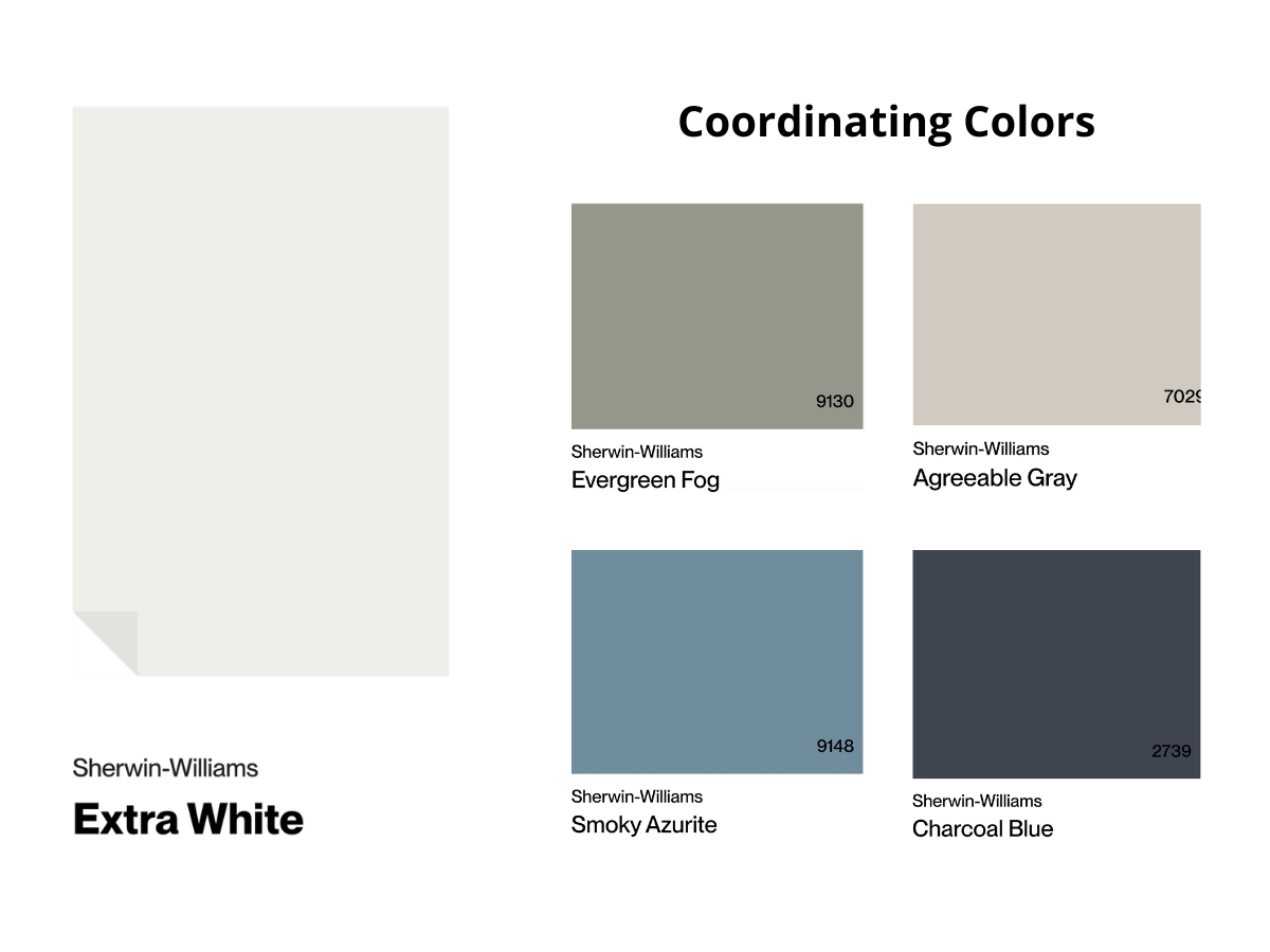
Extra White is a bit pickier about its friends. Its cool undertone might not get along with warm beiges and creams, but it matches cool colors like grays, indigos, and even metallics.
Remember that you’ll need some balance here: throw in some warm touches like copper or dark wood, or your space might feel too chilly.
Making Your Decision
Now that we’ve taken a good look at both shades, here’s the bottom line:
Go for SW Pure White when you want to create a soft, welcoming space with just a hint of warmth – it’s particularly great in north-facing rooms and keeps its true color under different types of lighting.
Pick SW Extra White for modern, clean-lined spaces and when you need a bright white with cool undertones, especially for ceilings and trim work.
And here’s a tip – always test your paint samples on the walls before you commit because your home’s lighting can completely change how the color turns out!