Finding the perfect gray for your walls can be tricky. Sherwin-Williams has two popular options – Repose Gray and Agreeable Gray – that even designers often mix up.
These aren’t in the brand’s top 10 bestsellers by accident. Both shades are incredibly versatile and great at making spaces feel warm. Though they might look similar at first glance, they have key differences that can really change how your space turns out.
I’ve put together more than 20 photos from actual projects to show you how these grays look in different lights and how they work with other colors.
Undertones & Character
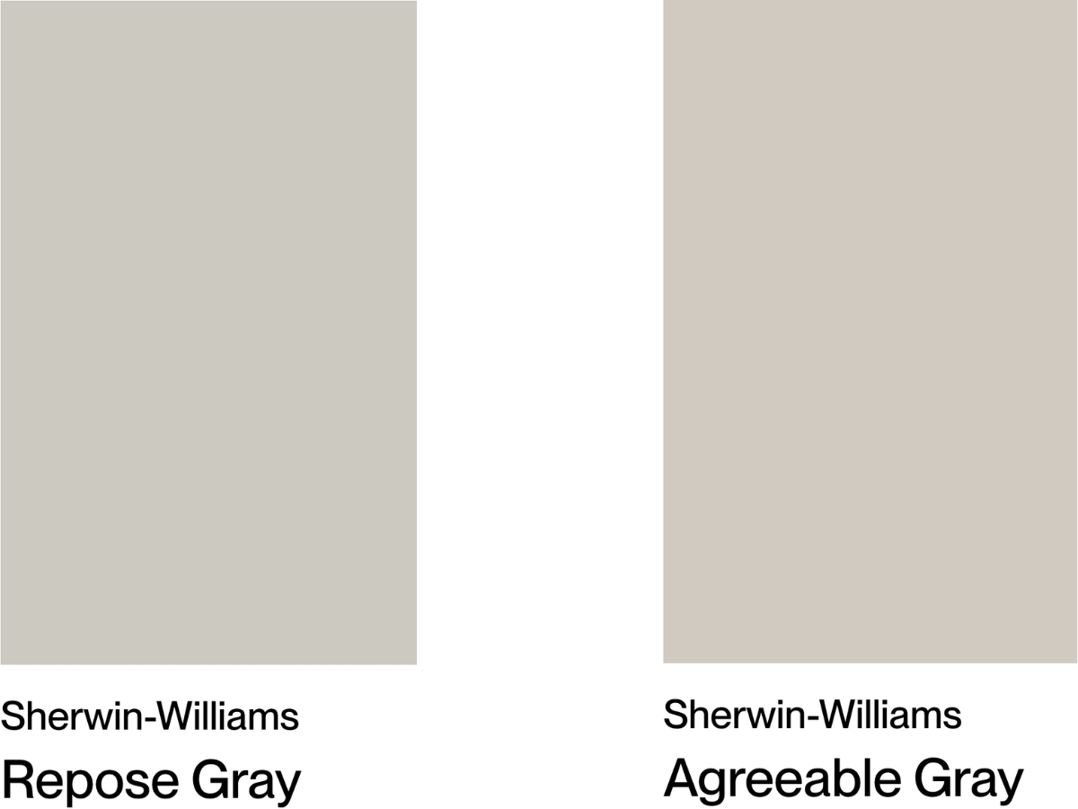
Repose Gray by Sherwin Williams sits right between gray and beige, with an LRV of 58. It’s got a hint of green hiding in there, and sometimes, you might catch a touch of pink in the shadows.
From my experience with similar colors, this one’s super reliable. Whether you have a sun-filled living room or a darker hallway, it keeps cool. It really shines in modern spaces where you want something neutral that won’t put you to sleep.
Agreeable Gray, another Sherwin-Williams shade, comes in slightly lighter (LRV 60) and definitely leans warmer. It has more personality – there’s a green undertone in there, but it’s so nicely blended with beige that everything feels soft and welcoming.
Just watch out – it can get a bit moody in dark corners where it might surprise you with a purple tint. I’ve found it really comes alive in bright, open spaces where you can see that warmth shine through.
Putting these two head-to-head? Agreeable Gray plays nicer with more materials, but you’ll need to think harder about your lighting setup.
Repose Gray is more of a “what you see is what you get” kind of color and handles different lighting like a champ, though it can come across a bit more businesslike.
Most designers reach for Agreeable Gray when their clients want that cozy, warm vibe, while Repose Gray is their go-to for cleaner, more minimal looks.
| SW Repose Gray | SW Agreeable Gray | |
| Color Code | SW 7015 | SW 7029 |
| Light Reflectance Value (LRV) | 58 | 60 |
| Color Family | Neutral | Neutral |
| Undertones | Beige/taupe, green; Can show purple/pink in shadows | Warm green, violet (subtle), beige |
Room-by-Room Comparison
Let’s see how these popular grays perform in different spaces since every room has its own lighting quirks and purpose.
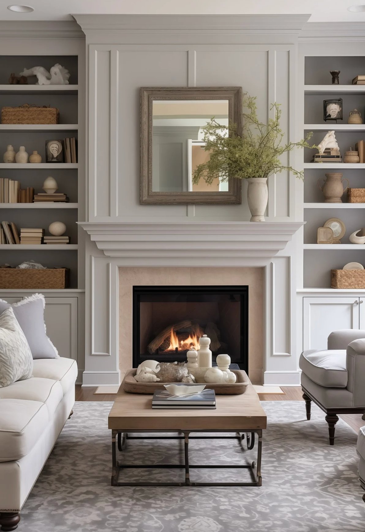
Living Rooms
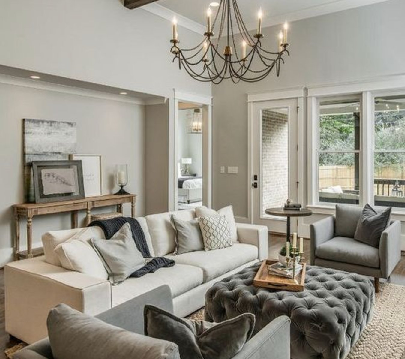
source
source
Repose Gray nails it as a neutral backdrop in living rooms, especially if you have big windows. Sunny day? Pure gray. Cloudy? That beige undertone peeks through. It looks fantastic with wood furniture and metallic touches.
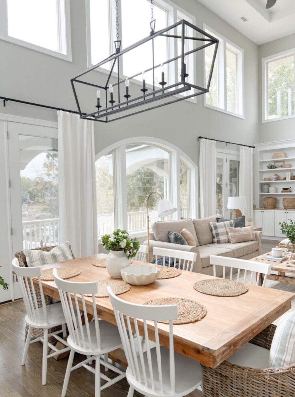
source
source
Agreeable Gray is more of a chameleon in living rooms. It’s got that extra warmth and brightness compared to Repose Gray, which just makes spaces feel more inviting.
I’ve noticed it’s more versatile with different furniture styles, and my clients tend to love it for open-concept spaces.
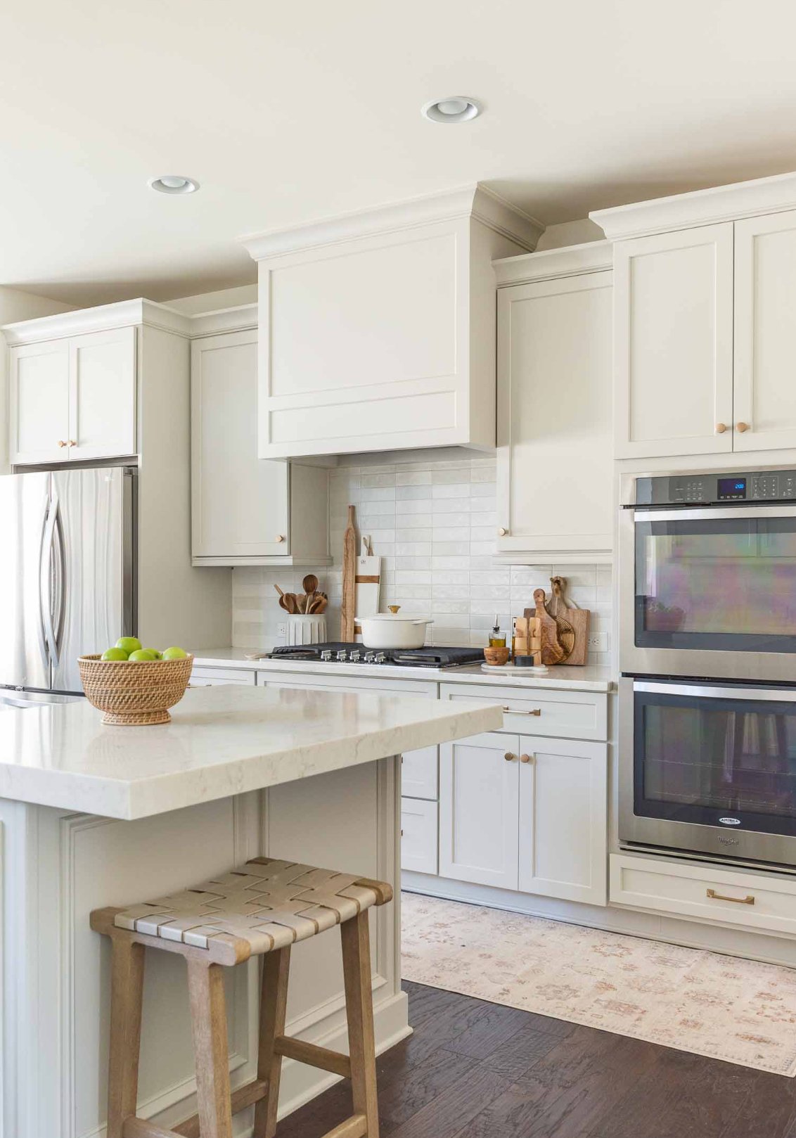
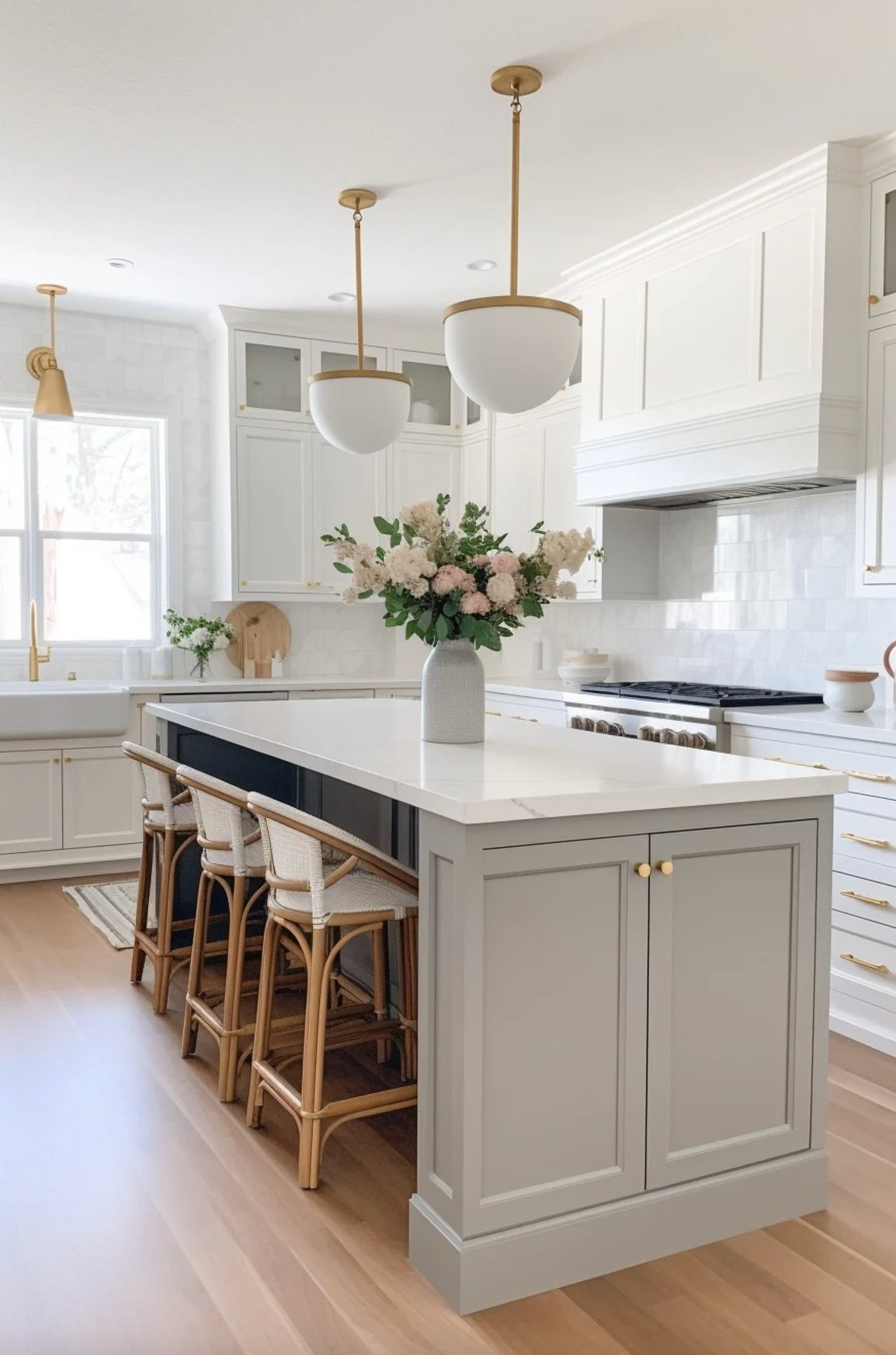
Kitchens
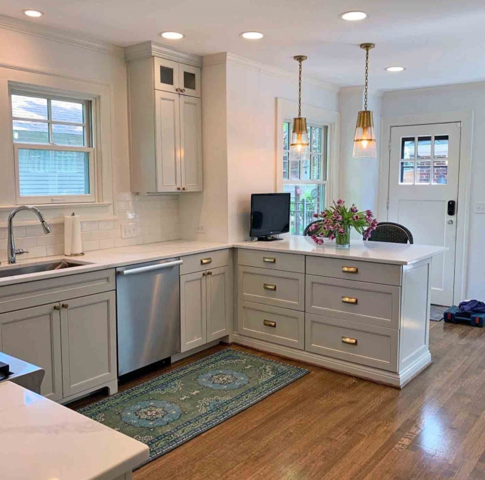
source
source
Repose Gray stays true to itself in kitchens, no matter the lighting. It has enough depth to hold its own next to white cabinets and makes marble or quartz countertops pop.
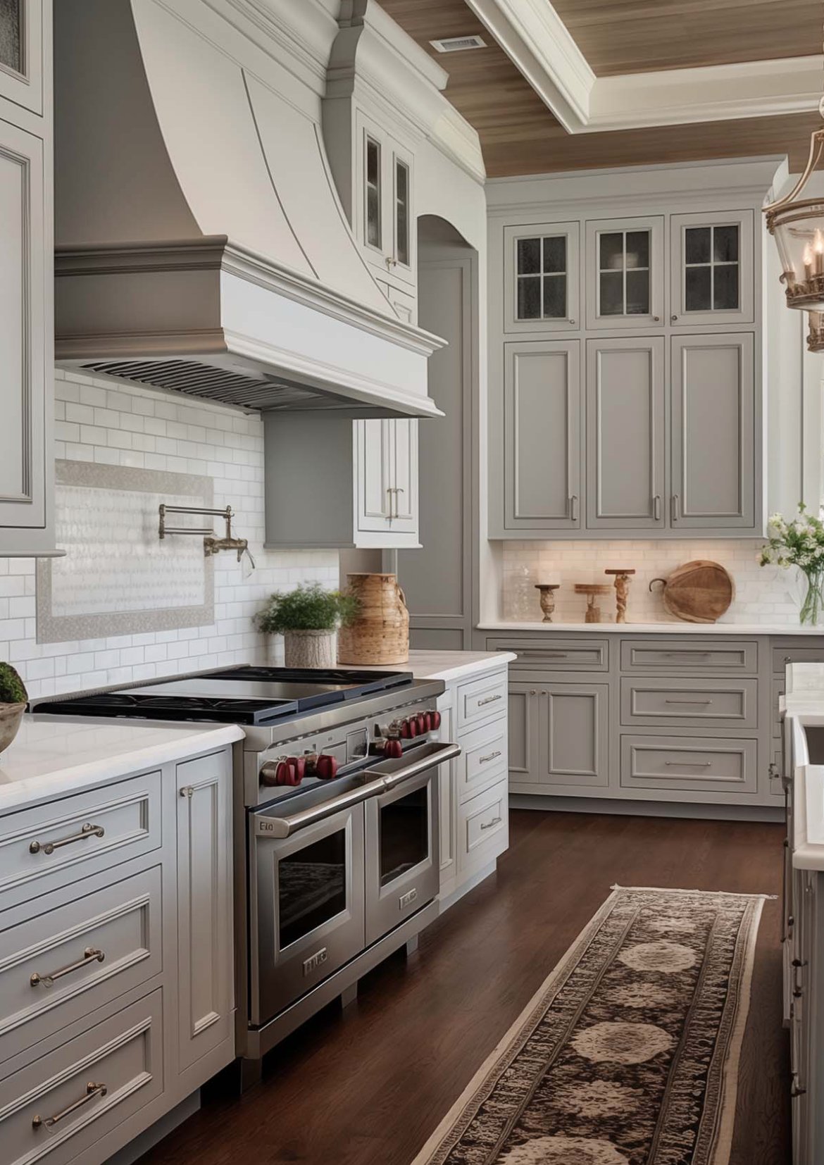
source
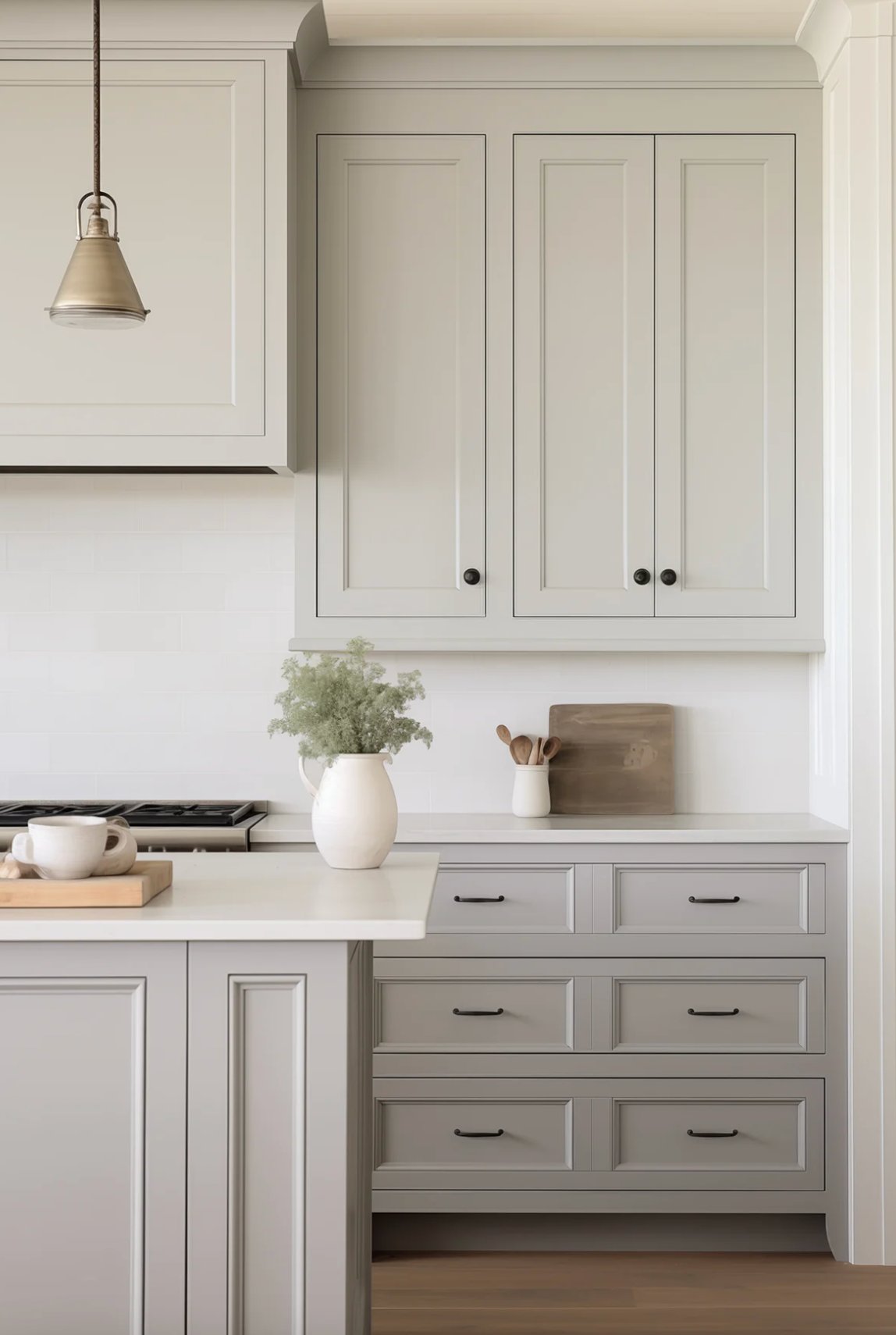
source
Agreeable Gray takes a gentler approach in kitchens. Thanks to that higher LRV (60 vs 58), it makes spaces feel bigger.
Plus, it’s more forgiving with cooking splatters and plays really well with those warm wood tones you often see in kitchen cabinetry.
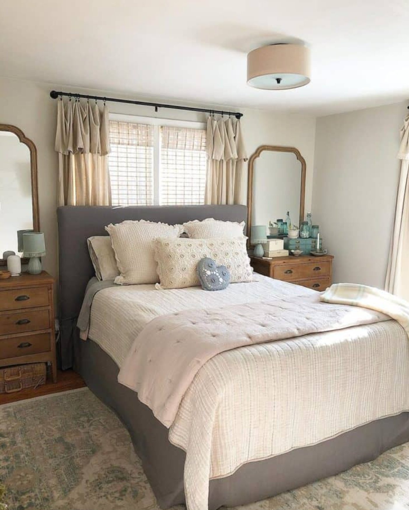
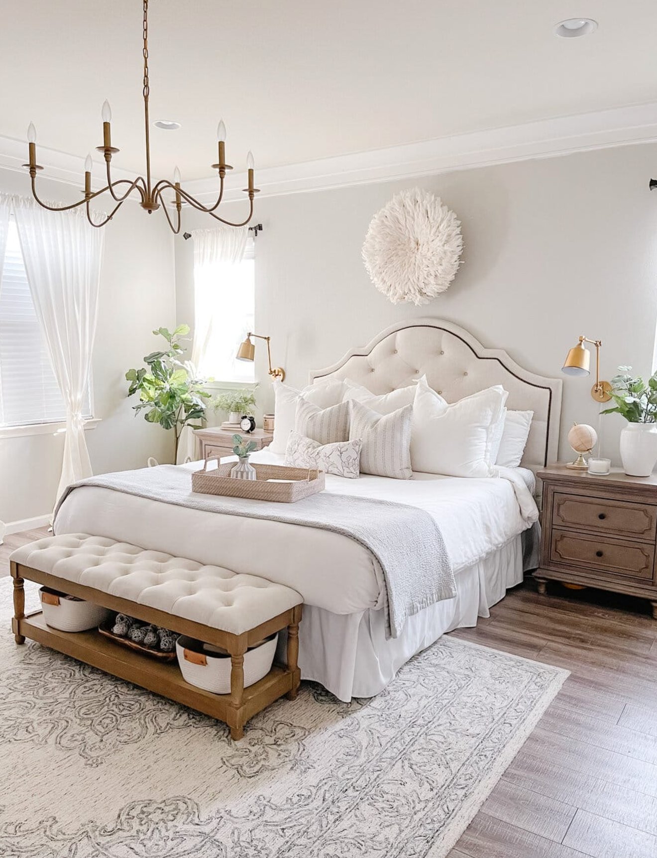
Bedrooms
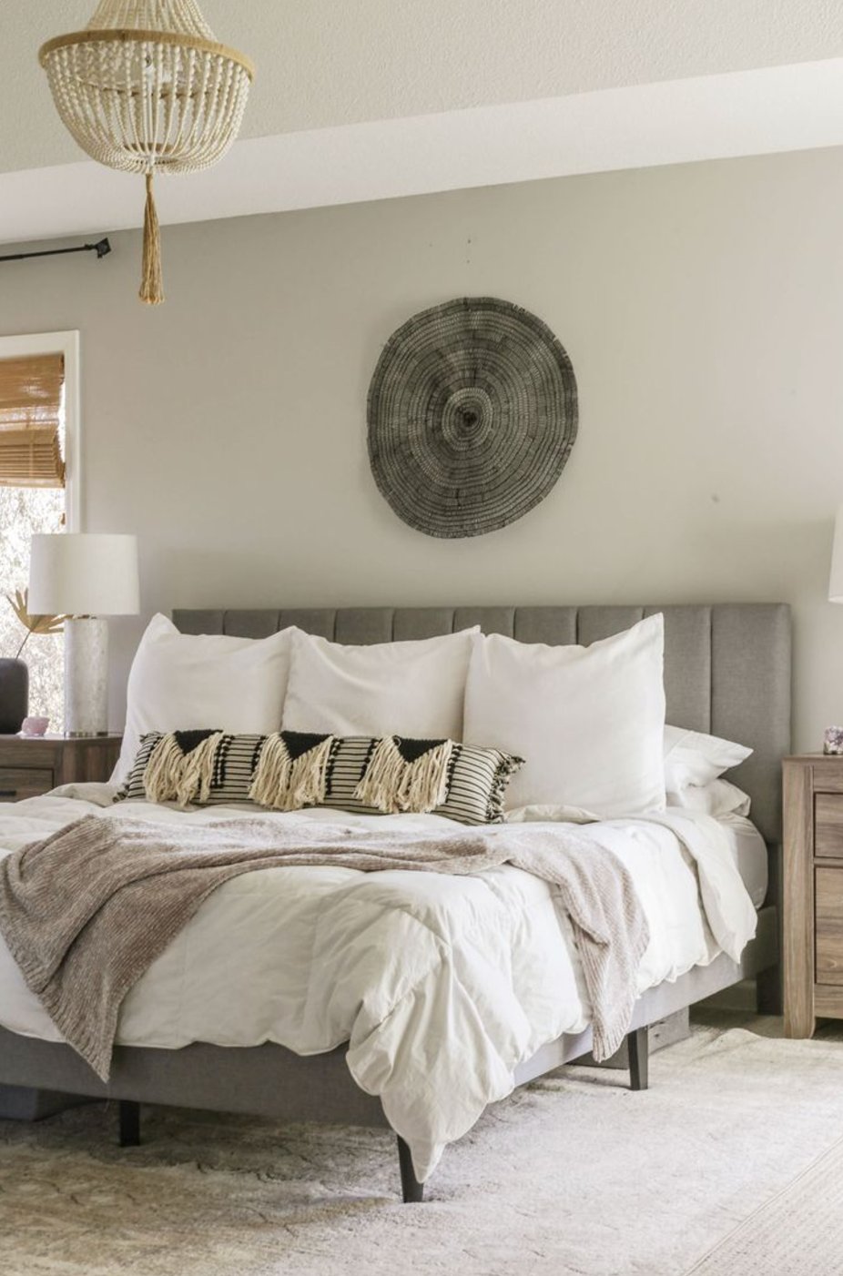
source
source
Repose Gray creates a peaceful bedroom vibe without making the space feel sleepy. It looks crisp in the morning light and gets cozier in the evening as its beige undertones come through.
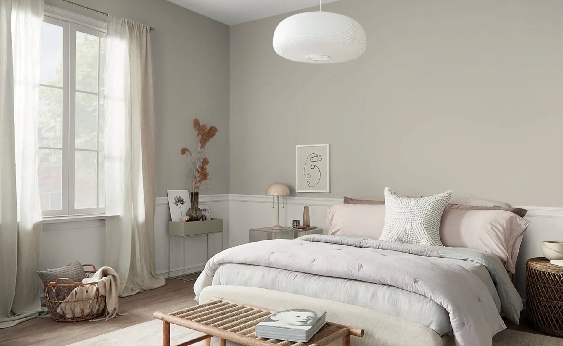
source
source
Agreeable Gray, on the other hand, has a more laid-back feel in bedrooms. It really shines in the evening light when you want the room to feel restful, and it plays nicely with pastel bedding.
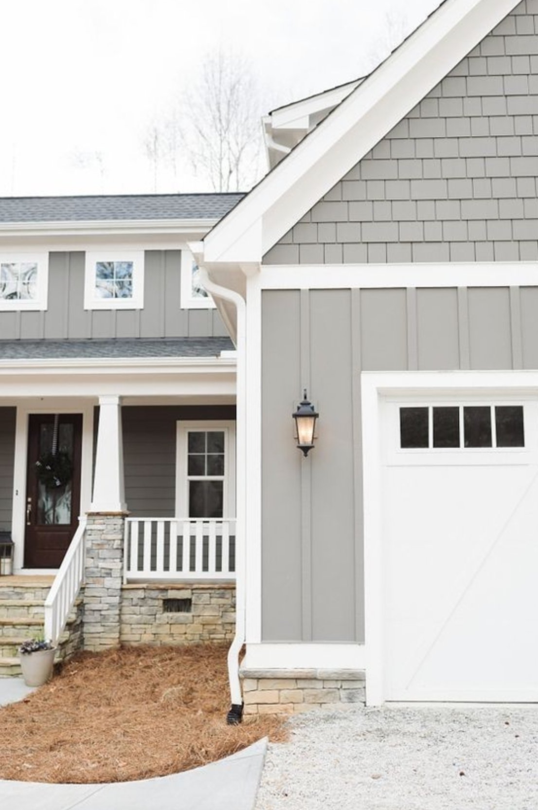
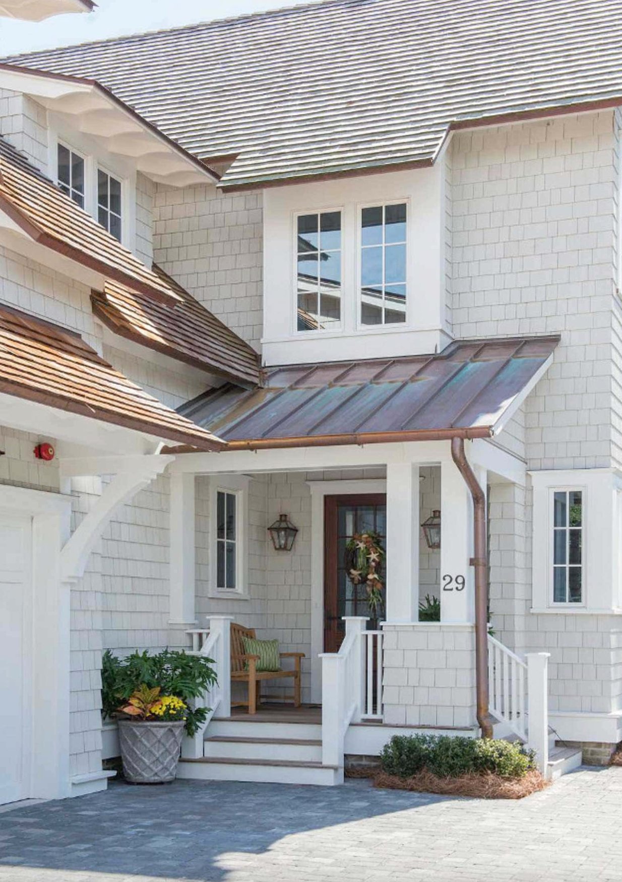
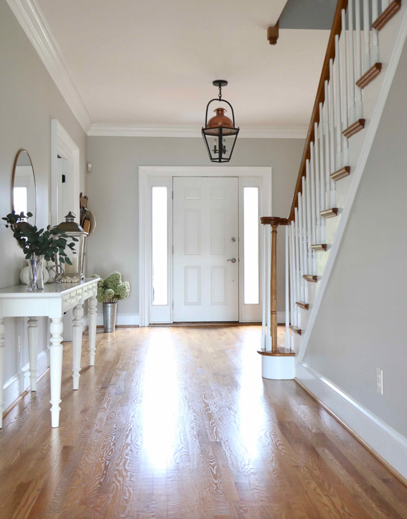
Exteriors
source
source
On the outside, Repose Gray gives off a modern, practical look. It shows up as a classic gray in sunlight but warms up a bit in the shadows. It’s a perfect match with white trim and dark accents!
source
source
Agreeable Gray does something more unique outside. It changes more throughout the day than Repose does, which gives facades some nice visual interest.
It comes across warmer and more inviting on bigger surfaces, though you’ll need to be more careful picking trim colors.
Lighting Impact
source
source
Repose Gray really shows its personality under different lights! It’s a straight-up classic gray in sunny spaces – which is why I love using it in bright living rooms and kitchens.
When it’s in shadow, you start seeing its cozy beige notes, and sometimes there’s even a hint of green. Under evening lights, it might lean slightly green, but it never gets that uncomfortable cold look.
It handles both warm and cool lighting like a champ. Just watch out – that beige undertone can sometimes take over in darker rooms.
source
source
Agreeable Gray is its own thing entirely! It’s a touch lighter than Repose Gray, so it feels airier in bright spaces.
The cool thing is how subtle its undertones are – you won’t get those surprise color shifts like Repose Gray sometimes gives you. It’s particularly great in rooms with steady artificial lighting.
Just keep in mind – in spaces where the light keeps changing, it might throw you some curveballs. That’s why I always tell people to test it right where they plan to use it. Overall, it’s got a warmer, friendlier vibe than Repose Gray.
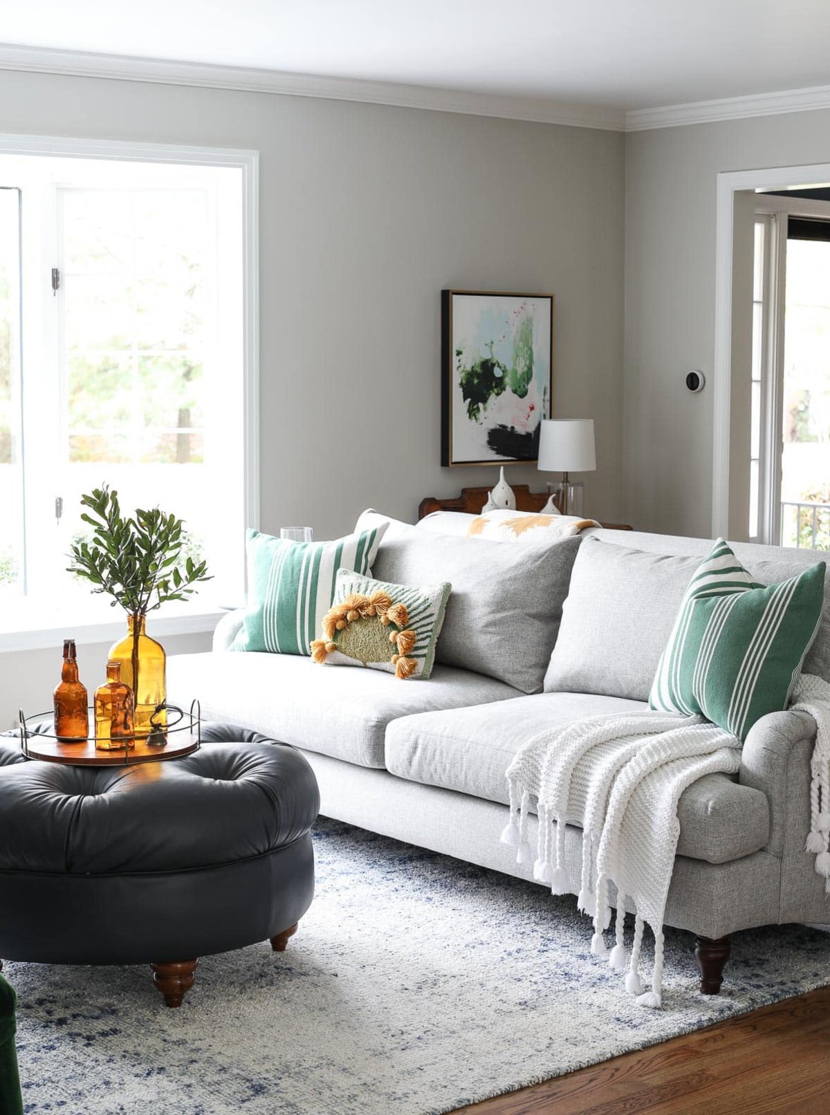
Coordinating Colors
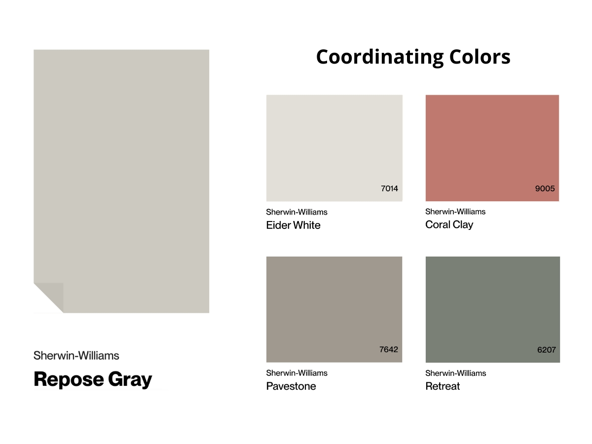
Repose Gray is a natural with… well, natural materials – especially dark wood and leather. I love pairing it with white fabrics and metal accents in matte nickel or aged bronze. It also looks fantastic with deep blues and earthy tones.
It makes a great backdrop for artwork and large plants too.
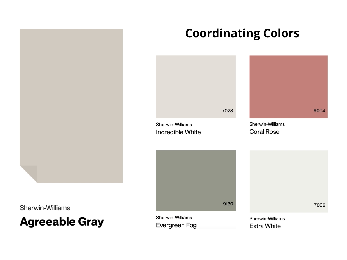
Agreeable Gray is a bit more of a team player with colors, even though both have similar palettes. It works great with warm and cool accent colors alike – everything from soft pink to muted green. It makes textures pop, which is why I’m a fan of mixing it with woven baskets, linen curtains, and ceramics.
Just be careful not to go overboard with yellow accessories – they can push the whole space into too-beige territory.
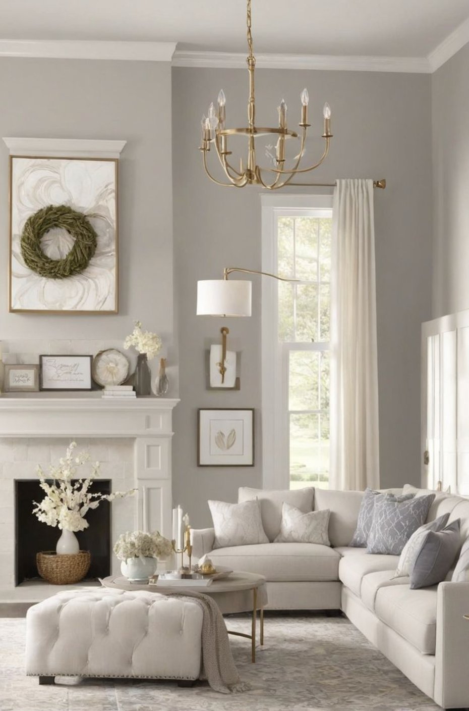
Making Your Decision
Let’s boil down what makes these colors different:
I reach for Repose Gray when I want a more defined, structured gray – it keeps its character in different lights and makes a fantastic backdrop for modern spaces.
It’s perfect when you’re trying to dodge that obvious beige look but aren’t ready to go full-on cool gray.
Agreeable Gray is my go-to for folks wanting something softer and more embracing. Its higher LRV helps rooms feel bigger, and that warm undertone makes well-lit spaces feel super cozy.
Pro tip – always test your paint samples in your actual space under different lighting. Colors can look totally different from house to house. Taking time to test will save you headaches (and money) down the road!