Picking the perfect white for your walls can be tricky – even seasoned designers struggle with this one. When you look at Benjamin Moore’s Simply White and White Dove, it’s easy to get stumped since these shades look practically identical at first glance.
But their tiny differences are crucial – they determine whether a shade will make your room shine or fall flat. It’s no wonder these whites have consistently ranked among the most popular interior colors for the past five years.
Let’s look at 20+ REAL photos to break down the actual differences between White Dove and Simply White, and determine which shade will work best in your space.
Undertones & Character
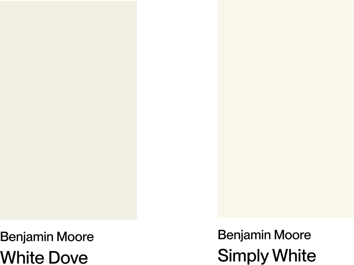
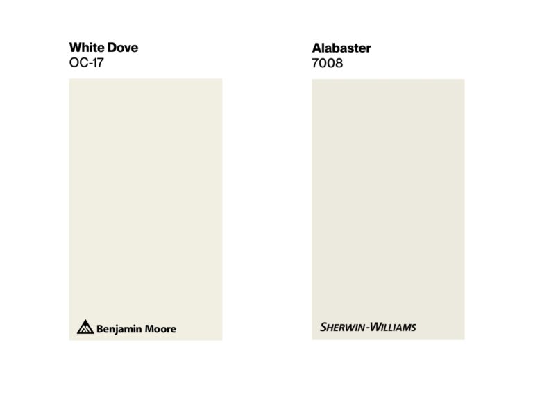
You really can’t compare whites until you see them next to each other. Take a look at the collage above – the difference in character and undertones jumps right out at you! This is exactly why I always suggest grabbing a few peel-and-stick samples of different colors and comparing them in your own space.
BM White Dove (OC-17) is a soft, creamy white with gray-beige undertones. It sits right between white and beige – think of it as a happy medium between the two.
With an LRV of 83.16, it bounces light around nicely while staying gentle on the eyes. This shade really shines in spaces where you want to create a cozy, laid-back vibe.
BM Simply White (OC-117) leans much closer to pure white. With an LRV of 89.52, it’s noticeably brighter and crisper than White Dove, but thanks to subtle warm notes, it doesn’t feel sterile at all.
This makes it a go-to choice for modern spaces where you’re aiming for that fresh, airy feeling.
| BM Simply White | BM White Dove | |
| Color Code | OC-117 / 2143-70 | OC-17 / PM-19 |
| Light Reflectance Value (LRV) | 89.52 | 83.16 |
| Color Family | Warm white | Warm white |
| Undertones | Warm yellow undertones | Soft greige with minimal yellow |
source
source
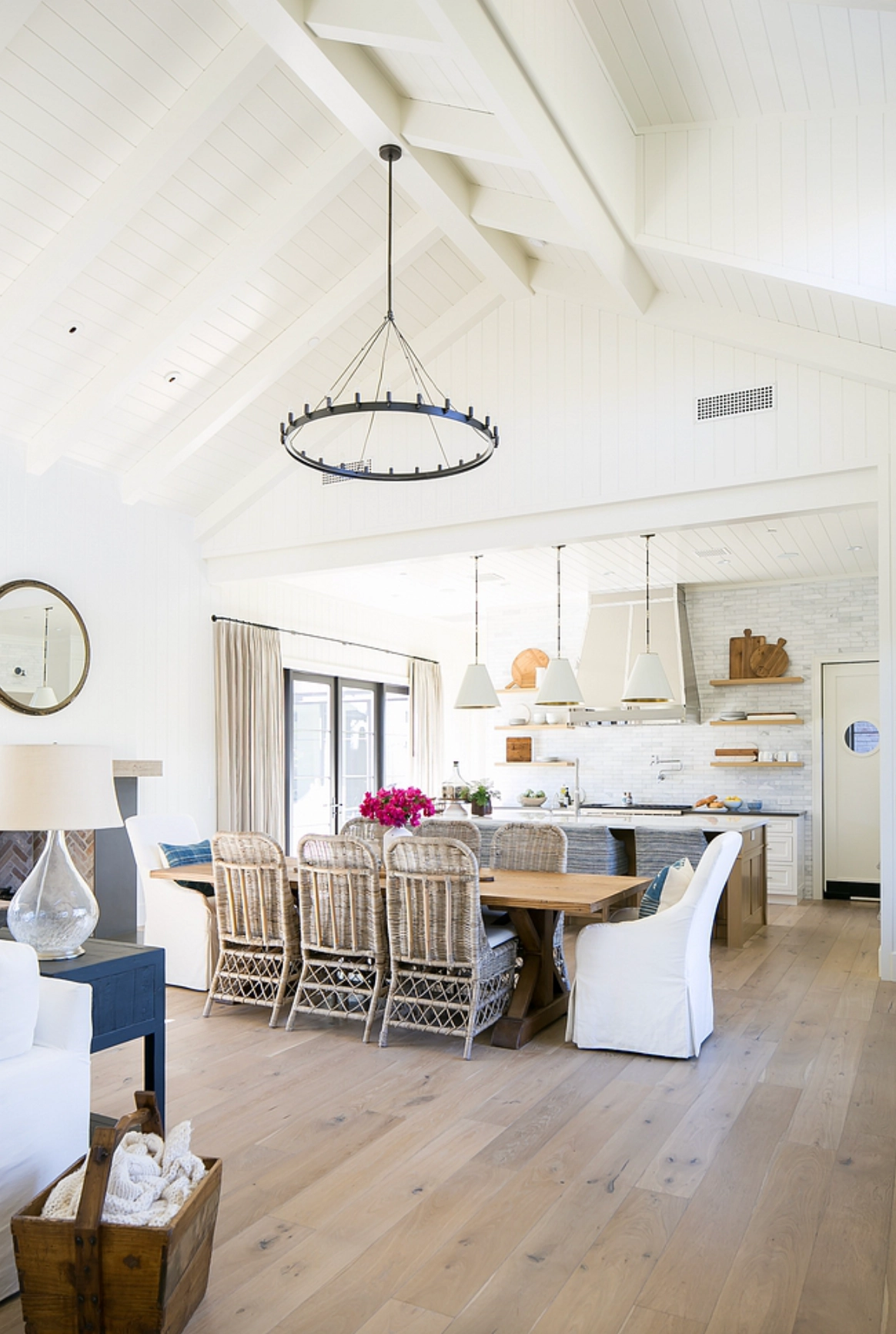
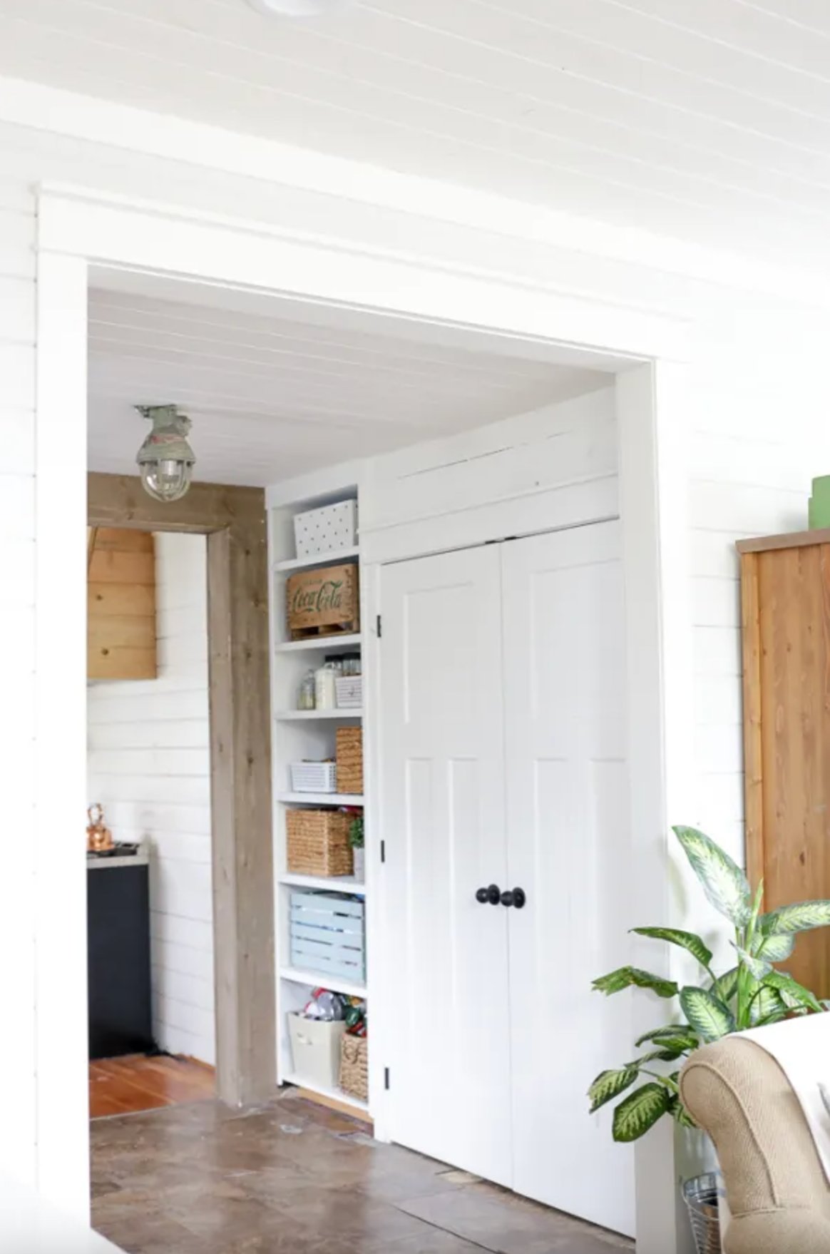
You’ll really notice the difference when it comes to moldings. White Dove creates softer transitions between surfaces, while Simply White gives you more of a crisp contrast. But don’t worry – neither one looks clinical. They both keep that welcoming, homey feel.
If we compare the two, White Dove is your friend when you want that relaxed atmosphere, while Simply White works its magic when you’re going for something more energetic and contemporary.
Just keep in mind these aren’t hard-and-fast rules – more like friendly suggestions. Both colors are pretty versatile and forgiving if you don’t get everything perfect.
Best Applications
Overall, White Dove works great in the same spaces as Simply White – they just set slightly different moods. Let’s look at how they perform in real rooms:
1. Kitchens
source
source
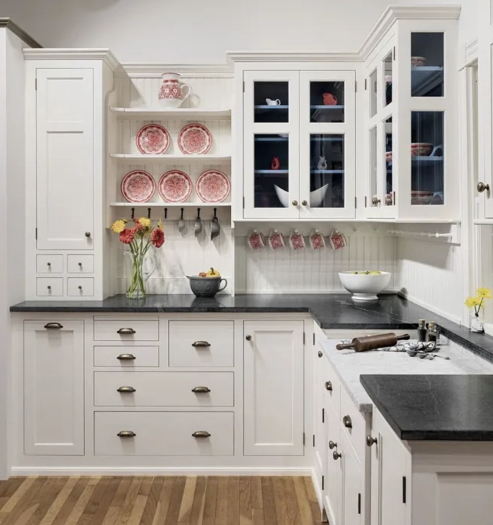
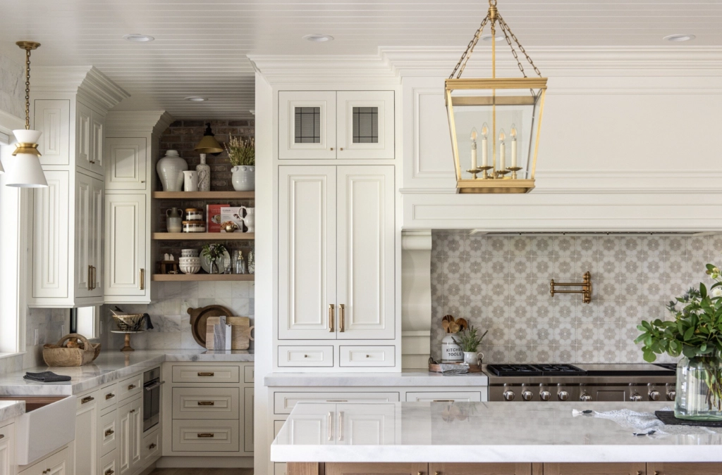
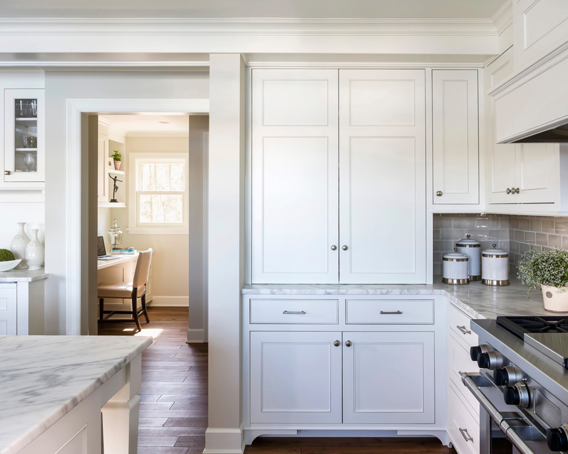
White Dove brings a cozy feel to kitchens with its soft gray-beige undertones. While fresher and brighter, Simply White can sometimes feel a bit too energetic for certain styles, especially if you’ve got lots of cabinet space.
source
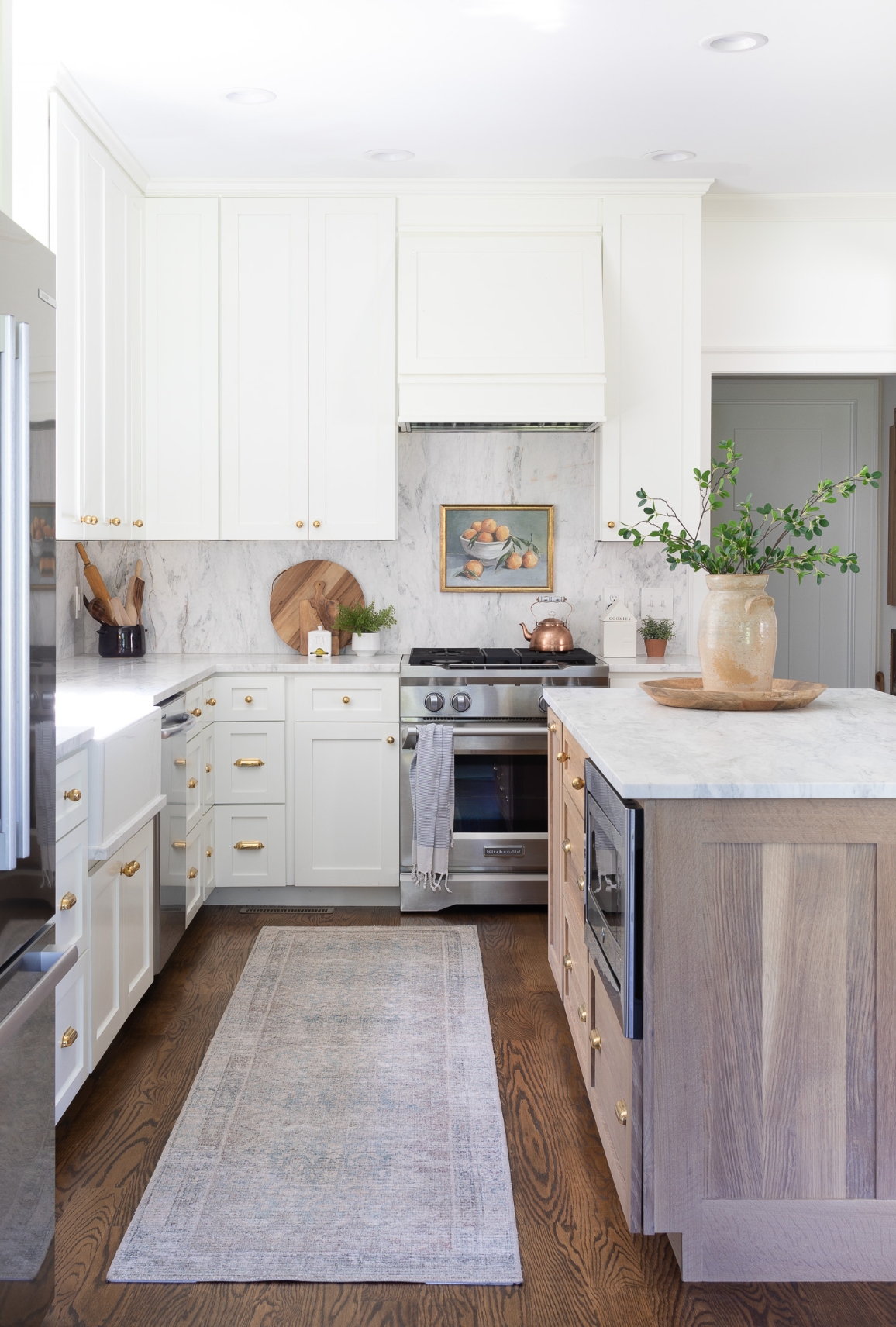
That said, Simply White really makes dark countertops and appliances pop. In rooms that don’t get much natural light, White Dove might look a bit flat, while Simply White helps brighten things up with its subtle yellow undertones.
2. Hallways and Entryways
source
source
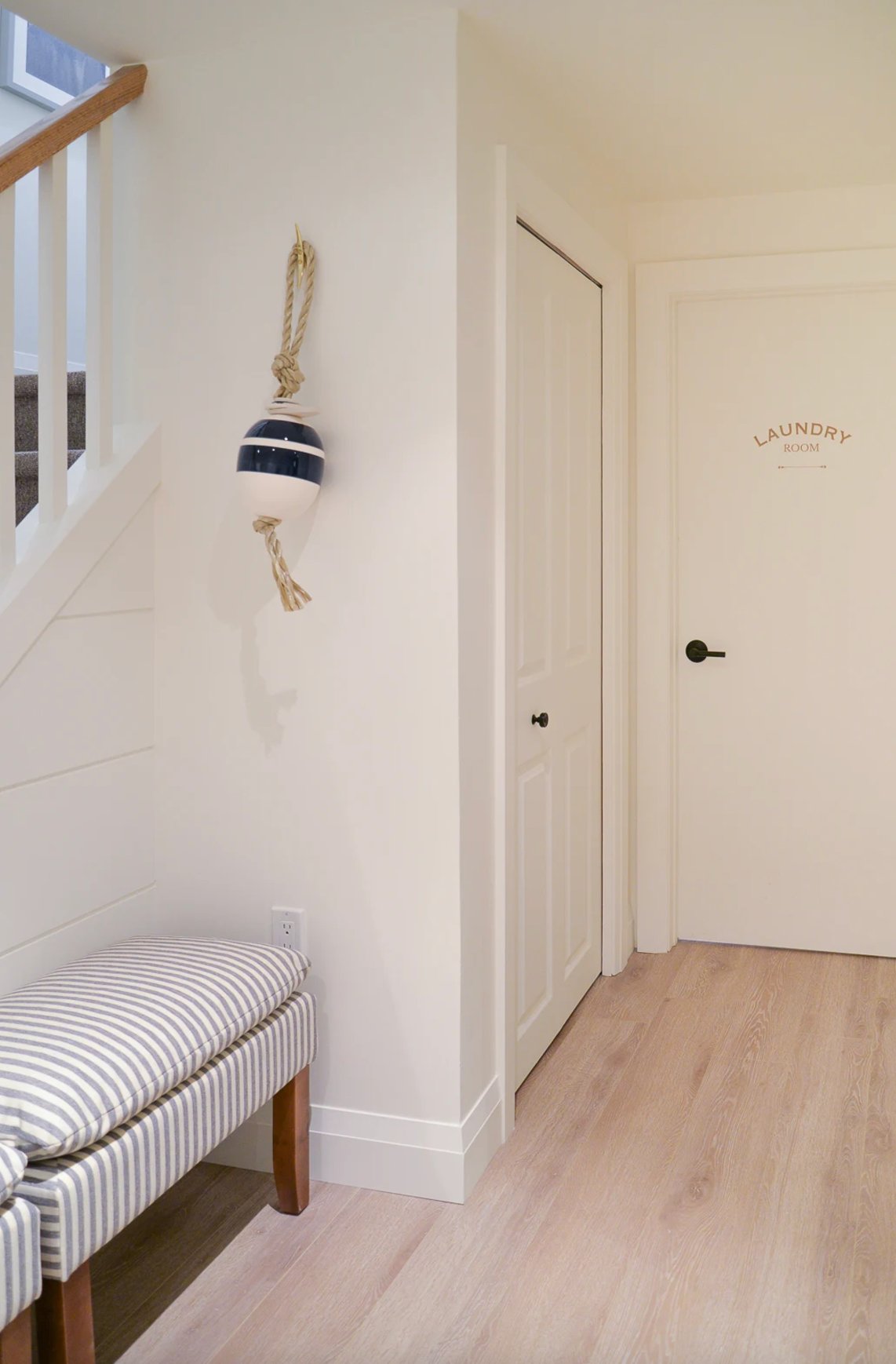
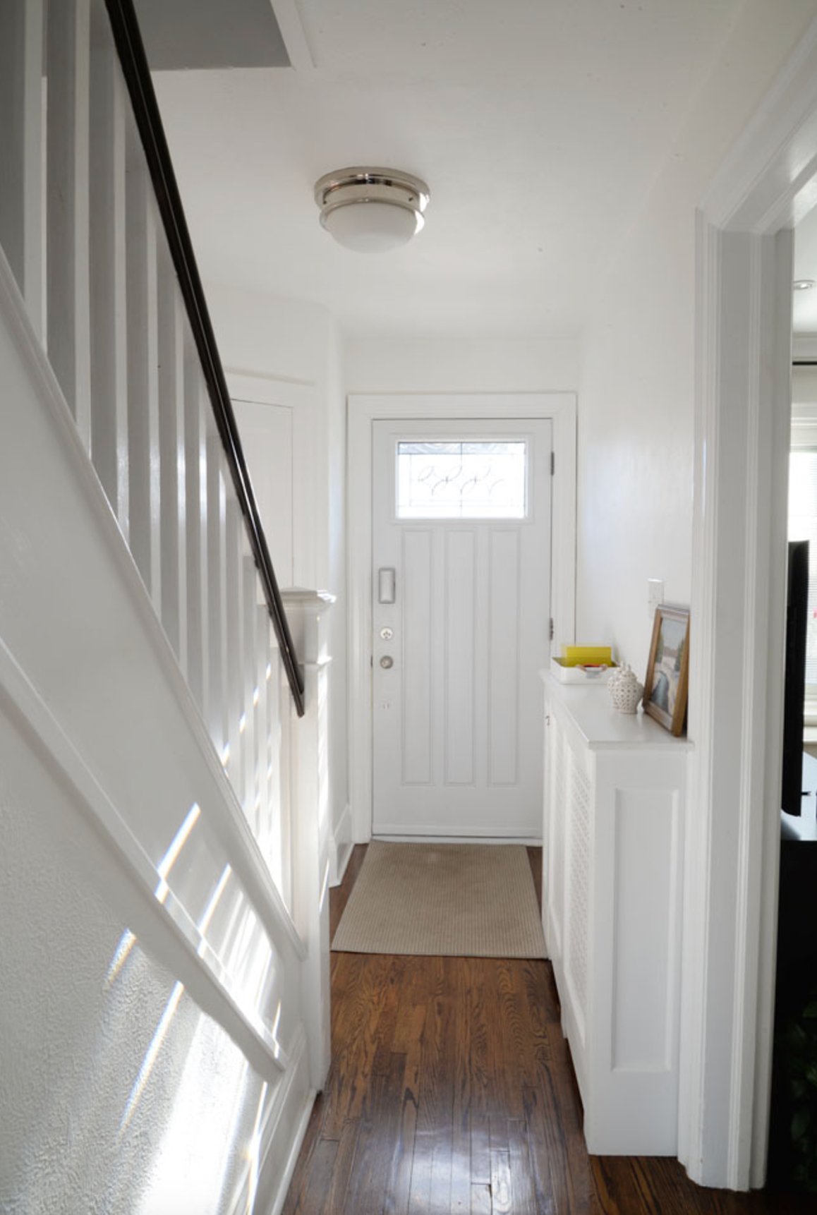
Simply White really comes into its own in entryways. Even in darker spaces, it doesn’t turn gloomy – instead, it makes the whole area feel like it’s glowing. You can use it on everything – walls, doors, baseboards – and it all ties together beautifully.
Just watch out for those standard yellow light bulbs – they can throw off the true color a bit.
source
source
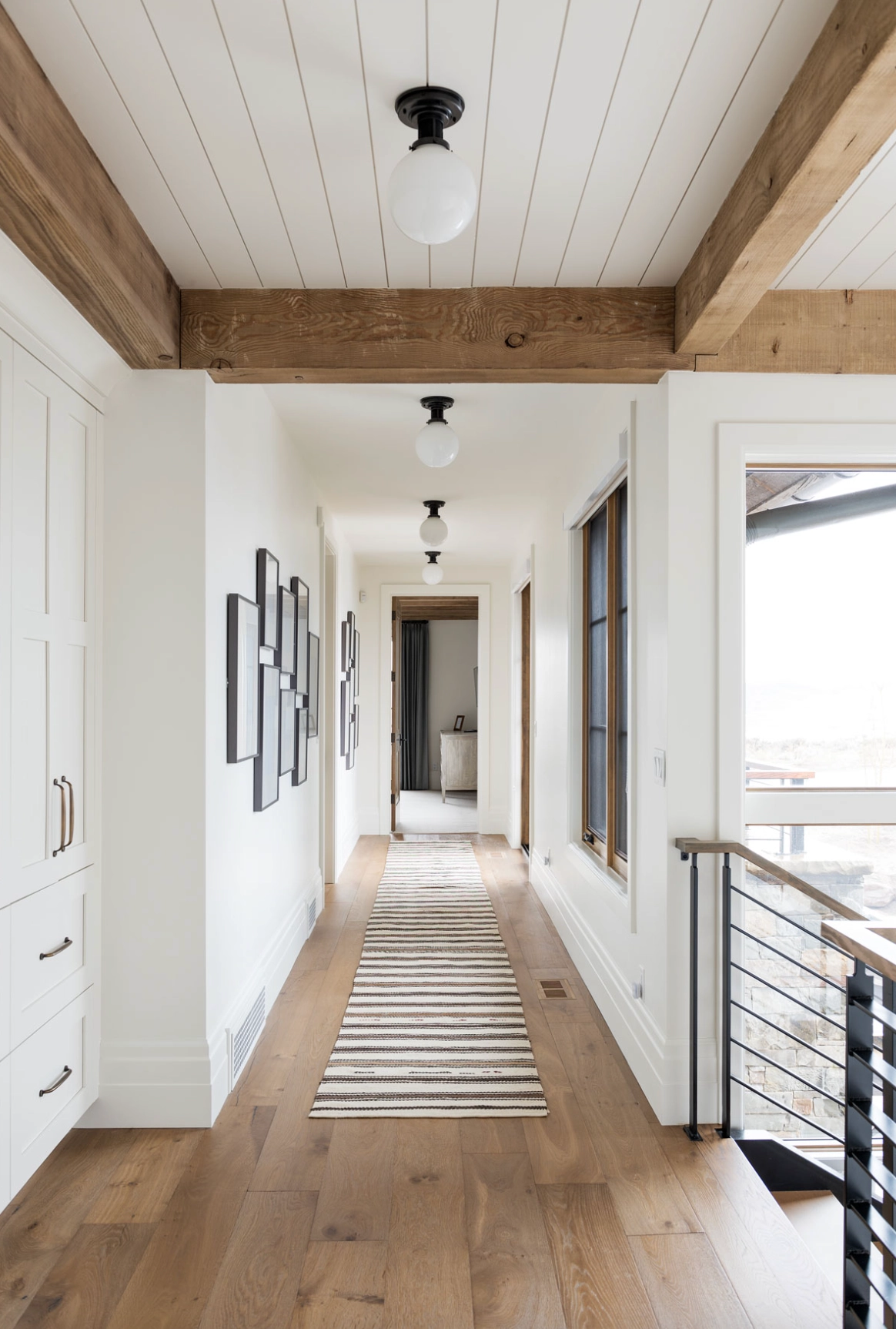
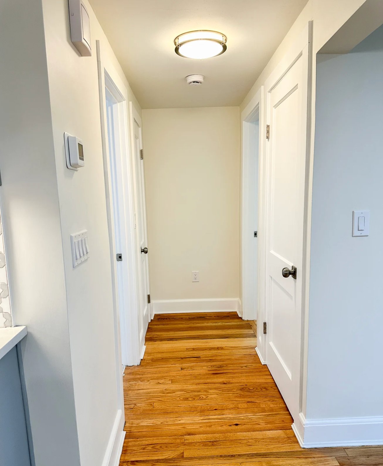
White Dove is more of a steady player in narrow hallways – its gray-beige undertones stay pretty consistent no matter the lighting. On moldings, it gives you that soft, elegant look without trying too hard.
3. Bedrooms
source
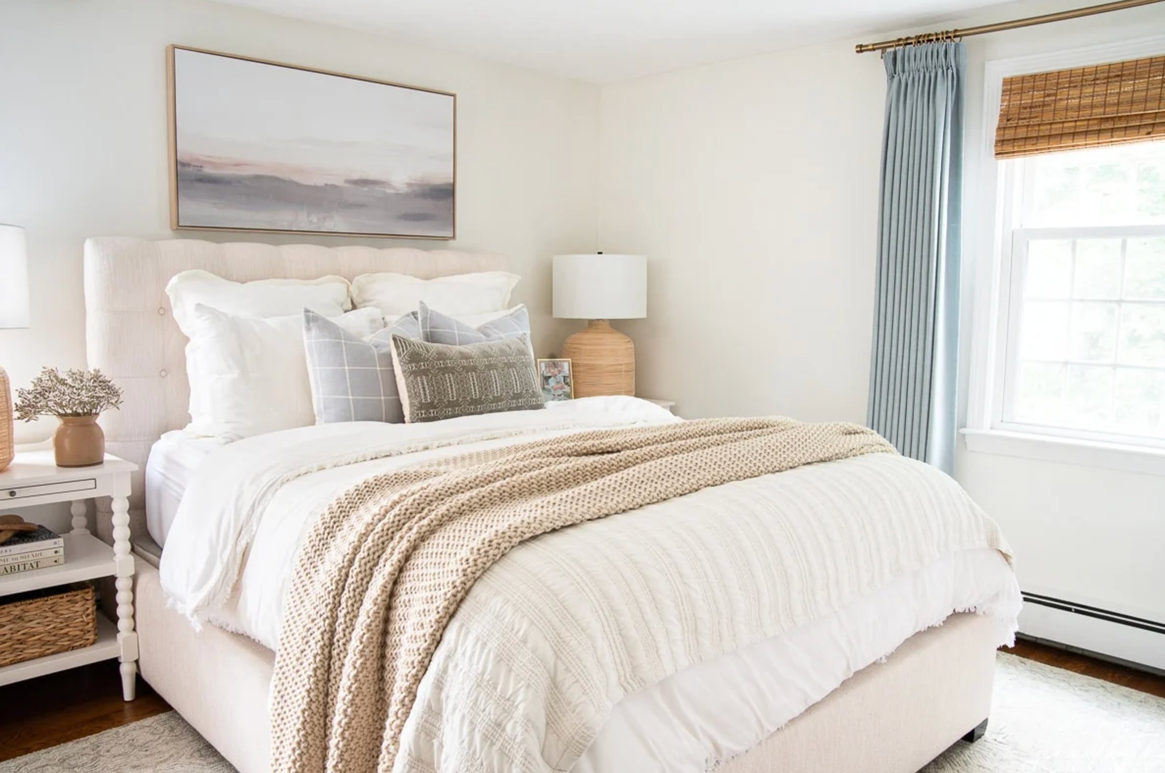
source
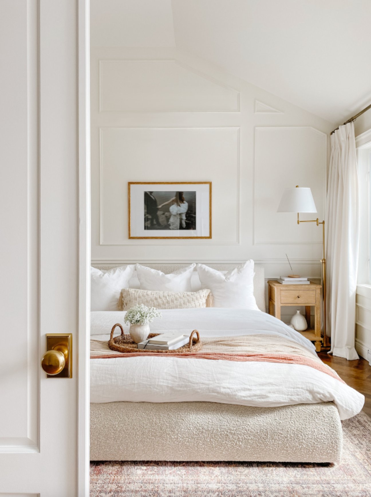
These two really show their personalities in bedrooms. Simply White creates this fresh, energizing vibe that’s perfect for minimal or Scandinavian-style spaces.
White Dove takes things in a cozier direction, making the bedroom feel more relaxing. It’s a natural fit for traditional spaces and plays well with wooden furniture and textured fabrics.
4. Living Rooms
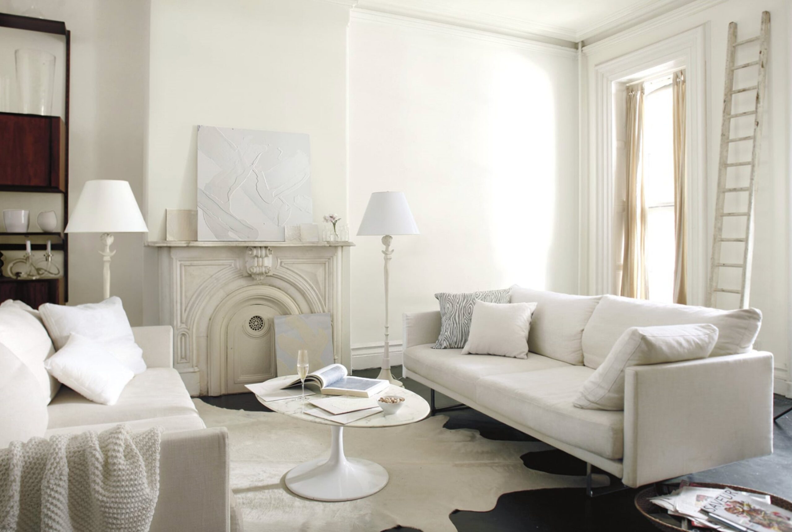
source
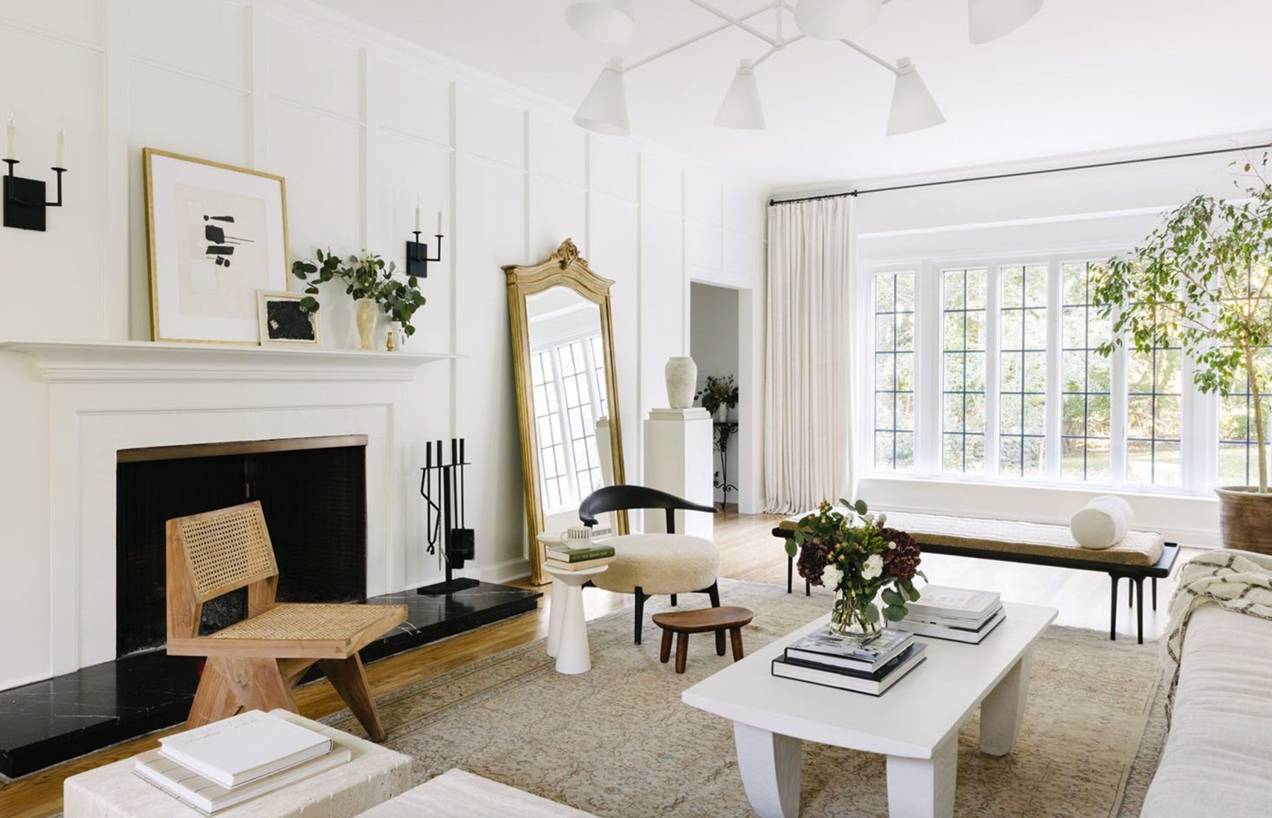
source
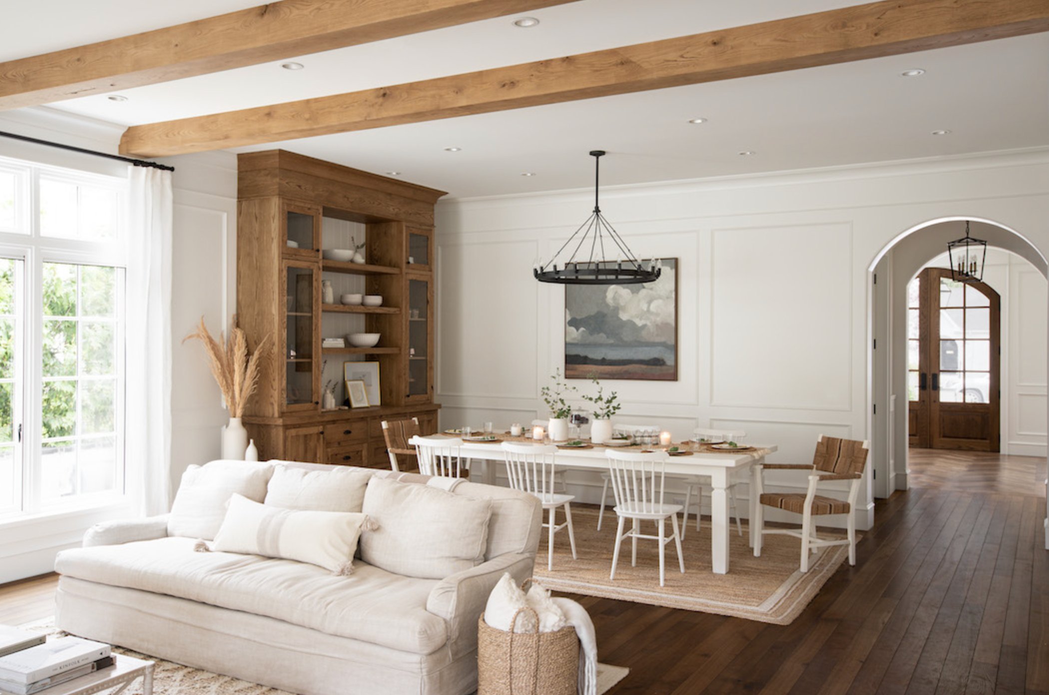
Simply White’s high LRV works its magic here, filling the room with light and brightness. It makes architectural details pop, and every line stands out crisp and clean. When paired with wooden furniture, it creates this gorgeous modern contrast.
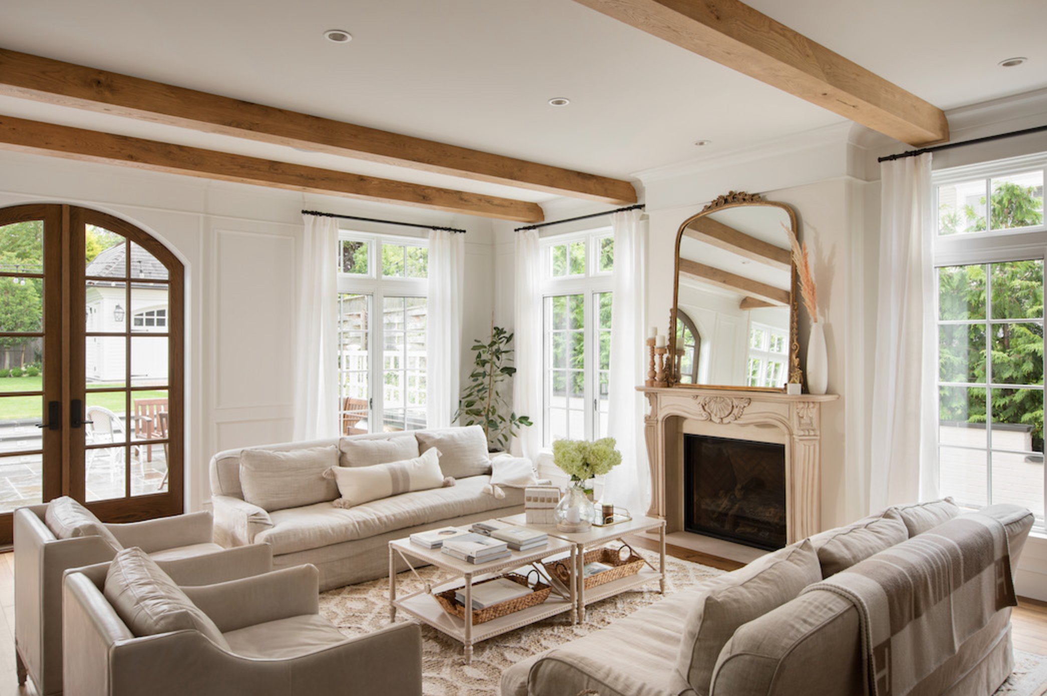
source
source
White Dove takes a different approach, making spaces feel more intimate and snug. Its gray-beige undertones soften any harsh contrasts, giving your living room a more pulled-together look. It’s especially stunning in rooms with fireplaces – it highlights traditional details without stealing the show.
Come evening time, White Dove creates this warm, inviting atmosphere that’s perfect for hanging out, while Simply White keeps that bright, energetic feel going strong.
Lighting Impact
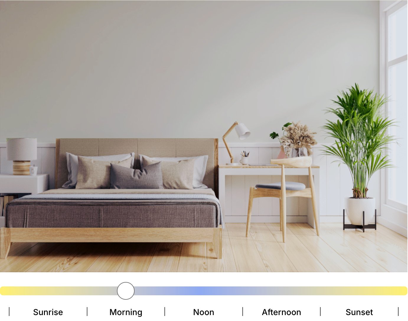
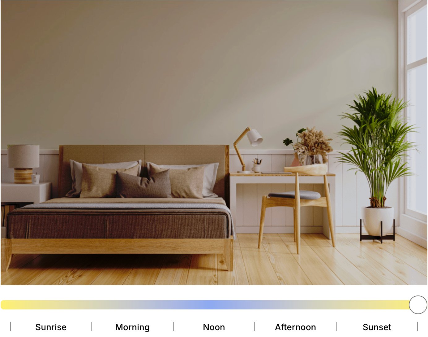
White Dove (LRV 83.16) works remarkably well under different lighting conditions. Its warm undertone shines in north-facing rooms, where it helps soften cool light and keeps the space from feeling too clinical.
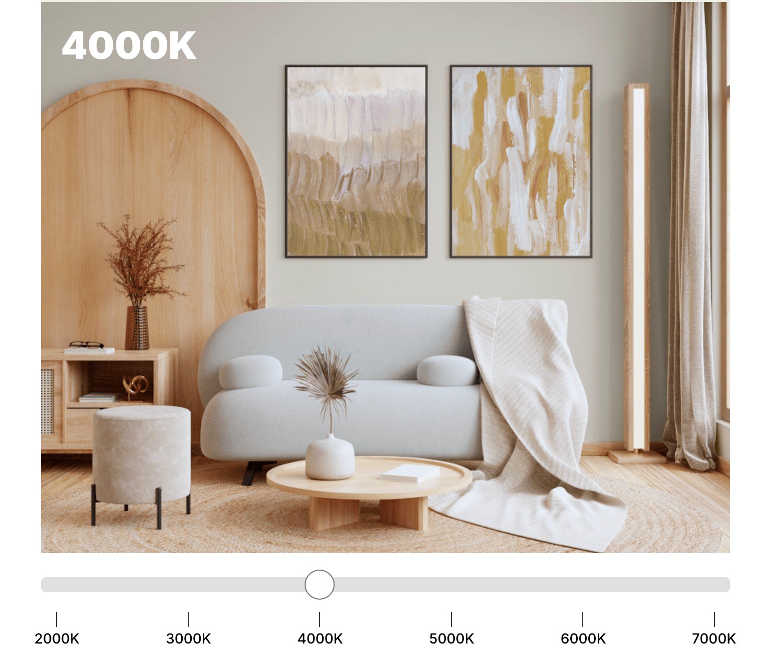
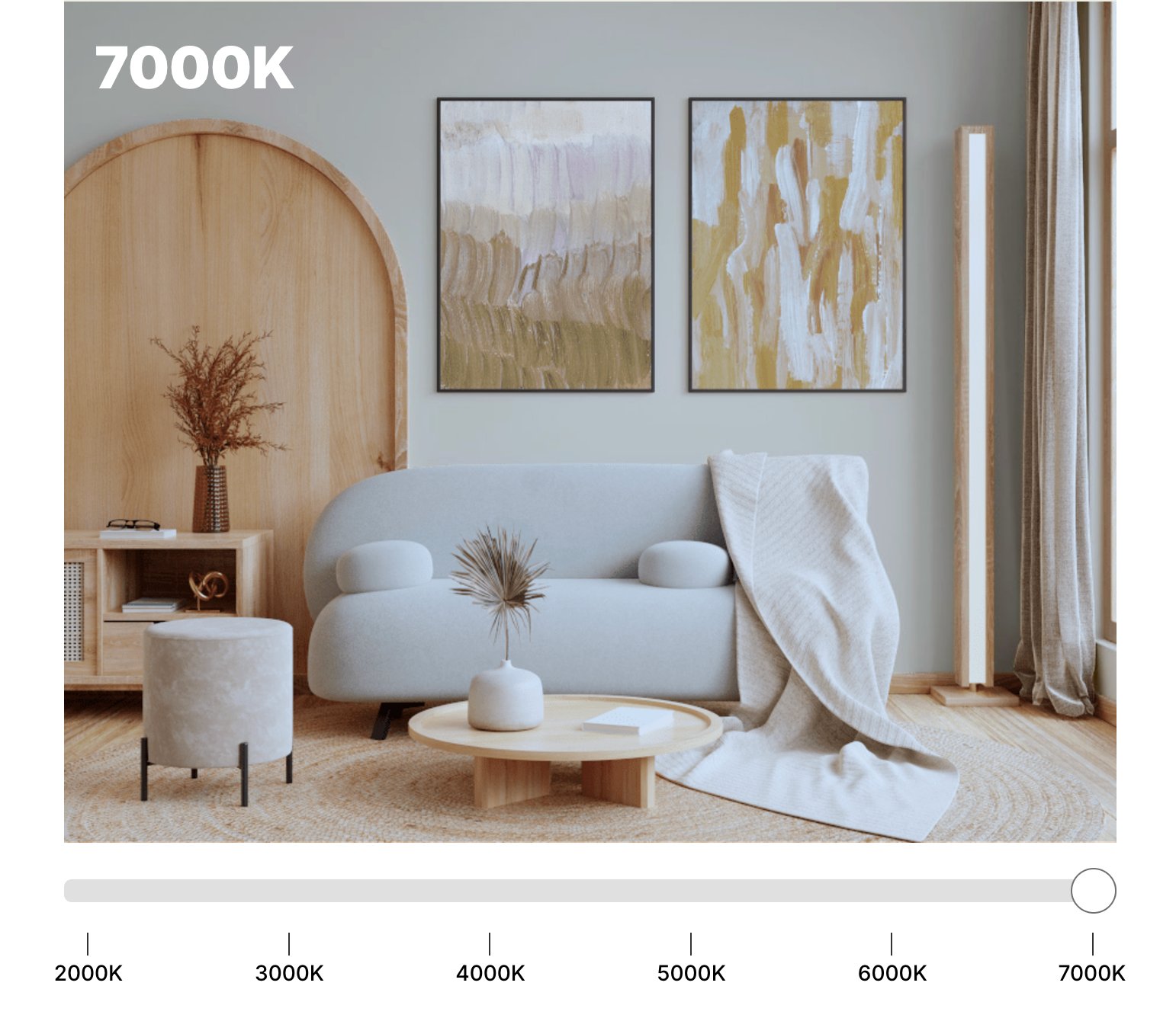
It shows its true neutral character in natural daylight, with just a hint of yellow coming through during golden hour. Under artificial light, White Dove stays true to itself – soft and balanced, never swinging too far in any direction.

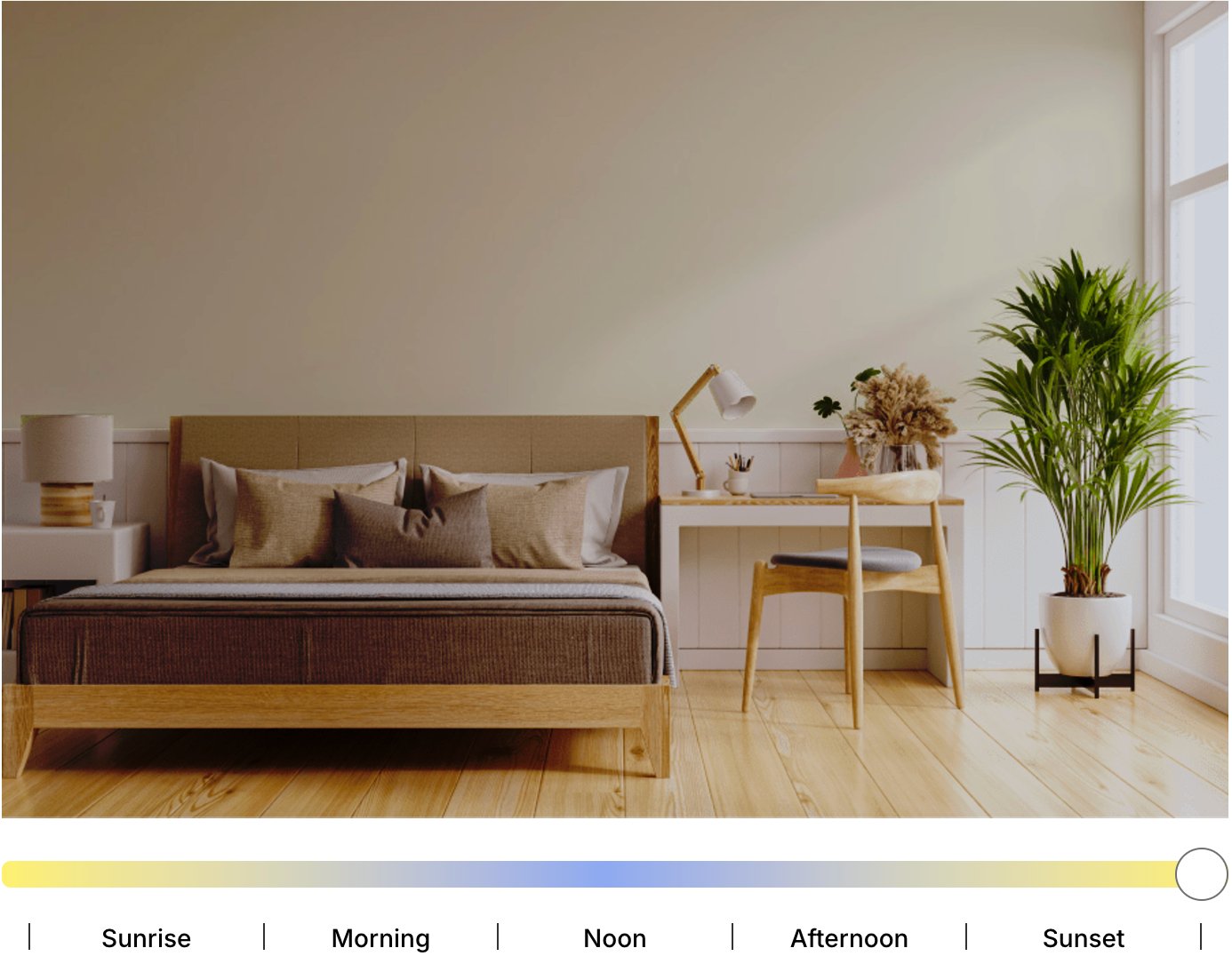
Simply White (LRV 89.52) is a bit more of a chameleon when it comes to lighting. It looks crisp and clean in bright daylight, with barely any yellow showing through. But its warm base becomes more obvious if it is put in a north-facing room.
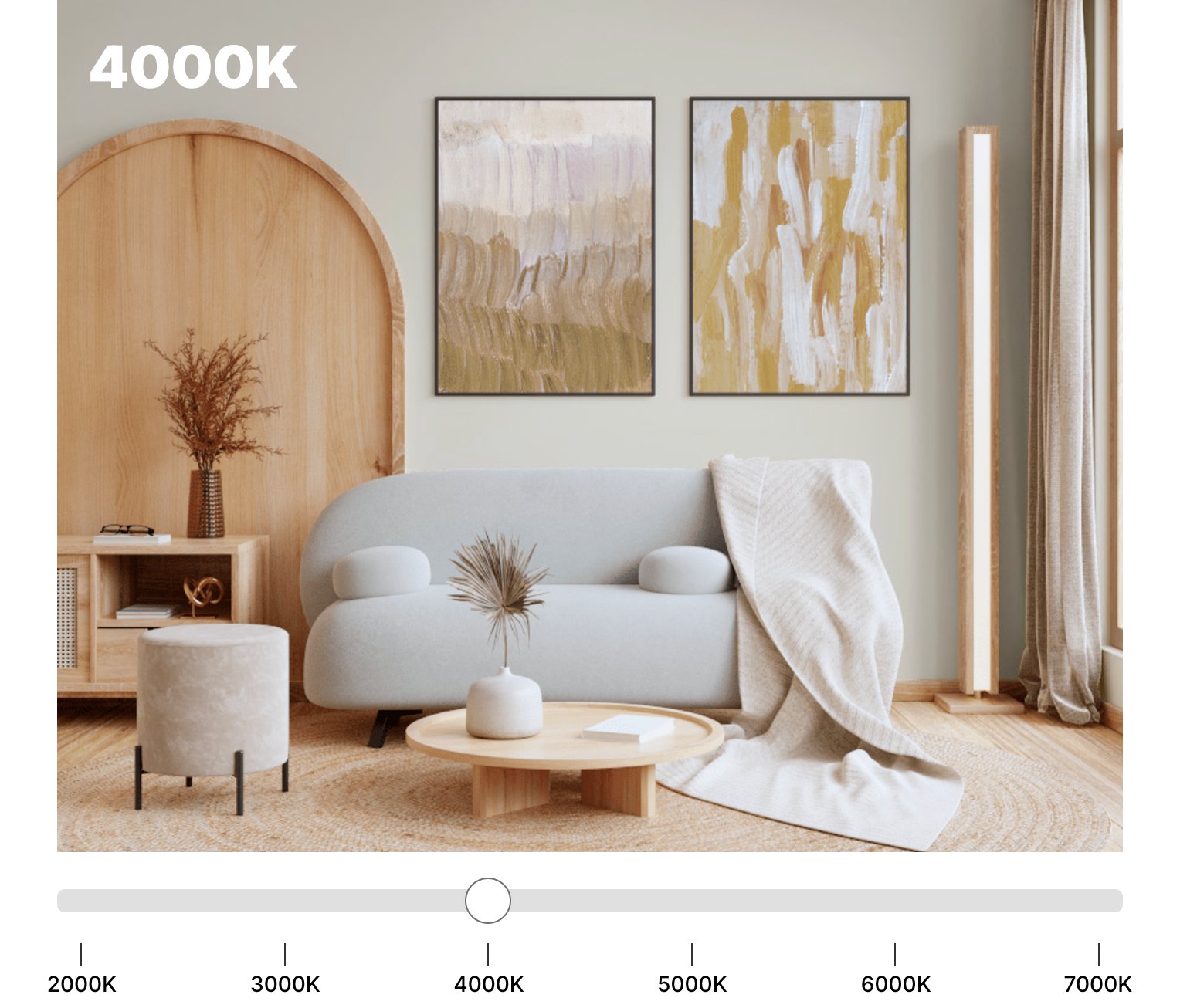
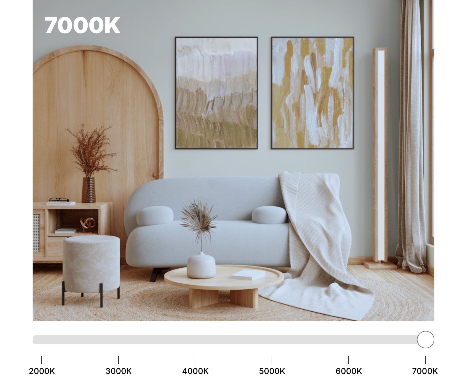
Switch on artificial lights, especially in the evening, and Simply White can warm up quite a bit, letting its yellow notes shine through. In darker spaces without natural light, it might end up looking warmer than you’d expect, sometimes even veering into creamy territory.
Coordinating Colors
White Dove
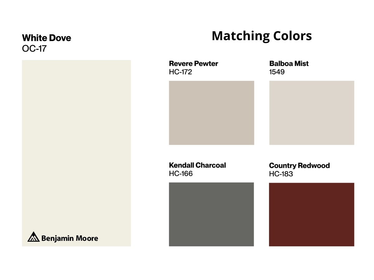
BM White Dove sets up a peaceful backdrop for color pairings. Thanks to its gray-beige undertone, it plays especially well with earthy colors – Revere Pewter and Balboa Mist blend with it seamlessly.
Looking to add some drama? It pairs beautifully with Kendall Charcoal – the dark gray brings nice depth to the space. For a warm accent, especially in traditional rooms, Country Redwood fits the bill perfectly.
Simply White
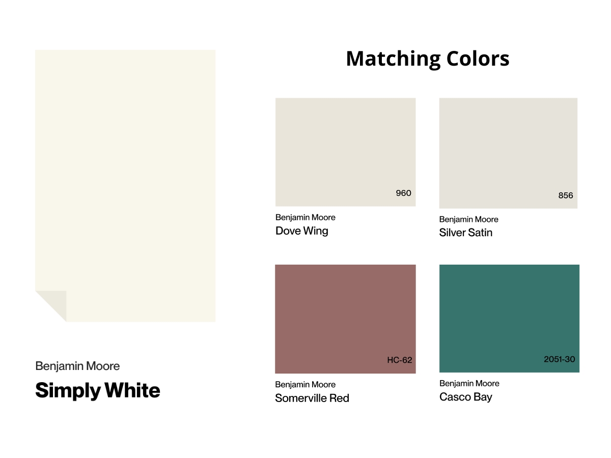
Simply White takes a different route with color combinations. It teams up beautifully with Dove Wing and Silver Satin to create a delicate light palette that’s perfect for modern spaces.
Want to add some warmth? Somerville Red brings in a lovely terracotta accent without taking over. And if you’re looking for a pop of color, Casco Bay offers a sea green that makes a statement while staying tasteful with its muted tone.
Making Your Decision
Here’s the bottom line – choosing between White Dove and Simply White really comes down to your lifestyle and the vibe you’re going for in your space.
Go with White Dove if you lean toward traditional or transitional style, love a cozy feel, and use lots of wood and textured materials.
It’s especially great when you need a white that stays consistent under different lights.
Simply White, on the other hand, works better in modern and Scandinavian spaces.
It’s your best bet if you want to make a space feel bigger, create bold contrasts with darker elements, or brighten up a room that’s short on natural light.
One last thing – and this is crucial – always test your chosen shade in your actual space. What you see in the store or in photos can be totally different from how it looks in your home.

