If you’ve ever tried picking white paint for walls, you know the challenge of finding that perfect shade. Today, I’m comparing two popular Benjamin Moore whites – Snowbound and Pure White.
While they might look nearly identical at first, their subtle differences can make or break your space – either creating a warm, welcoming atmosphere or ending up with something that feels sterile and clinical.
Let’s look at why designers gravitate toward these shades and when each one shines, using real-life examples from both interior and exterior projects.
Undertones & Character
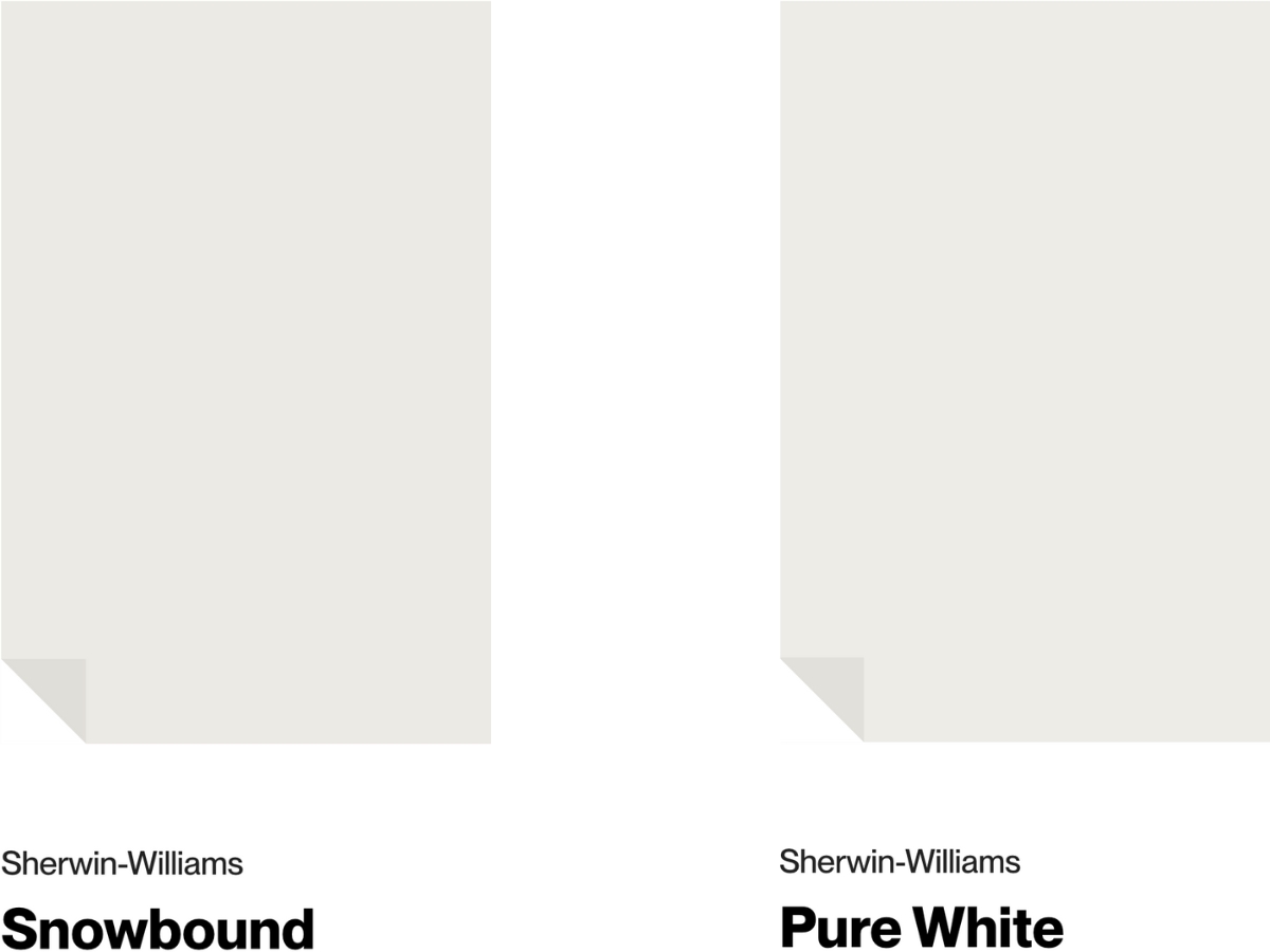
Sherwin Williams Snowbound is quite the interesting white – it has a creamy-gray undertone that really sets it apart. When the sun hits it, it warms right up, but catch it in the shade, and you’ll see it shift to a cooler gray.
It really comes alive in bright spaces, making the walls look gorgeous. Just keep in mind it might feel a bit chilly in north-facing rooms. With an LRV of 83, it bounces light around nicely and opens up spaces without that stark hospital feel.
Pure White by Sherwin Williams is like the easy-going cousin – it’s a soft white with just a hint of yellow underneath. Talk about versatility – it plays nice with pretty much any style.
I had a client with west-facing windows in their living room, and Pure White stayed true all day long – it didn’t go yellow even when the evening sun came in. At LRV 84, it’s a touch brighter than Snowbound but still keeps things cozy.
So what’s the real difference? Snowbound’s got more personality – you can clearly see that creamy-gray undertone and it likes to change throughout the day. Pure White plays it cool – its yellow undertone is so subtle you might miss it.
Want a white with some character? Go Snowbound. Need something foolproof? Pure White’s your best bet.
| SW Snowbound | SW Pure White | |
| Color Code | SW 7004 | SW 7005 |
| Light Reflectance Value (LRV) | 83 | 84 |
| Color Family | White | White |
| Undertones | Cream, gray, and purple | Minimal yellow and black |
Room-by-Room Comparison
Even though their light reflection values are super close (83 and 84 LRV), they create different vibes in a space. Let’s break it down:
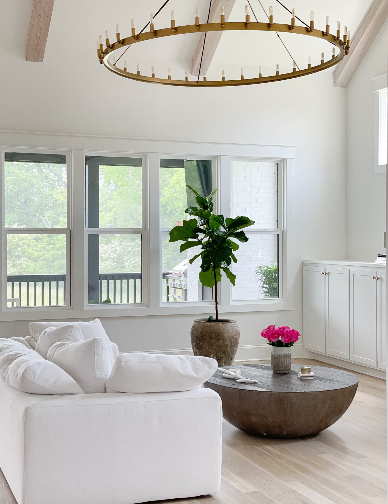
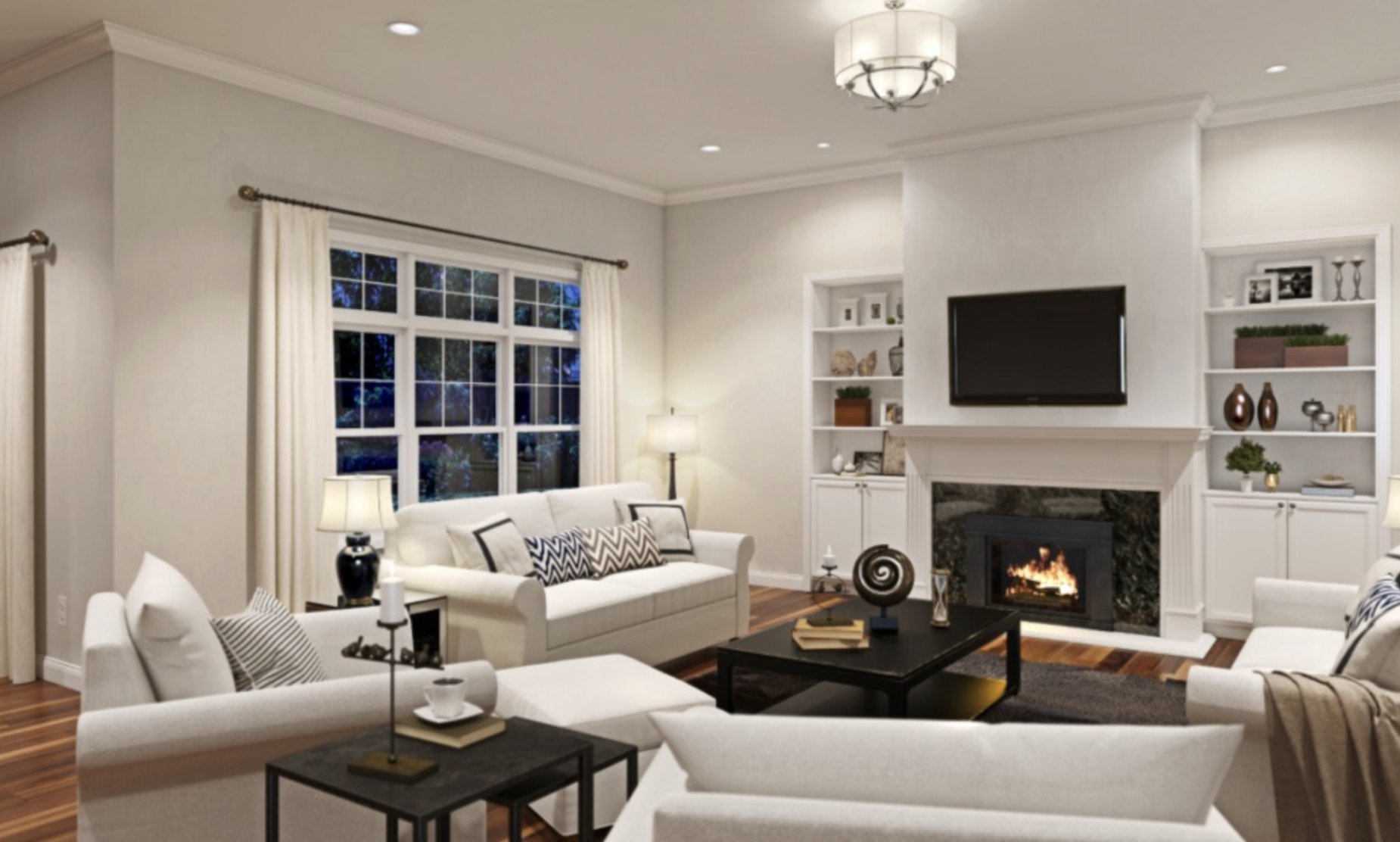
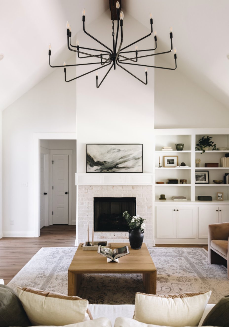
Living Rooms
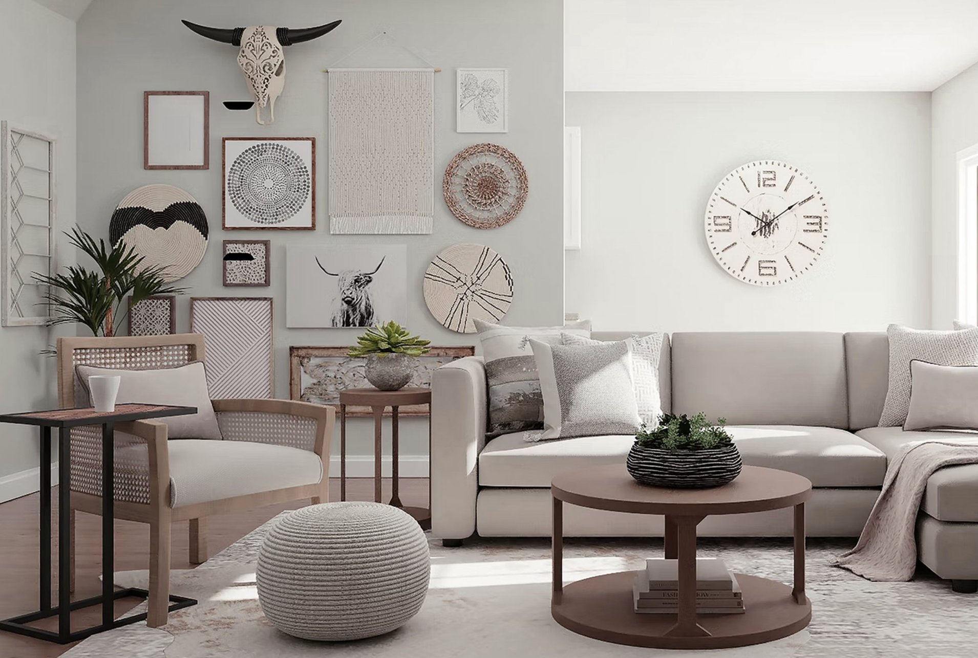
source
source
Snowbound brings the cozy factor to living rooms – that creamy-gray undertone doing its thing. Put it in a west-facing room and watch it shine – it gets all warm and soft as evening rolls in, and it’s perfect for hanging out. I’m a big fan of pairing it with darker furniture.
source
source
Pure White gives living rooms a fresher, more contemporary feel than Snowbound. Since it barely yellows, it’s perfect for showing off artwork and bold decor pieces.
Don’t worry about it feeling sterile though – it stays soft and welcoming even in bright sunlight.
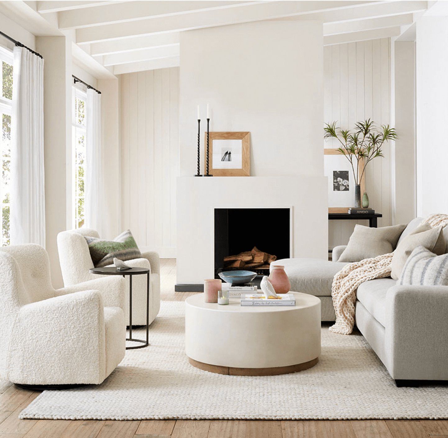
Kitchens
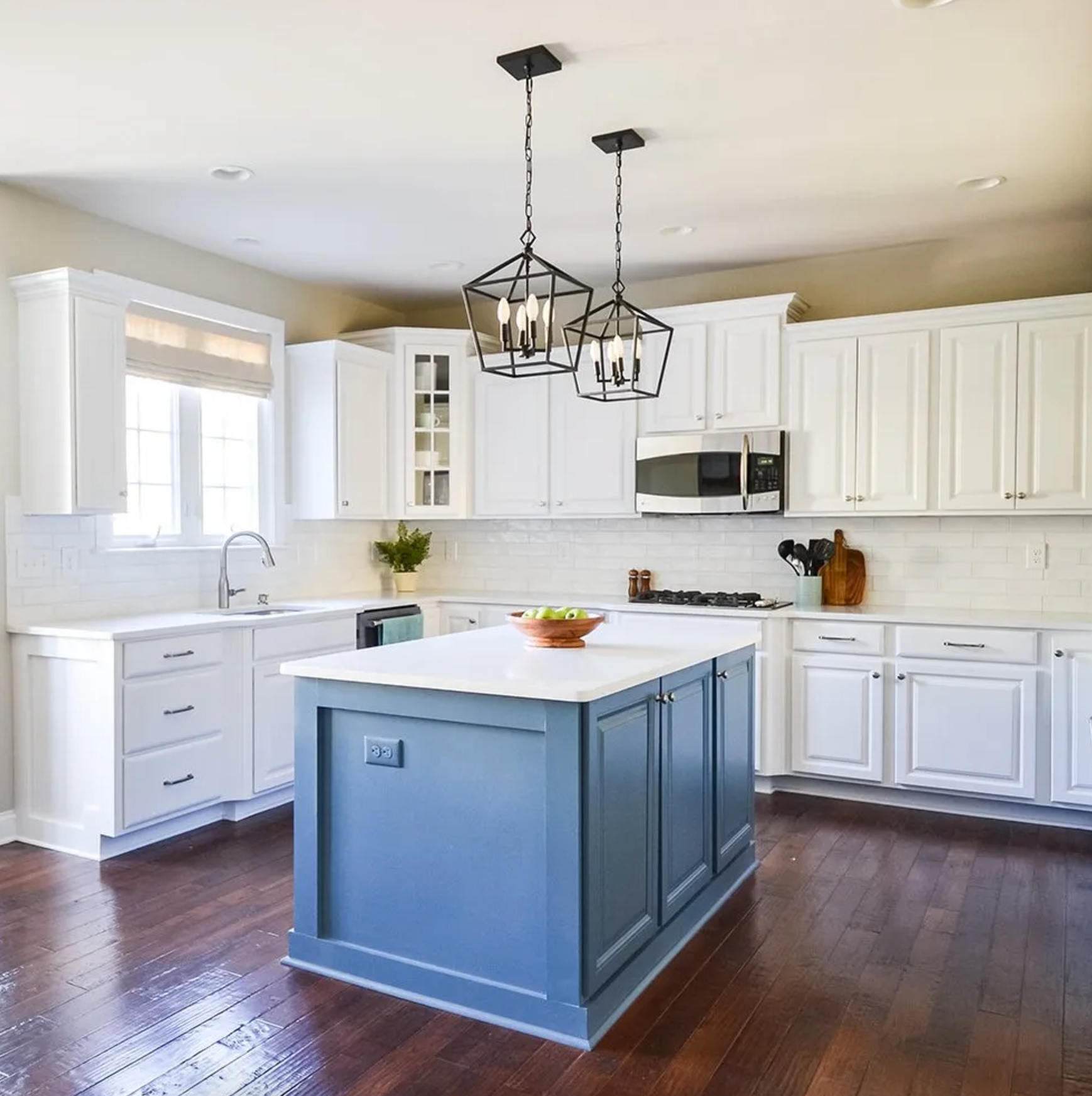
source
source
Snowbound’s a popular pick for kitchen cabinets and walls – that slight gray tint helps hide the occasional smudge. Under fluorescent lights, it takes on a cooler, cleaner look.
Just one thing – it can look a bit flat if you’re short on natural light.
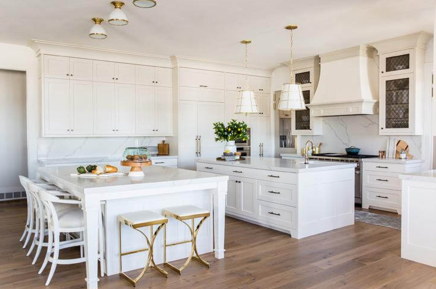
source
source
Pure White gives kitchens an extra dose of freshness compared to Snowbound. It’s great at bouncing light around and making spaces feel bigger. Looks fantastic with marble countertops, but fair warning – those cabinet fronts might need more frequent wipe-downs.
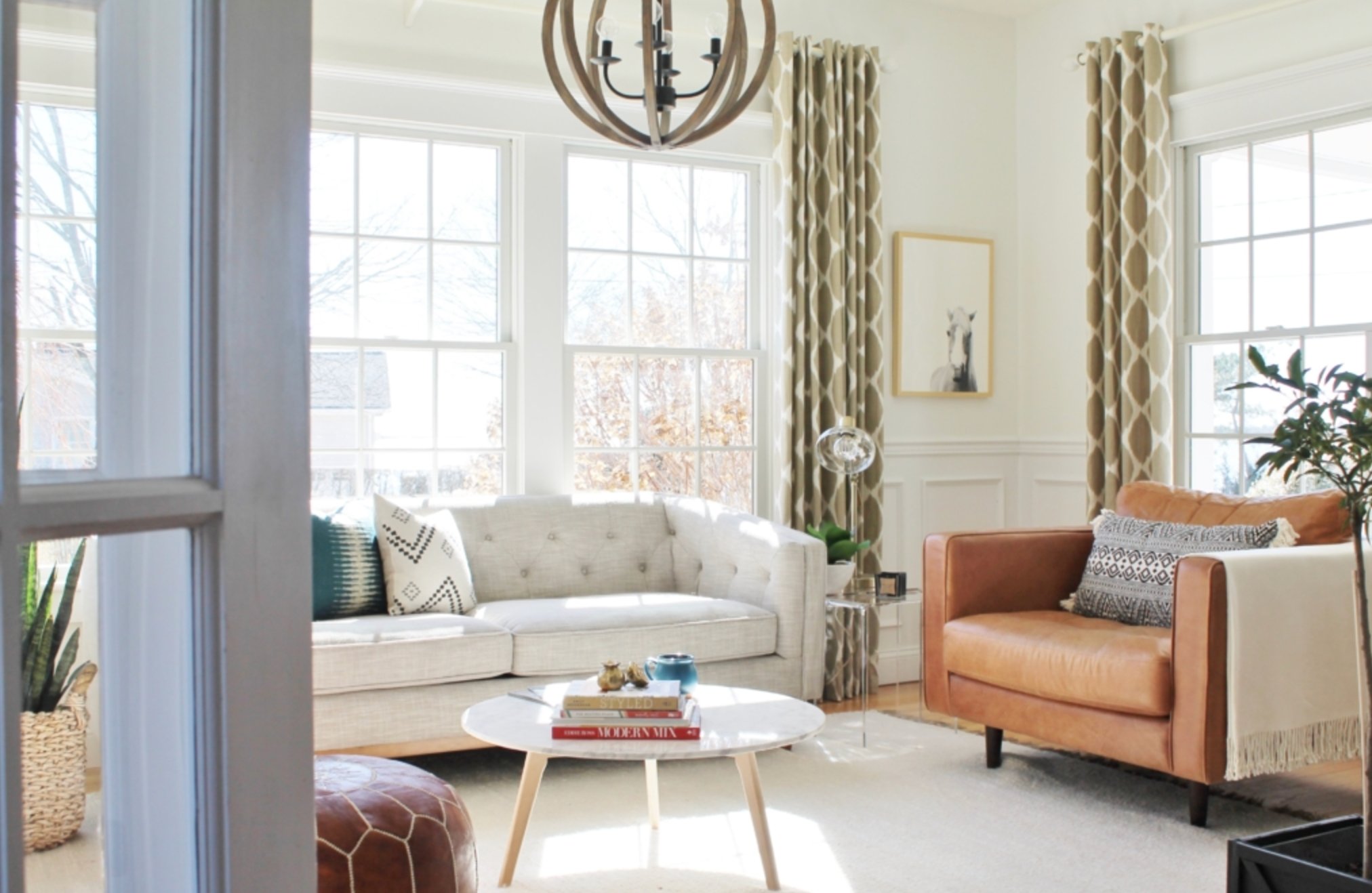
Bedrooms
source
source
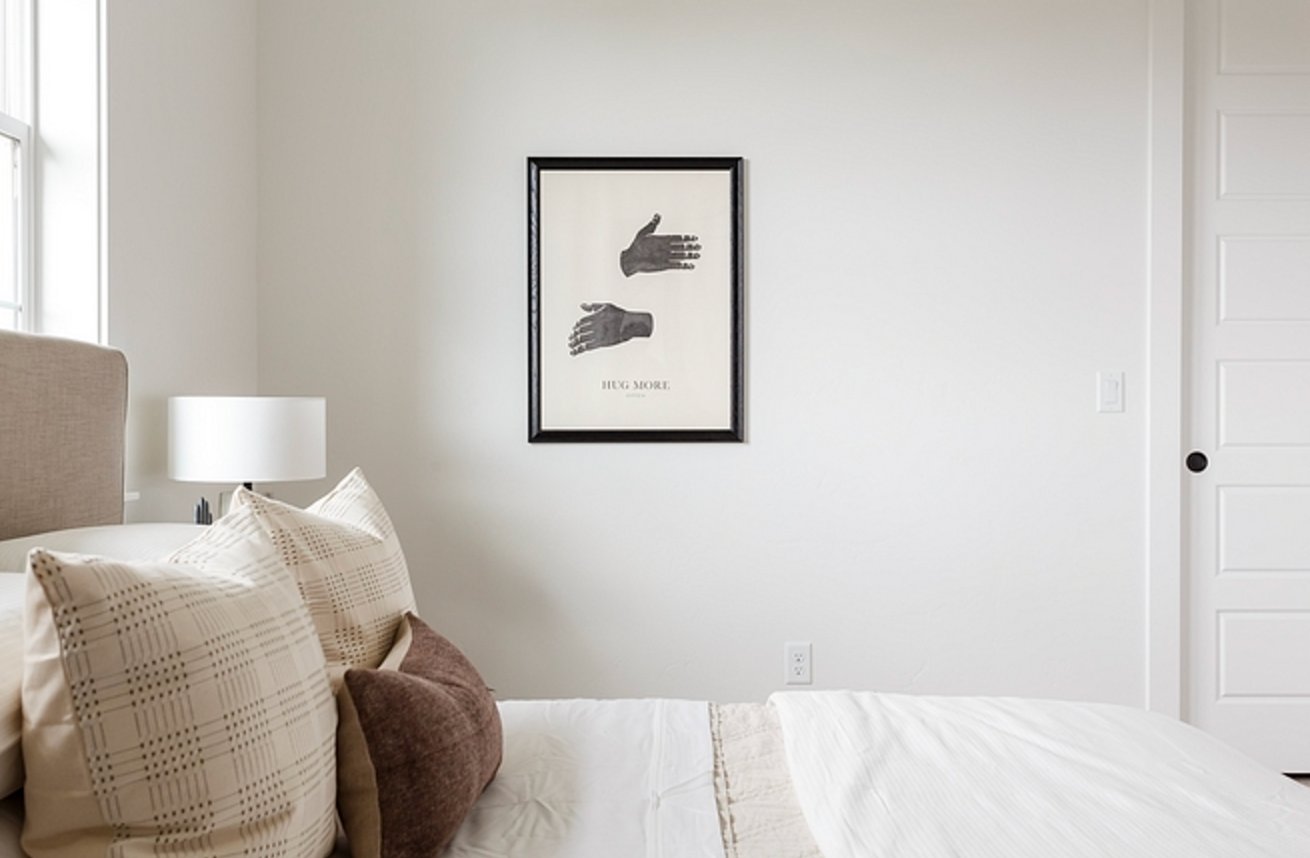
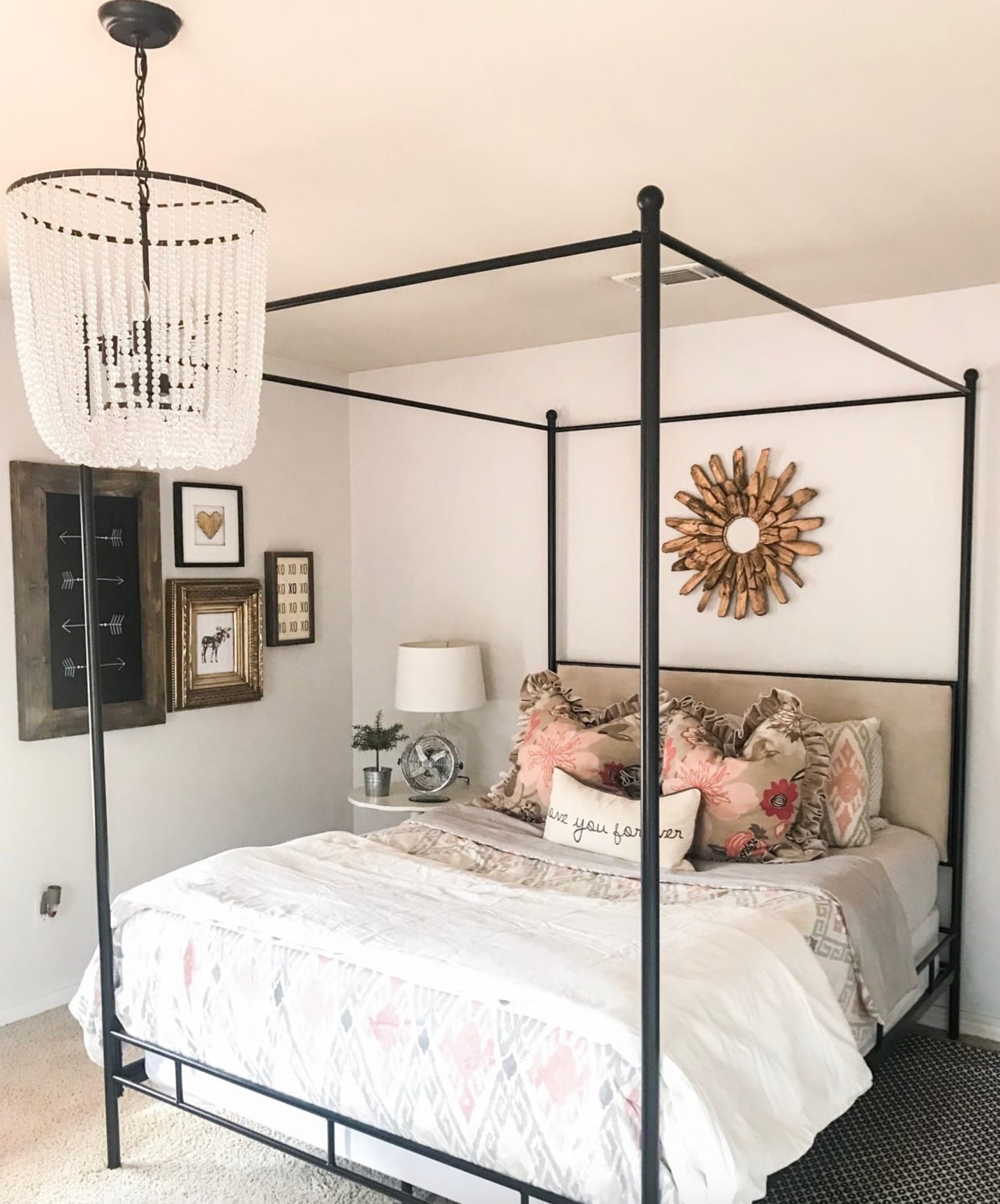
Snowbound is my go-to for bedrooms. That creamy-gray undertone just helps you unwind. Easy on the eyes in the morning, and when you add textured fabrics and wood elements, it creates an amazing cozy vibe.
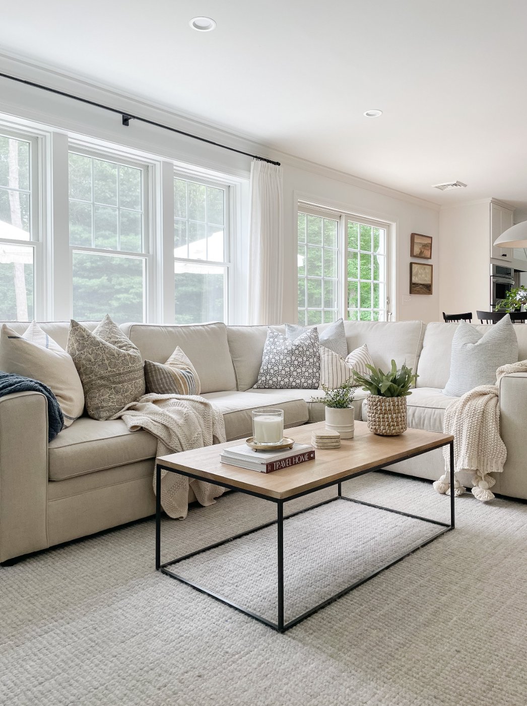
source
source
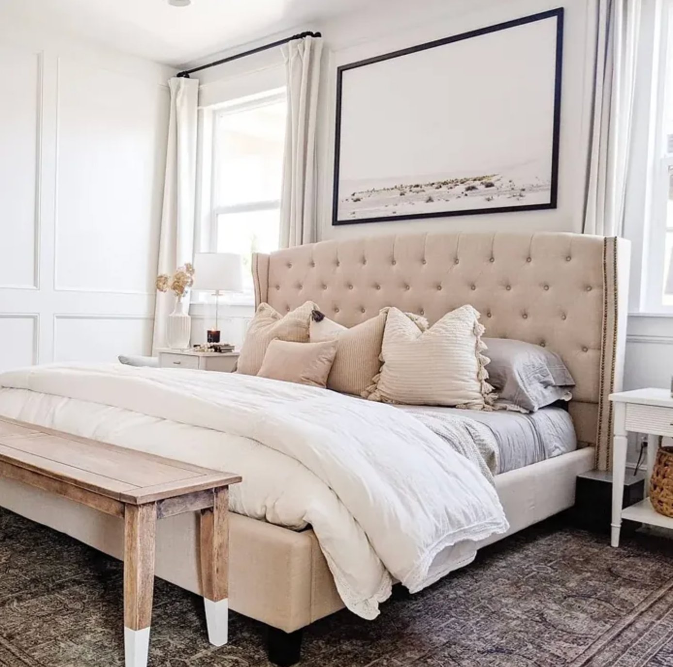
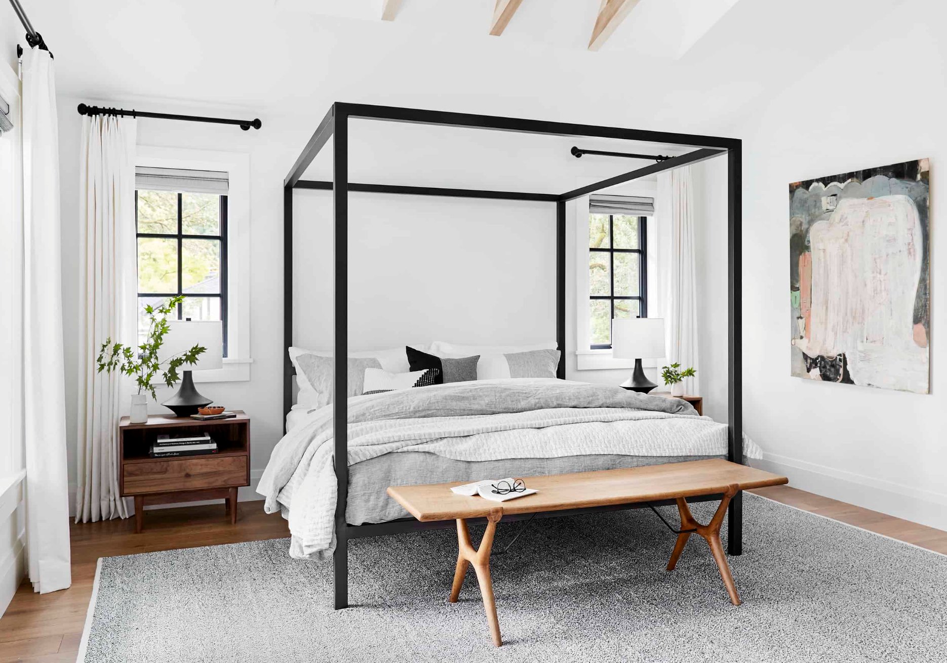
Pure White brings a lighter, breezier feel to bedrooms. While Snowbound is all about coziness, Pure White feels more refreshing and energizing. But even in north-facing rooms, it stays warm enough – thanks to that tiny hint of warmth in its undertone.
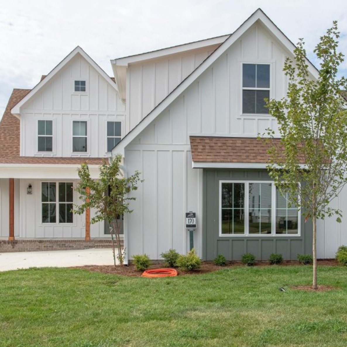
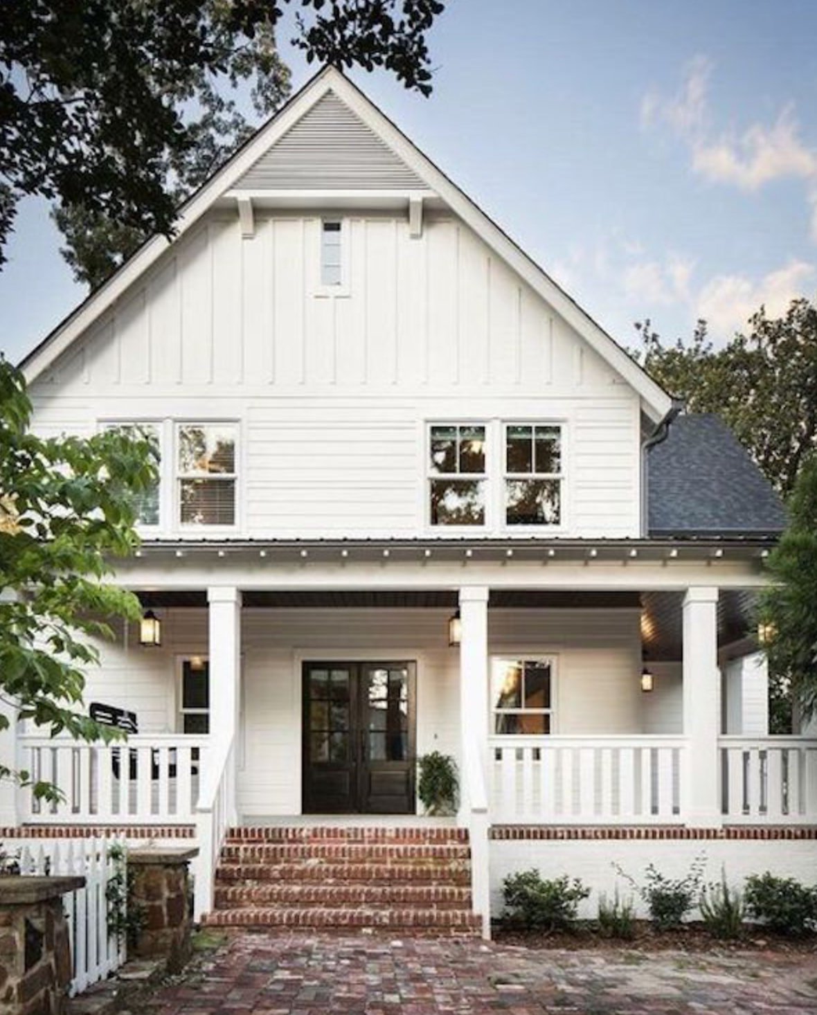
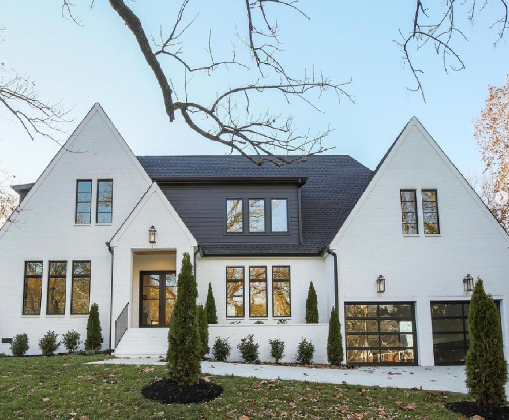
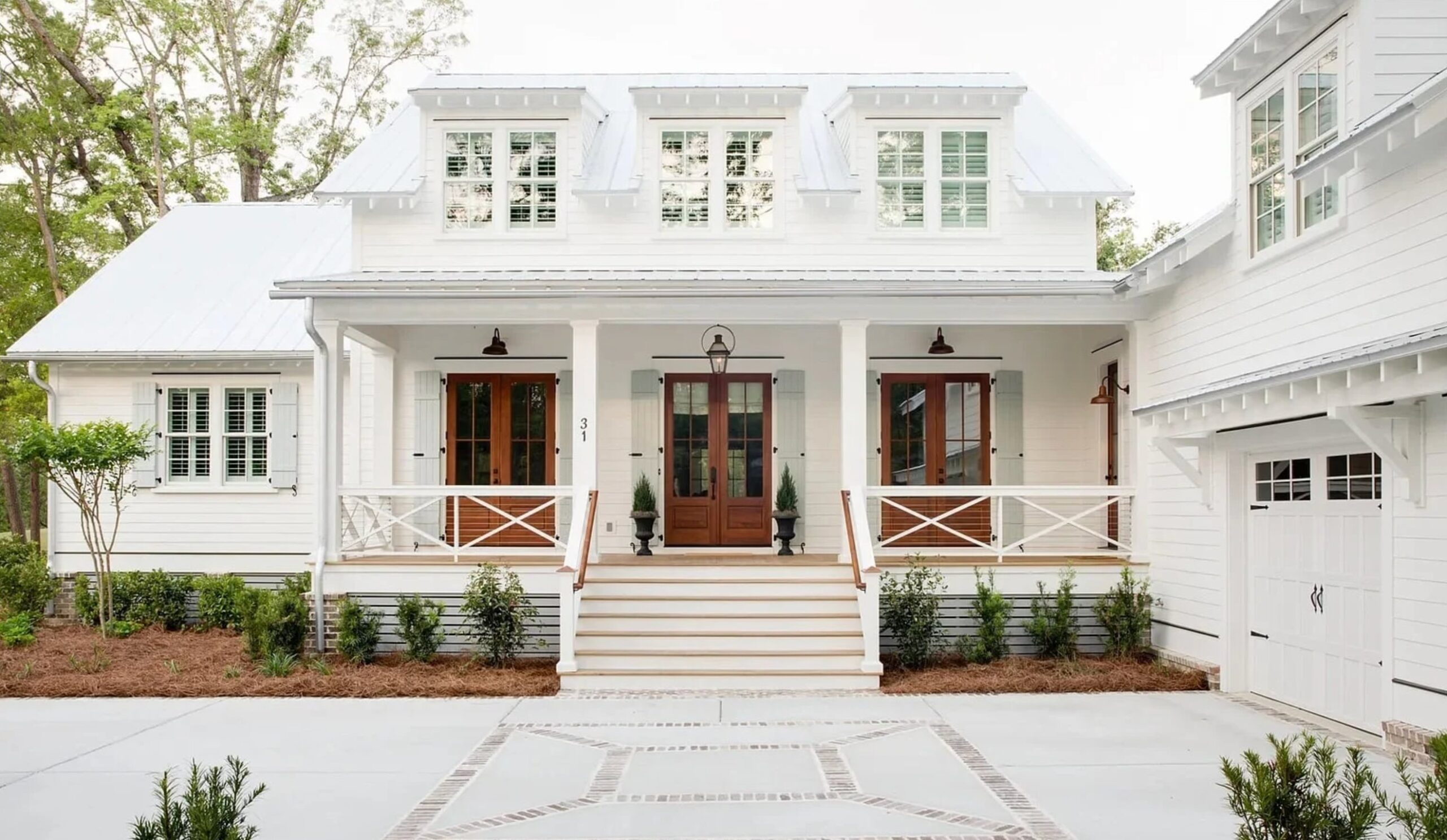
Exteriors
source
source
On exteriors, Snowbound has a softer look than other whites and doesn’t create harsh glare in the sun. It can lean slightly gray during overcast days, giving homes a more understated appearance. It’s a perfect match for dark roofs and stone accents.
source
source
Pure White by Sherwin Williams is quintessential American architecture, especially when compared to Snowbound. It reads cleaner and brighter in sunlight without looking artificial. Pair it with black accents, and you’ll have that classic colonial look nailed down.
Lighting Impact
source
source
Snowbound is quite the shape-shifter! It feels warm and inviting in sun-filled rooms – like wrapping yourself in a cozy cashmere sweater. But watch out on gloomy days – that gray undertone can sneak in, making spaces feel a bit flat.
source
source
Pure White takes a different approach. It’s a touch lighter (LRV 84) and way more consistent. I repainted a kitchen with it once, and the transformation was amazing – gone was that muddy look on cloudy days, replaced with a clean, crisp white.
Unlike its fussy cousin Snowbound, Pure White’s warmth is more subtle – it holds steady even during sunset, which you’ll especially notice in west-facing rooms. Still, it’s got enough warmth to avoid that sterile hospital feel.
Coordinating Colors
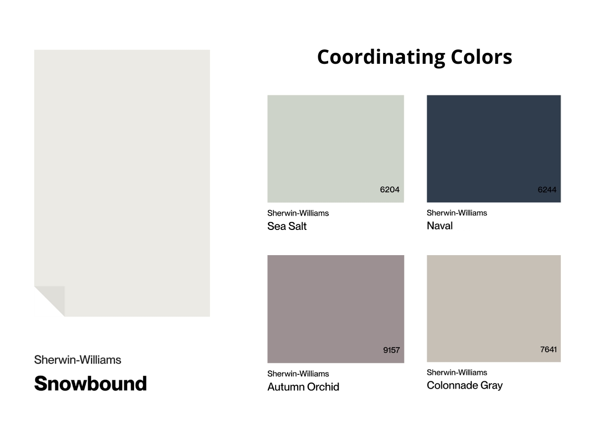
Snowbound shines next to natural materials – it loves warm woods and natural stone. My go-to combination includes gray fabrics and matte nickel finishes.
Deep blues and greens make great accent colors – they add richness without overwhelming the space. Just keep in mind that Snowbound’s creamy undertone might clash with stark white decor.
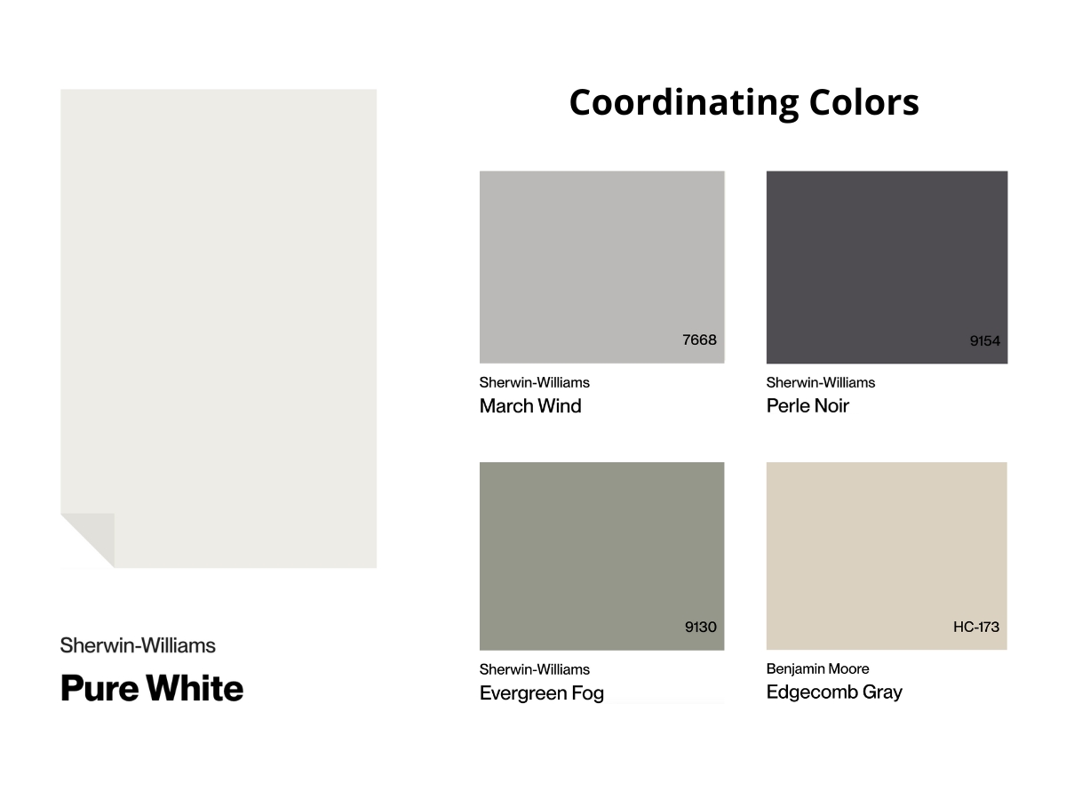
Pure White is more of a team player – that’s what I love most about it. Unlike Snowbound, it plays nice with bright white elements and cool metals.
It’s the perfect backdrop for any bold color you throw at it – from warm terracotta to rich emerald. Pure White looks equally good with both warm wood grains and cool marble surfaces.
Thanks to its subtle yellow undertone, it works beautifully with modern chrome and stainless steel elements.
Making Your Decision
Time to make the call!
After this deep dive, here’s the deal – go with Snowbound if you’re after that soft, cozy vibe without obvious yellowing.
Choose Pure White when you need a flexible white with just a hint of warmth that stays true in any light.
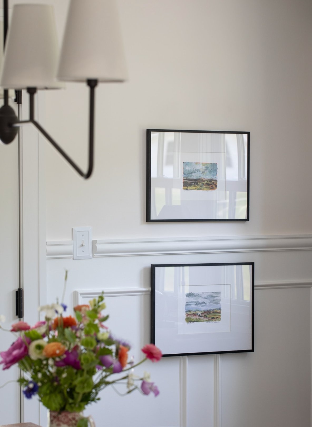
Always test both colors on your walls throughout the day before making your final decision!