What started as a simple search for the perfect black exterior paint turned into quite a research adventure! Two Sherwin-Williams shades – Tricorn Black and Iron Ore – frequently appear as the top contenders in this tricky quest for the perfect black.
Though both colors fall into the black family, there’s a subtle yet significant distinction between them. In this comparison, I’ll walk you through the basic characteristics and undertones of each shade, demonstrate how they behave in different rooms and lighting conditions, and share which color combinations work best with each.
To make this guide super practical, I’ve collected MANY real-life photos of homes – both exteriors and interiors – showcasing these shades in action.
Undertones & Character
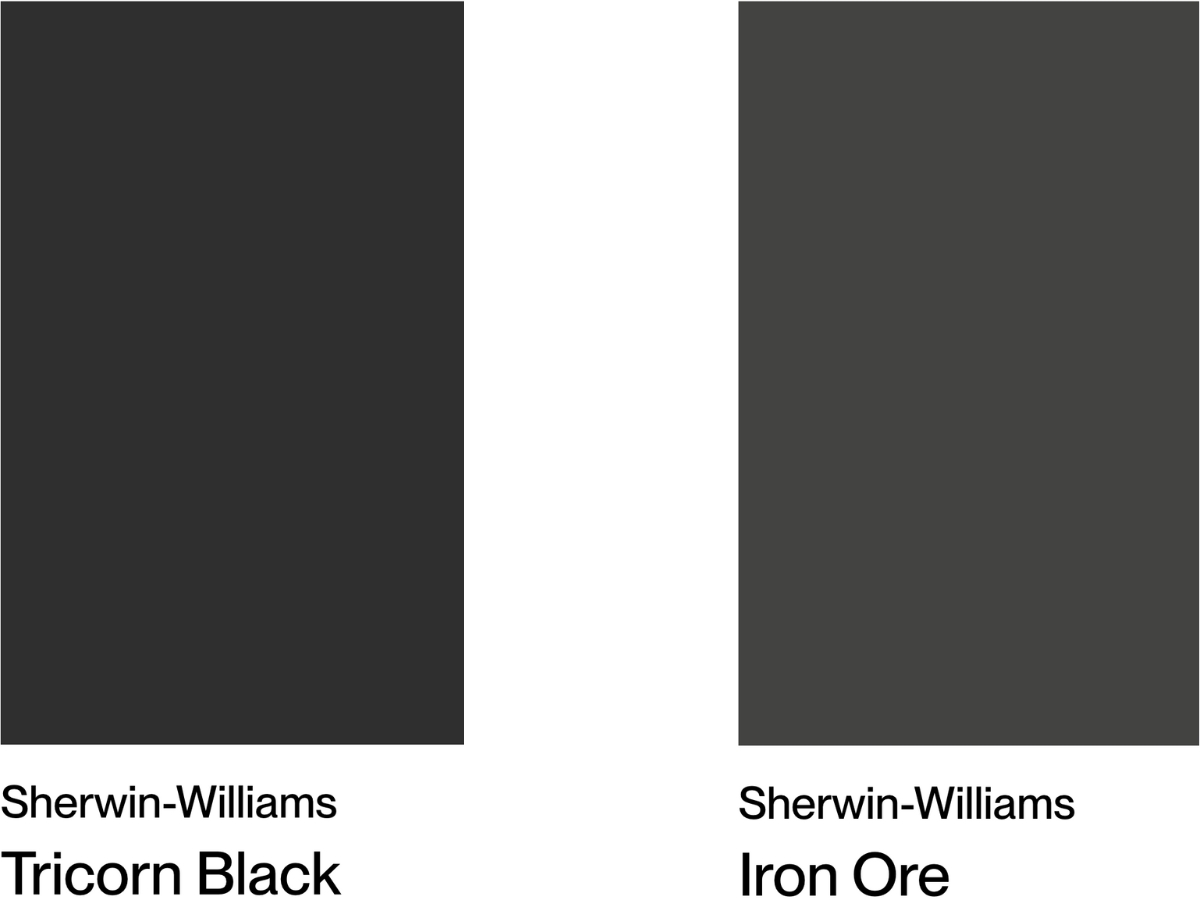
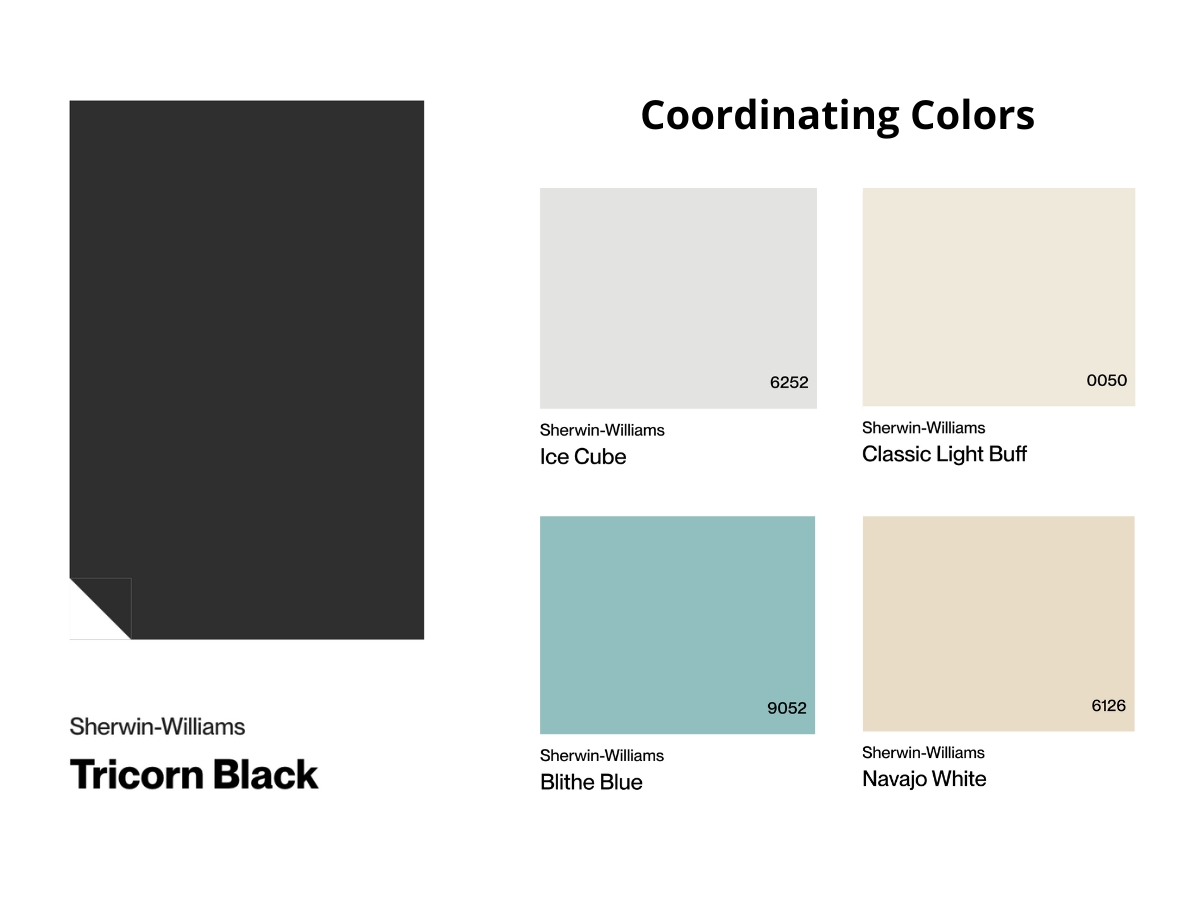
Tricorn Black has an LRV of 3, making it one of the darkest shades in Sherwin-Williams’ lineup.
The first time I saw it in person at the showroom, I was blown away by its depth – it really does look like pure black without any visible undertones. In bigger, bright spaces, it adds incredible depth without feeling oppressive.
It’s exciting to watch how it plays with other colors – cooling down next to warm blacks and warming up a bit near cooler shades. From what I’ve seen, Tricorn Black is a fantastic choice for both indoor and outdoor use, particularly in contemporary designs.
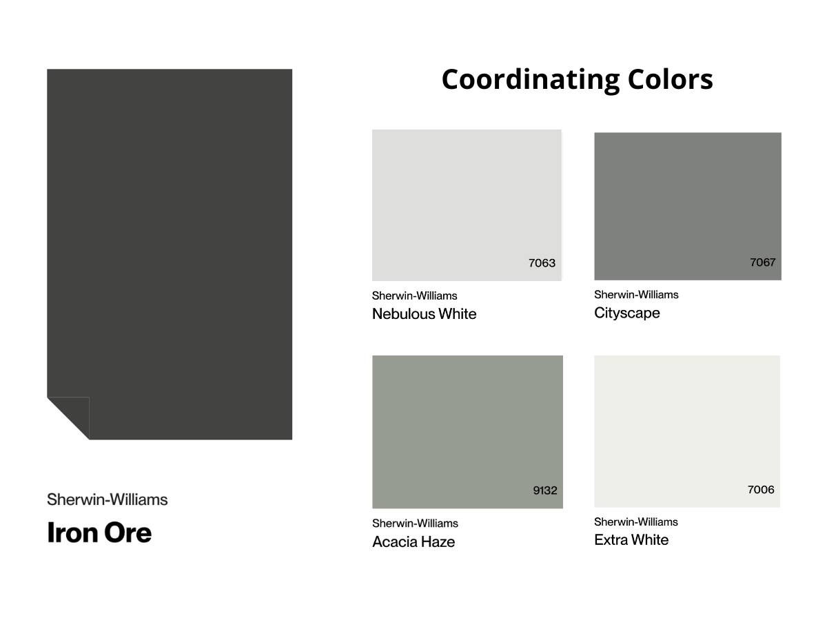
Now, Iron Ore – that’s a whole different animal. It’s a deep charcoal shade with an LRV of 6 that never quite goes full black.
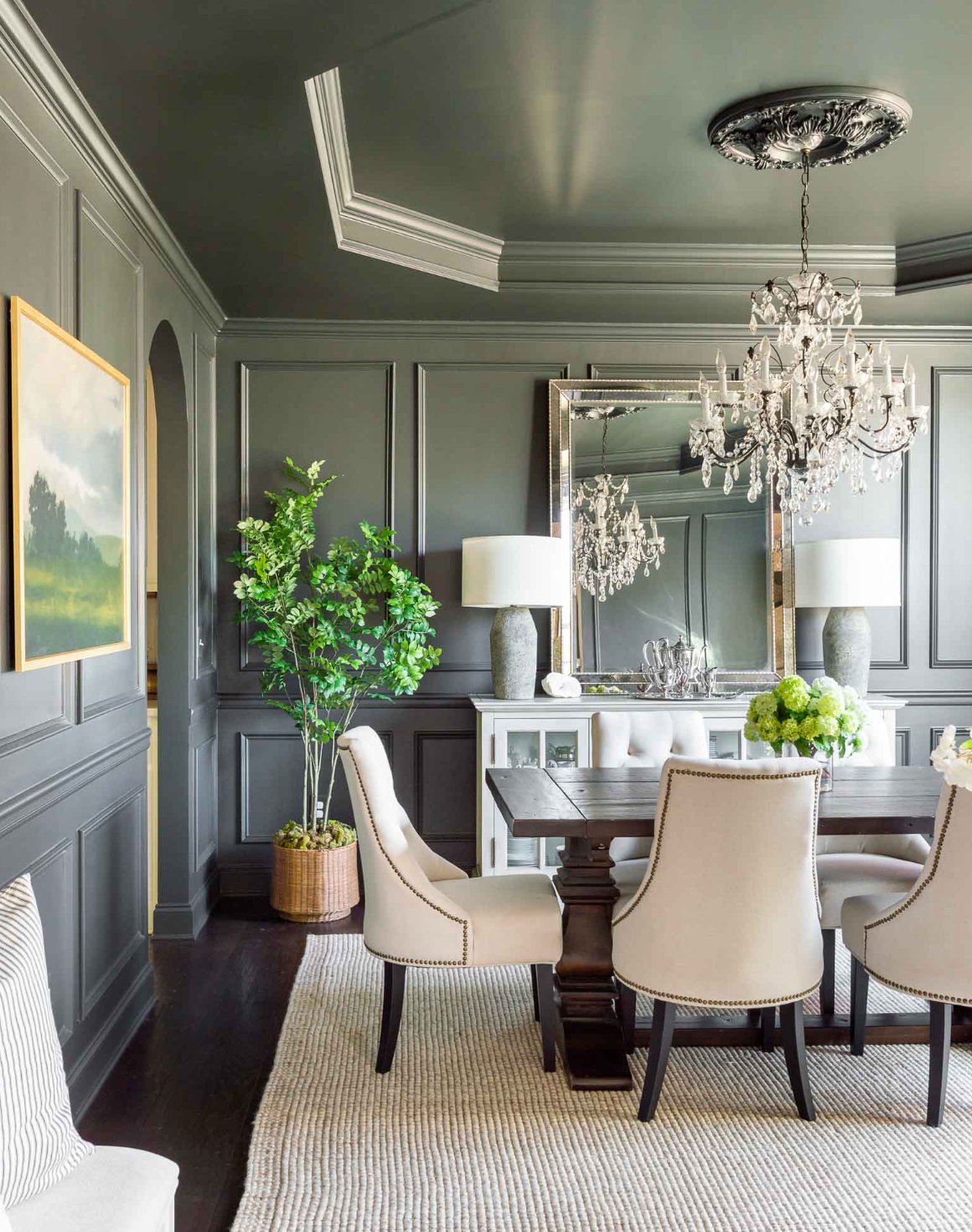
There’s always that gray undertone in there, and when the light hits it just right, you can catch some subtle green notes. I love using it in bedrooms and home offices – it creates this wonderfully cozy vibe, especially when you pair it with light wood and white accents.
In spaces with plenty of natural light, Iron Ore really comes alive, showing off all its depth and warmth.
The biggest difference between these two? It’s all about how they behave in a space. Tricorn Black is your true black – super dark and rich, without obvious undertones. It’s noticeably darker than Iron Ore. Meanwhile, Iron Ore always keeps its gray character and warmth – even in the dimmest light, it never goes completely black.
If you’re after that pure, dramatic black look – Tricorn’s your pick. But if you want something a bit softer and more complex with some warmth to it – go for Iron Ore.
| SW Tricorn Black | SW Iron Ore | |
| Color Code | SW 6258 | SW 7069 |
| Light Reflectance Value (LRV) | 3 | 6 |
| Color Family | Neutral | Neutral |
| Undertones | Cool undertones, can appear warmer next to cool colors | Greenish undertones in bright light, can show bluish tints, warm charcoal character |
Room-by-Room Comparison
Let’s look at how these two popular dark shades create completely different moods in real homes.
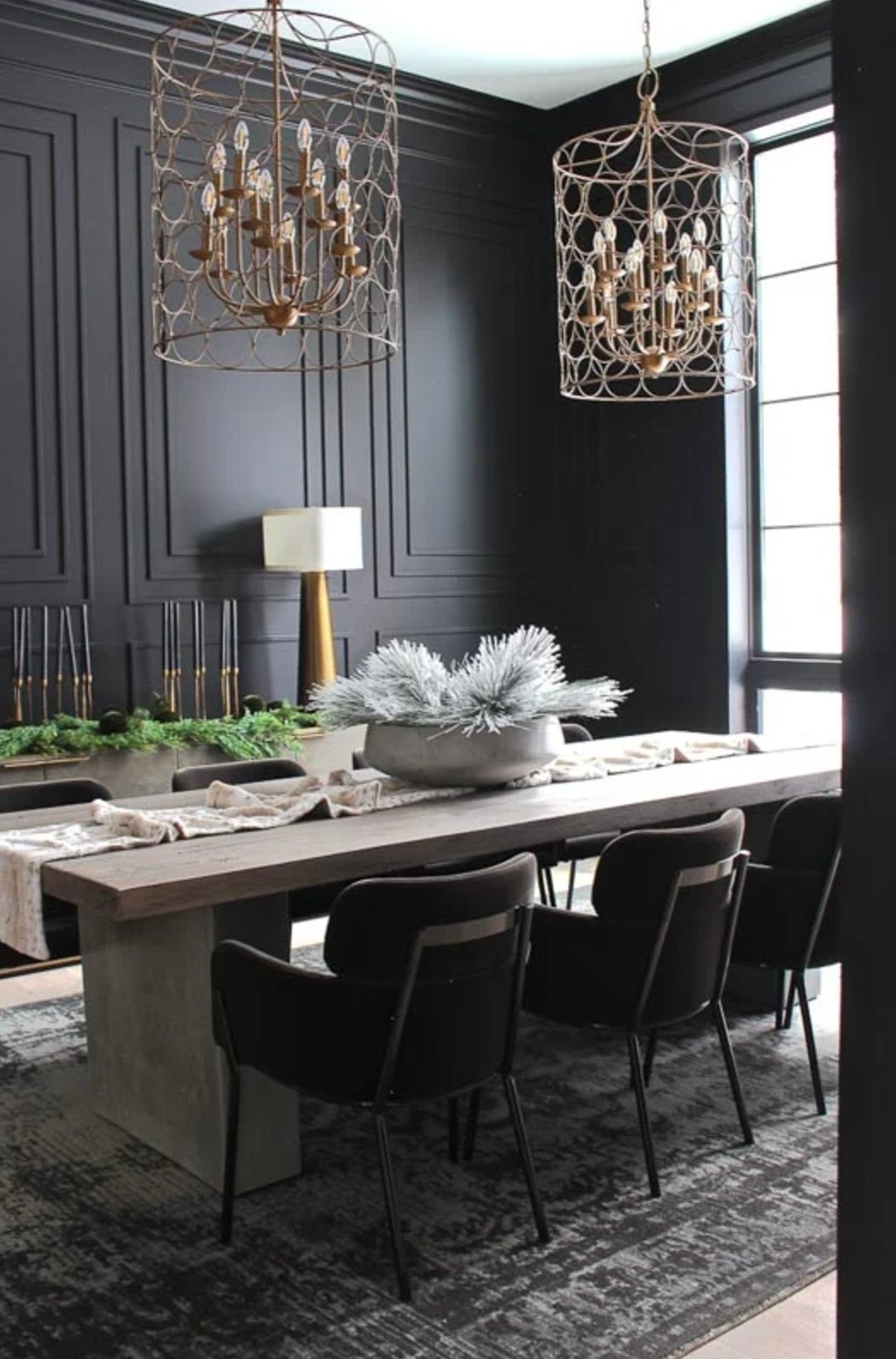
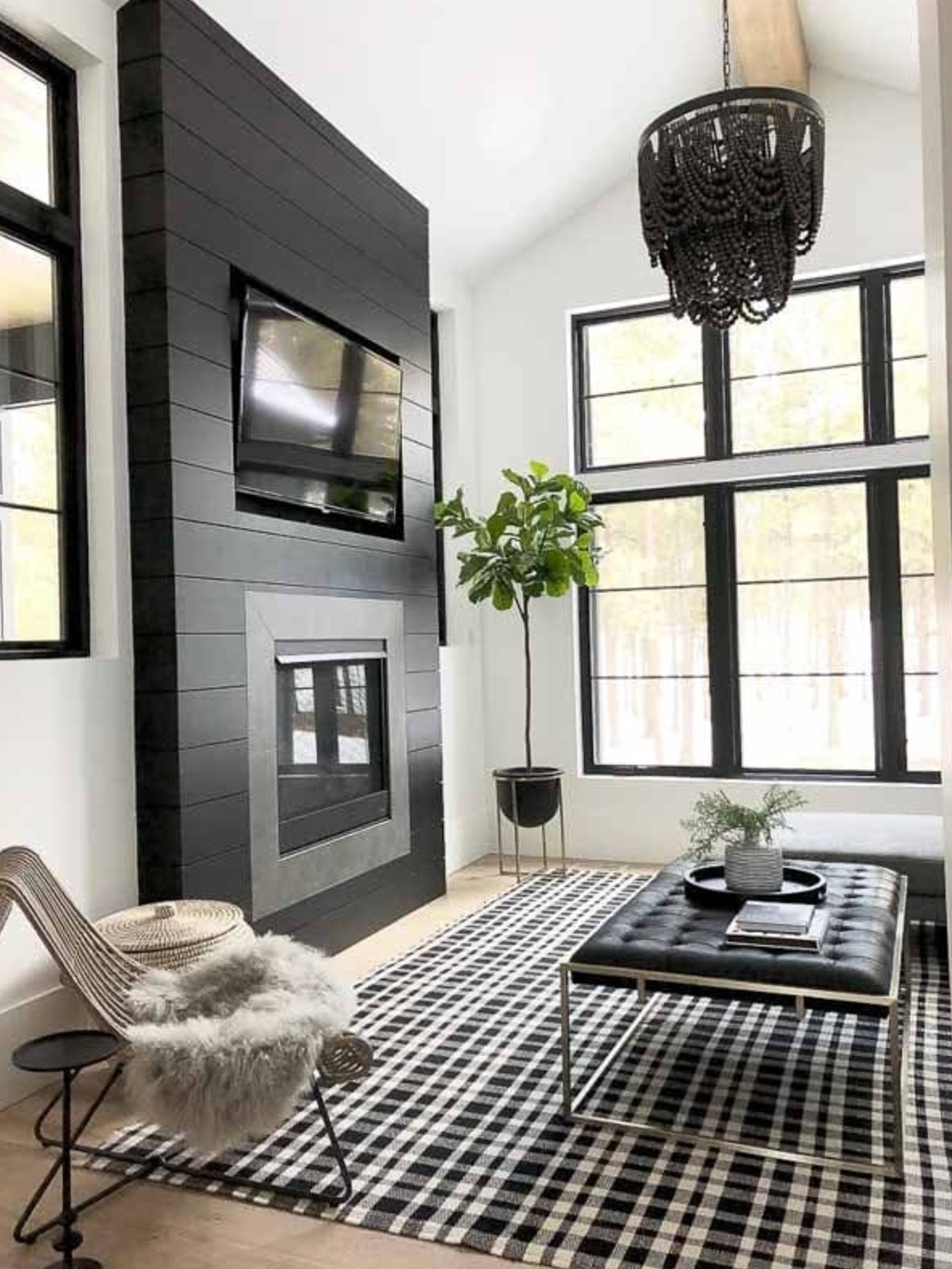
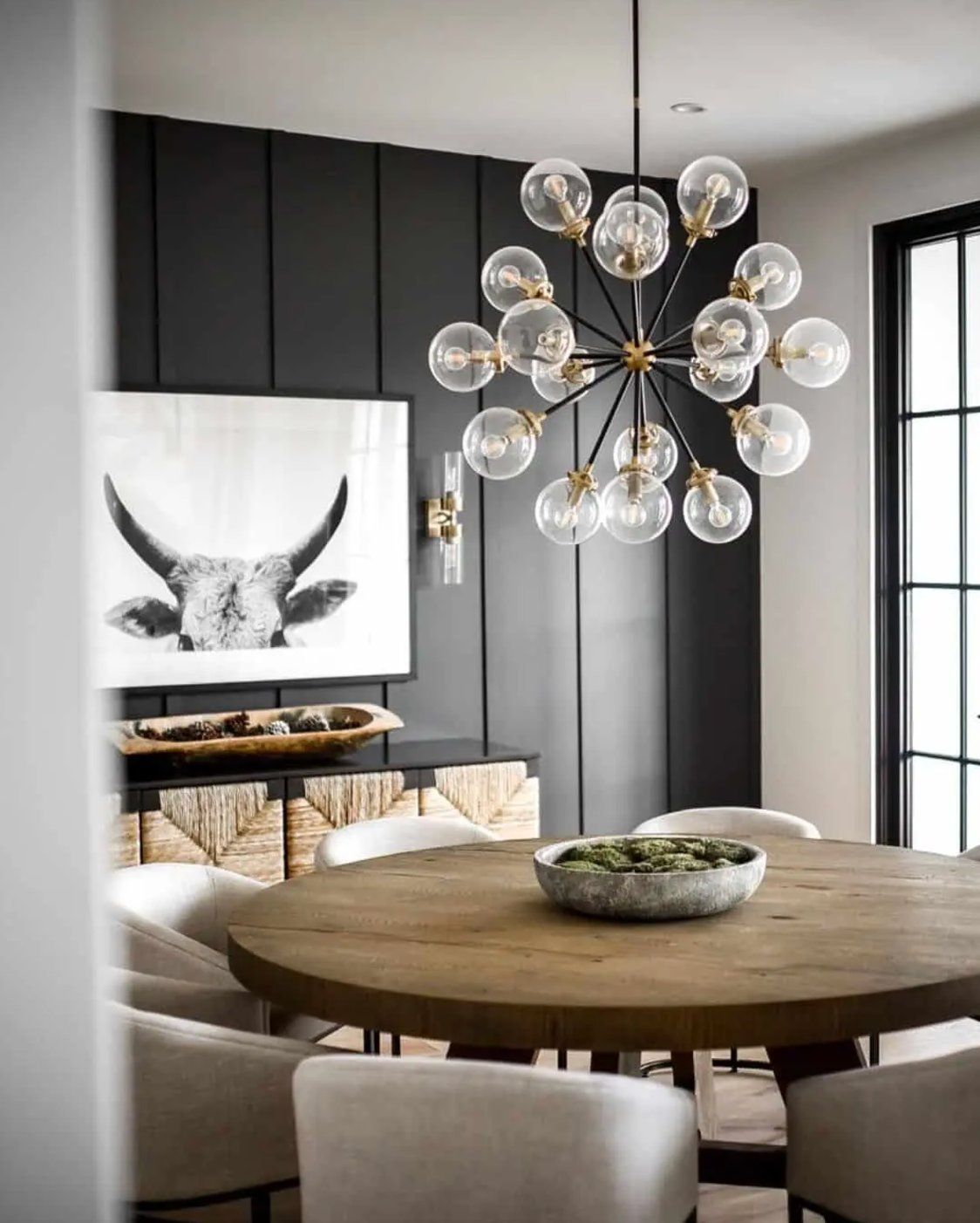
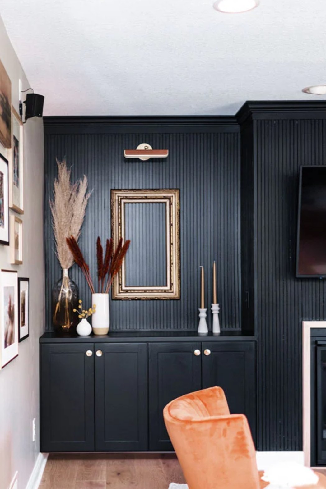
Living Rooms
source
source
Tricorn Black creates quite a statement in living rooms, especially on big walls with windows. If you’ve got a spacious room with good natural light, it won’t feel overwhelming – instead, it adds this amazing sense of depth.
I often find myself using it for accents – think picture frames or door frames.
source
source
Iron Ore feels more approachable in living spaces than its bolder cousin. Unlike the more dramatic Tricorn Black, it has lovely, warm undertones that really shine next to wooden furniture. When used on an accent wall or fireplace, it creates a softer contrast and feels more inviting.
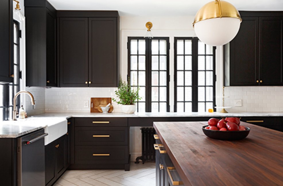
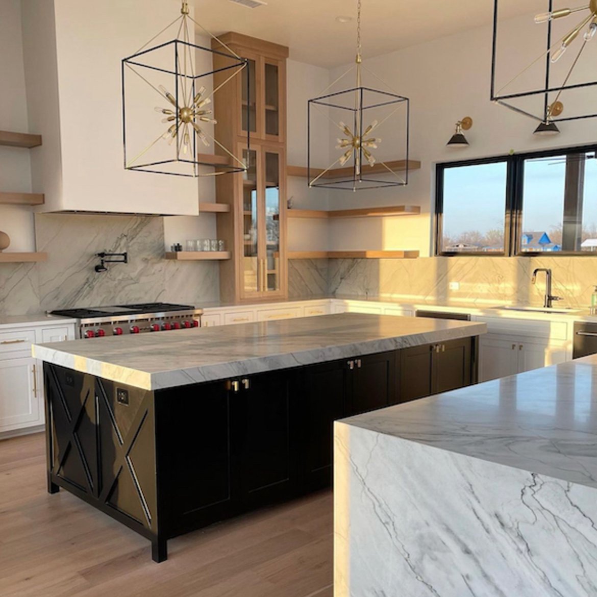
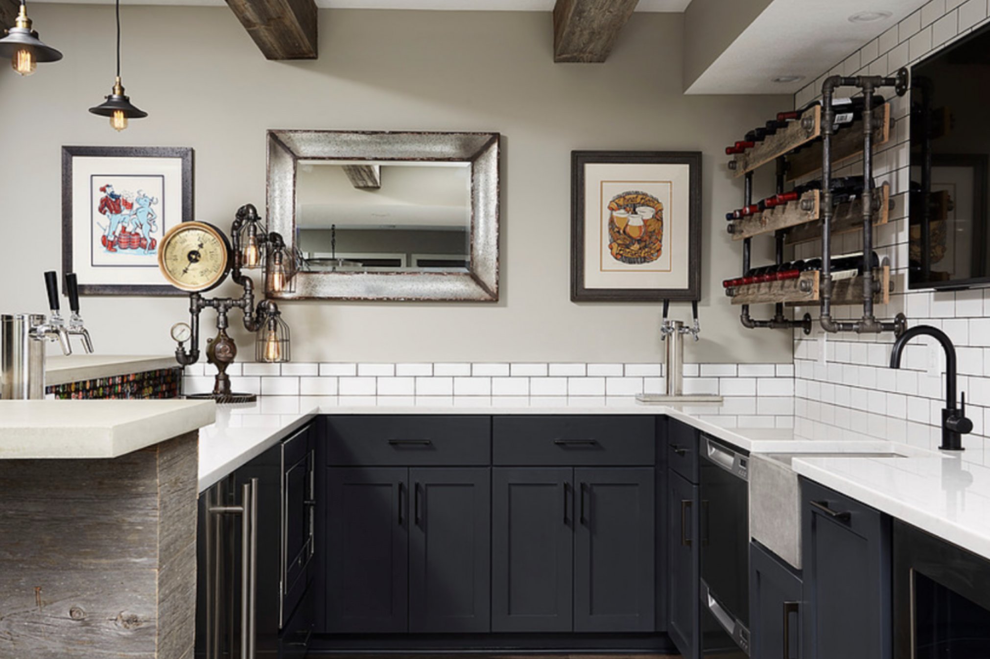
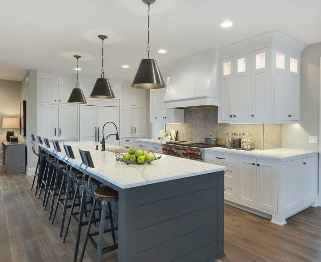
Kitchens
source
source
Tricorn Black is a knockout on kitchen cabinets and islands – it’s got that modern edge to it.
Just keep in mind you’ll need good lighting – with that low LRV of 3, it tends to soak up a lot of light.
source
source
Iron Ore is actually more forgiving in kitchens – that slightly higher LRV of 6 means it’s not quite as dark, and it shows off surface textures better.
Unlike Tricorn’s deep black, it picks up these beautiful gray tones in daylight, which really shows up on larger surfaces.
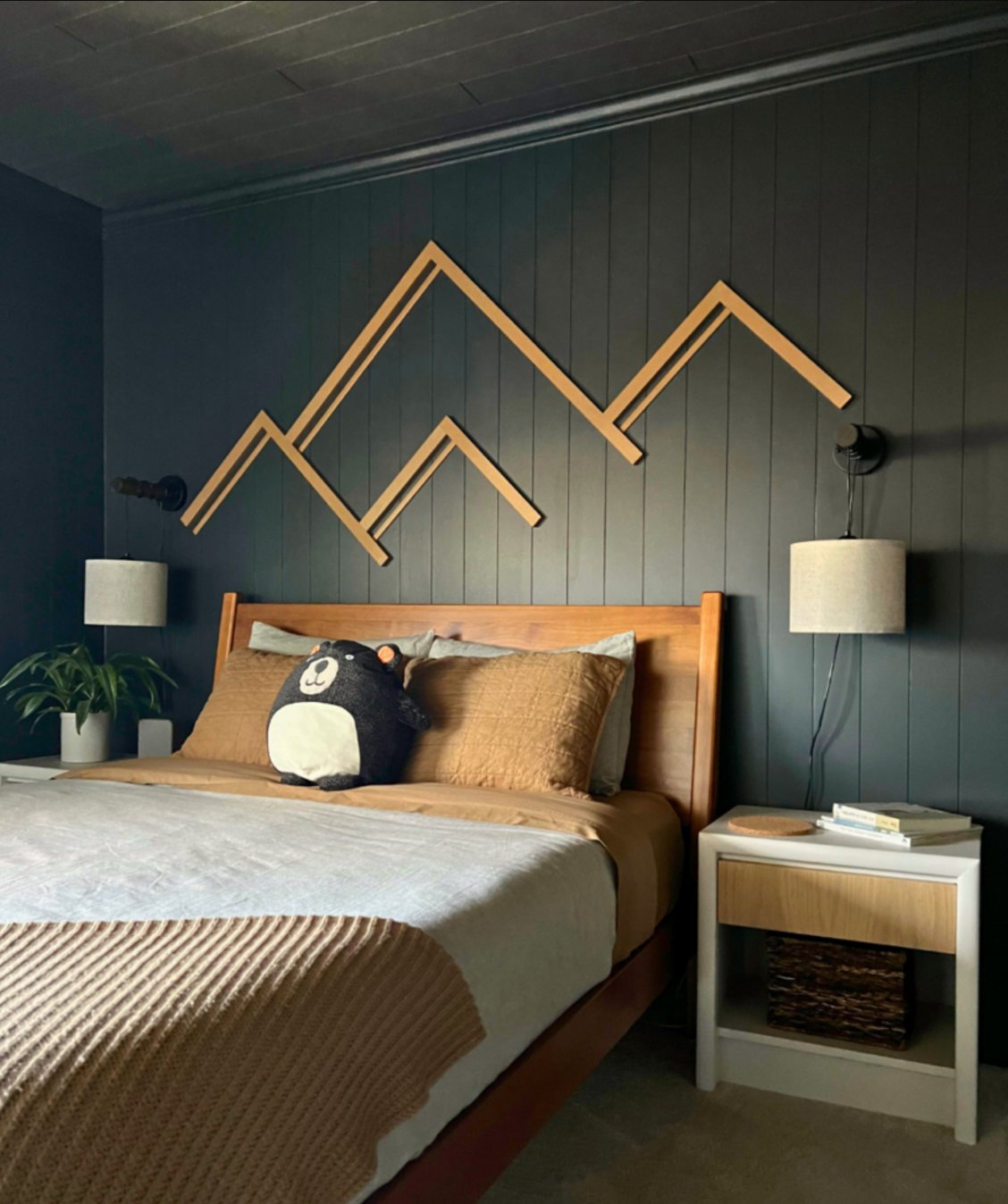
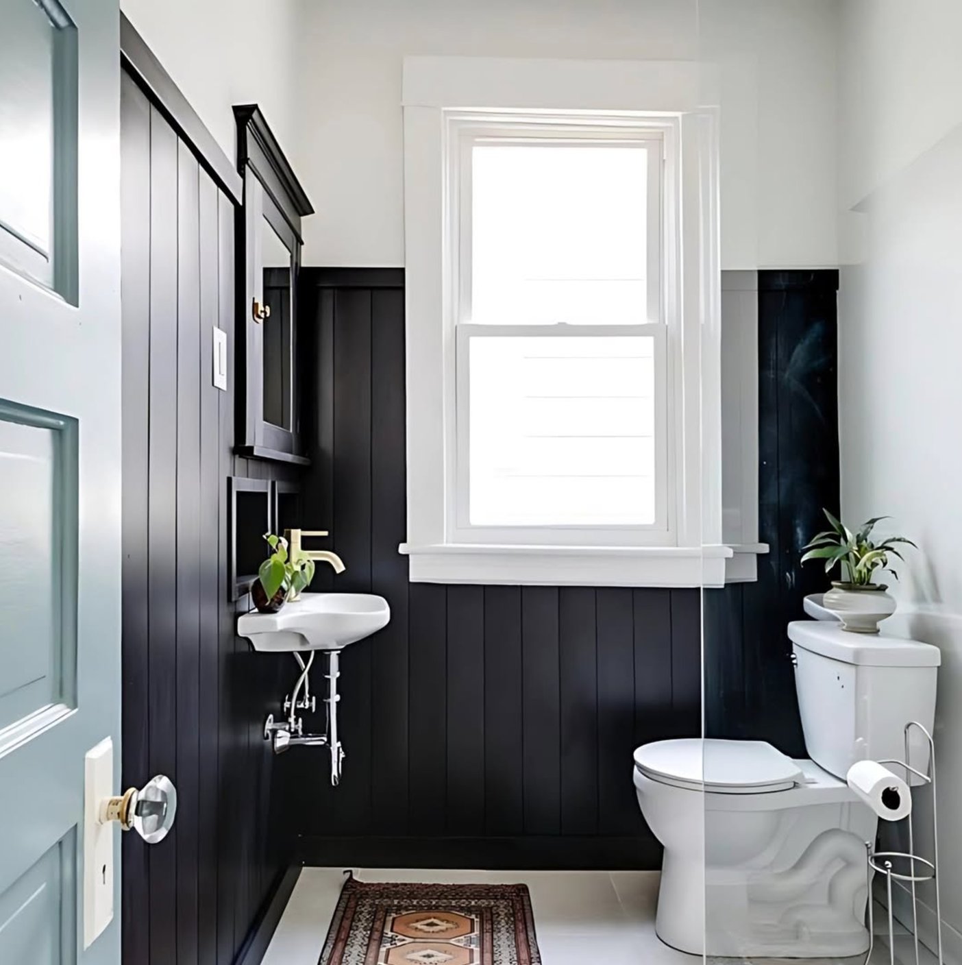
Bedrooms
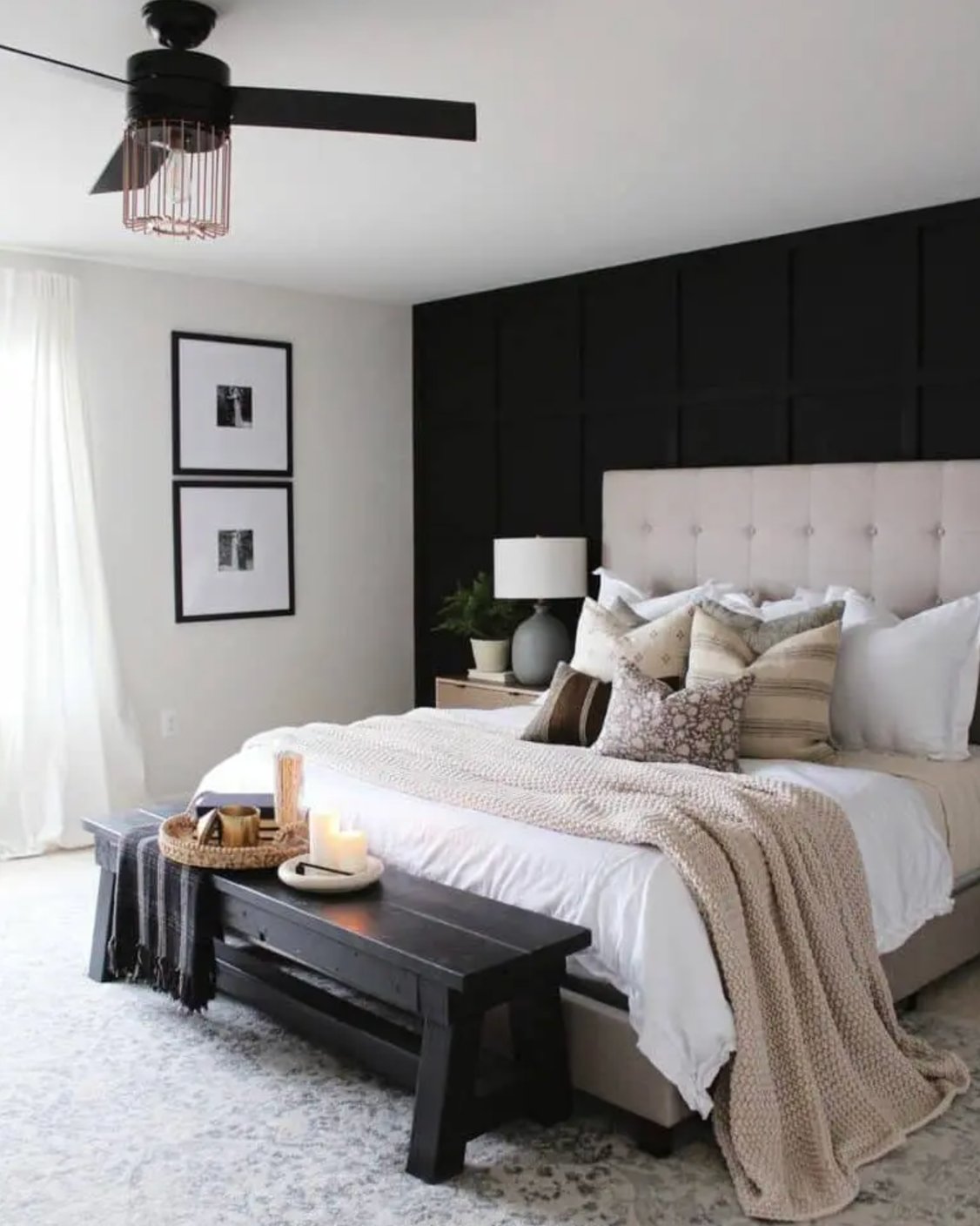
source
source
You’ll want to be careful with Tricorn Black in bedrooms – I’d only recommend it for larger rooms with plenty of windows or maybe as an accent wall.
It creates this incredibly deep, almost infinite effect that might be a bit too intense for a space meant for relaxation.
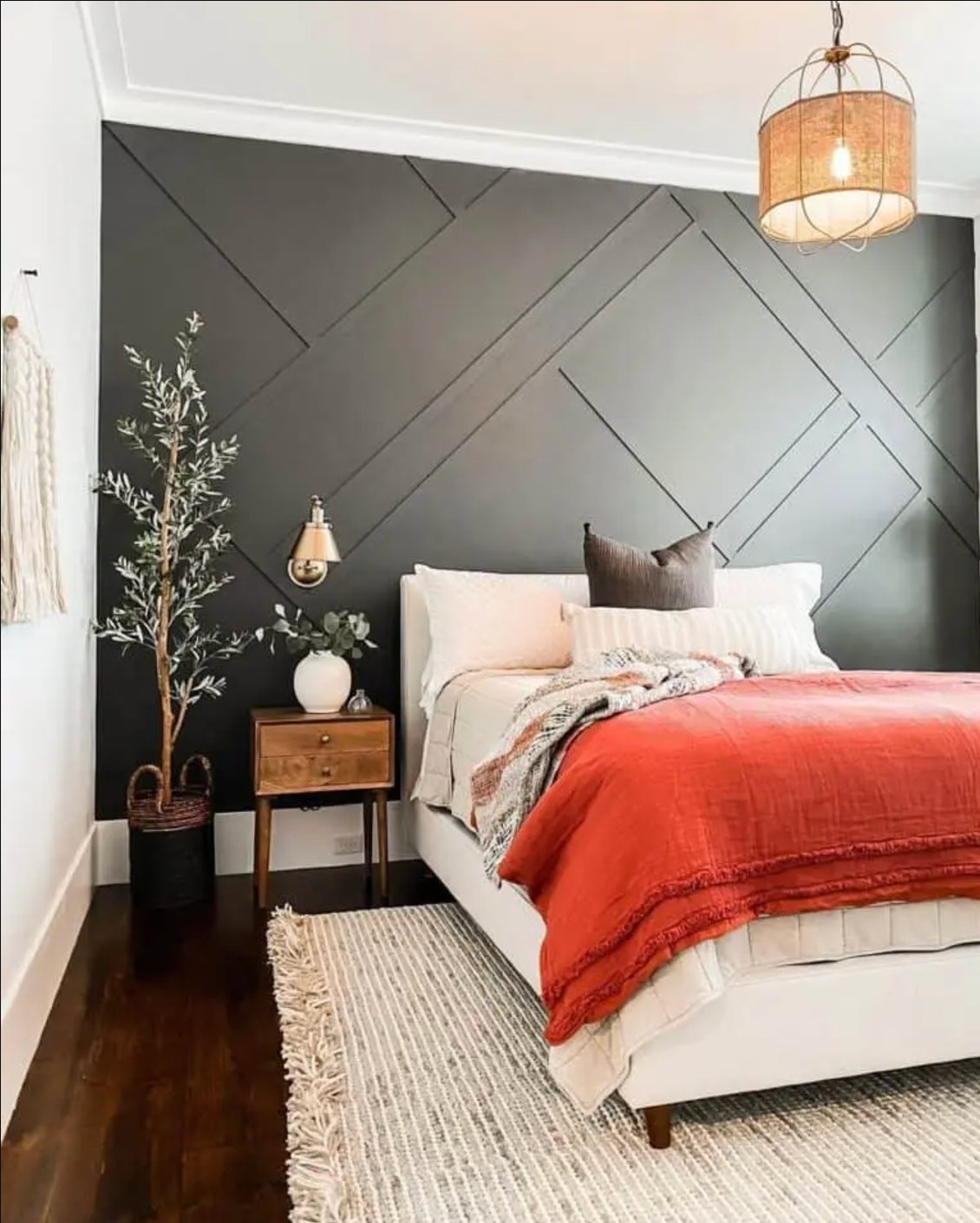
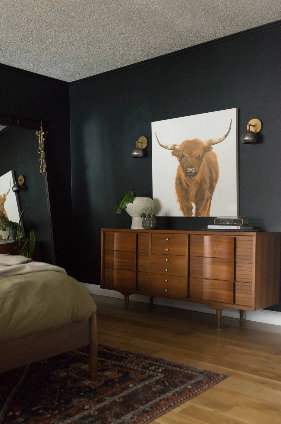
source
source
Iron Ore tends to be more versatile in bedrooms. Unlike the bold Tricorn, it creates a softer atmosphere thanks to its warm undertones. While it can look almost as dark as Tricorn in the evening, it transforms into this beautiful soft gray during the day.
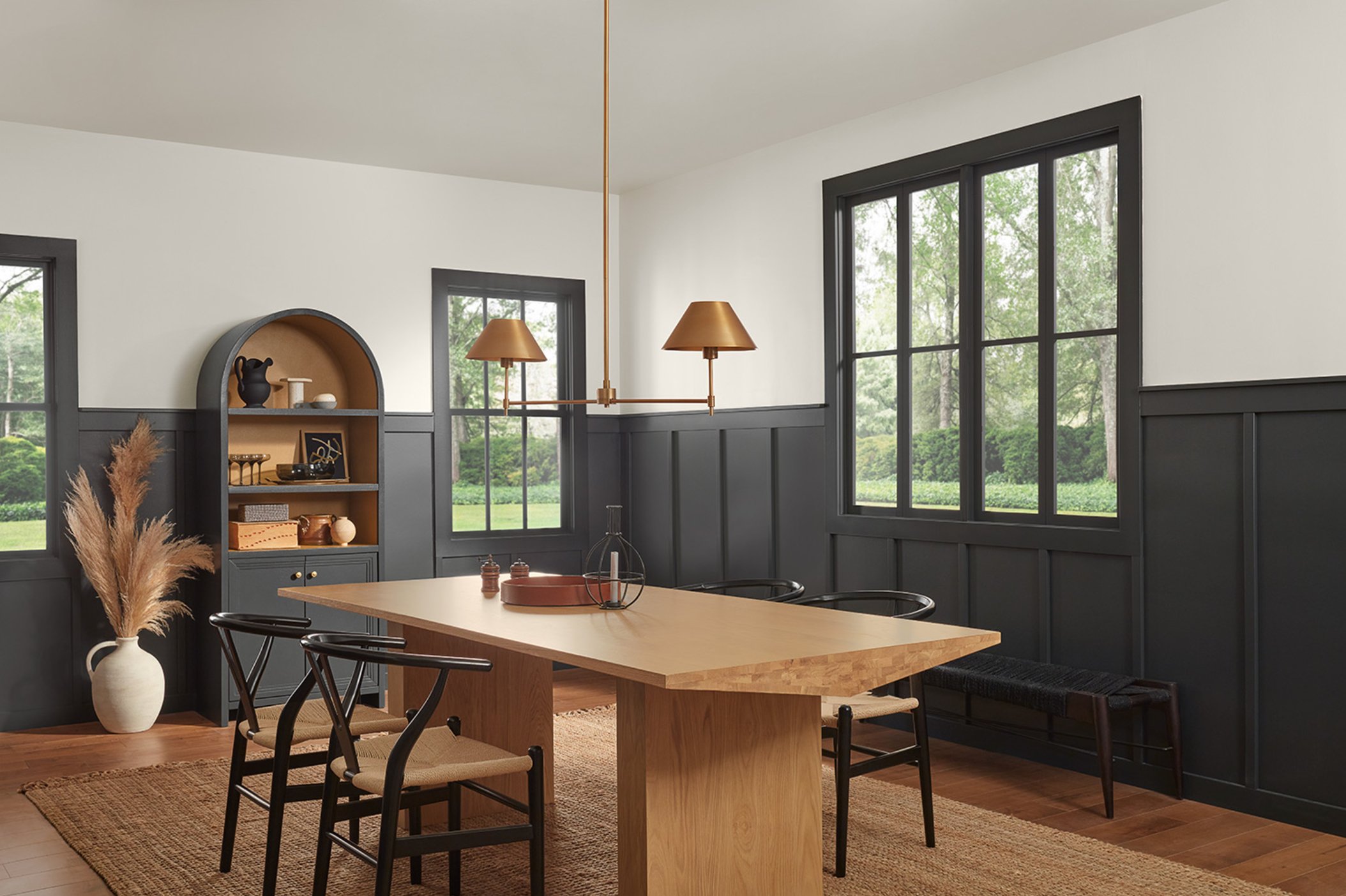
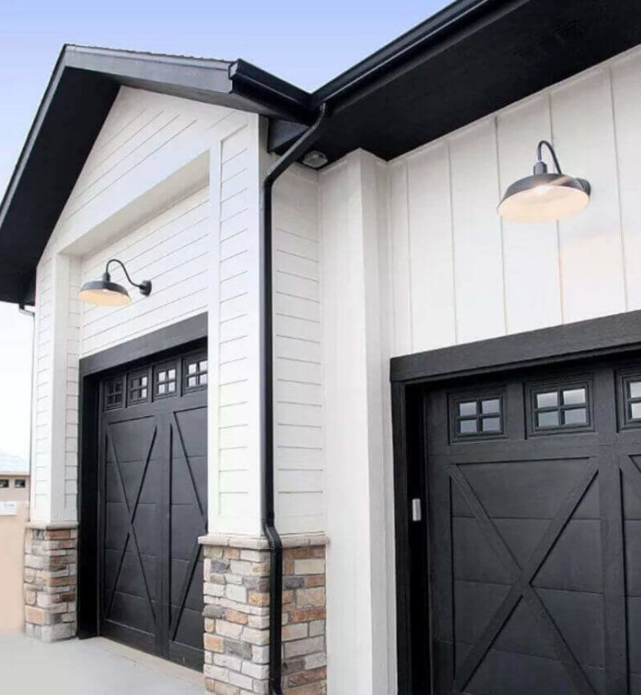
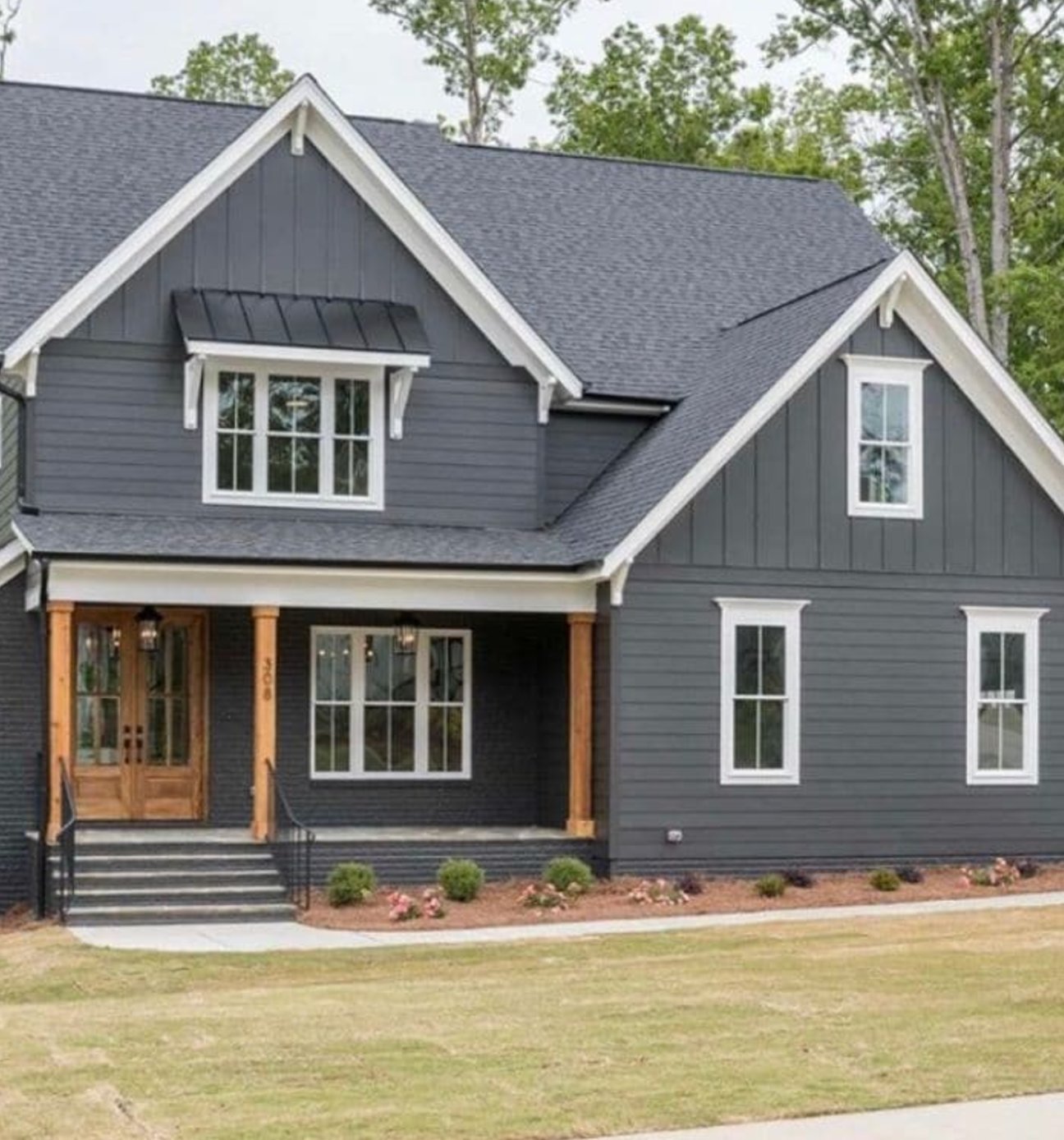
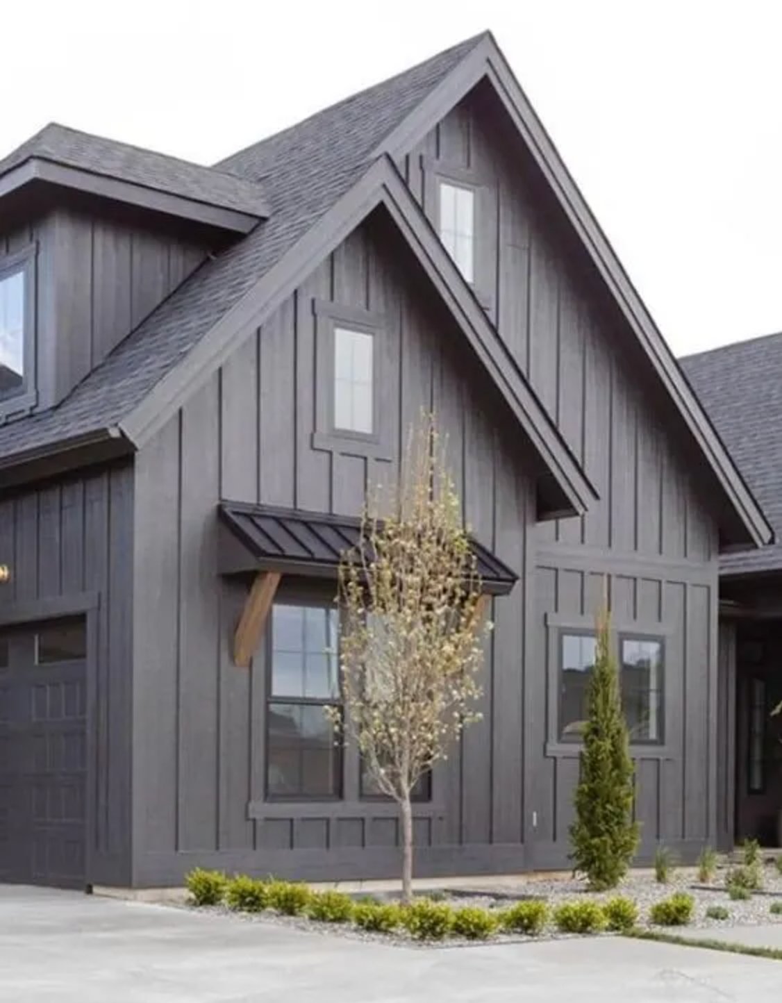
Exteriors
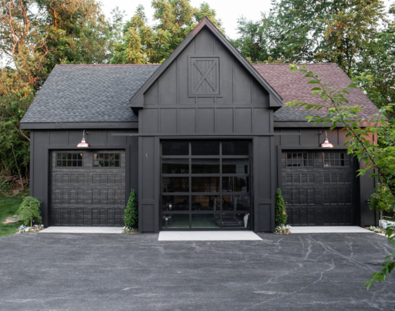
source
source
On home exteriors, Tricorn Black shines – this incredibly rich, deep black creates a gorgeous architectural definition.
It’s perfect for modern homes and looks particularly impressive across larger surfaces.
source
source
Iron Ore takes a more subtle approach on exteriors. Unlike Tricorn’s consistent boldness, it changes subtly throughout the day. Those warm undertones come through when the sun’s bright, making it a less severe choice for your home’s exterior.
Lighting Impact
source
source
When it comes to lighting, Tricorn Black can be pretty demanding. It creates incredible depth in living rooms with large windows but for a small bathroom? I’d only use it on an accent wall – and there’s a good reason for that.
In natural light, it stays a rich, deep black with virtually no undertones showing through. It can come across as quite harsh on sunny days, but that’s exactly what makes it perfect for creating dramatic contrasts.
source
source
Iron Ore is way more forgiving and flexible. Unlike the Tricorn Black, it shows different faces throughout the day.
In morning light, you’ll see a soft dark gray that transitions to nearly black by evening. What I really love is how its warm, woody undertones peek through in bright daylight.
Under artificial lights, it sometimes takes on subtle blue hints, which makes it more interesting than a straight-up black. It also handles poorly lit spaces much better than Tricorn Black – you won’t get that “black hole” effect.
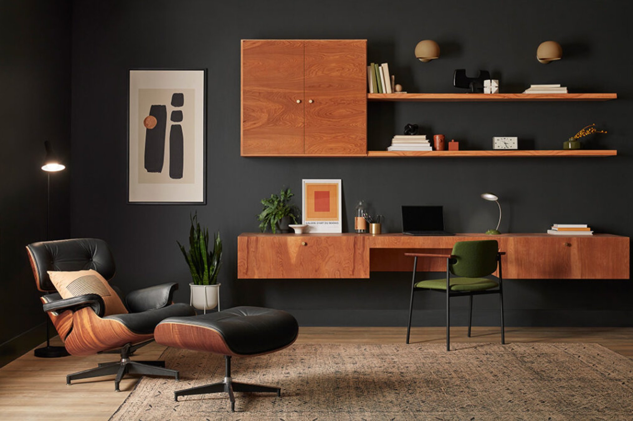
Coordinating Colors
Tricorn Black really shines when paired with clean, bright colors – they actually pop even more against it. Think rich emerald, mustard yellow, and sapphire blue.
For modern spaces, it looks fantastic with warm whites and ivory tones, giving you that classic contrast without feeling stale. Want to amp up the luxury? Add some gold or brass accents – they literally glow against this deep backdrop.
If you’re after something more laid-back, Tricorn Black plays nicely with earthy tones and warm beiges too.
Iron Ore is more of a team player than its darker cousin when it comes to color combos. It especially vibes with muted, dusty shades – lavender, terracotta, and sage green.
Unlike Tricorn Black, Iron Ore gives you softer transitions and doesn’t need such stark contrasts. It’s a great match for light woods, particularly oak and maple.
It brings out the best in complex pastels, adding depth without stealing the show. Plus, it looks fantastic with matte metals like nickel and aged silver, creating something more subtle than Tricorn Black’s dramatic statements..
Making Your Decision
So, now you’ve got the full scoop on these black shades!
Tricorn Black is your true, deep black (LRV 3) that’ll make the biggest statement in your space. Go for this one when you want that modern, crisp black with no compromises.
Iron Ore is the softer, more complex option (LRV 6) that shows different sides in different lights. It’s perfect when you want to go dark but aren’t ready to commit to full-on black.
Here’s a tip – definitely test samples of both colors in your space before making the final call. Trust me, you’ll really see the difference when you look at them in person!