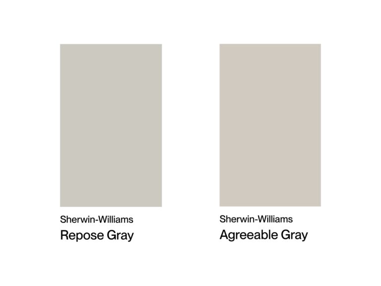
The choice between Sherwin-Williams’ Worldly Gray and Agreeable Gray can stump even seasoned designers.
At first glance, these colors might look nearly identical, but Worldly Gray tends to feel a bit cooler thanks to its slightly green undertone, while Agreeable Gray lives up to its name by playing nicely with pretty much any style.
I’ve gathered tons of real-life photos showing these shades in different interiors to give you a better idea of how they look under various lighting conditions and with different finishes.
Undertones & Character
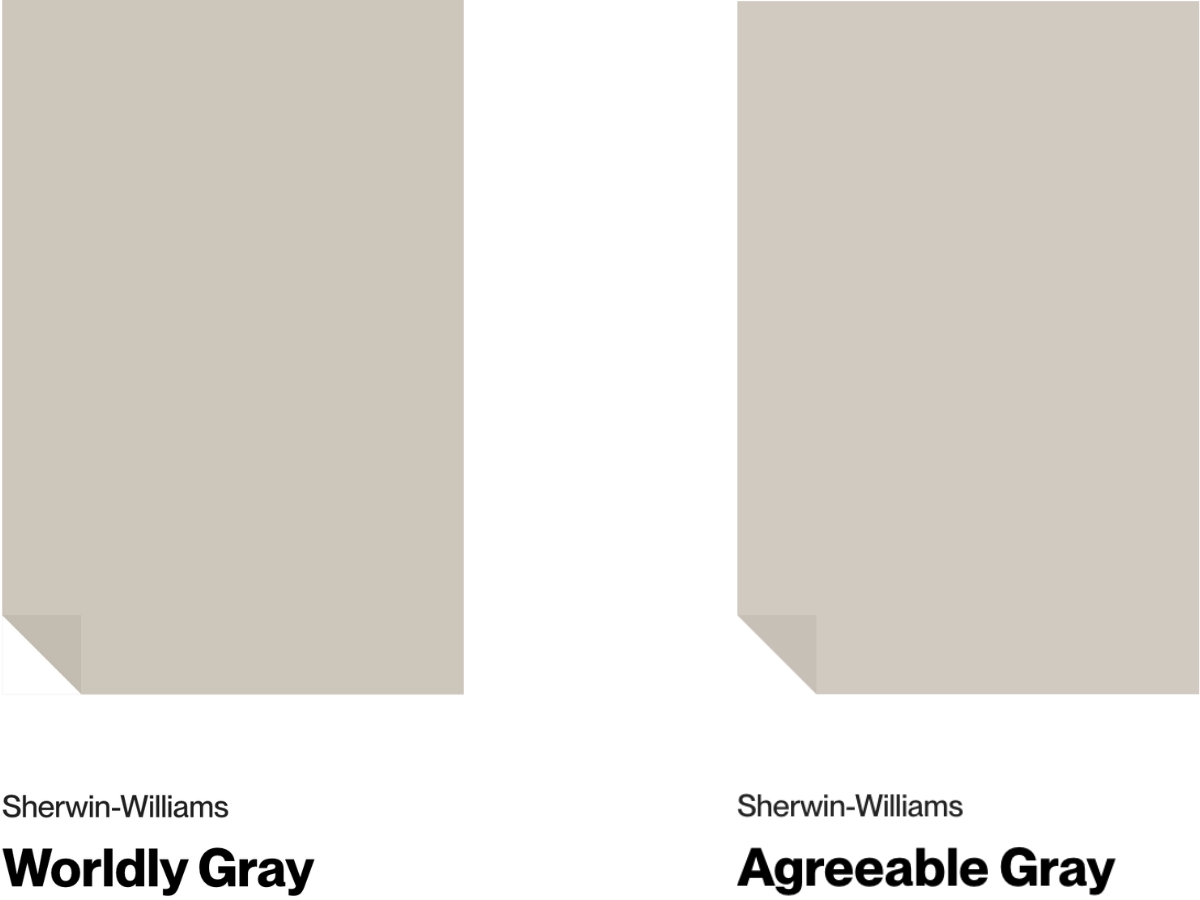
Sherwin Williams Worldly Gray is a warm gray with a subtle green undertone and an LRV of 57.
It warms up nicely in south-facing rooms while taking on a cooler vibe in north-facing spaces. I’m a big fan of how it looks in spacious, well-lit rooms – particularly living rooms and bedrooms. In the morning light, that green undertone really comes through, creating a beautiful color play.
The only catch is that it can fall a bit flat in darker spaces, so you’ll want to make sure you have good lighting.
Agreeable Gray from Sherwin Williams is slightly lighter (LRV 60) and, honestly, a bit more of a wild card.
It shares that warm green undertone but throws in some beige and even purple notes depending on the light. When I painted my living room with it, I couldn’t believe how much it changed throughout the day.
It’s gorgeous in bright spaces but can get a little unpredictable in rooms without good lighting.
Comparing the two – Worldly Gray is your steady Eddie, with a reliable warm gray personality. Agreeable Gray is more of a shape-shifter: warmer, lighter, and full of surprises depending on the light.
If you want to use one color throughout your house, I’d go with Worldly Gray. But if you enjoy a color that keeps things interesting – Agreeable Gray won’t disappoint!
| SW Worldly Gray | SW Agreeable Gray | |
| Color Code | SW 7043 | SW 7029 |
| Light Reflectance Value (LRV) | 57 | 60 |
| Color Family | Neutral | Neutral |
| Undertones | warm greige, subtle green, faint taupe (violet) | warm green, violet, beige |
Room-by-Room Comparison
These grays really show their true colors differently in each room. After lots of testing in various settings, here’s what I found:
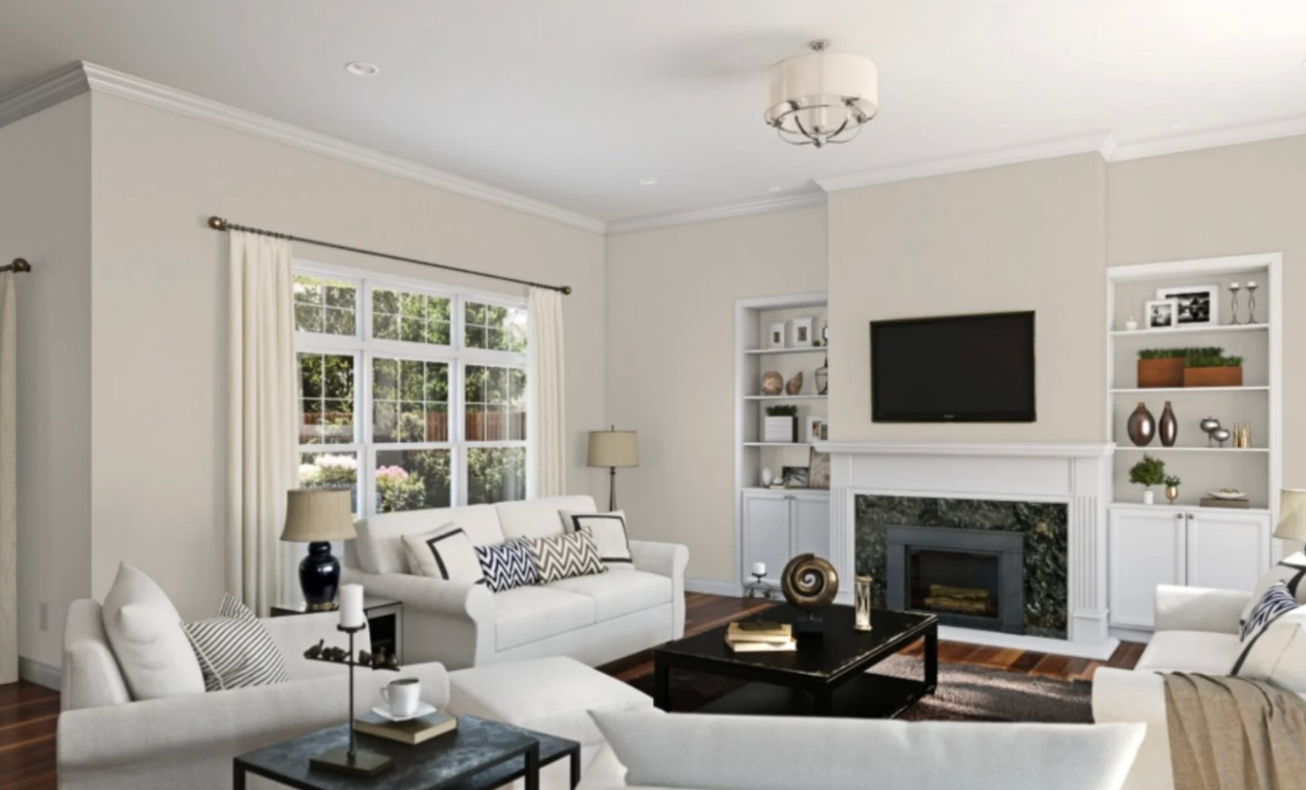
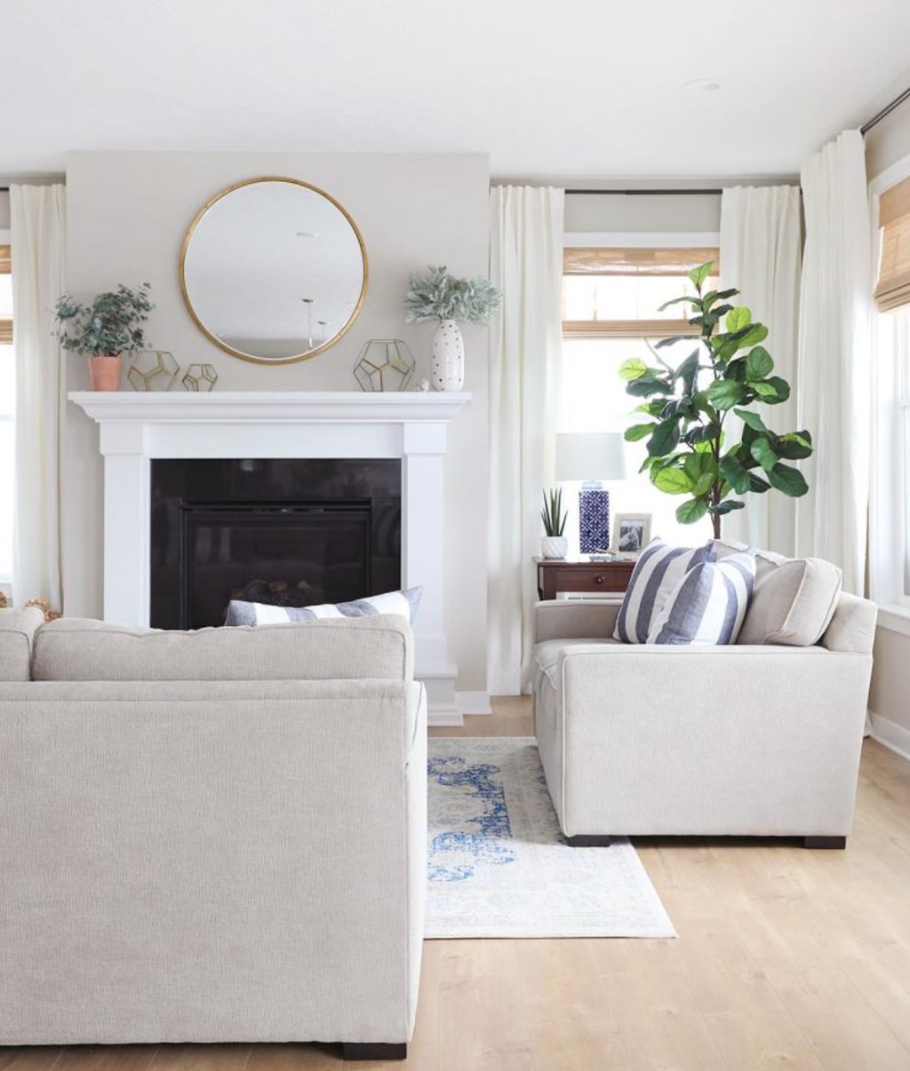
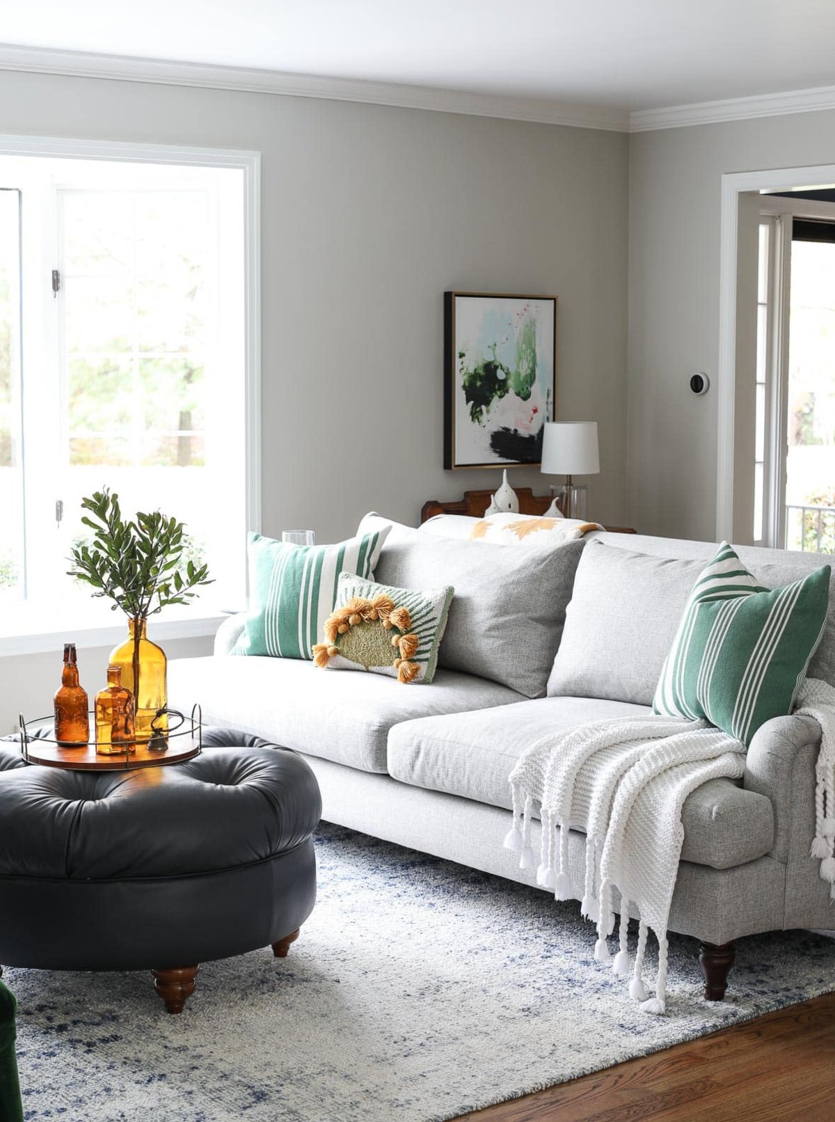
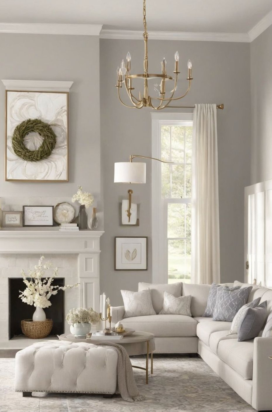
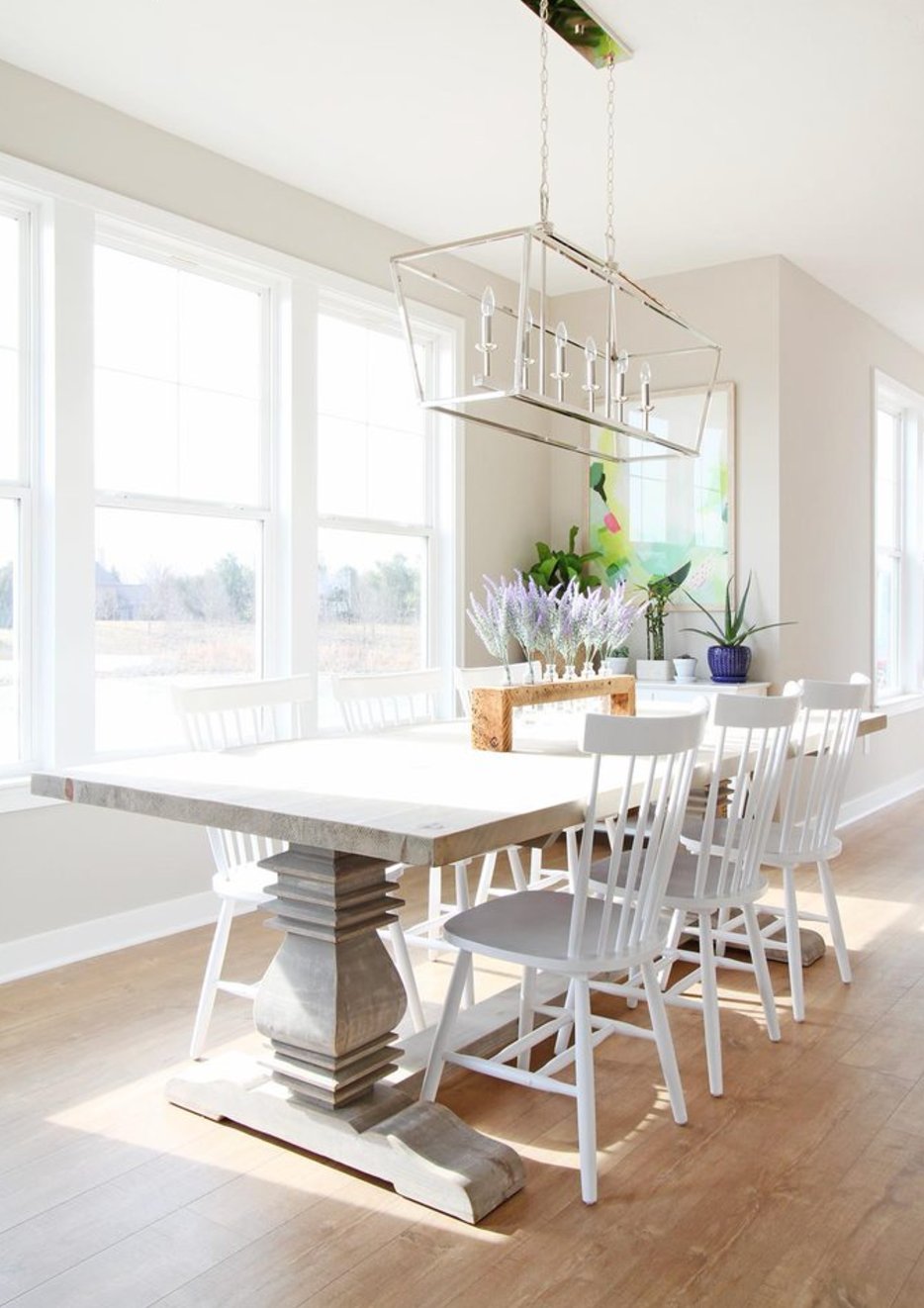
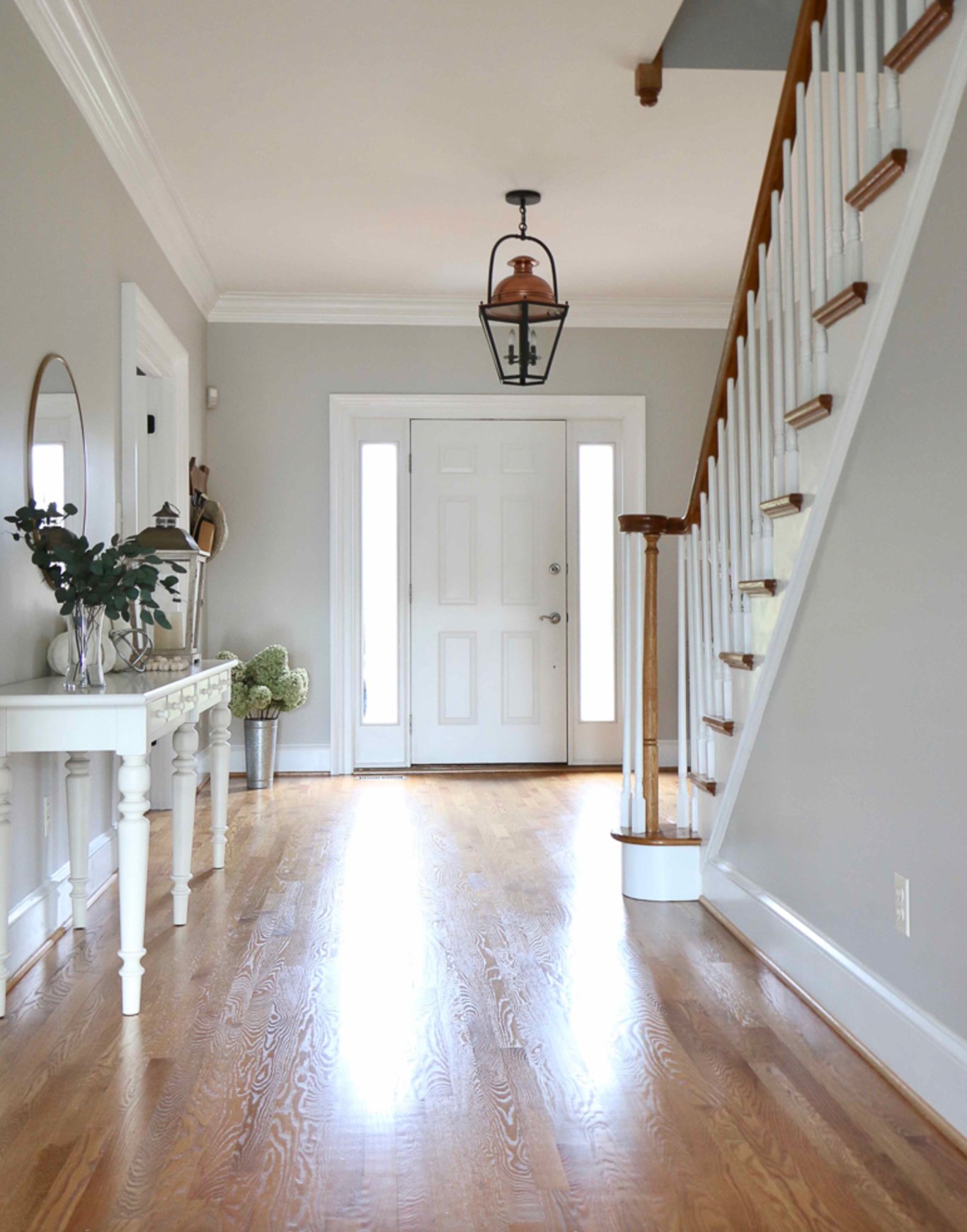
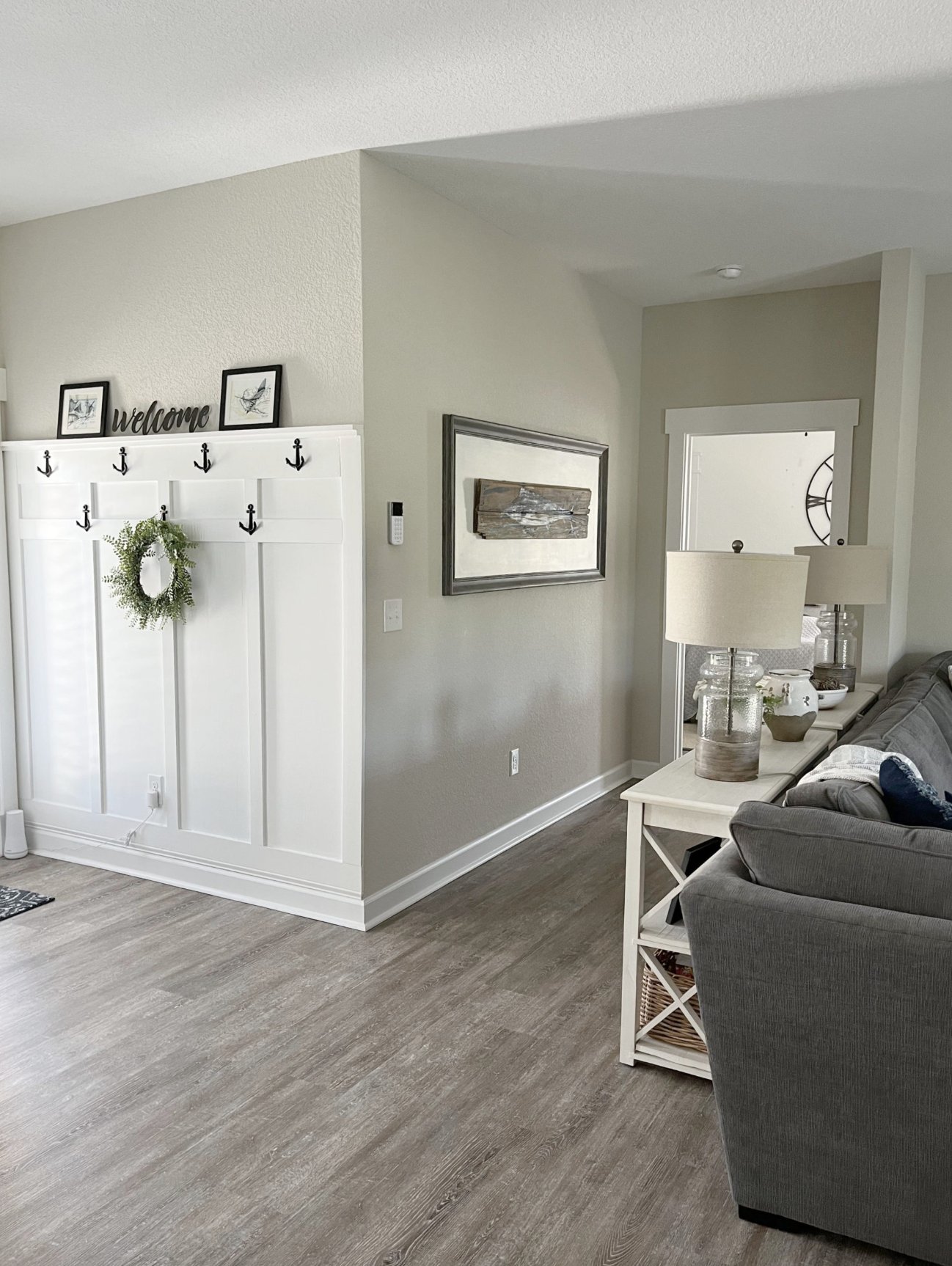
Living Rooms
source
source
Worldly Gray is a living room superstar. It feels warm and inviting on sunny days, and in open-concept spaces, it ties everything together beautifully.
source
source
Agreeable Gray runs a touch lighter and warmer. It’s perfect for family hangouts – especially nice when paired with wood furniture and natural fabrics.
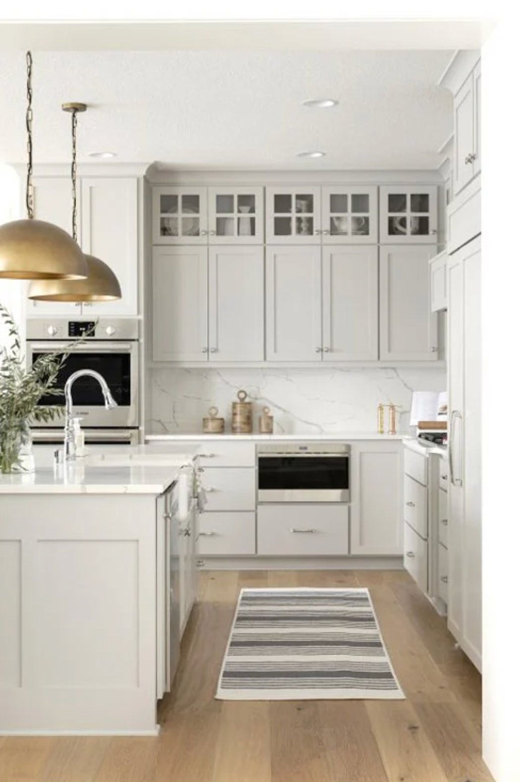
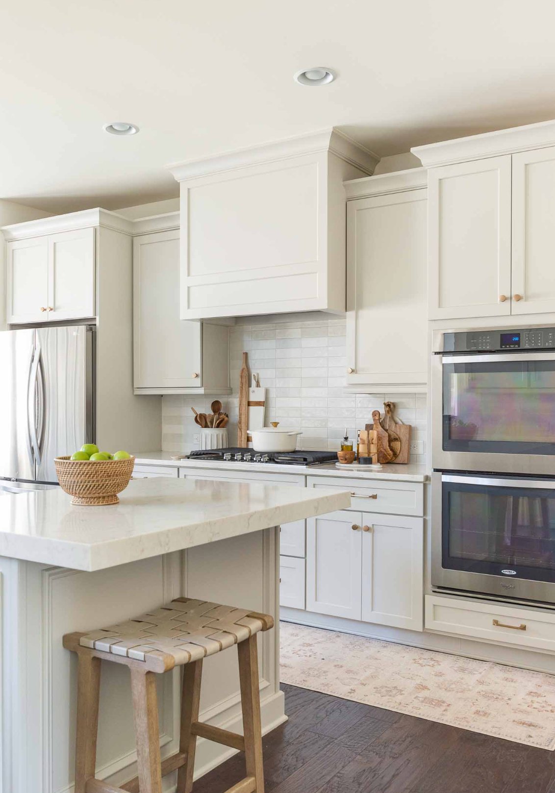
Kitchens
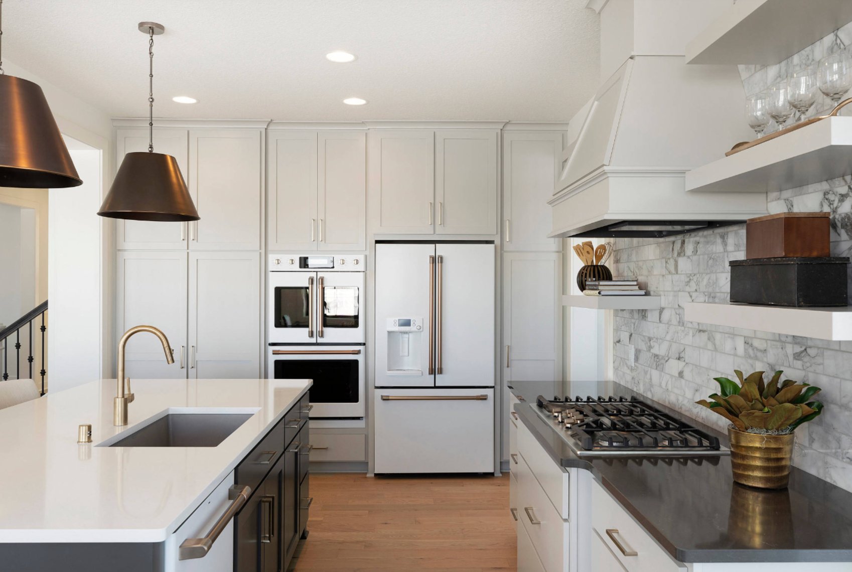
source
source
Worldly Gray makes a fantastic kitchen companion! That green undertone works beautifully with white cabinets and marble, and it’s an amazing neutral backdrop.
source
source
Agreeable Gray brings extra warmth to kitchens. It’s a game-changer in smaller spaces – making them feel bigger, and when combined with metallic touches, creates a modern yet cozy vibe.
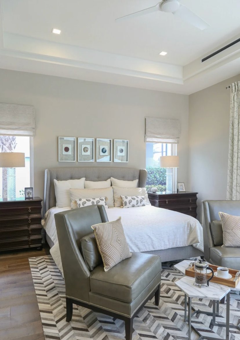
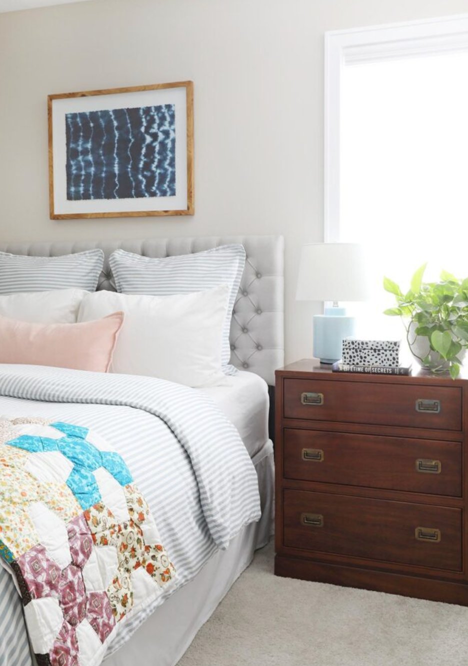
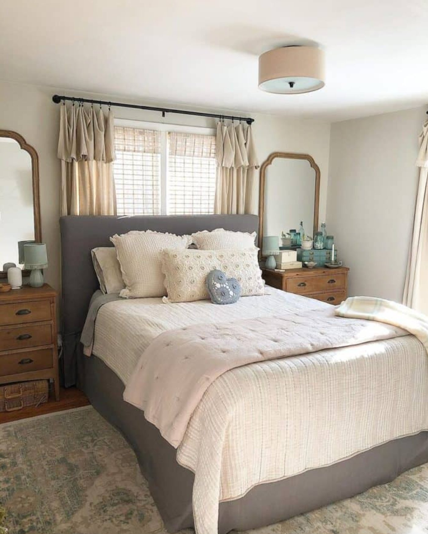
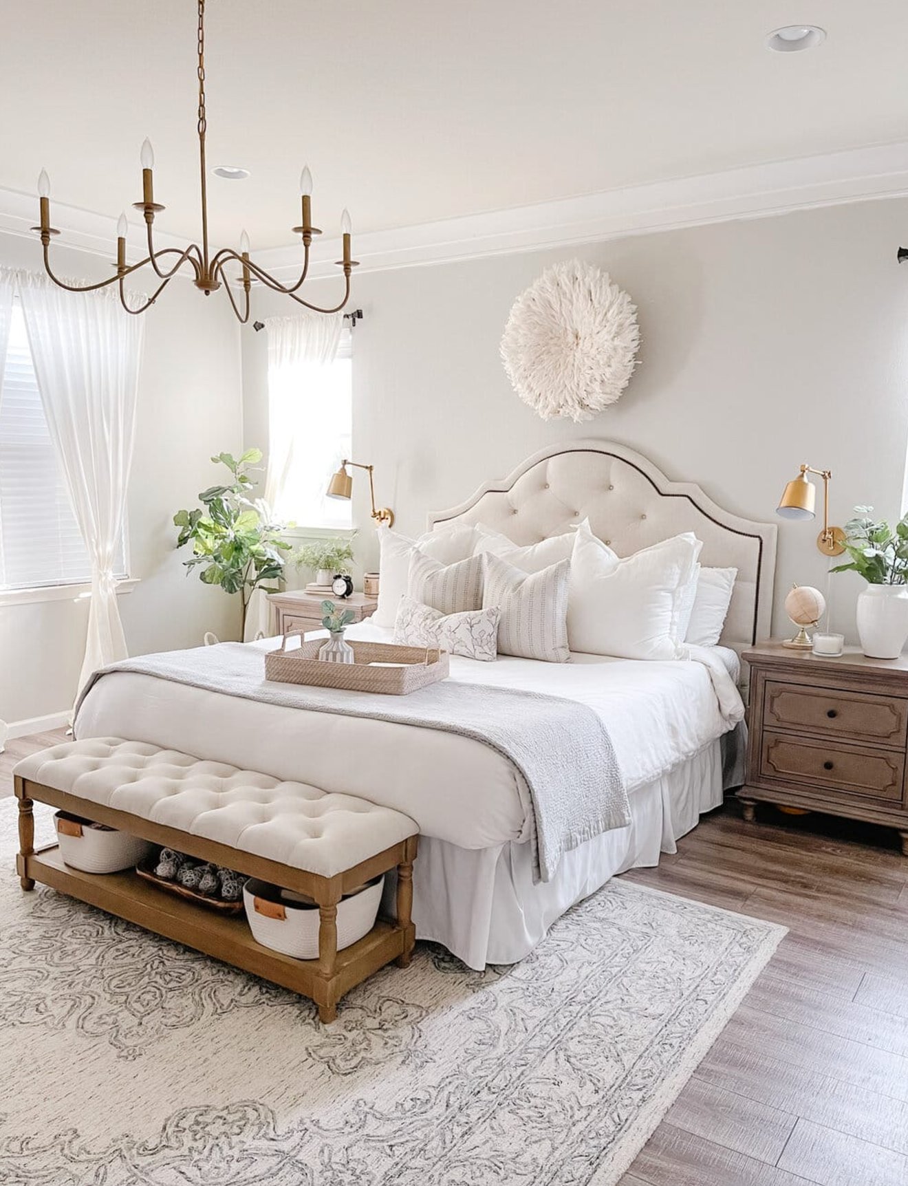
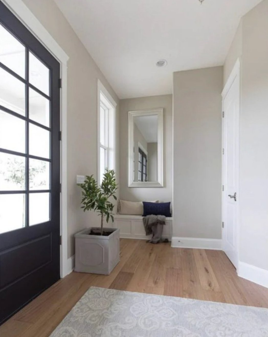
Bedrooms
source
source
Worldly Gray nails it in bedrooms – perfect for peaceful sleep. It’s subtle enough not to distract but still has character, working well with both modern and traditional styles.
source
source
Agreeable Gray takes bedrooms to next-level cozy. Pair it with soft textiles, and you’ve got the perfect relaxing vibe – especially great for master bedrooms.
Exteriors
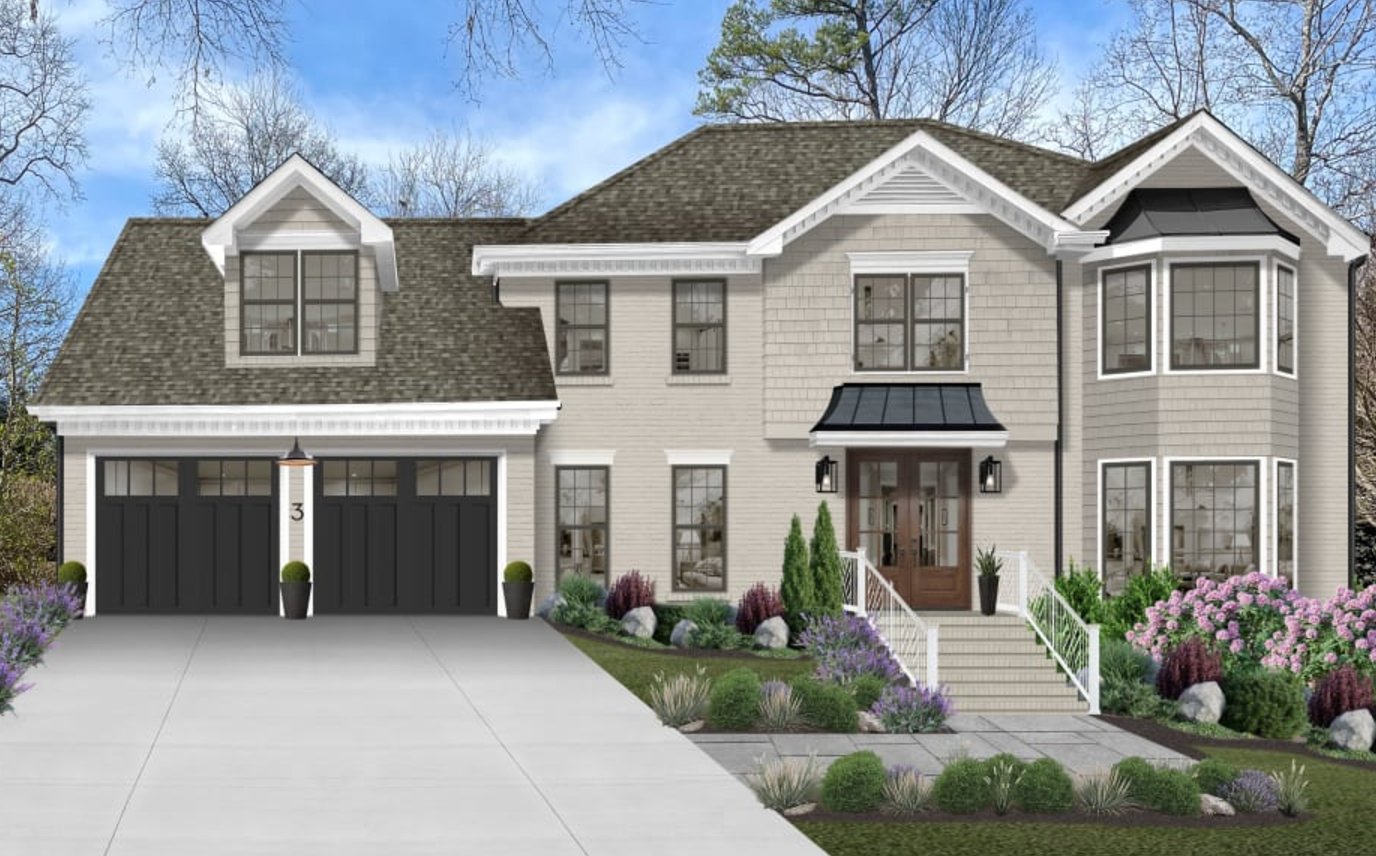
source
source
Worldly Gray looks fantastic on exteriors – clean and sophisticated, especially with white trim and a dark roof. Just make sure to check how it works with your existing materials first.
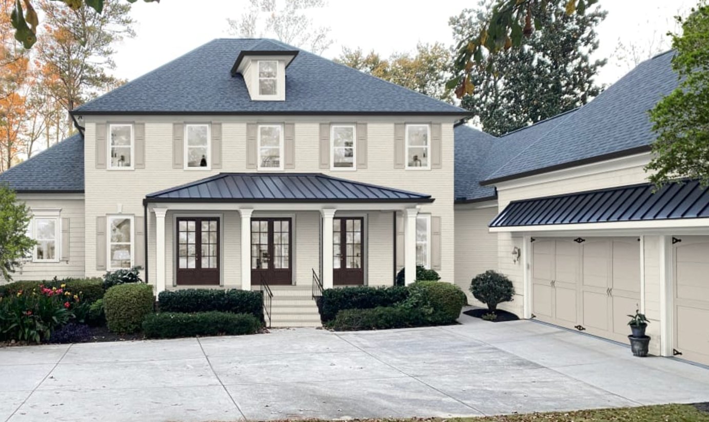
source
source
Agreeable Gray has a softer, warmer exterior presence compared to Worldly Gray. Houses practically glow against greenery! Remember, though, its beige undertones mean you’ll need to choose your trim carefully.
Lighting Impact
source
source
What makes Worldly Gray so interesting is how it changes with lighting.
In north-facing rooms, it leans cooler, while southern sunlight brings out its warmth. You might catch a hint of green in the morning, particularly on larger walls.
Without good lighting, it can look a bit flat. But give it plenty of natural light, and you’ll get these beautiful, subtle color transitions.
source
source
Agreeable Gray plays with light differently. It’s slightly lighter than Worldly Gray (LRV of 60 vs 57) and shows off more of its warm green undertones. Sometimes, you might even spot a touch of purple.
Just watch out – it can look patchy in dim spaces. While it handles artificial lighting really well, it needs more planning than Worldly Gray.
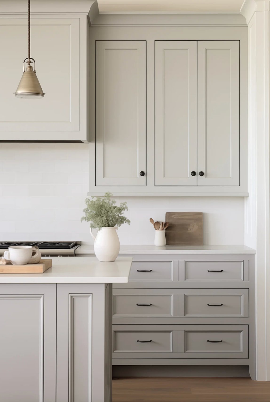
Coordinating Colors
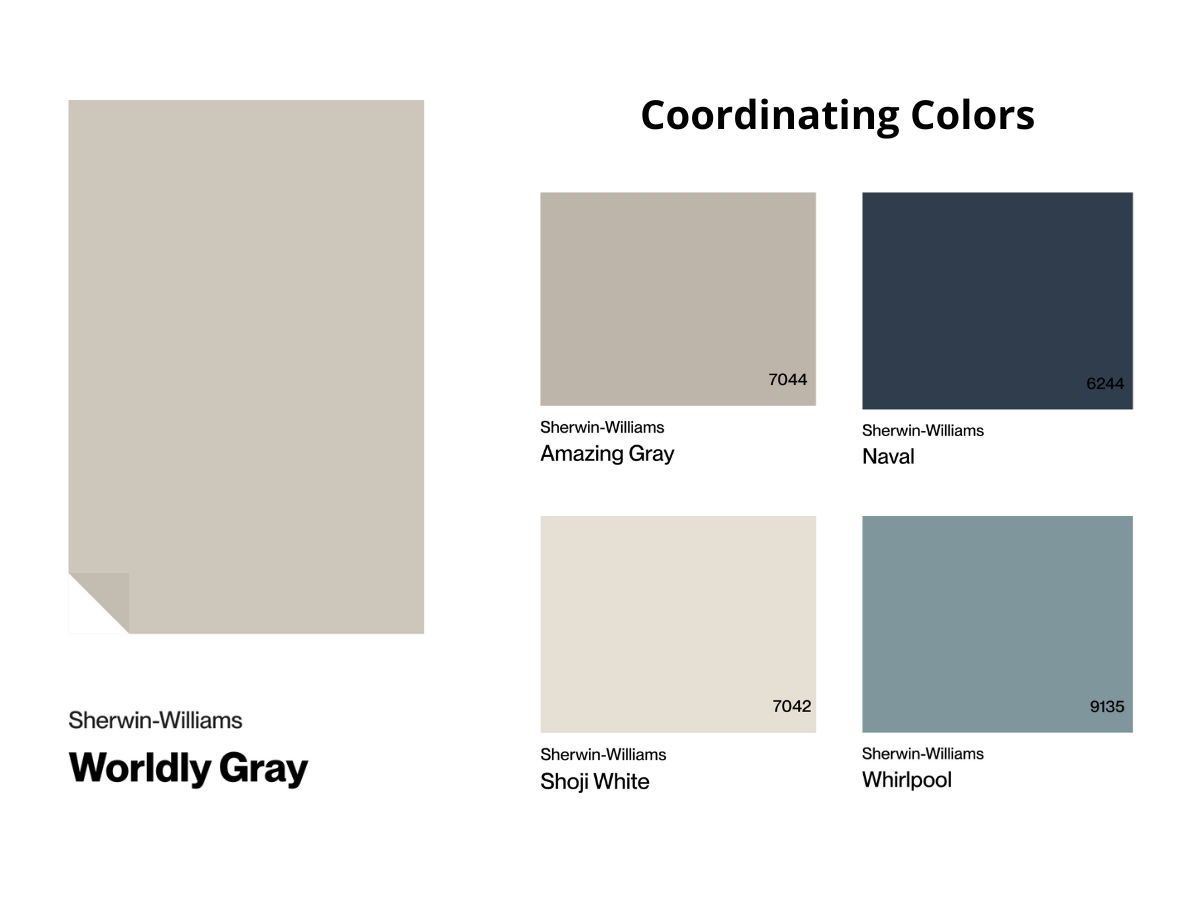
Worldly Gray is a natural partner for warm woods, from light oak to rich walnut. I love adding texture with cream and beige elements – think woven baskets or linen drapes.
Deep greens and terracotta make perfect accent colors, playing up the warmth. But be careful with cool metallic pieces – they can clash a bit.
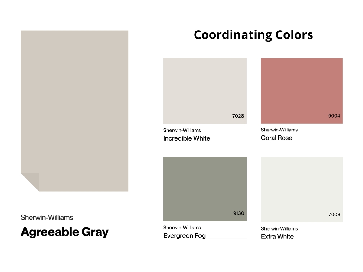
Agreeable Gray is more of a team player when it comes to color combinations. Its neutral base works beautifully with both warm and cool accents – everything from deep blues to sandy beiges.
It really shines with matte black details and dark wood, creating a modern but cozy vibe. Unlike Worldly Gray, it loves metallic finishes, especially aged brass.
Just don’t go overboard with decorative pieces – the color makes enough of a statement on its own.
Making Your Decision
Go for Worldly Gray if you want a versatile gray with subtle green undertones that really comes alive in well-lit spaces.
Choose Agreeable Gray for something warmer and lighter with beige notes, but remember it can be picky about lighting.
And here’s my golden rule – always test samples in your space under different lighting before making the final call!